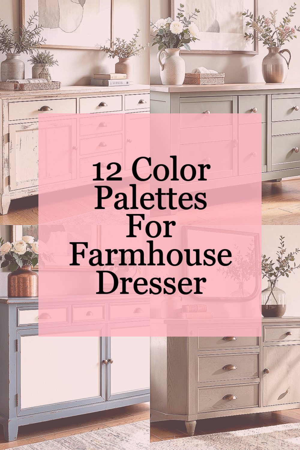
Warm wood, soft paint, and a little bit of charm can make any dresser feel brand new. The right color story turns everyday storage into a cozy room moment.
Below are twelve unique farmhouse dresser palettes with clear tips, budget ideas, and ways to make each one feel like you.
-
1. Cream + Weathered Oak + Antique Brass
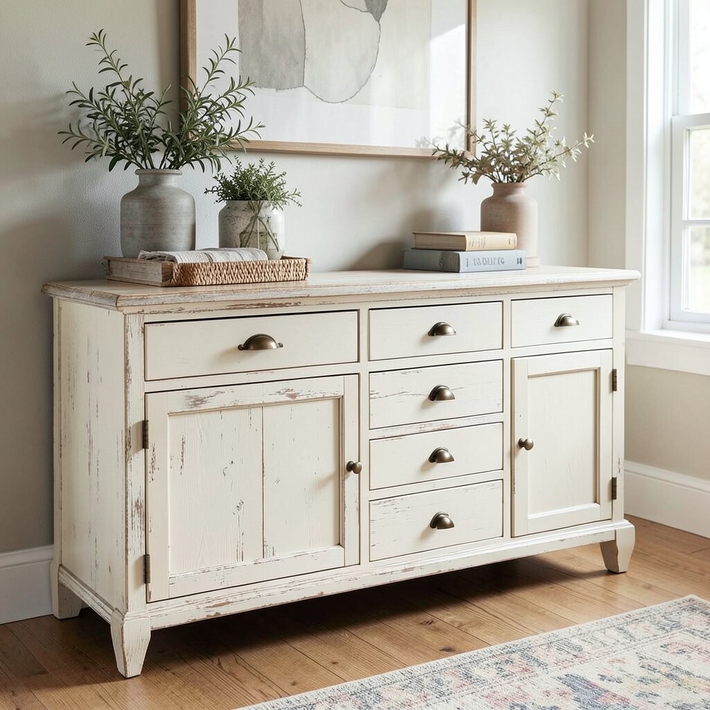
Cream + Weathered Oak + Antique Brass This palette looks like sunlight resting on old floorboards. Think creamy off-white drawers, warm oak grain showing on top, and hardware that glows like aged coins.
It gives that airy, clean farmhouse vibe without feeling too plain.Start with a creamy primer-friendly paint and seal it with a matte topcoat for a soft finish. For the oak feel, use either a clear wax glaze or a stain wash on the dresser top only.
Then swap pulls for antique brass to add instant “lived-in” character.
This combo hides small dings well, which is great if your dresser gets daily use.Personalize it by adding a thin stripe of cream around the drawer edges, like simple picture framing.
If you want more contrast, choose slightly deeper oak tones for the top. -
2. Sage Green + Soft Linen + Brushed Nickel
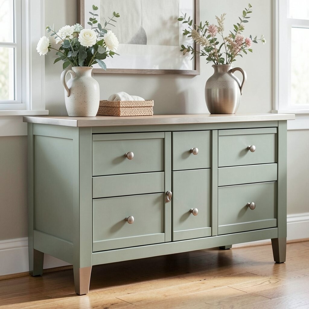
Sage Green + Soft Linen + Brushed Nickel Sage green makes a dresser feel calm and fresh. Pair it with a light linen white for the body, then use brushed nickel hardware to keep it crisp.
The result is farmhouse style with a gentle, modern mood.For best results, paint in smooth thin coats and lightly sand between coats so the finish looks velvety.
Sage can feel too strong if you choose the wrong shade, so test a sample on the back of a drawer before committing.The benefit of this palette is how easy it is to match with rugs, curtains, and bedding. Add personalization by stenciling small botanical lines on one drawer front and leaving the rest plain.
Budget-wise, you can keep costs down by doing stencils instead of full custom art. -
3. Dusty Blue + Chalky White + Oxidized Copper
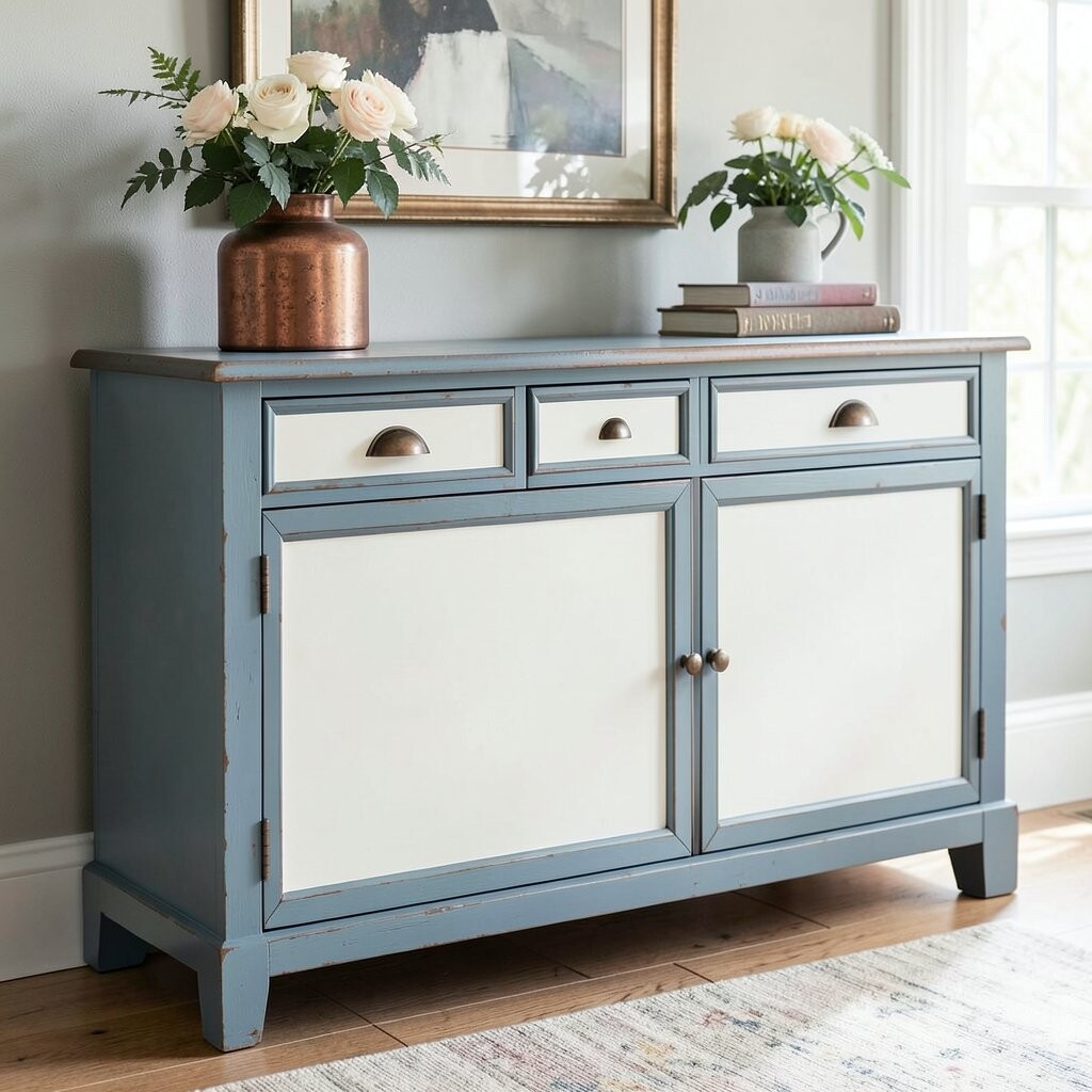
Dusty Blue + Chalky White + Oxidized Copper Dusty blue feels like a cloud that softened over time. Use chalky white as the main color, then add a dusty blue wash for some drawers or the top trim.
Oxidized copper pulls give a vintage “garden shed” wink.This palette is unique because it mixes cool calm tones with a warm metal that looks naturally aged.
It can make a small room feel bigger while still looking cozy and styled.
To keep it farmhouse, keep the blue muted, not bright.Try a two-tone layout: white dresser with a single blue accent drawer set.
For personalization, paint the drawer interiors a matching shade so the dresser feels thoughtful even when open.
If you’re watching costs, consider repainting only the fronts and reusing the rest with a new hardware upgrade.Current trend tip: vintage metals and earthy patinas are popping up in home styling right now, and copper accents fit right in.
Pair it with woven baskets and a soft lamp shade for a finished look. -
4. Warm Greige + Espresso Stain + Antique Bronze
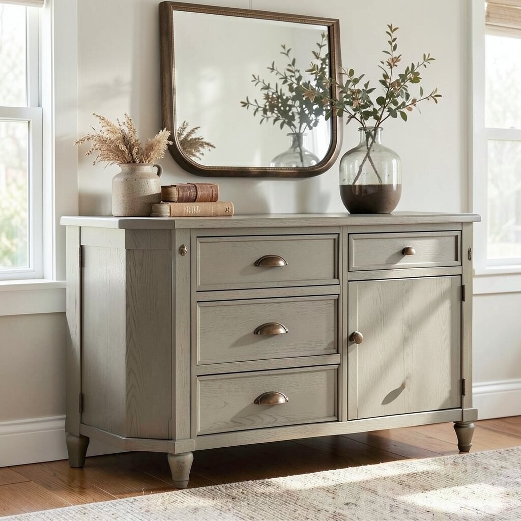
Warm Greige + Espresso Stain + Antique Bronze Greige sits between beige and gray, so it blends easily with many rooms. Add espresso stained details for depth, and choose antique bronze hardware for a rich, rustic touch.
This is a great choice if you want farmhouse style that feels more grown-up.To get the espresso look, apply stain on edges, legs, or a top panel, then wipe back for a softer blend. Coat everything with a protective finish so the greige stays smooth and easy to wipe clean.
This palette benefits real life: it hides dust and fingerprints better than very light colors. -
5. Terracotta + Soft Cream + Matte Black
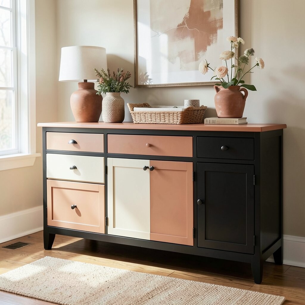
Terracotta + Soft Cream + Matte Black Terracotta brings instant warmth, like pottery warmed by the sun. Use a soft cream for most surfaces, then paint the drawer fronts terracotta for a bold but cozy pop.
Matte black hardware and small corner accents make it feel grounded and farmhouse-chic.The uniqueness here is the strong contrast without going harsh.
Terracotta adds personality, and the cream keeps the dresser from feeling heavy.Personalize it by using matte black on drawer pulls and knobs, plus a simple number label set on one drawer for a playful function.
Cost considerations are nice here too: repainting drawer fronts is usually cheaper than fully stripping and refinishing every part.
A sealing topcoat is worth it because terracotta tones can show wear if left unprotected. -
6. Charcoal + Light Sand + Antique Silver
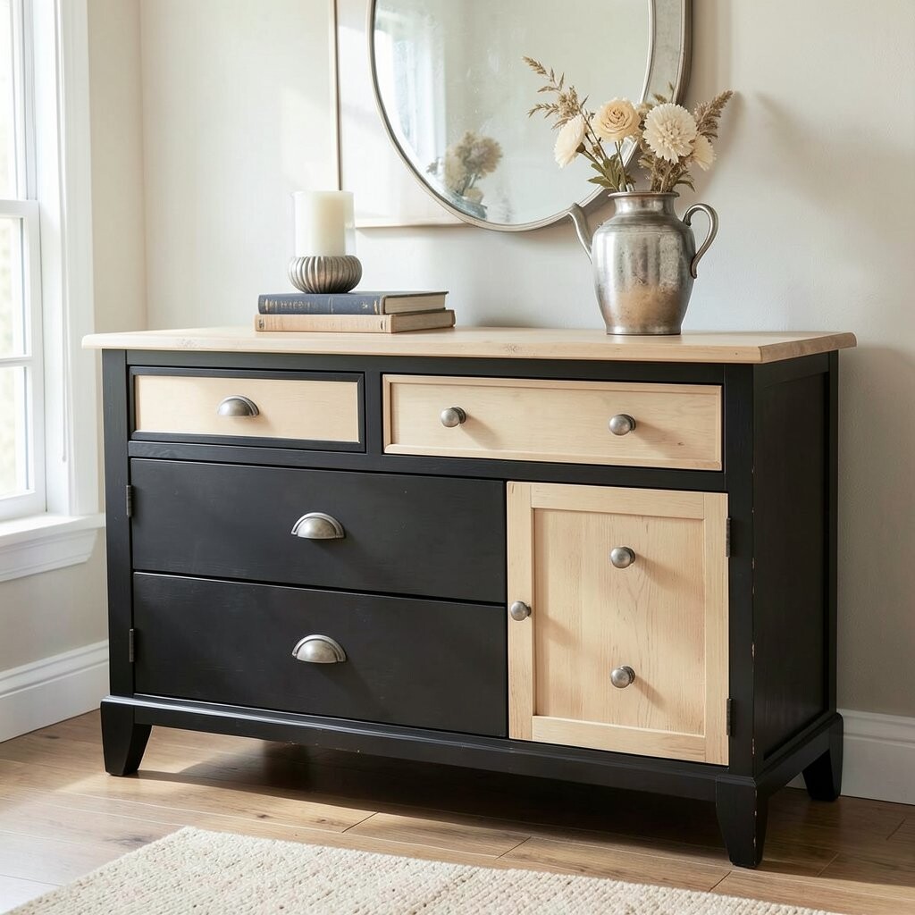
Charcoal + Light Sand + Antique Silver This palette feels like a cozy workshop shelf at the edge of farmhouse style. Picture charcoal drawer fronts paired with a light sand body, then antique silver hardware to tie it all together.
The contrast makes the dresser look sharp while staying rustic.For a trendy look, keep the charcoal only on the drawers and use sand on the frame.
That way, the dresser looks layered instead of flat.If you want extra texture, dry-brush the charcoal over a slightly darker base so it looks lightly distressed.
Personalization idea: stencil tiny stars or thin lines on two drawers, not all of them, so it feels intentional.
This palette also benefits darker rooms because it adds depth without losing warmth. -
7. Olive Green + Natural Wood + Brass-White Knobs
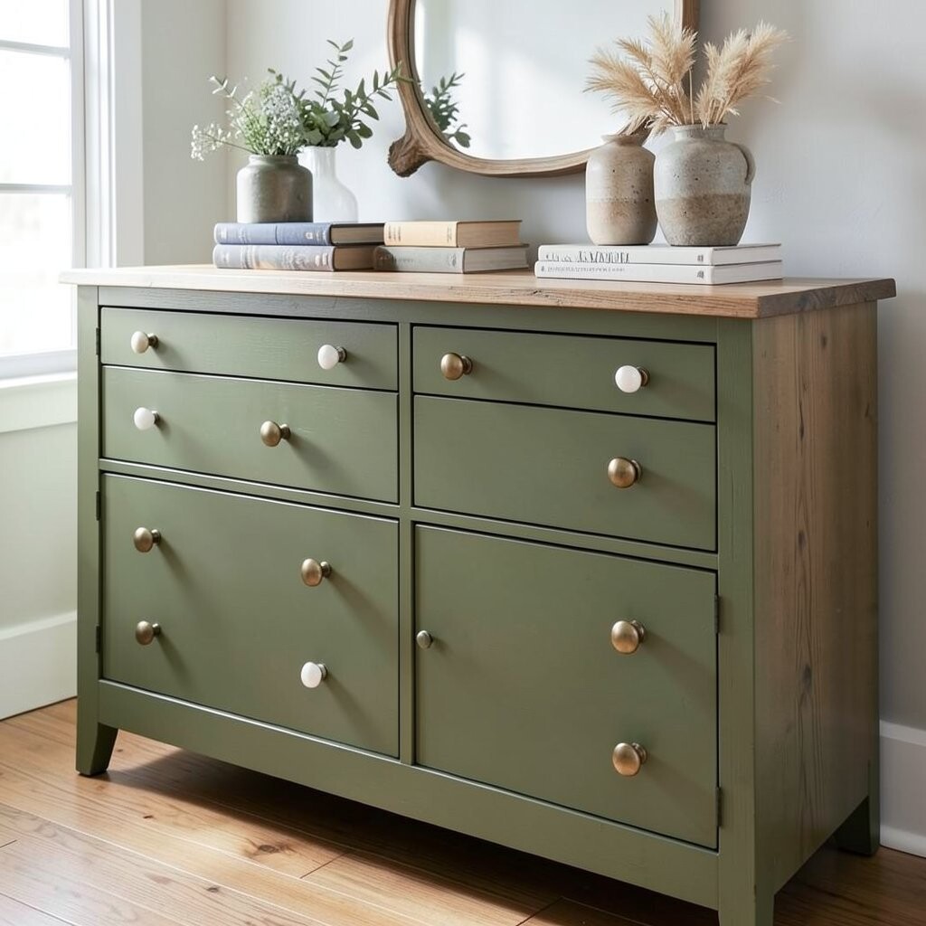
Olive Green + Natural Wood + Brass-White Knobs Olive green is rich and inviting, like a pantry shelf with neat jars. Pair olive on the dresser front with natural wood on top or sides, then choose brass-toned knobs with a lighter feel.
The whole look reads earthy, calm, and very farmhouse.To make it look clean, use a wood grain topcoat or clear sealer on the natural area so it stays protected.
Olive can vary a lot, so again, paint a test swatch and compare it next to your room’s light.
This palette is unique because it feels both rustic and fresh at the same time.Personalize with a subtle wash: lightly glaze the olive so the cabinet details show through. If you want to keep costs down, you can buy pre-primed paint and focus on drawer fronts first.
Hardware upgrade is one of the best “bang for your buck” moves because it changes the vibe fast.Trend note: earthy greens are popular in many homes right now, especially with natural fibers and warm lighting.
Add a linen runner or woven basket to finish the dresser styling. -
8. Soft Peach + Whitewash + Warm Gold
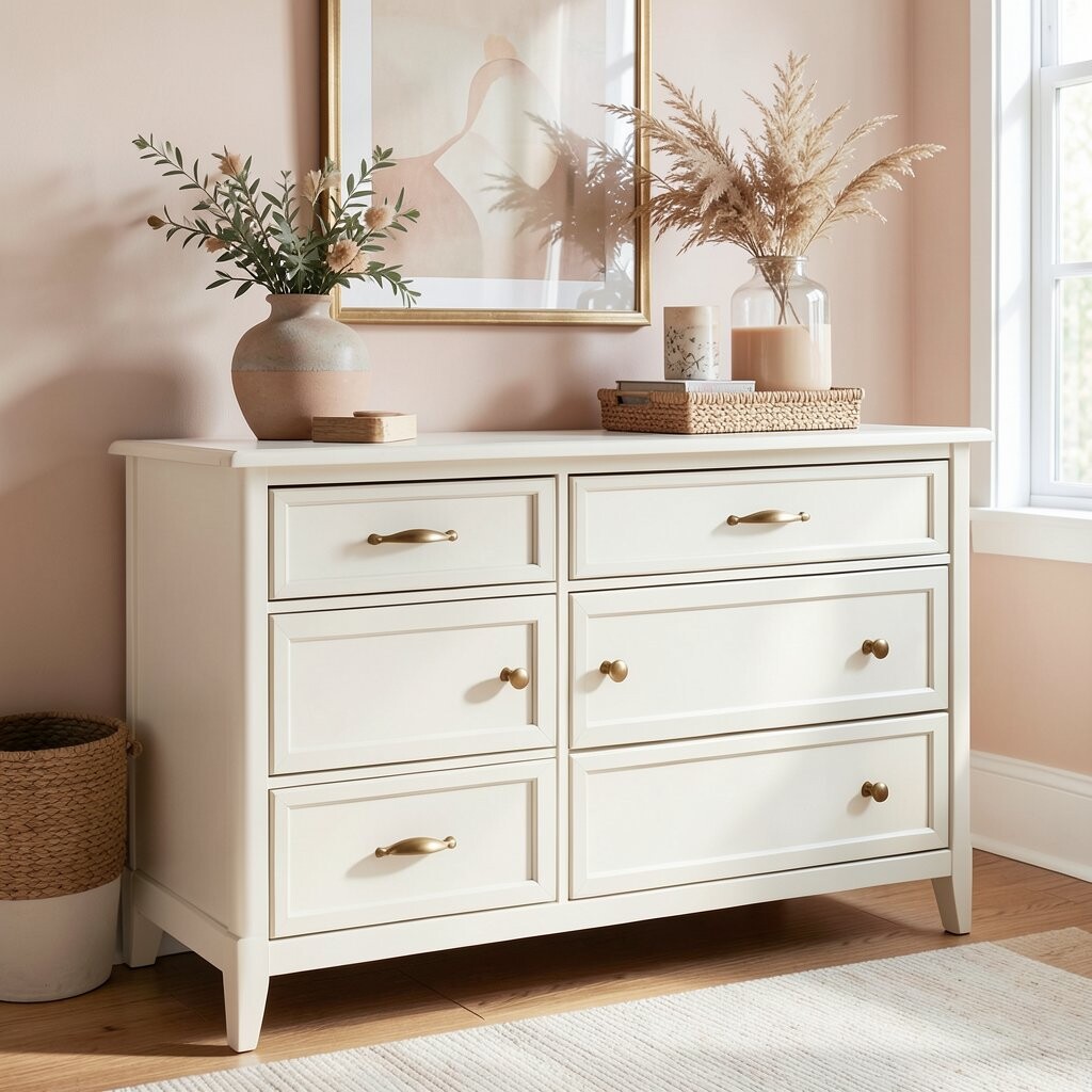
Soft Peach + Whitewash + Warm Gold Soft peach feels friendly and sunny, like a gentle morning. Start with whitewash on the main surfaces, add peach to drawer fronts, and pick warm gold hardware for sparkle.
This palette turns a basic dresser into a cheerful farmhouse piece.Whitewash can be done with a light paint and water-mix technique, but take your time so it stays light and airy. Peach looks best when it is muted, not bright, so choose a dusty peach tone.
The benefit is how it pairs with both neutral bedding and colorful decor without fighting. -
9. Linen White + Cocoa Brown + Rusty Red Pulls
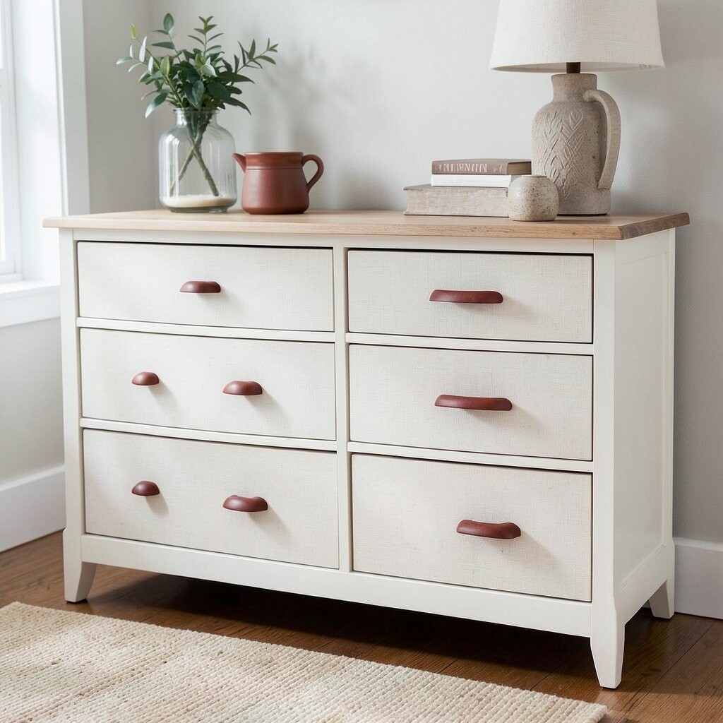
Linen White + Cocoa Brown + Rusty Red Pulls Linen white keeps everything bright, while cocoa brown adds cozy contrast. Rusty red pulls bring a farmhouse “rust and wood” theme that feels strong but still warm.
This palette is great for anyone who likes classic style with a twist.Try painting the base linen white and using cocoa brown for trim lines, top edges, or selected drawers.
The visual trick here is to limit the darker color so the dresser stays open and airy.Personalize by adding a thin cocoa line around drawer fronts, like a frame you’d see on vintage furniture.
Budget tip: if you don’t want to paint everything, just repaint the drawer fronts and keep the frame in linen white.
Current trend: warm reds and rust tones are showing up a lot in farmhouse styling, especially in hardware and textiles. -
10. Pale Yellow + Creamy White + Vintage Brass
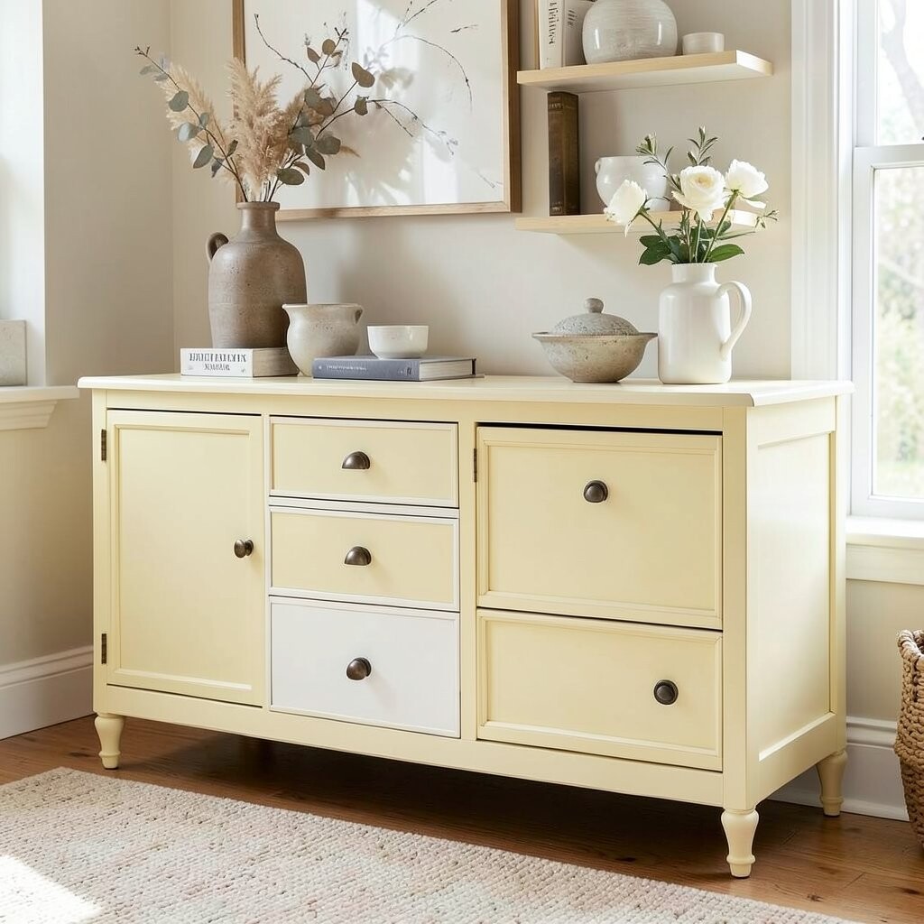
Pale Yellow + Creamy White + Vintage Brass Pale yellow is like buttered toast for your room, soft and comforting. Use creamy white for the main body, paint select drawers pale yellow, and choose vintage brass pulls for a sunny glow.
The dresser looks inviting even on gray days.Keep the yellow very light so it stays farmhouse, not “playroom.”
You can make it extra special by using a gentle glaze that lets the paint texture look handmade.Personalization idea: place pale yellow on the lower drawers only, then keep the top drawers creamy white for a balanced layout.
Cost considerations are easy here because touching up small areas is simple with light colors.
If you have pets or kids, use a durable protective topcoat so the finish wipes clean. -
11. Natural Wood + White Chalk Paint + Black Hardware
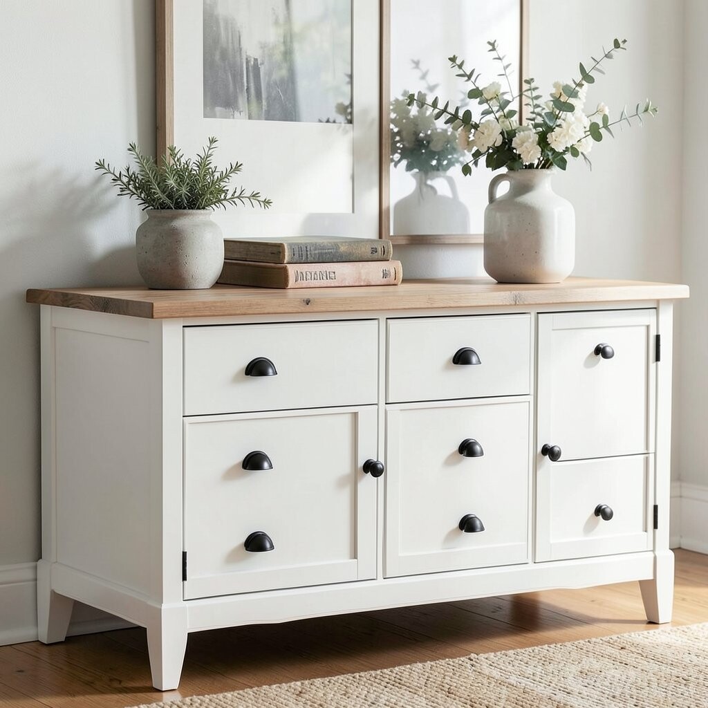
Natural Wood + White Chalk Paint + Black Hardware This palette feels like the dresser is wearing two kinds of outfits. Leave the natural wood visible on top or sides, paint the rest with white chalk paint, and install black hardware for bold clarity.
It’s a modern farmhouse look that still feels classic.The beauty is in the contrast: light paint brightens, while natural wood adds warmth.
Chalk paint can be forgiving, but you still need proper sealing for a smooth, durable finish.
This is a great option if your dresser already has a nice wood grain.For personalization, outline one drawer front with a thin black line or add simple farmhouse icons like tiny hearts or wheat stems.
If you want a budget win, do not strip everything—just clean well, lightly sand, and paint the parts you want to change.
Pair it with black-framed mirrors, simple wall hooks, or a striped throw for a coordinated room feel.Trend tip: high-contrast hardware, like black pulls against light paint, stays popular because it photographs well and looks sharp in real life.
Finish the styling with natural baskets and a neutral lamp shade. -
12. Soft Lavender + Dusty Rose + Brushed Nickel
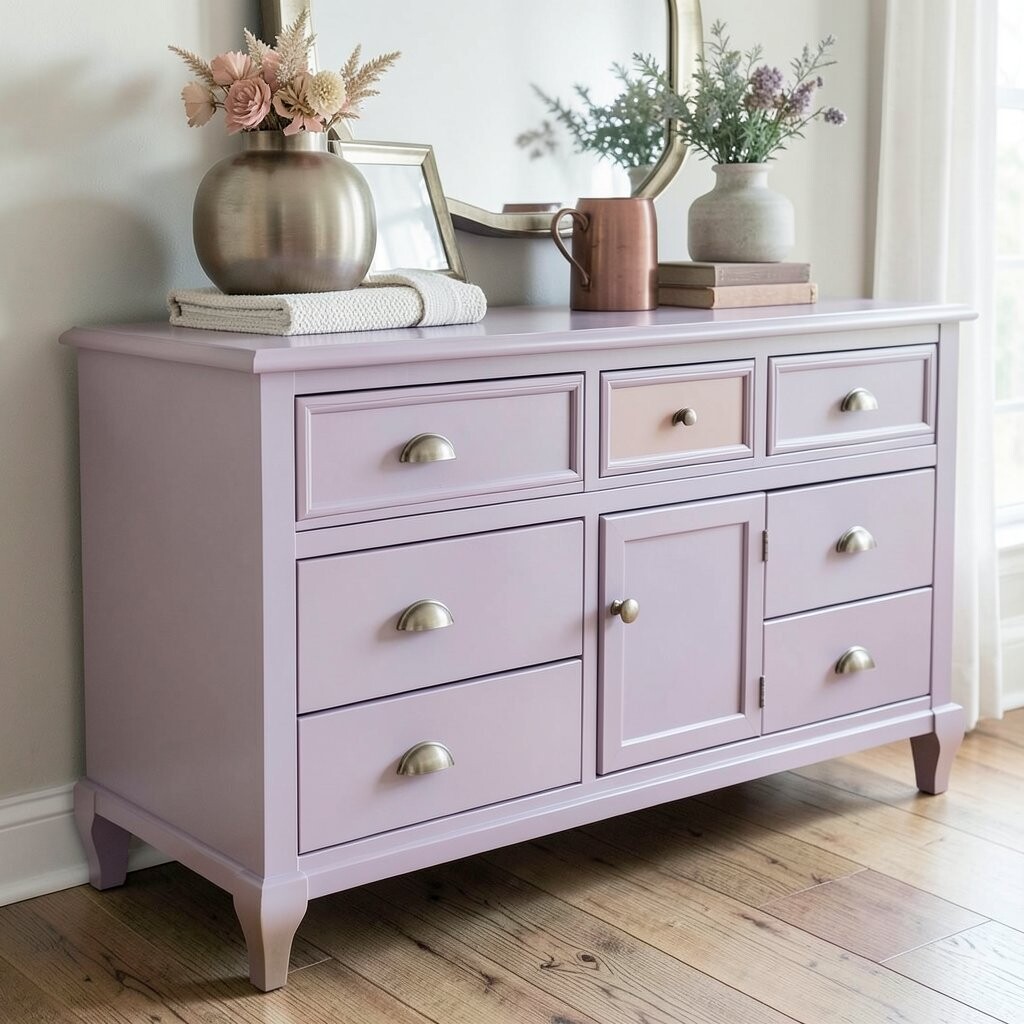
Soft Lavender + Dusty Rose + Brushed Nickel Soft lavender adds a dreamy farmhouse twist without turning into something too sweet. Pair it with dusty rose accents for a gentle warmth, then choose brushed nickel hardware to keep the look clean.
This palette feels unique, creative, and oddly calming all at once.Start by using lavender as the base color, then limit dusty rose to corner details, drawer fronts, or a small section of the top trim.
Make sure the undertones match; test samples because lavender and rose can look different depending on your lighting.
The benefit is that the colors feel cozy and artistic while still reading like farmhouse decor.