Sunlight looks different in every room, like it has its own mood. A few smart colour choices can make that mood brighter and calmer.
When your walls, trim, and fabrics work with the light, spaces feel bigger, fresher, and more inviting.
-
1. Start with a warm, light wall base
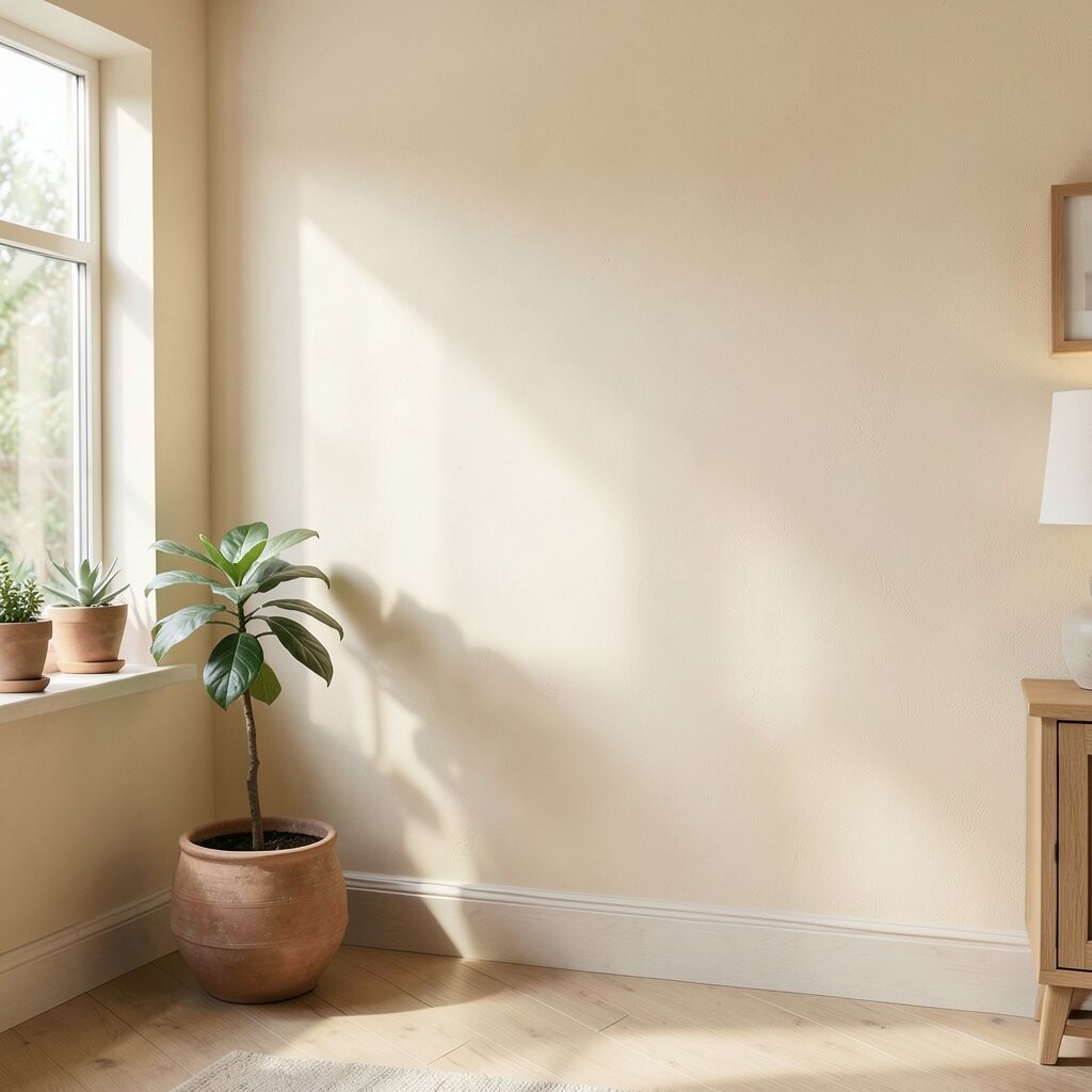
Start with a warm, light wall base Choose a wall colour that reflects daylight instead of swallowing it. Soft off-whites and warm light creams can make a room glow from morning to evening.
Picture the light sliding across smooth walls, turning dusty corners into gentle shadows. You will notice rooms feel more open, and the air in the space seems less heavy. If you are unsure, test a small patch on the wall and watch it at different times of day.
For tips, pick a tone that leans warm, not icy. Warm whites pair well with natural wood, woven baskets, and light curtains. This approach is usually budget-friendly because paint is one of the easiest upgrades.
If you love current trends, look for soft “greige” and creamy shades that still feel bright. Personalize it by matching the undertone to your flooring, like honey oak, walnut, or grey-stained boards.
-
2. Use crisp trim to bounce light around
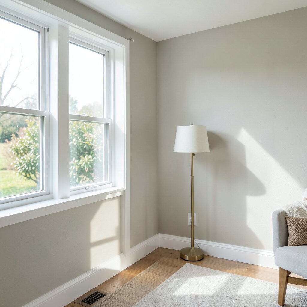
Use crisp trim to bounce light around Trim is like the frame around a picture, and it can guide light through your home. Bright, clean trim colour—often the whitest white you can tolerate—helps sunlight stay lively.
Imagine window light hitting the edges of doorways and baseboards, creating a neat glow line. This makes ceilings look taller and walls look straighter. It also helps dark furniture stand out without making the room feel gloomy.
For suggestions, paint trim in a finish that is easy to wipe, like satin. If you want cost control, you can do only high-impact areas first, such as around living room windows. Personalize the look by choosing the undertone that matches your wall colour.
-
3. Pick ceiling colours that lift the whole room

Pick ceiling colours that lift the whole room Your ceiling is a big surface, and it strongly affects how bright a room feels. A light ceiling colour reflects more daylight and helps the space feel taller.
Think about sunlight spreading across the top plane, then falling softly onto the walls. This can reduce the harsh “drop” feeling in rooms with low ceilings. If your ceiling is currently darker than your walls, switching to a lighter shade can be surprisingly noticeable.
Try this tip: keep the ceiling a shade lighter than the walls, especially in rooms that get limited sun. It is often an affordable upgrade because ceiling paint usually uses less visual planning. For personalization, choose a slightly warm ceiling for cozy spaces or a cooler one for a crisp, modern mood.
Today’s trend is using soft, airy ceilings that still feel natural. You can also blend ceiling colour into the top edge of tall moulding for an extra bright effect.
-
4. Choose curtains that hold light, not block it

Choose curtains that hold light, not block it Window treatments can either make sunlight sparkle or make it disappear. Choose sheer or light-coloured curtains that let daylight pass through.
Picture sunlight filtering through fabric, turning your floor into a warm patchwork. The benefit is clear: your room stays bright without glare. A simple tip is to hang curtains high and wide so light can flow around the sides.
-
5. Layer neutrals for a soft, bright look

Layer neutrals for a soft, bright look Layering neutrals is a great way to use colour without making a room feel flat. Combine light walls with textured rugs and pillows in creamy, tan, and light greys.
When you mix warm and cool neutrals, the light bounces more evenly across the room. You get a calm look that feels lived-in, not empty. For uniqueness, add one small natural accent like jute, linen, or boucle texture.
Cost considerations are helpful here: you can start with a throw pillow set or a rug, which often costs less than painting. Personalize by matching neutral tones to your artwork colours, so everything feels connected.
-
6. Add one bright accent wall the right way
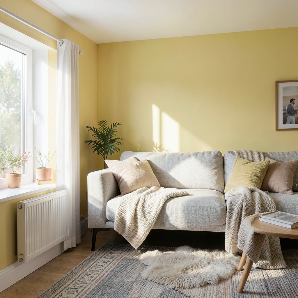
Add one bright accent wall the right way Accent walls can be fun, but they should work with your light, not fight it. Pick an accent colour that is lighter than you think, like a pale sage, soft sky blue, or light terracotta.
Visualize the accent wall becoming a “light catcher” that reflects sunshine and makes the room feel styled. The benefit is focus without heaviness. Tip: place the accent wall where daylight hits, such as opposite a window or along a sunlit hallway.
If you worry about commitment, use peel-and-stick wallpaper or a removable paint kit. That keeps costs lower and offers freedom to change later. For personalization, match the accent colour to a favourite piece, like a painting, lamp base, or patterned cushion.
-
7. Paint small corners for big brightness
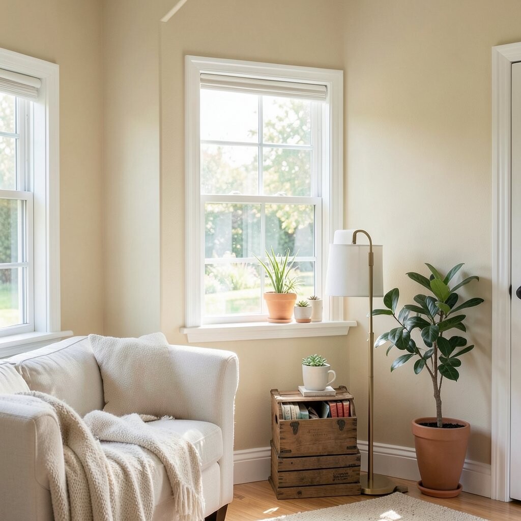
Paint small corners for big brightness Sometimes the darkest spots are the smallest ones, like alcoves, nooks, and behind lamps. A lighter colour in these areas can make the entire room feel brighter.
Imagine a tiny wall recess turning from shadowy to glowing, like it now has its own mini window. The benefit is dramatic because these spots pull the eye, so brightening them improves the whole feel. A practical tip is to use the same paint family as your main wall, but slightly brighter.
Cost is usually low because these areas take less paint and less time. Personalize by coordinating with your decor—try a soft warm tone in cozy spaces and a cleaner neutral in modern rooms. If your home has built-ins, this can be a trendy update that looks intentional.
-
8. Use reflective colours on shelves and cabinetry
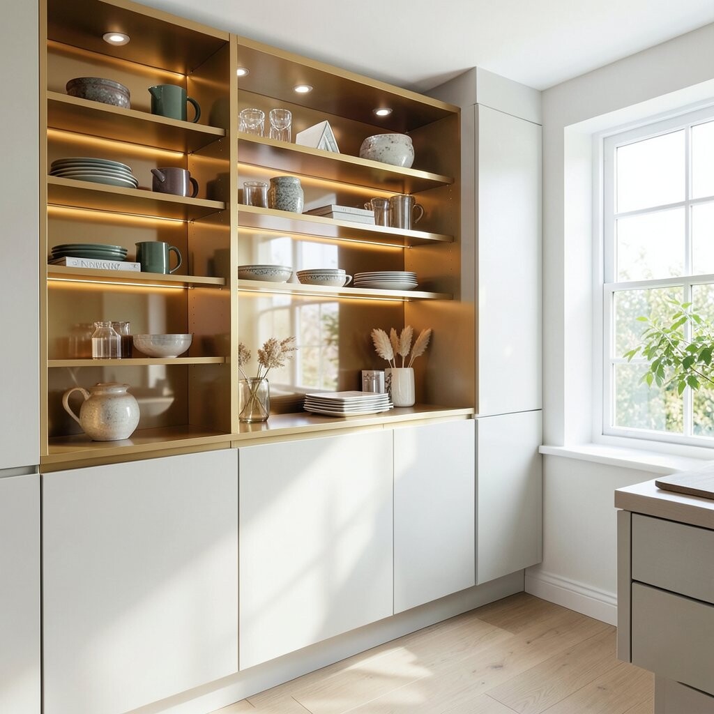
Use reflective colours on shelves and cabinetry Wood and glossy surfaces can bounce daylight, especially in kitchens and built-in shelves. Light cabinet colours and reflective finishes help the room stay bright longer.
Picture morning light hitting a pale cabinet door and spreading across the countertop. This can make a kitchen feel fresh and airy, even when it is busy. Try this tip: choose light cabinet shades or paint only shelves and lower sections first to manage budget.
If full painting feels too costly, add reflective elements like glass-front doors, metallic trim, or a glossy vase. Personalize the look by selecting hardware that matches your style—brushed brass for warm homes, chrome for cooler modern looks.
-
9. Choose flooring tones that work with daylight
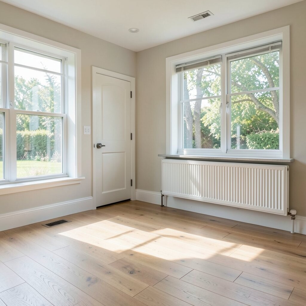
Choose flooring tones that work with daylight Your floor is a large light surface, so its colour matters. Light to medium wood tones and light greige floors can help sunlight travel across the room.
Visualize sunrays landing on lighter floors and lifting the brightness level around the furniture. The benefit is a room that feels balanced, with fewer dark “islands.” Tip: if you cannot change flooring, use a bright rug under key seating areas to add reflected light.
Cost considerations matter: replacing flooring is a big project, so start with rugs, runners, and wall paint first. Personalize by matching rug undertones to your floor, like warm creams with honey wood or cooler greys with ash tones. This is a very current approach because people want light-filled, natural aesthetics without major renovations.
-
10. Paint doors and hardware colours for contrast without gloom
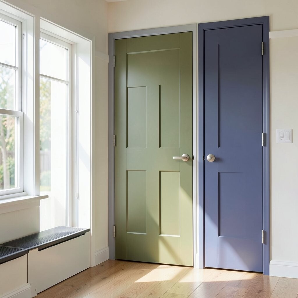
Paint doors and hardware colours for contrast without gloom Door colours can either soak up light or help it bounce. Keep doors in a light-to-medium tone when your goal is brightness, especially in hallways.
Imagine a hallway where the door frames catch sunlight and lead your eye forward. The benefit is that narrow spaces feel less narrow. A quick tip is to paint both sides of a door frame and the door itself in a matching family for a clean, bright line.
For uniqueness, you can add a subtle contrast: slightly darker doors than walls for structure. If you are budget-conscious, focus on the most visible doors first. Personalize the undertone so it matches your trim and flooring for a smooth, cohesive look.
-
11. Use light-coloured furniture and upholstery smartly
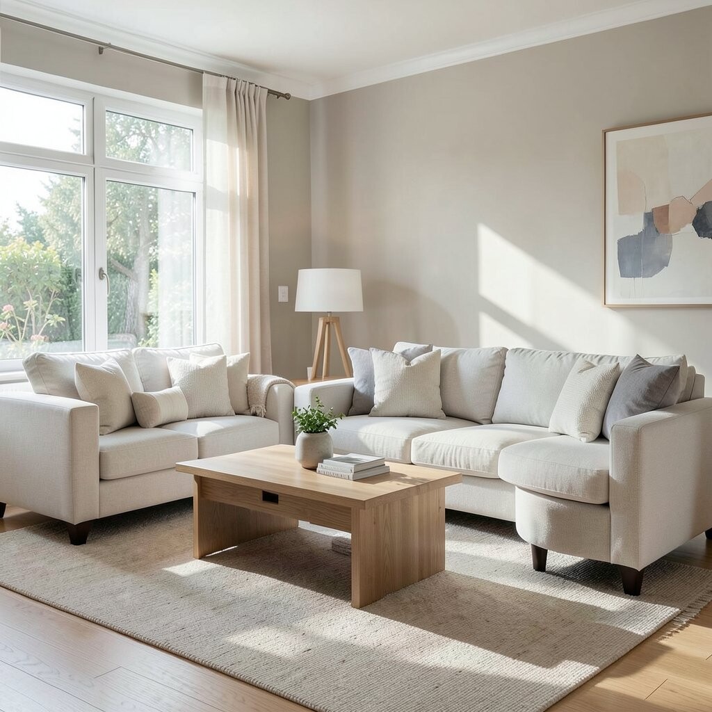
Use light-coloured furniture and upholstery smartly Furniture colour affects how much light bounces in a room. Lighter upholstery in cream, sand, or soft taupe helps brighten the space right away.
Picture a sofa that looks like it is “glowing” in daylight, with shadows staying soft instead of dark. This benefit makes rooms feel more welcoming and less heavy. Try this tip: keep the biggest furniture piece lighter and use darker accents in small amounts.
If you want a cost-friendly option, swap pillow covers and throws before replacing the whole sofa. Personalize with patterns—light stripes and small dots reflect light nicely while still showing personality. This approach matches current trends toward cozy, airy interiors with natural textures.
-
12. Add colour through wall art with a bright palette
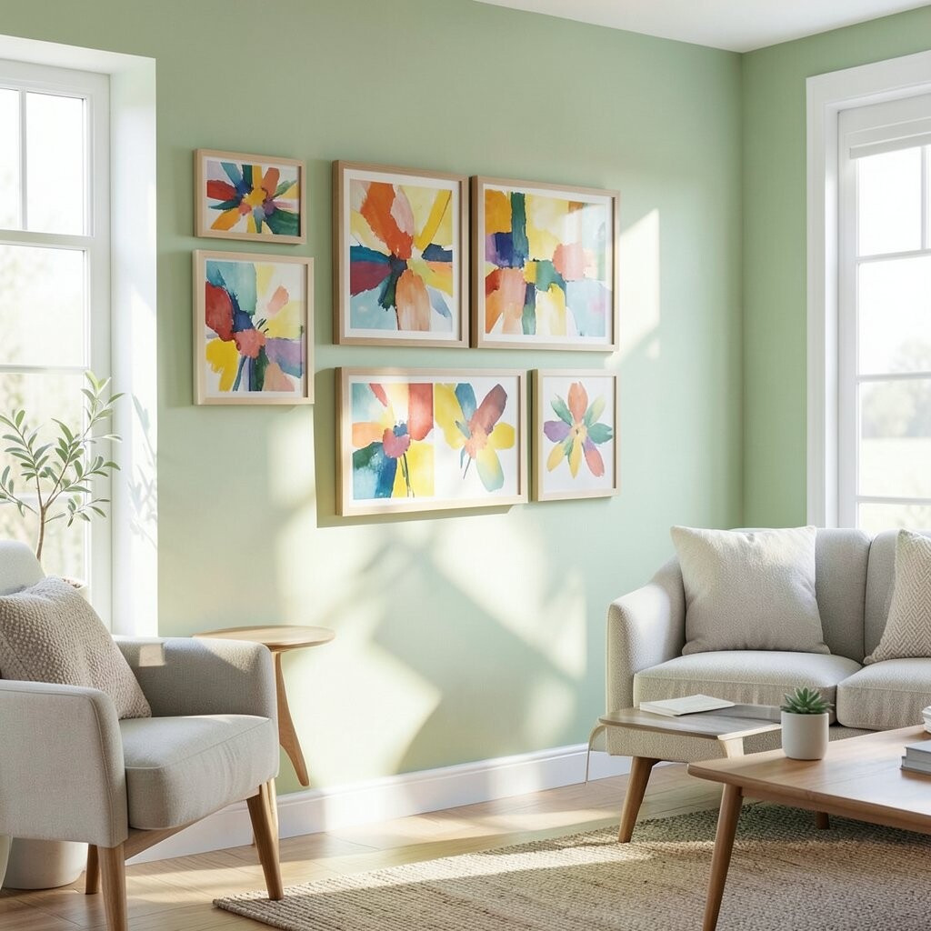
Add colour through wall art with a bright palette Wall art is an easy way to bring colour without repainting every wall. Choose pieces that include light shades like pale yellows, sky blues, or warm whites.
Imagine light bouncing off glossy frames or pale backgrounds, making your wall feel lively. The benefit is that the room looks curated, not plain. For tips, place art where it catches daylight indirectly, such as beside a window rather than in direct glare.
Cost considerations are flexible: prints can be affordable, and you can swap them seasonally. Personalize by selecting art that echoes the colours in your curtains, rug, or cushions. This makes your bright light scheme feel like it is yours.
-
13. Try pale greens to bring a fresh outdoor feeling
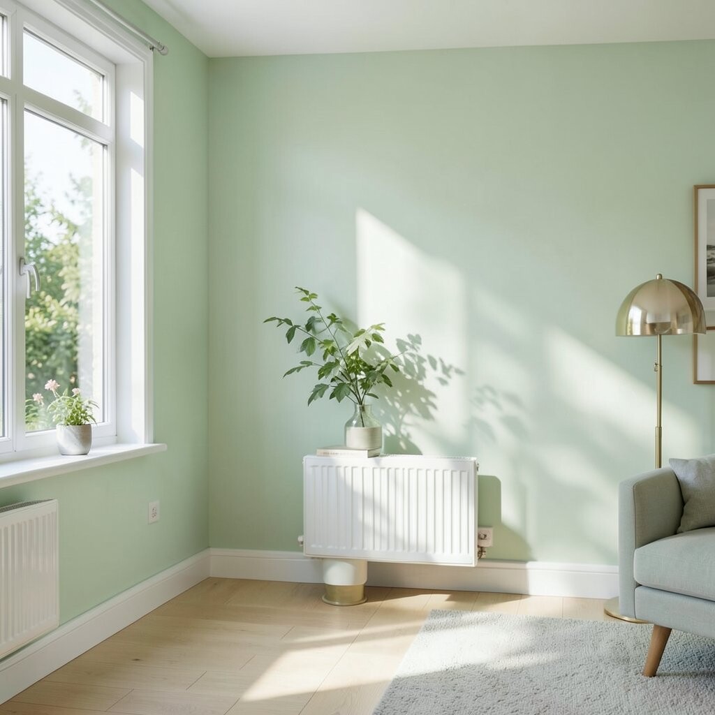
Try pale greens to bring a fresh outdoor feeling Light green colours can make a home feel like it is connected to nature. Think pale sage, soft eucalyptus, or airy mint—shades that are calming instead of loud.
Visualize sunlight turning these greens into gentle, fresh tones across the room. The benefit is an inviting mood that works well for living rooms, kitchens, and reading corners. Tip: pair pale green with warm whites and natural wood for a balanced look.
If you want uniqueness, add small touches of darker green through plant pots, picture mats, or a chair cushion. Cost considerations are manageable because you can start with one wall or just the trim in the green family. Personalize by choosing undertones that match your plants—cool greens for modern vibes and warmer sage for cozy spaces.
-
14. Use paint finishes that help brightness
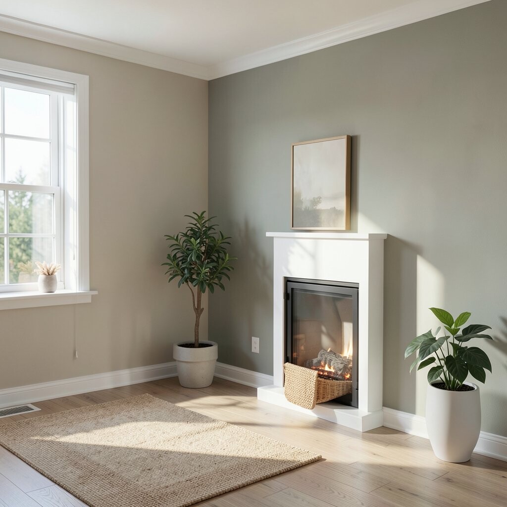
Use paint finishes that help brightness Not all paint looks the same in daylight. The finish—matte, eggshell, satin—affects how light reflects off your walls.
Imagine soft light spreading evenly on eggshell, while heavy matte can sometimes make surfaces feel darker. The benefit is better brightness control and easier cleaning. A helpful tip is to use eggshell in most rooms and a satin finish in areas that get handled a lot, like hallways.
Cost is usually similar across finishes, but you may need different applicators for different textures. Personalize by considering your room’s lighting: darker rooms often benefit from slightly more reflective finishes. Current trends still lean natural and low-shine, so eggshell is often a sweet spot.
-
15. Add metallic or glass accents for extra sparkle
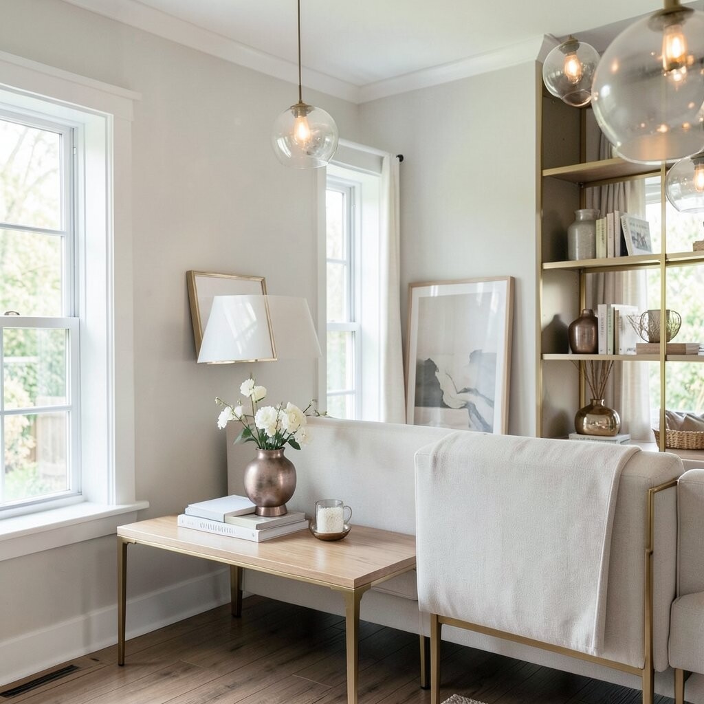
Add metallic or glass accents for extra sparkle Metallic and glass accents can bounce daylight around the room like tiny mirrors. Think brass lamp bases, chrome picture frames, or clear glass vases.
Picture a sunbeam hitting a glass surface and scattering small highlights across a wall. The benefit is a lively, happy atmosphere without using bold paint. Tip: place these accents where daylight can reach them, like near windows or opposite light sources.
If you need cost control, start with one item such as a mirror or a glass tray. Personalize by choosing metals that match your existing hardware—warm brass for warmer schemes and silver for cooler palettes. This keeps the look modern and bright without huge spending.
-
16. Place mirrors strategically to multiply light
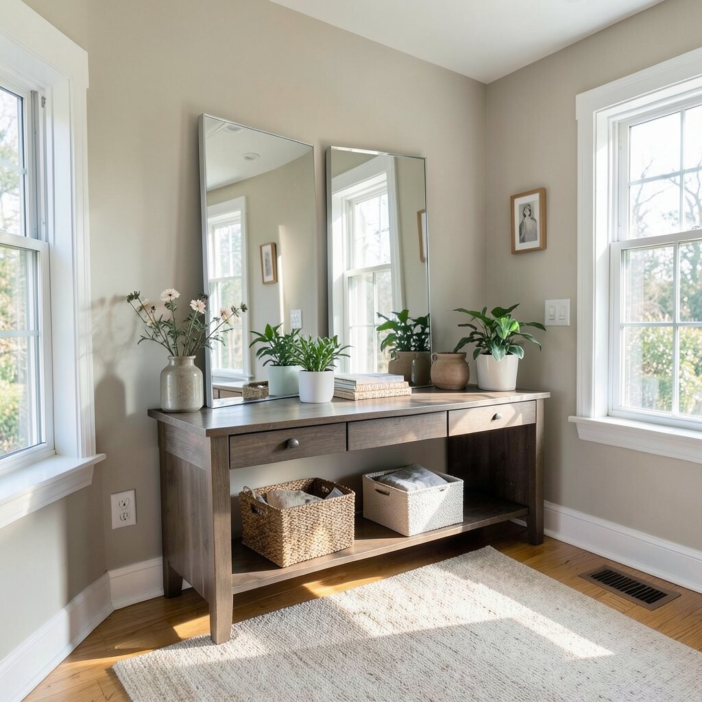
Place mirrors strategically to multiply light Mirrors are one of the fastest ways to make natural light feel stronger. A well-placed mirror can bounce daylight deeper into a room.
Imagine seeing the window light travel across the far wall, making the space feel twice as open. The benefit is instant brightness, especially in hallways and small living rooms. Tip: hang a mirror across from or beside a window, and keep the frame colour aligned with your trim for a polished look.
Cost considerations are good because you can choose affordable frames or shop for secondhand mirrors. Personalize by selecting a style that matches your home, like arched frames for soft charm or simple frames for modern lines. Current trends often use mirrors as decor, not just function, so choose one that you love even when the lights are off.
-
17. Create a colour path from room to room

Create a colour path from room to room Light travels through connected spaces, so consistency helps brightness flow. Choose a gentle colour path, like using similar undertones across adjacent rooms.
Picture your living room, hallway, and dining area sharing the same bright mood instead of changing into darker tones. The benefit is that transitions feel smooth, which makes your home feel larger. Tip: pick one “family” of whites and reuse it throughout—walls, trim, and doors.
Cost can stay reasonable because you might paint only key areas rather than everything. Personalize by varying the lightness level slightly, like one room a touch warmer and another room a touch cooler. This is a popular approach right now because people want cohesive, light-filled homes that still feel personal.
-
18. Try a bright, neutral kitchen palette

Try a bright, neutral kitchen palette Kitchens can feel dark because cabinets and countertops often absorb light. A bright neutral palette can make the space feel cleaner and more open.
Imagine a kitchen where cabinets reflect morning sun and counters look brighter and fresher. The benefit is a space that feels easier to work in, with fewer gloomy corners. A tip is to choose lighter cabinet shades, bright backsplash tiles, or light-coloured paint for walls.
Cost considerations: you can update brightness without fully replacing everything. Try painting only the wall areas, adding a lighter rug at the sink area, or changing hardware for a quick upgrade. Personalize with warm wood accents, like cutting boards and shelves that match your cabinet tone.
-
19. Use warm colour accents in the evening light
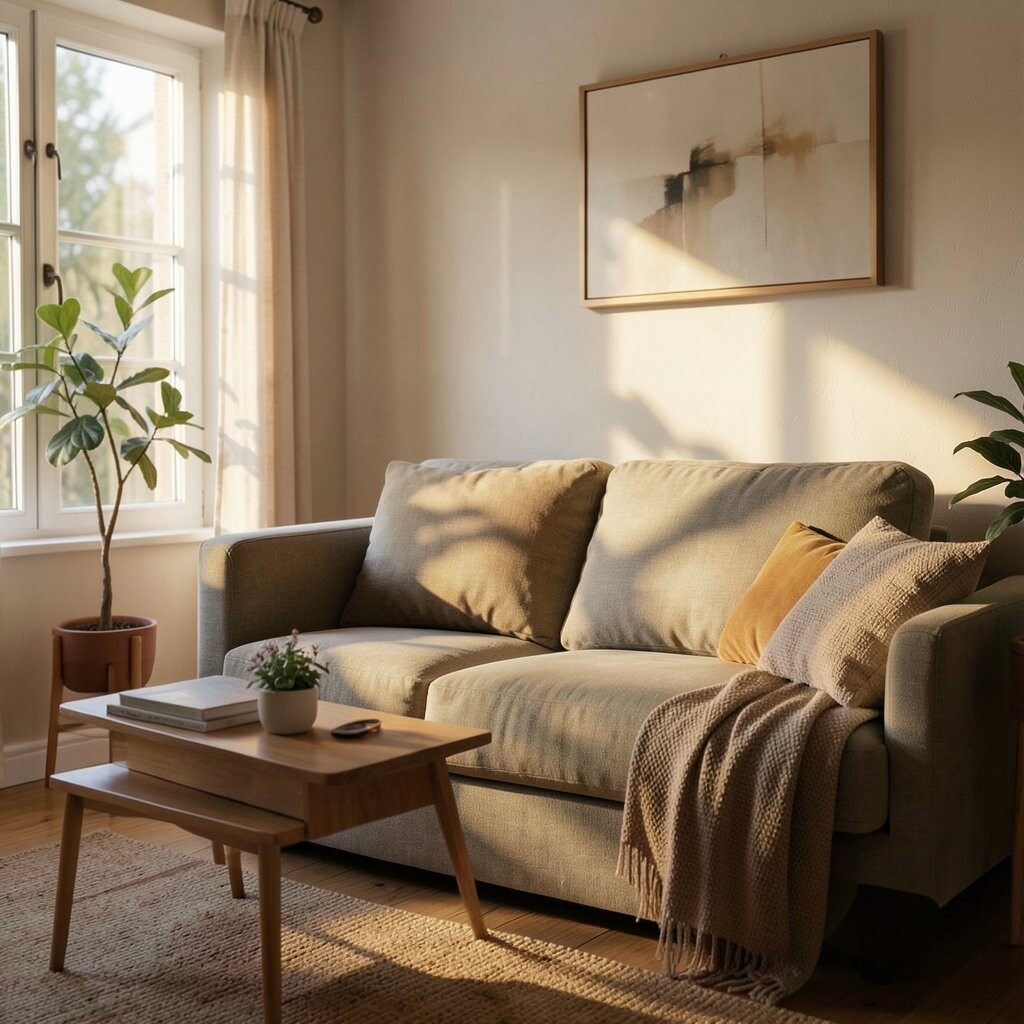
Use warm colour accents in the evening light Daylight changes as the sun sets, so your colour choices should handle evening too. Warm accents can make rooms feel cozy while still staying bright.
Picture amber lamp light mixing with warm wall tones, creating a gentle glow instead of a flat look. The benefit is a room that feels inviting at night, not just during the day. Tip: add warm accents in small ways like throws, art mats, and lamp shades, so you stay flexible.
If cost is a concern, start with budget-friendly items like curtains or pillow covers. Personalize by choosing warm accents that match your personality: terracotta for earthy charm, mustard for playful energy, or rose tones for a soft romantic vibe. This is trending because many people want “sunset rooms” that look good year-round.
-
20. Choose bold colours only in small, bright-friendly spots

Choose bold colours only in small, bright-friendly spots Bold colours can work beautifully if they are placed in smart spots. Use bright colours where light already hits, like above a radiator, on a chair back, or on a narrow stripe.
Imagine a bright pop near the window that looks like it is sparkling instead of overpowering. The benefit is personality without making the whole room feel heavy. A tip is to keep nearby surfaces light, so the bold colour stays crisp and lively.
Cost considerations are usually lower because small painted details use less paint. Personalize by choosing one or two bold shades that match your favorite items, like a blue vase or a patterned cushion. This approach fits current design tastes that mix calm backgrounds with playful highlights.
-
21. Refresh bathrooms with bright, clean colours
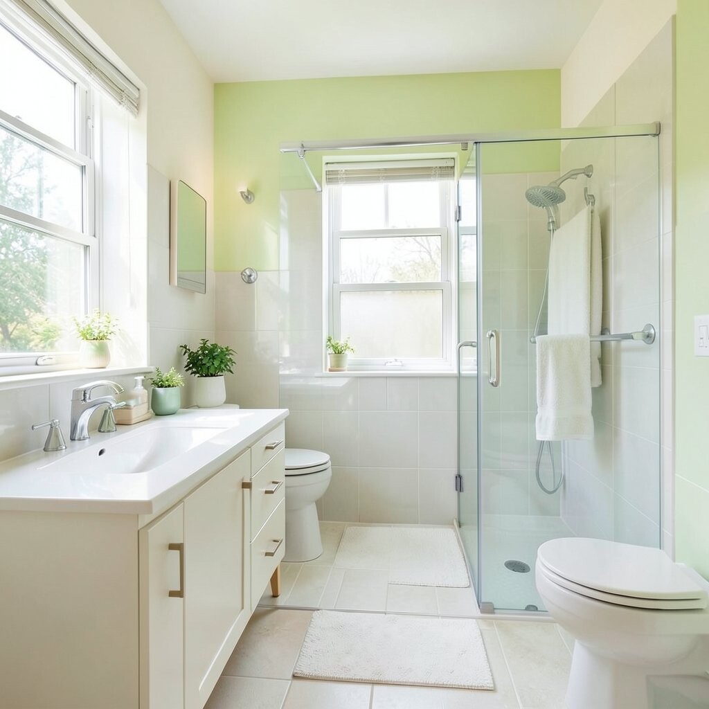
Refresh bathrooms with bright, clean colours Bathrooms often have limited natural light, so colour has to work harder. Bright, clean colours can make the space feel fresh and airy.
Picture a bathroom where the walls stay bright and the mirror area feels open and inviting. The benefit is that the room feels calmer, which matters in a space you use every day. Tip: choose moisture-friendly paint and light colours in soft tones like pale grey, warm white, or very light pastel.
Cost considerations are good because you can focus on one area, like repainting walls and updating small items. Personalize with colour from towels, bath mats, and art that use the same undertone as your walls. Current trends often aim for spa-like brightness, so light neutrals with subtle accents are a great match.
-
22. Test colours like a pro before you commit

Test colours like a pro before you commit If you want the best results, testing is your secret weapon. Lighting changes how paint looks, so you should see samples in your own home.
Visualize each sample on your wall as sunlight moves across it, changing the tone over time. The benefit is fewer mistakes and a finish that feels right, not just “nice in the store.” Tip: paint test patches and check them in the morning, afternoon, and evening.
Cost considerations are small because samples are usually cheaper than repainting. Personalize by picking the sample that matches your flooring undertone and your favourite fabric colours. This is a very modern habit too, because many homeowners now plan colour like they plan furniture—carefully and intentionally.