
Kitchen paint can change the whole mood of a home with just a few brushstrokes. A soft shade can make breakfast feel calm, while a bold color can make the room feel full of life. If your kitchen has been waiting for a fresh spark, these ideas may be just the little push you need.
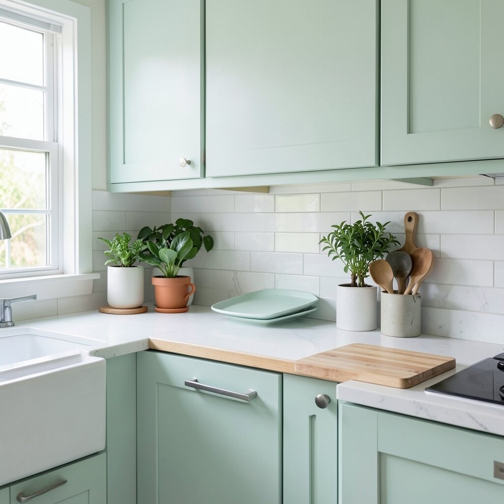
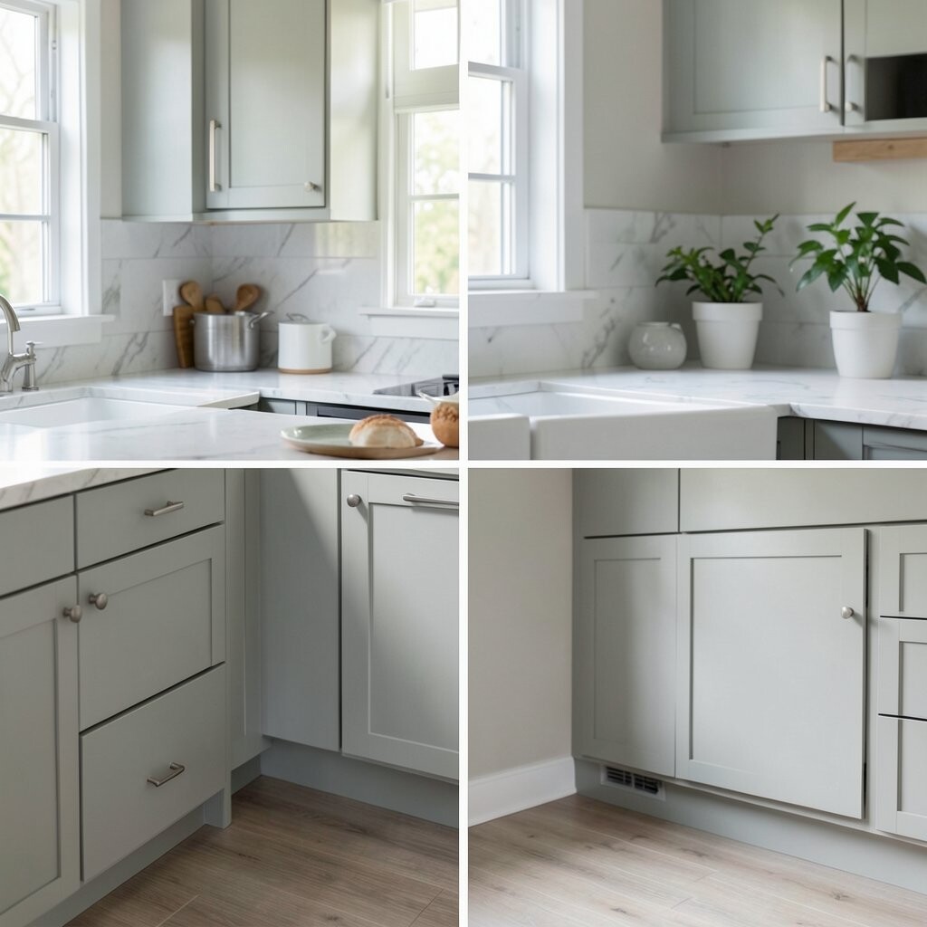
1. Soft Sage for a Fresh, Calm Feel
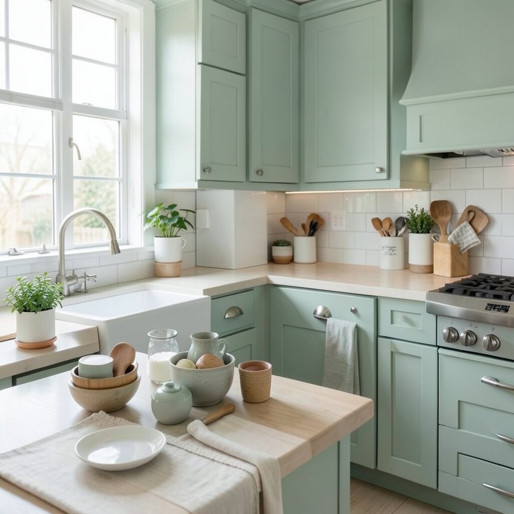
Soft sage brings a gentle garden feel into the kitchen, like fresh herbs on a sunny windowsill. It works beautifully with white cabinets, wood shelves, and warm brass handles.
This color feels peaceful and neat, which makes it great for busy homes. It also hides small smudges better than bright white, so it can be practical too.
Try sage on all walls for a full cozy look, or paint just one wall for a softer change. It is a popular trend in modern farmhouse and nature-inspired kitchens, and it usually costs the same as most standard interior paints.
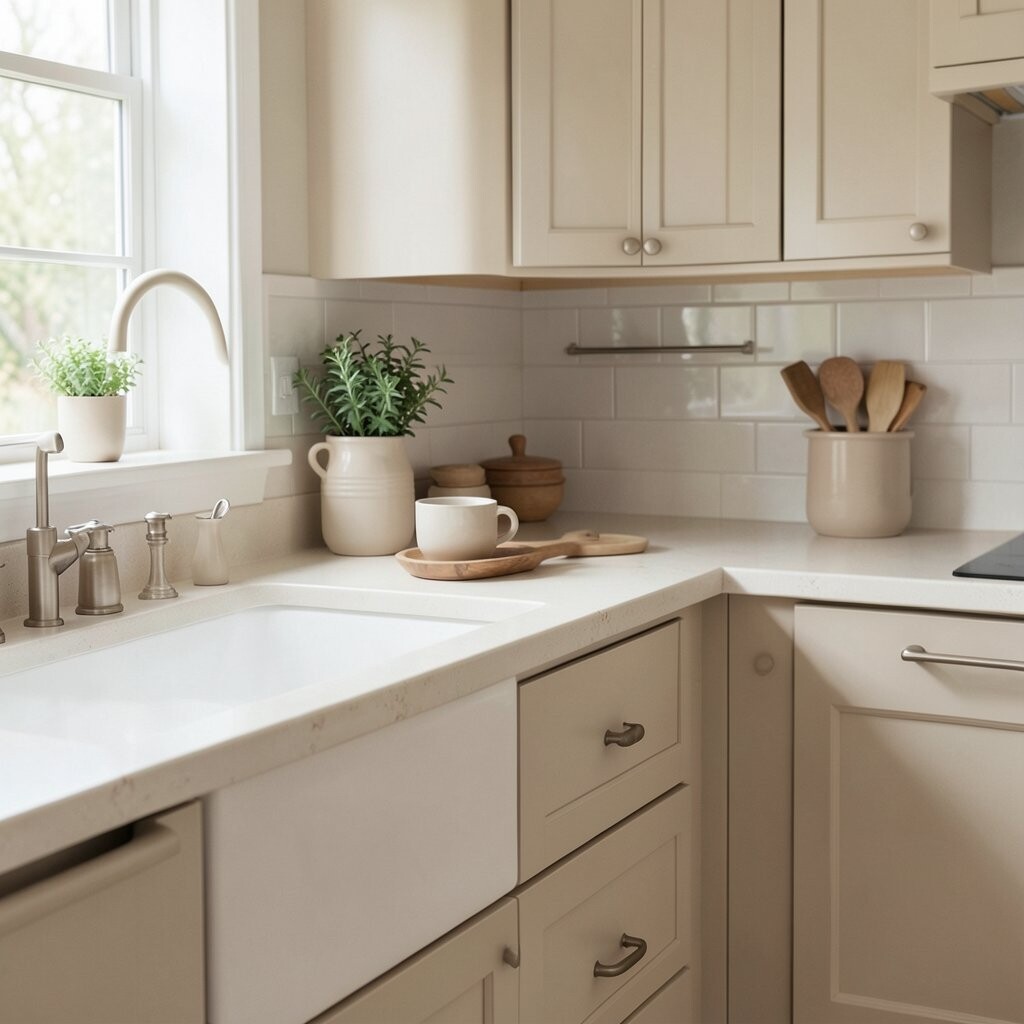
2. Warm Cream for a Cozy Glow
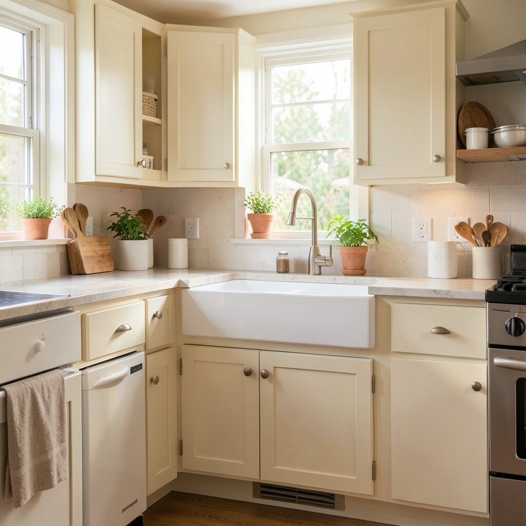
Warm cream gives the room a buttery, soft glow that feels friendly right away. It looks lovely with dark counters, woven baskets, and simple black fixtures.
This shade makes a kitchen feel bigger and brighter without looking cold. It is a smart choice if you want something classic that still feels gentle and welcoming.
You can pair it with beige, tan, or soft gold accents for a layered look. Cream paint is usually easy to find and budget-friendly, so it works well for a quick weekend update.
3. Deep Navy for a Rich, Stylish Look
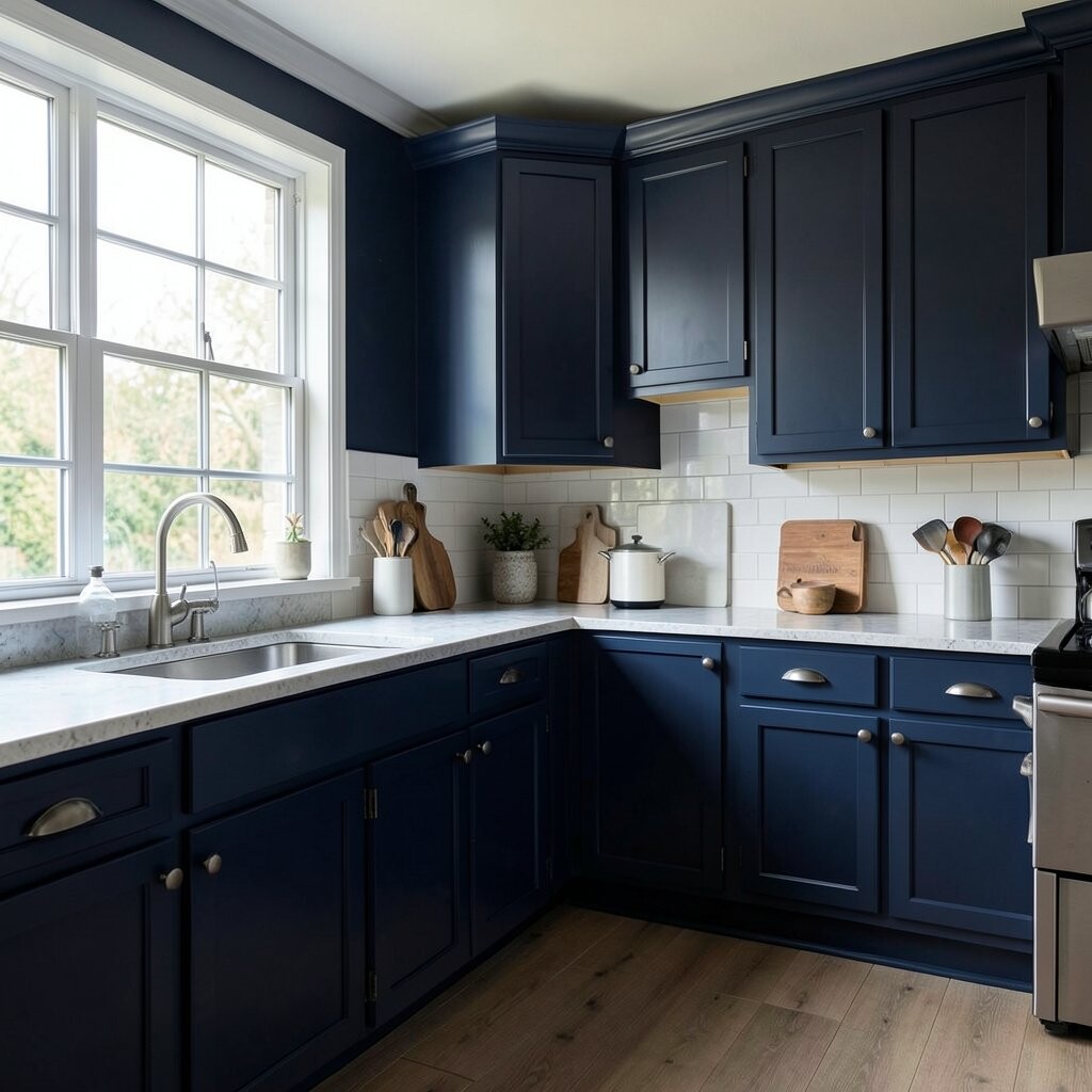
Deep navy adds a strong, polished feel that looks like it belongs in a fancy magazine. It shines next to white trim, marble counters, and shiny silver hardware.
This color brings drama in a good way, especially in kitchens that need more personality. It can make plain cabinets feel custom and expensive.
Use navy on an island, lower cabinets, or one bold wall if you want a smaller change. It is a trend in modern and classic homes, and the cost stays reasonable if you only paint one feature area.
4. Butter Yellow for Happy Morning Energy
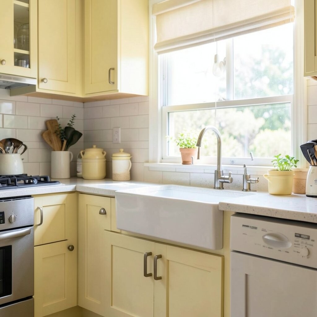
Butter yellow feels like sunshine in paint form, bright and cheerful without being too loud. It brings a happy glow to kitchens with white tile, pale wood, or vintage touches.
This shade can make early mornings feel a little lighter and more playful. It is a sweet choice for families who want the kitchen to feel warm and lively.
Keep the rest of the room simple so the color can shine. Butter yellow is often a low-cost way to add charm, especially if you already have light cabinets and floors.
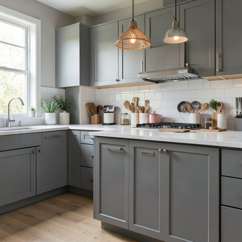
5. Charcoal Gray for a Cool, Modern Edge
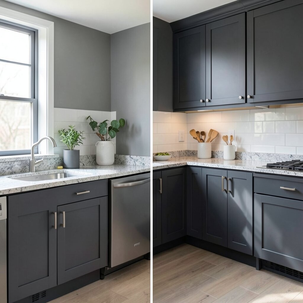
Charcoal gray gives a kitchen a sleek, grown-up look with a bit of drama. It pairs well with bright white counters, wood cutting boards, and matte black details.
This color is great if you want something darker than beige but not as bold as black. It can also help the room feel neat and tidy, which is nice in busy spaces.
Use it on cabinets for a strong style statement or on one wall for a softer touch. Charcoal paint is usually priced like other quality interior paints, so the main cost comes from the time and tools.
6. Pale Blue for a Breezy, Open Mood
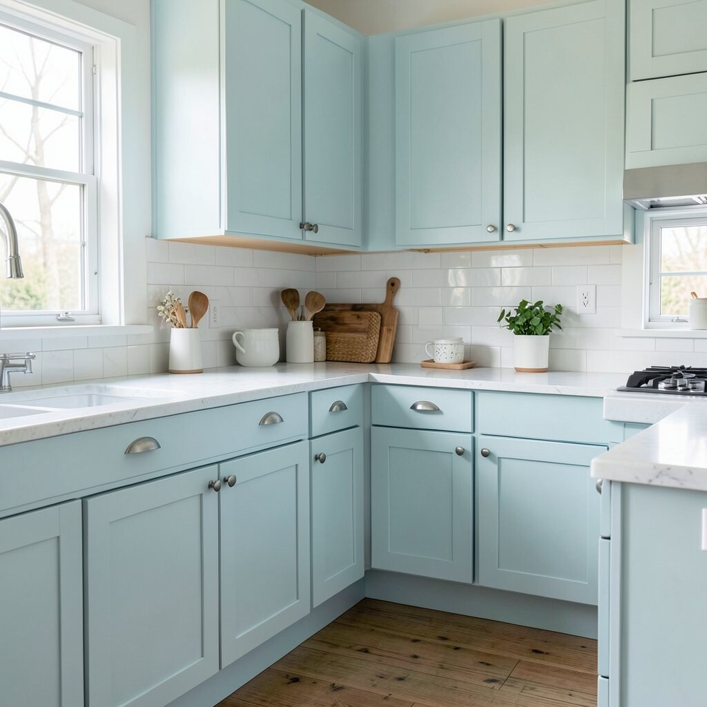
Pale blue makes a kitchen feel light, airy, and a little like a beach house. It looks lovely with white shelves, silver hardware, and glass jars filled with dry goods.
This shade brings a calm feeling that works well in small kitchens. It can make the space seem cleaner and more open, even on cloudy days.
Try pairing it with soft gray or sandy beige for a fresh color mix. Pale blue is a friendly trend for cottage and coastal styles, and it often fits a modest paint budget.
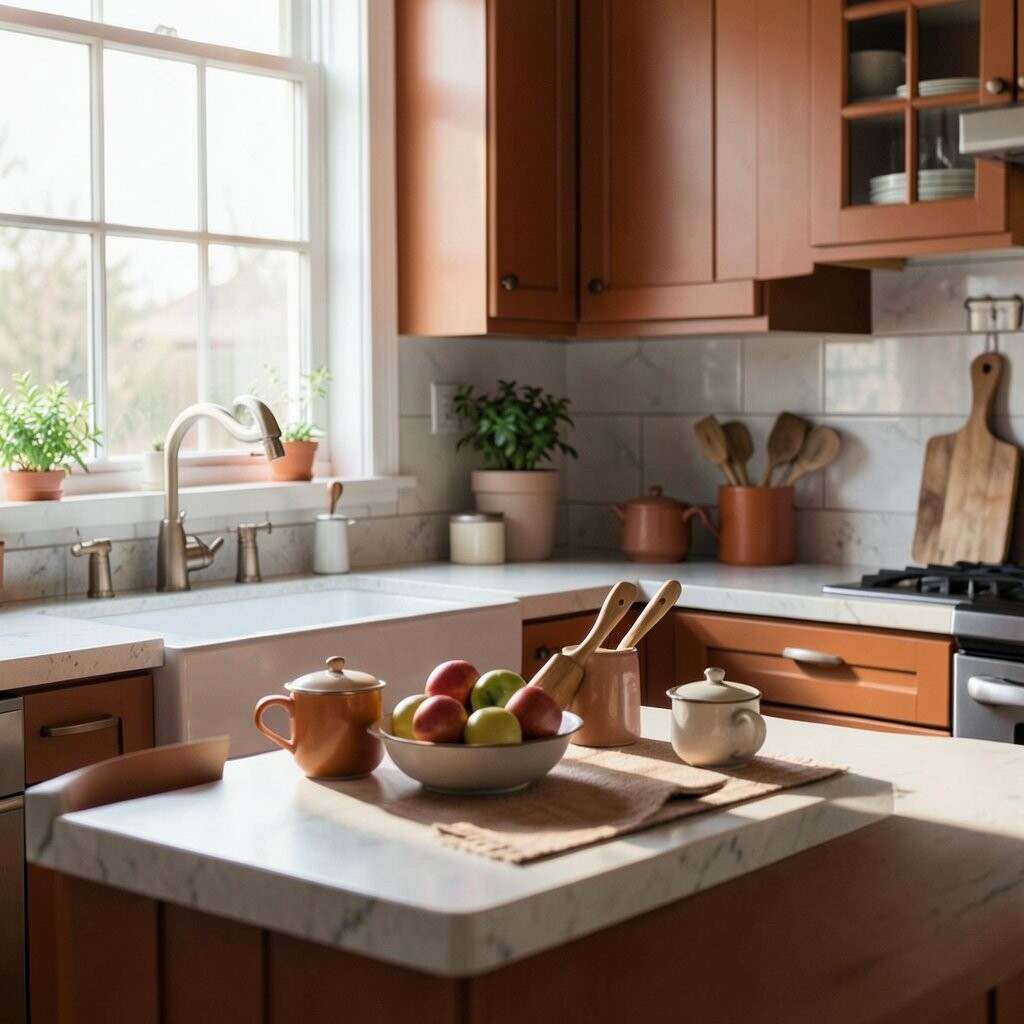
7. Terracotta for Earthy Warmth
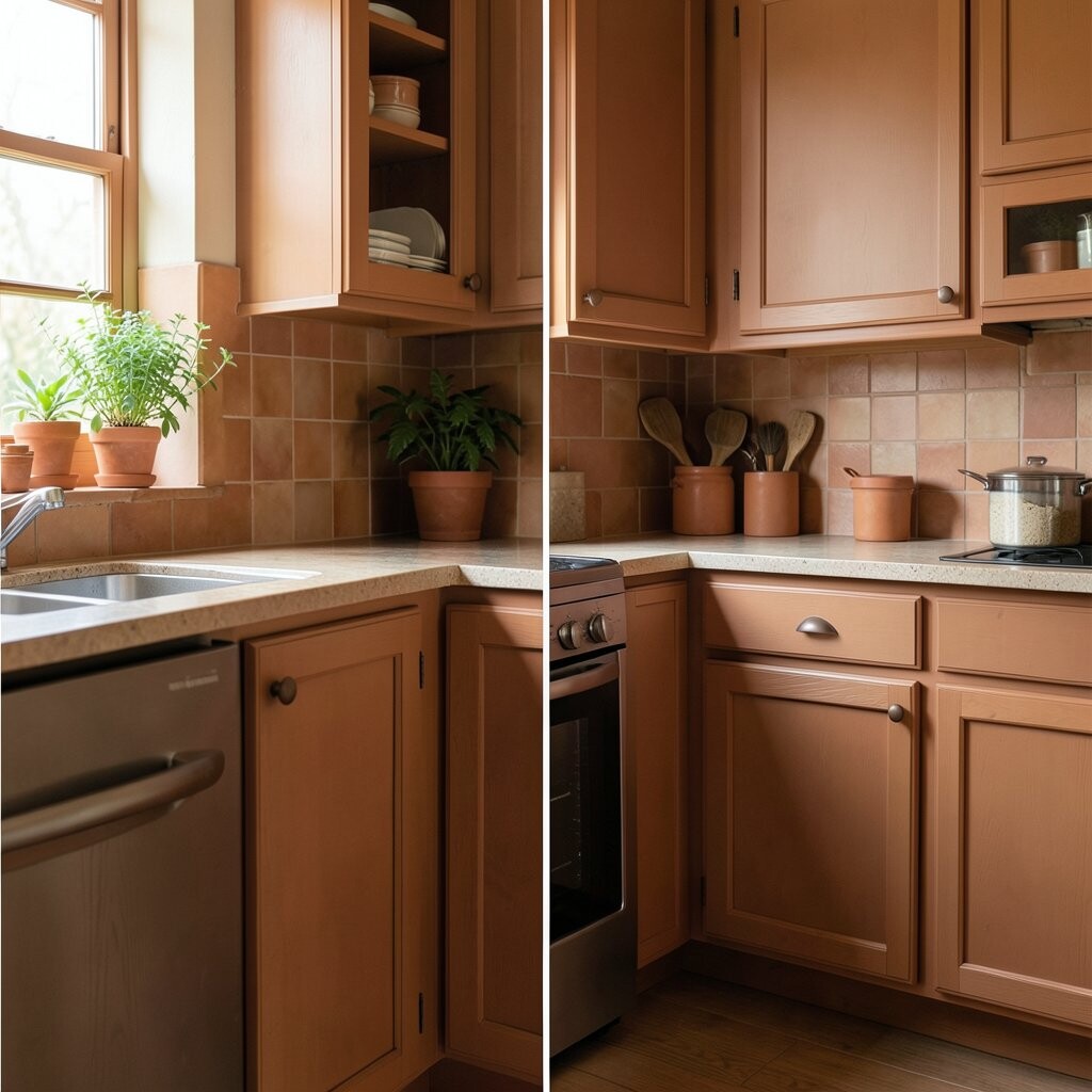
Terracotta gives the kitchen a warm, sunbaked look that feels rich and natural. It looks beautiful with cream cabinets, clay pots, and wood accents.
This color stands out because it feels both rustic and stylish at the same time. It adds instant character, especially in kitchens that need more soul.
Use it on a small wall or behind open shelves if you want a bold but cozy touch. Terracotta is a trendy choice in warm, handmade-looking spaces, and it can be affordable if you paint only one area.
8. Crisp White for a Clean, Bright Canvas
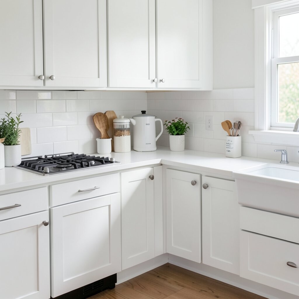
Crisp white gives the kitchen a fresh, bright look that never seems to go out of style. It makes colorful dishes, plants, and art pop right off the walls.
This shade is perfect if you want the room to feel open and neat. It also works with almost every cabinet color, which makes decorating much easier.
Choose a warm white if your kitchen gets less sunlight, or a cooler white for a sharp modern feel. White paint is usually one of the most affordable options, and it is easy to update with new decor later.
9. Olive Green for a Deep Natural Touch
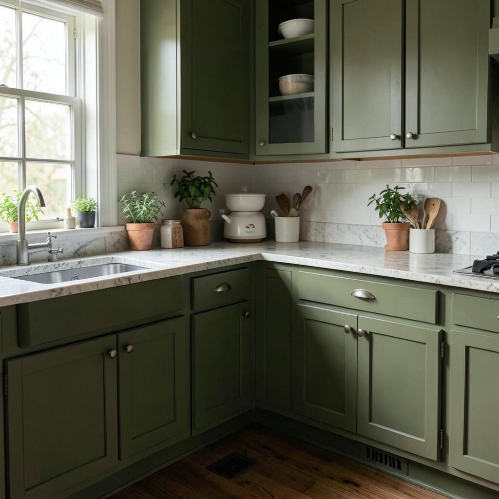
Olive green brings a grounded, earthy feeling that looks rich and calm. It pairs well with butcher block counters, brass knobs, and cream-colored tile.
This color feels unique without being too wild, which makes it a nice middle ground. It can give your kitchen a collected, designer look with very little effort.
Try it on cabinets for a bold style or on walls for a softer version. Olive is a strong trend in nature-inspired homes, and the cost is usually normal for standard paint finishes.
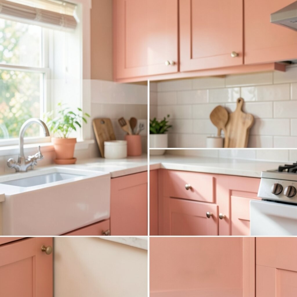
10. Peach Blush for a Soft, Pretty Glow
Peach blush adds a sweet, gentle warmth that feels cheerful and fresh. It looks lovely with white dishes, pale wood, and gold light fixtures.
This shade brings a soft charm that can make the kitchen feel more personal. It is especially nice if you want color, but not something too bright or busy.
Use it with simple decor so the color stays elegant and light. Peach blush is a fun trend for romantic and playful kitchens, and it can be a low-cost way to add a special touch.
11. Matte Black for Bold Style
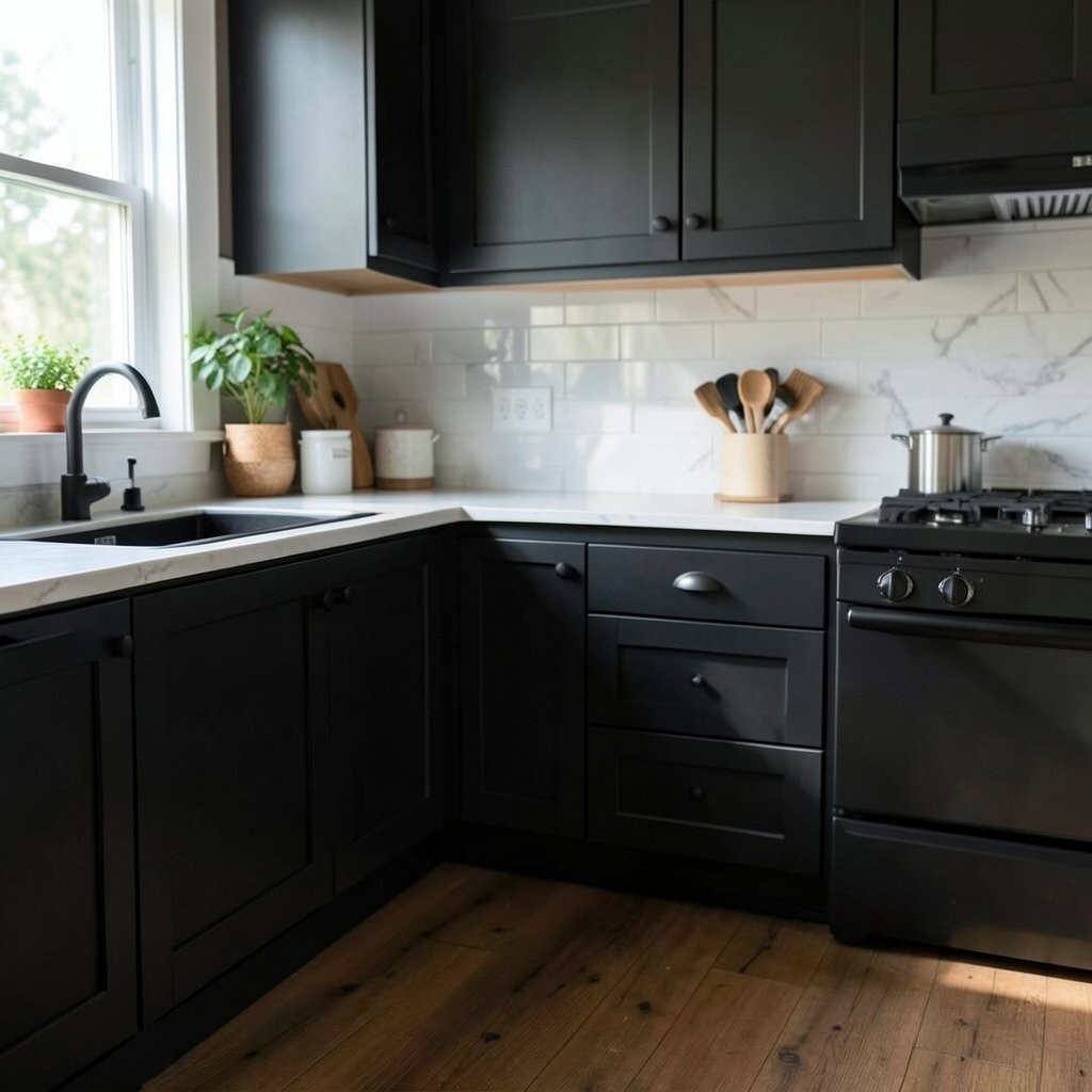
Matte black gives the kitchen a cool, dramatic edge that feels very modern. It works well with white walls, wood tables, and shiny metal details.
This color is unique because it makes everyday things look more stylish right away. It can turn a plain kitchen into a space that feels sharp and confident.
Try it on an accent wall, pantry door, or island if you want a strong look without too much darkness. Matte black is a popular trend in modern homes, and the paint cost is normal, though you may want extra prep for a smooth finish.
12. Dusty Rose for a Gentle, Charming Twist
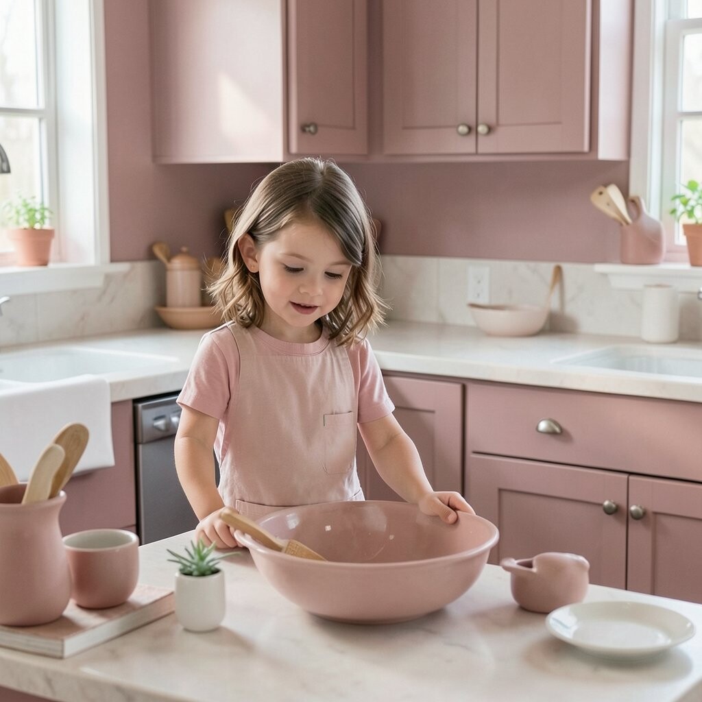
Dusty rose adds a soft, cozy feeling that is pretty without being too sweet. It looks lovely with cream cabinets, wood stools, and simple ceramic decor.
This shade gives a kitchen a warm, friendly mood and a little bit of charm. It feels fresh and personal, like a space that has a story to tell.
Use it with muted green or warm beige for a stylish color mix. Dusty rose is a lovely trend for softer, more creative homes, and it can be an easy update with a small paint can.
13. Light Taupe for Easy, Everyday Style
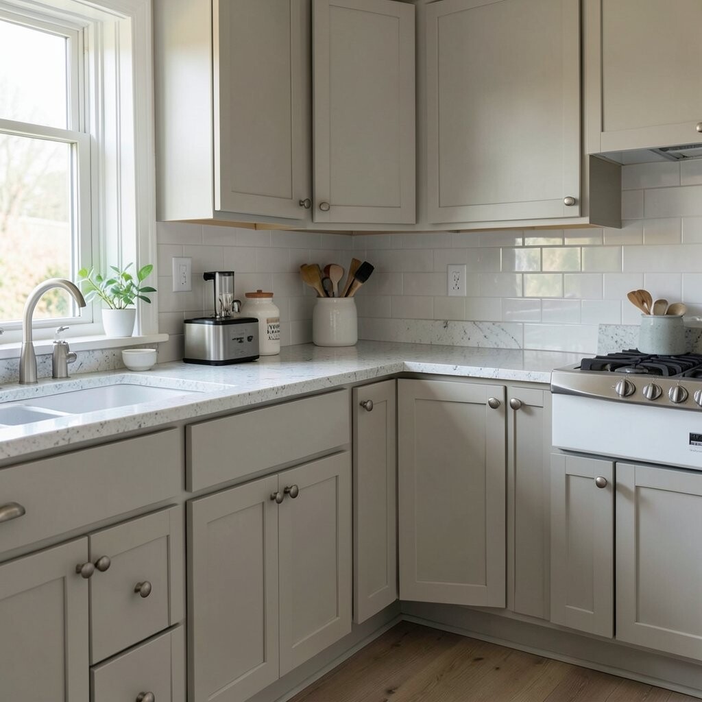
Light taupe is a soft mix of gray and brown that feels calm and polished. It works well with almost any cabinet color, which makes it a safe but stylish pick.
This shade is great for people who want something simple and classy. It gives the kitchen a neat look without stealing attention from your favorite dishes or decor.
Try adding warm wood, black frames, or woven textures to keep the room from feeling flat. Taupe paint is usually easy on the wallet, and it suits both old and new kitchen styles.
14. Mint Green for a Playful Fresh Look
Mint green feels cool, clean, and a little bit sweet, like a fresh candy wrapper. It looks especially cute with white cabinets, chrome handles, and bright sunlight.
This color can make a kitchen feel happy and open, which is great for small spaces. It has a retro charm that many people love right now.
Use it on one wall, a pantry nook, or even the back of open shelves. Mint is a fun trend in cheerful kitchens, and it usually costs the same as other light interior paints.
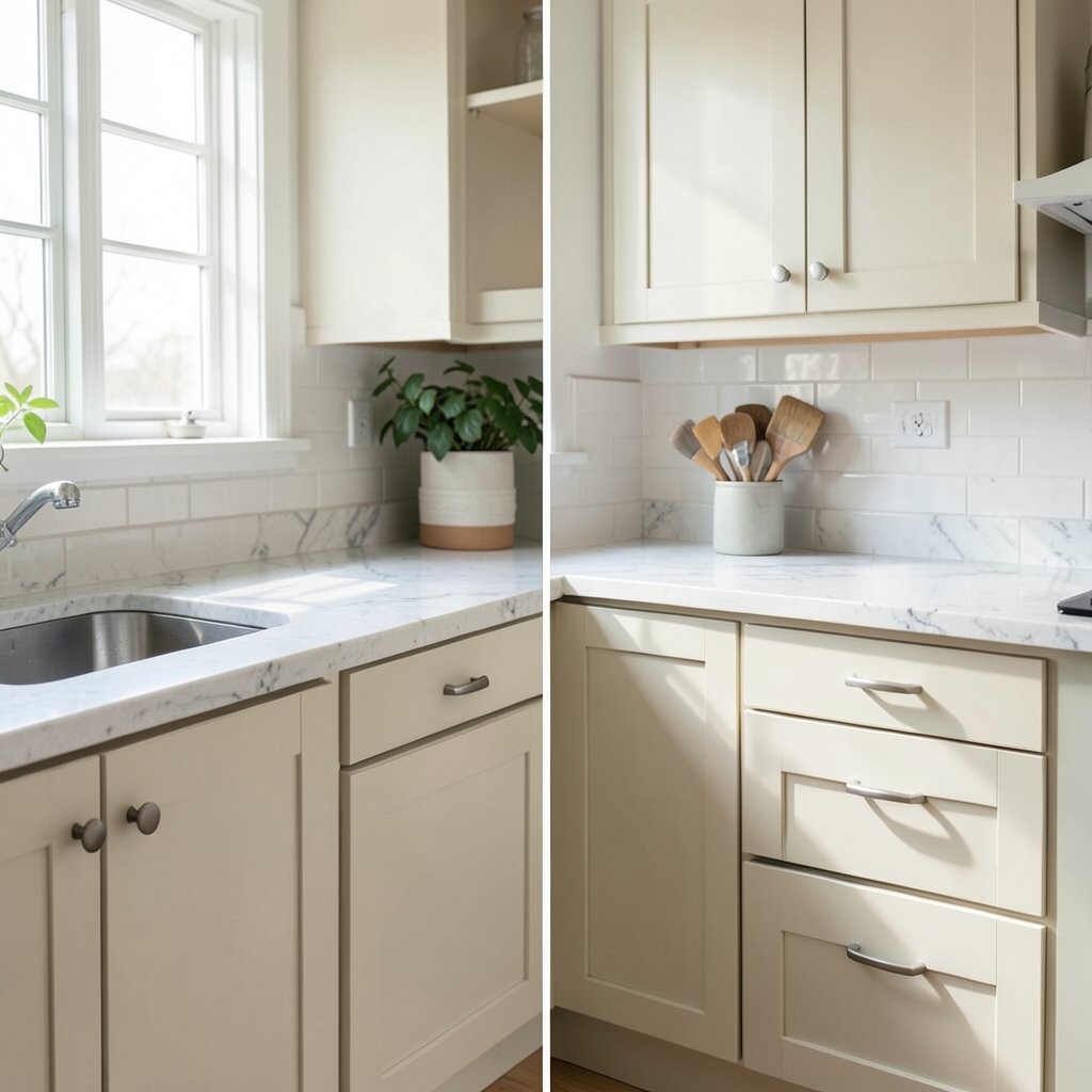
15. Warm Beige for a Soft, Sand-Like Look
Warm beige brings a gentle, sandy feel that makes the kitchen feel relaxed. It looks nice with white trim, tan rugs, and wood cutting boards.
This color is easy to live with because it feels calm and never too loud. It is a strong choice if you want a background color that supports the rest of your decor.
Pair it with black accents or green plants for a little contrast. Beige paint is often one of the most budget-friendly choices, and it works in almost any kitchen style.
16. Sky Gray for a Soft Modern Mood
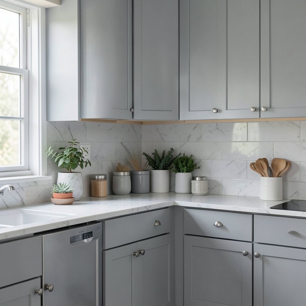
Sky gray has a cool, gentle look that feels fresh and neat. It pairs beautifully with white cabinets, silver hardware, and smooth stone counters.
This shade gives the kitchen a peaceful mood without feeling plain. It is a smart pick if you want a modern color that still feels calm and easy.
Use it with glass jars, simple art, and pale wood stools for a clean look. Sky gray is a popular trend in small and large kitchens alike, and the cost is usually very manageable.
17. Burnt Orange for a Bold, Cozy Punch
Burnt orange brings heat, energy, and a cozy fall feeling to the kitchen. It looks amazing with cream cabinets, dark wood, and black iron details.
This color is unique and full of personality, so it works well for people who like a brave look. It can make the kitchen feel warm and full of life right away.
Try it on a feature wall or inside a breakfast nook for a strong but friendly effect. Burnt orange is a stylish trend in earthy homes, and it can be affordable if used in a small space.
18. Soft Lavender for a Light, Dreamy Touch
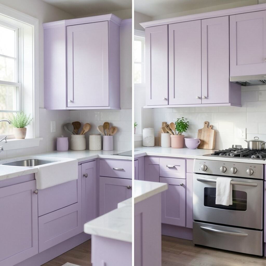
Soft lavender gives the kitchen a sweet, airy mood that feels calm and a little magical. It pairs nicely with white cabinets, silver accents, and clear glass accents.
This shade is special because it feels soft but still has personality. It can make a kitchen feel more creative and less ordinary.
Use it with pale gray or cream to keep the space balanced. Lavender is a lovely trend for people who enjoy gentle color, and the paint cost is usually the same as other light shades.
19. Forest Green for Deep, Rich Character
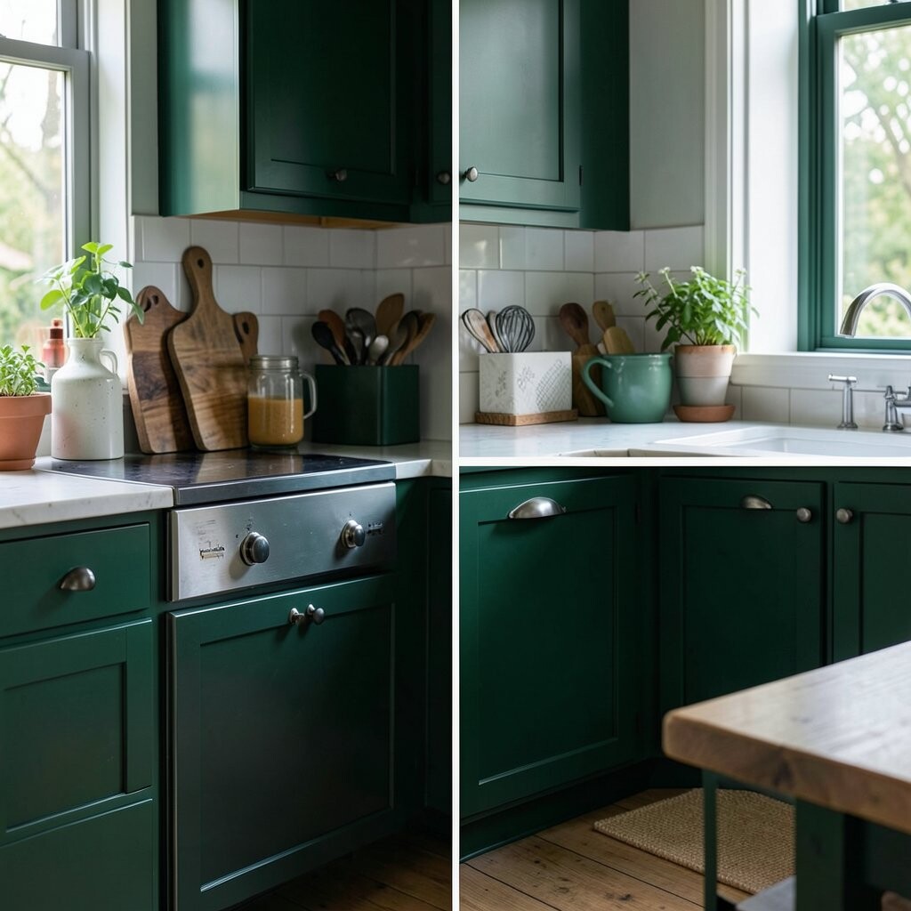
Forest green adds a deep, lush feeling that makes a kitchen feel grounded and full. It looks beautiful with brass hardware, white countertops, and natural wood shelves.
This color feels bold but still classic, which makes it a smart choice for long-term style. It can give the room a rich, custom look without needing a full remodel.
Paint lower cabinets or a single wall for a strong statement. Forest green is a major trend in cozy, high-end kitchens, and the cost is usually fair for a standard paint project.
20. Pale Sand for a Quiet, Sunny Base
Pale sand creates a soft, sunlit feeling that works like a quiet background song. It looks lovely with white trim, rattan baskets, and natural wood details.
This shade is easy to match with almost anything, which makes decorating simple. It gives your kitchen a smooth, easygoing look that feels welcoming every day.
Try adding colorful dishes or fresh flowers to make the room feel lively. Pale sand is a safe and affordable paint choice, especially for people who want a simple refresh.
21. Denim Blue for a Relaxed, Casual Style
Denim blue feels comfortable, cool, and a little bit playful, just like your favorite jeans. It works well with white cabinets, wood stools, and brushed nickel fixtures.
This color adds personality without feeling too serious. It can help a kitchen feel friendly and lived-in, which many people love.
Use it on cabinets, a pantry door, or a small wall near the table. Denim blue is a trendy choice for relaxed homes, and it is usually priced like most regular paint colors.
22. Soft Coral for Bright, Cheerful Warmth
Soft coral brings a happy glow that feels lively and warm without being too strong. It pairs well with cream, light wood, and simple white tile.
This color can make the kitchen feel more open and fun, especially in homes that need more energy. It has a friendly charm that makes people smile when they walk in.
Use coral on an accent wall or around a breakfast corner for a sunny pop. It is a playful trend in colorful kitchens, and the cost can stay low if you use it in a small space.
23. Mushroom Gray for Quiet, Modern Comfort
Mushroom gray is a soft, earthy shade that feels calm and a little fancy. It looks great with warm wood, black accents, and creamy white details.
This color is unique because it sits between gray and brown, which gives it a rich, cozy look. It works well in kitchens that want a modern feel without looking cold.
Try it with matte finishes and simple decor for a smooth, stylish effect. Mushroom gray is a growing trend in neutral homes, and it usually fits a normal paint budget.
24. Bright Teal for a Fun, Artistic Pop
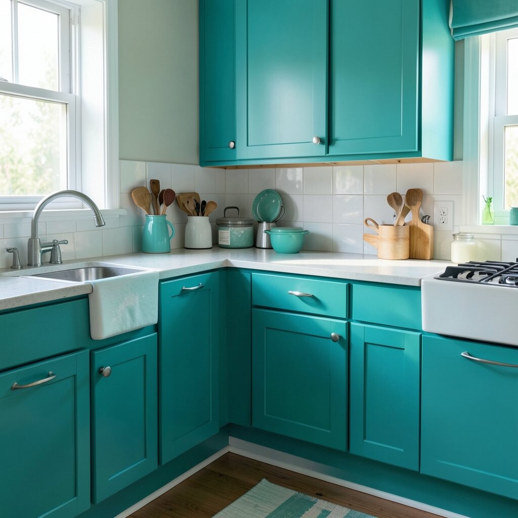
Bright teal brings a lively, artsy feeling that can wake up the whole kitchen. It looks amazing with white cabinets, chrome fixtures, and clean lines.
This shade is for someone who wants the room to feel bold and full of joy. It adds instant personality and can make a simple kitchen feel exciting.
Use teal on one wall, a small pantry, or even the inside of glass cabinets. It is a trendy color for creative homes, and the cost is usually the same as other standard paints.
25. Soft Greige for a Smooth, Smart Finish
Soft greige mixes gray and beige in a way that feels calm, smooth, and easy to love. It works with almost every style, from farmhouse to modern to classic.
This color is popular because it gives a kitchen a polished look without feeling stiff. It is a great choice if you want something flexible that can stay stylish for years.
Pair it with warm wood, black lights, or a colorful rug to make the room feel more personal. Greige paint is often a smart, affordable pick, and it gives you lots of room to change your decor later.