
Kitchen color can change the whole mood of a home in a flash. One shade can make a room feel calm, warm, bold, or bright. If you love pretty spaces, these ideas may spark a few happy daydreams.
1. Soft White for a Fresh, Bright Look
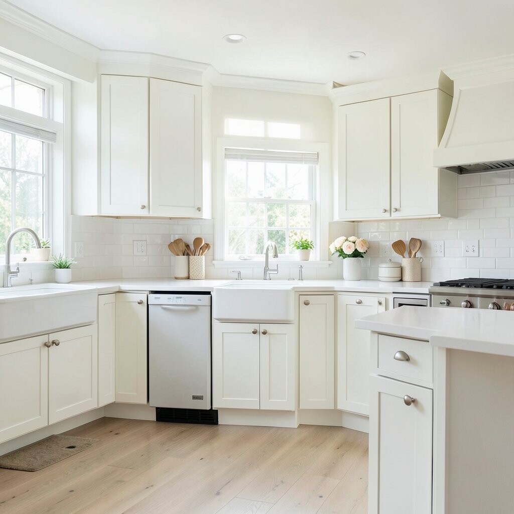
Soft white gives a kitchen a clean and airy feel. It makes walls, cabinets, and tile look neat and open, like morning light is always nearby.
This color works well in small kitchens because it helps the room feel larger. It is also easy to match with wood, black handles, silver tools, or colorful dishes.
What makes it special is its simple charm. You can add your own style with warm lights, woven baskets, or a bold rug, and the cost can stay low because white paint is often one of the cheapest choices.
2. Warm Cream for a Cozy, Soft Glow
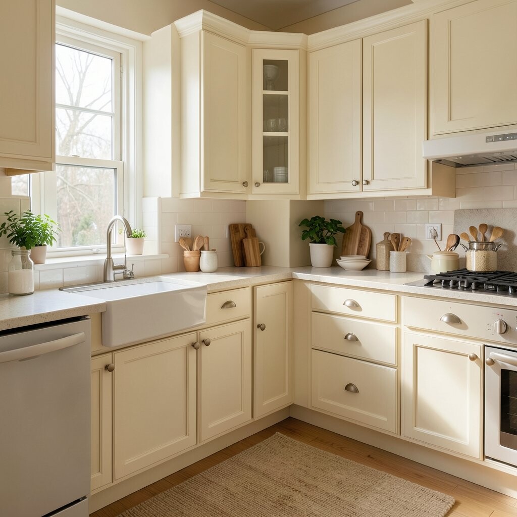
Warm cream feels gentle and welcoming. It has a soft golden touch that can make a kitchen feel like a sunny hug.
This shade is great for people who want a calm space without the sharp look of bright white. It pairs nicely with bronze knobs, natural wood, and soft green plants.
Its uniqueness comes from how it feels rich but still easy. Cream is a smart trend for cozy homes, and you can personalize it with patterned curtains or handmade jars, while the cost stays friendly with simple paint and easy decor.
3. Sage Green for a Calm, Nature-Inspired Space
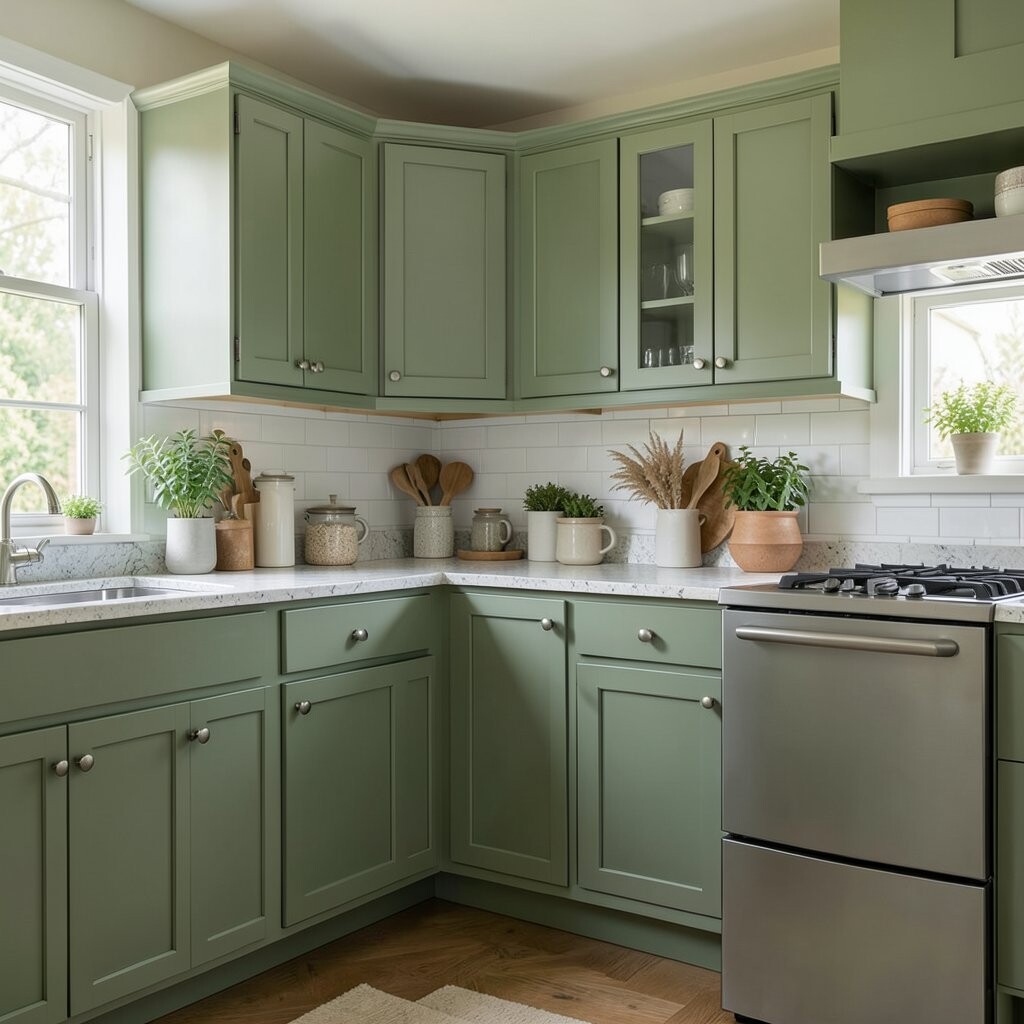
Sage green brings a quiet garden feeling into the kitchen. It looks soft, dusty, and peaceful, like fresh leaves after rain.
This color can help a busy room feel less noisy. It looks lovely with white counters, pale wood, and brass lights, and it can make cooking feel more relaxed.
Sage is popular right now because it feels fresh but not loud. You can make it your own with clay pots, herb shelves, or a checkered mat, and the cost is often just the price of paint and a few simple accents.
4. Navy Blue for a Rich, Stylish Feel
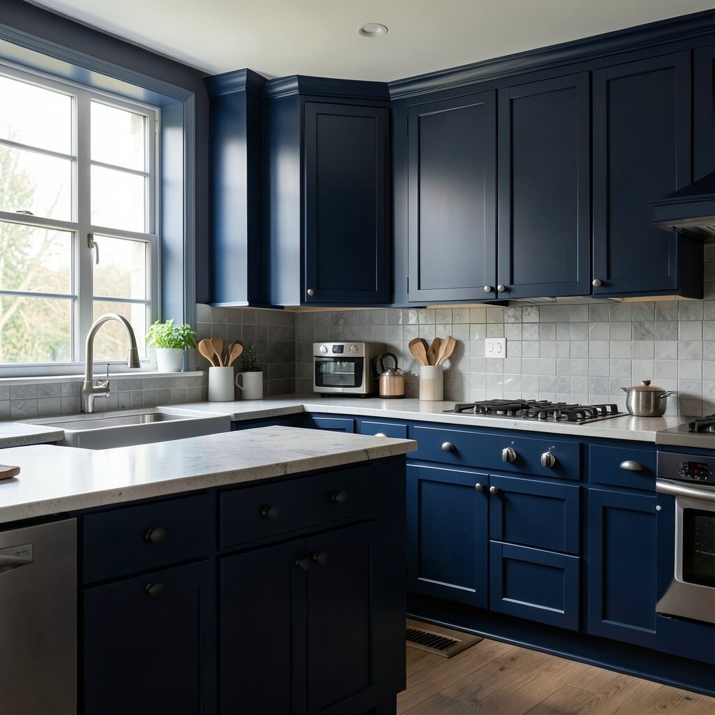
Navy blue adds deep color and strong style. It gives cabinets a dressed-up look that feels neat, smart, and a little fancy.
This shade works well in kitchens with lots of light, because the dark color stands out in a beautiful way. It looks great with white counters, gold handles, and glass lights.
What makes navy unique is its mix of calm and drama. It is a big trend in modern homes, and you can personalize it with striped towels or shiny stools, while the cost can be medium if you paint cabinets or add blue on just one wall.
5. Pale Blue for a Light and Breezy Mood
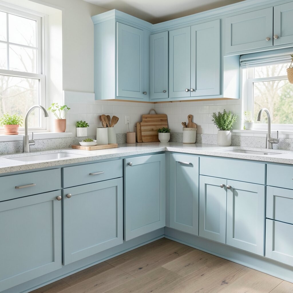
Pale blue feels soft, cool, and cheerful. It can remind you of clear skies and make the kitchen seem open and fresh.
This color is lovely in homes that want a gentle, happy look. It pairs well with white trim, light wood, and silver pieces, and it can help the room feel clean without being plain.
Pale blue stands out because it feels both sweet and neat. You can make it personal with sea-themed art, soft curtains, or blue dishes on open shelves, and the cost is usually low if you use paint and simple accents.
6. Butter Yellow for a Sunny, Happy Kitchen
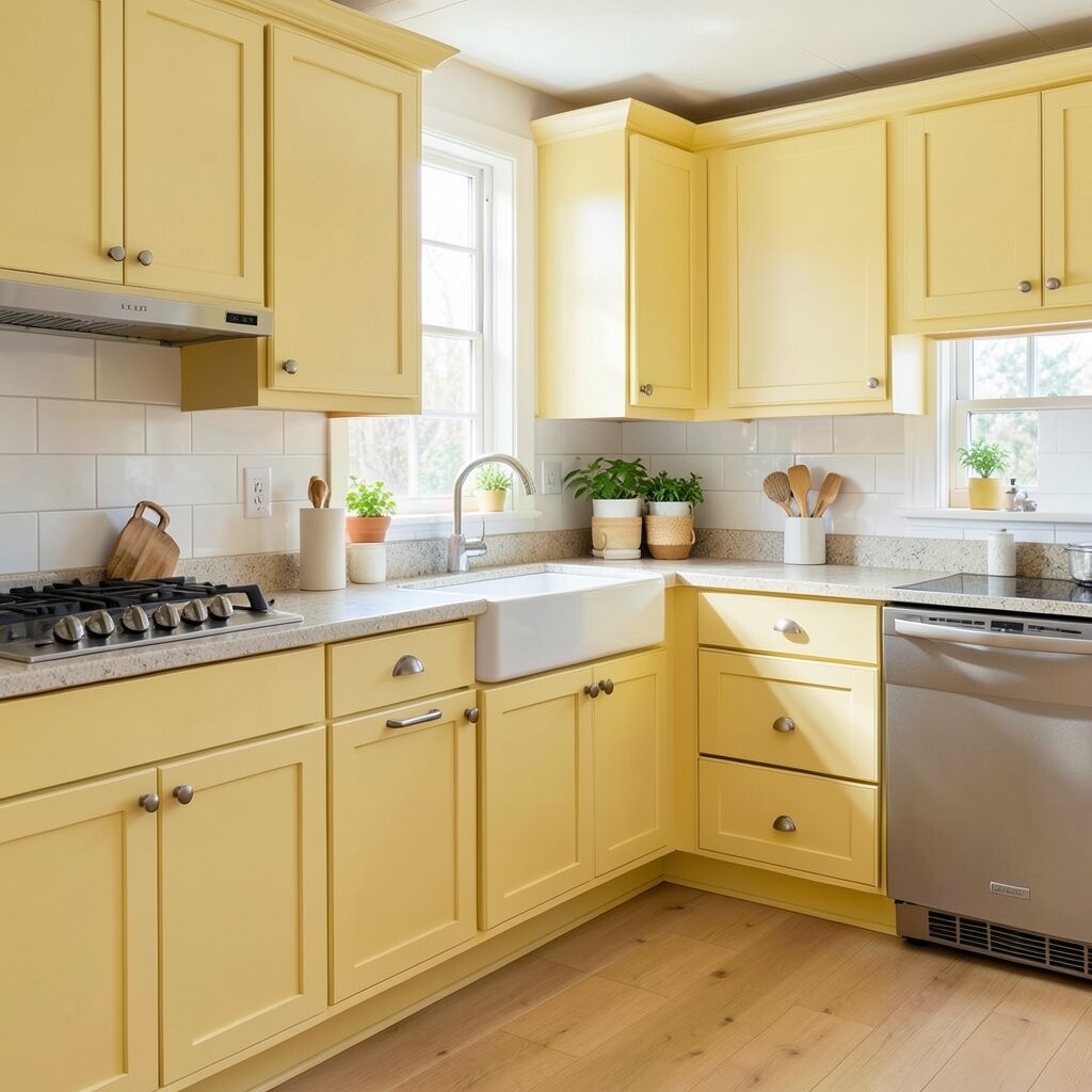
Butter yellow brings a warm smile to the room. It feels bright but soft, like sunlight on toast in the morning.
This color is great for making a kitchen feel cheerful and friendly. It works well with white cabinets, wood tables, and small green plants, and it can make breakfast feel extra happy.
Its special charm is that it feels fun without being too loud. Yellow is making a sweet comeback in cozy home style, and you can personalize it with flower prints or vintage cups, while the cost can stay low with paint and a few sunny details.
7. Charcoal Gray for a Cool, Modern Edge
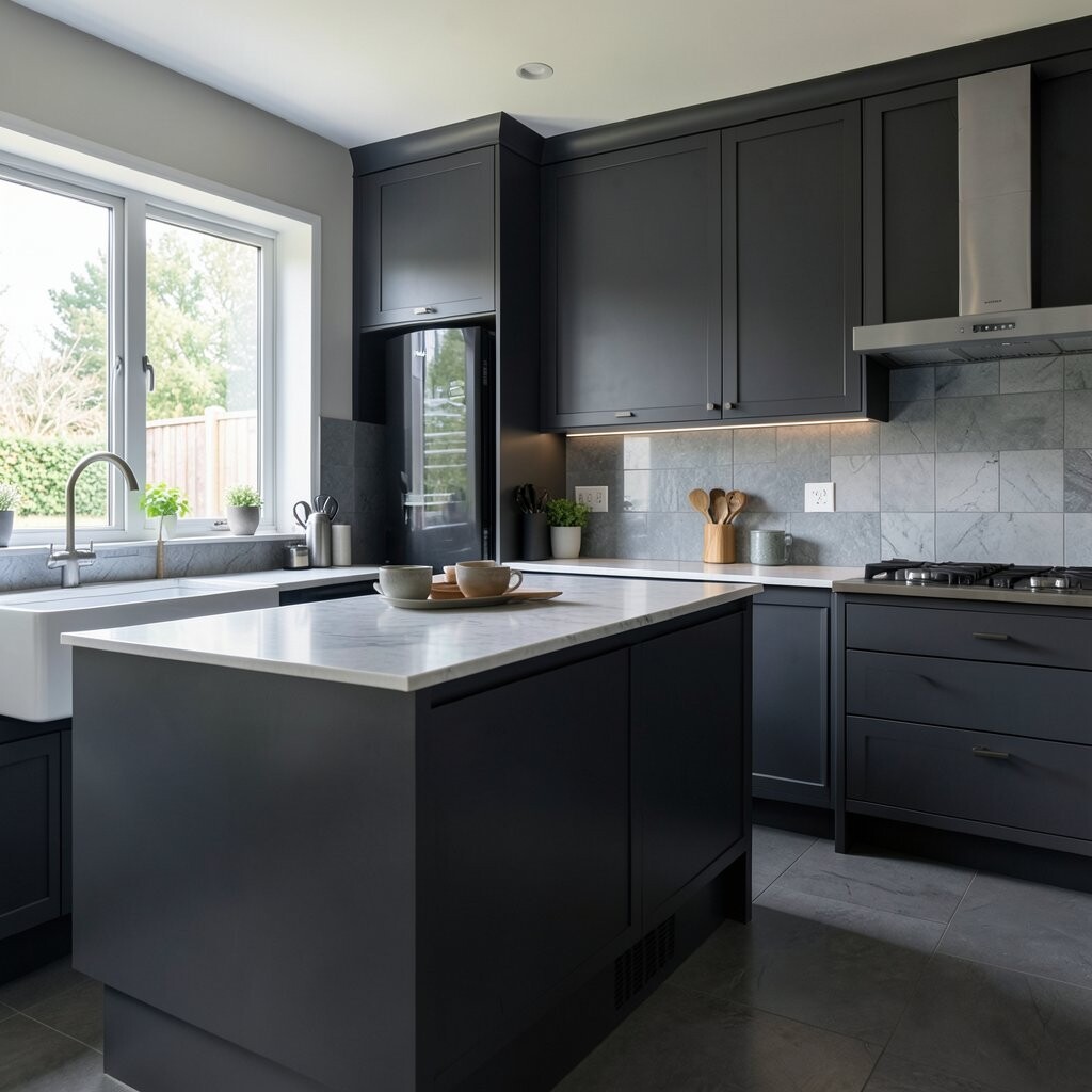
Charcoal gray gives a kitchen a strong and polished look. It feels smooth, deep, and a little dramatic in a very nice way.
This color works well with metal lights, white counters, and warm wood floors. It can hide small marks better than lighter shades, which is helpful in a busy kitchen.
What makes charcoal special is how modern it feels. It is a trendy pick for sleek homes, and you can make it yours with bright art, matte black handles, or colorful stools, while the cost depends on how much of the room you paint.
8. Forest Green for a Bold, Earthy Look
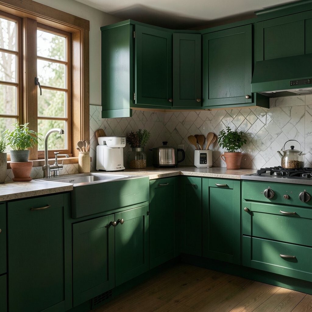
Forest green feels deep, rich, and natural. It can make a kitchen look like a cozy cabin with a fresh, stylish twist.
This shade works well on cabinets, especially with light counters and warm wood. It can bring a strong sense of calm and make the room feel grounded and full of life.
Its uniqueness comes from how bold and peaceful it feels at the same time. This color is a favorite in current home trends, and you can personalize it with copper pots, leafy plants, or woven chairs, while the cost can be medium if you paint cabinets or use it on one main wall.
9. Blush Pink for a Soft and Sweet Touch
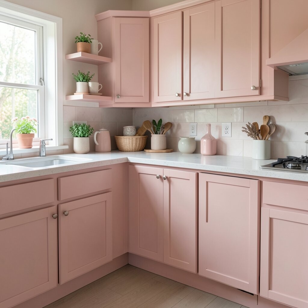
Blush pink gives a kitchen a gentle, pretty glow. It feels soft and warm, like a rosy cloud at sunset.
This color can make a space feel kind and playful without looking too childish. It looks lovely with white, gold, marble, and light wood, and it can make even a small kitchen feel special.
Blush stands out because it feels fresh and charming. It is a fun trend for people who like soft color, and you can personalize it with art prints, rose-colored bowls, or patterned tea towels, while the cost is often low if you use paint and simple decor.
10. Black and White for a Crisp, Classic Style
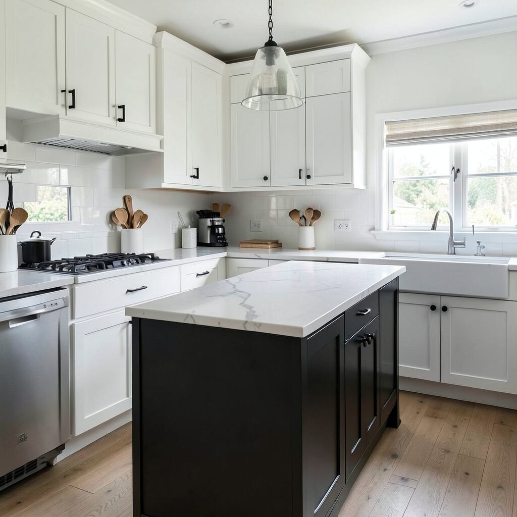
Black and white always feels sharp and timeless. The mix gives a kitchen a clean look with strong contrast and lots of style.
This idea works in many spaces because it can be simple or bold. White cabinets with black pulls, or black islands with white tops, can make the room feel neat and planned.
What makes it unique is how easy it is to dress up. This look stays trendy year after year, and you can personalize it with checkered floors, bright fruit bowls, or gold lights, while the cost can vary from low to high based on the materials you choose.
11. Terracotta for a Warm, Earthy Feel
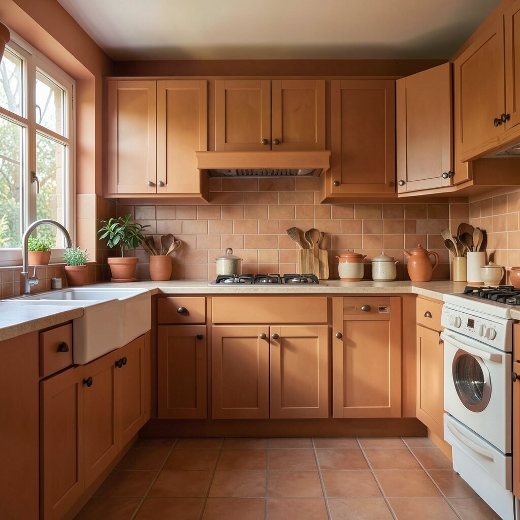
Terracotta brings the color of clay pots and warm soil into the kitchen. It feels cozy, rich, and a little rustic in the best way.
This shade works well with cream walls, wood shelves, and natural fabrics. It can make a kitchen feel like a warm place to gather, cook, and talk.
Its special charm is the earthy mood it creates right away. Terracotta fits well with today’s natural style trend, and you can personalize it with pottery, linen curtains, or handmade bowls, while the cost is often reasonable with paint or small decor updates.
12. Dusty Blue for a Calm, Pretty Balance
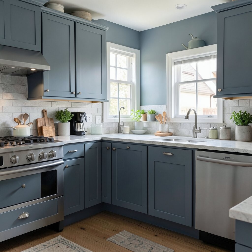
Dusty blue feels soft, cool, and a little dreamy. It has a quiet charm that can make a kitchen feel restful and neat.
This color works beautifully with white tile, pale wood, and brushed metal. It is a good pick for people who want color but still want a calm look.
Dusty blue is special because it feels both old-fashioned and fresh. It is a lovely trend for gentle home style, and you can personalize it with glass jars, striped cloths, or vintage dishes, while the cost is usually low if you start with paint.
13. Olive Green for a Stylish, Grounded Look
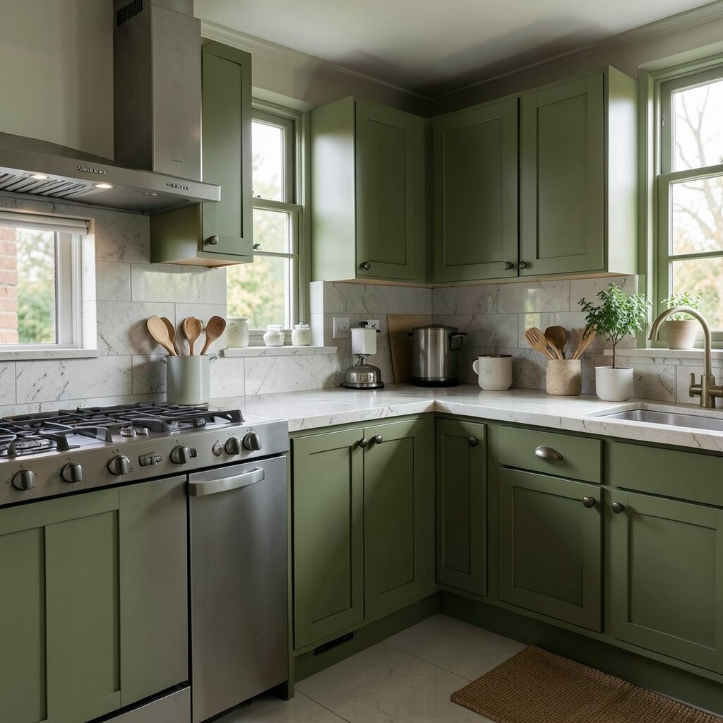
Olive green gives a kitchen a rich, grown-up feel. It is earthy and soft, with a touch of style that feels very current.
This color looks great with wood, cream, and dark metal. It can make the kitchen feel calm and full, without being too bright or too dark.
What makes olive unique is its smooth mix of nature and fashion. It is a strong trend in modern homes, and you can personalize it with woven lights, ceramic mugs, or warm beige accents, while the cost can stay fair with paint and a few well-chosen pieces.
14. Coral for a Fun, Lively Pop
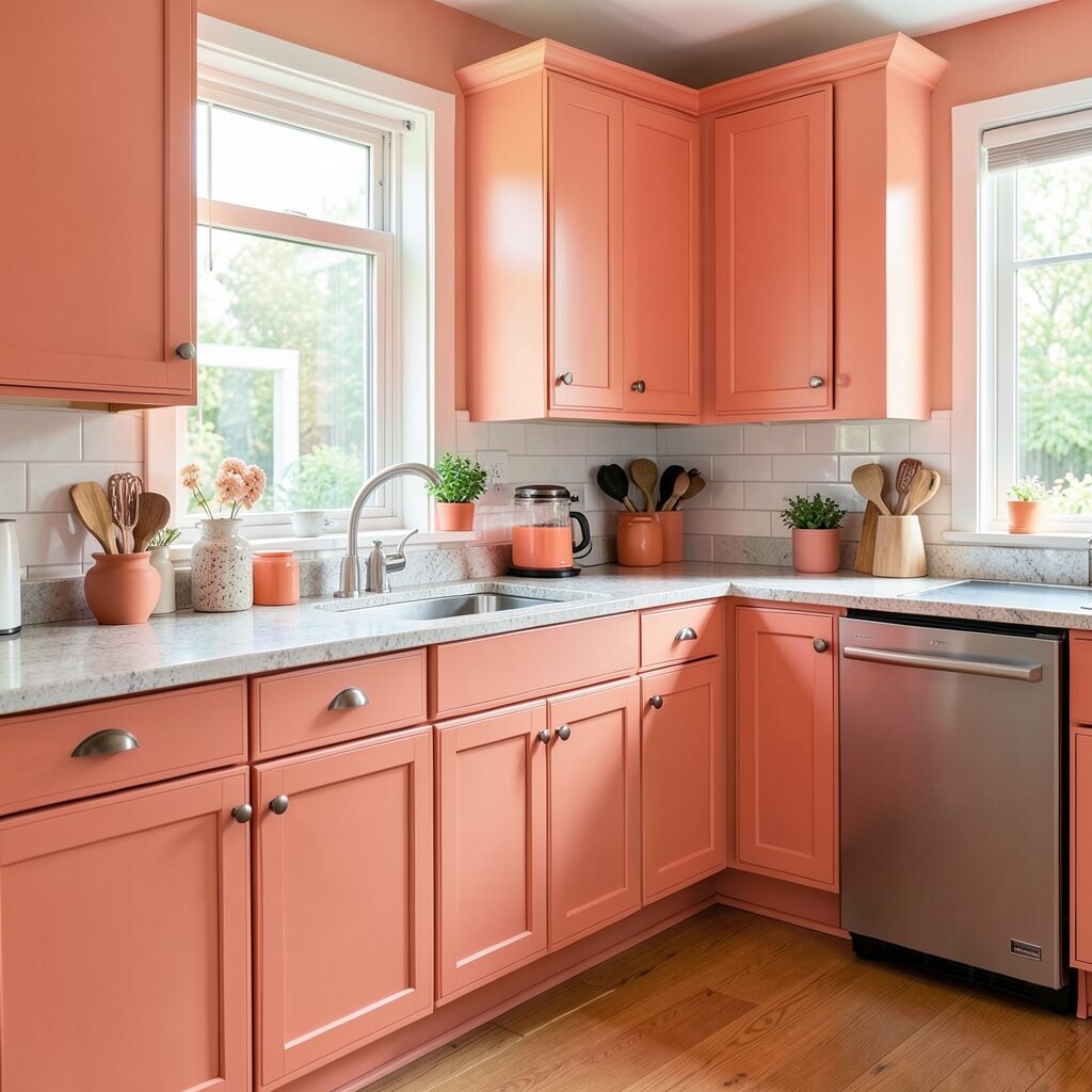
Coral brings cheerful energy into the kitchen. It feels bright, warm, and full of life, like a happy summer day.
This color can wake up a plain room and make it feel playful. It looks great with white cabinets, light wood, and gold accents, and it can make cooking feel more fun.
Coral is unique because it sits between pink and orange, so it feels fresh and bold. It is a lively trend for people who like color, and you can personalize it with tropical art, colorful dishes, or a bright runner, while the cost is often low if you use it on one wall or in small decor pieces.
15. Warm Taupe for a Soft, Elegant Finish
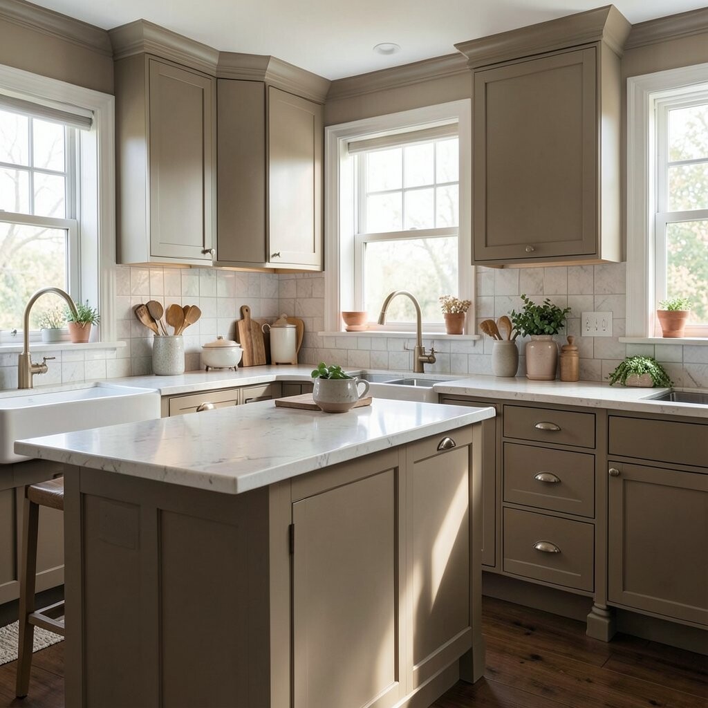
Warm taupe gives a kitchen a smooth and cozy look. It blends brown and gray in a way that feels calm, soft, and very grown-up.
This shade works well with almost anything, which makes it easy to style. It looks lovely with cream counters, black lights, wood stools, and soft green plants.
Its uniqueness comes from how quiet and classy it feels. Taupe is a smart choice in today’s calm home trends, and you can personalize it with textured rugs, pottery, or warm brass accents, while the cost is usually friendly because it works well with simple paint and easy decor changes.