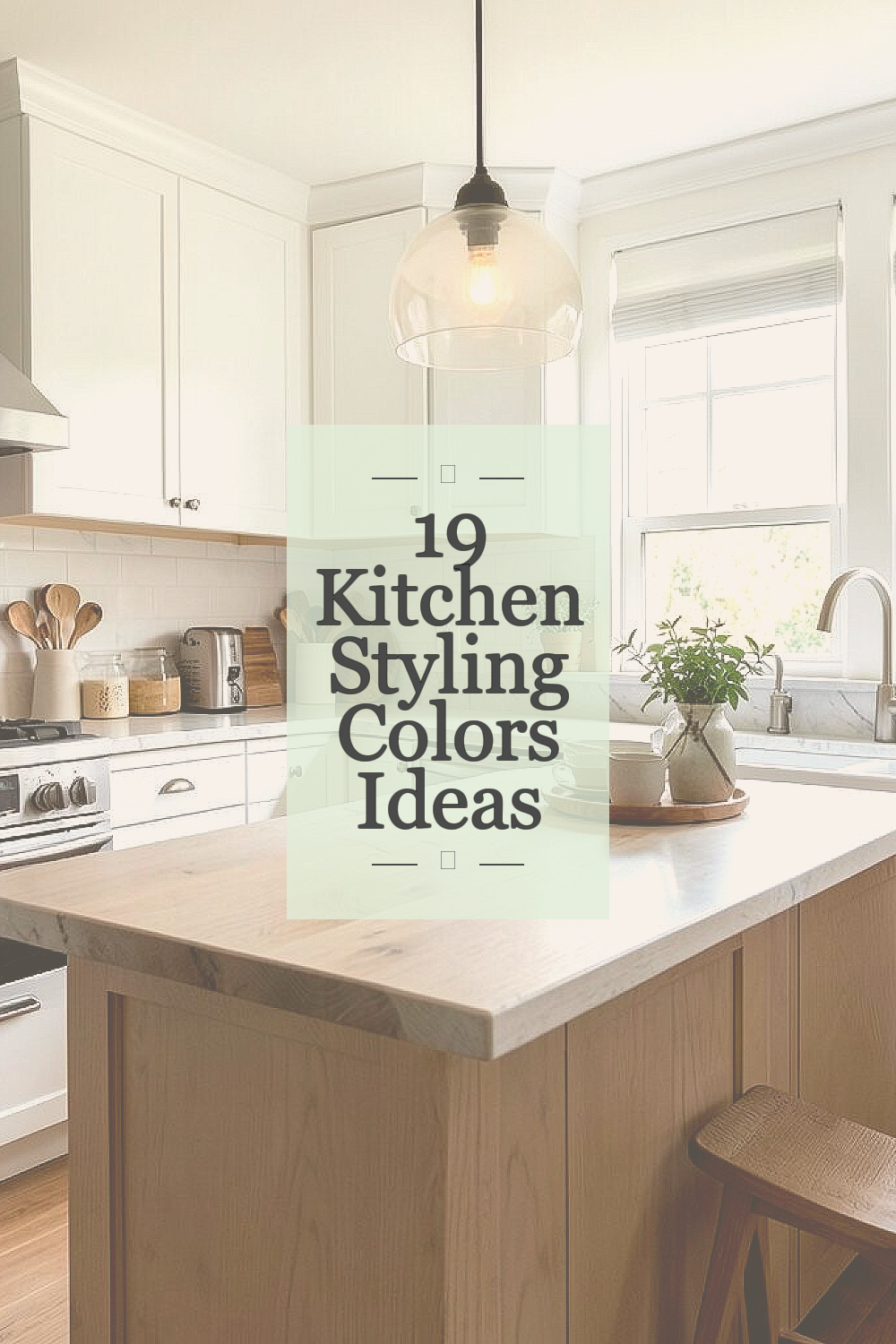
A kitchen can feel brand new with just the right colors. Small choices can change the whole mood fast.
1. Soft White With Warm Wood
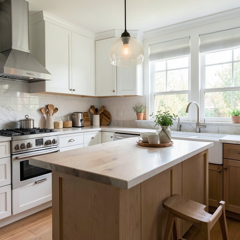
Soft white walls with warm wood cabinets give a kitchen a calm and cozy look. The room feels bright, open, and easy to live in, which is great for busy mornings and family meals.
This mix works well with many styles, so it is simple to make it personal with black handles, woven baskets, or a clay vase. It is also a smart budget choice because white paint is usually low cost, and wood tones can be added little by little with shelves, stools, or cutting boards.
2. Pale Sage Green

Pale sage green brings a fresh garden feel to the kitchen without shouting for attention. It looks soft on cabinets or walls and pairs well with white tile, brass, and light wood.
This color has become popular because it feels calm and current at the same time. You can keep it unique with rattan chairs, leafy plants, or open shelves, and it is often less pricey than a full remodel since paint does most of the work.
It also hides small marks better than plain white, which can be helpful in a busy cooking space. If you want a gentle change that still feels special, sage is a safe and stylish pick.
3. Navy Blue and Crisp White

Navy blue and crisp white make a kitchen feel sharp and clean. The dark and light balance gives the room strong contrast, which can make even a simple layout look polished.
This style works well on lower cabinets with white uppers, or as a bold island against pale walls. It feels rich and steady, and you can make it your own with gold lights, striped fabric, or a bright rug while keeping costs in check by painting only one part of the room.
Navy is also a trend that stays useful year after year because it looks classic and modern together. It is a smart choice if you want depth without making the kitchen feel too busy.
4. Butter Yellow With Cream Accents
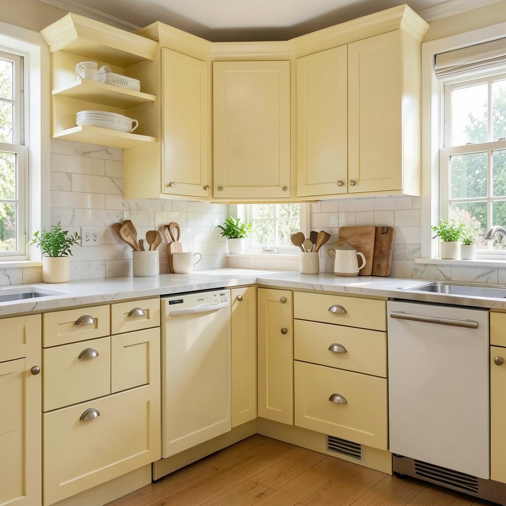
Butter yellow adds a sunny glow that makes a kitchen feel warm right away. Cream accents keep it soft, so the space feels happy instead of loud.
This color is lovely in kitchens that need a little more cheer, especially in rooms with less natural light. You can make it personal with blue dishes, wood stools, or patterned curtains, and the price stays friendly because a few cans of paint can do a lot.
It is a fresh look for cottage kitchens, older homes, and playful family spaces. If you want a room that feels bright and kind, this shade brings that feeling with ease.
5. Charcoal Gray With Brass Touches

Charcoal gray gives a kitchen a strong, modern look that still feels cozy. Brass touches add warmth and shine, so the room does not feel too dark or heavy.
This pairing looks great on cabinets, range hoods, or island bases, especially when matched with pale counters. It can feel more expensive than it really is, since paint and a few metal accents often create the whole effect.
Many people like this style because it hides wear well and feels easy to keep neat. Add your own touch with stoneware, warm wood cutting boards, or a bright piece of art to keep the space lively.
6. Dusty Blue and Soft Gray
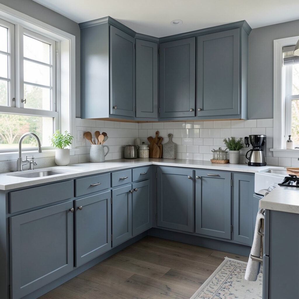
Dusty blue and soft gray make a kitchen feel calm like a cloudy morning. The colors blend gently, giving the room a peaceful look that is easy on the eyes.
This mix works well in small kitchens because the shades are light enough to keep the room open. It also gives you room to play with copper pans, white dishes, or pale oak, and it can be a low-cost update if you use paint and simple new hardware.
The look feels clean, but not cold, which makes it nice for everyday use. If you want something quiet with a little personality, this color pair is a lovely choice.
7. Deep Forest Green

Deep forest green makes a kitchen feel rich and grounded. It has a natural beauty that works well with stone counters, brass handles, and warm wood floors.
This shade is a favorite in current kitchen design because it feels elegant and earthy at once. You can keep it personal with cream dishes, vintage glass, or potted herbs, and you may save money by painting only the island or lower cabinets for a strong effect.
The color brings depth to plain rooms and can make simple features look more special. It is a bold choice, yet it still feels easy to live with every day.
8. Warm Beige and Terracotta
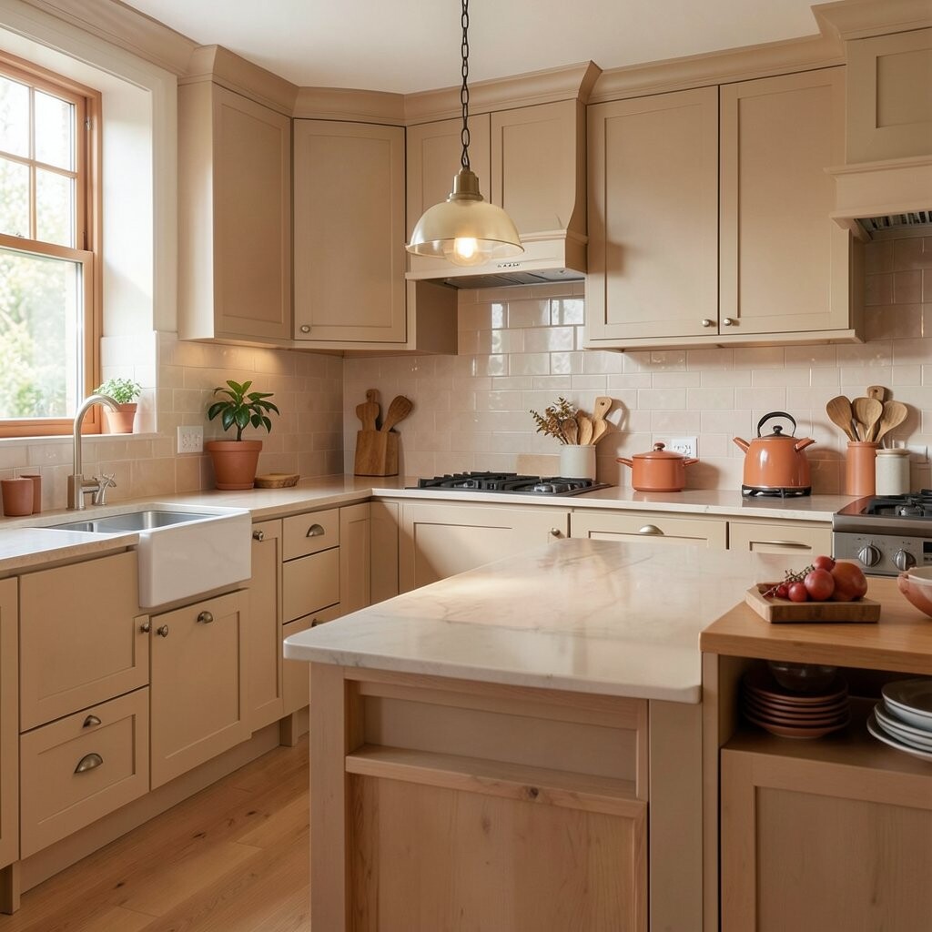
Warm beige and terracotta create a kitchen that feels sunny and natural. The colors give the room a soft earth look that feels friendly and grounded.
This pair works well with handmade tile, wood bowls, and woven textures, which adds charm without much effort. It is also a practical choice if you want to refresh the room on a smaller budget, since paint, textiles, and a few warm accessories can change the mood fast.
Terracotta is especially nice in kitchens that get good light because it glows in the day. You can make the look your own with open shelves, clay pots, or simple white dishes for contrast.
9. Black and White
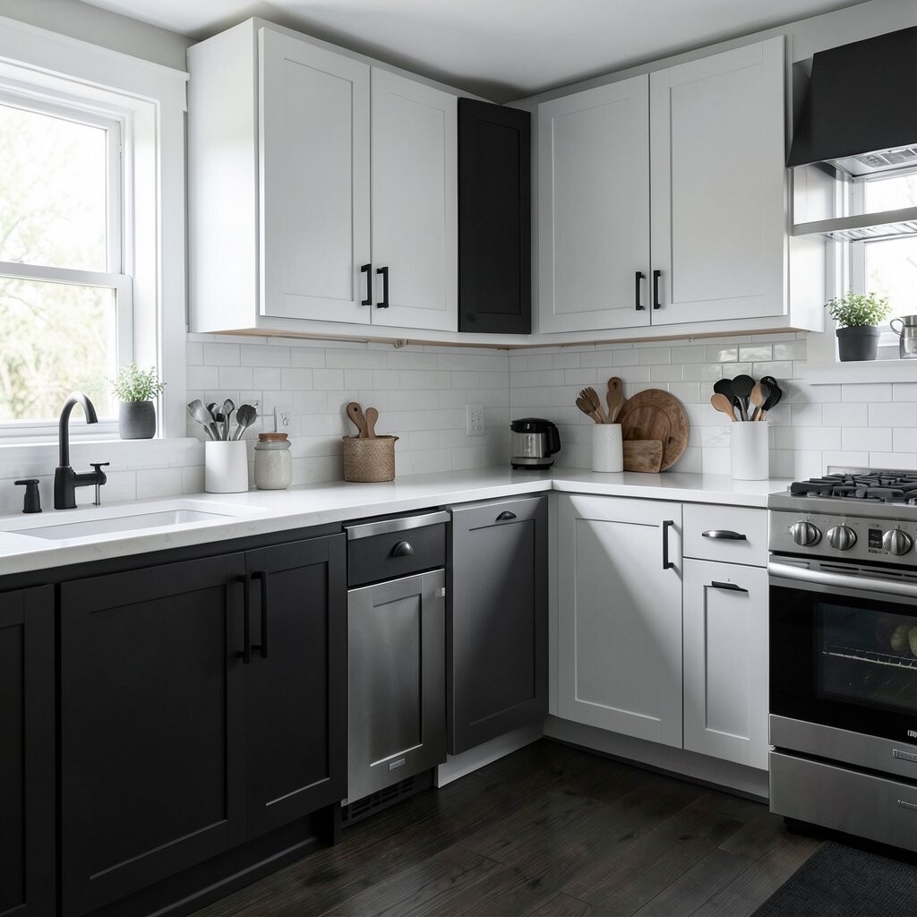
Black and white always gives a kitchen a crisp, strong look. The contrast is simple but powerful, and it can make cabinets, tile, or floors stand out in a clean way.
This color choice works in modern spaces, old homes, and even small kitchens when used with care. It is easy to personalize with wood stools, colorful fruit bowls, or bright art, and the cost can stay low if you focus on paint and a few new accessories.
The style feels timeless, so it is a good pick if you want something that will still look good later. Many people also like it because it makes the room feel neat and fresh with little effort.
10. Blush Pink With White
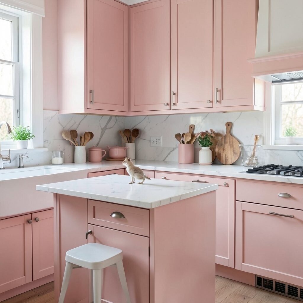
Blush pink with white gives a kitchen a soft, sweet look that still feels grown-up. The room feels light and airy, which can be nice if you want a gentle change from plain neutral tones.
This color pairing works well on walls, dishware, or a small island, and it looks fresh with gold lights or pale wood. It is a fun way to make the space feel special, and the price can be friendly if you start with paint and a few simple pieces.
Blush is a current favorite because it adds charm without taking over the room. You can keep it from feeling too delicate by adding black frames, stone counters, or clear glass jars.
11. Olive Green and Cream
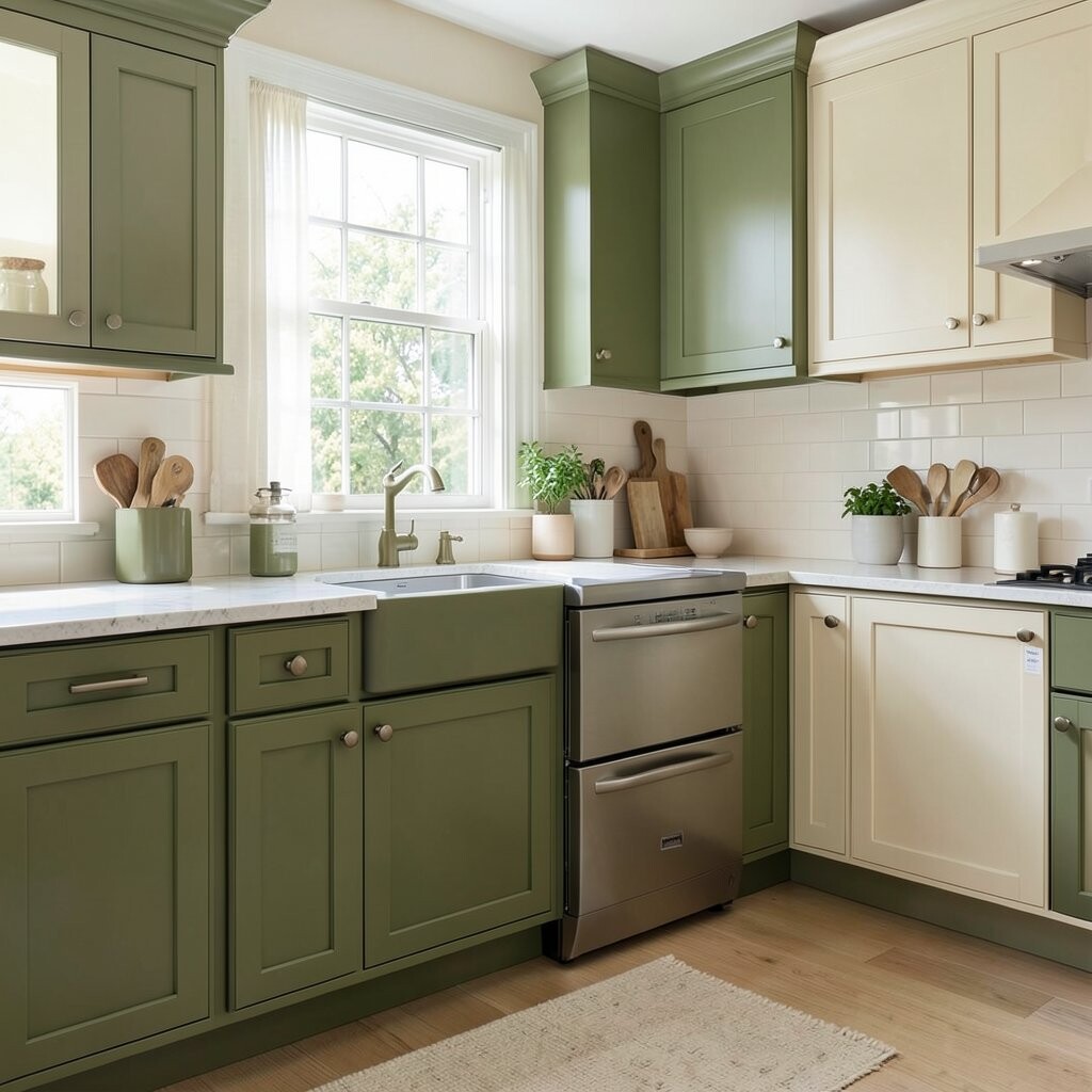
Olive green and cream bring a calm, natural mood to the kitchen. The look feels soft and earthy, like a quiet room filled with light and warmth.
This pairing works well with wood, wicker, and aged brass, so it is easy to style in a cozy way. It can also be a smart budget option because cream paint and olive accents can change the whole look without major work.
Olive green has a unique charm that feels a little richer than pale sage. If you want a kitchen that feels relaxed but still full of character, this is a strong choice.
12. Sky Blue With White Tile
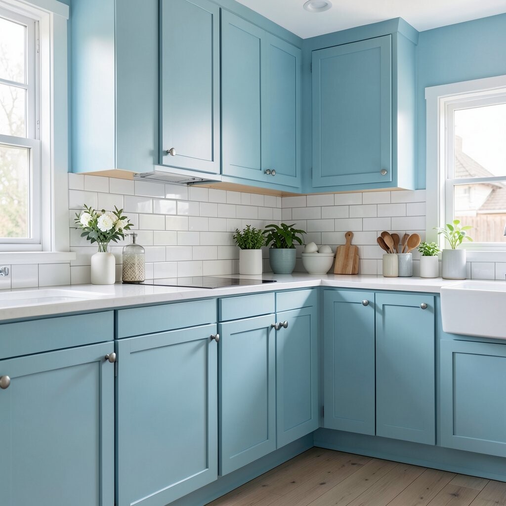
Sky blue with white tile gives a kitchen a clean, breezy feeling. It can remind you of open air and bright mornings, which helps the room feel cheerful.
This color idea works well for backsplashes, cabinets, or walls, and it pairs nicely with silver hardware and glass jars. It is also an easy look to personalize with striped towels, painted stools, or a colorful kettle, while keeping costs fair by using paint and simple tile choices.
The style feels fresh and light, which is great for smaller homes or kitchens that need more energy. It has a timeless charm that can still feel modern when you keep the rest of the room simple.
13. Rich Plum and Soft Neutrals
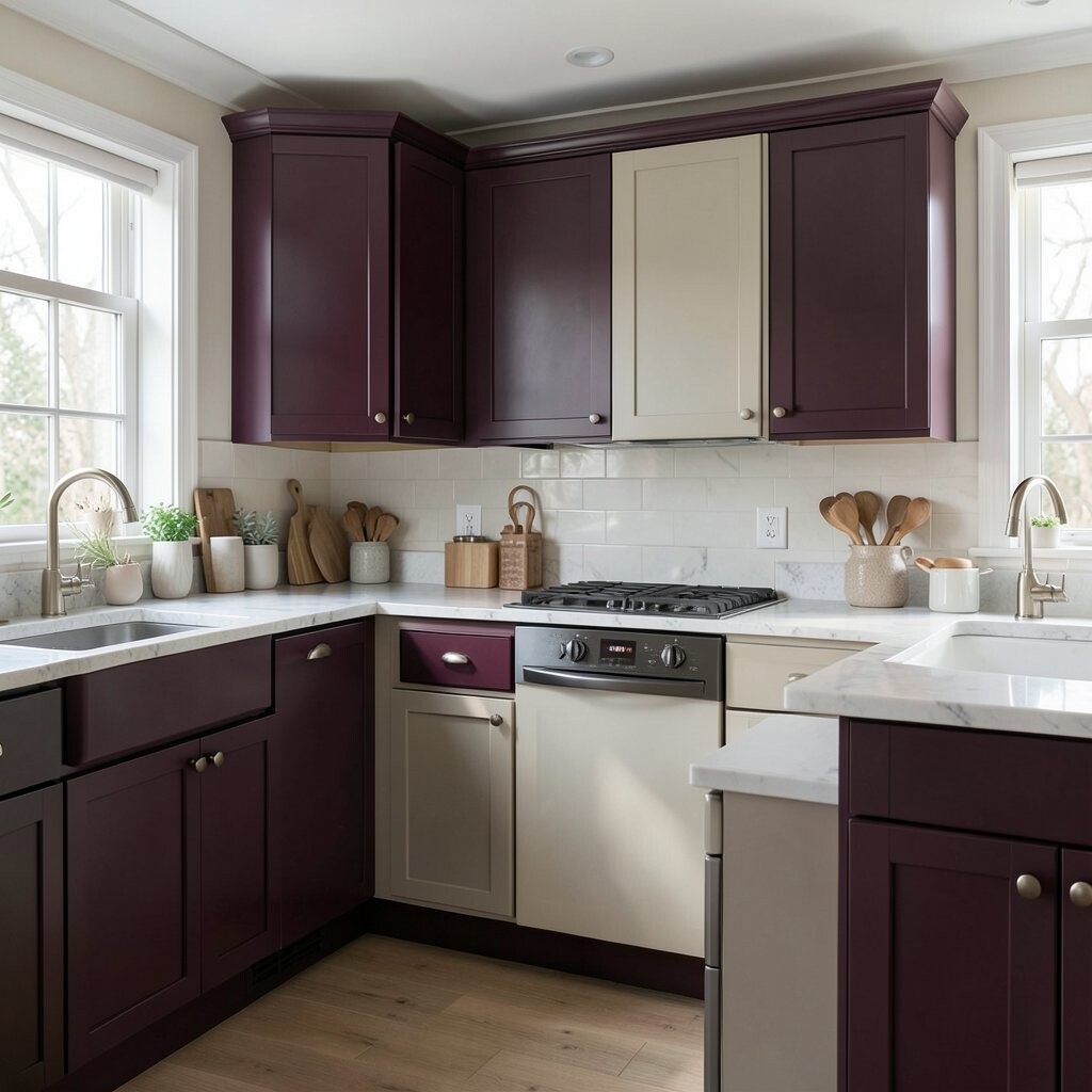
Rich plum brings a deep, moody feel that can make a kitchen look stylish and bold. Soft neutrals balance it out, so the room stays warm and inviting instead of heavy.
This mix works well with cream counters, pale floors, and brushed metal accents. It gives you a chance to show personality in a classy way, and it can be more affordable than a full redesign if you use plum on an island, a pantry door, or one feature wall.
People often like this color because it feels a little unexpected. If you want a kitchen that stands apart from common color schemes, plum adds that special touch.
14. Light Gray With Natural Oak

Light gray with natural oak creates a fresh and simple kitchen that feels neat and welcoming. The gray keeps things modern, while the oak adds warmth and an easy homey look.
This combo works well in many homes because it is soft enough to feel airy but not so plain that it becomes boring. It is easy to personalize with ceramic bowls, linen curtains, or black accents, and it can be a wise spending choice since light paint and natural wood details often do the trick.
The look is popular because it fits many design tastes and ages well. If you want a style that feels clean and relaxed, this pairing is hard to beat.
15. Teal and White
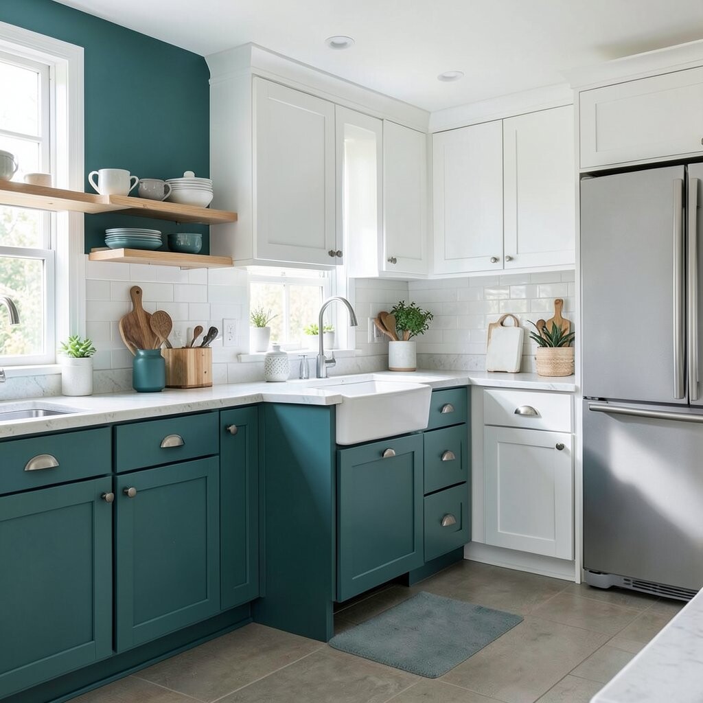
Teal and white make a kitchen feel bright, cool, and full of life. Teal adds color and energy, while white keeps the space fresh and open.
This pairing is great for anyone who wants a bolder look without going too dark. You can make it personal with brass pulls, patterned plates, or a colorful runner, and you can control the budget by painting only the lower cabinets or just the island.
Teal has a lively quality that feels both playful and polished. It works especially well in kitchens that need a strong focal point and a bit of extra cheer.
16. Warm Taupe and Black
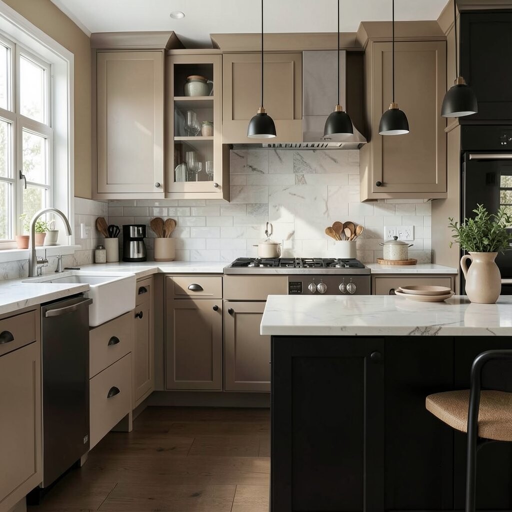
Warm taupe and black give a kitchen a smooth, modern look with a soft edge. The taupe keeps the room warm, while black adds shape and contrast.
This style looks nice on cabinets, stools, frames, or light fixtures, and it is easy to build around. It can be a cost-smart idea too, since a neutral base lets you change the mood later with low-cost accessories and simple seasonal swaps.
The look feels polished without being too flashy, which makes it useful for everyday life. You can bring in your own style with wood trays, glass jars, or small green plants for a fresh finishing touch.
17. Peach and Off-White
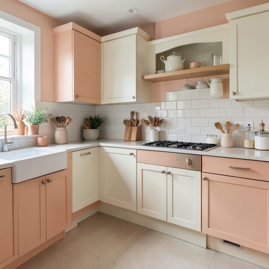
Peach and off-white give a kitchen a soft glow that feels warm and happy. The colors look gentle together and can make the room feel welcoming from the first step inside.
This choice works well in kitchens that need a little charm and a touch of fun. It is easy to personalize with copper pans, floral fabric, or pale wood shelves, and the cost can stay low if you use paint and a few small decor changes.
Peach is a nice way to add color without making the room too bright or busy. If you want a fresh look that still feels easy and kind, this one brings a lovely balance.
18. Pale Mint and White
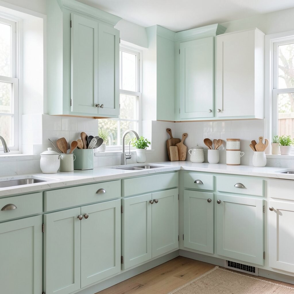
Pale mint and white make a kitchen feel cool, crisp, and cheerful. The mint adds a light color splash, while white keeps the space bright and tidy.
This style is especially nice in small kitchens because it feels airy and clean. You can make it unique with chrome hardware, clear jars, or pastel dishes, and the update can be affordable when you focus on paint, curtains, or a few matching accessories.
Pale mint also fits well with current fresh, soft color trends that feel easy to live with. It is a lovely choice if you want a room that feels fresh every day without trying too hard.
19. Mixed Neutrals With One Bold Accent
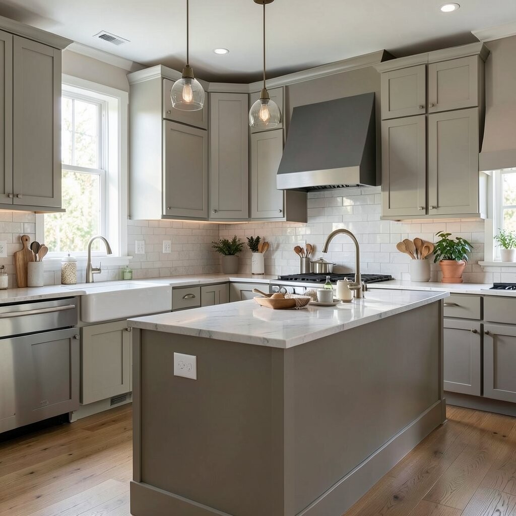
Mixed neutrals with one bold accent create a kitchen that feels calm but still interesting. Beige, white, gray, and wood set a soft base, while a bold touch like cobalt, red, or green brings the room to life.
This idea is very flexible, so it works for many homes and budgets. You can keep the accent small with bar stools, a backsplash strip, or a painted shelf, which makes it easy to personalize and easy to change later if your taste shifts.
The mix feels current because many people now like layered, lived-in spaces that do not look too perfect. It is also practical since neutral colors hide wear well and let one bright piece do the hard work of making the room feel fresh.