
Soft pastels can make a room feel calm and fresh. They also bring a sweet kind of charm that never feels too loud.
1. Pale Blush Pink
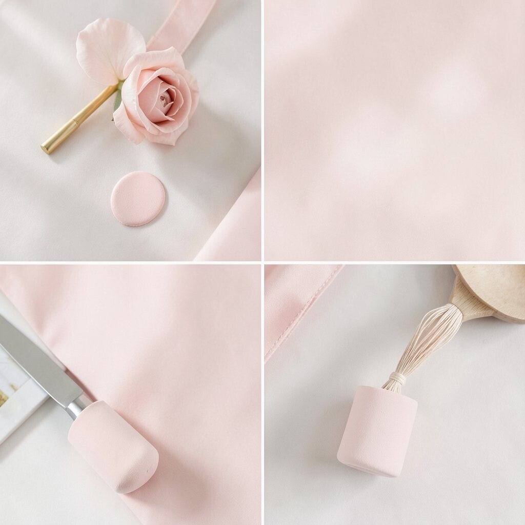
Pale blush pink gives a room a gentle glow that feels warm and inviting. It looks lovely on bedroom walls, cozy chairs, or even small decor pieces like vases and lamps.
This shade works well because it softens hard edges and makes a space feel friendly. It is a nice pick if you want pretty style without a bold price tag, since a few painted accents can do a lot.
2. Soft Mint Green

Soft mint green brings a clean, airy feel that can make a room seem brighter. It is a nice fit for kitchens, bathrooms, and reading corners where a fresh look feels welcome.
This color stands out in a gentle way, so it feels unique without shouting for attention. You can pair it with white shelves, wood tones, or simple plants, and that mix often feels modern right now. If you want to keep costs low, try mint on one wall or on smaller items like frames and cushions.
Because mint feels cool and light, it can help busy rooms seem calmer. Add a few personal touches in brass, rattan, or glass to make the space feel like your own.
3. Powder Blue
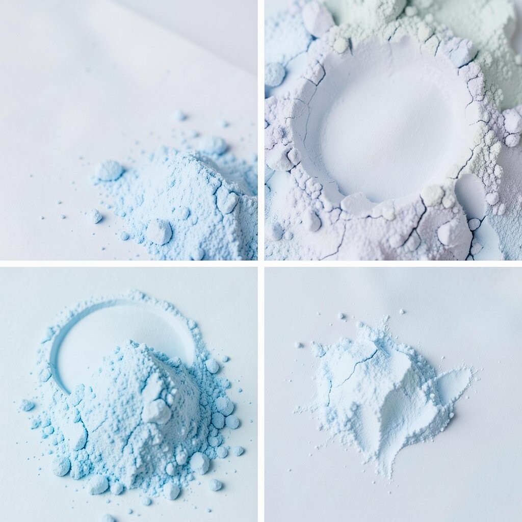
Powder blue has a soft sky-like look that can make any room feel open and peaceful. It is especially nice in bedrooms, nurseries, and quiet work areas.
This shade feels timeless, yet it also fits the current trend of light and easy home colors. For a simple update, use powder blue bedding, curtains, or a painted shelf, which can be more affordable than repainting a whole room.
It also plays well with white, cream, and light gray, which makes styling easy. If you want more personality, add a patterned pillow or a framed print with a few deeper blue tones.
4. Lilac Mist
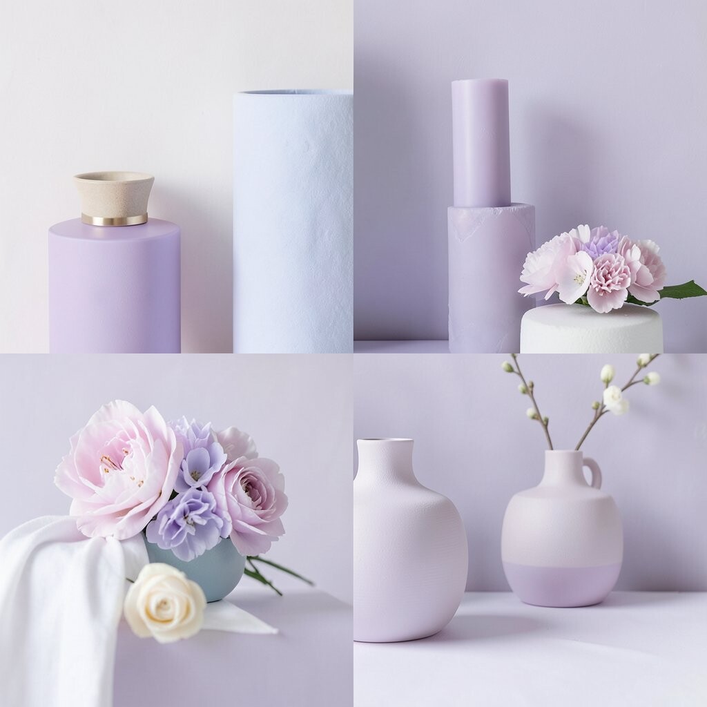
Lilac mist adds a dreamy feel that is soft but still playful. It can make a space look delicate and special, especially when used on accent walls or small furniture pieces.
This shade feels a little magical, which helps it stand apart from common neutrals. It is a smart choice for people who want a pretty room without spending much, since lilac decor items are easy to find in many price ranges.
Try it with silver details, pale wood, or white fabric for a light look. A few handmade items can make lilac feel more personal and less like a store display.
5. Peach Cream
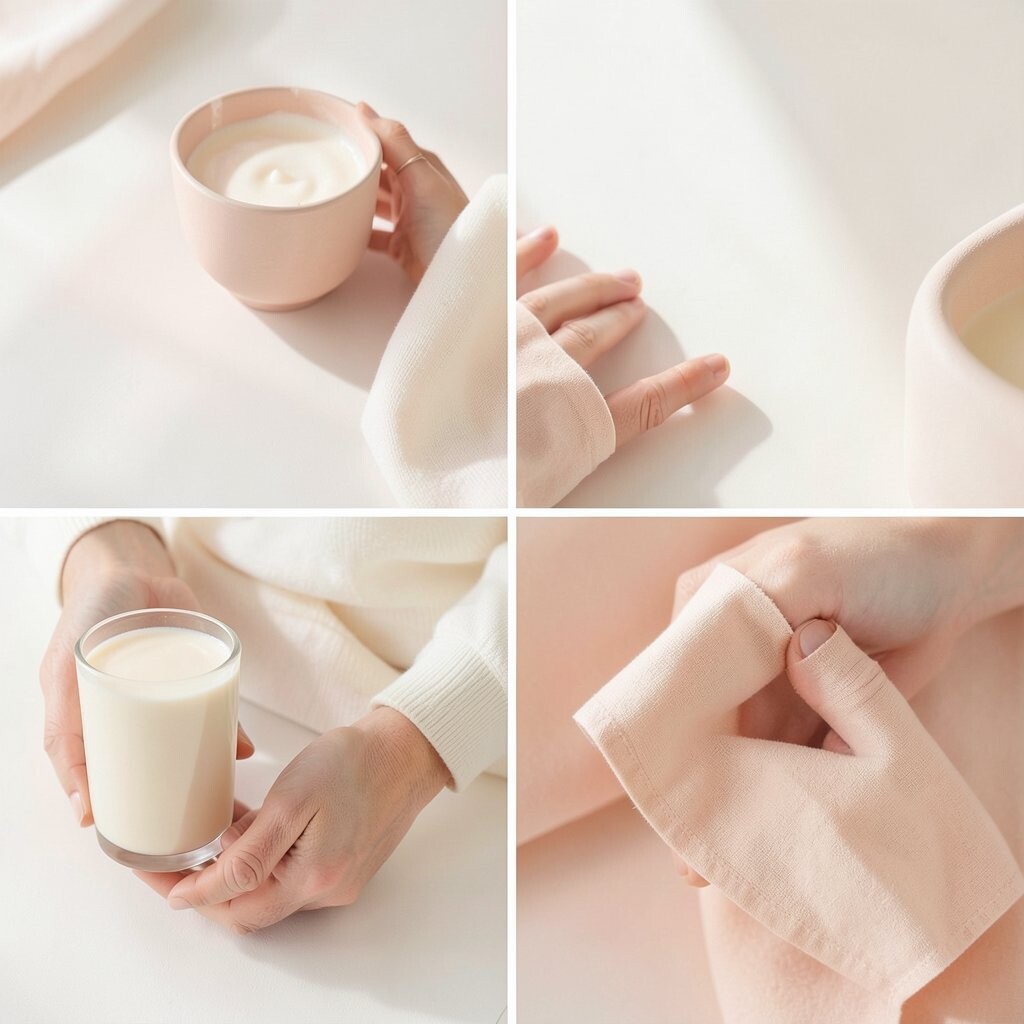
Peach cream brings a warm blush of color that feels sunny and soft at the same time. It works well in living rooms, entryways, and dining spots where you want a cheerful mood.
This shade is unique because it sits between pink and orange, so it feels gentle yet lively. It can be easy on the budget too, since peach throws, pillows, and lamps can give the same feeling as paint.
Pair it with linen, wicker, or pale oak to keep the look light and cozy. If you want a more custom feel, mix in art or pottery with tiny hints of coral or rose.
6. Butter Yellow

Butter yellow gives a room a soft glow that feels happy without being too bright. It can make small spaces seem warmer and more welcoming right away.
This color feels cheerful and current, especially in homes that lean toward simple cottage or vintage styles. A few yellow accessories, like a rug or dishware, can be a low-cost way to try it before painting.
It looks lovely with white trim and natural wood, which helps the shade feel calm. For a personal touch, add family photos or handmade crafts so the room feels lived in and kind.
7. Dusty Rose
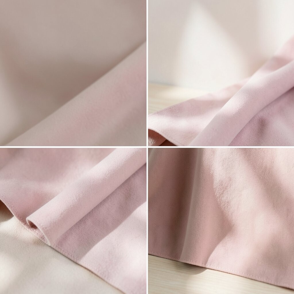
Dusty rose has a soft, grown-up feel that brings warmth without looking too sweet. It can make bedrooms, sitting rooms, and dressing areas feel calm and pretty.
This shade feels special because it has a bit of depth, so it reads more rich than a very pale pink. It also works well with budget-friendly decor, since simple rose-toned cushions or curtains can make a big change.
Use it with cream, tan, or soft gold for a polished look. If you want more individuality, mix in textured pieces like velvet, knit, or woven baskets.
8. Seafoam
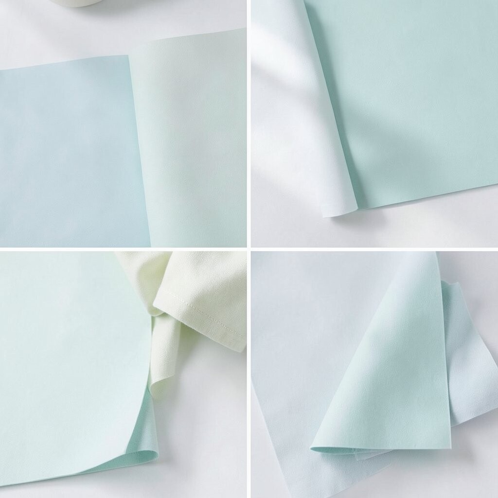
Seafoam has a breezy look that feels like a calm day near water. It can brighten bathrooms, laundry rooms, and small corners that need a little life.
The shade feels unique because it blends green and blue in a light, dreamy way. It is also easy to style on a budget, since seafoam towels, jars, or wall art can bring in the look without much effort.
Pair it with crisp white and pale gray for a fresh feel. A touch of natural stone or shell-shaped decor can make the space feel more personal and current.
9. Cloud Gray
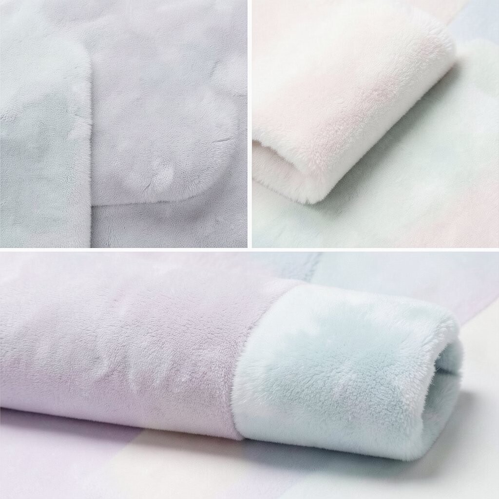
Cloud gray gives a room a misty, soft look that feels peaceful and clean. It is a great background color when you want pastel accents to stand out.
This shade is useful because it can calm a space without making it feel cold. It also helps other colors look sweeter, and that makes it a smart, low-risk choice for people who want a pretty room on a modest budget.
Try adding pink, blue, or mint details to keep the room from feeling flat. Simple changes like a gray rug or a painted side table can make the whole space feel more finished.
10. Soft Lavender
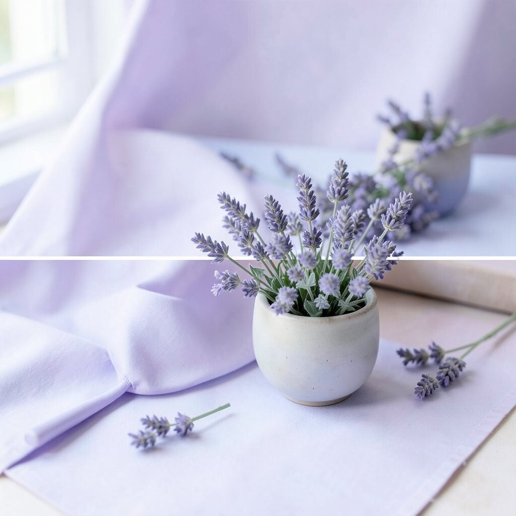
Soft lavender gives a room a light floral feel that seems gentle and calming. It works beautifully in bedrooms, craft rooms, and cozy nooks where you want a quiet mood.
This color feels a little different from more common pastel picks, which helps it stand out in a subtle way. It is easy to use in small amounts, so you can keep costs down by trying lavender candles, bedding, or wall art first.
It pairs well with white and pale wood, and that keeps the room from feeling too busy. Add one special object, like a favorite book stack or a small vintage mirror, to give the space more of your own story.
11. Pale Aqua

Pale aqua brings a cool, clean softness that can make a room feel light and open. It is lovely in bathrooms, sunrooms, and workspaces that need a fresh mood.
This shade feels trendy because it fits the calm, beachy style many people like right now. You can use it in affordable ways such as pillows, curtains, or painted picture frames if you do not want to repaint everything.
It looks nice beside white tile, pale wood, and glass. For a more personal touch, add woven storage, coastal art, or simple ceramic pieces that match your taste.
12. Creamy Apricot

Creamy apricot has a soft fruit-inspired look that feels warm and light. It can make a room feel friendly, relaxed, and a little sunny even on cloudy days.
This shade is nice because it feels cheerful but still calm enough for everyday use. It is also practical for styling, since apricot accents can be found in blankets, lamps, and pillows at many price points.
Use it with ivory, tan, or light terracotta for a gentle layered look. If you want the room to feel more one-of-a-kind, mix in handmade art or thrifted wood pieces.
13. Pale Sage

Pale sage has a soft green tone that feels restful and natural. It is a lovely choice for living rooms, bedrooms, and kitchens that need a quiet, fresh feel.
This shade is unique because it gives you color without feeling too bright. It is also one of the easiest soft shades to live with, and that makes it a smart choice when you want beauty and value together.
Pair it with cream, warm white, or light beige for a calm look. A few herb pots or natural fiber baskets can make the space feel personal and current at the same time.
14. Ballet Pink
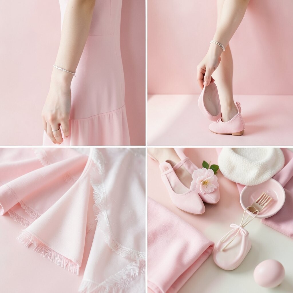
Ballet pink has a silky, delicate look that feels refined and sweet. It can make a dressing room, bedroom, or sitting area feel softer in an instant.
This shade shines when you want a romantic mood without going too bold. It also works well with affordable decor changes, like pink curtains, lamp shades, or a painted stool.
Mix it with ivory and light wood for a pretty balanced style. To keep it from feeling too plain, add one item with a little shine, such as a mirror or a small metal tray.
15. Sky Tint Blue

Sky tint blue feels open and happy, like a clear morning. It can make walls and decor seem lighter, which is useful in smaller rooms.
This shade is a good fit for homes that want a relaxed look with a fresh edge. It is easy to update on a budget with bedding, art prints, or even a soft blue chair cover.
Use it with white, pale gray, or sandy beige for a crisp finish. A few personal objects, like travel photos or favorite books, can make the room feel warm instead of plain.
16. Pale Coral
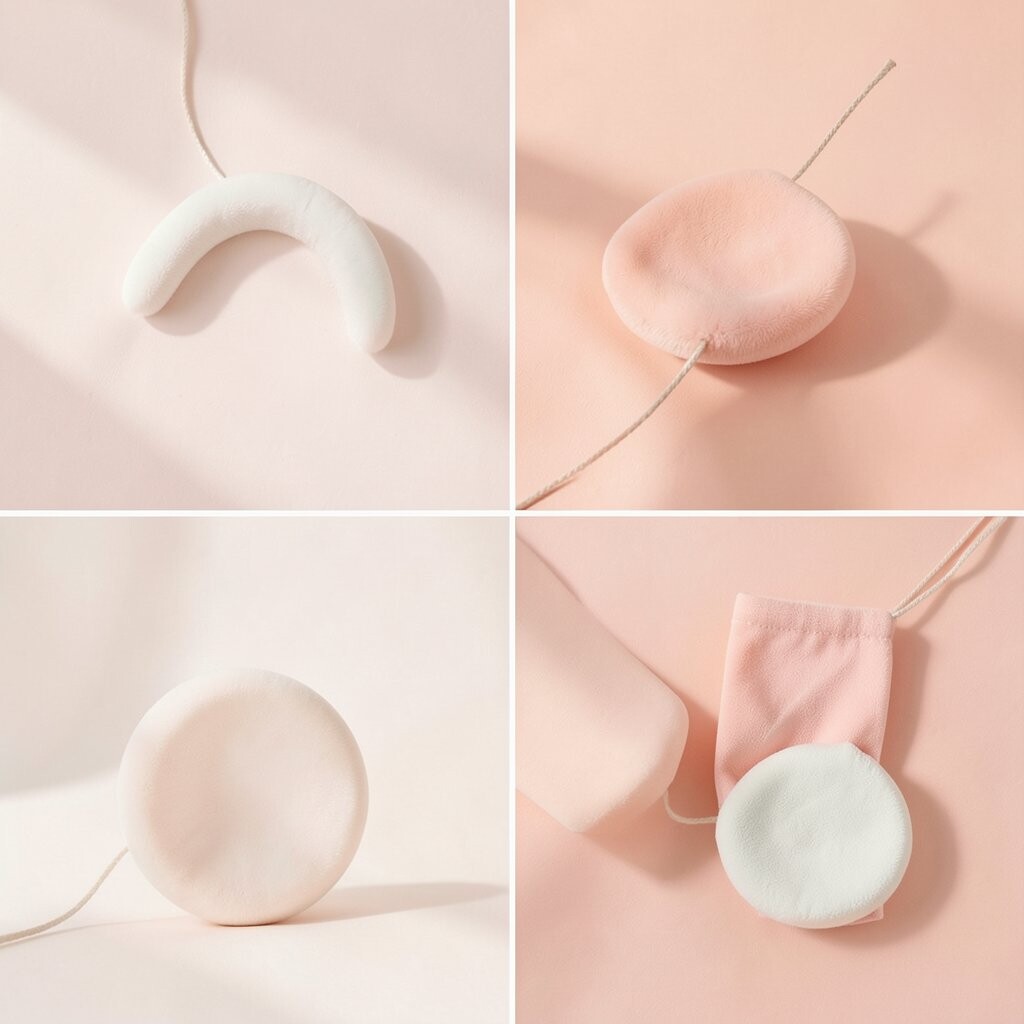
Pale coral gives a room a gentle pop that feels lively but still easy on the eyes. It is a cheerful choice for kitchens, children’s spaces, and bright corners that need more energy.
This shade feels special because it brings a little warmth and a little pink together. If you want a lower-cost update, coral dishware, art, or throw blankets can bring the same mood as a full paint job.
It looks lovely with white, cream, and light wood, which keeps it soft. Add a few woven or ceramic pieces to make the room feel more layered and personal.
17. Soft Taupe Pink
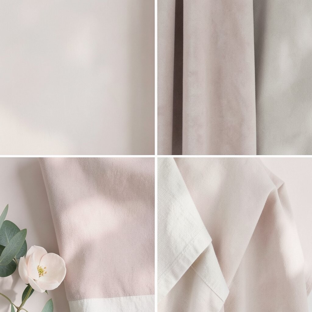
Soft taupe pink blends warm beige with a gentle rose tone, and that makes it feel calm and polished. It works well in bedrooms, offices, and entry spaces where you want quiet style.
This shade is unique because it feels modern and classic at the same time. It is also a practical choice when you want a color that can last through changing trends and still look good with simple, low-cost decor.
Try it with cream, stone, or muted gold for a rich but easy look. A few custom touches, like framed art or a special lamp, can make the space feel more like you.
18. Frosted Mauve

Frosted mauve has a soft dusty look that feels elegant and cozy. It can add depth to a room while still keeping the mood light.
This shade stands out because it has a little more character than plain beige or pink. It also fits well with current home trends that favor soft, layered colors and gentle texture, and that style can be built slowly with small purchases.
Use frosted mauve with ivory, soft gray, or pale wood for a balanced look. If you want the room to feel more personal, add a favorite throw or a few vintage pieces with charm.
19. Whisper White With Pastel Undertones

Whisper white with pastel undertones gives a room a very light, dreamy look that changes a little with the light. In one space it may feel a touch pink, while in another it may seem blue, green, or cream.
This shade is helpful when you want softness without a strong color choice, and that can be a smart move for smaller budgets and future changes. It also works with almost anything, so you can personalize the room with colorful pillows, artwork, or plants as your style grows.
The look feels clean, modern, and calm, which makes it great for almost any room. If you want a space that feels pretty but easy to live with, this gentle white is a lovely final touch.