Great design can stop the eye in a split second. Strong contrast makes that moment happen fast.
1. Black And White With One Bright Accent
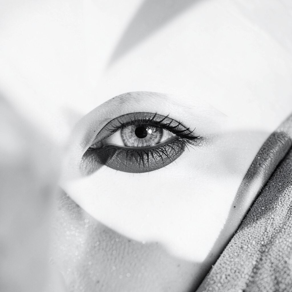
Black and white gives a clean, sharp look, and one bright accent color can make the whole design pop. It feels modern, bold, and easy to read, which helps posters, websites, and product labels stand out right away.
This style is unique because it keeps the base simple while still adding energy through a small color hit. It is also a smart budget choice since you can work with just two main tones and add a single vivid shade for a polished result. A red button, a yellow icon, or a blue headline can be enough to create a fresh personal touch that fits your brand.
2. Dark Backgrounds With Light Text

A deep background with light text creates a glowing effect that looks crisp and dramatic. The contrast makes reading easier in many cases, and it can give digital art, menus, and social posts a sleek feel.
Many designers like this look because it feels current and works well with night-mode trends across apps and websites. It can also save a bit on ink for printed pieces when used well, and it gives room to personalize with colored links, soft glows, or bold image overlays. Keep the text size large enough and test it on different screens so the design stays clear and friendly.
3. Soft Neutrals With A Single Strong Shape
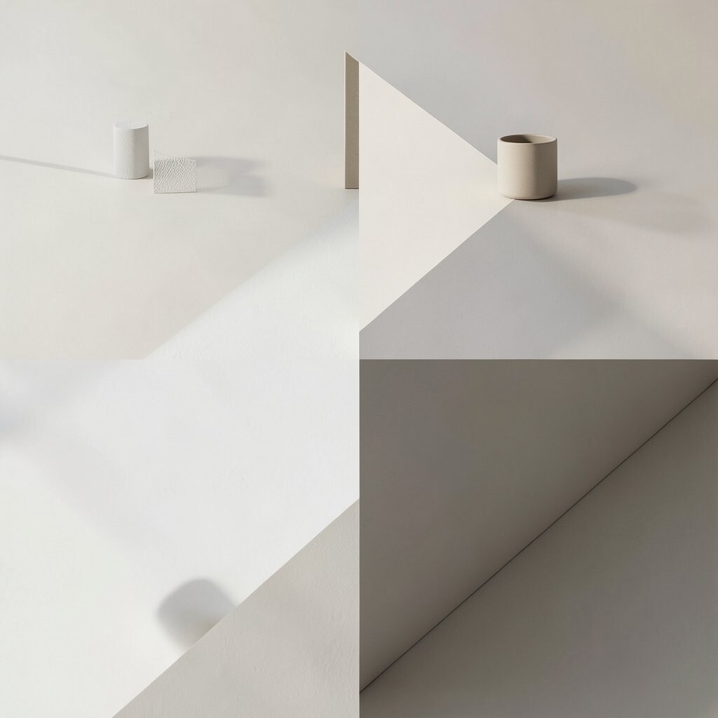
Soft beige, gray, or cream colors can feel calm, then one strong dark shape or bright block brings instant focus. The mix looks clean and balanced, and it gives a page or poster a quiet style with one bold spot to guide the eye.
This approach is useful when you want a design that feels calm but not plain. It is often affordable because neutral backgrounds print well and need little extra color work, while the strong shape can be reused across a whole brand set for a personal signature. Try circles, bars, or layered blocks to make the contrast feel fresh and easy to remember.
4. High-Contrast Fonts In The Same Color Family
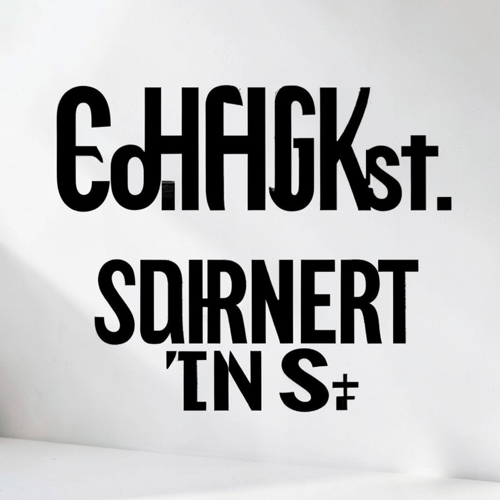
Using two fonts that look very different, such as a thick title and a thin body font, can create strong contrast even when the colors stay close. The page feels lively and guided, and the viewer can tell where to look first without any fuss.
This idea is popular in modern editorial layouts, where style and clarity need to work together. It is also a low-cost way to add drama because font choice can do a lot of the work without extra artwork or fancy effects, and you can make it personal by mixing a friendly font with a more serious one. Keep the pairings easy to read and avoid using too many styles in one space.
5. Bright Color On A Muted Photo

A muted photo gives a calm base, and a bright color on top can wake it up fast. The result looks polished and lively, with the color pulling the eye toward a logo, button, or headline.
This kind of contrast works well for ads, websites, and event graphics because the photo still feels real while the accent brings excitement. It can be a smart choice for cost control since you can use a simple photo edit and one strong color layer instead of a full custom image set, and it leaves room for personal style through color choice. Soft gray photos with neon text, or warm photos with cool blue overlays, can feel very current and memorable.
6. Thin Lines Against Thick Blocks

Thin lines can look graceful and delicate, while thick blocks feel strong and solid. Put them together and the design gets a clear sense of balance and motion.
This contrast is helpful for packaging, branding, and page layouts that need structure without feeling stiff. It is also a practical way to keep design costs down because simple shapes are easy to build and reuse, and you can personalize the look by changing line color, spacing, or block size. The style feels neat, modern, and easy to adapt for both print and digital use.
7. Warm And Cool Tones Together
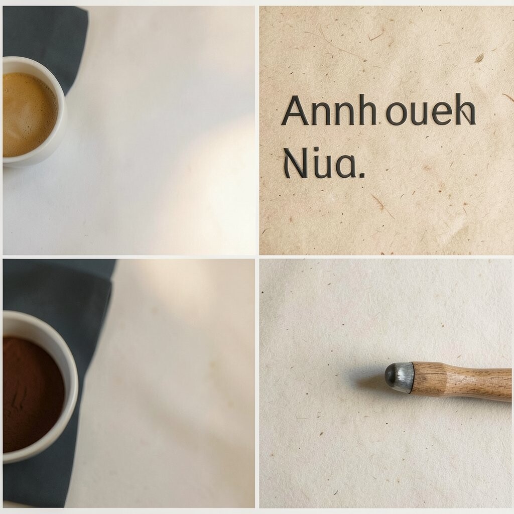
Warm colors like orange and red can feel lively, while cool colors like blue and green can feel calm. When they sit side by side, the design gains depth and a strong visual pull.
This mix is a favorite in current branding because it feels energetic without needing loud effects. It can also be budget-friendly, since you can work with two color families and still make a big impact, and it gives lots of room for personal choices based on mood or audience. For a soft result, use pale versions of each tone, or for a bold look, push the shades into richer, brighter territory.
8. Large Type With Tiny Details

Big letters command attention, and tiny details make the design feel rich and thoughtful. The size difference gives the eye a clear path, while the small pieces reward a closer look.
This idea works well for posters, book covers, and landing pages because it creates instant drama. It can keep costs lower too, since type can do much of the visual work without needing many extra graphics, and you can personalize it with tiny icons, small underlines, or delicate texture. Keep the main words short and punchy so the large type stays powerful instead of crowded.
9. Glossy Effects With Flat Shapes
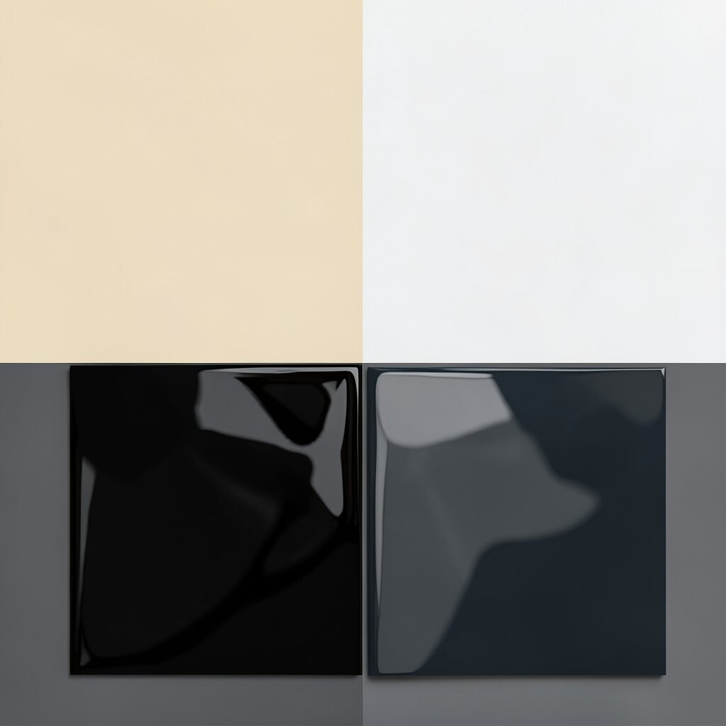
A glossy highlight on a flat shape can make the shape seem almost touchable. That mix feels playful and fresh, and it gives simple graphics a more polished look.
This style is showing up again in app art, social posts, and product ads because it blends old shine with new clean design. It can be affordable if you use built-in effects or simple gradients, and it lets you add personal flair through color, shine level, or shape choice. Keep the shine subtle enough so the design still feels neat and easy to read.
10. Texture Against Smooth Surfaces
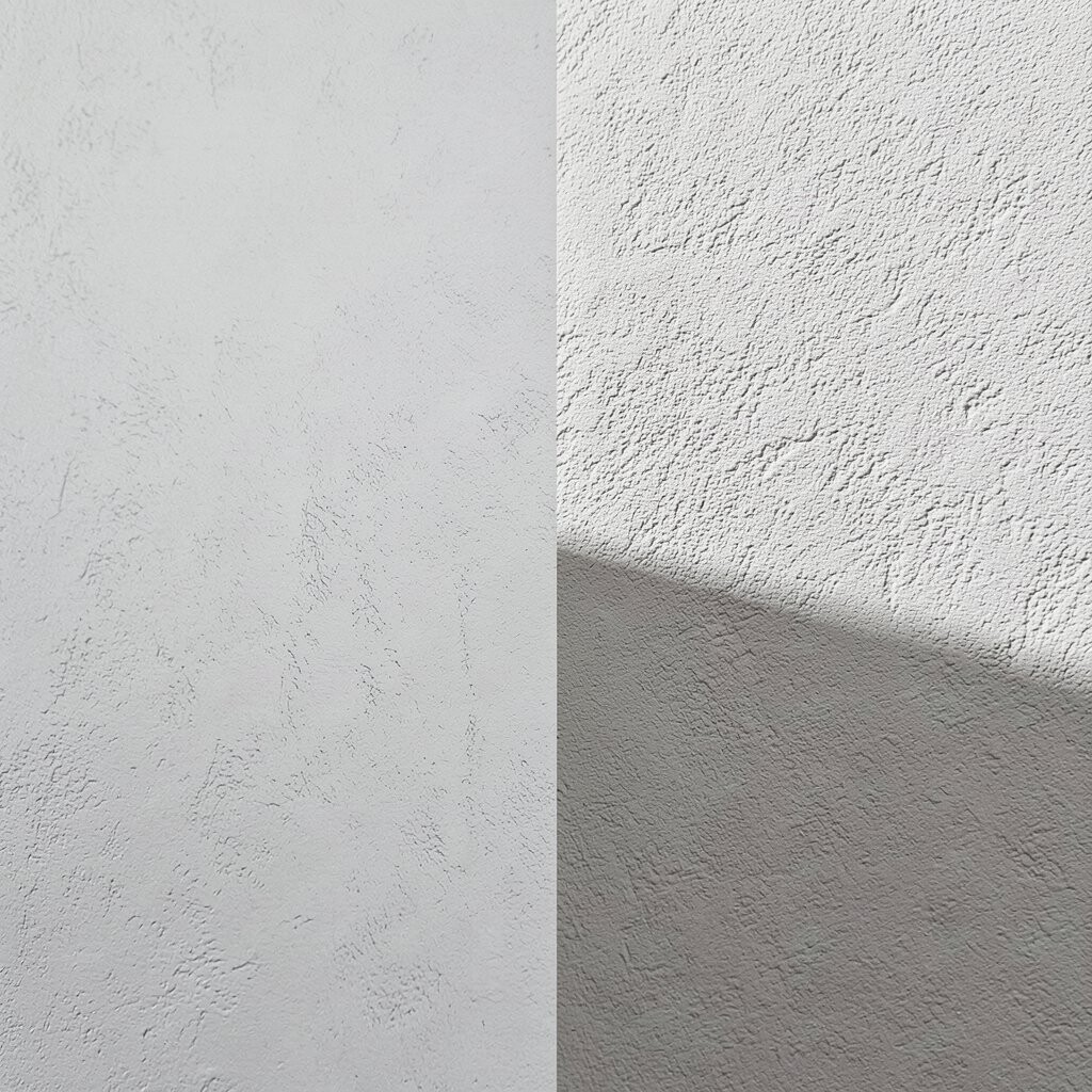
Rough paper, grain, or brush marks can look rich when placed beside a smooth background. The contrast makes a design feel more human and less flat.
This pairing gives strong visual interest without needing a full illustration, which is helpful for posters, labels, and social graphics. It can also be cost-wise smart because a light texture layer can lift simple artwork, and it gives room for personal style through paper scans, ink marks, or fabric patterns. The look feels warm and handmade, which many people enjoy in a world full of polished screens.
11. Bright Blocks In A White Space

White space gives the eyes room to breathe, and bright blocks break that quiet with a bold splash. The result looks clean and lively at the same time, which can make even a small design feel important.
This style is especially useful for modern websites and product pages where clarity matters. It can also save on design effort because a few bright blocks can carry the layout, and that keeps costs low while leaving space for personal touches like color shifts or shape changes. Many current designs use this roomy look because it feels open, fast, and easy to scan.
12. Old-Style Elements With Clean Modern Layouts
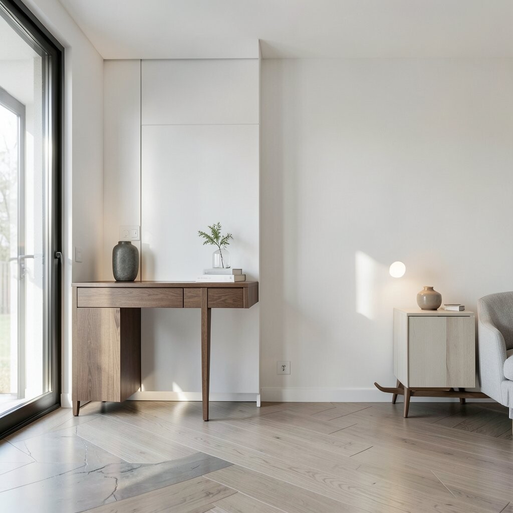
Vintage shapes, serif type, or classic borders can look even better when placed inside a clean modern grid. The mix gives a design a fresh story, with old charm on top of a tidy base.
This contrast feels special because it brings memory and simplicity together in one place. It can be a smart choice for brand work since you can reuse classic pieces in many ways, which helps with cost control and gives room to make the look personal through color, spacing, or paper choice. When done well, it feels current and familiar at the same time.
13. Dark Photography With Soft Glow

Deep photos with a soft glow can look dramatic and smooth, almost like a scene from a film. The darker areas create weight, and the glow guides the eye to faces, text, or key objects.
This look is popular for music art, fashion pages, and premium product ads because it feels rich without being too loud. It can be made with simple lighting or editing, which helps keep the cost under control, and it gives space for personal style through glow color, shadow depth, or background choice. The design feels unique because it carries mood instead of just color.
14. Sharp Angles Against Rounded Forms

Sharp angles can feel fast and bold, while rounded forms feel soft and calm. Put them together and the design gets a lively push and pull that keeps attention moving.
This contrast is easy to use in logos, UI cards, and posters because the shapes are simple but expressive. It can be affordable since basic geometry is quick to make and easy to repeat, and you can personalize it by changing corner size, angle direction, or overlap style. Many fresh layouts use this kind of shape mix because it feels playful without losing control.
15. Light Gradients With Deep Shadows

Soft gradients can melt color smoothly, and deep shadows can anchor the design with weight. Together they create a rich layered look that feels modern and slightly dreamy.
This style is handy for digital art, hero banners, and app screens because it adds depth without clutter. It may take a little care to get the blend right, but it can still be budget-friendly since gradients and shadows are simple digital tools, and it leaves room for personal taste through color choices and shadow shape. The effect feels current because many clean tech and creative brands use layered color right now.
16. Simple Icons With Bold Backgrounds
A simple icon can look tiny on its own, but a bold background makes it shine. The contrast helps the icon feel clearer, friendlier, and more memorable.
This approach works well for labels, apps, and guide graphics where quick reading matters. It is also practical because simple icons are easy to make, reuse, and print, which can keep costs low while giving you room to personalize the color, border, or icon style. Bright circles behind white icons or dark squares behind neon marks can create a lively, modern feel.
17. Mixed Scale In Repeated Patterns
When small shapes repeat next to a few large ones, the whole pattern comes alive. The eye enjoys the rhythm, and the design gets a strong sense of movement.
This idea is great for wallpaper, packaging, and fabric because it adds energy without needing a full scene. It can be cost-friendly when built from a simple repeat system, and it gives many ways to personalize through scale, spacing, and color mix. Current pattern work often uses this kind of size contrast to keep prints fun and easy to remember.
18. Matte Finishes With Metallic Touches
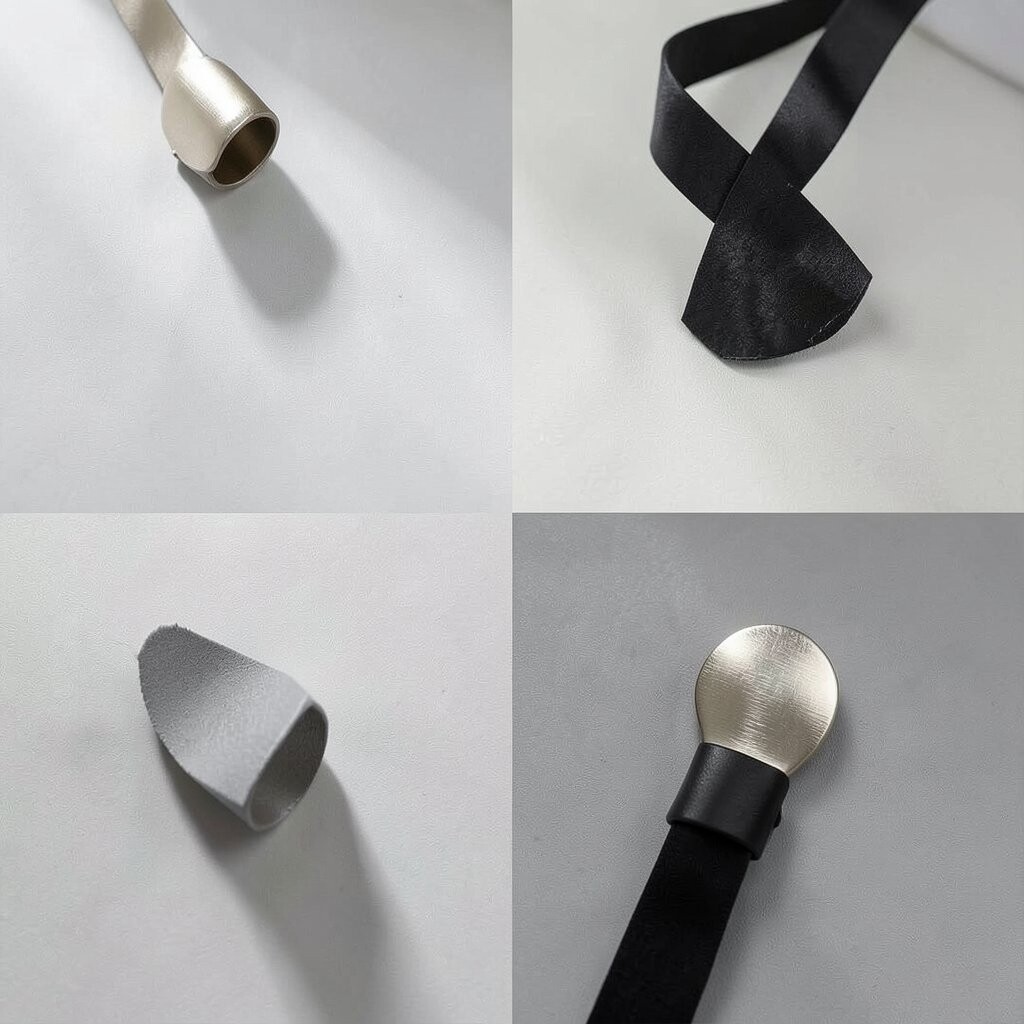
A matte surface feels soft and quiet, while metallic details catch light and spark interest. The mix looks rich and balanced, with the shine acting like a small moment of surprise.
This contrast is common in premium packaging and invitation design because it gives a high-end look without filling the page. It can cost more than plain printing if real foil is used, but small metallic accents can be worth it, and digital metallic tones can be a cheaper way to get a similar feel. You can make the look personal with gold, silver, copper, or even cool chrome touches.
19. Busy Backgrounds With Clear Foreground Shapes

A detailed background can feel lively, but it needs a simple foreground shape to stay readable. The bold front layer gives the design structure and keeps the viewer from getting lost.
This contrast works well for ads, event flyers, and cover art because it adds excitement and control at the same time. It can also help with budget planning since a single clean shape can hold a lot of text or branding, and that makes the layout easier to build and adjust. For a personal twist, use a shape that matches your story, like a frame, circle, or tall panel.
20. Pastel Colors Beside Pure Black
Pastels feel soft and sweet, and pure black makes them look sharper and more serious. The strong edge of black gives the gentle colors more power than they would have alone.
This pairing is a good fit for fashion, beauty, and lifestyle design because it feels stylish and easy to live with. It can also be practical for printing, since pastels often work well on a light base and black adds a clear anchor without much added cost, and you can personalize the balance by making black dominant or letting the soft colors lead. Many current brands use this mix to stay friendly while still looking polished.
21. Layered Transparency With Solid Forms

See-through layers can create a soft overlap, and solid forms keep the structure firm. The mix feels airy and modern, with each layer adding a bit of depth to the scene.
This style is useful in web design, presentations, and promotional art because it makes space feel active without becoming messy. It is often easy to build with simple shapes, which keeps the cost low, and it gives room for personal style through opacity, color blending, and layer order. When the transparent parts overlap in the right way, the design gets a unique glow that feels light and smart.
22. Minimal Layouts With One Loud Visual Punch

A minimal layout can feel calm and tidy, then one loud visual punch brings all the energy. That single strong image, color burst, or shape can turn a quiet page into something people remember.
This approach is a favorite for modern branding because it keeps things simple while still feeling bold. It can also be a wise cost choice since you only need one standout element to do most of the work, and it leaves plenty of room for personalization through the exact image, color, or placement you choose. The clean space around that punch makes the whole design feel intentional, fresh, and easy to use across print and screen.