Your shelves can look amazing or quietly messy in a single decision. Small styling mistakes add up fast, but fixing them is surprisingly simple.
1. Overcrowding Every Inch
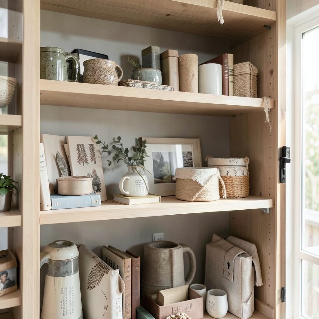
When shelves look packed from edge to edge, your eyes never get a break. Leaving breathing space makes the room feel calmer and more intentional.
Try starting with fewer pieces and adding only what truly belongs. Use one larger item and two smaller accents around it instead of lining up many similar objects. If you hate empty space, fill it with texture like a woven tray or a stacked book set rather than more items.
2. Ignoring Height and Creating a Flat Line
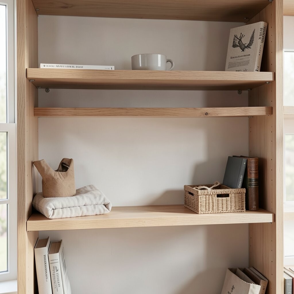
If every object sits at the same height, the shelf can look like a row of duplicates. Height variation adds movement and makes even simple decor feel styled.
Place taller items at the ends or in the back, then bring shorter pieces forward. Mix standing decor, books, and picture frames so the silhouette changes from top to bottom. For quick balancing, build a “tower” using one tall vase plus two shorter items on either side.
Consider the space above the shelf too, because items that are too low can feel lost. A small sculpture paired with a higher frame often looks more finished than several medium objects. If your shelf feels flat, adjust just one side first and compare.
3. Choosing a Color Mix That Competes
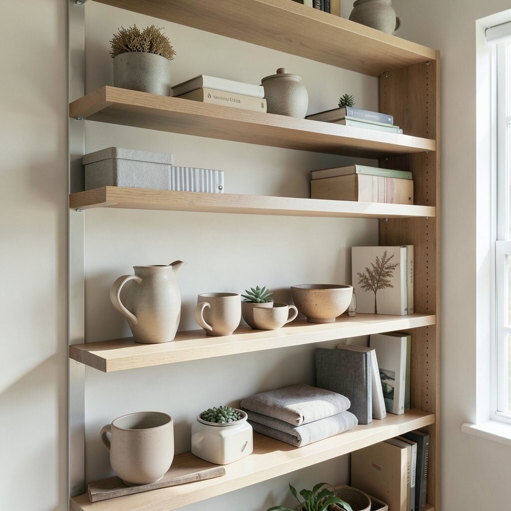
Bright mismatched colors can steal attention from the room and from each other. A shelf should guide the eye, not bombard it.
Pick a main color family and support it with one or two accent tones. For example, warm neutrals like cream and wood can be grounded by a single rich color such as terracotta or deep green. Keep other items in lighter shades so they act like soft background.
Also watch for repeating patterns that clash, like two busy prints next to each other. If you love pattern, balance it with solid items and add one plain book spine. When in doubt, limit yourself to three dominant colors across the whole shelf.
This approach looks intentional even when you use thrift finds. You can still personalize it by letting your favorite color appear in just one hero piece.
4. Skipping a Focal Point
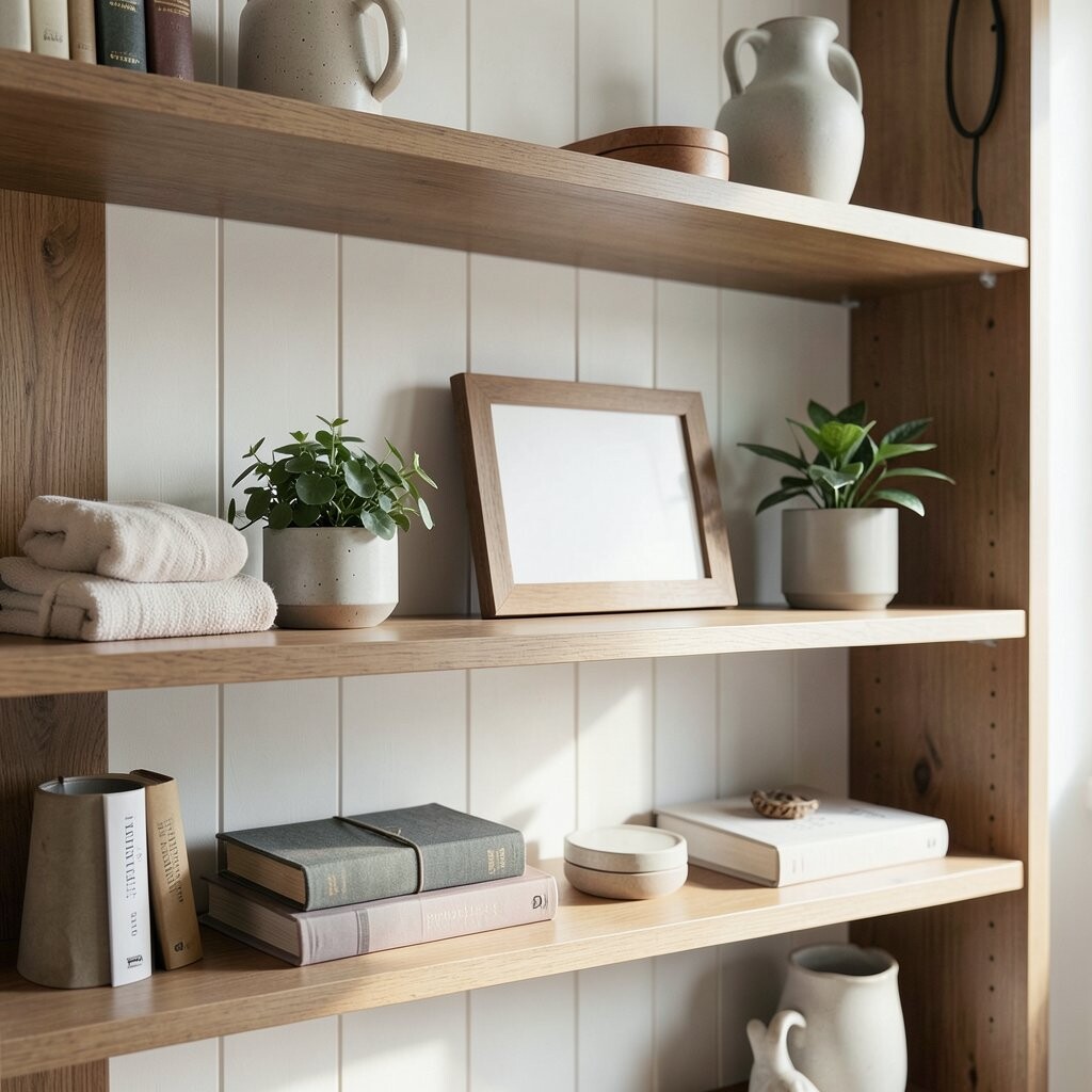
A shelf without a focal point can feel like random clutter. You need one anchor that tells your brain, “This is the main moment.”
Choose something that naturally draws attention, like a large artwork, a tall vase, or a chunky candle holder. Arrange smaller items around that anchor so the rest feels supportive instead of competitive. If you’re building from scratch, place the focal piece first, then add everything else after.
5. Styling Only the Front Row
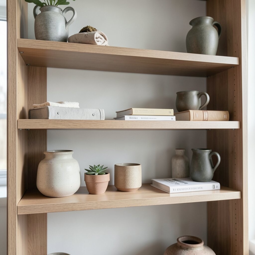
When everything faces forward, shelves can look like a display case with no depth. Adding back-layer pieces creates a richer, more realistic look.
Use the back corners for taller items and place slimmer decor toward the middle. Keep some objects slightly behind others so you get visible layering. Even a simple stack of books can become a back “platform” for smaller accents.
Don’t forget that shadows matter, too. Objects placed at different distances from the front edge catch light differently. Try moving one item backward by a few inches and see how the shelf suddenly looks more dimensional.
6. Using Only One Size of Everything
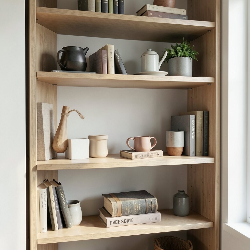
All-similar sizes make a shelf feel repetitive and a little boring. A beautiful shelf thrives on variety, like a good outfit with different textures.
Combine large pieces, medium pieces, and small accents in the same area. A good rhythm is one big item, two medium items, and a couple of tiny touches. You can make medium items out of books, framed photos, or small bowls.
7. Forgetting Negative Space With the Trays and Baskets
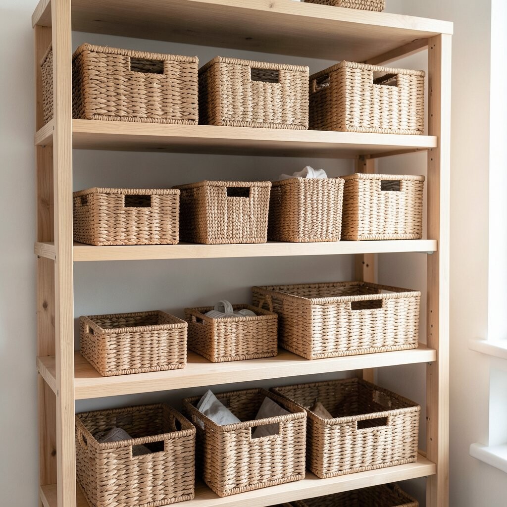
It’s easy to think baskets and trays automatically create order. But if they’re packed with similar objects, you lose the tidy effect.
Use trays to corral items with purpose, not to store extra clutter on display. Leave a little room inside trays so contents don’t feel shoved together. If you use a basket for cables or remotes, keep the visible top layer simple.
Try mixing one tray with a single decorative object inside it, like a candle or a mini plant. This keeps the basket from becoming just another container. Your shelves will look styled rather than stored.
8. Putting Too Many Candles and Wicks on Display
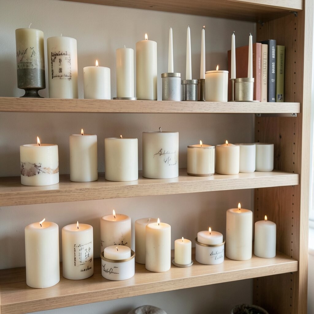
Candles look cozy, but a whole shelf of them can turn into “too much of the same.” The visual result can be heavy, especially in bright rooms.
Choose one or two candle holders and let the rest of the shelf use other materials like glass, ceramic, or wood. If you love multiple candles, rotate them by season rather than keeping every one out year-round. Even a matching pair looks better than a scattered group.
To keep the shelf practical, place candles where you can access them easily for evening use. When you remove one, keep the styling balance by replacing it with a small book stack or a vase.
9. Matching Everything Too Perfectly
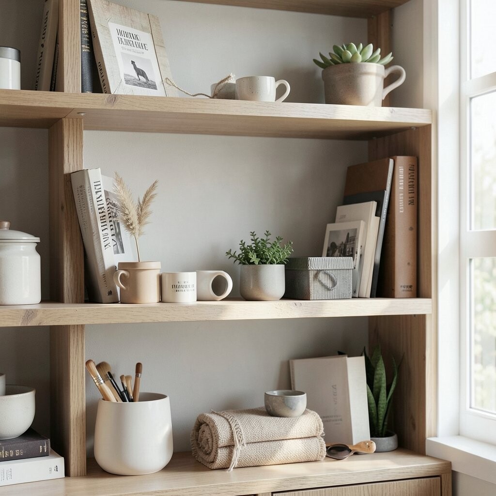
When every piece matches, the shelf can feel like a showroom instead of a home. Personal spaces need a bit of personality and contrast.
Let one item differ in shape or finish so the shelf feels lived-in. A matte ceramic next to a glossy frame, or a rustic wood tray paired with sleek decor, can look better together than identical sets. Mix new items with older ones so the shelf tells a story.
Try a “mostly coordinated” rule: match the colors, vary the shapes. This keeps your shelf cohesive while still feeling special.
If you accidentally buy a perfectly matched set, style it with one contrasting piece you already own. That small tweak prevents the shelf from looking flat and staged.
10. Not Accounting for Shelf Depth
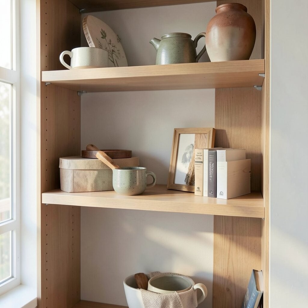
A shelf that’s shallow needs different styling than a deep one. If you place large items the same way on both, you may block sightlines and crowd the front.
For shallow shelves, favor fewer items with more vertical presence, like tall frames or slim vases. For deeper shelves, layer by placing deeper objects in the back and smaller pieces closer to the front. This helps the entire shelf look intentional rather than cramped.
Measure before you buy anything, even small decor. A piece that looks fine in a store can overpower a narrow shelf at home. If you’re unsure, use paper cutouts or painter’s tape to map out spacing.
11. Forgetting Proportion With Big Art or Mirrors
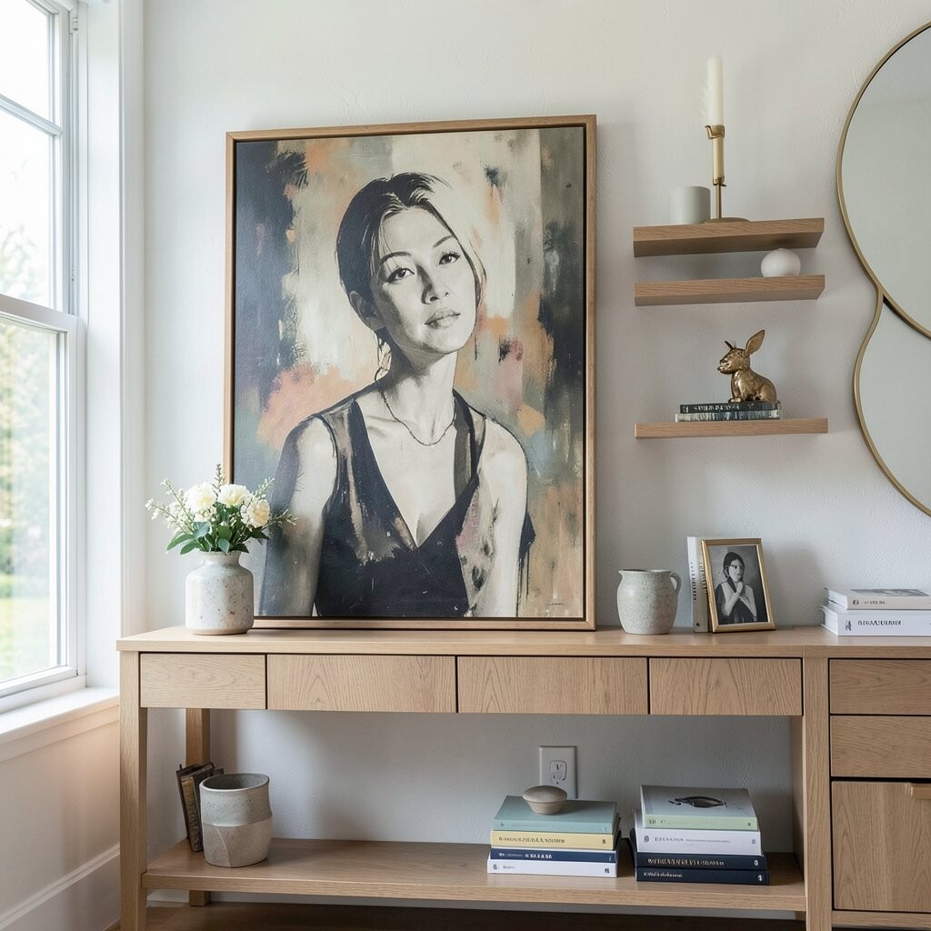
Oversized wall decor above shelves can dwarf the items below. Proportion mismatch can make the whole area feel off-balance.
When you have big art, keep the shelf styling simpler and more structured. Use fewer objects but give them stronger shapes, like a tall vase and a medium book stack. If the art is smaller, you can afford more variety on the shelf below.
Also check the distance between the shelf and the decor above it. If things feel too close, move shelf items slightly outward or use taller pieces to create visual separation. A little spacing creates a lot of calm.
12. Displaying Items Without a Clear Reason
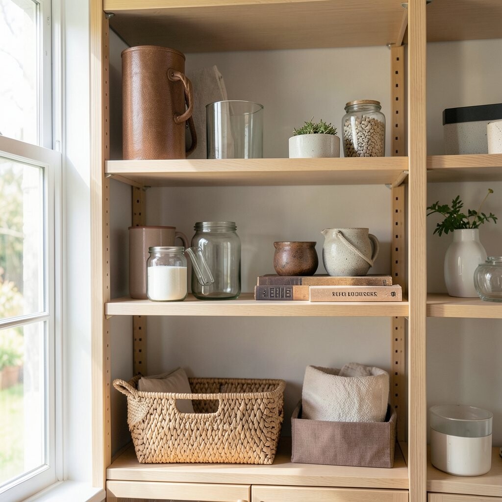
A shelf looks best when each item earns its spot. If you can’t explain why something is there, it may be taking up visual energy.
Group items that share a purpose, like travel souvenirs, reading favorites, or everyday rituals. A shelf can be decorative and functional at the same time, so choose items you actually use or love. For practical decor, place things you grab often, like a small tray for keys or a candle for evenings.
If you feel stuck, start with categories and then pick one item per category. That gives your shelf a natural logic without needing a complicated plan.
13. Neglecting Texture and Sticking to One Material
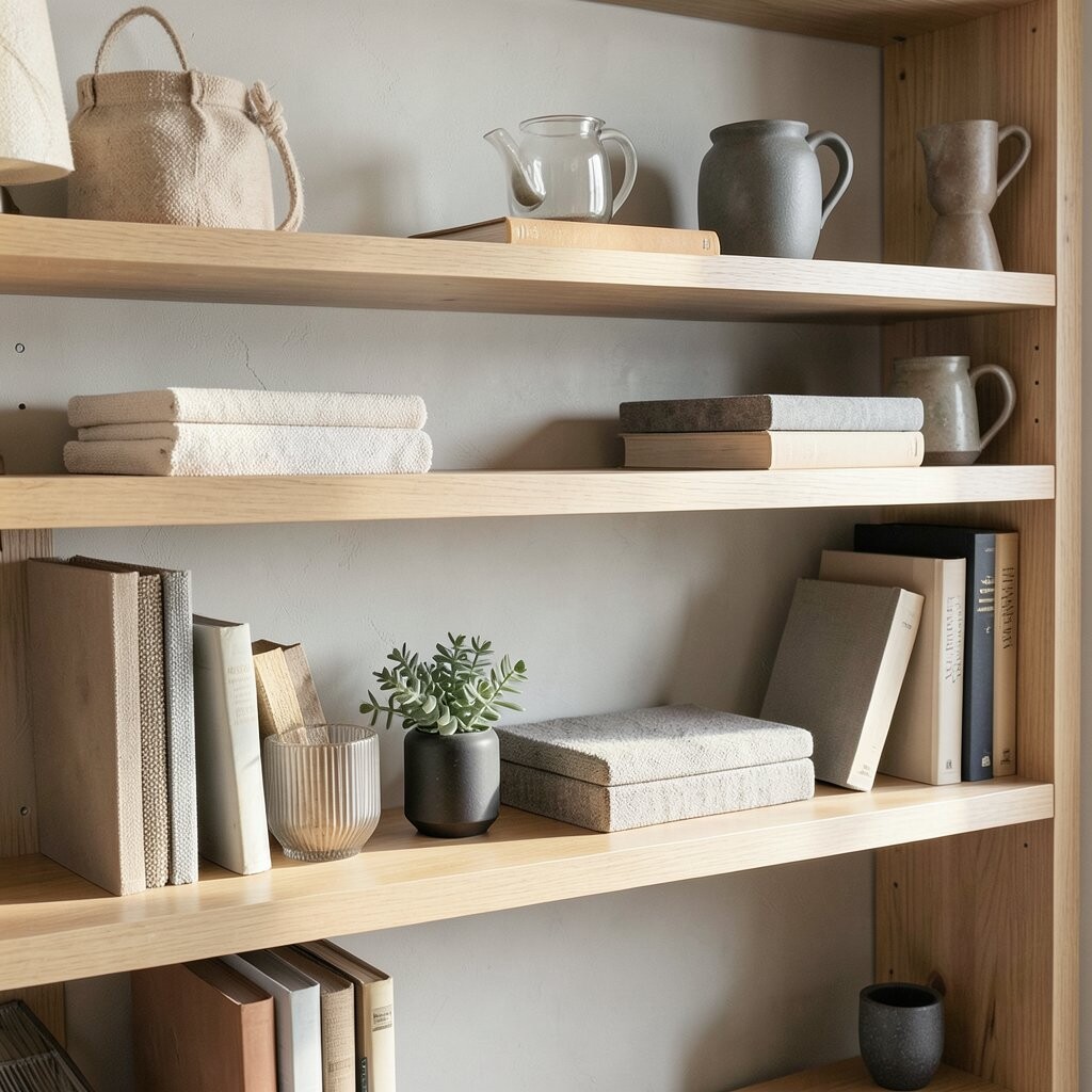
All smooth, all glass, or all metal styling can feel chilly or flat. Texture adds warmth and makes the shelf look more realistic.
Combine materials like ceramic, wood, linen, and woven accents. For example, pair a ceramic vase with a textured throw or a small woven basket. Even one fabric element, such as a folded scarf tucked behind books, can soften the overall look.
Look for contrast in finish too, like matte next to shine. This helps the shelf feel curated rather than random. If you’re unsure what texture to add, choose something tactile and small so it doesn’t overwhelm.
14. Not Turning Books to the Style You Want
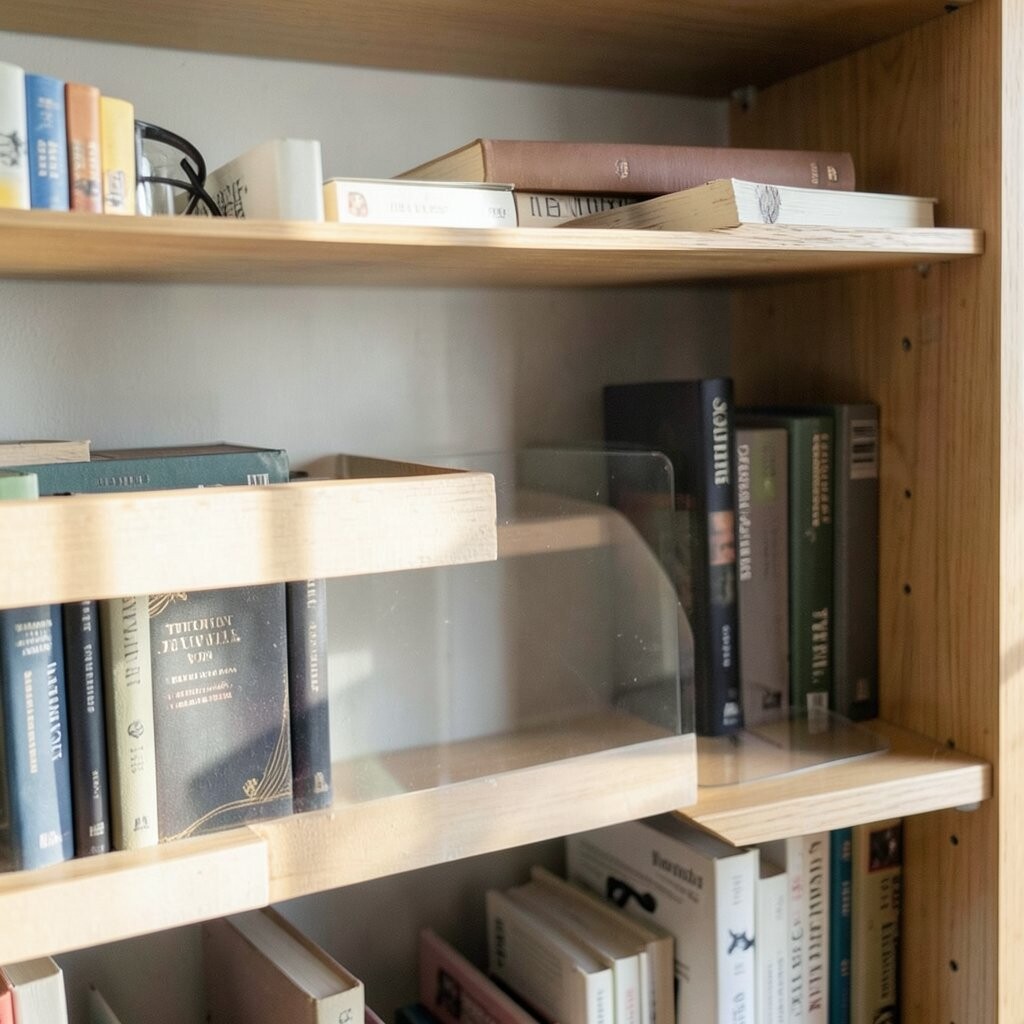
People often stack books in a way that hides the colors or patterns they love. Book styling is one of the easiest ways to create a cohesive look.
Use both vertical and horizontal stacks to create rhythm. Rotate book spines so the colors flow with your shelf palette. If you have a mix of random covers, consider wrapping one stack with a plain band so it supports the design instead of fighting it.
15. Placing Plants Like They Don’t Belong
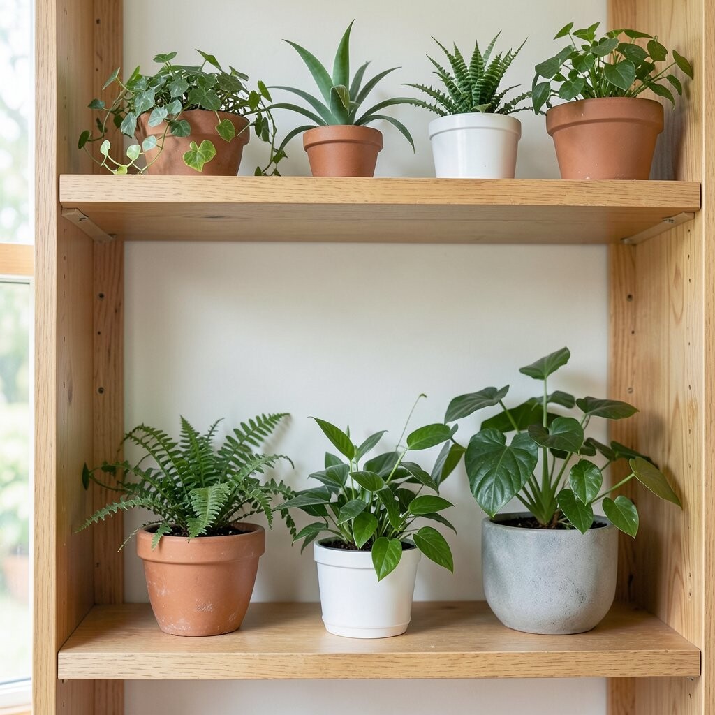
Plants can look awkward when they’re randomly dropped onto shelves. They need the right pot size, height, and placement to feel natural.
Choose a plant that matches the shelf conditions and your lifestyle, then style it with the pot as part of the design. Group plants with complementary items, like a small vase or a framed botanical print, so the plant feels intentional. Use a tray or a decorative planter cover to keep the look neat.
Don’t overcrowd with multiple tiny pots unless you’re going for a garden vibe. One healthy plant often reads more polished than several struggling ones. If your plant is tall, set it toward the back and build height with a book stack underneath only when needed.
16. Choosing the Wrong Lighting for the Shelf Area
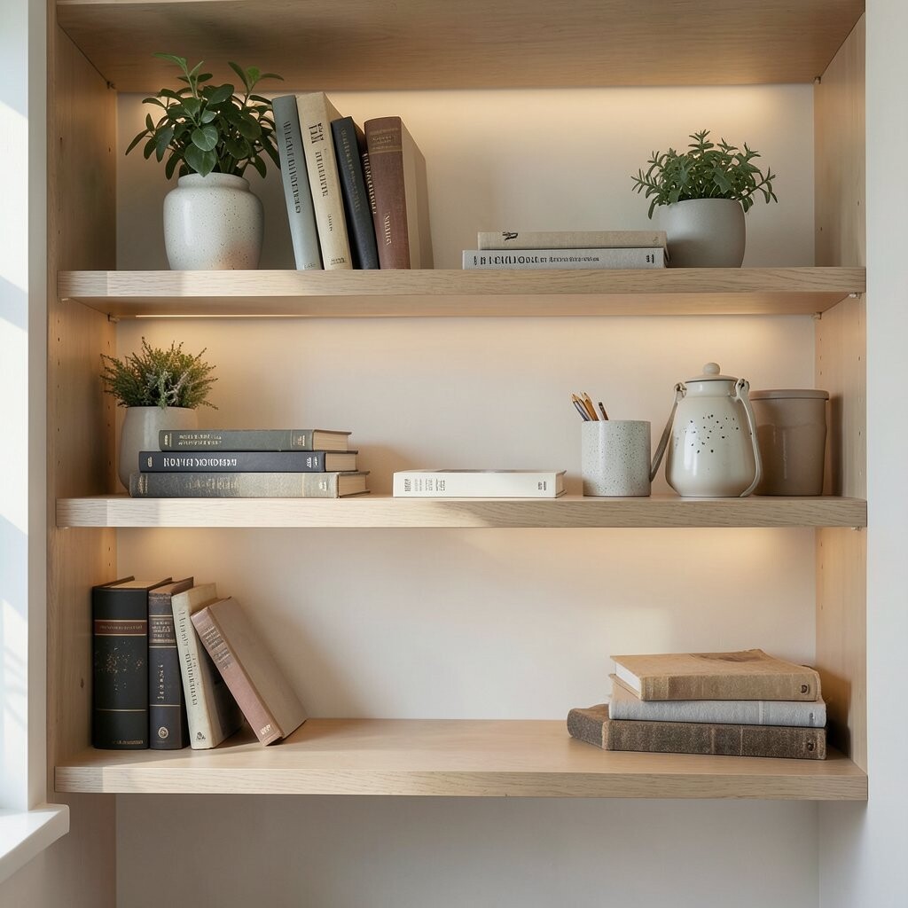
Even the best decor can look dull without the right lighting. Harsh overhead light can wash out colors, while warm lighting can make everything feel inviting.
If possible, use picture lights, small lamps, or LED strips to highlight your focal point. Aim light so it grazes objects and creates soft shadows, which makes textures and depth show up beautifully. Keep bulbs consistent in color temperature so the shelf looks coordinated.
Test how your shelf looks at different times of day. A piece that looks perfect in daylight can look flat at night. When the lighting changes, adjust placement slightly to keep the shelf’s “main moment” visible.
17. Letting Clutter Sneak In Through Storage “Accidents”
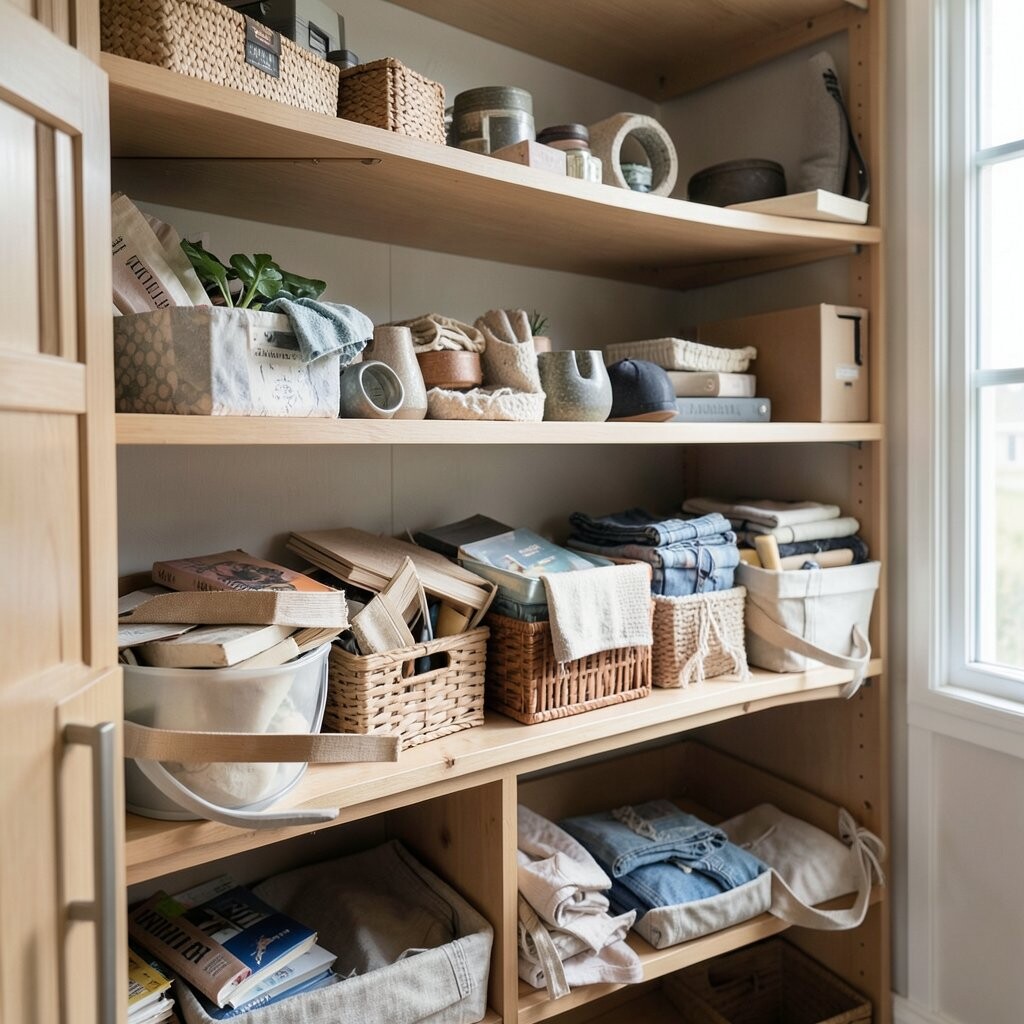
Sometimes shelves fail because small clutter keeps returning. Paper stacks, random cables, and everyday items can slowly take over your carefully styled look.
Use storage with a plan, like a closed container for backups or a dedicated bin for tech. Keep one or two “display slots” for items you want to show, and store the rest out of sight. A shelf stays beautiful when it has boundaries.
Do a quick reset every week by removing anything that doesn’t belong. If it doesn’t fit your shelf theme, put it away right away. That habit keeps your decor from turning into visual noise.
18. Overlooking the Backing, Background, and Wall Color
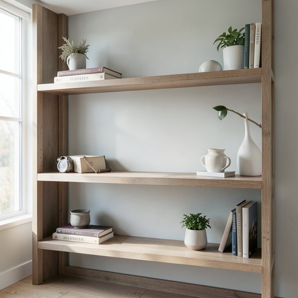
The wall behind your shelves can either support your styling or make it feel messy. A busy wall pattern can make your items look busier than they are.
If your wall is bold, keep shelf colors quieter and shapes simpler. On neutral walls, you can add more variety without overwhelming the scene. You can also improve contrast by using a plain backdrop like a fabric panel or removable wallpaper near the shelf area.
Think of the shelf like a stage, where the background affects the performance. When the background feels right, the same objects look cleaner and more intentional. Adjustments here cost little but change a lot.
19. Ignoring Seasonal Swaps and “Stale” Styling
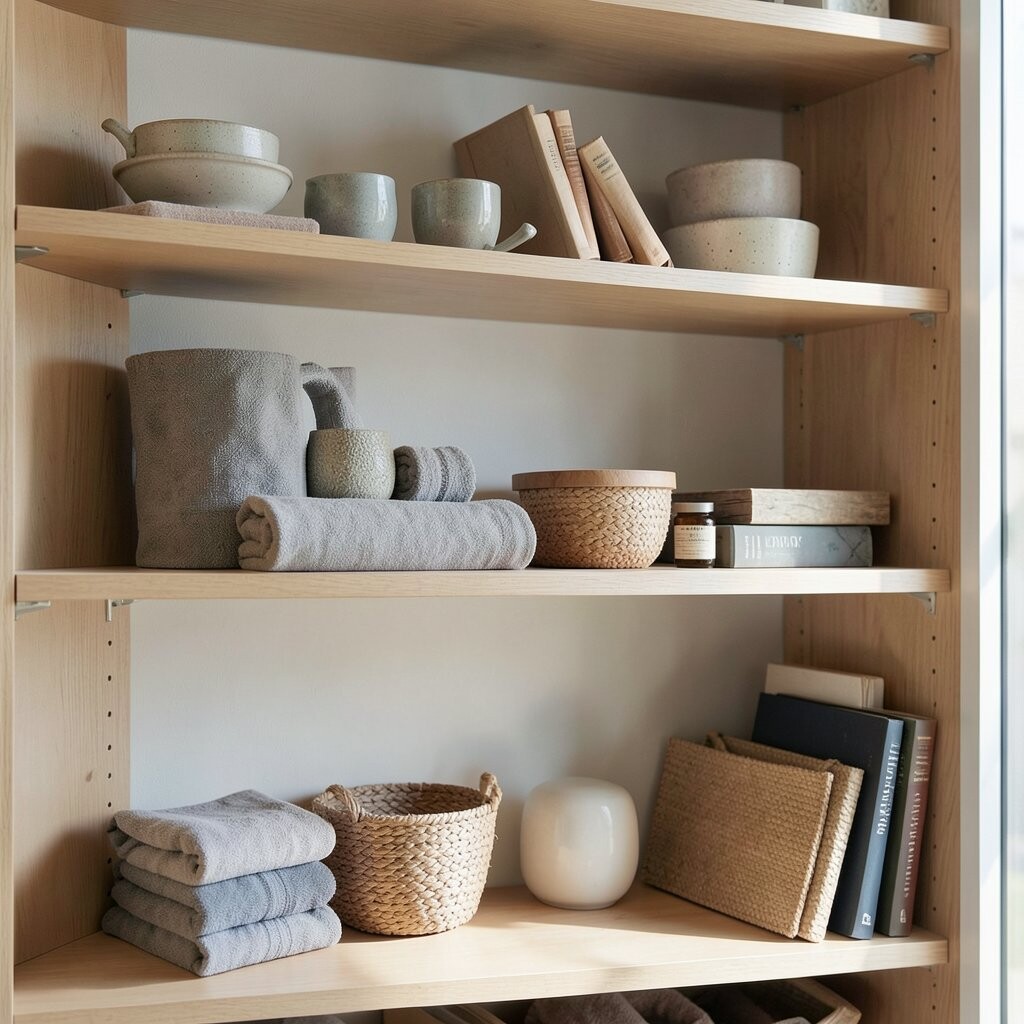
Keeping the same shelf styling for months can make your space feel stuck. Even when the decor was perfect, your home changes with your seasons and routines.
Refresh the shelf by swapping one or two items at a time, like changing candle holders, using seasonal greenery, or rotating framed photos. This keeps the look current without buying a whole new set. A small seasonal update also gives you a reason to tidy and re-check spacing.