Fresh paint can make your kitchen feel brand new. The right color choices can also make everyday cooking feel easier.
1. Soft Warm Neutrals With a Clean Edge
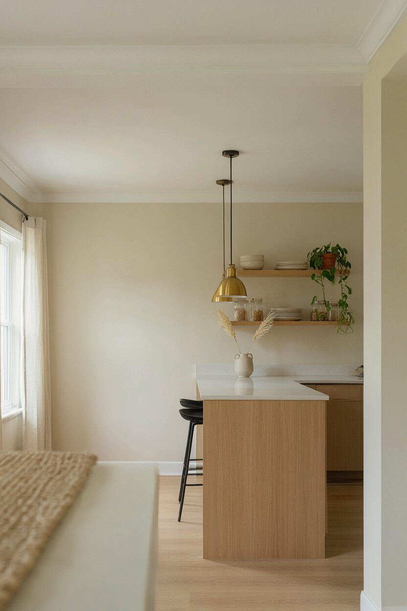
Try a warm neutral like creamy beige or light greige on walls. Keep the trim crisp with bright white for instant contrast.
This modern look feels welcoming without being too busy. Warm neutrals help natural light bounce around the room, making spaces look larger. Choose a satin or soft-sheen finish so wiping away splatters stays simple.
2. Two-Tone Kitchen Walls With a Statement Midline
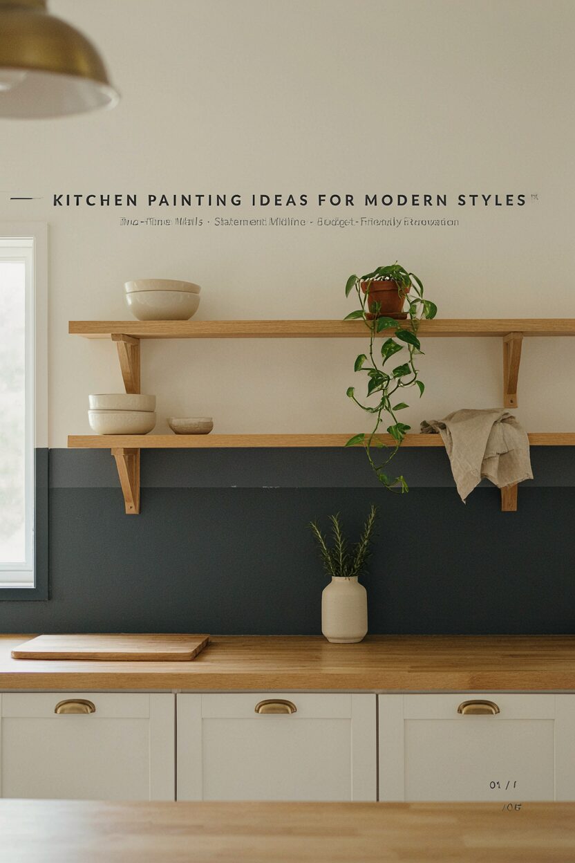
Paint the bottom half in a slightly deeper tone and the top half in a lighter shade. Add a clean “midline” where the colors meet for a tailored feel.
This design can hide scuffs and make the room feel balanced. Use painter’s tape to make the line straight, then remove it while the paint is still slightly tacky. For durability, pick a kitchen-safe wall paint that resists stains.
To personalize, match the lower color to your cabinet hardware or backsplash grout. If you worry about choosing shades, pick one color family and go two steps lighter or darker. Budget-wise, two-tone walls may mean extra paint and tape, but it’s still often less costly than a full renovation.
3. Matte Charcoal Accents for a Modern Contrast

Use matte charcoal on one wall or on a narrow strip near the ceiling. Pair it with light cabinets or pale countertops to prevent the space from feeling heavy.
Charcoal can make modern hardware and lighting stand out in a sleek way. It also hides minor marks better than high-gloss paint. Apply primer first if your wall is stained, and use a low-sheen finish to keep the surface soft and current.
This idea is unique because it leans moody without turning the whole room dark. If you like the look but want it gentler, try “smoky” gray instead of true charcoal. Keep the cost under control by painting only one feature wall and using sample pots to confirm undertones.
Current trend-wise, contrast walls keep showing up in modern kitchens, especially when paired with warm wood and brushed metal. Add interest by painting a simple chair rail or leaving the top wall neutral. Then use accessories like a black utensil crock to tie the theme together.
4. Crisp White Cabinets With Color-Blocked Backsplashes
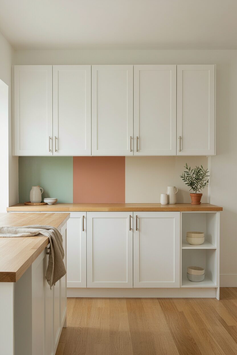
Stick with crisp white cabinets and paint the area around your backsplash with subtle color-block panels. Even a small painted accent can update the look fast.
White cabinets keep the kitchen bright while painted blocks add a modern rhythm. Choose a backsplash paint made for kitchens, or use a primer-rated bonding coat for best adhesion. This setup is practical because you can focus paintwork on a smaller area instead of repainting everything.
5. Sage Green Walls for a Calming Modern Mood
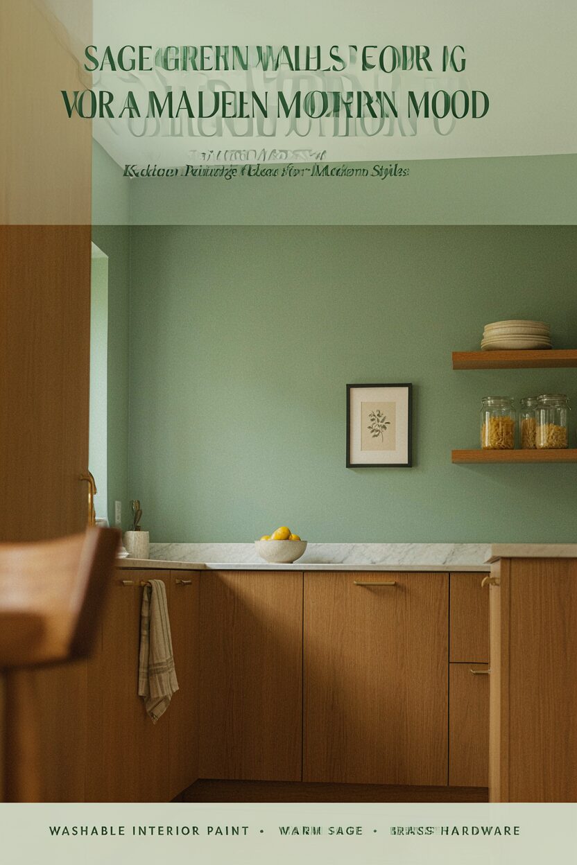
Sage green walls feel fresh and calm, especially in kitchens with warm wood tones. It reads modern, but it still feels natural and cozy.
Sage also pairs beautifully with brass, black, or brushed nickel hardware. Pick a washable interior paint so everyday splashes are easy to clean. For uniqueness, try sage with slightly warmer undertones rather than icy green.
To personalize, coordinate your dish towels and wall art in matching tones. If you’re concerned about color depth, start with a light sage and test it on two spots in the room. Budget-wise, this is usually affordable because you’re updating walls, not replacing anything.
6. Light Blue “Airy” Walls With Natural Light Boost
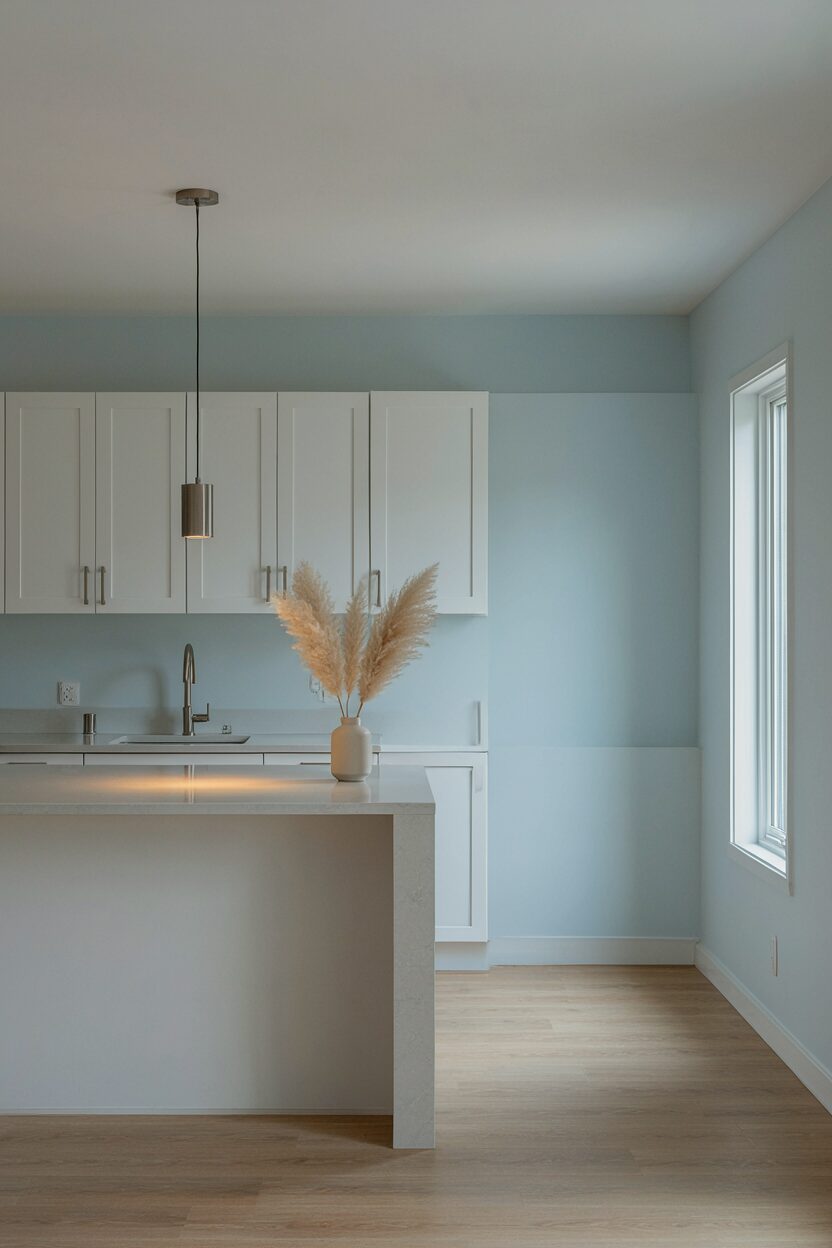
Choose a very pale blue that feels like sky or morning air. This shade can make a kitchen feel open and breezy.
Light blue can refresh your space without pulling focus from your cabinets. It also works well with white, cream, and light gray countertops. Use a semi-matte or satin finish so the walls stay easy to wipe.
To make it feel truly modern, keep the rest of the kitchen simple and streamlined. Add one metallic accent like a brushed steel faucet or pendant light. If your kitchen has cool lighting, test the paint at different times of day so the undertones stay flattering.
7. Vintage-Inspired Cream With Modern Hardware Pairing
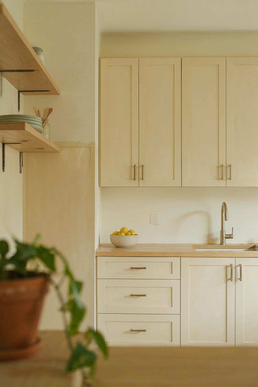
Paint walls in a vintage cream, then choose sleek hardware to balance the look. The mix of old-style warmth and modern lines feels curated.
This approach is beneficial because cream tones hide uneven wall texture better than stark whites. It also makes your cabinetry feel brighter without the glare that some white paints create. Prime properly, especially if you’re covering a darker color, to avoid flash-through.
For practical tips, paint in sections and keep a “wet edge” so you don’t see roller marks. If you want a unique twist, add a creamy glaze wash on one accent area for gentle depth. Cost is usually mid-range, mainly depending on how many coats your current wall color needs.
8. Bold Red Kitchen Door or Pantry Nook
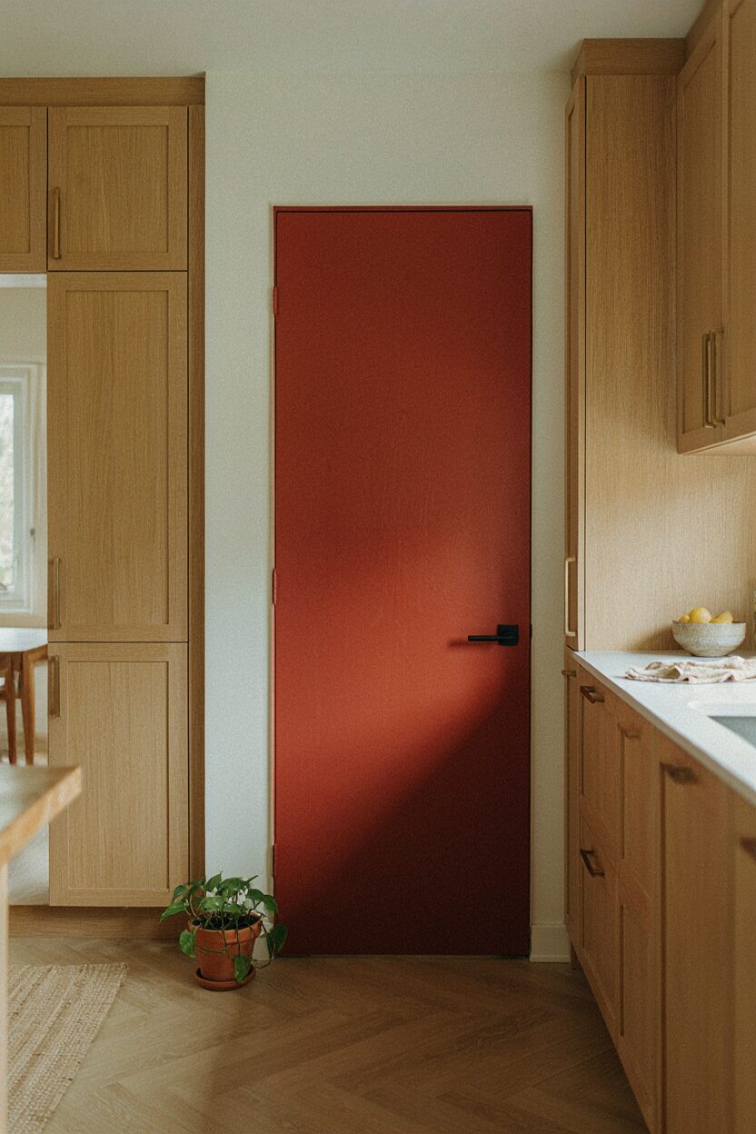
Pick a bold red for a door, pantry, or interior niche. A single pop of color can look surprisingly high-end in a modern kitchen.
Red adds energy, and it can make your kitchen feel more lively and confident. It’s also unique because you’re highlighting one functional space instead of coloring the entire room. Use durable cabinet paint or a paint rated for high-touch areas.
Keep it practical by painting the door flat on a drop cloth if possible, then reinstall carefully. If full removal is too much, use painter’s tape and work slowly around hinges. To personalize, choose a tomato red for warmth or a deeper cherry shade for drama.
When budgets are tight, painting one door is a smart upgrade. Current trend-wise, single-color focal points show up in many modern interiors, especially next to neutral cabinetry.
9. Textured Limewash Look for Soft Organic Modern Style

Consider a limewash-inspired paint effect for walls that look softly layered. This gives a modern, artistic feel without needing bold color.
The benefit is that it adds depth and interest even with simple decor. It also hides minor wall flaws better than perfectly flat paint. For best results, follow the product instructions and apply in even strokes, then avoid overworking the surface.
10. Warm Greige Walls With Black Trim Details

Go with warm greige for your walls, then add black accents on trim, window frames, or shelving. The contrast feels sharp and modern.
Greige is helpful because it sits between beige and gray, so it works with many countertop styles. Black trim makes shapes look crisp and can visually frame your kitchen. Use a semi-gloss or satin for trim so it wipes clean and stands up to splashes.
This idea is unique because it focuses on framing rather than covering everything in color. To personalize, match the black tone to your faucet or light fixtures. Cost is reasonable since you may only need to paint trim plus the main walls.
11. Coastal White With Sea Salt Undertones
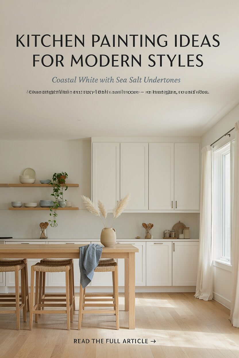
Use a coastal white with a gentle gray or green undertone. It keeps the room bright while still feeling a little more interesting than plain white.
This look benefits anyone who wants clean lines without cold vibes. It also works well if your kitchen gets lots of sun, because it won’t look harsh. Choose a washable, mildew-resistant paint if your kitchen has higher humidity.
To personalize, add light blue or sandy-colored accessories to echo the undertone. If you have darker cabinets, the sea-salt white can help the whole area feel lighter. Budget-wise, white walls are often faster to paint, which can reduce labor costs if you hire out.
12. Olive Green Lower Cabinets or Island Only
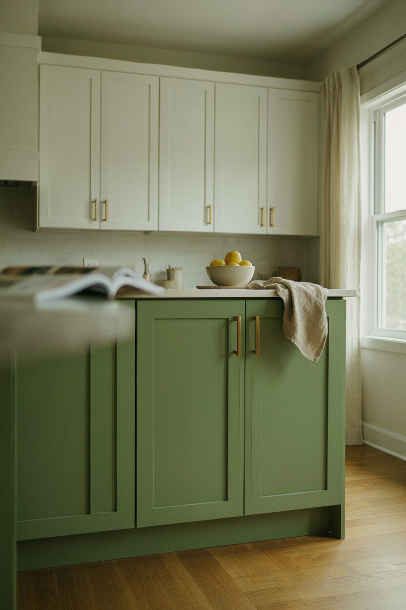
Paint lower cabinets or your kitchen island in olive green for a modern earthy vibe. It pairs nicely with white walls and warm metals.
Olive brings warmth and sophistication, and it can make wood floors and brass hardware look richer. Keeping the color to the island or base cabinets keeps the room from feeling too dark. Use cabinet paint and a primer that bonds well, especially if you’re going over glossy surfaces.
For practical tips, label doors as you remove them so re-hanging stays simple. Consider a smooth finish for easy cleaning, since islands see a lot of food prep. Personalize by choosing an olive with more gray for a calmer look or more yellow for a sunnier feel.
Cost considerations are manageable because painting one area often uses fewer supplies. Trend-wise, olive and muted greens are popular for modern kitchens that want character without going full bold.
13. Pastel Pink Tucked Into Nooks and Panels
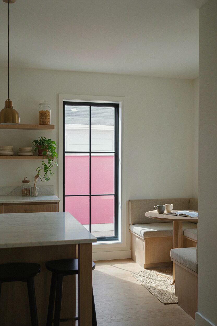
Try pastel pink in a small area like a window panel, breakfast nook wall, or inside cabinet detailing. It can feel sweet but still modern when used sparingly.
Pink can brighten the mood and add charm while still letting your overall kitchen palette stay neutral. Use it where light hits well, like near a window or under lighting. This idea stays practical because you only paint a small surface, which reduces both time and cost.
14. High-Gloss Feature Wall Behind Open Shelves

Paint the wall behind open shelving with a higher-gloss finish. It gives a slick, gallery-like look and makes shelves feel more intentional.
Glossy surfaces reflect light and can make the kitchen look sharper and more modern. The downside is that it can show imperfections, so smooth prep matters. Sand rough areas, spot-prime stains, and use a quality paint to avoid streaks.
To personalize, choose a color that works with your shelf contents, like a deep green or bold navy. Current trends lean toward “statement zones,” so pairing open shelving with a glossy accent fits right in. Budget-wise, you may spend a bit more on premium paint, but the impact is big for the amount of wall covered.
15. Deep Navy and White for a Nautical-Modern Edge
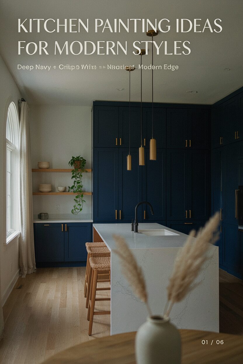
Use deep navy on walls, then balance it with crisp white cabinets or bright trim. This creates a strong modern contrast with a calm, collected tone.
Navy is unique because it feels bold yet refined, especially with brushed metal lighting. It can also hide wall marks better than lighter shades. For practical results, choose a paint that resists scuffs and apply two coats for even color depth.
Personalization idea: add a natural wood shelf or rattan accent to soften the contrast. If you worry about darkness, use navy only on two walls or paint the lower half. Cost considerations are similar to other wall projects, but navy may require extra coats if your current walls are light or stained.
Modern trend-wise, navy remains popular as a “grown-up” alternative to black. It also looks stunning with warm brass and matte black accessories.
16. Muted Terracotta for a Cozy Modern Feel
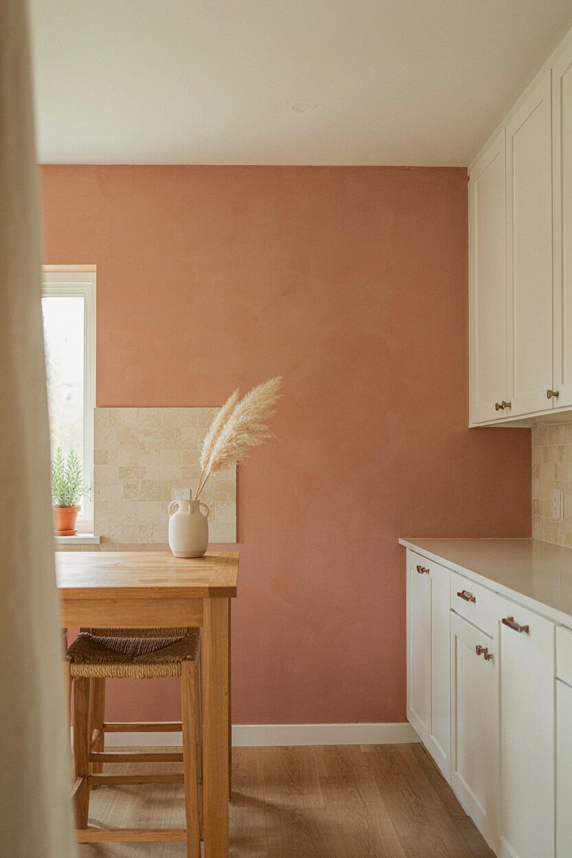
Pick a muted terracotta on one wall or on the kitchen’s lower accents. It brings warmth without the heavy look of bright orange tones.
Terracotta can make the kitchen feel inviting and makes neutral materials feel more grounded. It also pairs well with white cabinets, travertine-style backsplashes, and earthy floors. Use a washable finish so the warmth stays beautiful after cooking days and cleaning days.
17. Color-Matched Backsplash Panels Using Paint
Create painted panels that match your backsplash colors, even if your backsplash is tile or stone. You can paint a section of wall that “echoes” the pattern for a custom look.
This is unique because it ties together materials that might otherwise feel disconnected. It also helps your kitchen look more designed, even on a smaller budget. Use masking carefully and test your colors on scrap board so the tones match under your kitchen lighting.
For practical tips, clean the wall thoroughly and use a primer that works with your surface type. Choose a paint rated for kitchen use so it holds up behind the sink or stove area. Cost considerations are often lower than replacing tile, especially if you’re working on only one section.
18. Monochrome Gray With Subtle Shade Variation
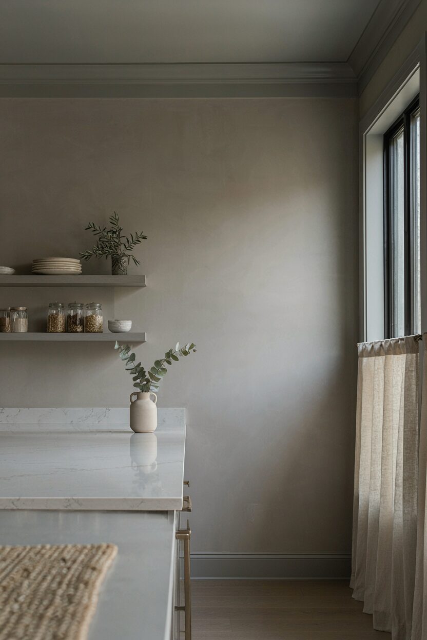
Go monochrome by using two or three shades of gray across walls and trim. Keep the undertones similar for a modern, calm flow.
Monochrome feels sleek and modern because it reduces visual “noise.” The benefit is that gray also pairs with most metals and countertop colors. To personalize, add a warmer light gray for the walls and a cooler gray for trim to create gentle depth.
For practical advice, pick a top-quality primer and plan for at least two coats to prevent patchiness. This is usually cost-friendly because you’re buying a small paint family instead of many unrelated colors. Current trend-wise, monochrome kitchens keep coming back because they look timeless and photograph well.
19. Soft Butter Yellow for a Gentle Upgrade
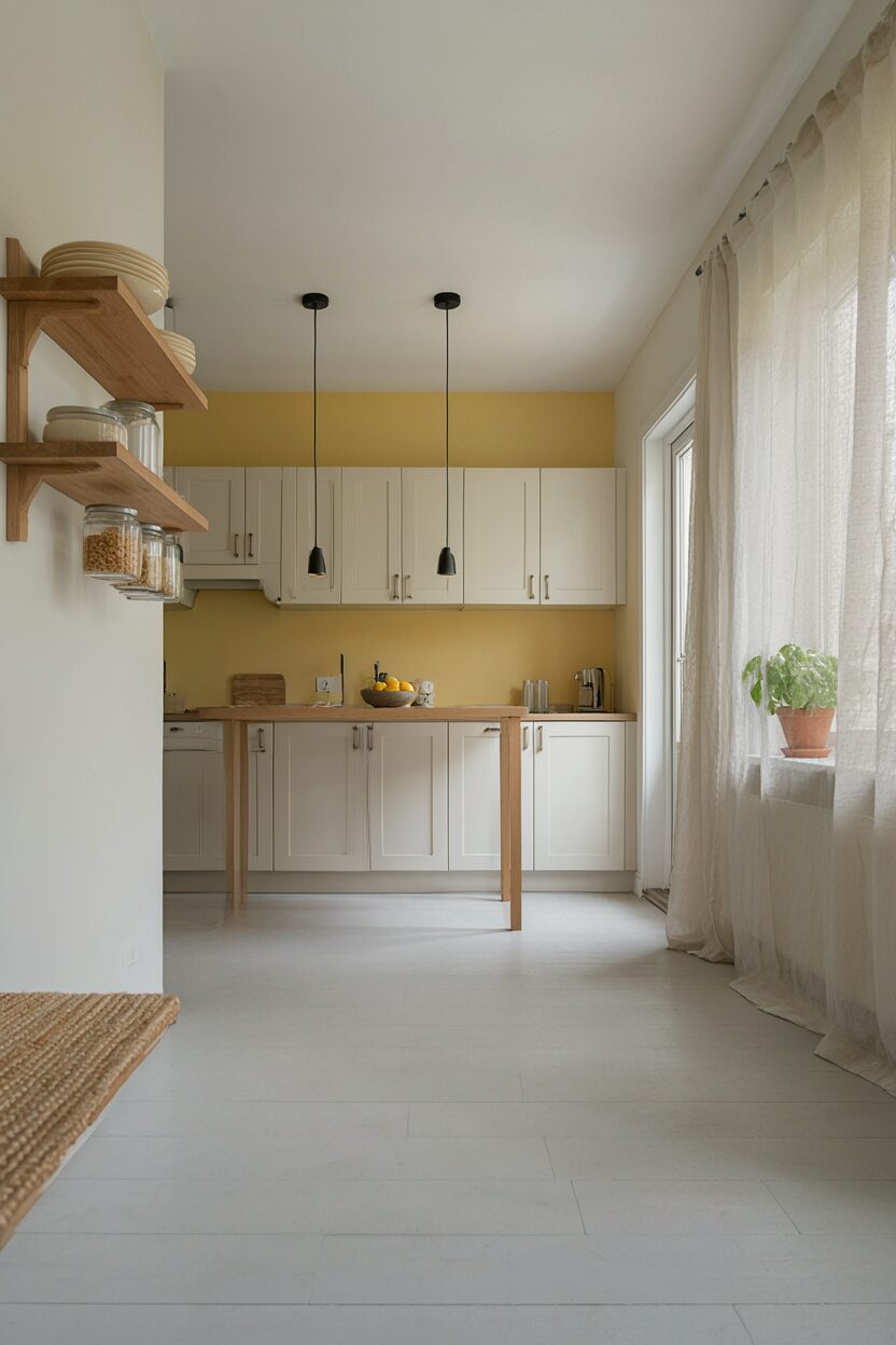
Choose a soft butter yellow that feels sunny but not loud. It can brighten a kitchen while still reading modern.
Yellow walls can make the room feel more cheerful, especially if your lighting is cooler. This look is unique because it’s not the bold “mustard” everyone expects, so it stays refined. Use a washable finish and consider a slightly warmer white for trim to keep everything cohesive.
To personalize, pair butter yellow with light gray, natural wood, or simple black accents. If you want a calmer approach, use butter yellow on an accent wall instead of all walls. Cost considerations are similar to standard wall painting, with potential savings if you stick to one accent area.
20. Matte Black Kitchen Ceiling for a Dramatic Twist

Paint the ceiling a matte black for instant drama and a modern, “covered” vibe. Pair it with bright walls and light cabinets so the space still feels open.
This is unique because ceiling paint rarely gets attention, yet it changes the whole room’s mood. Matte black also helps hide minor ceiling imperfections. For practical tips, protect cabinets and floors well, and use paint designed for ceilings to reduce drips and splatter.
21. Wood-Tone Cabinets With Fresh White Above
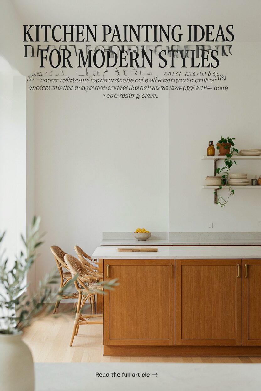
Keep or refinish wood-tone cabinets and paint the upper walls crisp white. The contrast makes wood look richer and the room feel clean.
This design is beneficial because wood cabinets often look best when walls are bright and simple. It also helps your backsplash and countertops stand out without competing colors. For personalization, add a warm off-white instead of pure white if you want a softer, cozy look.
Cost considerations can vary depending on whether you keep the cabinets as-is or repaint/refinish them. If you’re keeping them, you’ll likely spend more on wall paint and primer only, which keeps the project budget-friendly. Trend-wise, mixed materials like wood and white continue to be a modern favorite.
22. Color-Blocked Kitchen Corners With Micro Accents
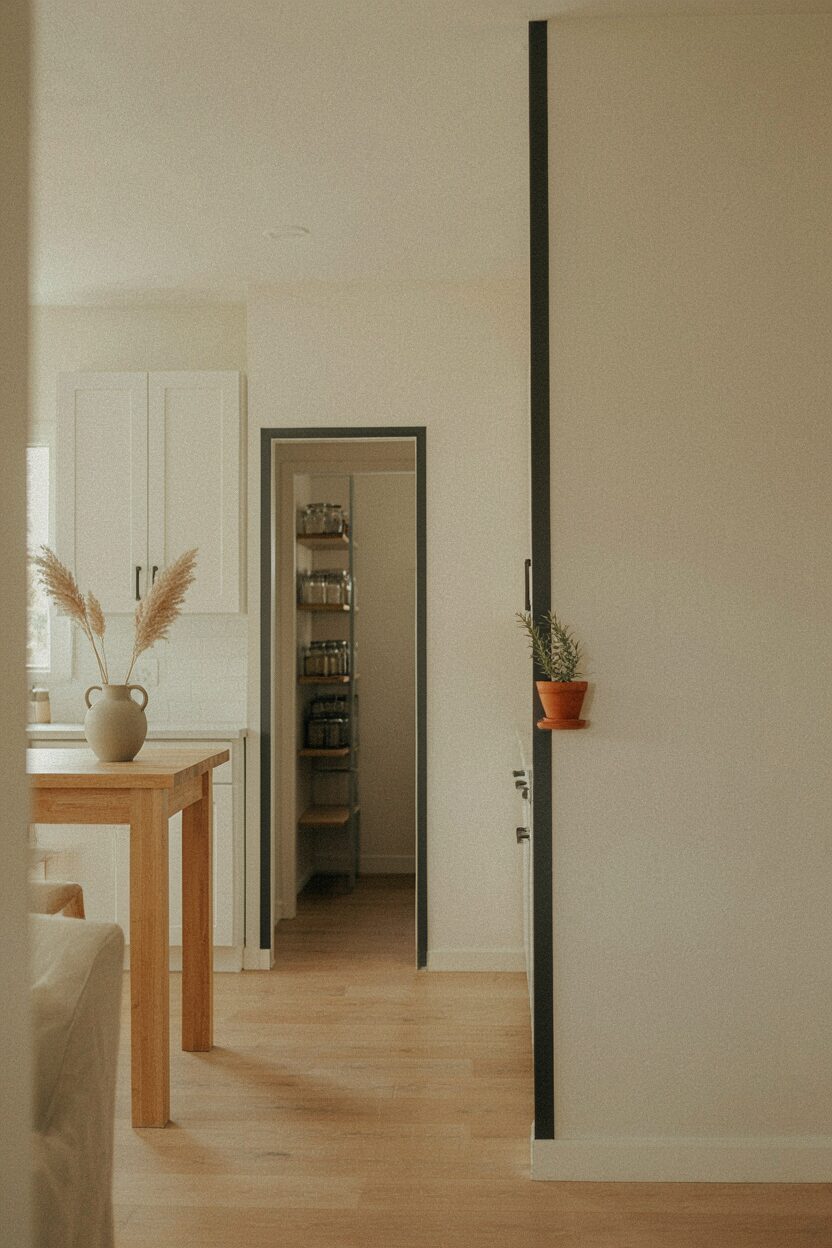
Paint corners or vertical sections in a contrasting color, like a narrow stripe at each corner. Keep the sections small so the look stays modern and tidy.
The benefit is that it gives structure to the room without overpowering it. You can also use this method to highlight features like a pantry opening or a hallway transition. For practical tips, use tape lines that are consistent in width, and step back often to keep the pattern balanced.
To personalize, choose shades that match your decor theme, such as warm beige with muted olive or white with soft charcoal. Budget-wise, micro accents use less paint and fewer surface areas, making them a smart option for a quick, stylish refresh. Current trends show lots of “patterning” done through paint rather than wallpaper, so this approach fits right in.