A bright kitchen deserves a bright system. Color-coding your cookbooks can make grabbing recipes feel effortless.
1. The Sunrise Gradient Stack

Start with warm reds and oranges at eye level and finish with soft yellows and creams higher up. Move left to right in gentle steps so your shelves look like morning light spreading across a wall.
This setup makes browsing faster because your eyes already know where “sweet” and “savory” vibes live. It also helps you notice duplicates or gaps in your collection without doing a single inventory sheet. For a clean look, keep book heights even by placing taller hardcovers at the back and slimmer paperbacks at the front.
2. The Color-Block Corner Café

Pick one shelf that becomes your “corner café,” then divide it into bold blocks of color. Put cookbooks with similar cover tones together, like a neat striped mural made of paper.
You’ll benefit from a quick visual cue when planning meals, since each block feels like a mini theme. This arrangement also looks fun with open shelving, because the color blocks pop against kitchen walls.
Try rotating covers so the most cheerful spines face outward, then use a small stack of coordinating cookbooks as the “front row.” If you want personalization, match the colors to your dish towels or backsplash tiles. For cost, start with the most colorful covers you already own, then add new titles only when their colors fit the blocks you need.
3. The Red-to-Blue Recipe Road

Create a winding path across two or three shelves by placing colors in order from red to blue. Think of it like a recipe road trip, where each book is a stop along the way.
This unique arrangement is great for families because everyone can find favorites by color memory instead of searching. It also keeps your kitchen from feeling cluttered, since the order makes the space look intentional.
To make it practical, group by category inside each color zone, such as baking in the warm section and quick dinners in the cooler section. Use bookends shaped like simple rectangles or curved wood to keep the line straight. When you add new cookbooks, don’t force them into exact spots—place them near the closest shade so the road stays smooth.
If you follow a trend, consider “tonal” layering, where different shades of the same color appear like calm waves. You can get that look even with mixed spines by pairing solid-color covers with neutral ones.
4. The Pantry-Friendly Neutral Base with One Pop
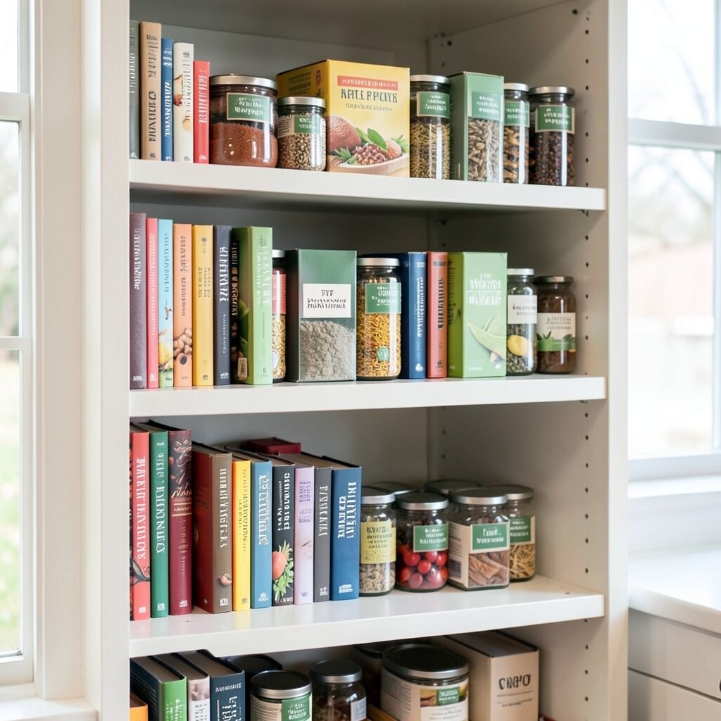
Begin with a shelf dominated by neutral covers—beige, gray, white, and muted earth tones—then add one bright color highlight. That single pop might be a teal baking book or a vivid red stew guide, standing out like a friendly sign.
This works especially well if your kitchen already has lots of visual elements, because neutrals help everything feel calm. You’ll also make decision-making easier, since the bright “hero” cookbook is the one you reach for first. For practical care, keep the hero book on the most reachable shelf so it doesn’t hide behind taller items.
5. The Alphabet Meets Color Method

Combine two systems: sort by color first, then arrange within each color by alphabet. Your shelves stay both visually pleasing and instantly searchable.
This method is unique because it balances “pretty” with “useful,” especially when you remember an author name. It can also reduce overbuying, since you’ll spot missing genres quickly once you see your color-alphabet layout.
Try using small labels on the shelf edge that match your color family—no need for detailed tags. If you want personalization, let each family correspond to a mood, like “cozy browns” or “fresh greens.” For cost, you can keep labels printed from your home printer, and only buy matching dividers if they improve how stable your shelf looks.
6. The Evergreen & Herb Green Shelf

Dedicate one shelf to greens, from sage to deep emerald, and let herbs and garden meals lead the arrangement. Put cookbooks with leafy imagery or green-toned spines front and center for that garden-fresh feeling.
This makes meal planning smoother when you want lighter dishes, salads, and vegetable sides. It’s also a fun visual reminder that your kitchen can feel alive even on busy days.
To make it practical, place everyday “weeknight” guides toward the front and special occasion books toward the back. Add a small ceramic plant marker or a folded recipe card stand to strengthen the theme. If you’re budget-minded, you can start with just one shelf and expand as you collect more greens over time.
Right now, herb-led interiors are popular, and this approach fits that trend without needing a full kitchen makeover. Choose a few cookbooks that match the style so your shelf looks curated, not accidental.
7. The Baking Spectrum Shelf

Make one shelf a full baking spectrum, moving from pale creams to warm ambers and ending with rich browns. Arrange cookbooks so the colors resemble icing shades in a bakery case.
This is a practical choice because it connects recipes to the moment you bake. When you’re craving cookies or bread, you naturally head to the shelf that “looks like dessert.”
To keep the shelf tidy, use matching bookends and keep any loose recipe cards in a single small folder. Personalize it by pairing a measuring cup holder in the same color tone as the dominant books. For cost considerations, you can often find budget-friendly baking titles in used bookstores, then slot them into the right shade range.
As a current trend, many kitchens are leaning toward “editorial styling,” where shelves look like small design displays. A baking spectrum is an easy way to get that look because the colors already feel curated.
8. The Bright Produce Color Carousel

Sort cookbooks by produce color, like orange carrots, red tomatoes, yellow citrus, and purple onions. Place them in a carousel layout so the colors curve around an imaginary center point.
This setup is unique because it turns your shelf into a visual menu of ingredients. It also helps you cook with what’s fresh, since the color system nudges you to match recipes to what you bought at the market.
For practicality, start with the most frequent produce you use, then build outward with seasonal colors. If you have open shelving, add a small woven basket on the side for produce-themed kitchen extras like garlic bulbs or citrus peels. Personalization is simple here: follow the colors of your favorite farmers market stand.
If you’re watching your budget, focus on one produce set at a time, such as citrus and berries, before expanding. Used cookbook spines still work well for this because the method depends on color family, not exact cover designs.
9. The Monochrome Texture Stack

Choose one color—like cool blue—and collect cookbooks that vary in shade and texture. This is monochrome stacking, but instead of only sorting by color, you also notice thickness, matte vs. glossy covers, and spine width.
This arrangement is calming and modern, and it makes your shelf feel like a styled gallery. It also prevents decision fatigue, because one color family is easier to scan than many.
Try placing shinier covers together so the shelf catches light in a gentle pattern. Use thin separators if you find gaps too wide, since consistent spacing makes monochrome styling look intentional. For personalization, repeat the same color on one small countertop accessory so the room feels connected.
As a trend, monochrome interiors are popular, and color-coded spines let you adopt that look with what you already own. You can add new books slowly as their shades match, instead of buying a whole set at once.
10. The Traffic-Light Dinner Plan

Arrange cookbooks like a traffic light: reds for comfort and heartiness, yellows for lighter meals, and greens for fresh and veggie-forward ideas. Position them left to right so you always read the “meal lane” the same way.
This is great for practical cooking because it matches your energy level, not just the recipe type. When the week feels busy, you can reach for yellow or green quickly without second-guessing. To make it even easier, place the “go-to” cookbook for each color at the front, where you can see it first.
If you want personalization, assign each light a time of day, like red for dinner weekends and green for weekday lunches. For cost, you can keep the system going by adding only one new book per color when it truly fits your kitchen needs. This also reduces clutter because you’ll be more thoughtful about purchases.
11. The Coastal Blue Waves Shelf

Use blues, whites, and seafoam greens to create a wave-like rhythm across your shelf. Alternate darker and lighter spines so your eyes feel a gentle motion while scanning.
This arrangement feels bright without being chaotic, and it pairs beautifully with kitchens that have light cabinets or natural wood. It also makes browsing feel like a mini vacation, which sounds silly until you’re actually hungry and need inspiration.
For practical tips, keep books with similar height together so the “waves” don’t look jagged. Add a small lighthouse-shaped bookend or a simple shell-toned tray to pull the theme together. If you want personalization, match your sea colors to a specific accent, like a blue mug set or a patterned runner.
On the cost side, you don’t need many additions—one or two bookends and a shelf tray can make a big difference. If you’re following current trends, coastal styling remains a favorite because it reads as clean, airy, and friendly.
12. The Spice Drawer Illusion on a Shelf

Make it look like your shelf is organized like spice jars by grouping books into compact “rows” based on color saturation. Deep, intense colors go together, while soft pastels form their own section.
This is unique because it creates an “instant grab” system for the kind of flavor you’re craving. You’ll also notice which flavor families you cook most often, since the most frequent colors will naturally gather in certain rows.
To keep it practical, leave a little breathing room between rows so books aren’t pressed so hard that covers warp over time. Use narrow vertical dividers if your spines vary widely in thickness. Personalize by choosing one row to match your favorite spice theme, like warm cinnamon tones or bright citrus zest vibes.
For cost considerations, you can use affordable, lightweight dividers and swap them as your collection grows. If you want a trend-friendly touch, look for books with matte finishes and bold typography, since those look especially crisp in color-saturation sorting.
13. The Seasonal Color Switchboard
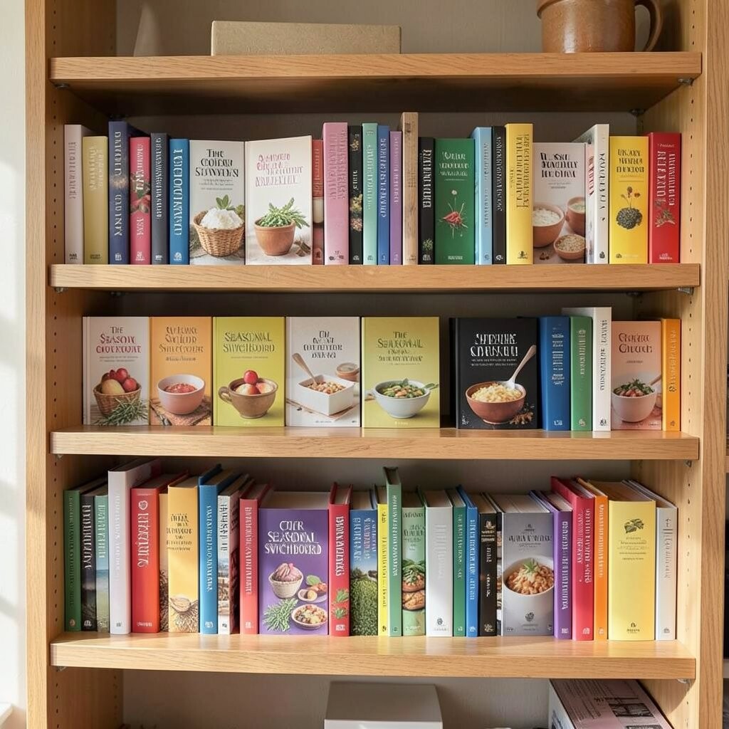
Dedicate two or three shelves to “seasonal modes,” then rotate the color coding when the weather changes. In spring and summer, lean into bright greens, yellows, and fresh reds, then shift toward deeper oranges and browns for fall and winter.
This is beneficial because it keeps your kitchen feeling current and makes your cookbooks feel more alive. It also reduces the chance that rarely used books get lost behind more frequently opened ones.
For practical tips, keep a small storage bin or tote for the season’s swap so you’re not moving everything around at once. Personalization ideas include matching the color palette to your seasonal decor or even your grocery list, like tomatoes and basil in summer. For cost, you can keep the rotation going without buying anything new by using your existing collection strategically.
If you want a trend angle, seasonal styling is growing in popularity because it blends organization with decor. When your shelves change colors with the seasons, your kitchen stays bright even when your routine changes.