Bright colors can wake up a room, a closet, or even a plain little corner that feels sleepy. They bring cheer, energy, and a fun kind of magic that makes everything feel more alive. If your eyes love bold shades and happy mixes, these color ideas may be just the spark you have been waiting for.
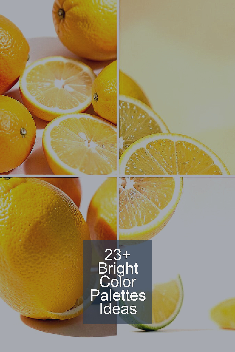
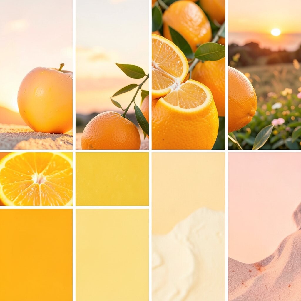
1. Citrus Punch
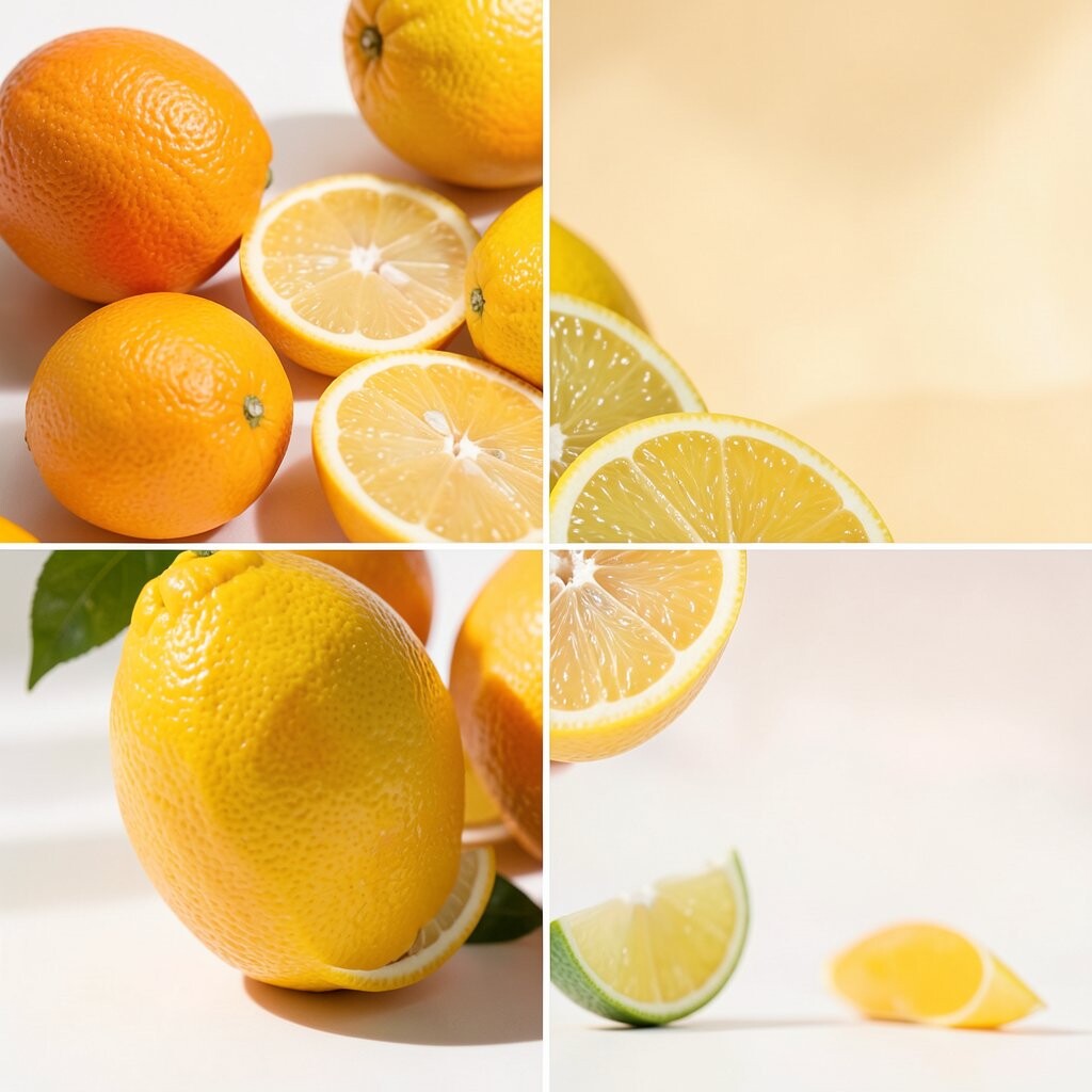
Citrus Punch mixes sunny yellow, juicy orange, and a splash of lime green. It feels like a fresh fruit bowl on a warm day, and it works great for kitchens, playrooms, and bold summer outfits.
This palette brings a happy mood fast, which is perfect when a space feels dull. It stands out because it feels bright but still friendly, not too loud or harsh.
Try using yellow as the main color and orange as the fun accent. If you want a softer look, add white or pale cream so the colors can shine without feeling too busy.
This style is popular in cheerful home decor and lively fashion pieces, especially in warm months. It can be low-cost too, since you may only need a few pillows, a vase, or a scarf to get the look.
2. Electric Coral
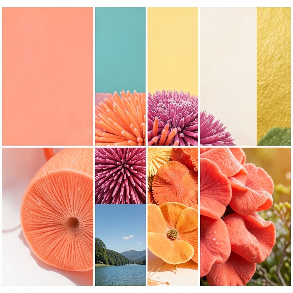
Electric Coral blends coral pink, bright peach, and a little golden glow. It feels sweet, sunny, and a bit fancy, like a beach sunset in a stylish room.
This palette is great for bedrooms, nail art, and party decor because it feels warm and pretty. Its special charm is that it looks soft and bold at the same time.
Pair coral with white furniture or light denim for a clean, fresh feel. You can also add gold details if you want a richer look that feels trendy and polished.
If you are decorating on a budget, small items like candles, frames, or throw blankets can bring this palette to life. It is easy to personalize by choosing more pink for a sweet look or more peach for a sunny one.
3. Pop Art Primary
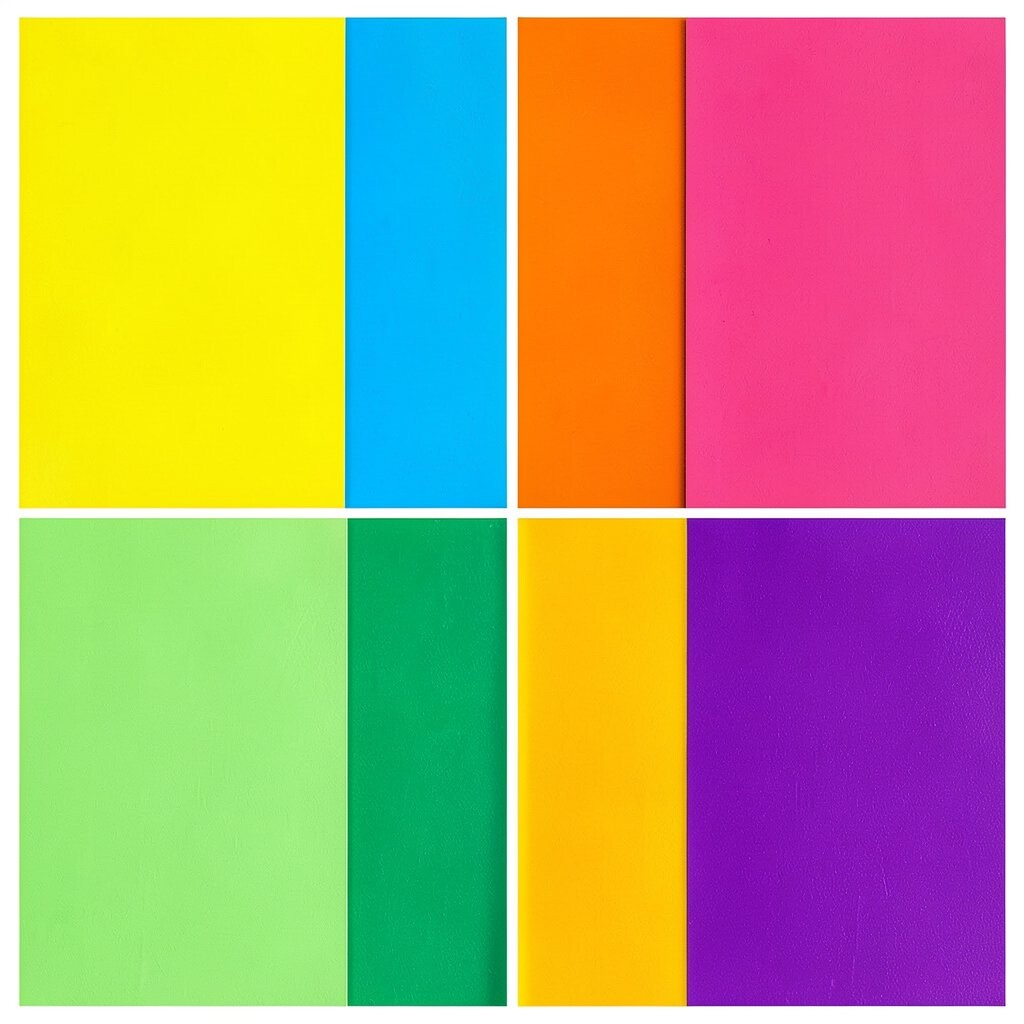
Pop Art Primary uses bright red, blue, and yellow in a bold, happy way. It feels playful and full of energy, like comic books and art posters coming to life.
This palette is perfect for creative spaces, kids’ rooms, and statement clothes. It helps a room feel lively right away and can make plain shapes look super cool.
Use one color as the star and the others as accents so it does not feel too crowded. Black and white can help the colors pop even more, which is a classic trend in pop art style.
This idea can be budget-friendly if you use paint, stickers, or simple fabric pieces. It is easy to make your own by choosing brighter or deeper versions of each primary color.
4. Tropical Lagoon

Tropical Lagoon brings aqua, teal, sunny green, and a little coral. It feels like a vacation by the water, with fresh air and bright flowers all around.
This palette works well in bathrooms, patios, and swimwear because it feels cool and happy. Its special look comes from mixing water colors with warm flower tones.
Try teal on larger pieces and coral in smaller accents for balance. Natural textures like wood, rattan, and woven baskets make the colors feel even more inviting.
This palette can fit many styles, from beachy to modern, so it is easy to personalize. You can keep costs low by using towels, art prints, or cushion covers instead of big changes.
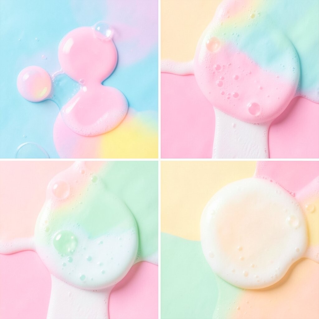
5. Candy Shop Pastels
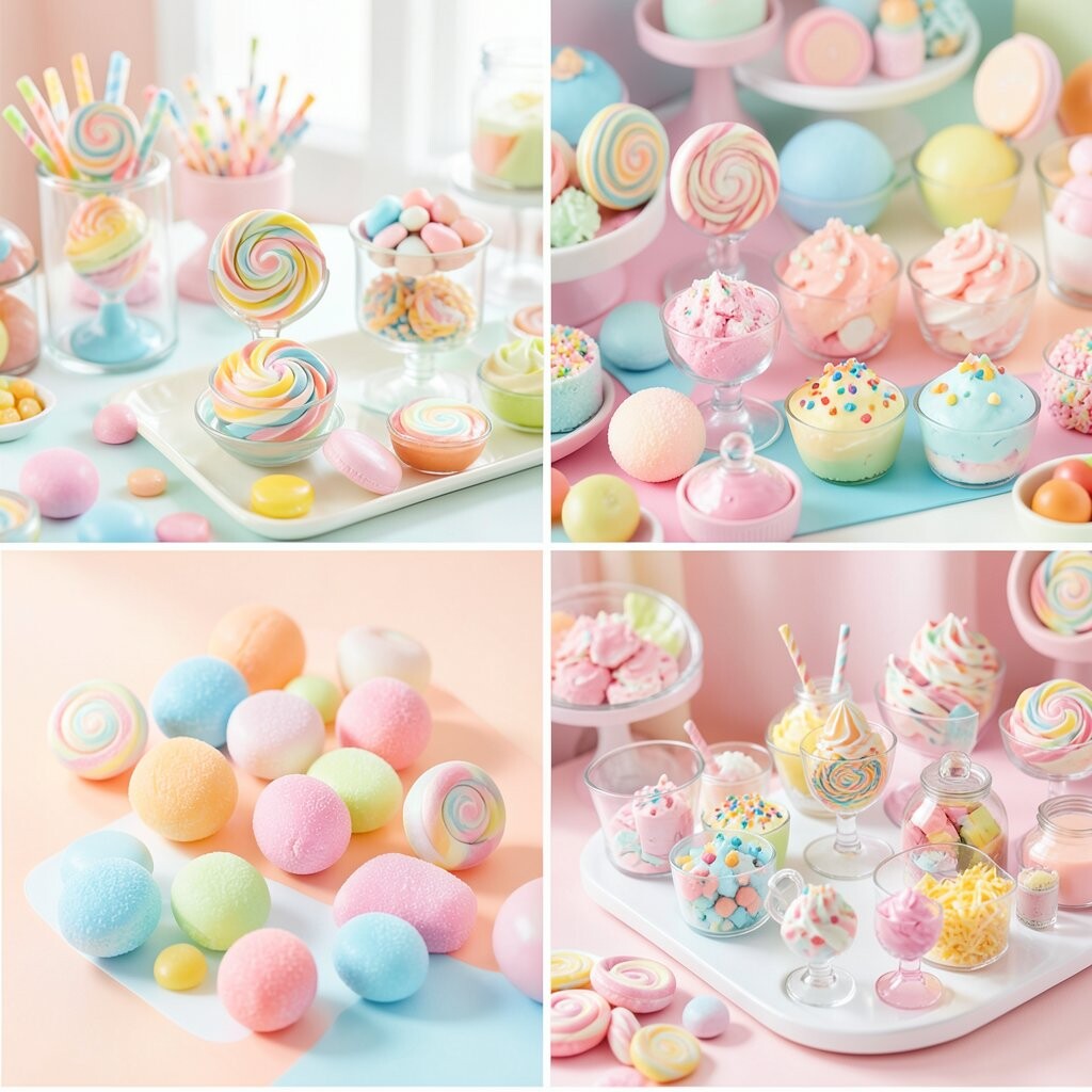
Candy Shop Pastels use soft pink, mint, lavender, and baby blue with a bright, sugary feel. They look sweet and cheerful, like a colorful candy shelf in a pretty little store.
This palette is lovely for bedrooms, baking spaces, and cute fashion looks. It gives a gentle kind of brightness that feels fun without being too strong.
Mix the colors in equal parts for a playful look, or let one shade lead for a calmer feel. White and silver details can make the whole palette feel fresh and light.
This trend is popular in cozy decor, stationery, and soft accessories. It can be low-cost and easy to personalize with pillows, mugs, hair clips, or wall prints.
6. Neon Night
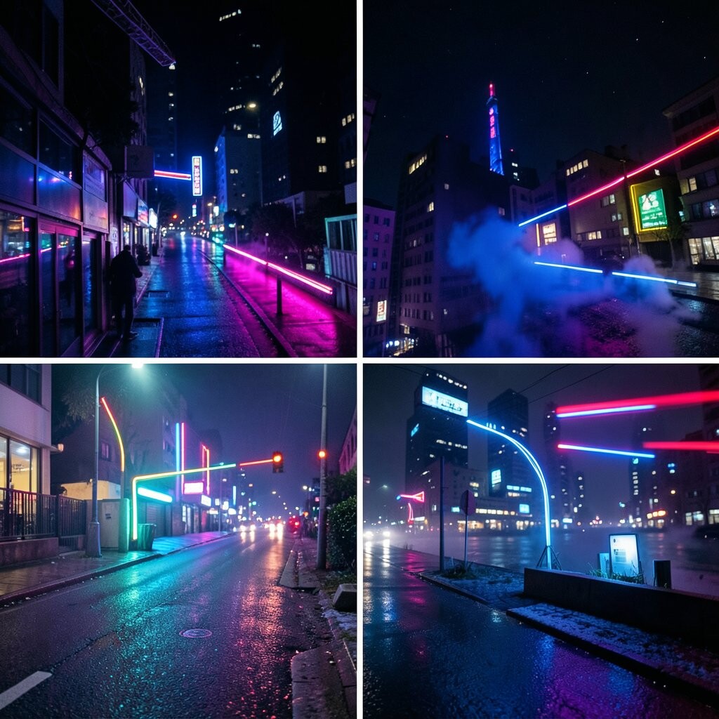
Neon Night features hot pink, electric blue, lime green, and glowing purple. It feels bold and exciting, like a late-night city sign or a fun dance floor.
This palette is a great pick for game rooms, party spaces, and daring outfits. Its biggest strength is how fast it grabs attention and makes a space feel alive.
Use neon colors in small doses so they sparkle instead of shout. Dark backgrounds like black or charcoal help the colors stand out in a dramatic, trendy way.
If you want to save money, try neon posters, lamp shades, or small decor pieces first. You can personalize the look by choosing just two neon shades if you want a cleaner style.
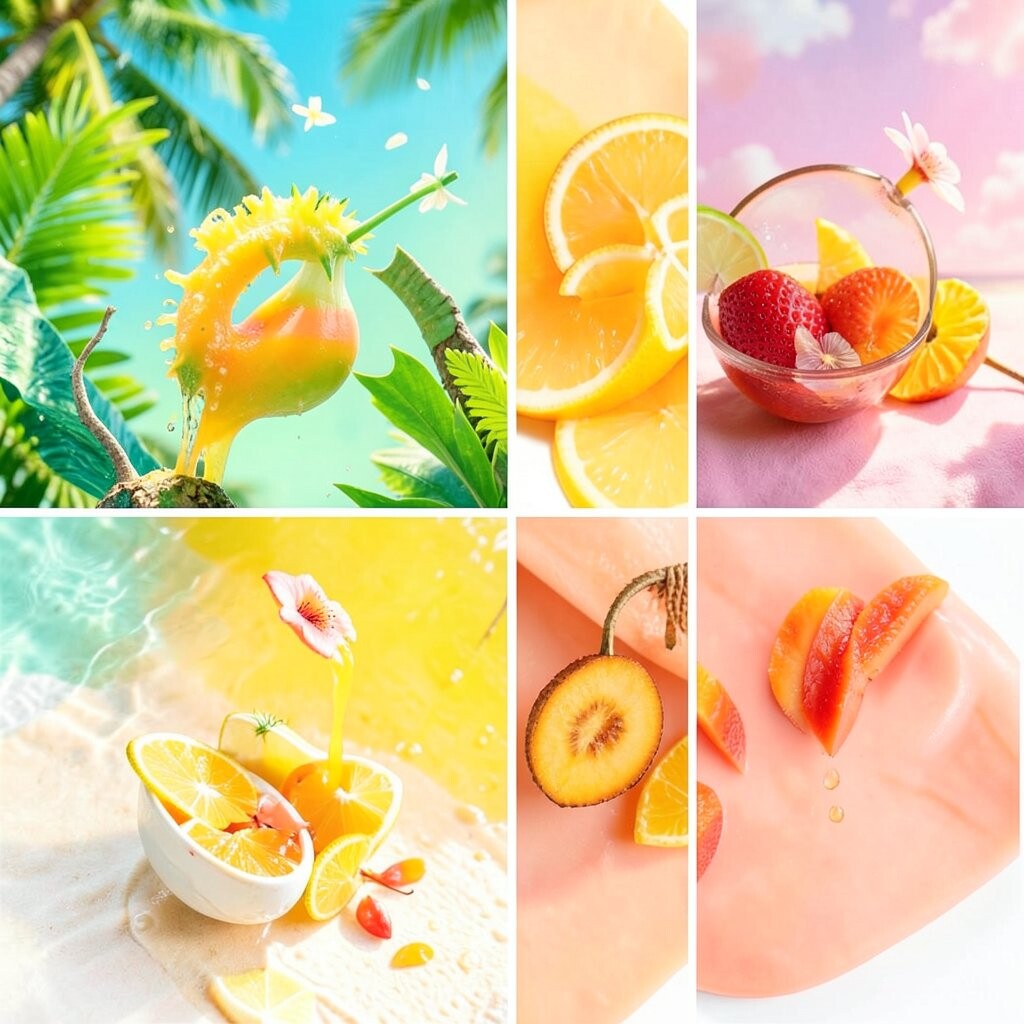
7. Mango Sunrise
Mango Sunrise mixes mango orange, warm yellow, and a touch of pink. It feels bright, juicy, and full of morning cheer, like sunlight on a fresh fruit bowl.
This palette works well in breakfast corners, art rooms, and sunny outfits. It brings warmth and joy, which can make a space feel more friendly and open.
Try pairing it with white or light wood for a crisp look. If you want more energy, add a small bit of red or gold for extra sparkle.
This palette is easy to use in affordable items like dish towels, prints, or table runners. It is also simple to personalize by making the orange softer or the yellow brighter.
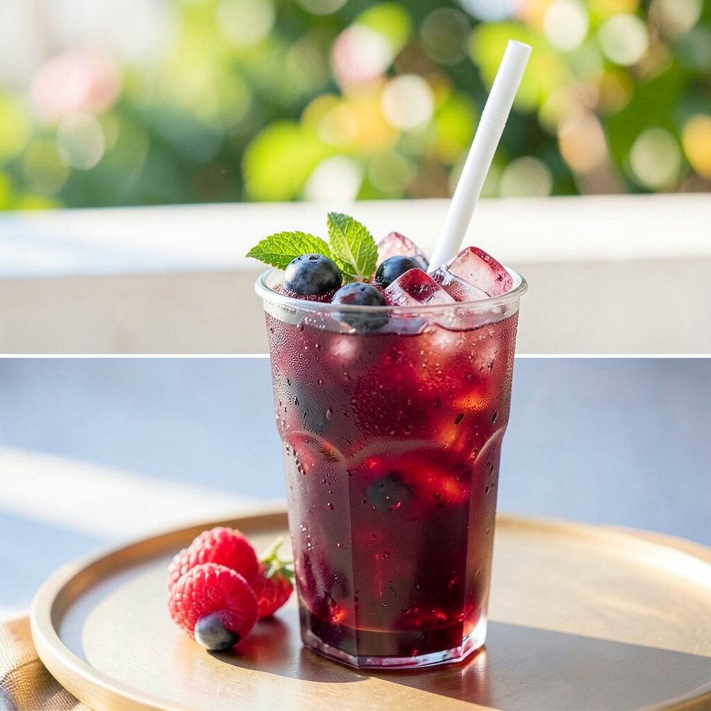
8. Berry Burst
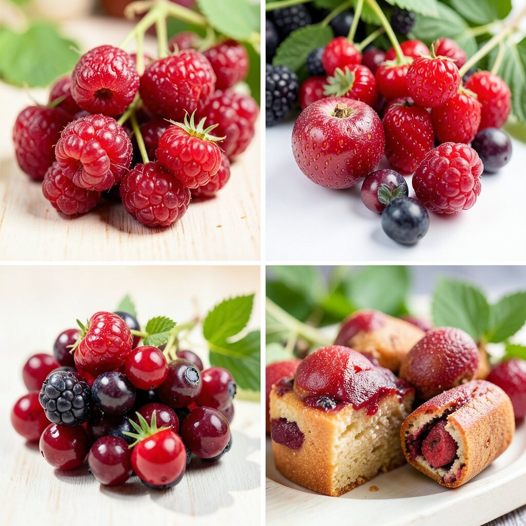
Berry Burst uses raspberry pink, plum purple, and bright red with a rich, juicy feel. It looks bold and sweet, almost like a bowl of fresh berries on a sunny table.
This palette is great for bedrooms, makeup spaces, and stylish clothes. It feels rich and fun, which makes it stand out from softer pink color ideas.
Use berry tones with cream or blush so the look stays pretty and not too dark. A little gold can make the palette feel more elegant and trendy.
This style can be low-cost if you start with simple accents like pillows, lip color, or a blanket. You can make it your own by choosing one berry shade to lead the whole look.
9. Sunshine and Sky

Sunshine and Sky mixes bright yellow with clear blue and a touch of white. It feels open, happy, and fresh, like a bright day with no clouds in sight.
This palette is perfect for kitchens, kids’ rooms, and casual clothing. It gives a clean feeling while still bringing a lot of cheer.
Use blue for balance and yellow for the happy spark. White walls, shelves, or shoes can help the colors feel crisp and easy to enjoy.
This is a popular choice for spring and summer decor. It can be budget-friendly too, especially if you use paint, cushions, or simple accessories.
10. Rainbow Remix
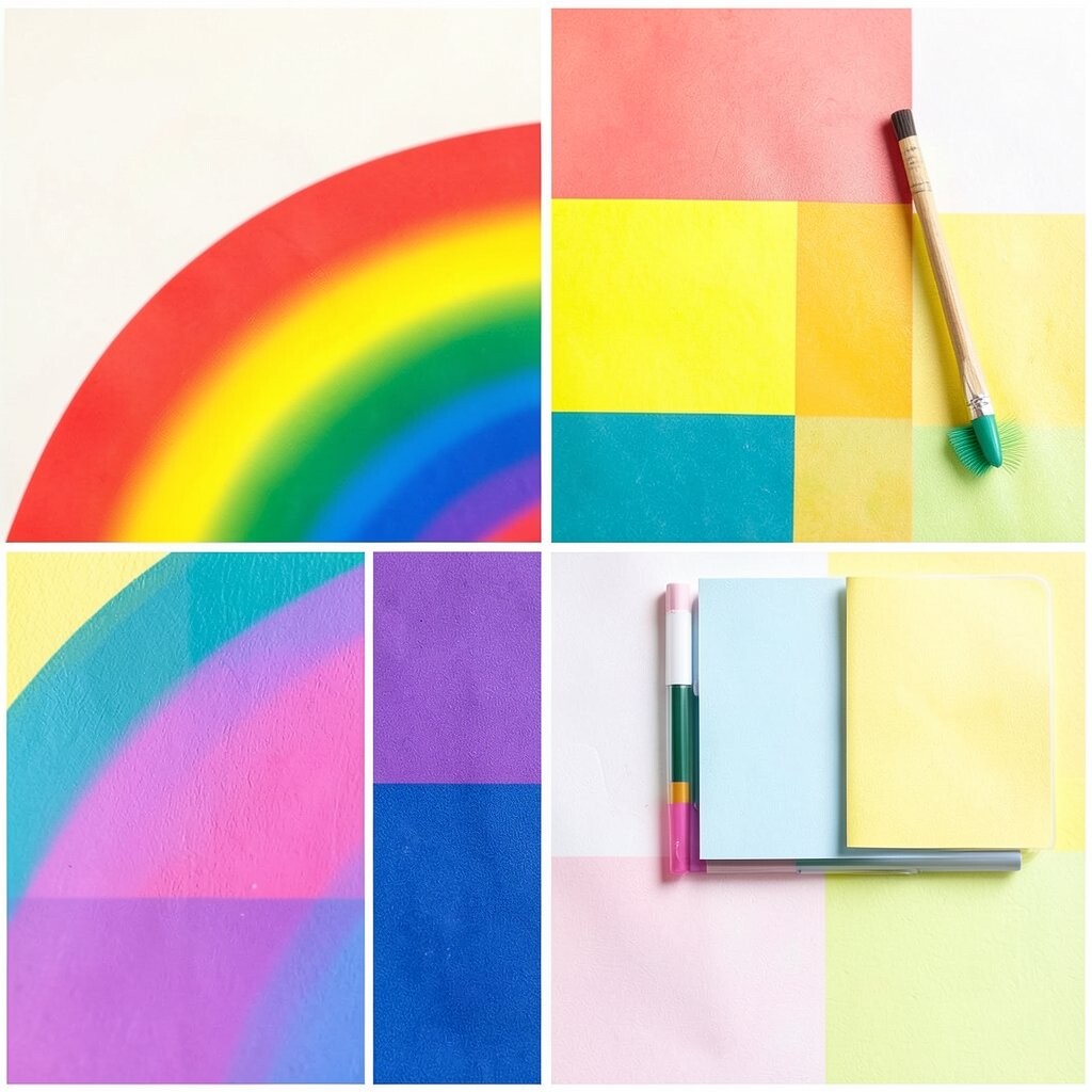
Rainbow Remix brings together many bright shades, like red, orange, yellow, green, blue, and purple. It feels playful and full of joy, like a party that never gets boring.
This palette is wonderful for craft rooms, kids’ spaces, and bold fashion lovers. Its uniqueness comes from mixing many colors while still keeping the look cheerful.
To keep it neat, repeat each color in small spots around the room or outfit. A white base can help the rainbow feel bright instead of messy.
This trend shows up in art, wall decals, and fun accessories. It can cost very little if you use colorful paper, ribbons, or small decor pieces you already own.
11. Lime Spark
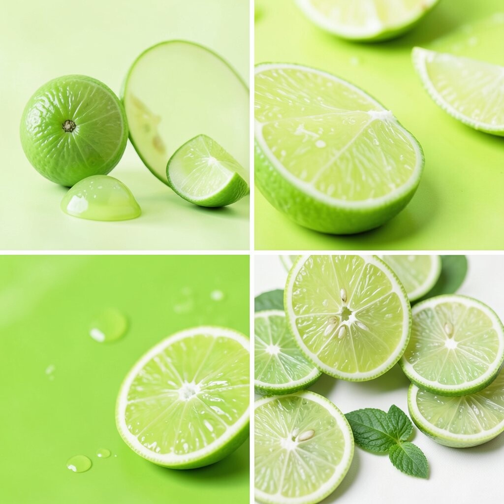
Lime Spark uses lime green, bright white, and a little turquoise for a sharp, fresh look. It feels zesty and modern, like a cool drink on a hot day.
This palette is great for bathrooms, sporty outfits, and creative desk spaces. It brings a clean, lively feeling that can wake up any plain area.
Pair lime with white to keep the look crisp and bright. If you want more style, add black lines or silver details for a modern edge.
This palette can be inexpensive because one bold accent can do a lot. Try a lamp, water bottle, or chair cushion to test the style before buying more.
12. Hot Pink Party
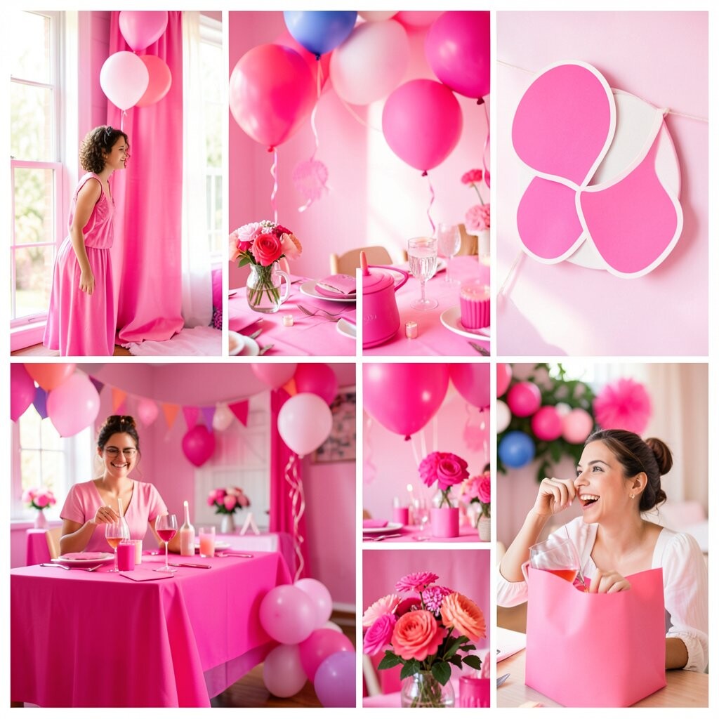
Hot Pink Party centers on bright pink with touches of red and white. It feels loud in the best way, like confetti, lipstick, and happy music all together.
This palette is perfect for fun bedrooms, celebration decor, and standout fashion. It gives a confident feeling and makes small spaces seem more exciting.
Use white or light beige to keep the pink from feeling too heavy. A little sparkle, like glitter or shiny metal, can make the whole look feel extra playful.
This style is very trendy in accessories, wall art, and statement furniture. It can be low-cost if you start with small things like candles, notebooks, or a bright bag.
13. Ocean Candy

Ocean Candy blends aqua, soft teal, mint, and a tiny bit of coral. It feels cool and sweet, like ocean water with a pretty candy twist.
This palette works well in bathrooms, beach houses, and summer outfits. It feels fresh and calm while still keeping a bright, happy mood.
Try using aqua as the base and mint as the soft helper color. Coral accents can add a little surprise and keep the palette from feeling too plain.
This look is easy to personalize with towels, art, or glass decor. It can also be budget-friendly because many stores carry these colors in simple home items.
14. Sunflower Glow
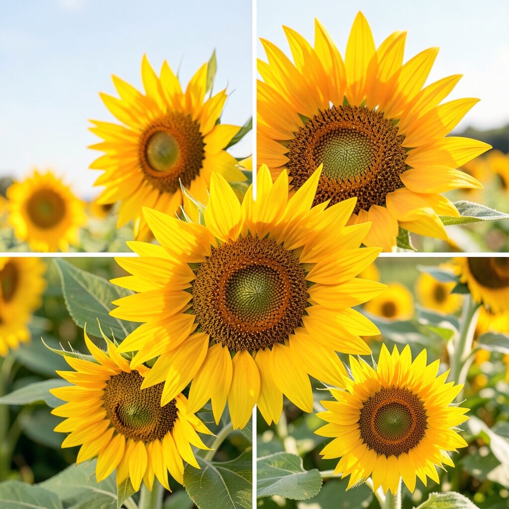
Sunflower Glow uses golden yellow, warm orange, and a touch of brown. It feels bright and cozy, like a field of sunflowers on a happy afternoon.
This palette is lovely for kitchens, entryways, and cheerful fall decor. It brings warmth without feeling dark, which makes it a nice pick for bright spaces.
Pair it with white or natural wood for a soft, welcoming look. If you want a little more punch, add a small bit of red or green for contrast.
This palette is popular in rustic and farmhouse styles, but it can also feel modern. It is simple to use on a budget with flowers, dishware, or throw pillows.
15. Grape Soda Pop
Grape Soda Pop mixes bright purple, lavender, and a little pink. It feels fizzy and fun, like a sweet drink with bubbles and a shiny label.
This palette is great for bedrooms, art spaces, and playful fashion items. It stands out because purple can feel both dreamy and bold at the same time.
Use lavender for softness and bright purple for the main punch. White or silver can help the palette feel clean and a little magical.
This trend works well in makeup, stationery, and bedroom decor. It can be low-cost if you use small items like pens, blankets, or wall stickers.
16. Firecracker Mix
Firecracker Mix uses red, orange, and yellow in a very lively way. It feels warm, strong, and full of motion, like a burst of sparks in the sky.
This palette is a good fit for bold kitchens, event decor, and active wear. It gives a space a strong heartbeat and makes it feel exciting fast.
Use one color as the main note and the others as bright accents. A little white or black can help the palette stay balanced and easy on the eyes.
This look is often seen in modern art and statement pieces. It can be affordable if you start with a few small items instead of a full room makeover.
17. Minty Fresh
Minty Fresh uses mint green, pale aqua, and bright white with a cool, clean feel. It looks crisp and happy, like fresh leaves after rain.
This palette is perfect for bathrooms, laundry rooms, and clean fashion looks. It gives a neat feeling while still keeping a bright and cheerful touch.
Try using mint on larger pieces and white on the smaller ones. A hint of gold or silver can make the palette feel a bit more special.
This style is easy to personalize with towels, soap holders, or light clothing. It can also be low-cost because the colors work well in simple, everyday items.
18. Tropical Punch
Tropical Punch mixes hot pink, orange, lime, and turquoise in a juicy way. It feels like a beach drink with a tiny umbrella and a lot of fun.
This palette is a great choice for summer parties, pool areas, and bold accessories. It brings instant joy and makes any space feel more playful.
Use bright colors in different sizes so the look feels lively but not crowded. White or sand tones can help calm the mix just enough.
This palette is trendy in vacation decor and festival style. It can be cheap to try with cups, napkins, swimsuits, or colorful prints.
19. Blueberry Blast
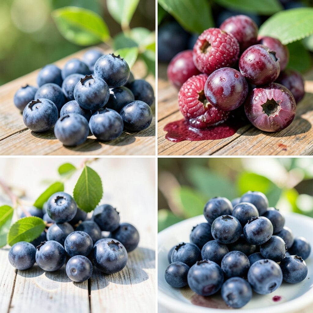
Blueberry Blast uses vivid blue, violet, and a little white. It feels cool, rich, and a bit dreamy, like a night sky with a bright berry twist.
This palette works well in bedrooms, study spaces, and polished outfits. It feels bold but still calm, which makes it very easy to enjoy.
Mix deep blue with lighter purple for a layered look. White bedding, paper, or shelves can help the colors stand out in a clean way.
This palette is popular in modern decor and creative branding. It can stay budget-friendly if you use simple textiles, notebooks, or framed art.
20. Peachy Keen
Peachy Keen blends peach, soft coral, and warm cream with a sunny smile. It feels sweet and gentle, like a soft fruit color with a happy glow.
This palette is lovely for bedrooms, living rooms, and soft clothing pieces. It brings warmth without feeling too strong or too dark.
Use cream as the base and peach as the main color for a cozy look. A tiny bit of gold can make the whole palette feel more polished and trendy.
This idea is easy to personalize with blankets, curtains, or pretty dishes. It can also be low-cost because many stores carry peach tones in simple home goods.
21. Bold Kiwi
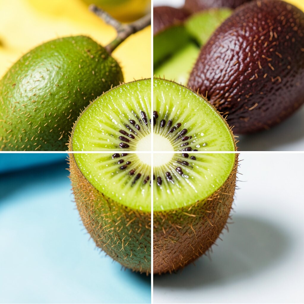
Bold Kiwi uses bright green, yellow-green, and a splash of white. It feels fresh and punchy, like a kiwi fruit cut open on a sunny day.
This palette is great for kitchens, workout spaces, and fun casual clothes. It gives a room a lively boost and feels very clean and awake.
Pair kiwi with white for a crisp style, or add black for a sharper edge. Small touches of wood can soften the look and make it feel more natural.
This palette fits current trends in sporty and fresh decor. It can be inexpensive if you start with a plant pot, tote bag, or bright kitchen towel.
22. Sunset Soda
Sunset Soda brings orange, pink, and purple together in a fizzy, glowing mix. It feels warm and dreamy, like the sky right before night arrives.
This palette is wonderful for bedrooms, lounge corners, and artsy outfits. It creates a soft glow that feels exciting and calm at the same time.
Use pink and orange together for warmth, then add purple for depth. A little cream or beige can help the colors feel smooth and easy to live with.
This look is popular in wall art, throws, and sunset-inspired decor. It can be low-cost if you use prints, candles, or a few colorful pillows.
23. Jewel Box Brights
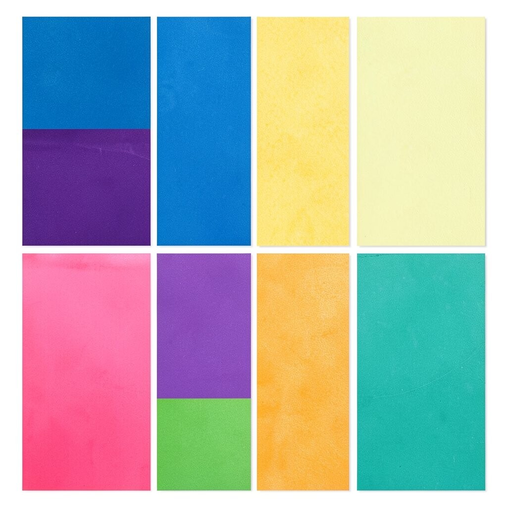
Jewel Box Brights use emerald, sapphire, ruby, and amethyst in a shiny, rich way. It feels fancy and bold, like a treasure chest full of glowing stones.
This palette is perfect for elegant rooms, special events, and standout fashion. It feels more grown-up than candy colors, but still keeps a bright spark.
Use one jewel tone as the lead and the others as accents for a balanced look. Gold details make this palette feel extra rich and stylish.
This trend is loved in home decor, jewelry, and evening wear. It can be affordable if you choose small items like vases, scarves, or decorative trays.
24. Bubblegum Breeze
Bubblegum Breeze mixes bubblegum pink, sky blue, and a little white. It feels sweet, airy, and playful, like a soft cloud with a candy heart.
This palette is perfect for cute bedrooms, fun craft spaces, and cheerful outfits. It has a youthful charm that feels bright without being too bold.
Try using pink as the main color and blue as the cool balance. White keeps everything light and airy, which helps the palette feel fresh.
This style is easy to personalize with art, bedding, or small accessories. It can also be very budget-friendly if you use simple pieces that already match the colors.