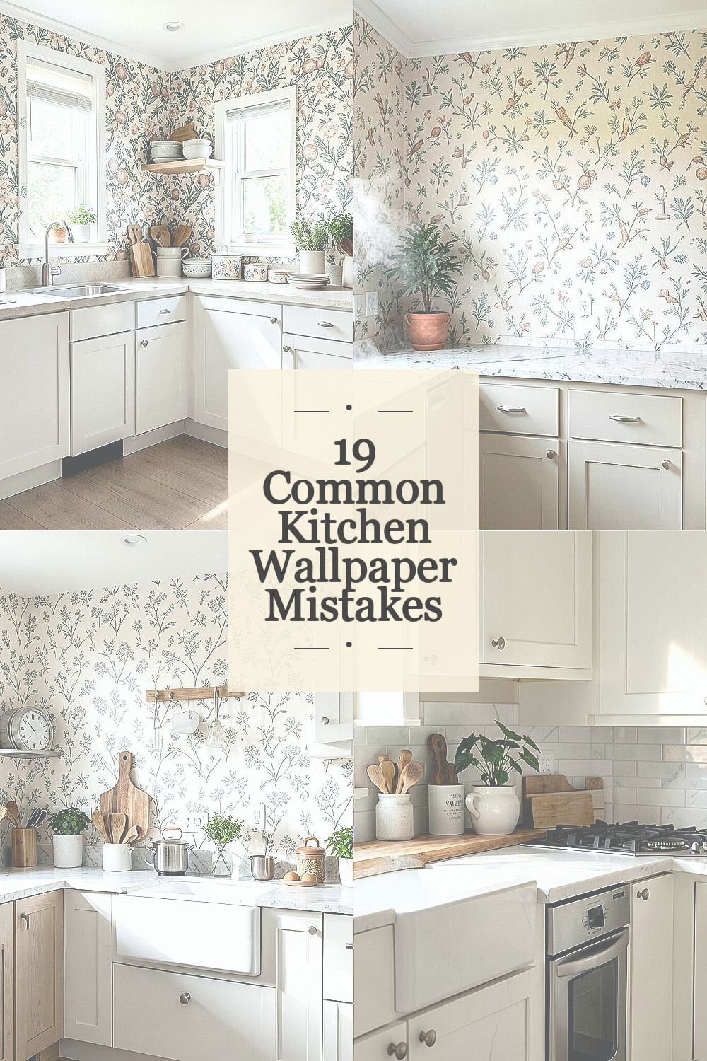
Kitchen wallpaper can be bold, pretty, and full of charm. A few small mistakes can make it look tired fast.
1. Picking a Style That Fights the Room
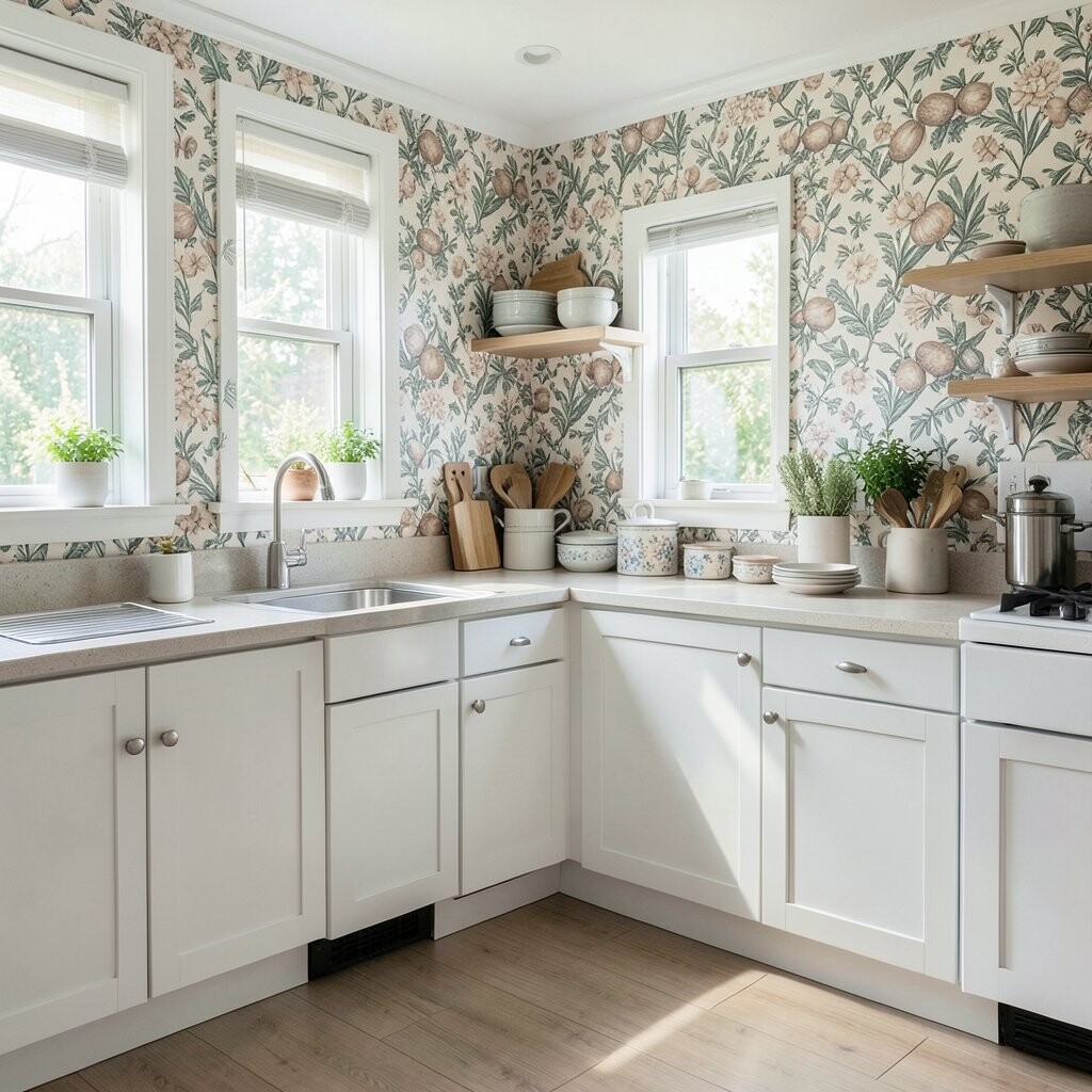
A wallpaper can look lovely in a book and still feel wrong in a kitchen. If the pattern clashes with your cabinets, counters, or floor, the room may feel busy instead of fresh.
Try holding samples near the sink, stove, and shelves so you can see the full picture. Soft florals can warm up a plain space, while crisp stripes may suit a modern room with shiny metal touches, and both choices can feel personal without cost running wild. A good match also makes the kitchen feel calm and pulled together.
2. Ignoring Steam and Splashes
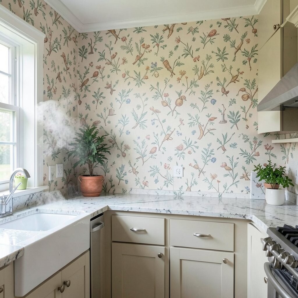
Kitchens make heat, moisture, and mess all day long. If the paper cannot handle that, it may peel, curl, or stain before you get to enjoy it.
Choose a washable finish when you can, especially near the sink or kettle. Smooth patterns often wipe clean more easily than rough textures, and that saves time and money later. A practical choice can still feel stylish, especially with fresh colors that keep up with current looks.
Think about where water usually lands and keep wallpaper away from the heaviest splash spots if possible. That small habit can help the design stay neat, bright, and useful for years.
3. Forgetting to Test the Light
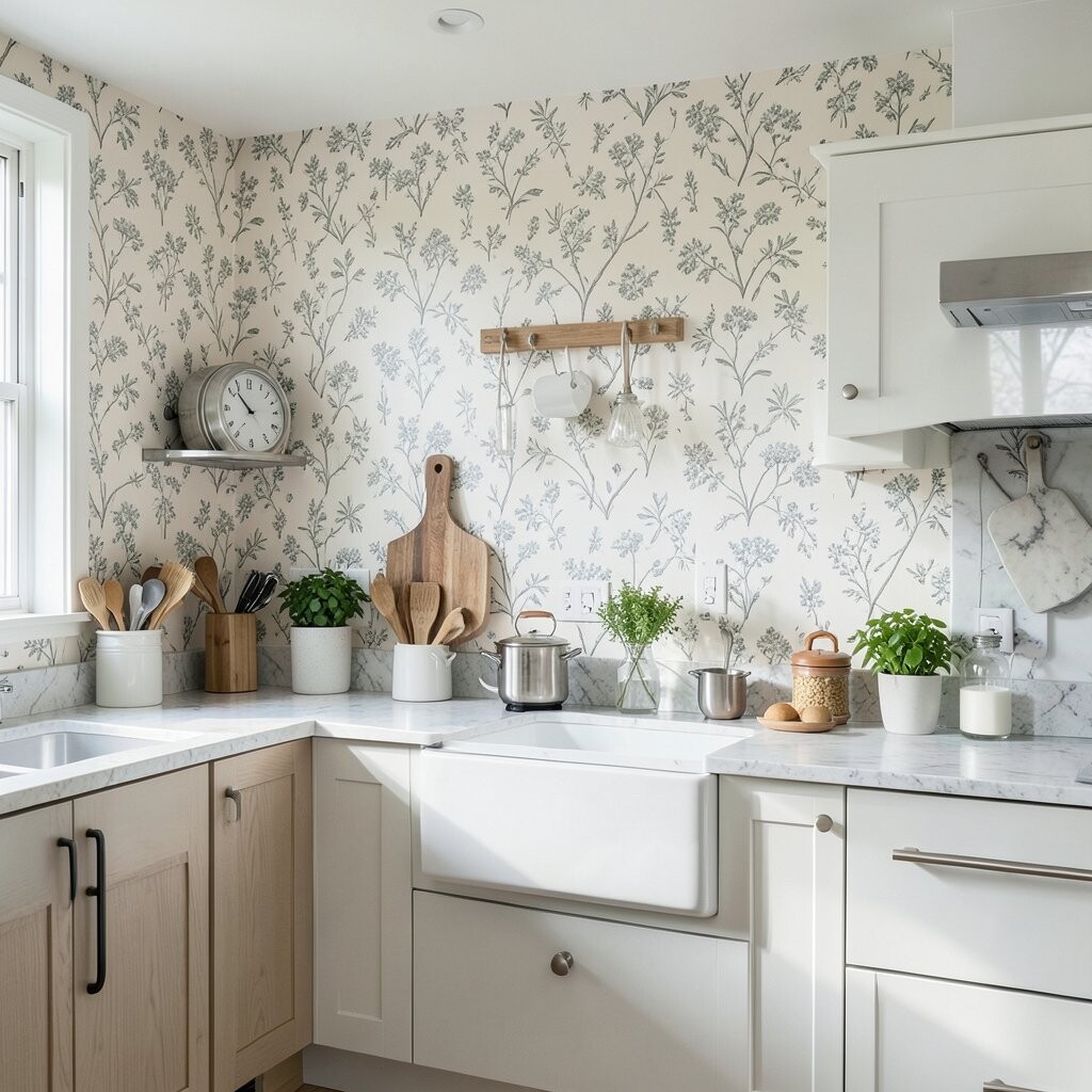
Wallpaper can look soft and sweet in one light and harsh in another. Morning sun, kitchen lamps, and gray weather all change the way the pattern appears.
Place a large sample in the room and watch it at different times of day. Warm gold, pale green, and gentle blue often shift in a nice way, while dark prints may feel richer at night, so this test can save a costly mistake. It also helps you choose a look that feels unique to your home instead of the store shelf.
When the light is right, even a simple paper can feel special. That makes the whole kitchen feel more open and welcoming.
4. Using a Tiny Sample Only

A small swatch can fool your eye. A pattern that seems sweet in your hand may look loud once it covers a full wall.
Ask for the biggest sample you can get, or tape several pieces together to make a larger view. This helps you judge the scale, color, and mood without guessing, and it can keep you from buying something that needs replacing soon. Bigger samples are a smart way to spend money with more confidence.
It also gives you room to test how the paper sits beside dishes, curtains, and art. That extra step can lead to a look that feels more like your own kitchen.
5. Overlooking Pattern Scale
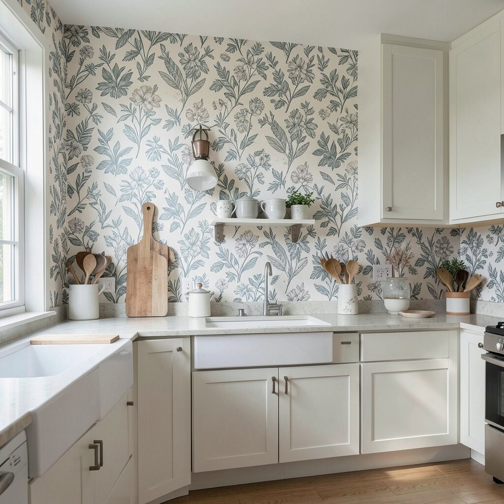
Pattern size matters more than many people think. A tiny print can disappear in a big kitchen, while a giant print can crowd a small one.
Look at the wall size, ceiling height, and cabinet placement before you decide. Large leaves or bold shapes can add drama in open spaces, while smaller repeats can keep a cozy room feeling neat and light, which is very helpful when you want style without waste. Balanced scale often makes the wallpaper feel more expensive than it is.
If you are unsure, lay the sample on the floor and step back. That simple move can show you how the design will really read from across the room.
6. Choosing Hard-to-Clean Texture
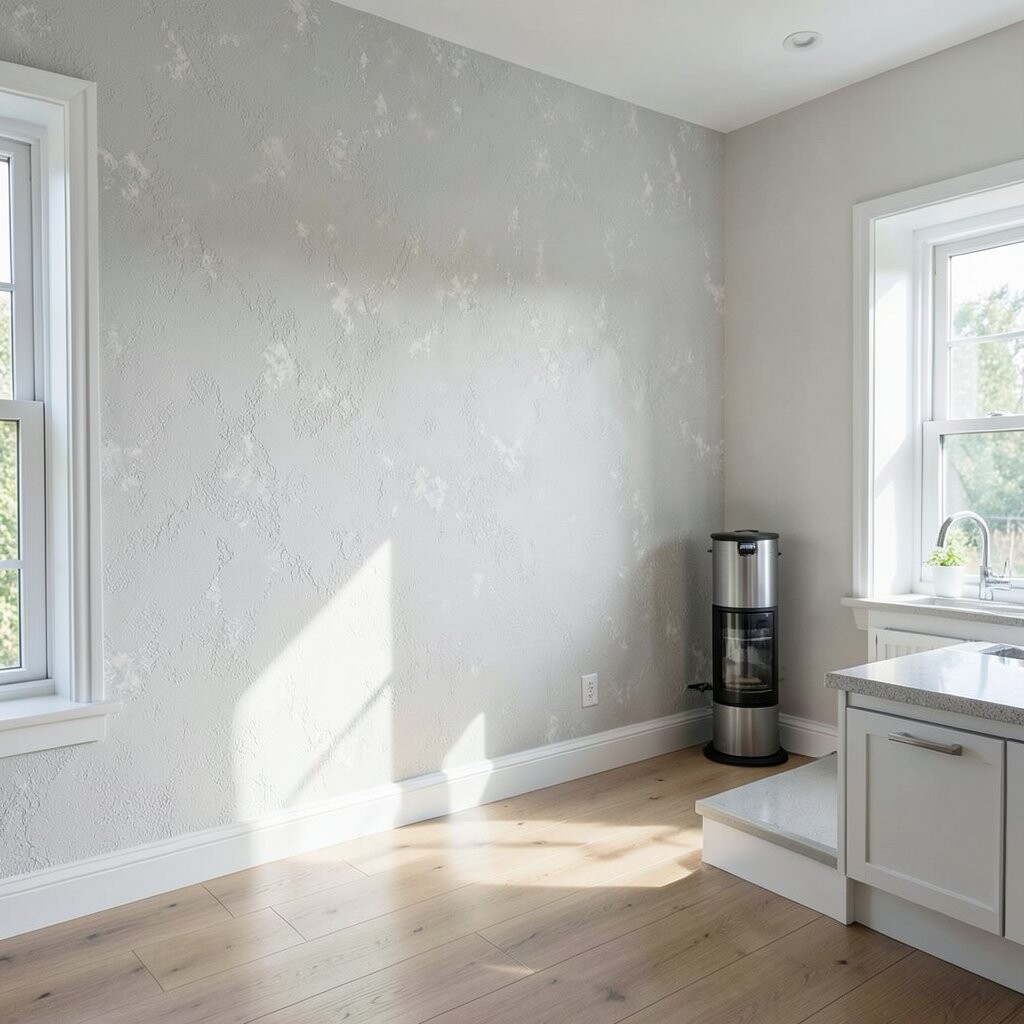
Pretty texture can be tempting, but kitchens ask for easy cleaning. Deep raised patterns may hold grease and dust in a way that makes upkeep annoying.
Pick a surface that can handle a quick wipe, especially if you cook often. A smooth or lightly textured paper gives you beauty and ease at the same time, and that mix is a big reason many people like the newer kitchen wallpaper trends. Less scrubbing means more time enjoying the room.
Some textured looks still work well if they stay far from the stove. Used in the right spot, they can add richness without making care too hard.
7. Matching Everything Too Perfectly

A kitchen full of perfect matches can feel flat. If the wallpaper copies the cabinets, counters, and chairs too closely, the room may lose its spark.
Let the paper give the room one fresh voice, like a surprise color or a small shape with charm. That little contrast makes the space feel unique and more fun to live in, and it usually costs less than changing big items in the room. A bit of difference can make the whole kitchen feel more alive.
Try pairing a soft wall print with plain dishes or simple curtains. This keeps the room balanced and lets the wallpaper shine in a friendly way.
8. Forgetting About Cabinet Lines
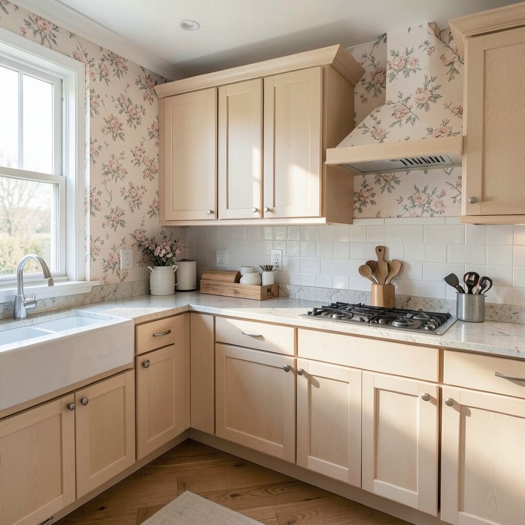
Cabinet doors and shelves break up wall space in a kitchen. If the wallpaper pattern lands awkwardly against those lines, the room can look chopped up.
Check where seams, shelves, and cabinet tops will sit before you hang anything. A smart layout can make the pattern feel neat and calm, and it can even make the kitchen look larger. Good planning now can also lower the chance of wasted paper and extra expense.
Patterns with simple repeats often behave well around cabinets. That can keep the whole wall feeling tidy while still giving the room personality.
9. Going Too Dark in a Small Space
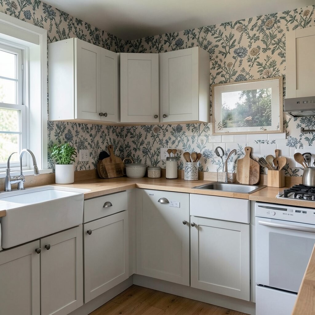
Dark wallpaper can be rich and dramatic, but it needs the right room. In a small kitchen with little light, it can make the space feel tight and heavy.
Try lighter shades if the room already feels crowded. Pale botanicals, soft checks, and airy lines can open the room while still giving it charm, and that is a current favorite for many homes that want a fresh but gentle look. You can still add boldness through art, rugs, or dishes.
If you love deep color, use it on one wall or a smaller nook. That way you get the mood without losing the bright, open feeling that makes cooking more pleasant.
10. Skipping Grease-Prone Zones

Some walls near the stove and prep area take a real beating. If wallpaper sits too close to splatter and steam, it may stain faster than expected.
Think about placing paper on safer walls first, then use tile, paint, or another easy-clean finish where mess happens most. This keeps the wallpaper looking fresh longer and helps protect your budget from early repairs. A careful layout also lets you use a delicate pattern without giving up function.
It is often wiser to save the prettiest paper for a feature wall or breakfast corner. That choice can still feel special and may make the whole room more polished.
11. Forgetting the Ceiling Feels Too Low
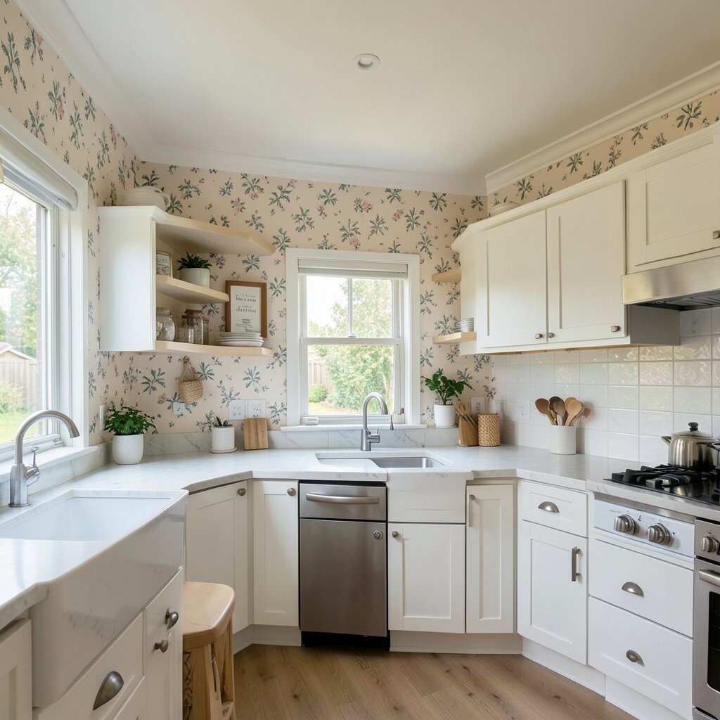
Busy wallpaper can press down on a low ceiling. Strong horizontal patterns or dark tops may make the room seem shorter than it is.
Choose a pattern with a bit of vertical flow if the ceiling feels tight. Slim vines, small stripes, or rising shapes can draw the eye upward and make the room feel taller, which is a lovely trick for older kitchens. This can give you style without needing any costly building work.
Even the direction of the print can change the mood of the room. A smart choice here can make the kitchen feel lighter and more open.
12. Buying Without Checking Material Quality
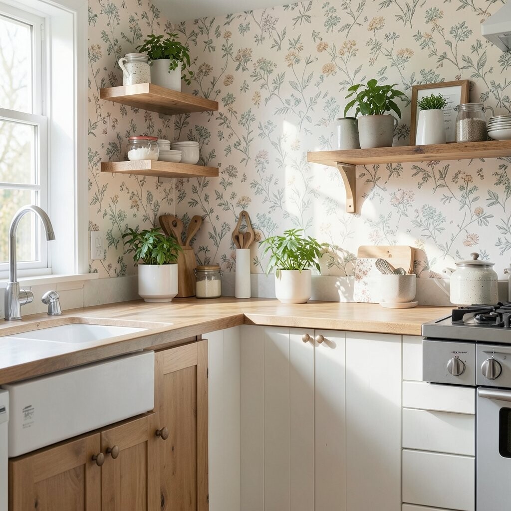
Not all wallpaper is made for kitchen life. Thin paper may tear easily, fade too fast, or bubble when the room gets humid.
Look for strong material and a finish made for busy spaces. Better quality may cost more at first, but it often saves money because you do not need to replace it as soon. It also gives the room a richer feel and keeps the design looking neat after many wipe downs.
Good quality can show in the way the color stays even and the edges stay flat. That kind of durability is worth paying attention to when the kitchen is used every day.
13. Ignoring the Color of Food and Surfaces
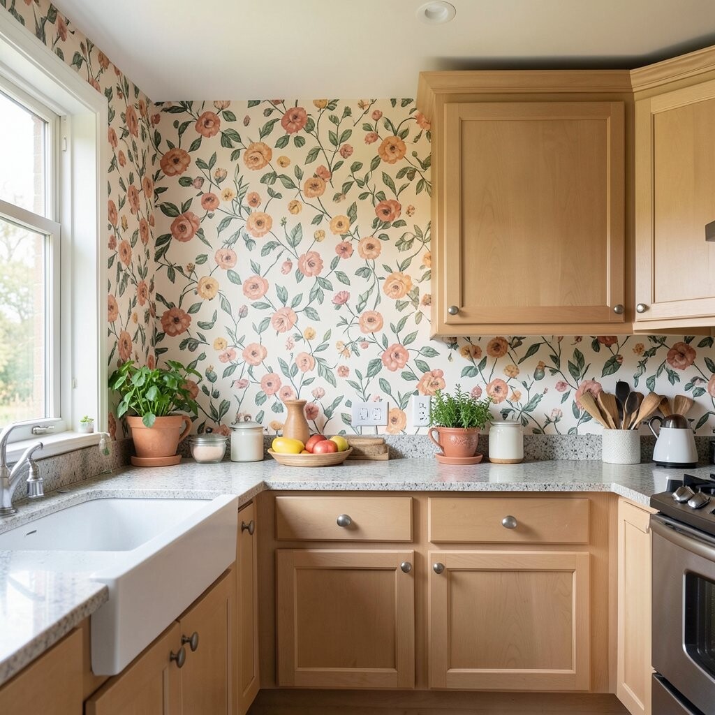
Kitchen wallpaper sits next to fresh fruit, wooden bowls, metal tools, and colorful dishes. If the colors clash, the room can feel messy even when it is clean.
Think about the shades you already own and choose wallpaper that plays well with them. Warm neutrals, soft greens, and gentle blues often work with many kitchens, while brighter prints can give a cheerful twist if the rest of the room stays simple. This approach keeps your kitchen looking personal without needing a full makeover.
It also helps the wallpaper feel like part of daily life instead of a separate thing on the wall. When the colors work together, the whole room feels more settled.
14. Hanging It Without a Plan for Repeats
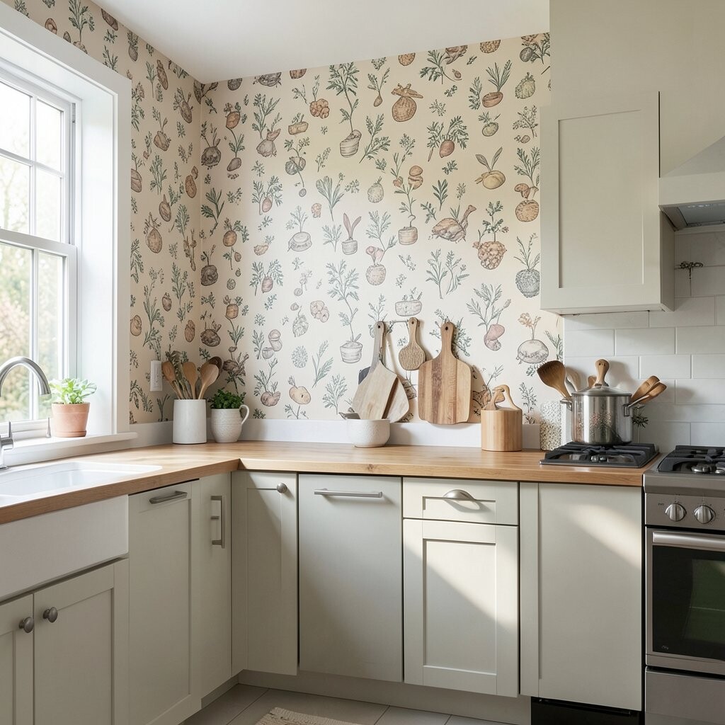
Pattern repeat can make or break the finished wall. If the design is not lined up well, flowers, shapes, or lines may look uneven and distracting.
Before hanging, study how the repeat works and mark the wall carefully. This extra care can make a bold pattern look smooth and professional, which is especially helpful if you want a high-end feel on a modest budget. Clean alignment also helps the room feel more thoughtful and unique.
Take your time near corners, outlets, and trim. A neat repeat makes even a playful print look calm and intentional.
15. Choosing a Trend That Will Tire Fast

Trendy wallpaper can be fun, but some looks fade quickly. If you follow a loud trend too closely, the kitchen may feel dated before you are ready to change it.
Try mixing one trendy touch with a classic base so the room keeps its charm longer. A modern color or fresh botanical can feel current without locking you into a style that may not age well, and that can protect your wallet from another early redo. This balance gives you freshness now and comfort later.
Classic shapes with a small twist often last best in kitchens. They keep the room feeling current while leaving room for your own taste to grow.
16. Missing the Chance to Make It Personal

A kitchen should say something about the people who use it. If the wallpaper feels generic, the room may look nice but not truly yours.
Choose a print that connects to your habits, favorite colors, or family stories. Maybe it echoes a garden you love, a color from a favorite bowl, or a pattern that feels calm during busy mornings, and those small details give the room heart without a big price tag. Personal touches often matter more than fancy features.
When wallpaper has meaning, the kitchen feels warmer every day. It can even make simple tasks like making tea or packing lunch feel a bit more pleasant.
17. Forgetting How It Looks with Open Shelving
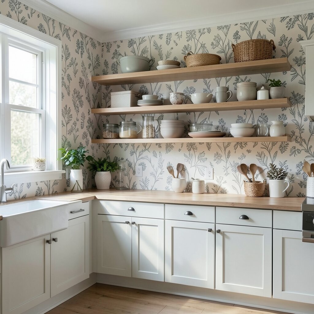
Open shelves expose more of the wall, so the wallpaper stays in view all the time. If the print is too loud or too plain, the shelves may lose their charm.
Think about the dishes, jars, and cups you display, and choose a pattern that helps them stand out. Soft background prints can make colorful plates pop, while a bolder wall may work best with simple dishware, and that choice can make the room feel more curated. The right mix can feel stylish without buying much more than paper and paste.
This is a great place to add personality in a small way. Your shelves and wallpaper can work together like a pretty stage for everyday items.
18. Not Planning for Future Changes
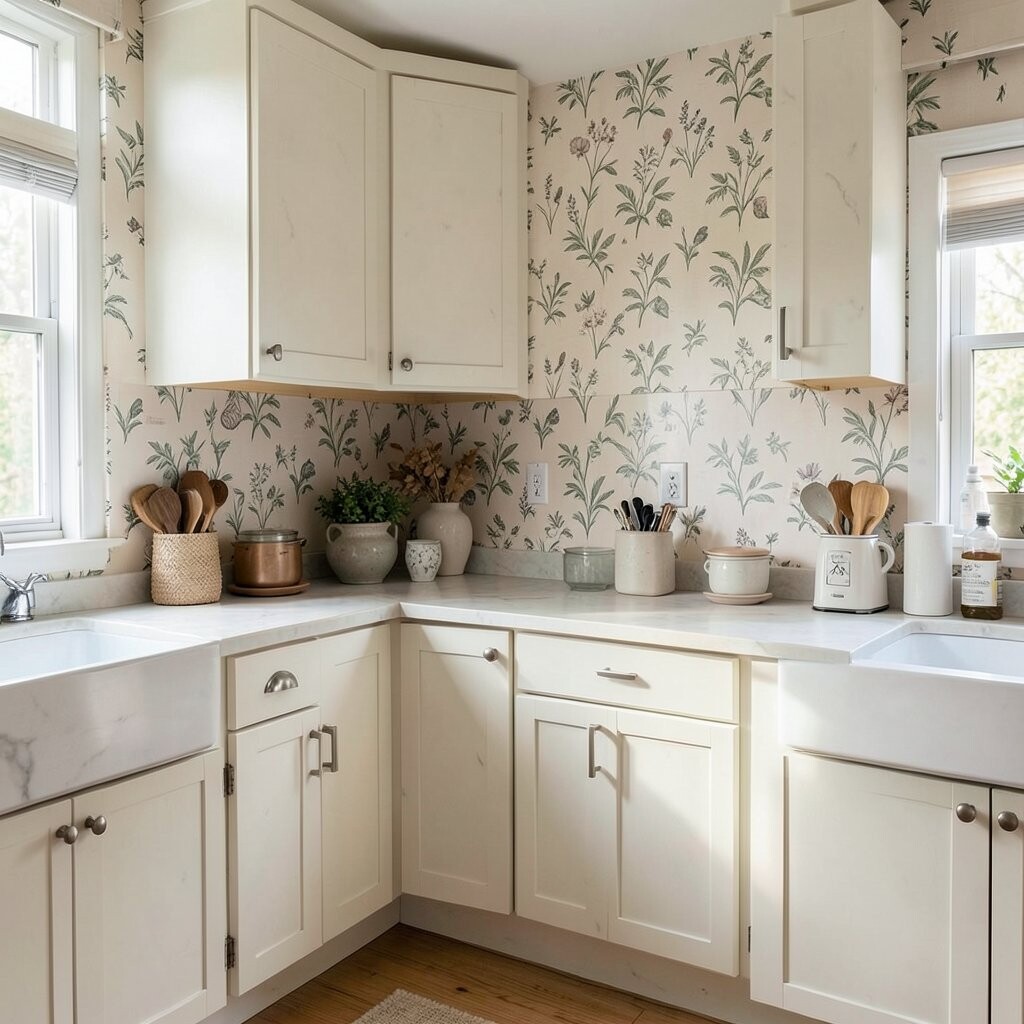
Kitchens change more often than people expect. If your wallpaper is too tied to one appliance color or one season, it may not suit the room later.
Choose a design that can live with future paint, chairs, and hardware changes. A flexible print saves money because you will not need to redo the walls each time a small update happens, and that makes the space feel smarter over time. Neutral wallpaper with a lively detail often works especially well for this.
Think ahead to how the room may age and still look good. That forward step can keep the kitchen stylish long after the first rush of decorating fades.
19. Rushing the Final Decision
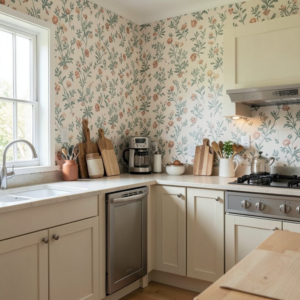
It is easy to fall in love with a wallpaper and buy it too fast. In a kitchen, that rush can lead to regret if the color, finish, or scale is not right.
Sleep on the choice, compare a few samples, and picture the room on a busy morning and a quiet night. This slower pace can save money, lower stress, and help you choose a look that feels right for the long haul. The best kitchen wallpaper is the one that still makes you smile after the first excitement passes.
When you give the choice some time, the room often tells you what it needs. That calm, steady approach can lead to a wall that feels beautiful, useful, and truly your own.