A kitchen can feel brand new with just a fresh coat of paint. The right color can make the room brighter, cozier, or more stylish in a way that feels easy and fun. If your kitchen needs a little spark without a big spend, these ideas may be exactly what you want.
1. Soft White With Warm Cream Undertones
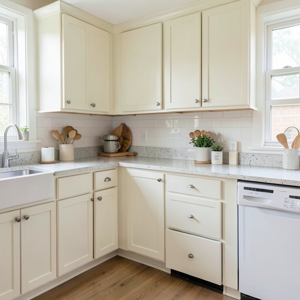
Soft white is a classic choice that makes a kitchen feel clean and airy. When it has a warm cream touch, it feels softer and more welcoming than a cold bright white.
This shade works well with wood shelves, gold handles, and simple tile backsplashes. It is great for small kitchens because it helps light bounce around the room.
What makes it special is how easy it is to style with almost anything. If you want a calm, tidy look on a budget, this is one of the safest and prettiest picks.
Try it on walls, cabinets, or even a ceiling for a fresh look. A gallon of good paint can cost less than many kitchen decor items, so it gives a lot of style for the money.
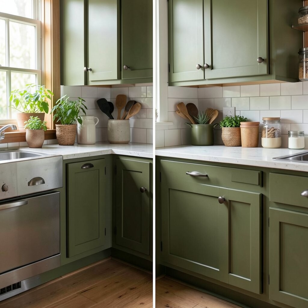
2. Sage Green With a Dusty Feel
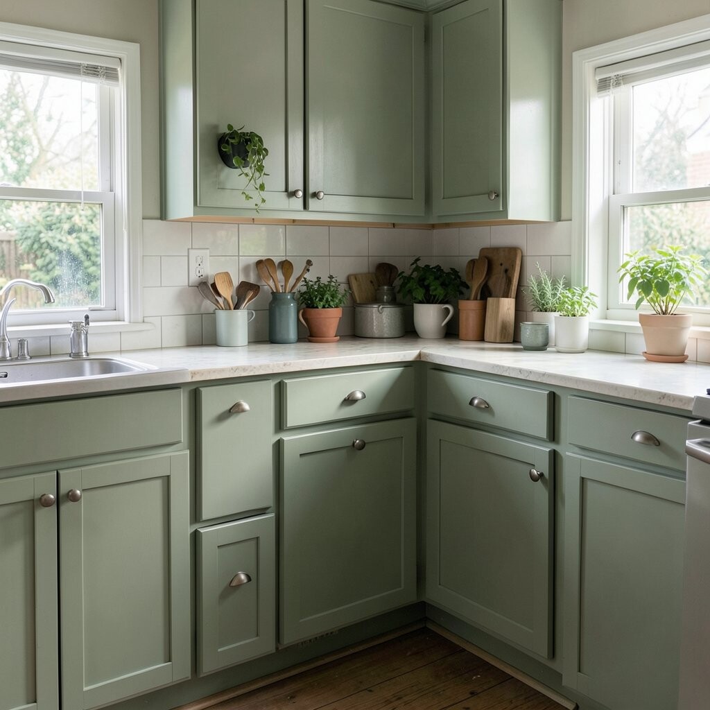
Sage green brings a soft nature look into the kitchen. It feels peaceful and cozy, like a little garden corner inside the home.
This color looks lovely with brass pulls, white dishes, and woven baskets. It also hides small marks better than very pale colors, which is helpful in busy kitchens.
The unique thing about sage is that it feels trendy and timeless at the same time. Many people love it because it works in modern homes and old homes alike.
For a personal touch, pair it with open shelves and potted herbs. Paint is still one of the cheapest ways to get a fresh style shift, and sage gives a rich look without a rich price.
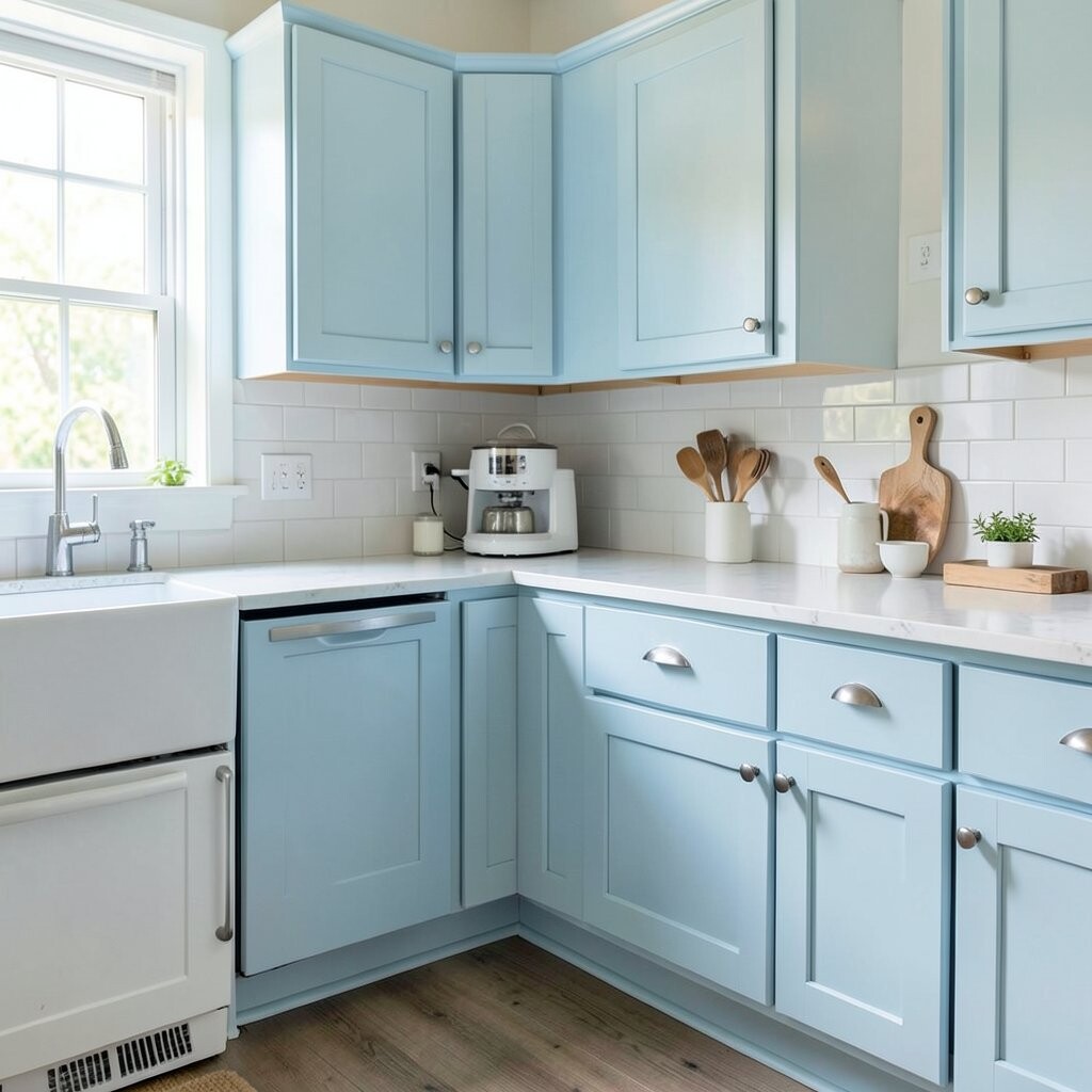
3. Pale Blue for a Breezy Mood
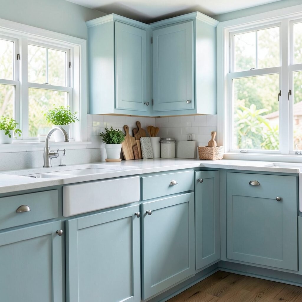
Pale blue makes a kitchen feel light, open, and fresh. It can remind you of a clear sky on a calm morning.
This shade is lovely with white trim, silver hardware, and glass jars. It is a smart pick for kitchens that need a cheerful lift without feeling too bold.
What stands out about pale blue is its gentle charm. It adds color, but it still feels soft enough for everyday use.
If you want a sweet and simple update, use it on lower cabinets or just one wall. It is a low-cost way to add personality while keeping the room easy to live in.
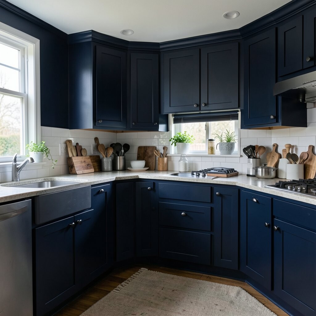
4. Deep Navy for a Fancy Look
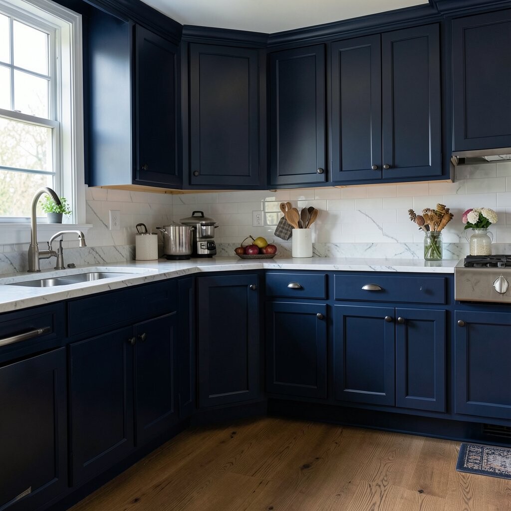
Deep navy gives a kitchen a rich and polished feel. It can make plain cabinets look much more expensive right away.
This color looks beautiful with white counters, light wood, and shiny metal handles. It works especially well in kitchens that get good natural light.
Navy is unique because it feels bold but still calm. It has a classic style that does not go out of fashion fast.
For a budget makeover, paint just the lower cabinets navy and keep the top half light. That mix saves money on extra materials and gives the kitchen a custom feel.
5. Butter Yellow for Happy Energy
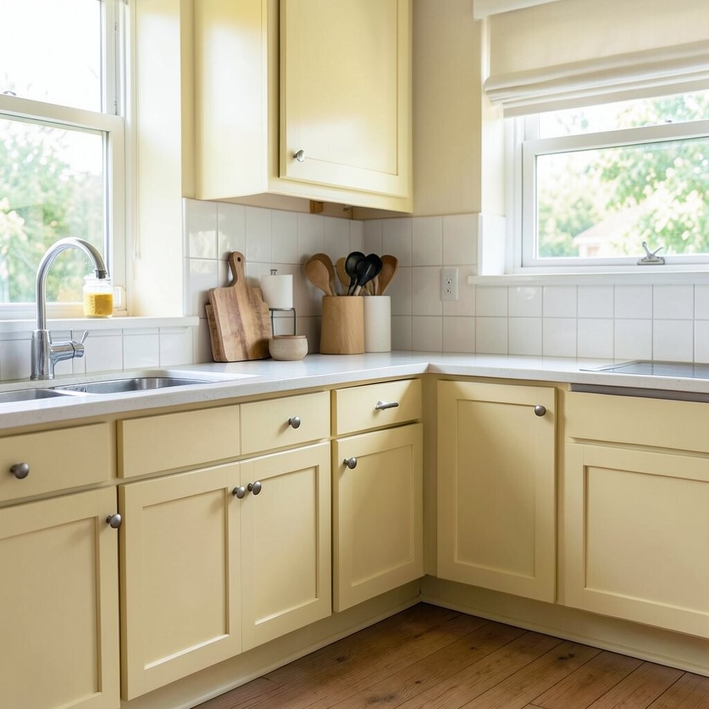
Butter yellow brings a sunny, cheerful feeling into the kitchen. It makes the room feel warm and friendly, like a smile on the walls.
This shade works well with white trim, pale wood, and simple farmhouse pieces. It is a great choice if your kitchen feels dull and needs a little joy.
What makes butter yellow special is how soft it is. It adds color without becoming too loud or hard to match.
Try it on a breakfast nook wall or on cabinet doors for a sweet touch. It is an affordable way to make the room feel brighter and more inviting every day.
6. Charcoal Gray for Modern Style
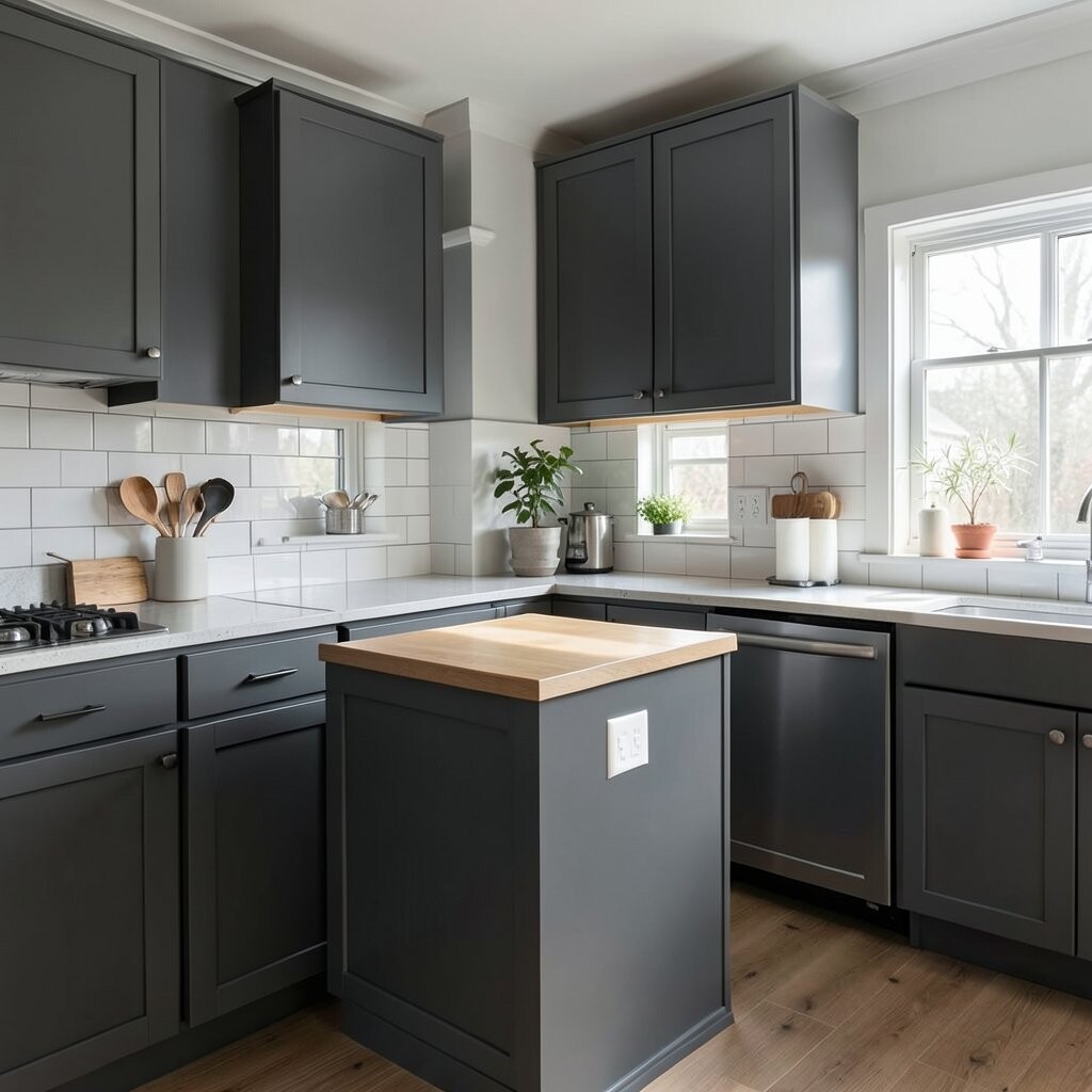
Charcoal gray gives a kitchen a cool, modern edge. It feels sleek and strong, but it can still be cozy when paired with the right accents.
This shade looks great with white countertops, warm wood, and black fixtures. It can help older kitchens feel more current without a full remodel.
The best part is how it hides smudges and little marks better than lighter paints. That makes it a smart pick for busy families and home cooks.
If you want a stylish update on a budget, use charcoal on one feature wall or the island. It gives a bold look while keeping the cost much lower than new cabinets.
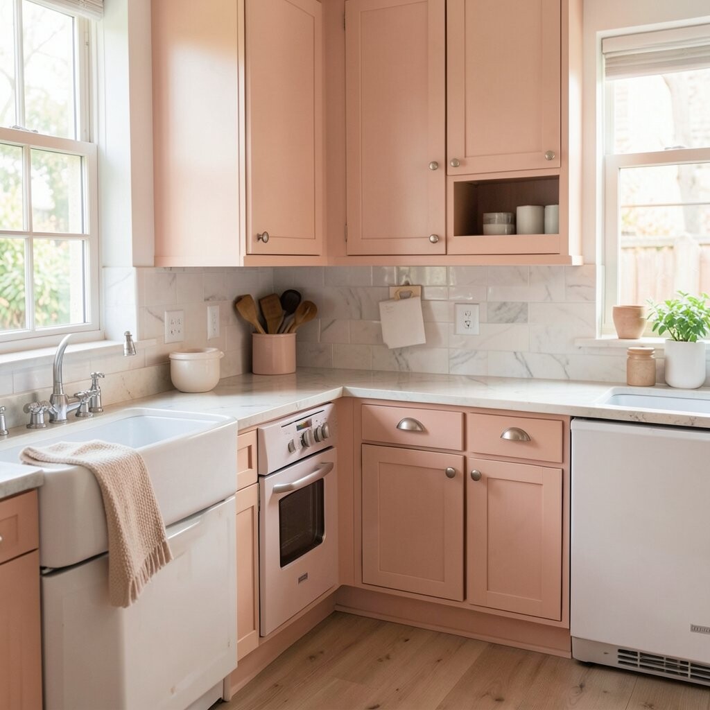
7. Blush Pink for a Soft Surprise
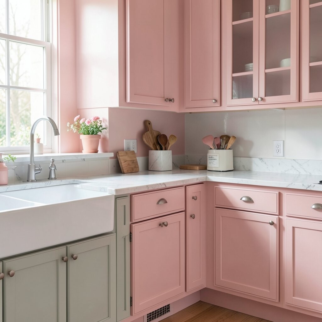
Blush pink can make a kitchen feel sweet, soft, and a little playful. It brings a gentle charm that feels fresh without being too bright.
This color pairs well with white tile, light oak, and matte gold details. It is a fun way to add personality if you want something a bit different.
Blush is unique because it feels trendy but still easy to live with. It can make the kitchen feel more special in a quiet, pretty way.
Try a dusty blush on a pantry wall or small cabinets for a pretty pop. Paint gives you a budget-friendly way to try a stylish look before spending on bigger changes.
8. Olive Green for Earthy Warmth
Olive green gives the kitchen a rich, earthy feeling. It feels grounded and cozy, almost like bringing the outdoors inside.
This shade looks lovely with cream counters, black handles, and natural wood cutting boards. It works well in kitchens that need warmth and depth.
What makes olive green stand out is its grown-up style. It feels a little moody, a little rustic, and very charming all at once.
For a personal touch, add woven textures and clay pots nearby. It is a smart, low-cost way to make a basic kitchen feel layered and full of character.
9. Crisp Black for a Bold Statement
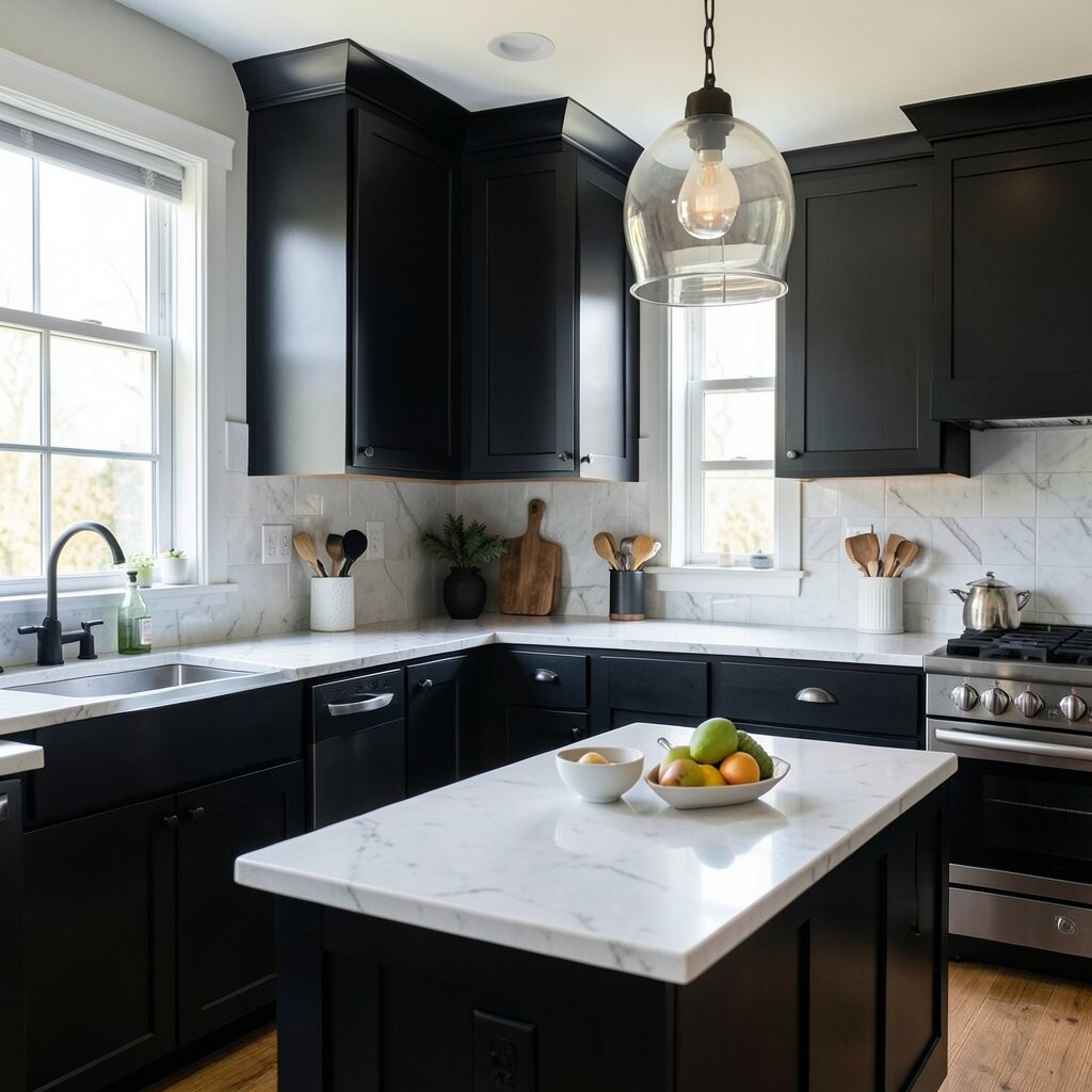
Black paint can make a kitchen feel sharp and stylish. It creates a strong look that feels clean and a bit dramatic.
This shade works well on lower cabinets, a pantry door, or a kitchen island. It pairs nicely with white walls, wood stools, and bright pendant lights.
The uniqueness of black is how quickly it can make simple things look chic. Even old cabinets can feel more modern with this color.
If you are nervous, use black in a small area first. It is a budget-friendly way to add a high-end feel without buying new kitchen pieces.
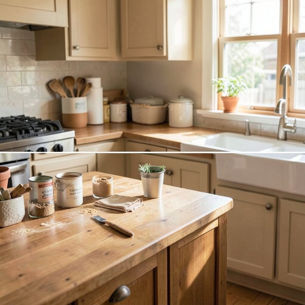
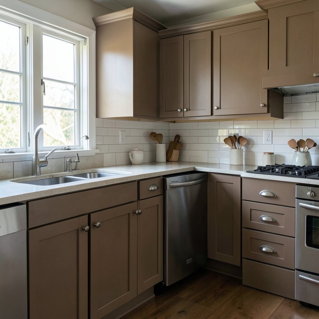
10. Warm Taupe for Easy Comfort
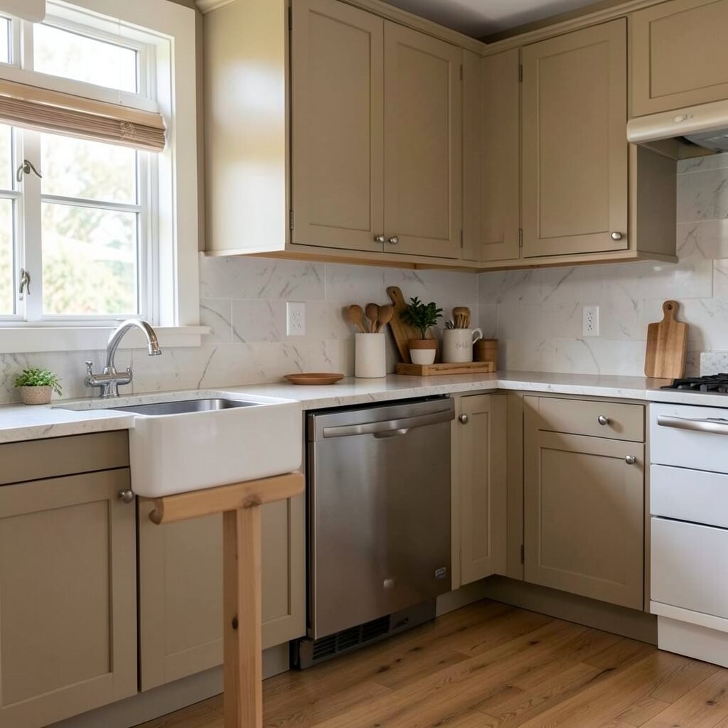
Warm taupe is a soft mix of beige and gray. It gives the kitchen a calm, cozy look that feels easy on the eyes.
This color is lovely with stone counters, white dishes, and wood accents. It fits many styles, from simple cottage looks to more modern spaces.
What makes taupe special is how smooth and gentle it feels. It does not shout for attention, but it still makes the room feel finished.
For a personal twist, use it with colorful tea towels or art prints. It is a low-cost color that can make your kitchen feel put together fast.
11. Dusty Teal for a Fun Vintage Feel
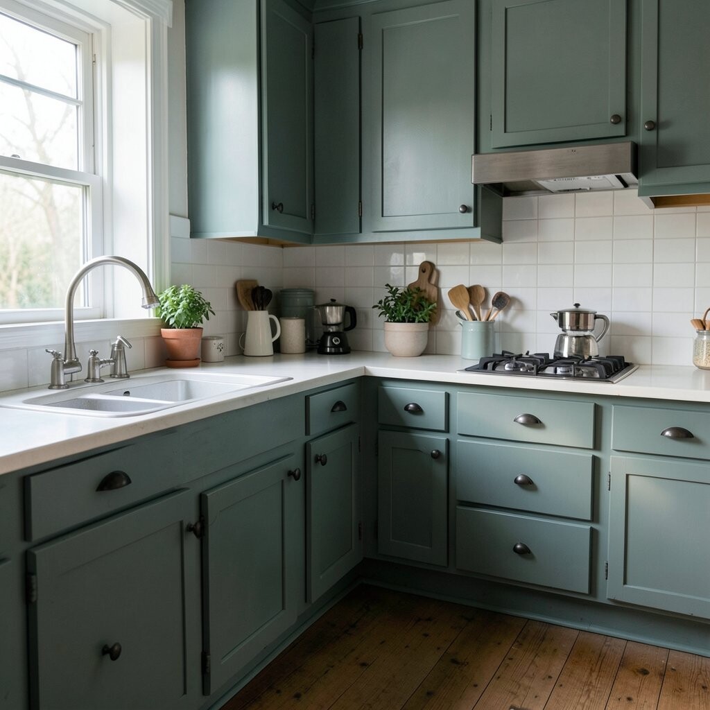
Dusty teal adds a pretty mix of blue and green to the kitchen. It has a vintage feel that can make the space seem full of charm.
This color looks great with brass, white tile, and old-style glass jars. It works especially well if you like a little color but not anything too bright.
Its uniqueness comes from the way it feels both playful and old-fashioned. That mix gives it a lot of personality.
Paint your island dusty teal and keep the rest of the room light for balance. It is a budget move that can make the whole kitchen feel custom-made.
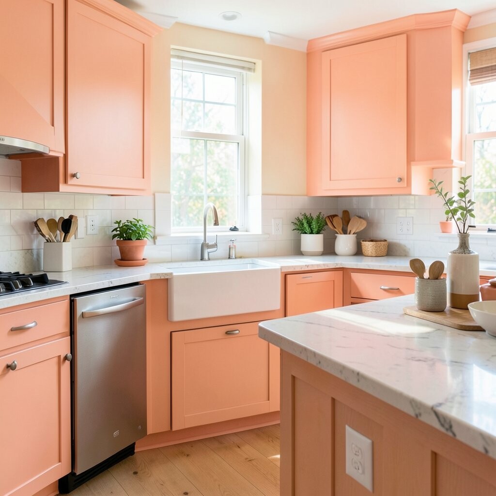
12. Soft Peach for a Cozy Glow
Soft peach gives a kitchen a warm glow that feels friendly and light. It can make morning coffee moments feel even happier.
This shade pairs well with cream cabinets, pale wood, and simple white dishes. It is a nice choice if you want color that feels gentle and sweet.
What makes peach special is its cheerful softness. It adds warmth without making the room feel too bold or busy.
Try it on one wall, a breakfast corner, or inside open shelves for a small surprise. It is a low-cost way to make the room feel fresh and personal.
13. Classic Greige for a Safe Stylish Pick
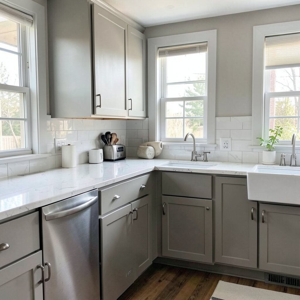
Greige is a mix of gray and beige that feels neat and modern. It is one of those colors that seems to fit almost anywhere.
This shade works with many cabinet colors, from white to dark wood. It is a smart choice if you want a calm kitchen that still feels updated.
The special thing about greige is how easy it is to live with. It gives you a polished look without being too cold or too plain.
Use it on walls and add bright decor for a little life. Since it is such a flexible color, it helps your budget stretch by matching items you already own.
14. Forest Green for Rich Depth

Forest green brings a deep, cozy feeling to the kitchen. It can make the room feel like a warm cabin with a stylish edge.
This shade looks beautiful with wood counters, cream tile, and black or brass hardware. It is a strong color, but it still feels natural and calming.
What makes forest green unique is its rich, full look. It gives a sense of luxury even when the project is small.
For a budget-friendly idea, paint just the lower cabinets or a coffee nook. Add plants and warm lighting to make the color feel even more inviting.
15. Powder Blue for a Light Fresh Look
Powder blue feels soft, airy, and clean. It can make a kitchen seem brighter and more open right away.
This color works well with white trim, pale wood, and simple silver hardware. It is a sweet choice for people who want color but still like a light, calm room.
The uniqueness of powder blue is how gentle it feels. It can make the kitchen feel quiet in a good way, almost like a peaceful morning.
Try it on cabinets with a glossy finish for a fresh touch. Paint is a small cost compared with new cabinet doors, and this shade gives a very pretty payoff.
16. Terracotta for Warm Rustic Charm
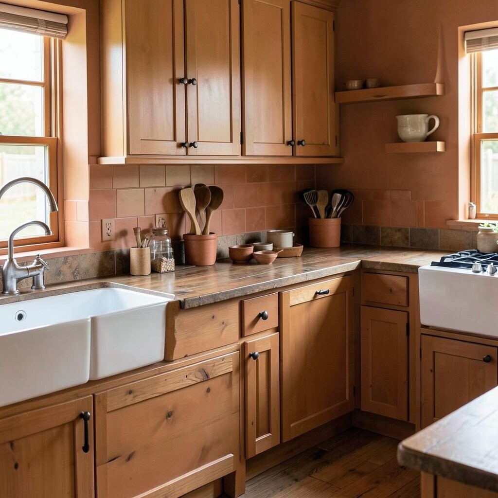
Terracotta brings a warm, earthy glow to the kitchen. It feels inviting and full of life, like sunbaked clay.
This shade looks lovely with cream, tan, black, and natural wood. It works well in kitchens that need a cozy, handmade feel.
What makes terracotta special is its rustic charm. It can make a plain room feel more interesting and full of texture.
Use it on an accent wall or a small cabinet area if you want a softer start. It is a budget-friendly way to add warmth without buying lots of new decor.
17. Soft Lavender for a Pretty Twist
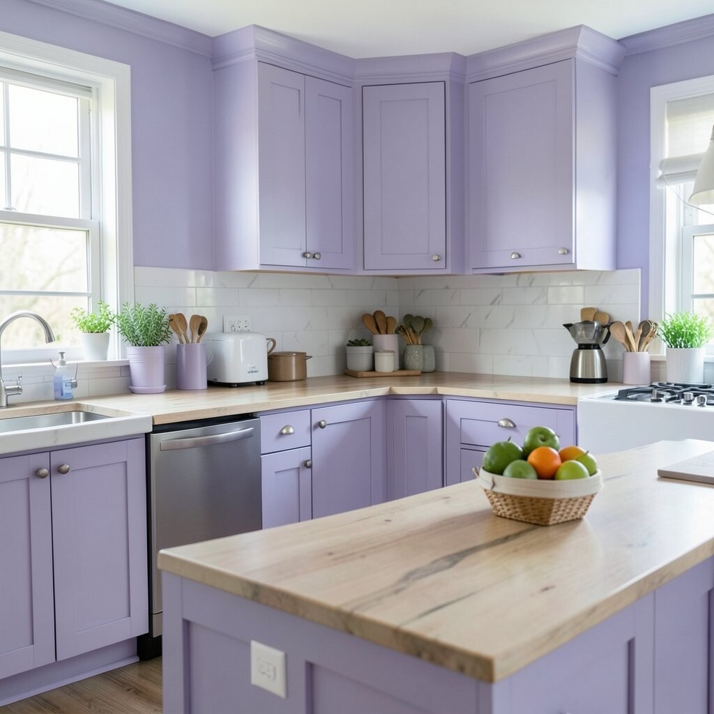
Soft lavender gives the kitchen a sweet and dreamy look. It feels light and a little magical, but still calm enough for daily life.
This color pairs well with white cabinets, silver hardware, and glass canisters. It is a fun choice if you want something a bit unexpected.
The unique part of lavender is how fresh it feels without being loud. It can add a gentle charm that stands out in a lovely way.
For a personal touch, mix it with floral dish towels or pastel art. It is a low-cost color that can make the kitchen feel cheerful and special.
18. Warm Sand for a Natural Look
Warm sand is a soft tan shade that feels simple and cozy. It brings a calm, beachy feeling without looking too themed.
This color works well with white trim, woven textures, and light wood. It is a great pick if you want the kitchen to feel relaxed and easy.
What makes warm sand unique is how natural it looks. It blends well with many styles and does not fight with other colors.
Try it with open shelves and ceramic bowls for a clean, homey look. It is a smart budget choice because it gives a polished finish without needing extra design pieces.
19. Midnight Blue for Deep Drama
Midnight blue makes a kitchen feel rich, deep, and a little fancy. It has a strong look that can make even simple spaces feel special.
This shade pairs beautifully with white counters, brass handles, and warm wood stools. It is great for adding depth without using black.
The uniqueness of midnight blue is its moody charm. It feels bold, but it still has a soft side when the light hits it.
Paint the island or lower cabinets for a dramatic touch on a smaller budget. This gives you a high-style look without repainting the whole room.
20. Pale Mint for a Fresh Retro Feel
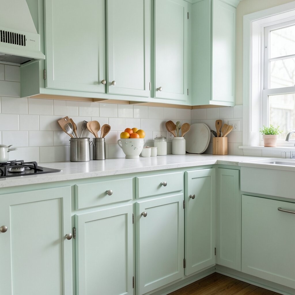
Pale mint gives the kitchen a cool, fresh feeling with a retro wink. It feels light, playful, and easy to enjoy every day.
This color looks great with white tile, chrome accents, and simple wood details. It is a fun way to bring in color without making the space feel too busy.
What makes pale mint special is its cheerful, old-school charm. It can make a kitchen feel happy and a little nostalgic.
For a personal touch, use mint with vintage dishes or fun tea towels. It is a low-cost paint idea that can make the room feel bright and full of personality.
21. Mushroom Brown for Quiet Style
Mushroom brown is a soft, muted brown-gray that feels calm and modern. It gives the kitchen a grounded look that feels easy to live with.
This shade works well with cream, black, and natural wood. It is a great choice if you want something deeper than beige but softer than dark brown.
The unique thing about mushroom brown is its quiet style. It feels refined without trying too hard.
Use it on walls or cabinets and add warm lighting for a cozy effect. It is a budget-friendly way to make the kitchen feel rich and welcoming.
22. Sunny Coral for a Bright Happy Pop
Sunny coral brings a lively, happy energy into the kitchen. It feels fresh and bold, like a cheerful burst of color.
This shade looks lovely with white cabinets, pale wood, and simple gold accents. It works best in small or medium doses if you want a lively but balanced look.
What makes coral unique is how playful it feels. It can turn a plain kitchen into a place that feels full of fun and warmth.
Try it on a single wall, stools, or the inside of a pantry for a fun surprise. It is an easy, low-cost way to make the kitchen feel bright, personal, and ready for a fresh start.