
Neutral rooms can feel warm and full of life. The right shade can make them glow in a gentle way.
1. Soft White Walls

Soft white walls give a room a clean look that feels bright without being harsh. They bounce light around, which helps small rooms feel open and fresh.
This shade works well with almost any style, from modern to cozy cottage. It is also a smart choice if you want a budget-friendly update, since a simple paint job can change the whole feel of a space. Add warm wood, woven baskets, or black frames to keep the room from looking plain.
2. Warm Beige Layers

Warm beige brings a smooth, sandy look that feels calm and welcoming. It adds more depth than plain white, so the room feels rich but still light.
You can use it on walls, rugs, or curtains for a soft layered effect. It is a favorite in homes that want a natural look, and it pairs nicely with cream, tan, and muted green. If you are decorating on a small budget, beige pillows or throws can make a big difference without much cost.
Try mixing matte and textured pieces so the color has more interest. A beige room can feel very personal when you add family photos, handmade pottery, or a favorite reading chair.
3. Greige Comfort

Greige, which is a mix of gray and beige, gives a room a smooth and balanced look. It feels softer than gray alone and warmer than beige alone, so it works in many homes.
This shade is great if you want a modern space that still feels cozy. It looks nice with brass, natural wood, and creamy fabrics, and it is a strong trend in calm, lived-in interiors. For the best result, test it in morning and evening light before painting the whole room.
Greige also helps artwork and furniture stand out without stealing the show. If you want a custom feel, pair it with one deeper neutral, such as taupe or charcoal, for a layered look that feels thoughtful.
4. Creamy Ivory Accents

Creamy ivory adds a gentle glow that can make a room feel soft and sunny. It has a warmer touch than pure white, which makes the space feel more relaxed.
Use it in bedding, lampshades, or painted trim to brighten dark corners. It is a nice choice for rooms that get little sunlight, and it often looks more expensive than it really is. To make it feel special, mix ivory with linen, cane, or light oak pieces.
5. Pale Taupe Balance
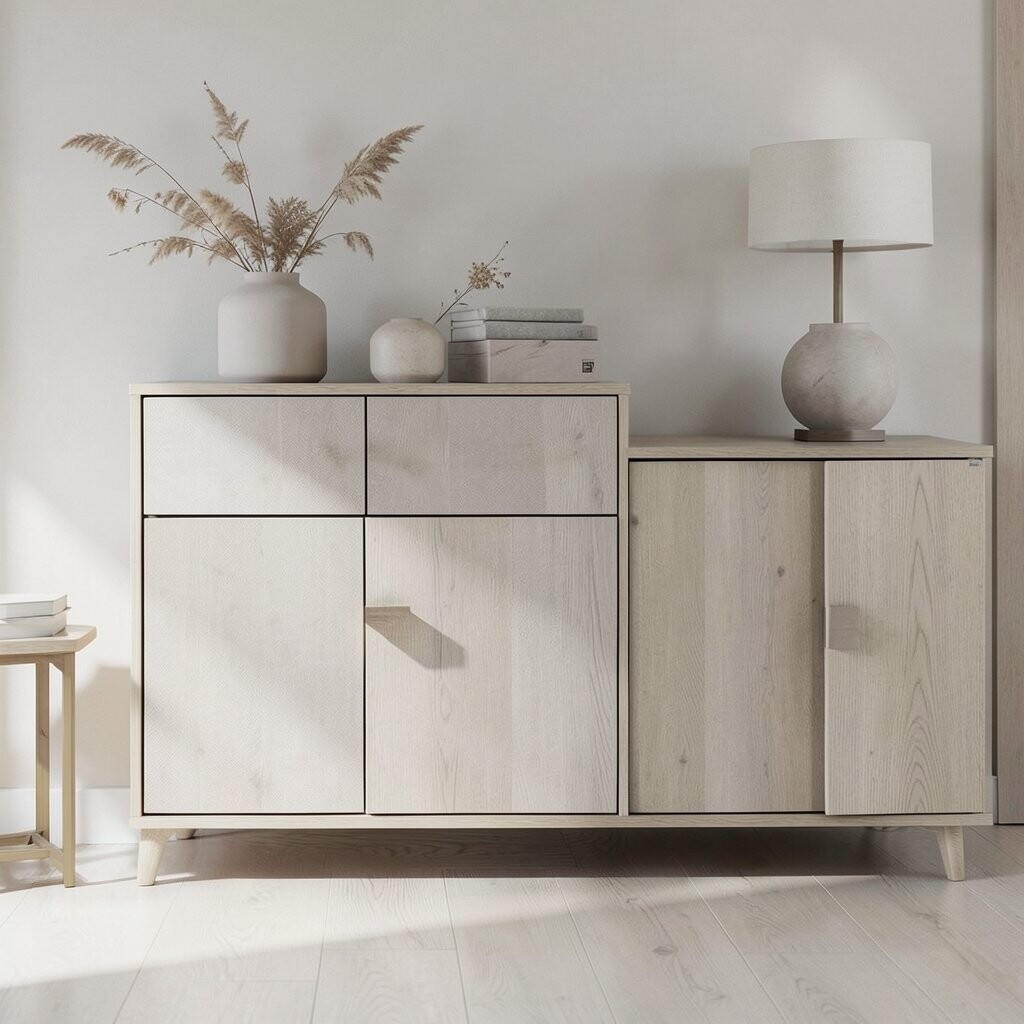
Pale taupe brings a quiet elegance that feels both earthy and light. It can calm a busy room while still giving it enough color to feel complete.
This shade is useful in bedrooms, living rooms, and entryways where you want a soft welcome. It fits well with current trends that favor natural tones and gentle contrast, and it is easy to find in paint, fabric, and decor. If your room needs more life, add green plants or gold details to wake it up.
Pale taupe also works well for people who like to change decor often. It gives you a flexible base, so you can switch pillows, art, and accessories without repainting.
6. Light Stone Neutrals

Light stone shades have a cool, smooth feel that can make a room look polished and bright. They remind you of river rocks and soft concrete, but in a friendlier way.
This color is good for modern homes that need a calm backdrop. It can make white trim pop and can also help colorful accents stand out more clearly. Since it is a timeless choice, you will not need to replace it soon, which helps save money over time.
To keep the room from feeling flat, bring in cozy textures like wool, velvet, or thick knit blankets. A few warm accents will make the space feel balanced and more personal.
7. Sand-Toned Serenity

Sand-toned neutrals feel soft, sunny, and easy to live with. They create the look of a calm beach house without needing bright color.
This shade is lovely in rooms where you want a relaxed mood, such as family spaces and bedrooms. It blends well with rattan, driftwood, and white ceramics, which makes styling simple and affordable. For a more custom look, use different sand tones together so the room has depth.
It is also a strong choice if you want a space that feels bright but not cold. A sand wall color can make everyday items feel more polished, even when the rest of the decor stays simple.
8. Dove Gray Glow
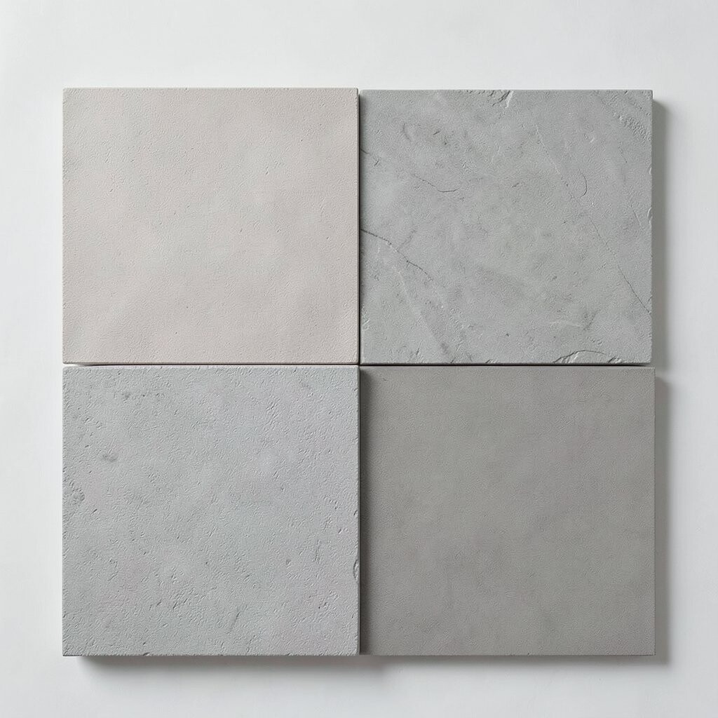
Dove gray has a soft misty look that can brighten a room in a calm way. It gives walls a gentle color that feels neat and airy.
This shade works especially well in homes that get a lot of daylight, since it changes softly as the light moves. It is a smart pick if you like clean lines and a fresh style, and it pairs nicely with white, navy, and light wood. You can keep costs low by using dove gray in just one feature wall or in a set of matching decor pieces.
To make the space feel warmer, add a cream rug or beige curtains. The mix of cool and warm neutrals gives the room a finished look that still feels easy.
9. Mushroom Modern

Mushroom is a cozy neutral with a hint of earthy warmth. It gives a room a grounded feel while still keeping things bright enough to stay cheerful.
This color is popular in rooms that want a soft and stylish look without going too dark. It looks beautiful with natural linen, walnut furniture, and simple black accents, and it can make a room feel more mature in a good way. If you are decorating slowly, mushroom pillows or a small accent chair are good low-cost ways to start.
The shade has a special charm because it feels both calm and rich. Add a woven light fixture or handmade ceramics to bring out its natural side and make the room feel one of a kind.
10. Oatmeal Softness
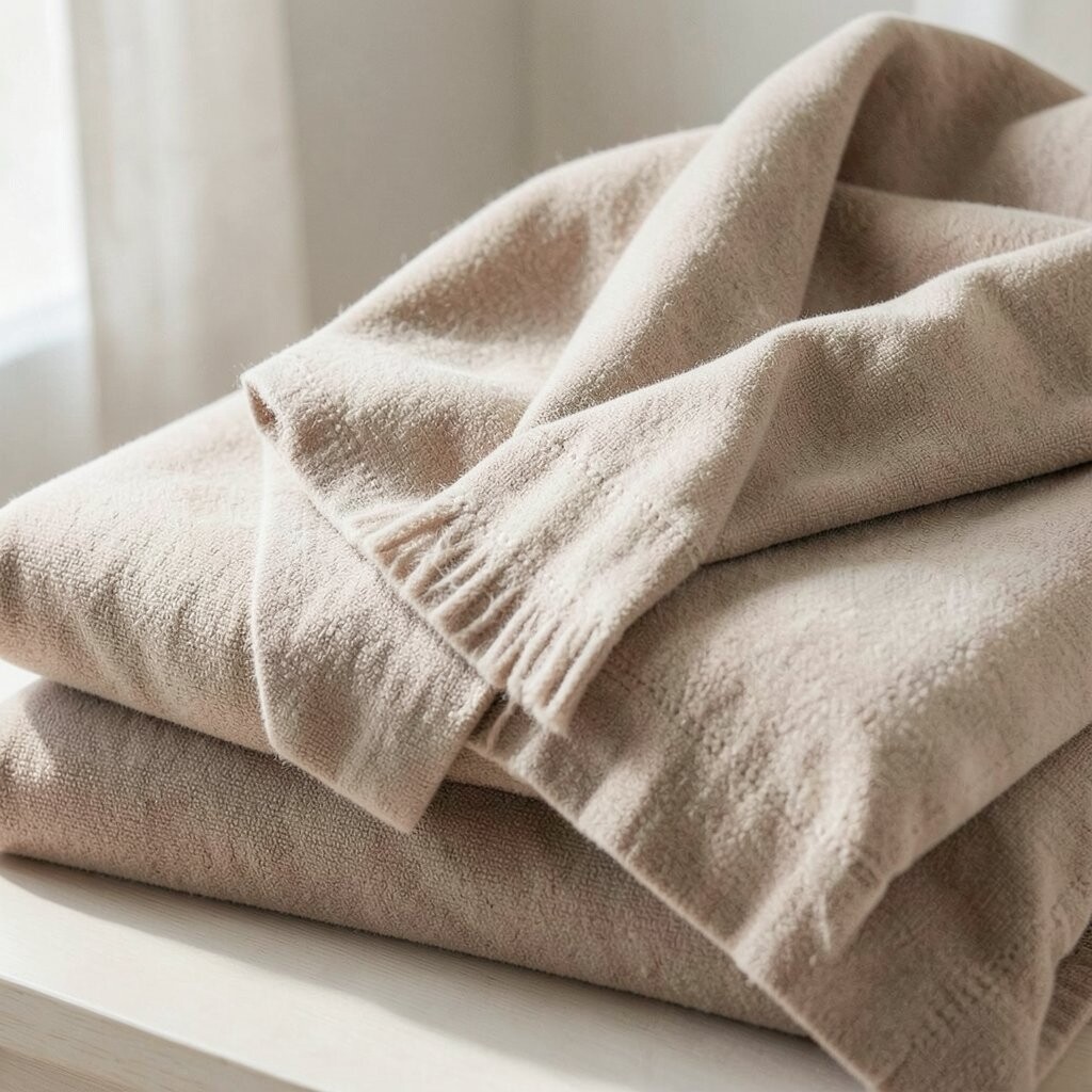
Oatmeal is one of those shades that feels friendly right away. It has a warm, gentle look that can make a room feel soft and lived in.
It is a helpful choice for large walls, curtains, and rugs because it brings the space together without shouting for attention. Oatmeal works well with the cozy home trend that mixes comfort, texture, and simple shapes. If you want to keep spending in check, start with pillows or bedding in this color before buying bigger pieces.
This shade also gives you room to play with style. You can make it look relaxed with cotton and knit fabrics, or more polished with glass, brass, and smooth wood.
11. Pebble Gray Tones

Pebble gray has a soft rocky look that feels calm and neat. It can make a room seem fresh, especially when paired with bright trim or sunny light.
This color is great for people who want a neutral that is not too warm and not too cool. It works in offices, halls, and sitting areas because it feels steady and easy on the eyes. To keep costs reasonable, use it in rooms that already have good light, since the color will look best there.
Add personal touches like framed prints, books, or a bold chair to keep the room from feeling too plain. Pebble gray gives those pieces a clean backdrop, so they stand out in a quiet way.
12. Linen White Warmth
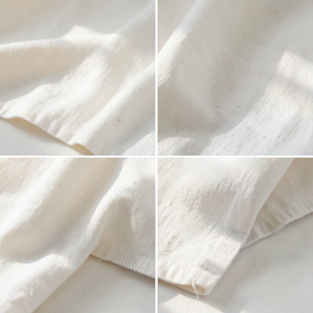
Linen white feels airy, soft, and a little creamy, like fresh fabric in sunlight. It can make a room look brighter while still keeping a cozy mood.
This shade is a nice fit for people who want white walls but do not want a stark or cold look. It is easy to use with almost any decor style, and it has been a steady favorite in many current homes because it feels calm and natural. If you want a small change with a big effect, linen white on trim, shelves, or cabinets can refresh the whole room.
The color also works well with simple accessories in clay, wood, or soft green. Those touches help the room feel cared for and personal without needing a lot of money.
13. Dusty Almond Charm
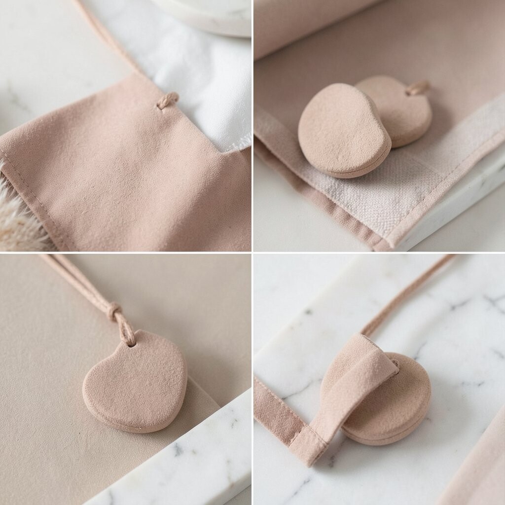
Dusty almond adds a soft golden touch that feels warm and inviting. It brightens a room in a quiet way, giving the space a sunny mood without strong color.
This shade is lovely for walls, throws, and upholstered chairs because it brings a gentle glow to the whole room. It pairs well with natural textures and is a nice choice for homes that want a friendly, collected feel. Since it is subtle, you can use it in small amounts if you are unsure about going all in.
For a more custom result, mix dusty almond with ivory and caramel details. The layered look feels rich, but it still stays simple enough to live with every day.
14. Muted Clay Neutrals
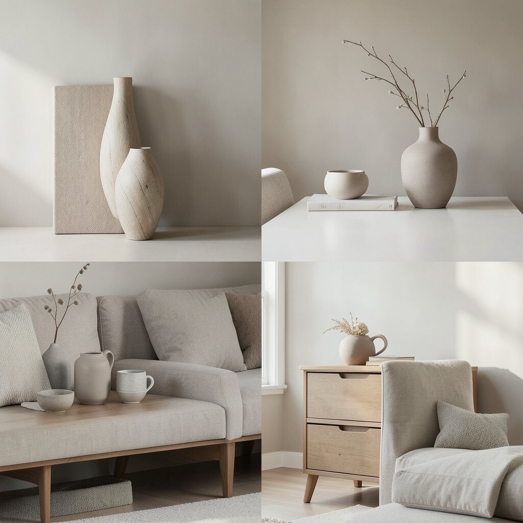
Muted clay gives a room a soft earthy warmth that feels fresh and welcoming. It adds more character than many pale neutrals, yet it still keeps the space bright and calm.
This shade is especially nice in dining areas, bedrooms, and living rooms where you want a gentle color story. It fits current design trends that lean toward natural, sun-baked tones, and it can look beautiful with cream, terracotta, and pale wood. If you are watching your budget, use muted clay in a few key decor pieces and let the rest of the room stay simple.
The color stands out because it feels grounded but still light enough for everyday use. Personal touches like woven art, handmade vases, or a vintage lamp help it feel unique and full of personality.