Blue can feel like a quiet breath for a room. With the right choices, your space stays calm without looking crowded.
1. Airy Pale Blue Walls With Clean Edges
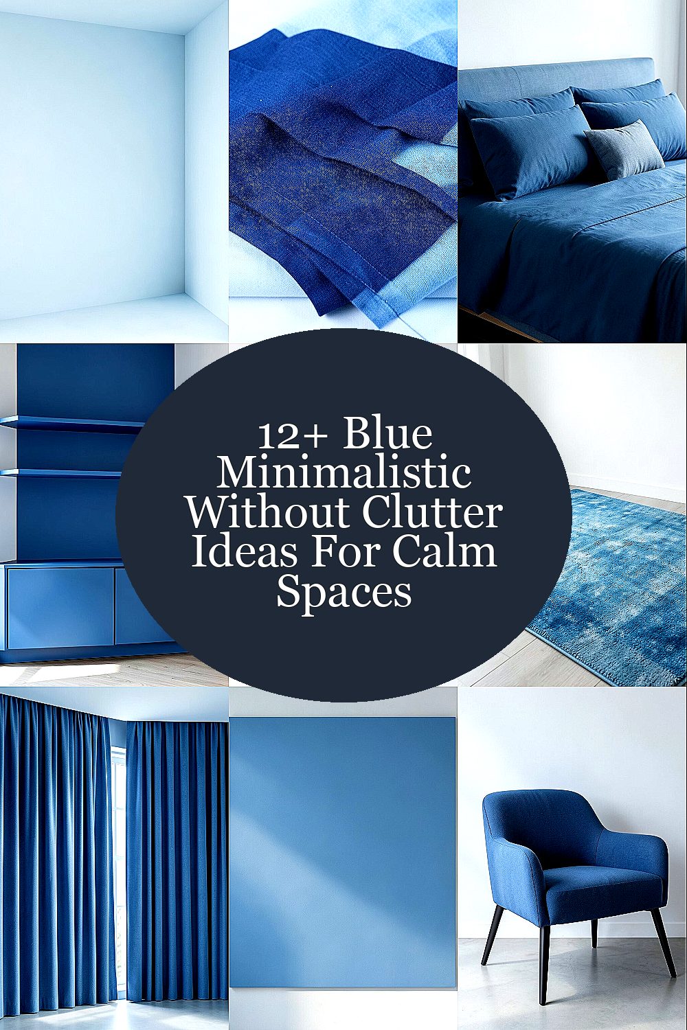
Choose a soft, pale blue that looks bright but not harsh. It makes walls feel farther away and helps your eyes rest.
Paint coverage matters, so use a quality primer and smooth coats for a neat finish. Keep the color consistent from trim to ceiling to avoid busy visual breaks. If you love variety, try a slightly deeper blue on one interior wall to add calm depth without clutter.
2. Layered Navy and Sky Textiles Instead of More Stuff
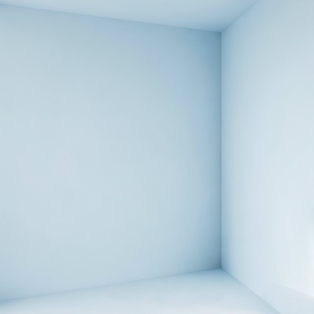
Use curtains, throw blankets, and pillow covers in navy and sky tones for a calm color rhythm. Soft fabrics add comfort without adding visual noise.
Try a simple rule: one solid pattern maximum, and the rest in plain textures like linen or cotton. This keeps the room feeling intentional and easy to manage day to day.
For personalization, match the textile undertone to your walls, like cooler blues for grayish paint. If you’re on a budget, swap covers first, then update one curtain panel later. Thrift stores often have great pillow covers if you wash and check fabric condition.
3. Tonal Blue Bedding With One Calm Focal Accent
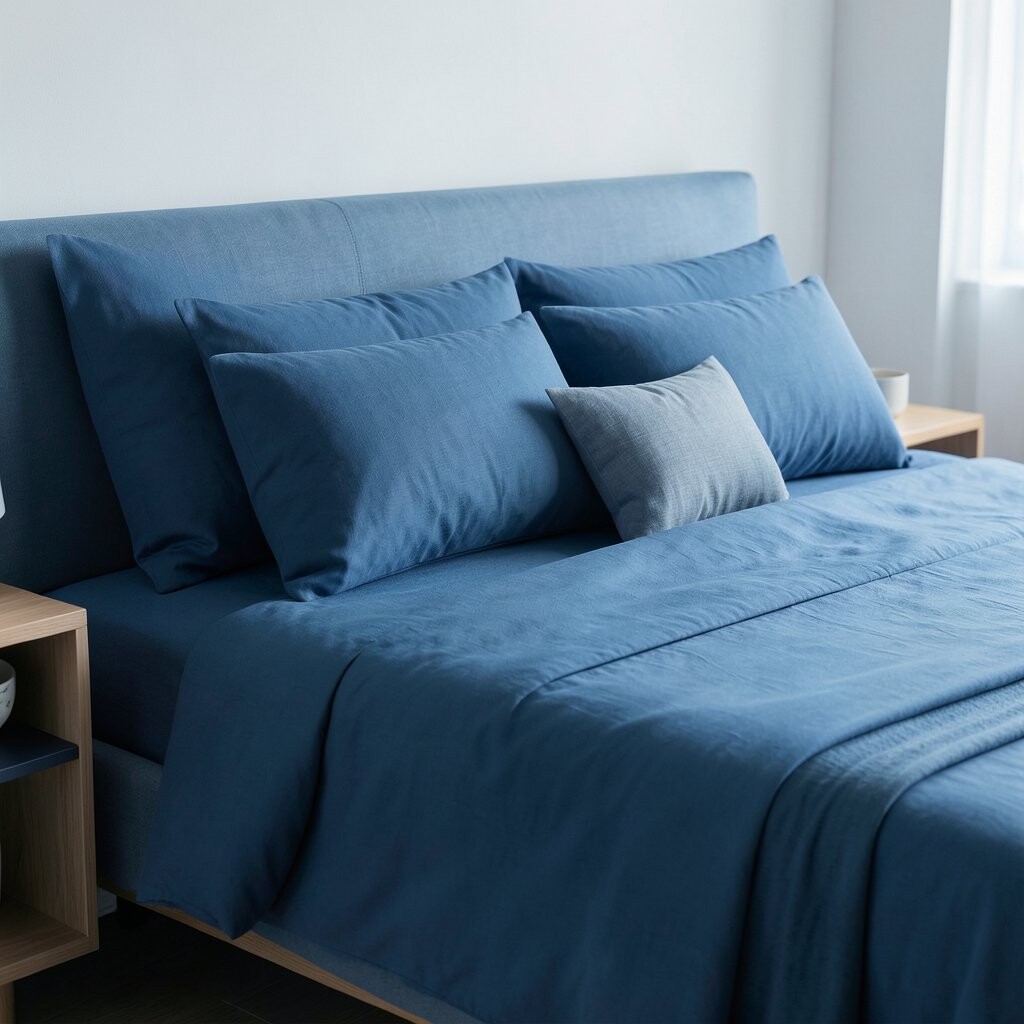
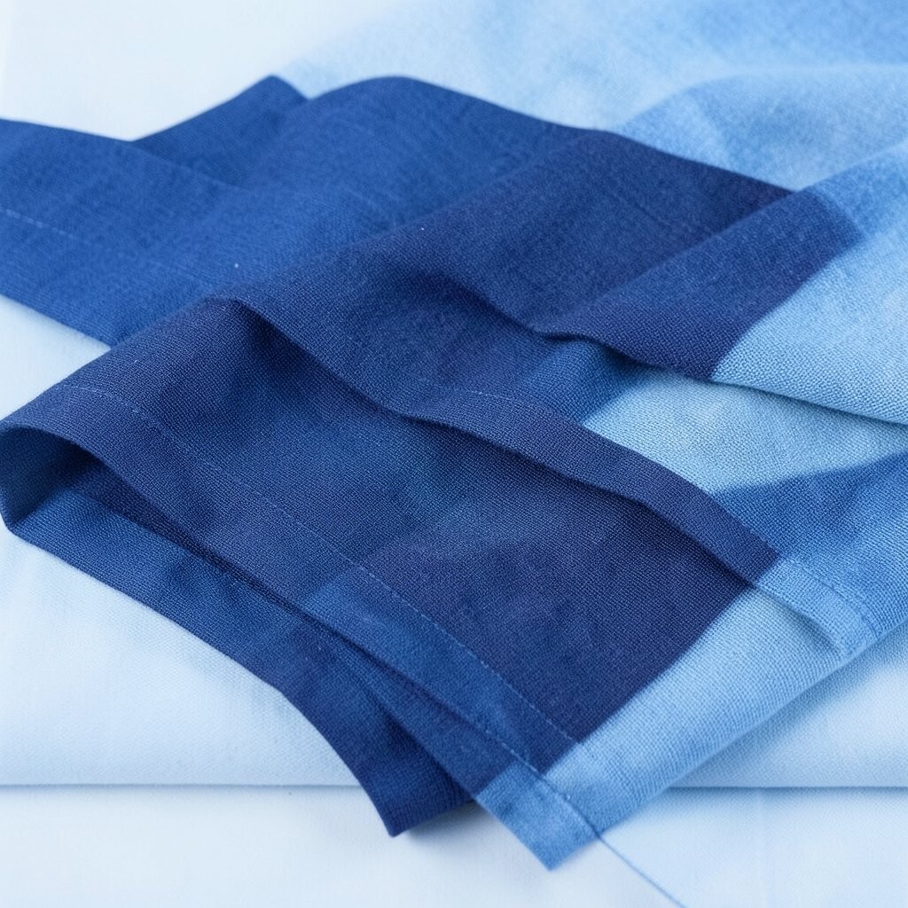
Set your bed with tonal shades that stay within the same blue family. Think of a gradient effect, from pale sheets to slightly deeper duvet edges.
Choose one focal accent, like a single medium-blue throw or a textured headboard cushion, instead of many competing pillows. Fewer items on the bed also make it easier to keep tidy every morning.
Unique touches can be subtle, such as matelassé stitching, ribbed knit, or a fabric that catches light gently. Aim for crisp corners and a smooth top surface so the look stays minimal. If you want cost control, start with duvet covers and build the rest slowly as pieces wear out.
Right now, tonal “quiet luxury” bedding styles are popular, and blues are often chosen because they photograph well and feel soothing. In a small room, this layered look can make the bed feel larger and more grounded without adding bulk.
4. Floating Shelves With Closed Storage Below
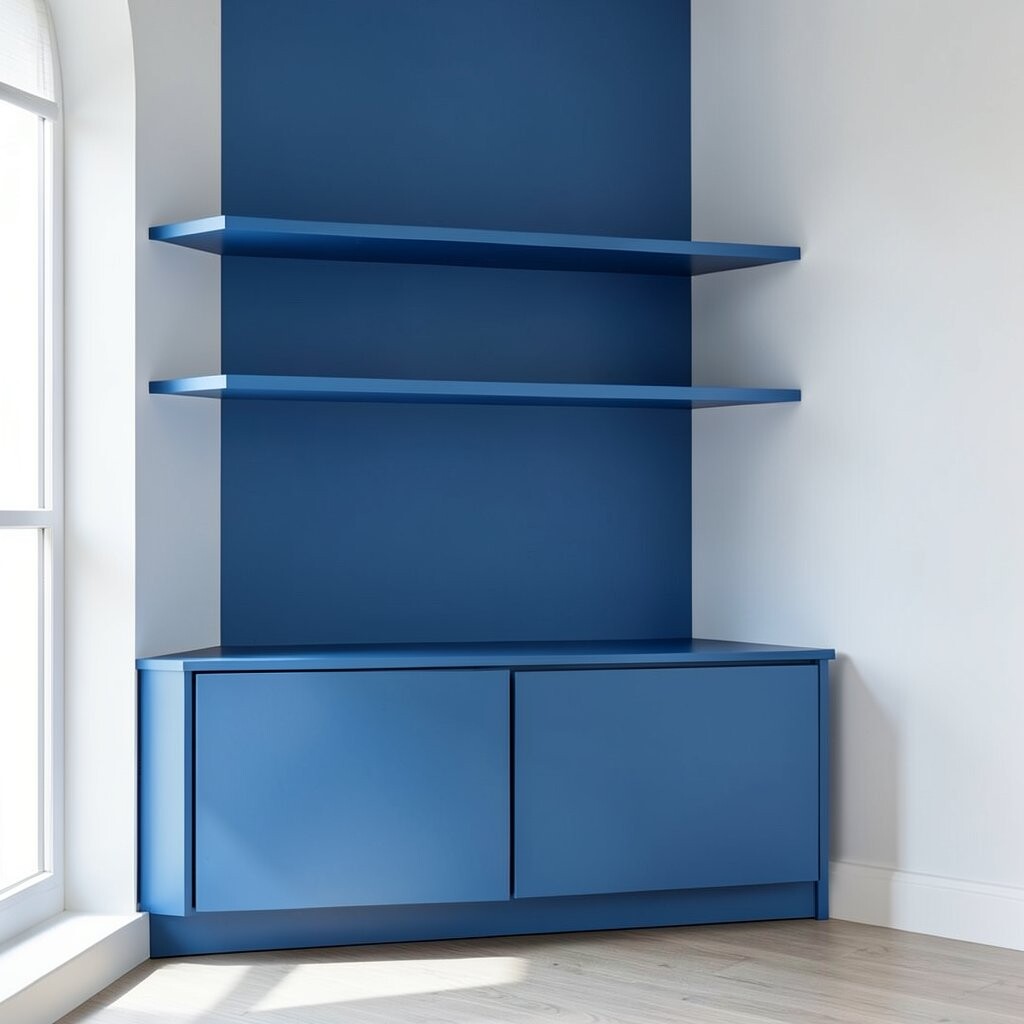
Floating shelves in blue tones can show just a few favorite items while keeping the rest hidden. Pair them with closed cabinets or drawers underneath for a tidy visual line.
Use the shelves like a gallery: keep objects spaced and limit the number of pieces. This prevents the room from looking like it’s always under construction.
5. Matte Blue Ceramic Vases With Fewer Flowers
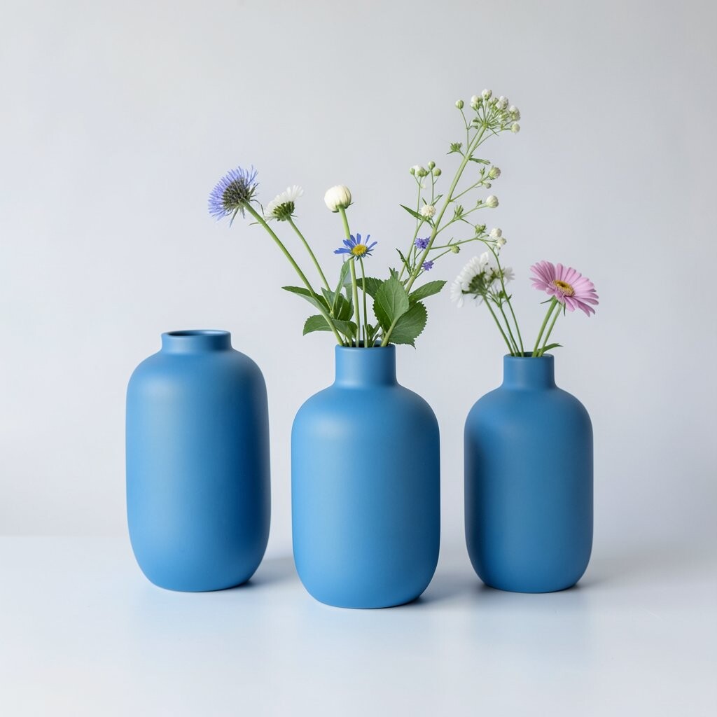
Pick one or two matte blue vases to bring color to a tabletop or windowsill. Matte finishes feel modern and don’t reflect light in distracting ways.
For a calm look, use fewer stems or choose seasonal branches that look good even when they start to fade. A short arrangement can feel intentional and less “decor overload.”
Uniqueness comes from shape: try tall and narrow next to a round bud vase for balance. If you want to personalize, match the vase glaze to your wall paint undertone. Costs can be friendly because you can buy one standout vase and reuse it with different stems throughout the year.
6. Ocean-Blue Area Rug That Anchors Everything
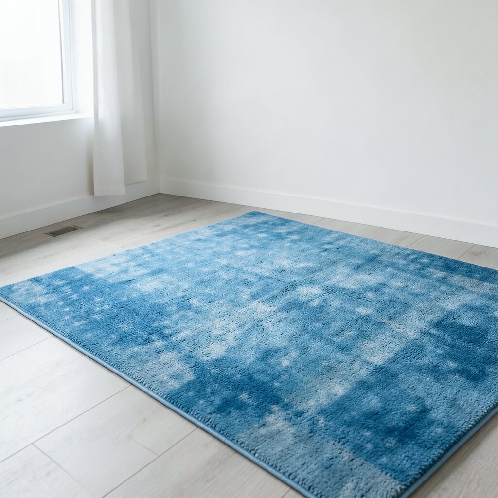
An ocean-blue rug can anchor a living room and reduce the need for extra decor. When the floor has a calming color, everything else feels more organized.
Choose a rug with a simple pattern or a solid tone so it doesn’t compete with furniture. Make sure the front legs of your seating pieces sit on the rug for a cohesive layout.
For practical tips, measure first and plan for the rug to extend past the seating area. If your room is small, a lighter blue rug can make it feel wider. Trends right now favor vintage-inspired distressed looks, so consider a soft, worn finish to add character without clutter.
7. Blue Curtains That Reach the Ceiling for Height
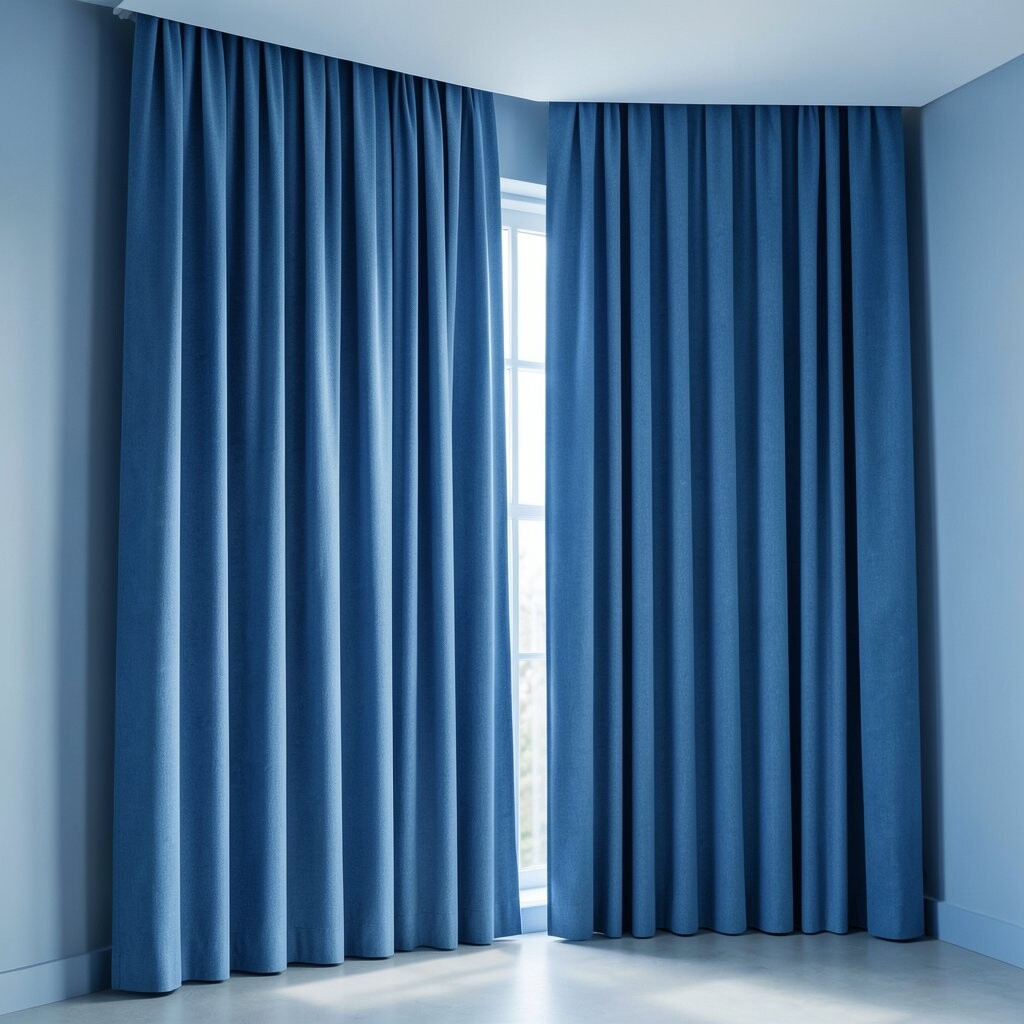
Ceiling-height curtains in blue create a smooth vertical flow that makes a room feel taller. The longer fabric lines visually reduce the need for extra shelf items.
Use a single color and keep folds generous for a simple look. If you like texture, go for linen, semi-sheer panels, or a subtle weave so the room stays interesting.
To personalize, select a blue that matches a hint in your rug or bedding, not every item at once. For cost considerations, ready-made panels can be cheaper, but custom length is worth it if your ceiling is tall. A trending approach is mixing solid colors with sheer layers for gentle daylight.
8. Minimal Blue Wall Art With Big Negative Space
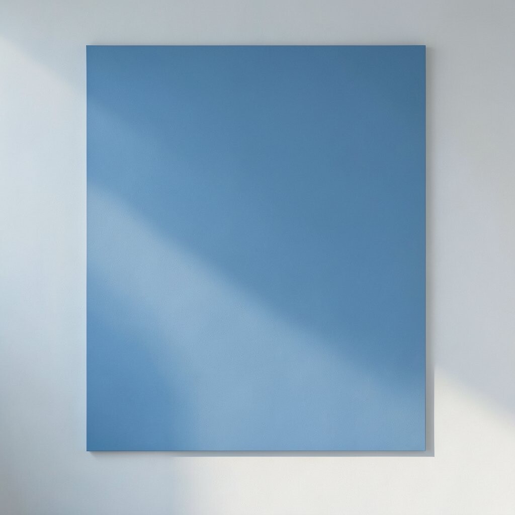
Choose one larger piece of blue wall art instead of many small prints. Big shapes and clear spacing help the eye rest.
Look for art that uses gradients, abstract waves, or calm geometric forms. A single frame style, like simple wood or a matte metal, keeps the wall from feeling busy.
For practical placement, center the art at eye level and keep it evenly spaced from other elements. If you want to try personalization, switch art seasonally while keeping the same color family. Even with a small budget, you can frame quality prints and swap them without changing the room’s overall calm vibe.
Right now, minimalist line art and soft watercolor gradients are popular because they add color without visual clutter. Blue versions often feel especially soothing and friendly.
9. One Blue Accent Chair With a Simple Backdrop
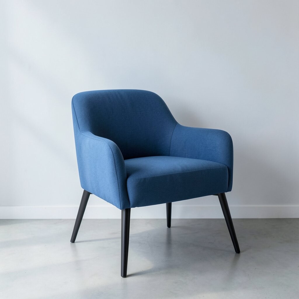
An accent chair in blue can become the room’s calm “anchor” point. It adds color, comfort, and personality while reducing the urge to add more decor.
Keep the surrounding furniture neutral, like cream, light wood, or warm gray. This helps the chair stand out without the whole room competing for attention.
If you’re aiming for a unique look, consider a chair shape with gentle curves and a textured fabric. Practical tip: use a removable cover or washable cushion to keep it looking fresh. Cost-wise, secondhand upholstered chairs can be a great deal if the frame is sturdy and the fabric is in good condition.
Trends lean toward comfortable, slightly oversized seating, and blue upholstery fits that vibe while still feeling minimal. In a calm space, one strong piece often beats many smaller ones.
10. Streamlined Blue Kitchen Storage With Clear Habits
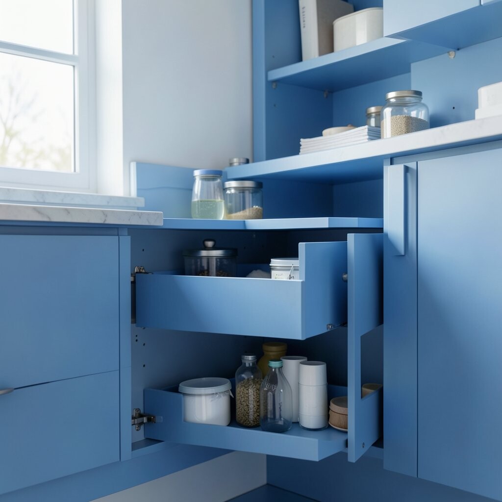
In the kitchen, blue can appear through towels, mugs, or small appliances without turning surfaces into a display. Clean counters look calm, and calm counters start with smart storage.
Use closed cabinets for everyday items and keep only a few items out at a time. A simple habit is to “reset” the counter for five minutes after cooking.
Personalization can be easy: pick one blue mug style and reuse it daily, then keep the rest of the dish set in neutral colors. For cost considerations, start with affordable basics like dish towels and a matching utensil crock. A current trend is color-coordinated accessories paired with hidden storage, which keeps the kitchen looking sleek.
11. Blue Lighting: Warm Bulbs, Cool Hues
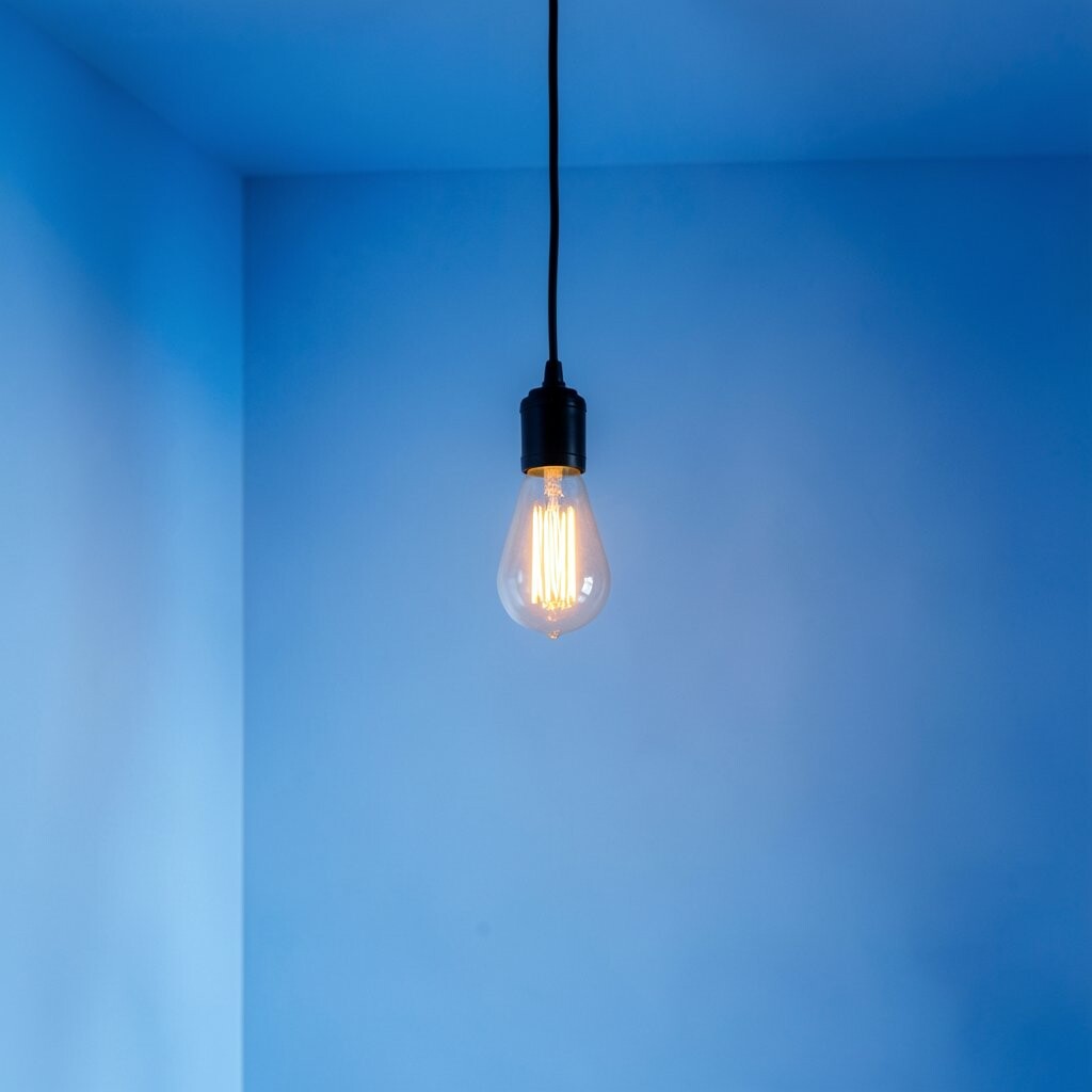
Blue-themed rooms still need warm light to feel cozy. Choose lighting fixtures that look simple, then use bulbs that glow warm.
Try a blue glass lamp base or a subtle blue accent in a shade, but keep the rest of the fixture minimal. Warm bulbs help blue tones feel inviting instead of cold.
For practical tips, place lamps to create soft shadows rather than harsh overhead lighting. If you want to personalize, use dimmers so evenings match your mood. Cost can be kept low by upgrading bulbs first, then adding one fixture later if you want a bigger change. A trend right now is layering light sources for a calm, spa-like feel.
12. Quiet Blue Workspace With a Clear Desk Rule
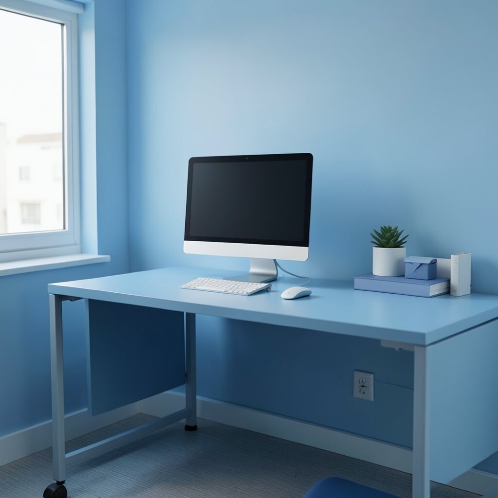
A blue workspace can support calm focus when the desk stays clear. Use a blue desk mat, a simple pen cup, or a tidy file holder to bring color without clutter.
Set a clear rule: only keep what you use daily on the desk surface. Everything else should live in drawers, wall organizers, or closed cabinets.
Uniqueness can come from small organization choices, like a single tray for chargers and one labeled container for paper. If you want to personalize, choose a blue shade that matches your favorite accessory, like a notebook cover or lamp. For cost, start with desk organizers before buying bigger items, and you’ll still see the calm effect quickly.
13. Blue Bedroom Storage That Disappears Into the Room
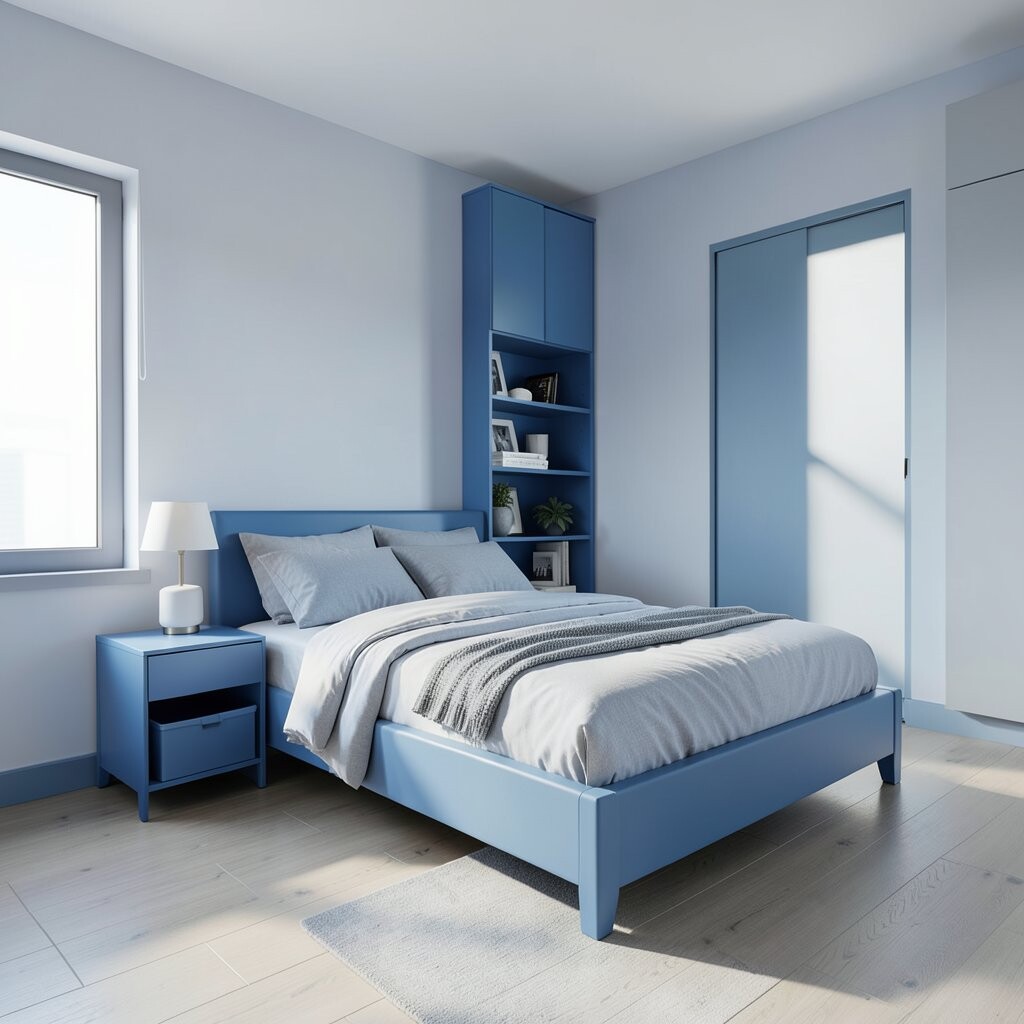
For the calmest feeling, hide away storage so blue tones look clean and intentional. Blue can show up in closet interiors, cabinet fronts, or matching organizers that blend in.
Choose sleek bins, drawer dividers, and matching hangers so everything looks uniform. When you open the wardrobe, the color feels cohesive instead of chaotic.
Personalization is easy: use scented sachets, folded linen sets, or a single decorative basket in a coordinating blue. Cost considerations depend on how much you need to replace, but you can often improve the look with organizers instead of new furniture. Current trends favor “category sorting,” which keeps mornings smoother and helps spaces feel calmer every day.
As a final touch, keep one surface like a nightstand simple so blue decor feels like a breath, not a pile. This makes the room feel restful, especially when you’re winding down.