White cabinets look crisp and clean, and a red backsplash brings instant personality. The contrast can feel bold without ever looking messy.
1. Glossy Cherry Red Tile for a High-Shine Pop

Glossy cherry red subway tiles can make your kitchen look brighter right away. The light bounces off the shine and makes the white cabinets feel even fresher.
Choose a thin white grout line to keep the red crisp and the pattern clean. For maintenance, wipe the surface after cooking so grease has less time to stick. If you love a polished look, finish with matching red trim or a small red accent in your hardware.
2. Matte Claret Micro-Tiles for a Softer, Modern Mood

Matte claret micro-tiles give off a calm, grown-up vibe compared to glossy finishes. The texture adds depth, so the red doesn’t feel loud—it feels styled.
This option helps hide minor splashes and fingerprints better than high-gloss surfaces. Pair the micro-tiles with simple, flat-front cabinet doors to keep the look tidy and modern. A great way to personalize is to add a narrow border tile in a lighter crimson shade for gentle contrast.
Plan for careful layout, because tiny tiles need consistent spacing and careful cutting. Labor costs can run higher with micro-tile installs, so consider hiring a pro if you want perfect alignment. If you’re on a budget, look for pre-made mesh sheets and compare grout colors before buying.
3. Bold Red Glass Slabs for Sleek, Splash-Ready Style

For a dramatic, smooth wall, red glass slabs can look like a solid block of color. They create a clean line between backsplash and cabinets, which is visually calming even when the color is strong.
Glass is also practical for kitchens because it wipes down quickly. It’s especially helpful behind the sink and near the stove where water spots and cooking splatter happen most. If you want something unique, pick a gradient red or lightly speckled glass so the finish feels more artistic.
To keep the color rich, choose the right thickness and let the installer seal edges properly. Expect the material to cost more than standard ceramic tiles, but you may save time during installation because large panels reduce grout lines. Match your lighting with warm bulbs so the red looks true and inviting, not dull.
Consider adding a slim stainless steel or black metal trim where the slab meets the countertop. That small detail can make the whole backsplash feel intentional. You can also coordinate cabinet hardware in brushed nickel or matte black to keep the design cohesive.
4. Red Cement-Style Pattern Tiles for Artful Charm

Cement-style red tiles bring a handmade, artistic feel to a kitchen. The pattern adds movement, so the backsplash becomes a focal point without needing to be glossy.
Many cement-look designs include subtle weathered tones, which helps camouflage everyday mess. For uniqueness, choose a pattern that repeats in a balanced way so it doesn’t fight the cabinet lines. If you want extra practicality, seal cement-style surfaces when recommended by the manufacturer.
5. Terracotta-Red Herringbone for a Warm Welcome

Terracotta-red herringbone adds warmth and rhythm against white cabinets. The angled lines look lively, and the earthy red feels welcoming instead of harsh.
This layout can make a small kitchen feel taller because the pattern pulls the eye upward. Keep the grout light or medium to highlight the zigzag shape. If you want to personalize, try a slightly varied tile set so the tones shift subtly across the wall.
Budget-wise, herringbone can take longer to install due to the cutting and alignment. To reduce cost, you can limit the herringbone area to the main backsplash zone and use a simpler red tile around the rest. In terms of trends, herringbone remains popular because it balances bold color with classic layout energy.
6. Weathered Deep Red Vintage Look for Character
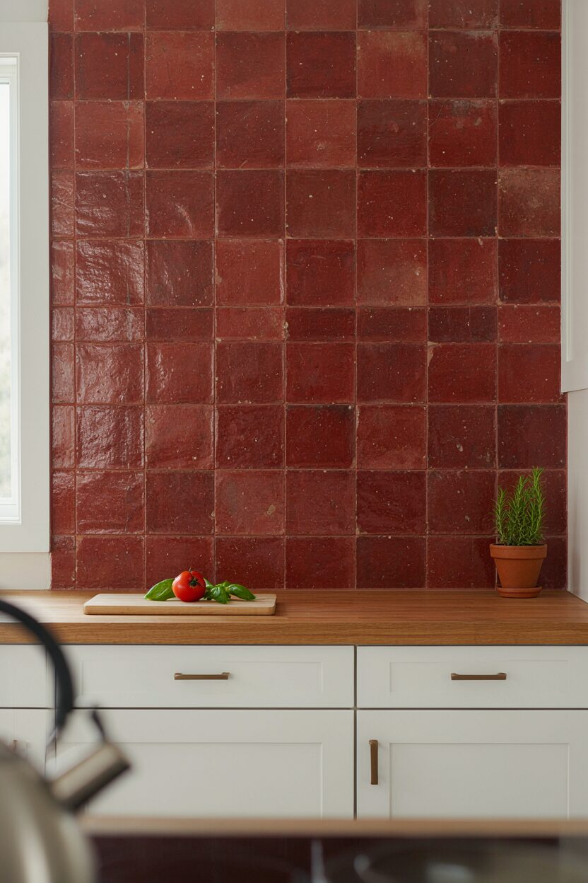
Weathered deep red tiles can make your kitchen feel like it has history. The worn texture makes the color look richer and more dimensional next to bright white cabinets.
This style is great if you want bold color but also want it to feel timeless. The uneven glaze helps hide tiny chips and light scuffs, which is helpful for busy households. A practical tip is to choose a consistent tile thickness so the backsplash stays level and doesn’t create visible steps.
7. Red-and-White Checker Accent for Playful Contrast

A red-and-white checker pattern can add a cheerful edge to otherwise simple cabinets. The repeating squares make the backsplash feel structured, almost like a graphic design.
Checkers can also work as a style “bridge” if your kitchen has both modern and vintage elements. Keep the size of the squares medium so the pattern doesn’t become too busy at close range. Personalize by choosing a deeper red for drama or a softer tomato red for a lighter feel.
If you’re planning a full remodel, this is a chance to match the checker to your flooring or rug tones. Installation takes careful layout, so measure twice and dry-fit first. Costs can vary widely based on whether you buy individual tiles or a checker mosaic sheet.
8. Matte Brick-Red Tiles with Crisp White Grout

Brick-red tiles with matte finish can give you strong color without shine. When paired with crisp white grout, the backsplash looks clean, sharp, and intentionally designed.
This is a practical choice because matte surfaces often look better between cleanings. The color stands out while grout lines add a tidy grid effect behind the counters. For uniqueness, choose a slightly varied brick tile shade so the wall feels natural rather than flat.
Consider spacing and grout width carefully, because those details strongly affect the final look. Matte tiles are usually mid-range in price compared to glass or custom stone. A current trend is pairing matte tile with minimalist faucets and simple cabinet hardware in black or brushed nickel.
9. Red Moroccan-Style Pattern for Global Flair

Moroccan-style red pattern tiles bring bold personality and an almost decorative feel. The shapes add an elegant rhythm that looks stunning against the smooth simplicity of white cabinets.
This backsplash can make even a basic kitchen feel special. The raised or detailed designs also add depth, so the backsplash looks good from different angles. To personalize, pick a pattern that includes tiny accents like cream, gold, or soft pink so it blends naturally with your countertop.
Installation may take time because the pattern must align and stay centered around features like outlets. If you want to keep costs under control, you can use patterned tile only on the main focal area and use a solid red tile for the edges. Seal the tiles if recommended, especially if the surface is porous or has a special finish.
For a trend-forward look, pair the backsplash with warm wood cutting boards or copper-toned lighting. Those details help the red pattern feel curated rather than random.
10. Deep Red Stone-Look Panels for a Luxurious Feel

Stone-look panels in deep red can create a high-end backsplash look with less visual clutter. The swirls and veining resemble natural stone and add sophistication.
This style is unique because it combines bold color with an organic, elegant pattern. It’s also practical since fewer grout lines can mean less scrubbing over time. When choosing panels, confirm that they’re rated for wet areas behind sinks and near heat sources.
If you’re estimating cost, compare per-square-foot pricing between tile and panel systems. Panels can sometimes cost more upfront but reduce labor time. A helpful personalization idea is to align the “veins” so they flow horizontally with your countertop, making the design look even more intentional.
11. Red Subway Tiles with Black Accent Trim

Red subway tiles are classic, and adding black accent trim makes them look designer-level. The black lines feel modern and add contrast that makes the red pop even more.
It’s a strong benefit for busy kitchens because black accents can visually break up the look of grout and minor splatters. Keep the white grout clean and bright so the pattern stays crisp. Personalize by choosing a thicker black trim stripe at eye level, which can make the backsplash feel like it has a “signature” frame.
Costs can be reasonable if you stick with standard tile sizes and pre-made trim pieces. If you want extra polish, choose matching black outlets or switch plates. This is a trend that many kitchens are using now because black and red together feels bold yet balanced.
12. Glossy Red Holographic or Opalescent Tile for a Magic Effect

Opalescent or holographic red tiles can look like they change color when the light hits them. Against white cabinets, that shifting shine feels playful and luxurious at the same time.
The benefit is that you get visual interest without needing complex patterns. Your backsplash can look different throughout the day, which makes the kitchen feel lively. For personalization, pair it with simple hardware so the tile stays the star.
13. Red Frameless Mosaic for a Modern, Clean Grid

A red mosaic made from small stones or glass pieces can create a smooth, modern grid effect. When installed evenly, it looks intentional and crisp rather than busy.
This design is unique because it lets the red vary slightly across the surface, giving a subtle shimmer. It’s helpful for hiding small imperfections since the mosaic naturally masks tiny flaws. When planning the layout, think about the edges and corners, because clean borders can make or break the final look.
Cost considerations vary depending on whether you choose stone mosaic, glass mosaic, or ceramic mosaic. Glass often costs more, but it can look extra refined and wipe easily. If you want to stay trend-aligned, keep the mosaic tight and use minimal grout color so the pattern looks sleek and modern.
For practicality, select grout that resists stains and seal as recommended. If your backsplash gets heavy use, prioritize easy-clean materials so you enjoy the look longer.
14. Red Patterned Border Tile for a Bold Focal Band

If you want bold color without covering the whole wall, a red patterned border tile is a smart option. It creates a striking focal band while keeping the rest of the backsplash calm and simple.
This approach can be more budget-friendly because you use accent tiles only where they matter most. It’s also easier to match countertops and cabinet finishes since the large background area can stay neutral or lightly toned. Personalize the border by choosing a repeating motif that connects to your faucet shape, lighting style, or even your dishware colors.