
Bright rooms feel cheerful, calm, and inviting at the same time. Picking wall colors can make that feeling even stronger.
1. Soft Ivory With Warm Undertones

Soft ivory walls look like sunlight that never leaves. They keep the room bright while still feeling cozy.
This palette works especially well when you want a gentle background for furniture and art. Ivory also pairs nicely with wood tones, brass accents, and creamy textiles. If you paint over off-white walls, choose a warm undertone to avoid a flat or slightly gray look.
2. Crisp White With a Hint of Gray

Crisp white can make a bright room feel extra clean and modern. Adding a small hint of gray keeps it from feeling too stark.
This color is unique because it handles shadows well, so corners don’t look heavy. It’s a great choice for contemporary spaces, especially with sleek lighting. In a north-facing room, test samples in the afternoon to see how the gray note behaves.
To keep it from feeling cold, warm up your styling with beige rugs, oak furniture, or soft yellow bulbs. For cost, it’s usually one of the most budget-friendly options since white paints are widely available. A current trend is using “balanced whites” that look airy in daylight but still stylish at night.
3. Light Beige With a Sand-Like Glow

Light beige brings the calm feeling of a beach morning indoors. It brightens without creating a harsh contrast.
This palette stands out because it’s forgiving—small scuffs and texture show less than on pure white. Beige also makes colorful decor look richer, like teal, terracotta, or navy. Choose a sandier shade for a more sunny vibe rather than a pinky beige.
Try painting the main walls in beige and keeping trim in a slightly brighter white for crisp edges. If your room gets a lot of direct sun, consider a durable interior paint finish, like eggshell, to keep it looking smooth. You can personalize the look with natural fibers such as jute baskets or linen curtains.
In terms of trends, “quiet neutrals” are staying popular because they feel timeless yet fresh. For budget planning, beige can be more flattering with fewer touch-ups since it hides imperfections. Paint samples are worth it here because undertones vary a lot from brand to brand.
4. Pale Peach for Soft Warmth

Pale peach walls add gentle warmth without overpowering the room. They look lively in bright spaces and feel welcoming even in the evening.
This color is unique because it acts like a warm spotlight while staying light. It flatters warm metals and natural light, especially with white trim and light wood. If you want a practical tip, pair peach with creamy whites and keep patterns small so the room stays airy.
5. Butter Yellow With an Airy Tone

Butter yellow can make a bright room feel instantly happier. The key is choosing a soft, airy yellow rather than a bold lemon.
This palette is special because it blends sunshine and calm at the same time. It works well with gray, navy, and even muted greens, so you have plenty of styling options. For best results, use it in rooms that get good daylight so it doesn’t feel flat.
Consider using a satin or eggshell finish for easy cleaning, especially in kitchens or family rooms. Personalize it by adding pale blue accents, like throw pillows or a simple framed print. In many current home trends, warm yellow tones are used to create cheerful “daylight rooms” that feel fresh year-round.
6. Blush Pink for a Light, Breezy Mood

Blush pink turns bright rooms into places that feel soft and restful. It’s romantic without being heavy.
This palette is unique because it can read neutral in daylight, especially with the right undertone. Blush also pairs beautifully with gold, light wood, and crisp white cabinetry. If you’re unsure, start with a smaller area like a dining nook or a bedroom wall.
To keep it from becoming too sweet, add balance with darker accents like charcoal frames or deep wood furniture. You can personalize using textures, such as a boucle chair or a woven rug, to add depth. For cost considerations, one accent wall usually uses less paint and makes sampling easier.
Recent trends show blush tones used more often in “soft modern” interiors, where every element feels light and intentional. Choose a paint that is labeled low-VOC if you want better indoor air comfort. Test swatches near the ceiling too, since blush can shift with light height.
7. Seafoam Green for Fresh, Clean Energy

Seafoam green feels like a gentle breeze on a sunny day. It keeps rooms bright while adding a fresh pop of color.
This palette stands out because it’s light enough to reflect daylight, yet still colorful. Seafoam also pairs well with white, light oak, and even sandy beige. For practical tips, use it in spaces where you want a calm, uplifting mood, like a bathroom or breakfast corner.
Personalize the look with decor in coral, crisp navy, or natural wicker. To keep maintenance easy, consider an eggshell finish that wipes clean. As for trends, soft greens like seafoam are staying strong because they feel both nature-inspired and modern.
If your room has lots of warm lighting, choose a seafoam with a cooler undertone so it doesn’t drift too yellow. When planning your budget, remember that paint sheen affects how touch-ups blend, so pick one and stick with it. A few sample sizes can save time if you’re changing existing wall colors.
8. Pale Sky Blue With White Highlights

Pale sky blue brings an open, airy feel to bright rooms. It can make even simple furniture look more cheerful.
This color is unique because it visually “lifts” the space, especially with white trim. Sky blue also looks great with silver fixtures, light gray textiles, and soft wood floors. A practical tip is to keep the undertone slightly cool if you want the room to feel crisp.
9. Soft Sage for Calm That Still Feels Bright

Soft sage walls offer calm energy without making the room look dark. It’s a gentle green that feels balanced and modern.
This palette is special because it works like a neutral, especially with cream and warm white accents. Sage also makes plants look extra vibrant, which is perfect for bright rooms. For personalization, add natural textures like rattan, linen, and stoneware.
In terms of practical tips, pair sage with white trim and choose artwork that includes both warm and cool colors. If you have lots of sunlight, sage can look even lighter, so sample it before committing. A current trend is “biophilic” design, where plant-like colors help the room feel connected to nature.
Budget-wise, sage is often available in many mid-range lines, so you can choose based on how smooth you want the coverage. For best results, use painter’s tape carefully around trim and allow enough drying time between coats. If your walls have stains, consider using a stain-blocking primer so the color stays even.
10. Light Lavender for a Subtle Dreamy Touch

Light lavender can add a dreamy atmosphere while keeping brightness. It’s a soft choice that feels playful but still refined.
This palette stands out because it combines a cool tone with a gentle lightness. Lavender looks especially pretty in rooms that have white shelving, light curtains, and minimal clutter. A practical tip is to balance it with warm wood and off-white fabrics so the room doesn’t feel too chilly.
To personalize, choose accents in soft gray, lilac, or muted gold. For cost considerations, if you’re painting often, a good-quality primer can reduce how many coats you need. Current trends are showing more pastel walls like lavender because people want personality without harsh color.
11. Warm Charcoal-Gray for Dramatic Contrast
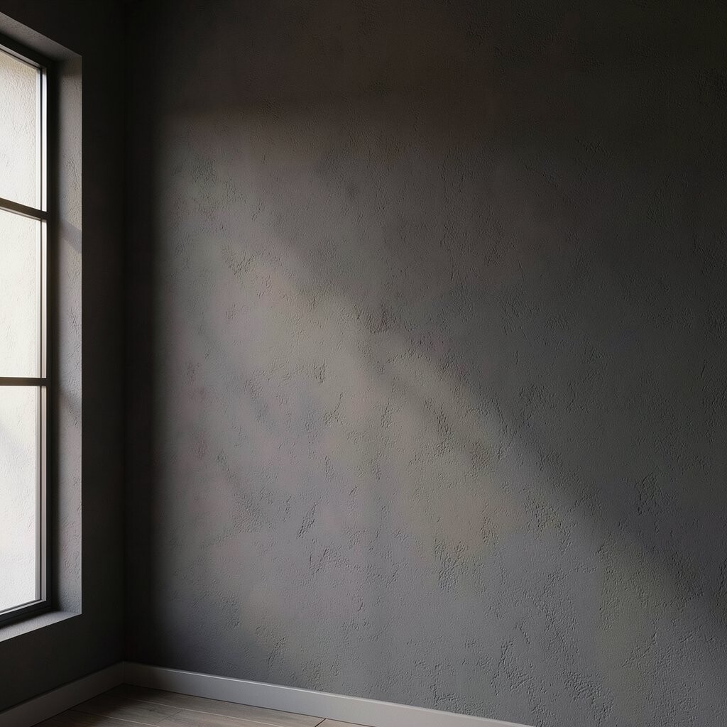
Warm charcoal-gray can create a bold, bright-room look when used wisely. In a room with lots of light, it can feel stylish rather than heavy.
This palette is unique because it turns contrast into a design feature. Instead of dulling brightness, charcoal can frame bright decor and make whites pop. Try it on an accent wall, or use it in a hallway where light sources guide the eye.
For practical tips, pair charcoal with crisp white trim and light flooring to keep the room open. Add mirrors to bounce light around, and choose warm lighting bulbs for a more welcoming tone. Personalize it with black hardware, a deep-toned rug, or modern art with bright highlights.
Cost-wise, charcoal shades often require more careful priming if your walls are uneven. It’s smart to estimate paint quantity based on the coverage rate listed by the brand. This look matches current trends in “modern contrast,” where darker walls highlight architectural lines.
If you’re nervous, consider a lighter gray first, then adjust based on how it feels at different times of day. A matte finish can hide wall imperfections, but eggshell may be easier to clean. Always test a swatch near where furniture sits so you can judge the real-life effect.
12. Terracotta Tint for Sun-Baked Charm

Terracotta-tinted walls can bring sun-baked charm into a bright room. It feels earthy, warm, and full of character.
This palette stands out because it adds warmth without turning the room orange. A light terracotta tint works best when paired with creams, warm whites, and light wood floors. For practical tips, start with a lower-saturation color if you’re painting an entire room.
Personalize it with patterned tiles, woven baskets, and cozy textiles in teal or olive. For cost considerations, terracotta colors can be slightly more expensive depending on whether they’re custom-mixed. Keep maintenance in mind by choosing an easy-clean finish, especially in high-traffic areas.
13. Neutral Towpe-Grey for Balanced Brightness

Neutral towpe-grey brings a refined, grounded look while staying light enough for bright rooms. It helps create a calm backdrop for decor.
This palette is unique because it lands between warm beige and cooler gray. That middle spot makes it flexible for both modern and classic styles. A practical tip is to pair it with crisp white trim and textiles in oatmeal, cream, or soft caramel.
14. Turquoise Wash for a Clear, Lively Look
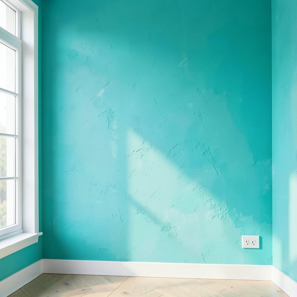
Turquoise wash gives bright rooms a vibrant but friendly personality. It feels like clear water and can energize everyday routines.
This palette is special because it can read light and playful rather than overpowering, depending on how washed out the color is. Turquoise also looks great with white, light beige, and natural wood. For practical tips, choose a slightly watery shade and balance it with simple decor so the walls stay the star.
Personalize the look with accessories in coral, golden yellow, or crisp navy. For cost considerations, turquoise can be easier to manage when you pick a popular paint brand shade rather than an ultra-custom mix. Current trends often show people mixing bright colors with clean whites for a fresh, modern result.
15. Bright Coral Accent for Instant Cheer

Bright coral on walls can add instant cheer, especially when the room already has lots of light. It feels energetic without needing a full-room commitment.
This palette is unique because it creates a “mood lift” while still letting neutrals handle the rest. Try coral as an accent wall, a half-wall, or even behind a gallery arrangement. Keep the rest of the room in white or warm beige so the coral stays bright and balanced.
For practical tips, use coral-friendly trim colors like creamy white and choose fabrics in light neutrals to soften the impact. Personalize with patterns that include coral tones, such as subtle geometric prints or floral accents. From a budget perspective, an accent approach usually saves money on paint and reduces the risk of feeling like the color is too strong.