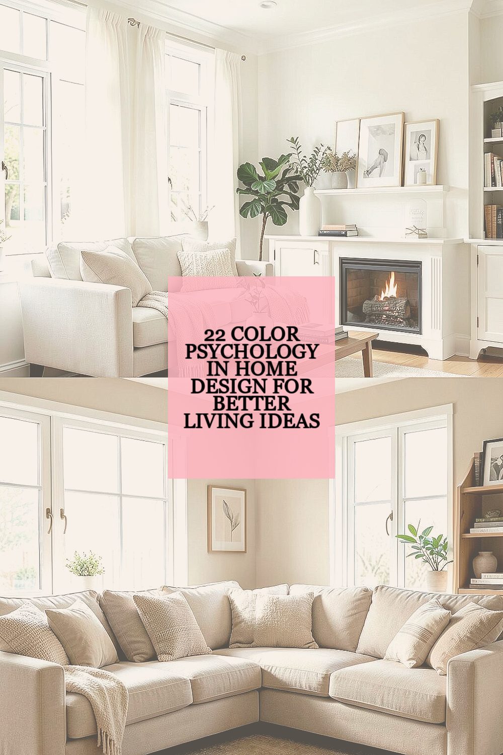
Colors in your home talk to your brain every day. The right ones can help your space feel calmer, cozier, and more “you.”
-
1. Soft White for a Clear, Fresh Start

Soft White for a Clear, Fresh Start Soft white walls look like morning light, even when the sky is gray. They make rooms feel clean, open, and easy to breathe in.
When you paint in soft white, your furniture and decor usually stand out in a nice way. This color is great for kitchens, hallways, and small rooms that need extra space. A simple tip is to pick a soft white with warm hints if your lighting is yellow, and choose a cooler soft white if you want a crisp feel.
-
2. Warm Beige for Steady Comfort
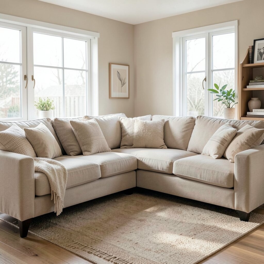
Warm Beige for Steady Comfort Beige can look like a comfy sweater for your home. Think sandy tones, creamy plaster, and gentle earth vibes that feel steady.
It works well in living rooms and bedrooms because it does not fight with your style. Beige also helps skin tones and wood furniture look richer. If you want a personal touch, add texture with linen curtains or a chunky knit throw so the room feels layered, not flat.
Cost-wise, beige is a smart choice because it hides small scuffs better than bright colors. For a trend, try “greige” shades (a beige-gray mix) because many designers pair them with warm metals like brushed brass. Choose samples and view them at morning and evening, since beige can shift in different light.
-
3. Sky Blue for Calm Focus
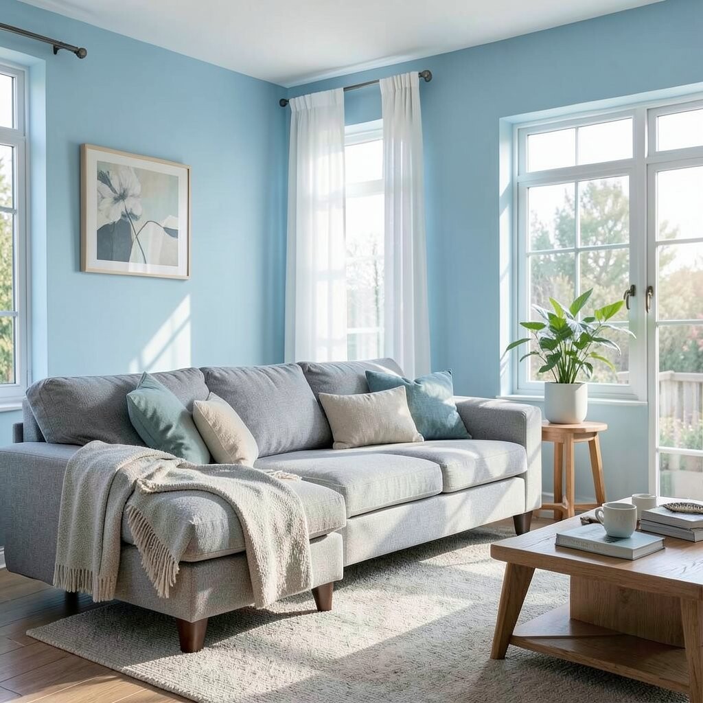
Sky Blue for Calm Focus Sky blue on walls can make you feel like you have more air in the room. It often brings a peaceful, “quiet mind” mood right away.
Blue is also a helpful background for focus areas like study corners and home offices. Try pairing it with white shelves, light wood, and simple decor for a clean look. To personalize, add one deeper accent like dusty navy in art frames or a pillow.
If you want to keep costs friendly, paint just one wall as a focal point. Another budget idea is to swap curtains or a rug first, then decide on paint later. Current trend: soft, slightly muted blues that feel natural rather than super bright.
-
4. Deep Navy for Brave, Cozy Nights
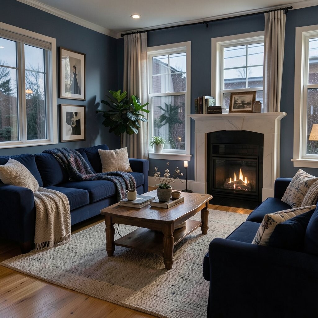
Deep Navy for Brave, Cozy Nights Navy is dramatic in the best way, like a dark velvet curtain. In a room, it can feel protective, warm, and grown-up, especially at night.
Use it in dining rooms, reading nooks, and bedrooms where you want calm energy. Pair navy with gold, warm white, or rich wood to make the space feel classy. A great tip is to balance navy with lighter textiles so the room stays inviting, not heavy.
-
5. Sage Green for Balance and Renewal
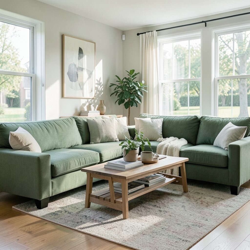
Sage Green for Balance and Renewal Sage green looks like fresh leaves but in a gentle, indoor way. It often feels like balance—calm enough for rest, still lively enough to feel hopeful.
This color can make living areas feel grounded, and it also pairs beautifully with natural materials. Try it on walls, cabinets, or even doors for a soft “botanical” vibe. Personalize with plants, rattan baskets, or ceramic planters in creamy whites.
If you want an easy upgrade without repainting, consider sage green accessories like cushions or a rug. Sage is also a popular trend lately because it fits both modern and farmhouse looks. For cost planning, use paint for the biggest impact, and add greens through decor for quick updates.
-
6. Olive Tones for Relaxed Strength
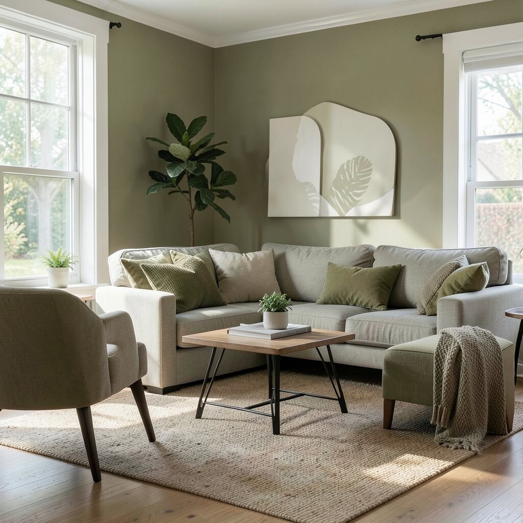
Olive Tones for Relaxed Strength Olive can feel earthy and steady, like trees outside your window. It creates a grounded look that still feels stylish.
This color works well in kitchens, entryways, and rooms where you want a “ready to live” feeling. It also pairs nicely with stone countertops, black hardware, and warm metals. If you love personal style, add patterned tiles or art with warm reds or mustard accents to make it yours.
Cost considerations matter here: olive shades can be tricky if your walls are very bright already, since you may need more paint for even coverage. A smart plan is to do patch tests and check coverage on your exact wall. Trend note: olive is showing up more in matte finishes because matte looks soft and modern.
-
7. Red Accents for Energy and Vitality

Red Accents for Energy and Vitality Red makes your space feel awake, like a spark in the air. Even small pops of red can add warmth and motivation.
You can use red in the form of art, a bold throw pillow, or a statement vase. It is great for areas where people gather, like dining rooms or game spaces. To personalize, choose a red that matches your vibe—brick red for cozy, cherry red for playful, and deep rust for a stylish muted look.
If red feels too strong, treat it like seasoning: use it lightly. This keeps costs lower and helps you avoid repainting if you change your mind. A current trend is pairing red accents with calming neutrals like cream and soft gray for a balanced, “not too much” feel.
-
8. Terracotta for Earthy, Friendly Warmth

Terracotta for Earthy, Friendly Warmth Terracotta brings a sunny warmth that feels welcoming right away. You might picture terracotta pots, clay steps, and cozy room corners.
It can make a living room feel warm without needing bright colors. Pair terracotta with beige, cream, or deep green for a natural look. If you want an actionable tip, use terracotta in ceramics, wall art, or a textured paint finish on one wall to keep the budget under control.
-
9. Orange for Creative Cheer
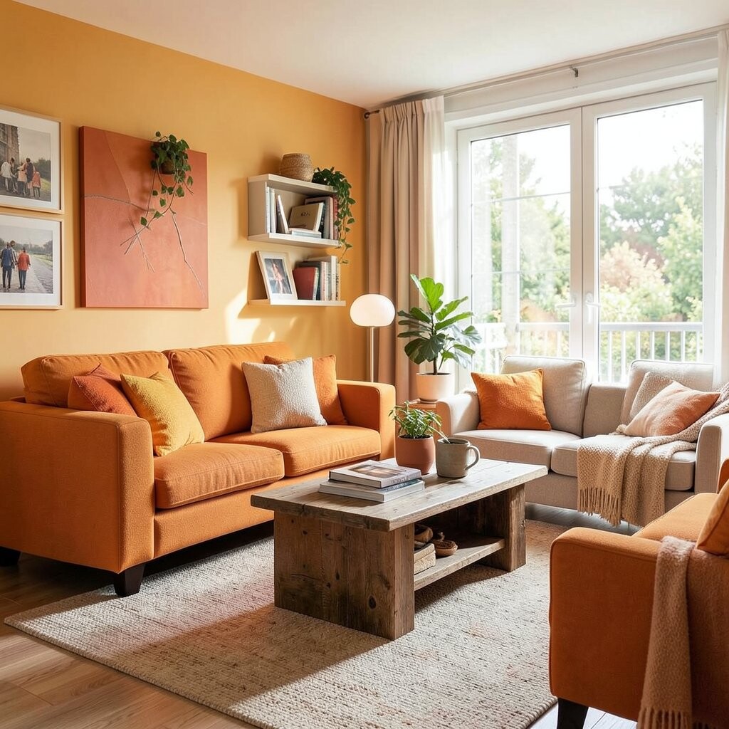
Orange for Creative Cheer Orange can feel like a friendly high-five to your brain. It adds energy and creativity, especially when you choose softer shades like burnt orange or peachy orange.
Try orange in studios, craft rooms, and play areas where imagination matters. It can also work in kitchens because it feels warm and inviting. For personalization, add orange through a statement lamp, a woven rug, or wall decals if you want a low-commitment option.
Cost tips: start with decor before paint, because orange trends can change faster than neutral paint. A current trend is “cinnamon” and “apricot” tones that feel cozy and not too loud. If you paint, use warm whites and light woods to keep the room balanced.
-
10. Yellow for Cheerful Light

Yellow for Cheerful Light Yellow can glow like late-afternoon sunshine inside your home. It often boosts mood and makes everyday tasks feel a bit brighter.
Choose pale buttery yellow for bedrooms and kitchens so it stays gentle. In a hallway or entryway, yellow can help you feel more awake when you walk in. To personalize, add natural textures like wicker baskets or linen curtains that soften the brightness.
Budget-wise, yellow can be cost-smart if you use it as an accent wall, since yellow can look expensive when it is done right. If you are worried about repainting, try yellow peel-and-stick wallpaper or removable tiles first. Trend note: warm, muted yellows are replacing the super bright “caution” yellows for a more grown-up look.
-
11. Purple for Imagination and Calm
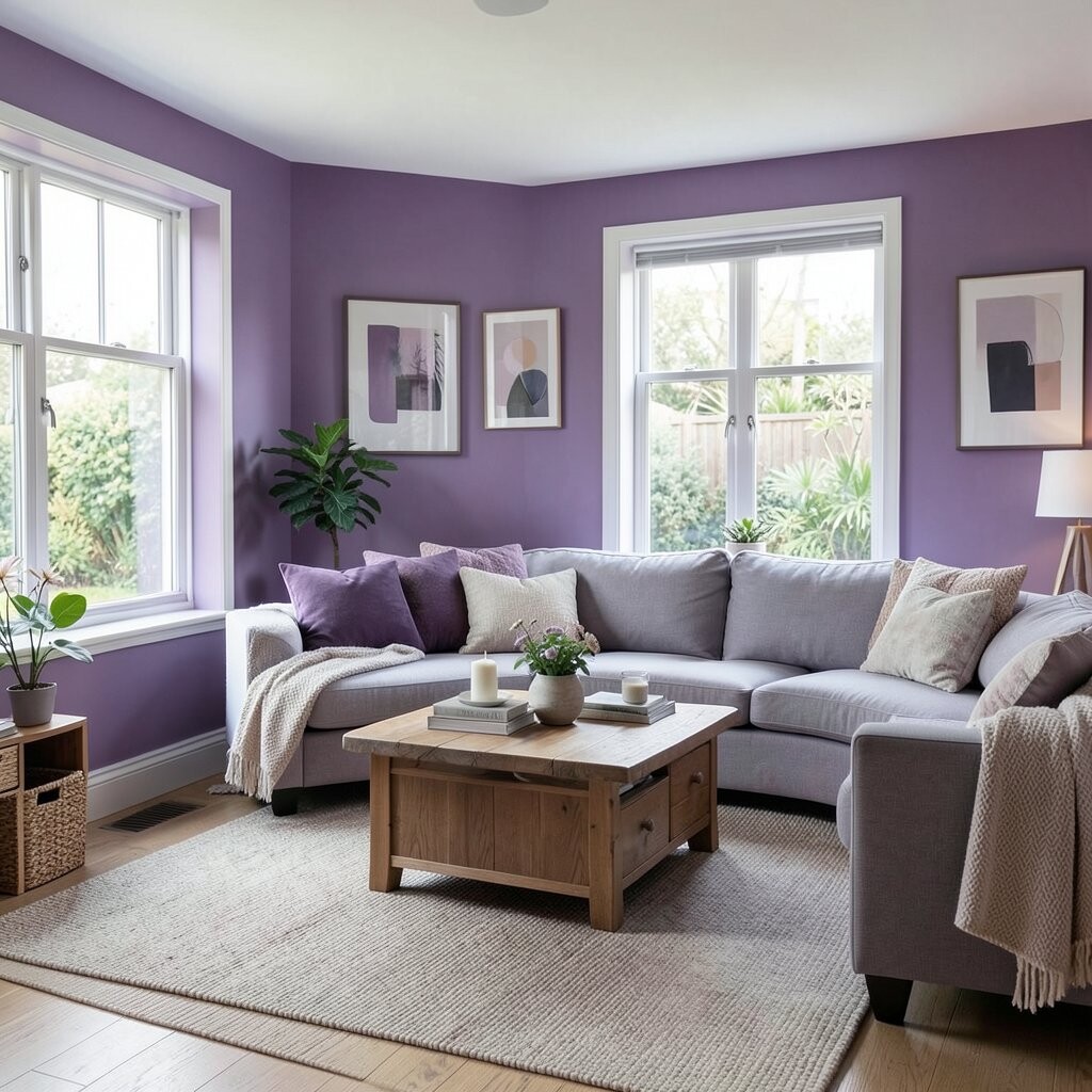
Purple for Imagination and Calm Purple can feel magical, but it does not have to be loud. Soft lavender and muted lilac shades often feel soothing and creative.
This color can be great for reading rooms, bedrooms, or creative corners where you want peace and ideas. Pair purple with soft gray, warm white, or light wood so the look feels balanced. For personalization, add layered lighting like warm lamps, because purple can look extra cozy under soft light.
If you want cost control, use purple in bedding, curtains, and artwork instead of painting every wall. A current trend is “dusty” purples that look vintage and stylish, especially when paired with neutral textures. Always test samples, because purple can shift from calm to dramatic quickly depending on undertones.
-
12. Pink for Gentle Comfort
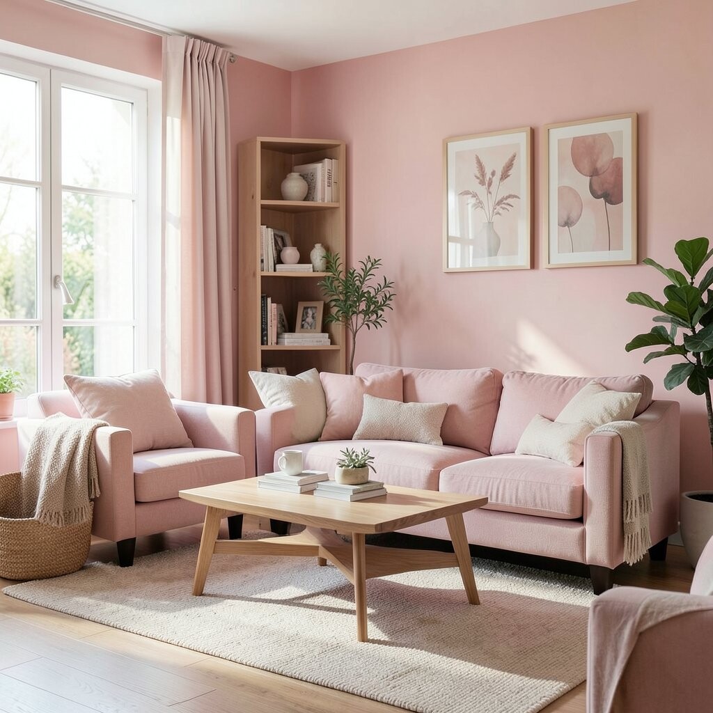
Pink for Gentle Comfort Pink can feel sweet and safe, like a calm hug. When it is muted, it brings softness without feeling childish.
Try blush pink in bedrooms, nurseries, and cozy living spaces for a warm, comfortable mood. It also looks beautiful with cream, warm gray, and natural wood. Personalize it with simple patterns like subtle stripes or floral art to keep it light and friendly.
-
13. Gray for Modern Balance

Gray for Modern Balance Gray can bring a clean, modern calm when it is chosen well. It is like a quiet background that lets your decor shine.
Use gray in offices, living rooms, and kitchens to help the space feel organized. Pair it with white trims, black hardware, or warm wood to avoid a cold look. A tip that saves time: decide on undertones first—warm gray and cool gray can feel totally different in real rooms.
Cost considerations are simple: gray often covers well and works with many styles, so it can be a practical base. Trend note: soft, warm “greige” and “mushroom” grays are popular because they look cozy, not sterile. If you want quick impact, start with paint in one area and add textiles in complementary colors.
-
14. Black for Sharp Style and Strong Focus
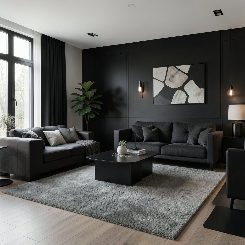
Black for Sharp Style and Strong Focus Black adds bold contrast and can make a room look designed on purpose. It feels strong, crisp, and very modern.
Use black in smaller ways like frames, light fixtures, door hardware, and accent walls. It can also help your eyes focus, which is great in entryways and work zones. To keep it comfortable, balance black with warm whites, soft textures, and light curtains.
-
15. White for Airy Simplicity

White for Airy Simplicity White can make your home feel bright and airy, like the room is opening up. It also gives you lots of freedom with decor.
When you use white in living rooms and bathrooms, it can help the space feel fresh and easy to keep. It is also perfect for minimal styles, because it lets furniture colors stand out clearly. Personalize with color through rugs, pillows, and art so white never feels boring.
Cost wise, white paint is often budget-friendly, and it can make other updates look more expensive. A current trend is “warm white” rather than icy white, because it feels softer and more welcoming. If you have natural light, white will look especially good, but test before you commit.
-
16. Charcoal for Cozy, Low-Noise Comfort
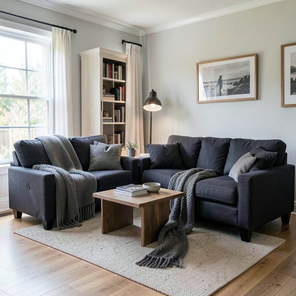
Charcoal for Cozy, Low-Noise Comfort Charcoal sits between black and gray, and it feels calm and cozy. It can hide shadows and small imperfections more than you might think.
This shade is great in bedrooms, media rooms, and spaces where you want a restful mood. Pair charcoal walls with creamy whites and warm lighting to keep the room inviting. Personalization idea: add a soft boucle chair or a textured rug so the dark color feels comfortable, not stark.
Cost tips: charcoal can make your room feel smaller if overused, so consider painting one wall or using it for built-ins. Trend note: darker accent cabinetry and feature walls are showing up more because they look rich and modern. Try samples near your lighting sources to see how charcoal changes across the day.
-
17. Brown Wood Tones for Homey Stability

Brown Wood Tones for Homey Stability Brown tones, like oak, walnut, and chestnut, feel like stability in a room. They bring comfort that is both visual and emotional.
Wood colors help many color palettes work together, which is why they are loved by many homeowners. Use them in floors, furniture, shelves, and paneling for a warm base. To personalize, choose wood with a finish you love—matte for calm, or satin for a soft glow.
Budget consideration: if you cannot replace floors, you can still add wood tones with shelves, coffee tables, or picture ledges. Trend note: lighter wood is popular right now for a bright, Scandinavian vibe, while deeper walnut is popular for a luxury feel. Mix wood tones carefully so the room looks intentional, not random.
-
18. Natural Cream for Soft Warmth
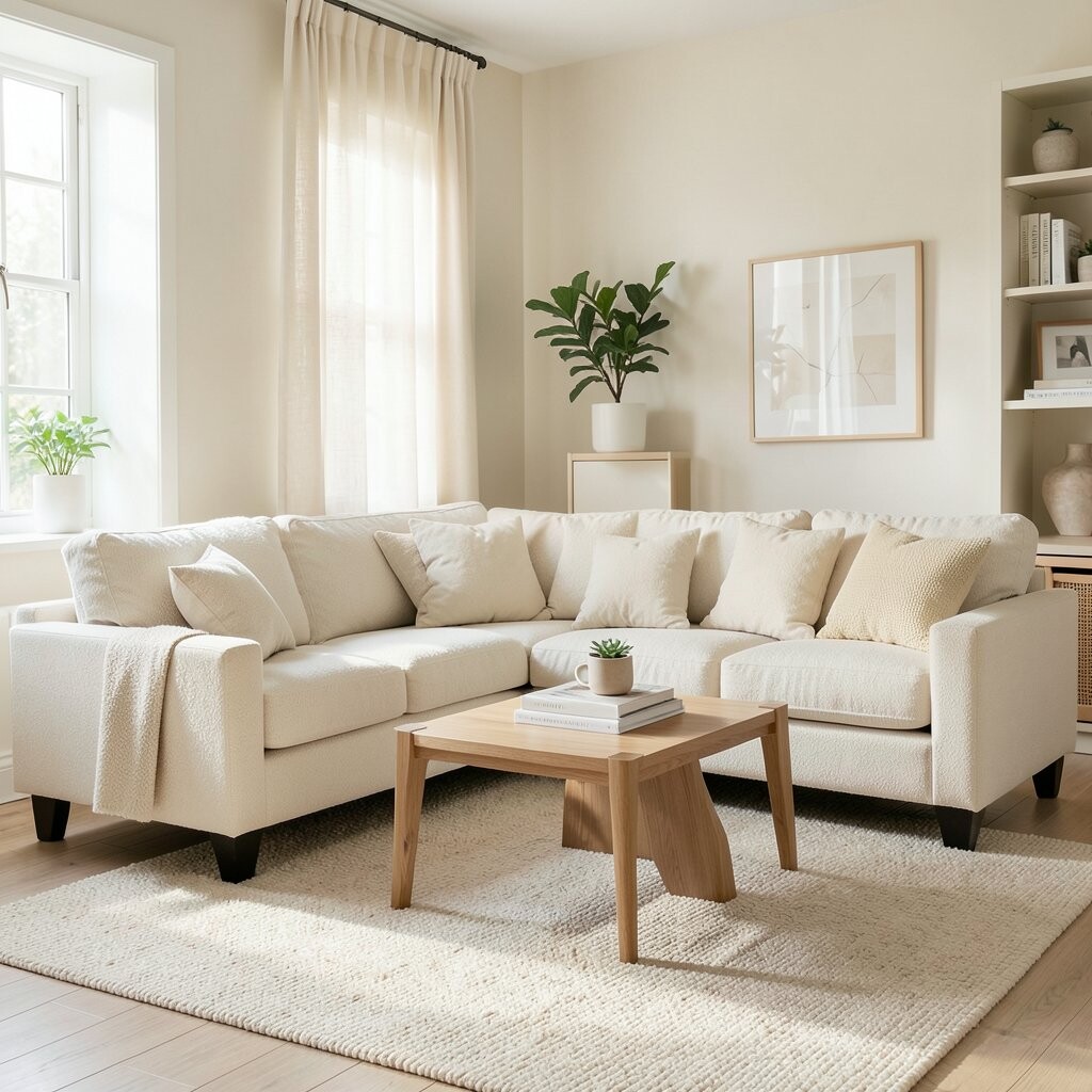
Natural Cream for Soft Warmth Cream is like white with extra warmth, and it feels gentle from day one. It is cozy without being too heavy.
Use cream in kitchens, bedrooms, and family rooms where you want calm daily comfort. Pair it with pastel accents for a soft look or with bold colors for contrast. A good tip: cream walls look amazing with warm metal finishes like brass, so consider updating lighting or cabinet hardware.
-
19. Teal for Refreshing Energy

Teal for Refreshing Energy Teal blends blue calm with green renewal, so it feels lively but still relaxed. You might see it in ocean-like colors, with a cool, refreshing vibe.
Teal works well in bathrooms, kitchens, and bedrooms where you want “fresh start” energy. Pair teal with warm whites, light wood, and black accents for a modern feel. Personalization idea: use teal in a tile backsplash, a statement mirror frame, or a textured wall painting.
Cost considerations: tile can be pricier, so if you want to stay lighter on the budget, start with a teal rug or paint a vanity cabinet. Trend note: jewel-toned yet muted colors like teal are becoming popular because they look rich in natural light. Choose a shade that matches your flooring undertones to avoid clashing.
-
20. Aqua for Playful Calm
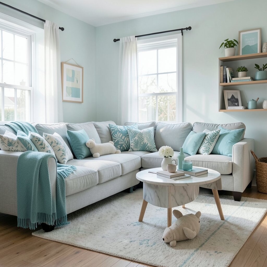
Aqua for Playful Calm Aqua looks like a gentle wave, and it often feels playful and light. It can make a room feel friendly without turning it into a “loud” space.
This color is fun for bedrooms, kids’ areas, and creative spaces where you want joy. It also pairs nicely with white and light gray, so you can keep the overall look clean. To personalize, match aqua with patterns like tiny dots or subtle stripes to make it feel curated.
For cost planning, aqua accents are easy to switch later, which is great if you like changing decor seasons. Current trend: soft aqua with natural textures like linen, jute, and rattan for a beachy but grown-up vibe. If you paint, consider using it on cabinets or one wall so the look stays balanced.
-
21. Golden Honey for Cozy Happiness
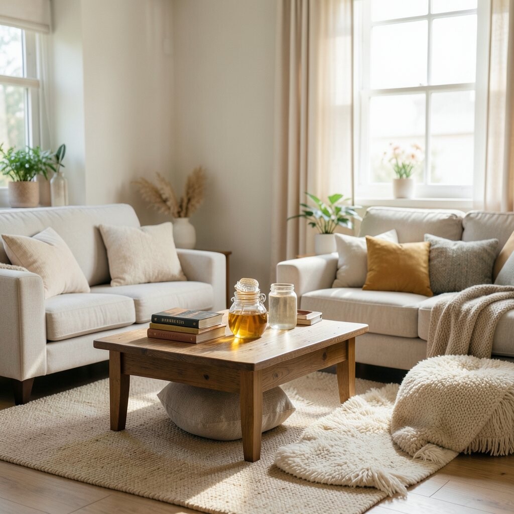
Golden Honey for Cozy Happiness Golden honey tones feel warm like candlelight, even during the day. They can add comfort and a sense of celebration.
Use golden honey in dining rooms, entryways, and kitchens to make people feel welcome. It also pairs well with deep green, cream, and dark wood for a rich look. Personalization idea: add honey-colored lighting, like a warm bulb tint, to make the color feel extra inviting.
Cost considerations: you can add golden honey through paint, but you can also add it through decor like frames, vases, and woven baskets. A trend that fits here is “warm minimalism,” where neutral bases meet golden accents for a calm yet cheerful feel. Test color samples near your light sources because honey can appear more orange or more yellow depending on undertones.
-
22. Monochrome Color Stories for Easy Style

Monochrome Color Stories for Easy Style Monochrome design means using one color family in many shades. It looks neat, intentional, and calming because everything feels like it belongs together.
You can build a monochrome story with layered neutrals, like cream, sand, beige, and soft brown. This is a great option if you want a home that feels stylish without lots of guesswork. Personalize it by adding variety through textures—smooth paint, matte ceramics, woven rugs, and soft curtains all help the same color family feel rich.
Cost-wise, monochrome is flexible: you can paint first, then add decor later, or you can start with decor and update paint after. Current trend: “tonal living” is very popular, and it works in modern, farmhouse, and even small apartments. For best results, choose one main shade for walls, one supporting shade for furniture, and one darker shade for accents like frames or throw pillows.