
Earthy color feels like a warm cup you can see. These above-ground shades make rooms feel steady, calm, and lived-in.
1. Clay Taupe

Clay taupe sits between beige and soft gray with a hint of warm earth. It makes walls feel grounded even when the space is bright.
Use it on main walls to create a cozy backdrop for wood furniture and linen curtains. It helps hide small scuffs and dust, which is great for everyday living. Pair it with brushed brass or matte black hardware to keep it modern without losing warmth.
2. Mushroom Brown

Mushroom brown looks like rich earth without going too dark. It brings a calm, natural softness to rooms that need balance.
This tone is especially nice in hallways, where you want color warmth but not heaviness. Try it on an accent wall behind a bench or console. It also flatters warm-toned art, like botanical prints and landscape photos.
If you have darker floors, mushroom brown can make everything look intentional. For personalization, match one shade in your textiles, like a throw blanket or area rug. Cost-wise, painting is usually budget-friendly, while adding a few matching pieces can be an easy upgrade.
3. Terracotta Dust

Terracotta dust has a sun-baked feel that still reads soft. It adds warmth even in rooms with cooler lighting.
Consider it for cabinets, shelving, or the inside of built-in nooks. The color makes ceramics and woven baskets look extra inviting. It can also brighten small spaces because it’s warm rather than harsh.
To make it unique, blend it with off-white trim for a gentle contrast. You can also use it in a mural-like stripe pattern on one wall. Pair with natural fiber textures like jute, sisal, and thick cotton.
When planning cost, compare a full-room paint job to a single feature wall. If you’re not ready for paint, look for terracotta-toned rugs, curtains, or throw pillows first. Current trends often mix warm clay tones with soft neutrals for a cozy, “designed” look.
4. Mossy Olive

Mossy olive feels like a quiet forest floor. It adds calm energy and looks stunning with natural materials.
Use it for dining chairs, a reading nook, or framed wall panels to add depth. It works well with creamy whites and warm woods, like oak and walnut. For practical tips, test a sample in both morning and evening light because olive can shift slightly.
5. Sienna Linen
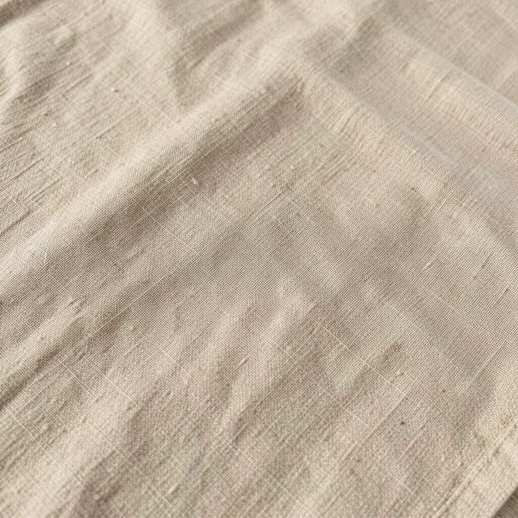
Sienna linen is a pale, dusty warm brown that feels airy. It’s cozy without being too dark, which makes it great for open-plan spaces.
Choose it for large walls if you want warmth but still want your room to feel light. It pairs beautifully with light oak, rattan, and soft gray accents. For a unique touch, use it in a subtle stripe or on ceiling panels for visual interest.
Budget-wise, this shade is easy to match with existing decor, so you may only need a new curtain or rug. A trend you’ll see often is “tone-on-tone,” where different linen-brown shades layer together. Try one darker accessory and keep the rest of the room in lighter, dusty neutrals.
6. Sandstone Beige

Sandstone beige reads warm and smooth like sunlit rock. It’s a reliable choice for creating a calm, everyday backdrop.
It’s especially effective in rooms with lots of daylight because it won’t feel cold. Paint your main walls with sandstone beige and let darker wood pieces anchor the look. Add soft taupe textiles so the room feels cohesive.
To personalize, match the beige to a key item like a favorite leather bag, a ceramic set, or a quilt. This color also works for small upgrades like door frames or built-in trim. If you want a trend-forward feel, keep the palette simple and add one earthy green or rust accent.
7. Warm Charcoal

Warm charcoal brings depth without going fully black. It makes cozy spaces feel more tailored and less flat.
Use it sparingly on lower cabinets, window trim, or a fireplace surround. It creates a strong contrast against creamy wall colors. Warm charcoal also hides everyday marks better than lighter shades.
For uniqueness, try it in a matte finish on shelving or a media console. If your room feels small, keep the majority of surfaces light and let charcoal act like a frame. Cost can vary, so consider painting only one “hero” area if you’re working within a budget.
8. Burnt Sugar Umber

Burnt sugar umber is deep, sweet, and gently smoky. It feels cozy and a bit nostalgic, like old leather books.
Use it on accent walls, curtains, or large furniture pieces like a dresser. It pairs well with warm metals and rich textures such as velvet or thick wool. The shade also makes art look more dramatic.
If you want a lighter look, mix this tone with warm beige in a paintable accent like a panel. You can also layer it through rugs and throw pillows rather than painting everything. That’s a smart way to control cost while still getting the full “earthy mood.”
Current trends lean toward moody neutrals, especially in living rooms. Keep lighting warm with bulbs around 2700K to 3000K for the most flattering color. This helps the umber feel inviting instead of heavy.
9. Pewter Clay Gray

Pewter clay gray is balanced and soft, with earthy warmth under the surface. It’s a great choice if you want gray but not the icy kind.
Try it for bedroom walls, office nooks, or the lower half of a painted wall. This color blends easily with white trim and can make warm wood look richer. It also works well with neutral patterns like subtle stripes and grounded geometric prints.
To make it unique, pair pewter clay gray with a touch of muted green or terracotta. Add texture through curtains, woven baskets, and a chunky knit throw. If you like personalization, match the undertone to a plant pot or stone countertop you already have.
For cost, gray tends to be forgiving, so you can often cover existing colors well. Still, sample it first because some grays lean more blue depending on light. A trend that’s popular right now is mixing soft grays with warm earth tones for a “modern cottage” vibe.
10. Redwood Rust
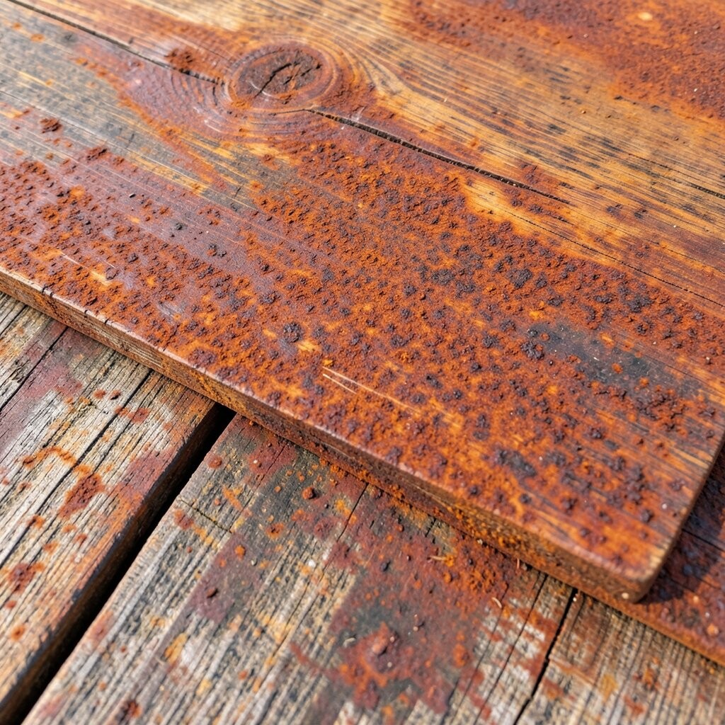
Redwood rust is earthy red that feels toned down rather than loud. It adds energy while keeping the room grounded.
Use it in small doses on pillows, a chair frame, or a ceramic collection on open shelves. It also looks great on interior doors because it feels like a warm highlight. Pair rust with cream, olive, and natural wood for a balanced palette.
To personalize, choose a rust that matches your existing tones, like the color of your favorite leather or the earth in your area rug. Cost is usually manageable since you can start with fabric and decor before committing to paint. This shade fits current trends that favor warm metals and layered neutrals.
11. Desert Ochre

Desert ochre brings the glow of late-afternoon light. It feels sunny, but still earthy and calm.
It works well on dining rooms, entryways, and kitchens where you want warmth without feeling overstimulated. Choose a lighter ochre for walls, then add deeper browns in accessories. Ochre also looks great with natural stone counters and warm white cabinetry.
For uniqueness, try an ochre accent ceiling or a painted niche behind a bookshelf. If you want an easy upgrade, look for ochre curtains or a patterned rug with ochre highlights. Cost-wise, ochre often needs a careful match, so test swatches to avoid undertone surprises.
12. Olive Branch Green
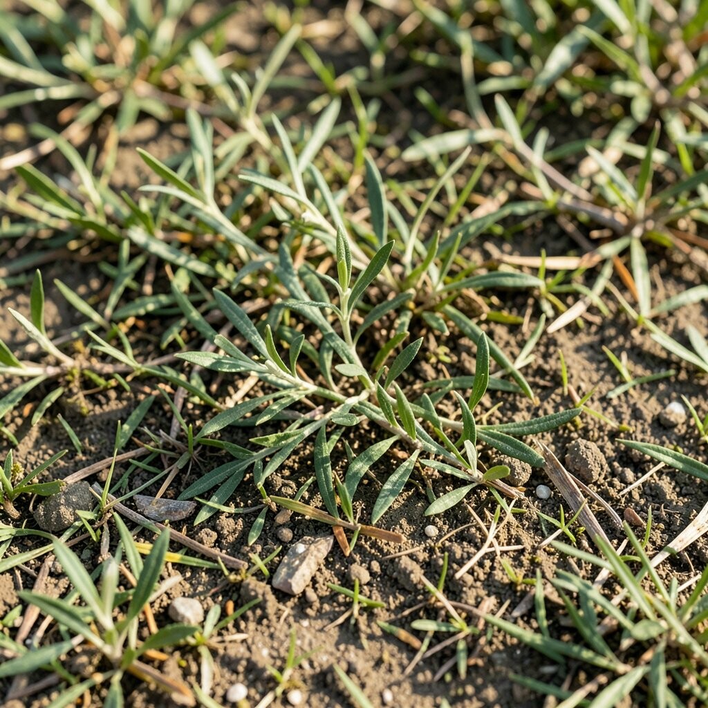
Olive branch green is a softer green that feels friendly, not too intense. It creates a cozy, slightly vintage mood.
Paint it on a reading chair wall area or use it on cabinetry for a warm kitchen twist. The color looks rich with white trim and natural wood. It also pairs well with soft beige and camel tones, creating a smooth, “wearable” palette.
To personalize, layer in plants or botanical art to echo the green’s natural vibe. If you’re budget-conscious, bring it in through throw pillows, a woven basket, or a lamp shade. A trend that’s common right now is biophilic styling, where greens and natural textures make spaces feel alive.
13. Clay Creek Blue-Grey

Clay creek blue-grey is muted and soothing, like water over stone. It’s a gentle twist for people who want calm color without strong blues.
Use it in bedrooms or bathrooms to create a serene, spa-like feeling. It pairs well with warm neutrals so the room stays cozy. You can also use it for lower cabinets or a built-in bench to add depth.
For uniqueness, combine clay creek with sand and taupe rather than pure white. Textures matter here, so add linen, terracotta pottery, or a woven throw. This color also looks excellent with antique gold and matte black accents.
Cost considerations are practical: if painting feels big, start with a few items like towels, bedding, or a small accent wall in a nook. Trends in soft interiors often blend blue-greens with warm clay and beige to avoid stark contrast.
14. Driftwood Taupe

Driftwood taupe feels weathered and comforting. It’s like the color of smooth wood after years of sea air.
Use it on walls or trim to create a soft, natural flow. Pair it with light fabrics, woven textures, and simple metal frames for an uncluttered look. If you have coastal pieces, this tone helps them feel more grounded.
15. Steeped Tea Brown
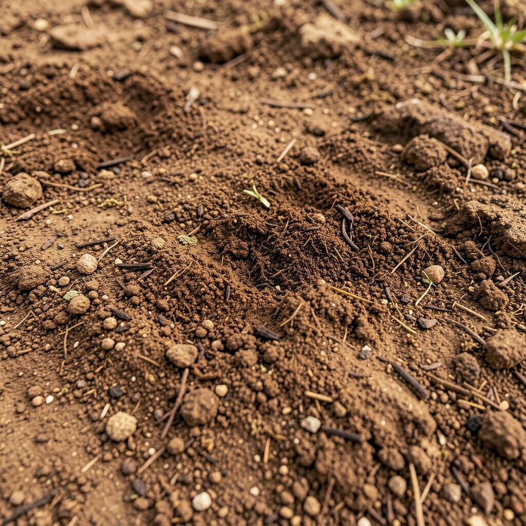
Steeped tea brown is warm and slightly red, like a well-brewed cup. It adds an inviting, cozy feeling to living spaces.
Paint it on an accent wall behind a sofa or on a bookshelf for depth. It also works on doors and baseboards when you want subtle drama. Pair with cream, warm gray, and natural textures to keep it from feeling too heavy.
To personalize, match this tone with your favorite throw blanket or rug undertone. Cost-wise, tea brown is rich, so it can make small decor items look more expensive. A current trend is using darker neutrals to frame lighter furniture for a layered, warm look.
16. Cider Wheat

Cider wheat is a pale golden brown that feels like gentle autumn light. It brings cheer without becoming bright.
Use it in kitchens and breakfast areas where you want warmth and clarity. It looks beautiful with white cabinetry, warm wood, and simple black accents. For practical tips, pair it with warmer bulbs so the color reads golden rather than flat.
To personalize, add pattern through curtains or a rug while keeping the base wall color steady. This is an easy palette for renters because you can swap textiles without repainting. Budget-wise, paint is still usually the biggest cost, but you can test the vibe cheaply with accessories first.
17. Greige Claystone
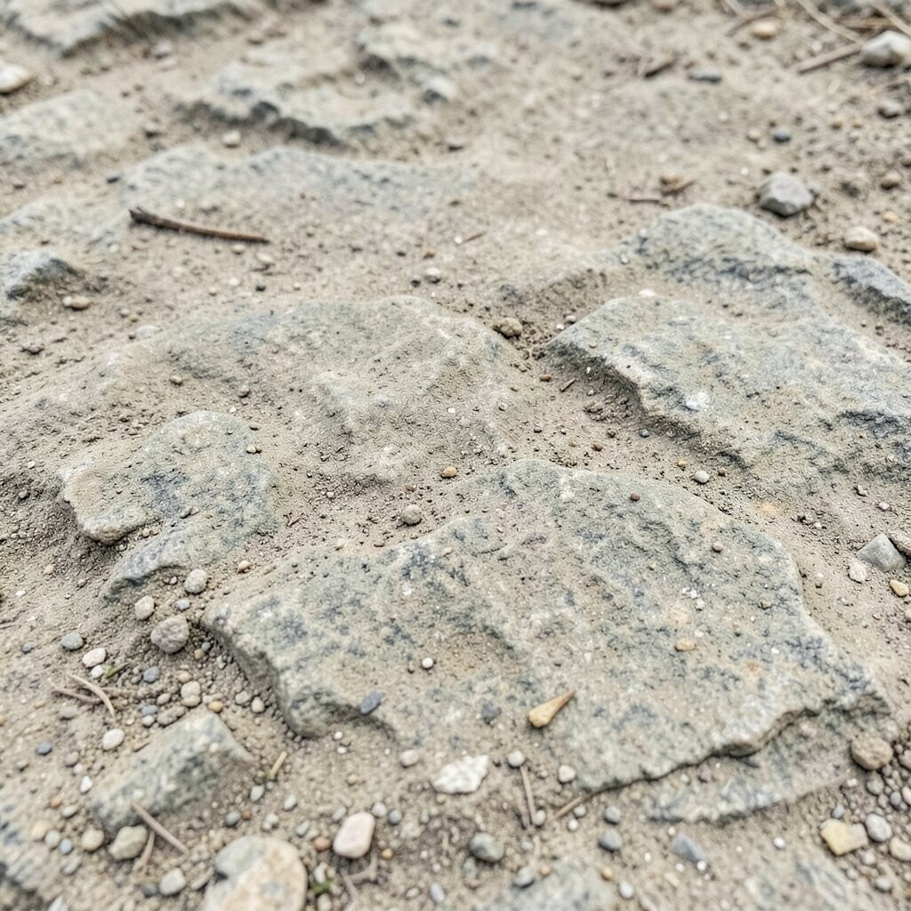
Greige claystone is a mix of warm beige and light gray. It feels flexible, making it easier to match many existing pieces.
This tone works well in open spaces because it doesn’t fight with other colors. Use it on walls and let your furniture bring contrast. It also helps patterned decor look calmer because the background stays quiet.
For uniqueness, add one deeper earthy accent like olive or rust through art or pillows. You can also use greige claystone on cabinetry for a soft, modern feel. If you’re planning costs, greige shades can be forgiving, so they’re a good choice when you want minimal surprises after painting.
Current trends favor warm neutrals that look natural in daylight, so claystone tones are a strong option. Pair with matte finishes and natural fibers for a cozy, not-too-formal mood. This keeps your space feeling lived-in and warm all year.
18. Silt Sage

Silt sage is muted and earthy, with a calming green undertone. It feels balanced, like plants growing beside a quiet stream.
Use it for bedrooms, nurseries, or a calm home office. It pairs well with warm whites and light woods, creating a gentle, restful setting. Add soft neutrals like sand and cream to keep the room airy.
To personalize, bring in woven textures and simple ceramic shapes to echo the natural vibe. Cost considerations are simple: you can start with accent pieces like bedding or curtains before making a bigger paint commitment. This tone also matches a trend for “soft countryside” palettes that rely on gentle greens and warm neutrals.
19. Cocoa Shell

Cocoa shell is a medium brown that feels rich but approachable. It’s great for cozy spaces that need comfort and visual warmth.
Paint it on lower walls, dining nooks, or built-ins for a layered look. This color looks especially good with light upholstery and cream trims. It also makes warm lighting feel even cozier.
For uniqueness, use cocoa shell alongside lighter taupes and a touch of olive for a natural pairing. You can also create a cozy rhythm by matching the wall color to a rug undertone. Cost-wise, deeper browns can show less staining, so they’re practical for high-traffic areas.
20. Quarry Stone Beige

Quarry stone beige has a grounded, slightly cool neutrality. It feels sturdy, like a calm foundation for your decor.
Use it in living rooms or entryways where you want a steady, welcoming look. Pair it with dark wood, simple linen curtains, and brushed nickel or matte black. For practical tips, choose a satin or eggshell finish to make cleaning easier.
21. Rusted Iron Clay

Rusted iron clay mixes warm browns with a hint of metallic depth. It adds a cozy, artisan feel without needing heavy decor.
This tone works beautifully for decorative accents like a cabinet finish, a painted tray, or an accent chair. It pairs well with creamy whites and deep greens for a grounded, earthy contrast. To personalize, repeat the color in two places so it looks intentional.
If you’re considering cost, this can be a great choice for budget-friendly DIY because small painted items give big impact. Current trends often highlight handmade textures, so matte paint and visible brush strokes can look especially stylish. Keep the rest of the palette soft to prevent the rust tone from overpowering the room.
22. Palomino Hearth

Palomino hearth is a warm, creamy tan that feels like a firelit evening. It makes rooms feel comfortable right away.
Use it on large walls and pair with caramel browns, warm whites, and natural wood. Add cozy textures like thick knit throws, boucle, and woven baskets for a richer feel. For personalization, choose a rug with subtle earth tones so everything blends smoothly.
Cost considerations are friendly because this color works with lots of existing neutrals. It also trends with the current love for warm minimalism, where everything is simple but feels inviting. In your lighting plan, keep bulbs warm so palomino hearth looks golden and soft.