
Light can feel shy until color gives it a friendly place to land. Pick a few smart shades, and your rooms start acting like they have more daylight.
Below are home colour ideas that feel fun and doable, even if you love cozy neutrals. Each one includes what it looks like, why it helps, and how you can make it your own.
-
1. Crisp White Trim That Makes Everything Look Taller

Crisp White Trim That Makes Everything Look Taller White trim can look clean like fresh paper against your walls. When the edges are bright, windows and doors seem more open.
The benefit is simple: your eye finds lines easily, and the room feels tidy and bright. Choose a white that matches your lighting, especially if you have warm bulbs. For a personal touch, keep the walls slightly warmer, then let the trim stay crisp.
If you want a budget-friendly option, repaint only the most visible trim. A small can of paint and painter’s tape can go a long way. In current styling, “bright edge” details are popular because they make modern furniture look even sharper.
-
2. Soft Sky-Blue Accents for an Airy Mood
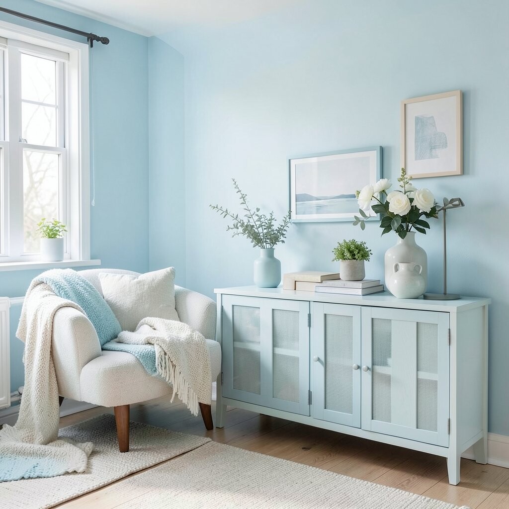
Soft Sky-Blue Accents for an Airy Mood Think of a pale sky-blue pillow or a narrow wall ledge painted in gentle blue. It looks calm and fresh, like a breath of cool air.
Blue accents help your space feel less heavy and more relaxed. Try it in small spots first, like a side chair, a curtain panel, or a ceramic vase.
To personalize, match the blue with warm whites, light wood, and tiny hints of brass. If you like bold style, go one shade deeper for one statement piece. Cost-wise, accessories usually cost less than repainting, so you can test the look without stress.
-
3. Warm Buttery Yellow on a Feature Wall

Warm Buttery Yellow on a Feature Wall Buttery yellow feels sunny, even when the day is cloudy. Picture it behind a bed, a dining table, or a reading nook.
This color element can brighten your whole room because it reflects light warmly. It also adds cheer without looking harsh, especially if your yellow is soft and creamy.
For tips, keep the rest of the palette neutral so the wall stays the star. Pair it with oatmeal curtains, light gray or beige furniture, and natural textures like rattan. If you are cost-conscious, paint is a strong value, and one wall can be enough.
Trend-wise, gentle “sunroom yellow” is showing up in modern interiors because it feels friendly and not too loud. Personalize by adding art with navy, forest green, or terracotta highlights for extra life.
-
4. Terracotta Pottery and Clay Tones for Cozy Light
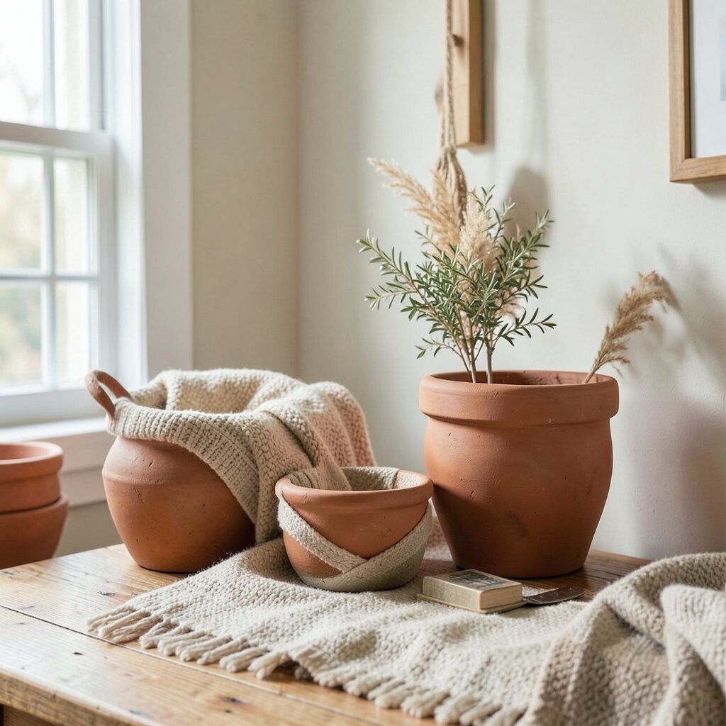
Terracotta Pottery and Clay Tones for Cozy Light Terracotta tones look like warm clay jars and sun-baked pottery. You might see them on plant pots, throw blankets, or accent ceramics.
These earthy colors brighten your space in a comforting way. They work especially well in rooms that feel cool, like those with north-facing windows.
Choose a clay shade that leans orange-warm, then add it slowly with small items if you like to change often. Matching becomes easy when you combine terracotta with cream, light wood, and soft sage greens. From a cost view, thrift-store ceramics are often affordable, and they bring instant character.
-
5. Golden Hardware for Small Glints of Joy

Golden Hardware for Small Glints of Joy Cabinet knobs and drawer pulls in gold look like tiny sunrise highlights. Even a simple metal change can make a kitchen feel more cared for.
The benefit is “brightness by sparkle,” because shiny surfaces reflect light. Golden hardware also pairs well with many wall colors, from crisp white to warm beige.
For a smart tip, stick to one gold finish across a space to keep it cohesive. If your budget is tight, repaint existing hardware (some are paintable) or replace just one set in a visible area. Current trends lean toward “warm gold” rather than icy chrome, which feels welcoming and modern.
-
6. Muted Sage Green for Calm, Fresh Walls
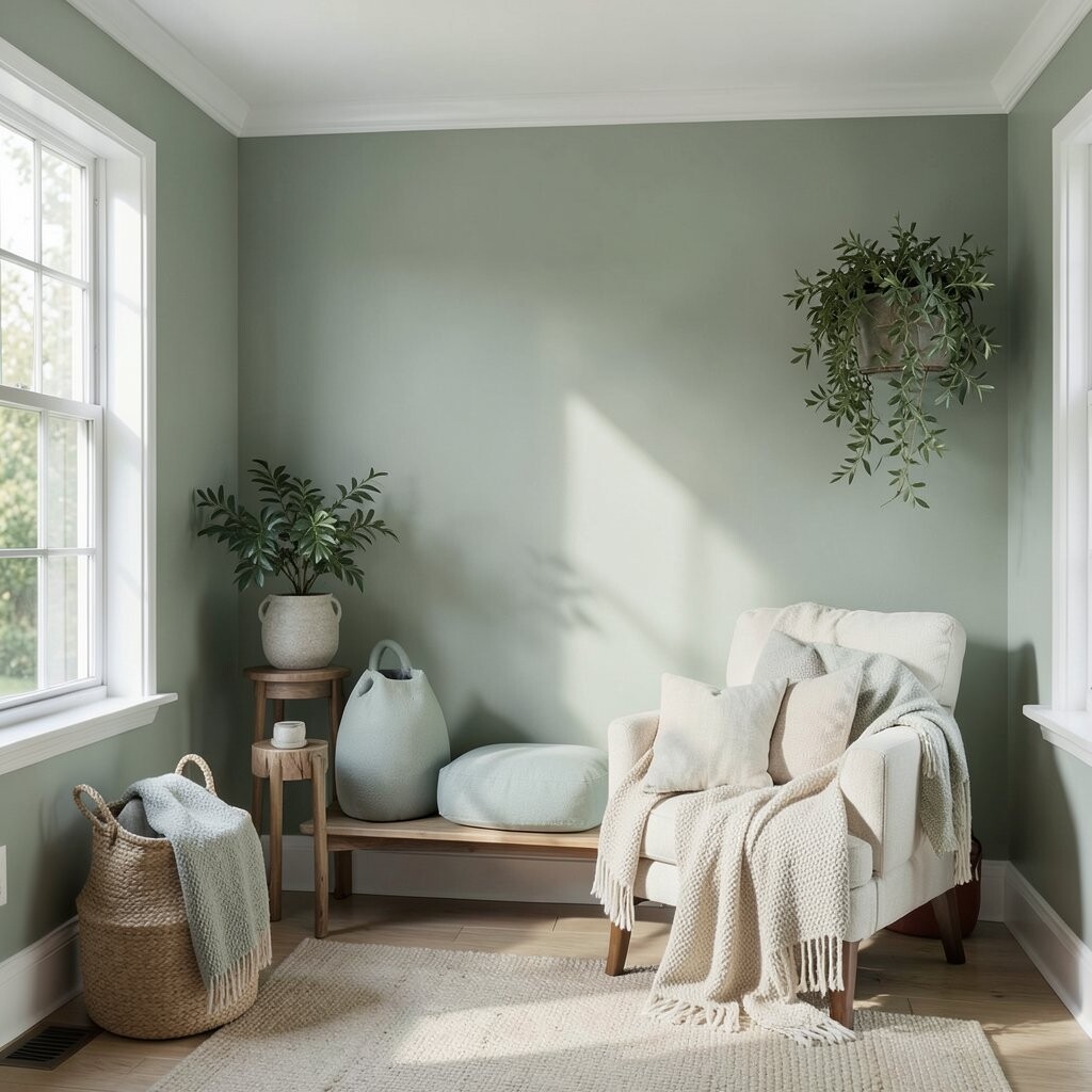
Muted Sage Green for Calm, Fresh Walls Sage green looks like greenery after a soft rain. It gives your room a calm, fresh vibe without feeling too bold.
This color element can make white furniture look brighter and more clean. It also helps rooms feel balanced when you have lots of wood or natural textures.
Keep the shade light and slightly gray so it stays airy. Personalize by adding botanical art, woven baskets, or cotton curtains in warm white. Cost is manageable because paint can refresh a room quickly, and you can do it room by room.
-
7. Color-Blocked Curtains That Frame the Light
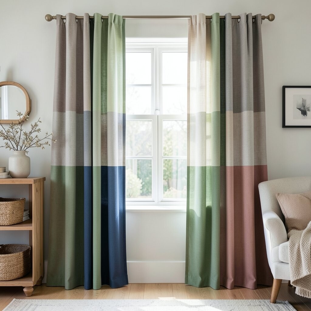
Color-Blocked Curtains That Frame the Light Color-blocked curtains add a stylish “window glow” to any room. Imagine panels with a pale base and a stripe in coral, teal, or deep olive.
They brighten by letting your window become a focal point. Curtains also help control light, so you can soften glare and still keep the space cheerful.
For tips, choose colors that repeat elsewhere, like in a pillow or rug. If you want a low-cost route, rework existing curtains with a simple trim or fabric panel. The current trend favors playful stripes and blocks, because they look modern yet still cozy.
Personalize by picking a stripe color from your artwork, so everything feels connected.
-
8. A Bold Mirror Frame for Instant Brightness
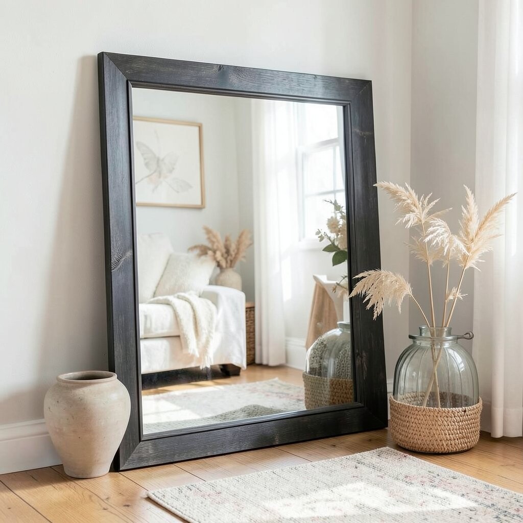
A Bold Mirror Frame for Instant Brightness A mirror with a colorful frame acts like a light catcher. Picture a teal or mustard frame reflecting daylight across a hallway.
The benefit is faster brightness without waiting for repainting. Mirrors also make narrow spaces feel longer and more open.
For tips, hang the mirror where it can reflect a window or bright lamp. Match the frame color to small decor for a clean look, like a vase or book spine accents. Cost-wise, mirrors vary, but a thrift find with a fresh paint job can be an affordable win.
-
9. Bright Area Rugs to Warm Up Dark Corners
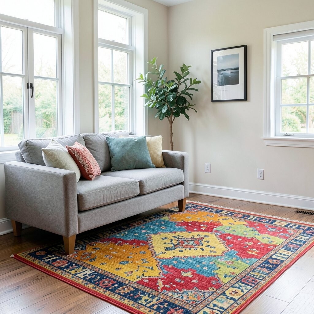
Bright Area Rugs to Warm Up Dark Corners A vibrant area rug can change the mood of a whole room. Think of light blue, warm coral, or cheerful patterns under your furniture.
Rugs make spaces feel layered and welcoming, and they help hide shadows. When the rug has lighter tones, the floor looks less “far away” and more connected.
Personalize by choosing a pattern that matches your style—geometric for modern, soft florals for classic, or stripes for a clean look. If you are cost-conscious, go for a smaller size first or choose a rug with a mix of colors so it hides wear. Current trend notes: “sunny neutral” rugs with hints of color are popular because they feel bright but not overwhelming.
To make it cohesive, repeat one rug color in two other places, like a cushion and a lamp shade.
-
10. Accent Walls in Paint and Wallpaper Kombos
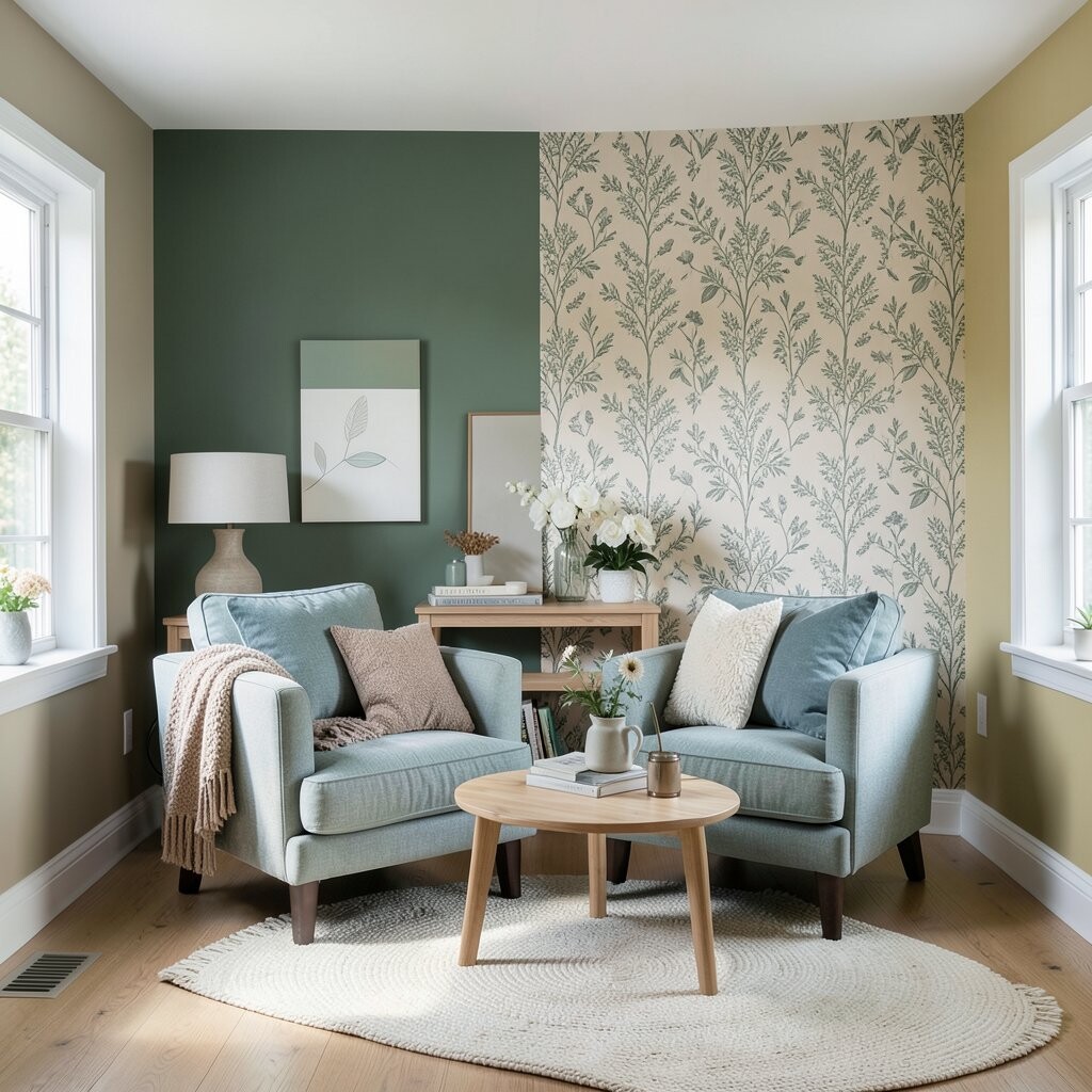
Accent Walls in Paint and Wallpaper Kombos Accent walls make a room feel like it has a personality. You can use paint for the main area and wallpaper on a smaller zone, like behind a desk or in an entry alcove.
This adds brightness because it brings focus to one spot and stops the whole wall from feeling flat. It can also hide small imperfections.
Try a light wallpaper with subtle texture, such as tiny leaves or a soft pattern. For personalization, match wallpaper colors to your sofa or curtains so everything looks planned. Cost-wise, wallpaper can be pricier, but using it on just one section keeps the budget calmer.
-
11. Fresh Pillow Color Swaps for Instant Lift
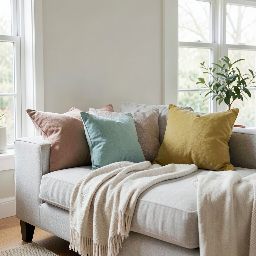
Fresh Pillow Color Swaps for Instant Lift Pillow covers are the fastest way to brighten your space. Swap in a couple of lighter shades like cream, pale teal, or sunny yellow for a quick mood change.
The benefit is immediate: your living room or bedroom looks updated without heavy work. You also get the fun of changing your color theme with the seasons.
Personalize by mixing textures, like pairing linen-look covers with a soft knit. Tip: repeat one color across the room, then vary the shades of the rest. For cost considerations, shop sales or mix affordable basics with one “standout” cover that you truly love.
-
12. Statement Art with Light Colours as a “Window” Effect

Statement Art with Light Colours as a “Window” Effect Wall art can act like a second window when it uses bright tones. Look for paintings or prints with pale skies, warm yellows, or clear whites.
This helps your walls feel lively and can pull color throughout the room. It also makes the space feel more “finished,” which is a big part of brightness.
For tips, choose art that includes at least one of your room’s main colors. Personalize by framing pieces in a cheerful finish, like light oak or a painted frame. Cost-wise, you can frame prints from online galleries or swap inexpensive art for new seasonal styles.
Trend-wise, layered gallery walls with light backgrounds are popular because they feel airy and modern.
-
13. Painted Ceiling Accents to Lift the Whole Room
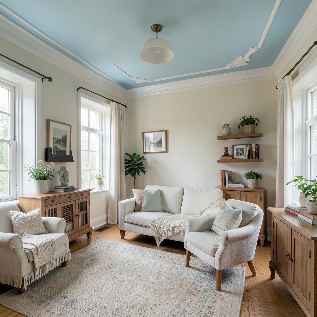
Painted Ceiling Accents to Lift the Whole Room Painting a ceiling edge or adding a gentle ceiling tone can make the room feel taller. Imagine a soft white ceiling with a pale blue border that feels like the sky.
This color element brightens from above, which is where your eyes naturally travel. It also makes lighting feel more even across the room.
For tips, keep the ceiling lighter than the walls so you do not shrink the space. Personalize with tiny color pops like a thin stripe, star decals, or a subtle pattern in one corner. Cost is usually moderate because the area is smaller than a full wall, and you can do it yourself if you enjoy DIY.
-
14. Colourful Lighting: Lamp Shades and Bulb Warmth
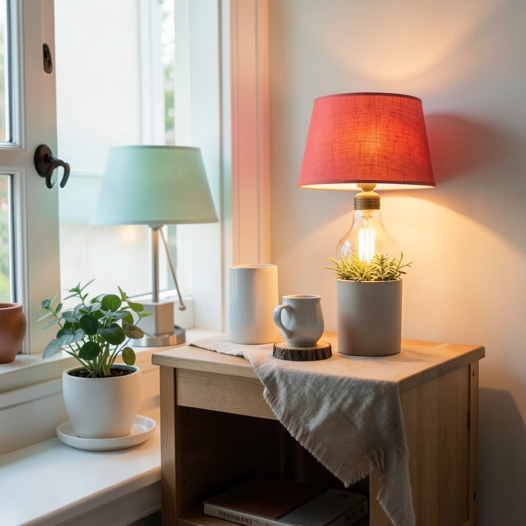
Colourful Lighting: Lamp Shades and Bulb Warmth Lighting color can brighten a room like nothing else. A lamp shade in oatmeal, blush, or pale gold can soften shadows and make the space feel cozy.
The benefit is better mood, because the light tone changes how every other color looks. You can also keep your walls neutral and still get a bright feel through lighting choices.
For tips, choose bulb warmth that matches the vibe you want. Warm light can feel cozy, while neutral light can feel crisp. Personalize by coordinating lamps with your pillow colors or rug accents, so the whole room feels synced. Cost-wise, lamp shades and bulbs are often less expensive than paint, and you can swap them easily.
-
15. A Colourful Storage Moment to Keep Things Bright
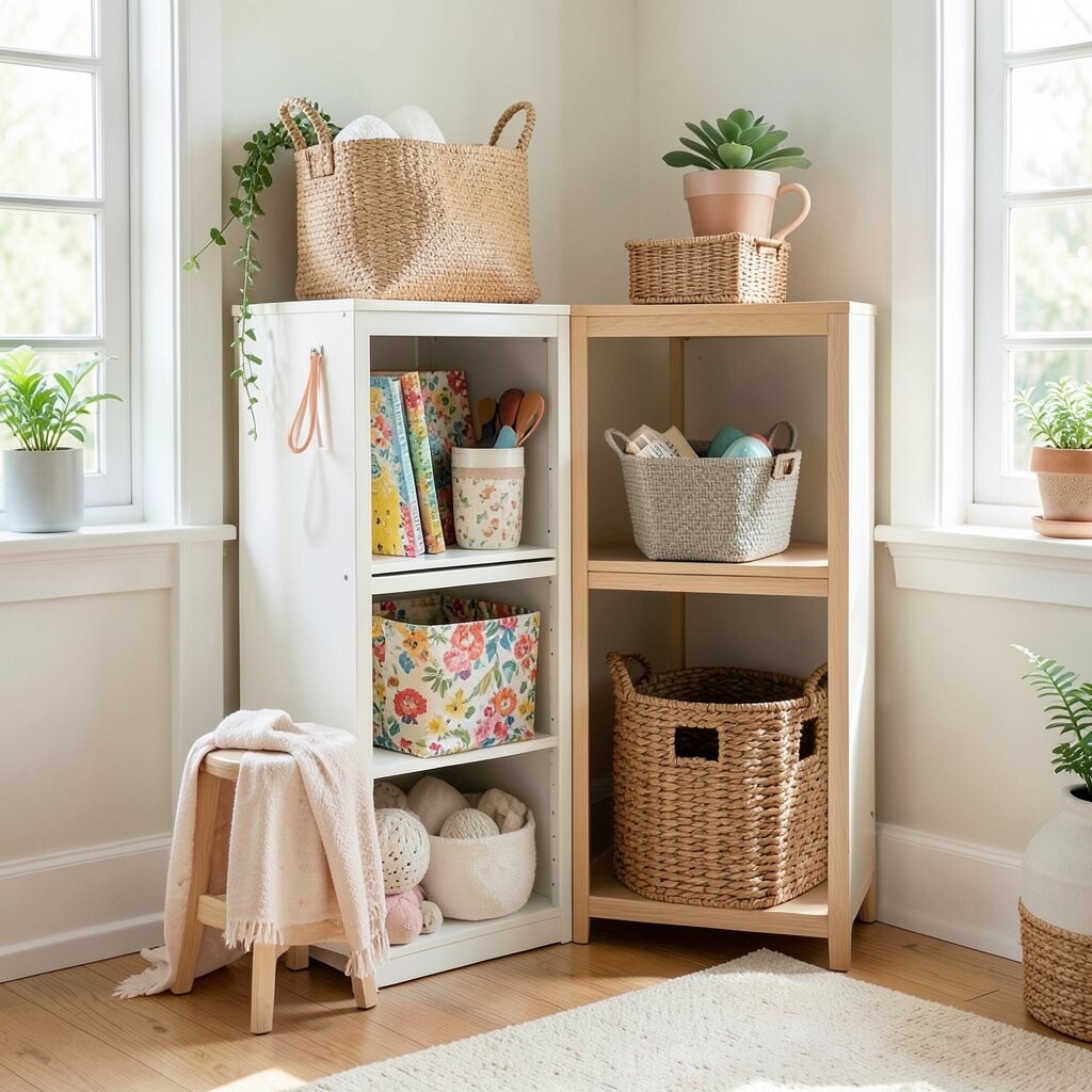
A Colourful Storage Moment to Keep Things Bright Storage does not have to be boring. A painted bookshelf back, bright bins, or a colorful cabinet can turn everyday clutter into a style feature.
This brightens your space because it removes the “shadowy” feeling that dark storage can create. When your storage looks cheerful, your room feels calmer and more organized.
Try a personal approach: match bin colors to the most common wall tone, then add a pop color for balance. Tip: pick one or two bright shades and repeat them so it feels intentional, not random. Cost considerations are good here too, because paint can refresh shelving and bins can be bought in sets during sales.