Your kitchen can look brand-new without a full remodel. A fresh coat of paint can make the whole room feel brighter and more you.
1. Bright White Cabinet Glow

Bright white cabinets bounce light around the room. That simple change can make even a small kitchen feel open and clean.
Choose a high-quality satin or semi-gloss for easy wiping. Pair the white with warm hardware like brushed brass or soft black for contrast. Before painting, degrease well and sand lightly so the new finish sticks smoothly.
2. Soft Greige Walls for Easy Matching
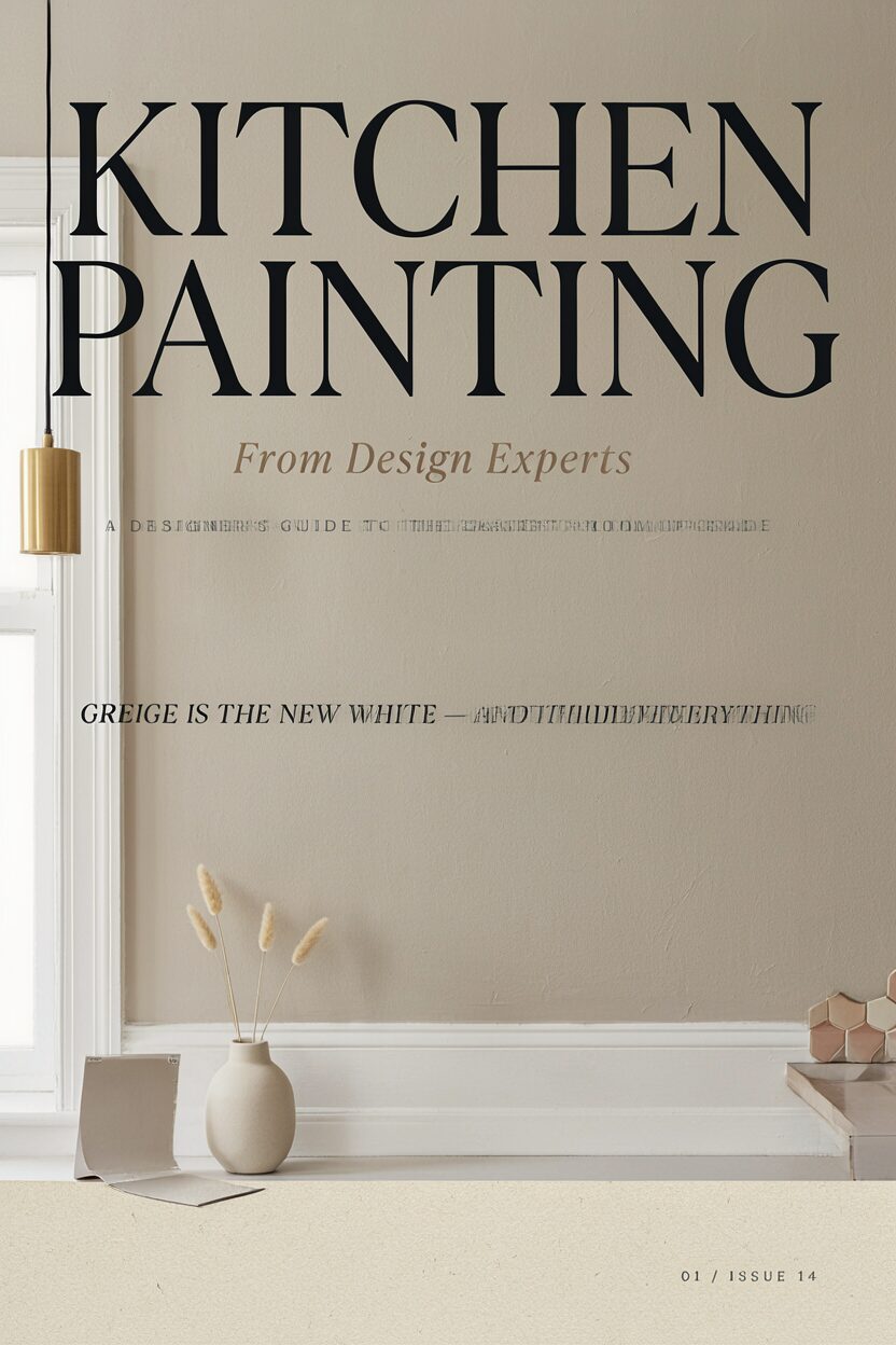
Greige sits between gray and beige, so it fits many styles. It also hides minor scuffs better than a crisp white.
Use a warm undertone if your kitchen has yellow lighting, and a cooler undertone if you have blue-toned fixtures. For a quick upgrade, paint the trim a slightly brighter shade of the same family. Current home design trends love greige because it stays stylish while still feeling cozy.
If you worry about “flat” color, add depth with a darker painted accent wall or a peel-and-stick geometric backsplash as a test. Budget-friendly paint is often your best return since you only need a roller, a few brushes, and painter’s tape. Plan for two coats and give everything a full dry time before you put small items back.
3. Two-Tone Cabinet Paint with Color-Blocked Lower Units

Two-tone cabinets add personality without turning the whole kitchen loud. Painting the lower cabinets a deeper shade can also ground the space.
Try pairing a crisp upper cabinet color with a navy, forest, or muted charcoal base. This method makes countertops look neater because the visual “weight” sits lower. Keep the same paint sheen on both parts so the finish looks consistent.
To make the look feel intentional, match your hardware finish to one of the cabinet colors. If your kitchen is narrow, stick to a darker color on the bottom only, since too much dark paint can shrink the room. Plan extra drying time because cabinet work usually needs more steps than wall painting.
Costs vary depending on whether you spray or brush, but you can stay on budget by painting doors while leaving frames intact. Add a protective topcoat to help the finish resist daily cooking splashes.
4. Benjamin Moore-Inspired Sage Green Accents
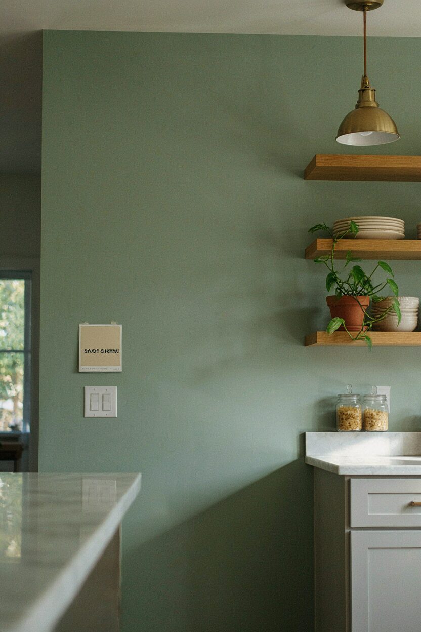
Sage green feels calm, fresh, and slightly vintage. It’s a great match for natural wood, linen, and warm metals.
Paint a single accent wall, the inside of open shelving, or even the island drawers. Choose a matte or eggshell wall finish for a soft look, then use semi-gloss for areas that get touched often. Test the color on a small section near your light switch, since sage can read different in morning vs evening light.
5. Coastal Blues with a Weathered Cabinet Finish

Light coastal blues can make your kitchen feel like a sunny morning. Adding a subtle weathered look keeps the color from feeling too perfect.
Use a blue base, then apply a dry-brush technique over high points for a lived-in finish. This style works well with white countertops and rattan or wicker decor. It also pairs nicely with open shelves and simple glass jars.
To keep it practical, choose a cabinet paint that’s meant for kitchens and finish with a durable clear coat. Budget-wise, you’ll spend more on supplies like brushes and sealing products, but the final look often feels custom. If you want to test the technique, practice on a spare board before touching real cabinet doors.
6. Chalkboard Paint for a Functional Wall

Chalkboard paint turns a blank wall into a useful spot for notes. It’s especially fun for families who want reminders that are easy to update.
Pick a location near the coffee station, pantry door, or a mudroom-like entry. Choose a matte finish that takes chalk smoothly, and seal it properly for best performance. You can even create a custom menu board shape by taping off a rectangle before painting.
To personalize, write cooking schedules, grocery lists, or kids’ chore reminders. When it’s time for a change, you can erase and repaint with a fresh coat if needed. Cost is usually low because you can cover just one wall section rather than the entire room.
7. Warm Walnut Tonality on an Island

Painting an island with a warm walnut look brings richness to the kitchen. It also gives the space a layered, designer feel.
You can achieve this with a brown glaze over a base paint, then seal for durability. Pair the island with lighter walls or cabinets so the darker color stands out. This trend is popular because it adds warmth without requiring expensive wood replacement.
If you’re worried about the island looking too heavy, keep the rest of the cabinets light and add warm lighting above the island. Use a satin or semi-gloss finish for cleanability since islands get the most contact. Plan for a little extra time because glazing needs patience and careful wiping.
8. High-Contrast Black Hardware and Deep Charcoal Trim

Dark trim can make a kitchen feel crisp and high-end. When balanced well, it highlights your cabinets and creates sharp lines.
Painting the trim a deep charcoal works like a frame around the room. It also complements stainless appliances and black lighting fixtures. Keep the main wall color lighter so the kitchen still feels airy.
For uniqueness, try a slightly different charcoal shade in different zones, like upper trim vs lower toe-kick. That small variation adds depth without looking messy. Tape edges carefully and use a brush for corners, since mistakes stand out most on dark paint.
Cost stays reasonable because trim coverage is limited compared to full walls. You may need touch-ups, but the final look usually feels worth it. Finish with a paint that resists scuffs, since trim gets bumped during everyday cleaning.
9. Light Linen Wall Color for a Soft Modern Feel

Linen-colored walls feel bright without being icy. They create a calm backdrop for your everyday kitchen life.
This shade often looks best in kitchens with lots of natural light. Match it with white cabinets, pale wood flooring, or minimal metal accents. If your space has darker counters, linen can keep everything feeling friendly.
For practicality, choose an eggshell or washable finish so splashes and fingerprints wipe away. Use two thin coats instead of one thick coat to reduce streaks. If you have open shelving, paint the shelf backs the same tone to reduce visual clutter.
Budget-friendly tip: you can repaint walls quickly, and the color change alone can refresh the entire kitchen. Add a new rug runner or a few updated countertop accessories to make the color feel intentional.
10. Color-Matched Upper Cabinet Interiors

Painting only the inside of upper cabinets gives a designer-like surprise. You’ll see the color every time you open the door.
Use a slightly darker shade than the cabinet exterior, or go with a complementary tone like dusty blue or soft terracotta. This idea works especially well with glass-front doors because the interior color becomes part of the display. It also helps you organize since the interior shade can make items look more coordinated.
For uniqueness, paint the back panel of open shelves to match the interior cabinet color. Keep the sheen consistent, and let everything dry fully before loading dishes. Costs stay low because you’re painting smaller surfaces, not the whole room.
11. Two-Section Accent Wall with Micro-Pattern Wallpaper Paint

If you like pattern but don’t want wallpaper, painted texture can help. A micro-pattern accent wall feels subtle up close and stylish from a distance.
Start with a base wall color, then use a stencil for repeating shapes. Keep the pattern scale small so the kitchen doesn’t feel busy. Choose a stencil in a slightly different tone rather than a totally new color for a more grown-up look.
To make it practical, apply a washable topcoat or use a paint made for walls with extra durability. Align your stencil carefully for crisp edges, and rotate your starting point slightly so the pattern looks natural. This approach is trendy because it adds visual interest without heavy installation.
Cost considerations are friendly since stencils are reusable. If you don’t want to commit, test on cardboard or a scrap wall first. When you plan the exact wall section, you can keep the paint use minimal.
12. Matte Finish Walls with Glossy Trim for Clean Lines

Mixing matte walls with glossy trim gives your kitchen a tailored look. The sheen contrast makes edges look sharper and more architectural.
Use an interior wall paint with a matte or flat finish for the main color. Then choose a semi-gloss for baseboards, window trim, and door frames. This also helps hide wall imperfections while making the trim stand out.
13. Warm Terracotta on a Feature Nook or Corner

Terracotta adds warmth and a grounded, handcrafted vibe. It’s a great choice for kitchens with earthy tones and natural materials.
Paint a small nook, a corner wall, or the area behind a breakfast bar chair. Keep the rest of the kitchen in soft whites or warm creams so the terracotta remains the star. This color is trending because it works beautifully with modern farmhouse and Mediterranean-inspired decor.
To keep it cleanable, use a durable paint and consider semi-gloss on trim and doors in that zone. Personalize the look with matching pottery tones, woven baskets, or wooden cutting boards. Cost is manageable because you’re covering limited square footage.
14. Subway-Tile Look with Painted Grout Lines

You can get a tile-inspired look without replacing anything. Painted “grout” lines give walls a fresh structure and a new focal point.
Choose a light backsplash color base, then use painter’s tape to map thin grout lines. Add a smooth finish paint so the wall area feels easier to wipe. This idea works well behind a coffee station or along a small section of the counter wall.
For best results, measure carefully and keep lines consistent in width. Use a foam roller for even coverage and a small angled brush for corners. When you’re done, consider a clear protective finish rated for kitchen use, especially near splashes.
15. Refreshing the Ceiling with a Subtle Tint
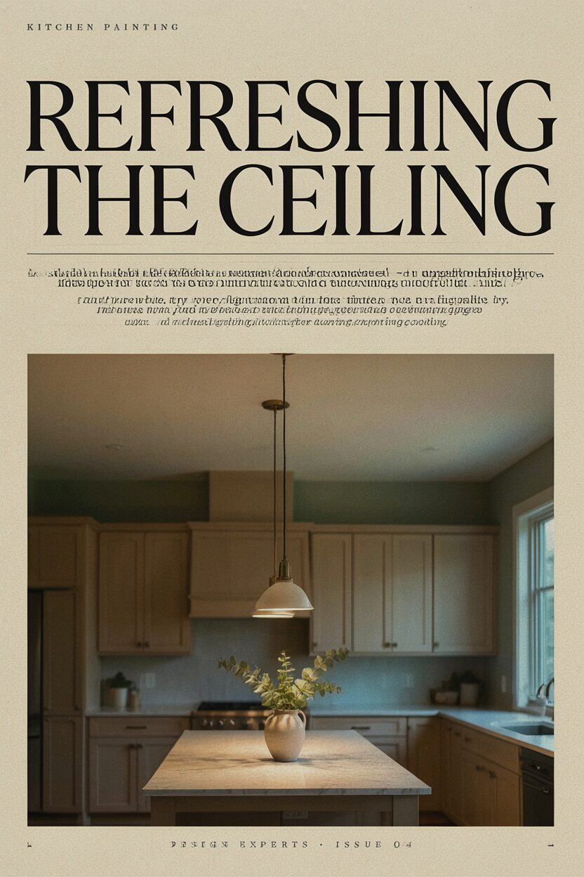
Painting the ceiling can make the whole kitchen feel taller. A subtle tint helps the space feel warmer and more connected.
Instead of pure white, try a very light warm tone that matches your walls. This is a simple upgrade that many designers use to reduce stark contrast. It also helps lighting look softer, which can be comforting during evening cooking.
Use a flat or ceiling-specific paint so it reduces glare. If you’re repainting after repairs, skim and sand first for a smooth surface. The cost is usually low because ceilings use less product than cabinets, and the impact is surprisingly big.
16. Pastel Cupboard Color with Clear-Coat Protection

Pastel cupboards bring a playful, cheerful mood into the kitchen. Think soft mint, pale peach, or light powder blue for a gentle color pop.
To keep it practical, choose a cabinet paint meant for frequent cleaning and apply a strong topcoat. Pastels can show wear faster than darker colors, so plan for long-term durability. Balance the sweetness with neutral counters, light wood, and simple hardware.
For personalization, paint a small stripe on the inside of cabinet doors or the edge of shelves. This small detail feels special without overwhelming the room. Budget-wise, a single pastel shade can replace the need for extra decor when the rest of the kitchen stays neutral.
17. Accent Color Around Windows and Built-Ins

Painting around windows like built-in frames creates a custom look. Your kitchen will feel more designed and less “standard builder grade.”
Choose a color that complements your cabinets, such as a muted teal, deep bronze, or warm gray-green. If you have built-ins, paint their interior backs too so everything feels cohesive. This technique draws the eye and makes the architecture stand out.
Use high-quality tape and a steady hand because the edges need to be crisp. Sand and prime any glossy surfaces so paint bonds well. Cost can be kept in check by focusing on visible trim areas rather than repainting the entire room.
18. Warm White Cabinets with a Soft Eggshell Wall Pairing

Warm white cabinets make the kitchen feel inviting and tidy. Pairing them with an eggshell wall color keeps everything smooth and comfortable.
Look for warm undertones so the room doesn’t feel too yellow or too cold. Pair warm whites with brushed nickel or warm gold hardware for a balanced look. This combination is a classic, but it still feels current because it works with many design trends.
For uniqueness, add one subtle contrast element, like painting the pantry door a slightly deeper warm shade. It’s a small change that makes your kitchen feel intentional. Costs are reasonable because you can stick to one main cabinet color and one wall color, then add only minimal accent work.
19. Rustic Farmhouse Distressed Cabinet Details

Distressing adds character and makes cabinets look like they’ve been loved. It’s especially effective on corners, edges, and hardware areas.
Start with a base color and then add a lighter “under-layer” so distressing reveals depth. Use sandpaper lightly and focus on realistic wear patterns rather than random spots. This helps the final look feel authentic, not messy.
To personalize, distress more around areas near the sink and prep zones where wear would naturally happen. Seal the finish well so the distressing doesn’t collect grime. Cost can be moderate, but it can save money compared to replacing cabinet components since you’re creating a high-end look with paint and technique.
20. Monochrome Look with Layered Grays

Monochrome kitchens feel sleek and calm. Layering grays instead of switching to bold color keeps the look modern.
Use one gray for cabinets, another slightly deeper gray for trim, and a lighter gray for walls. The change in shade adds depth without creating clutter. This trend is popular because it photographs beautifully and works with nearly any countertop material.
To avoid a “flat” result, pay attention to undertones and finishes. Pair matte wall paint with semi-gloss trim, and choose hardware finishes that match the depth you picked. A consistent color story also helps you buy fewer small decor items since the room already looks coordinated.
21. Accent Door Color on the Pantry for a Surprise Pop

A pantry door is often the most hidden surface in a kitchen. Painting it a bold accent color turns it into a charming focal point instead.
Pick a color that matches your personality, like rich teal, sunny yellow, or a deep wine tone. Keep the surrounding cabinets neutral so the accent door stands out when you open and close it. This is a smart cost move because you’re spending paint on one door rather than an entire kitchen.