
Small changes can make a kitchen feel brand new. The right paint color can do it without draining your wallet.
1. Crisp White With a Soft Warm Undertone

If your kitchen feels dark or dated, crisp white can brighten everything fast. Choose a warm white so it doesn’t look icy next to wood cabinets or honey-colored floors.
This style works because white paint reflects light and makes counters, tiles, and hardware stand out. For a smooth finish on a budget, use a primer only if the surface is stained or glossy. Apply two thin coats, then let each coat dry fully before deciding if you need more coverage.
2. Chalky Sage That Feels Calm and Cozy
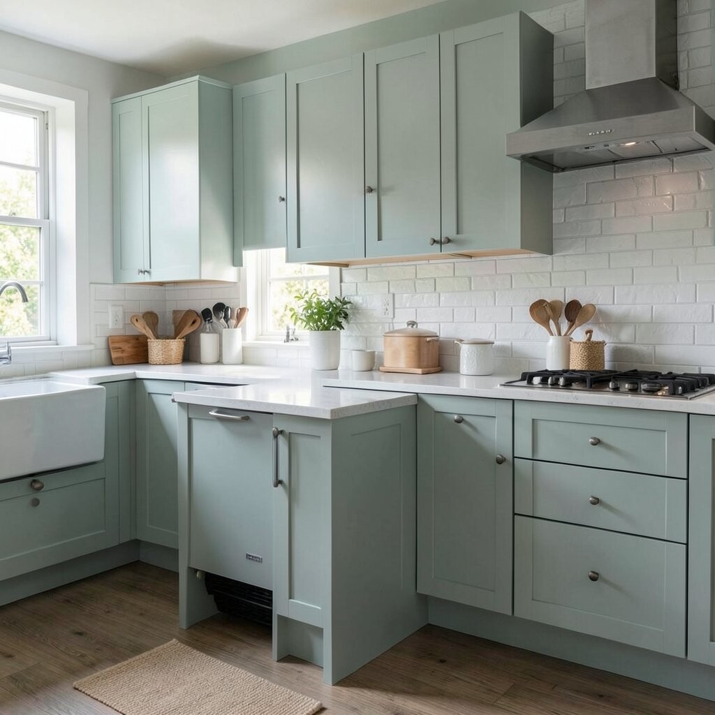
Sage green brings a modern, gentle vibe that still feels welcoming. It pairs beautifully with light woods, black fixtures, and off-white backsplashes.
What makes it unique is the slightly dusty, chalky look, which hides minor wall imperfections. To keep it modern, stick to satin or eggshell sheen and avoid high-gloss that can look too shiny. Start with a sample square on the wall, since sage can shift from gray-green to warm green depending on your lighting.
If you’re working under $25, consider painting only the main wall behind open shelving or the area around the breakfast nook. That smaller scope helps you buy better-quality paint without overspending. Finish the look with simple, clean hardware or a fresh set of matching canisters for an instant refresh.
3. Deep Charcoal for a Statement Wall

Charcoal paint looks sleek and modern, especially in kitchens with lots of natural light. It can also make stainless steel appliances feel extra crisp.
The benefit of charcoal is contrast, because it frames your backsplash and cabinets like a photo mat. Use it on one wall, the lower cabinets, or even the inside of an accent niche. For practical results, clean the wall thoroughly and sand lightly if you’re painting over glossy paint.
To personalize it, add a thin border line in a lighter color or paint the trim a soft white for a crisp edge. Stick to a durable interior paint rated for walls, and choose a finish that wipes easily. If you’re using leftover paint, test it first because charcoal can show patchiness when coverage isn’t perfect.
On the cost side, prioritize coverage over fancy extras by buying the right roller and a quality angled brush. A fresh roller nap can be surprisingly helpful for avoiding streaks. When you keep the project focused, the total can stay under your budget even with a small primer purchase.
4. Matte Terracotta for a Warm, Modern Glow
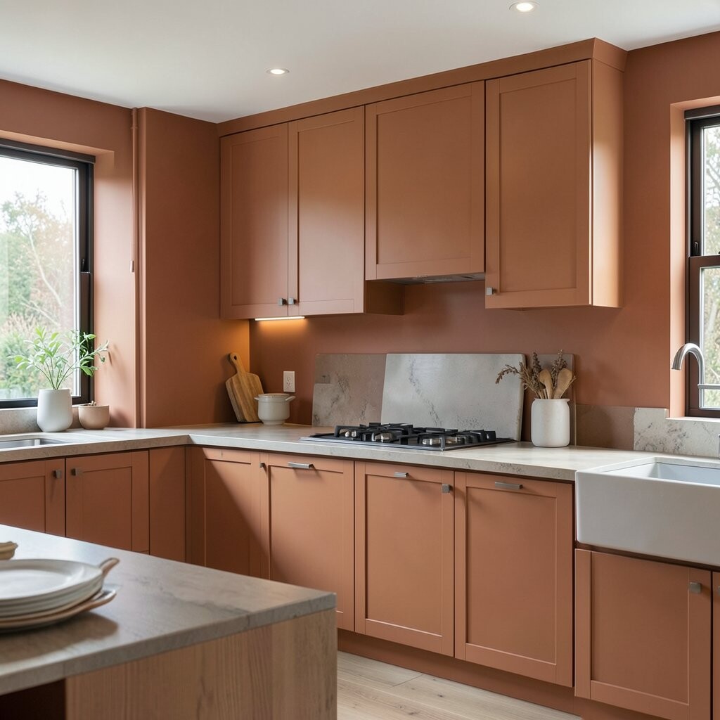
Terracotta adds warmth and personality without looking overly rustic. A muted, modern terracotta feels great with white counters, patterned tile, or warm metal accents.
This color stands out because it brings a sun-kissed tone that makes the kitchen feel alive. Paint the back wall or a small half-wall area for the most balanced look. For durability, pick a washable paint and consider sealing porous areas in older homes before the first coat.
5. Soft Blue-Gray for an Airy, Clean Look
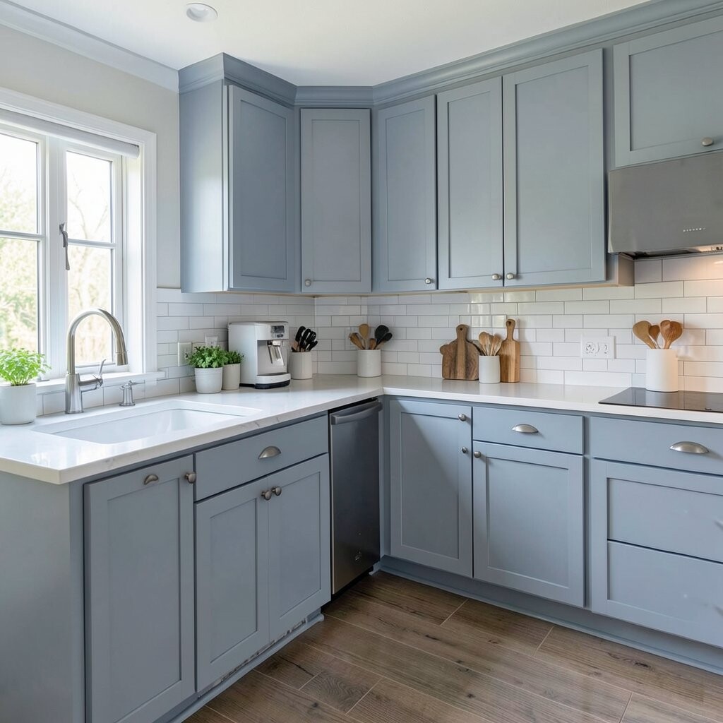
Blue-gray walls make kitchens feel calm, tidy, and a little more spacious. It’s a smart choice if you want color but don’t want it to feel loud.
This idea is unique because it works as a “neutral with personality.” Pair it with white cabinetry, light gray grout, or pale wood floors to keep the overall vibe cohesive. To avoid coldness, choose a blue-gray that has a hint of green rather than a very strong icy blue.
When you’re trying to stay under $25, paint a single wall or just the portion above open shelving. Use painter’s tape carefully around outlets and trim, then remove tape while the paint is slightly tacky for cleaner lines. If you want extra pop, add a new set of dish towels and a coordinating fruit bowl in a similar undertone.
6. Sunny Butter Yellow That Isn’t Too Bright
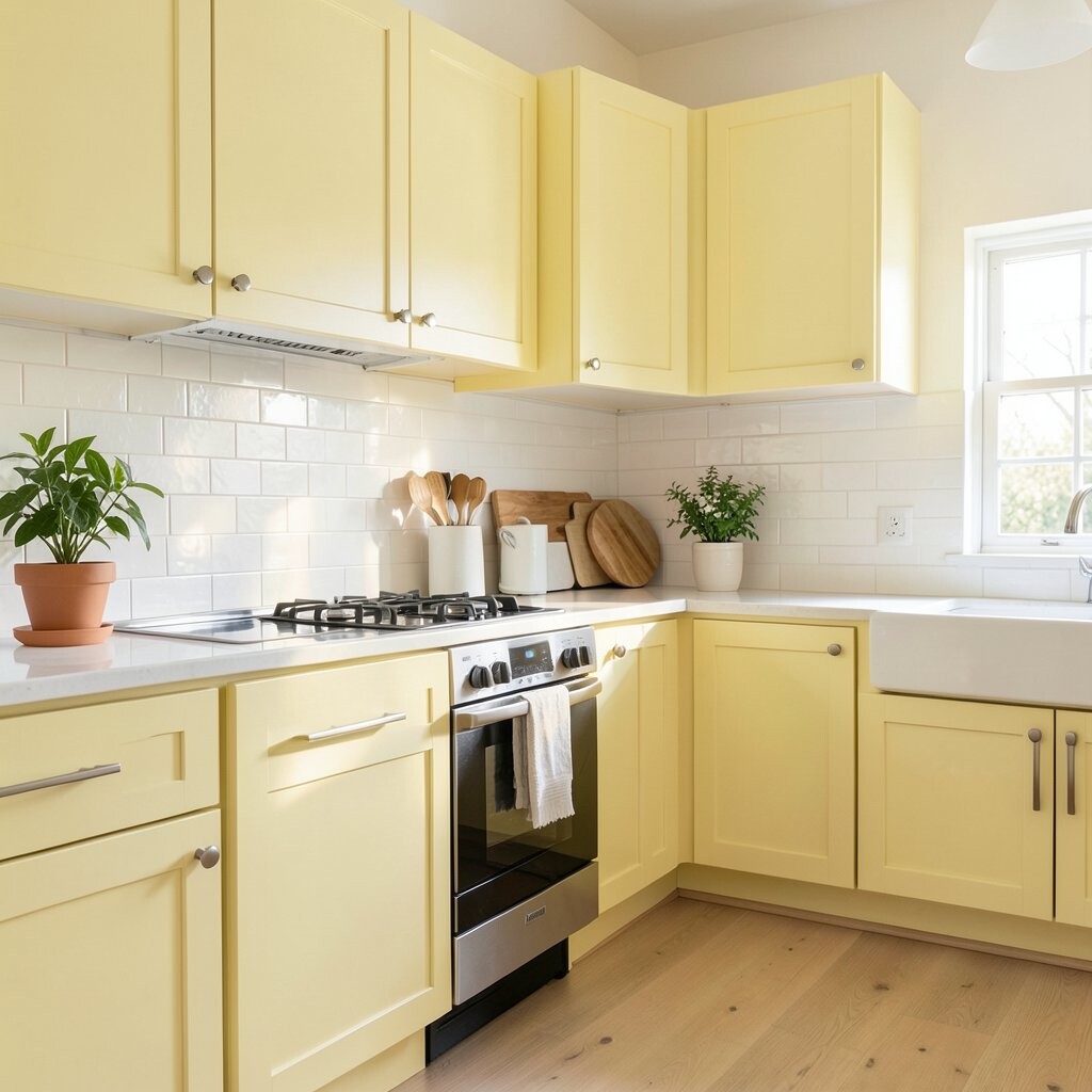
Butter yellow brings cheer to the kitchen without turning it into a high-energy circus. Look for a pale, buttery shade that reads warm and friendly instead of neon.
This color is special because it pairs well with almost every material, from white cabinets to dark wood. It also helps make morning light feel softer and more inviting. For practical application, use an interior paint that’s washable and let it cure fully before heavy cleaning.
To personalize, paint only the wall near the dining area or breakfast bar so the yellow acts like a mood boost. Add simple styling like a matching vase, patterned backsplash accessories, or bright green plants to complement the warmth. If your kitchen has lots of cream or beige already, a slightly more golden butter tone can help everything look intentional.
7. Light Greige for Modern Neutral Balance

Greige—half gray, half beige—creates a modern neutral that feels both calm and stylish. It’s a great fit if you want something warmer than true gray but more grounded than off-white.
What makes it unique is how it adapts to your existing palette, especially if you have wood cabinets or tan stone. Choose a greige with subtle undertones so it doesn’t clash with your backsplash. A simple two-coat plan usually works best, but you may need a primer if your wall is stained or previously dark.
Budget tips matter here: use a small roller for speed and a brush only for edges, corners, and outlets. If you’re repainting frequently, a consistent sheen like eggshell across the room keeps everything looking even. Personalize with updated cabinet hardware in matte black or brushed nickel for a modern finish.
8. Bold Black-Cabinet Touches With Wall Neutral

If repainting your whole kitchen sounds too big, try a small black update instead. Painting select cabinet doors, a toe-kick area, or a narrow band near the countertop can look surprisingly modern.
This approach is unique because it keeps your walls light while letting black accents do the heavy style work. Pair black accents with warm whites and natural wood for balance. For practical tips, use paint made for cabinets or a bonding primer so the surface holds up to daily kitchen life.
To keep costs under $25, focus on one section, like the cabinets above the sink or a small run of open shelving. Consider replacing only one hardware set if you don’t have funds to swap everything. Finish by cleaning and lightly sanding before you paint so the new coating adheres well.
When you want personalization, add a thin white trim detail around the painted area. This makes the black look sharper and more intentional, even on a small budget.
9. Cool White Walls With a Color-Blocked Back Wall

Color blocking can look high-end even when you’re just using two paints. Start with a cool white for most of the kitchen, then add a contrasting band or rectangle on the back wall.
This idea feels modern because it draws the eye and creates clean, graphic lines. Use painter’s tape to measure and align shapes so the result looks crisp. For practical tips, paint the lighter color first, let it dry, then tape and add the darker or brighter block.
To make it easy, choose colors that already match your kitchen, like a blue-gray rectangle against cool white. You can also match the block to an accent like your rug or dish set. If you want a budget win, cover the most visible wall area and leave the rest alone.
10. Soft Pink Blush for a Gentle, Trendy Feel

Blush pink adds warmth and charm without becoming childish. In a kitchen, it looks especially good when the rest of the room stays neutral.
This style is unique because it feels both modern and calm, especially with matte finishes. Pair it with light wood, white countertops, and brushed gold or copper accents for a warm, current vibe. Choose a washable paint and apply steady coats to avoid streaks, since lighter colors can show uneven coverage.
For practical personalization, paint the kitchen wall near your window or the wall beside the fridge so the blush tone catches the light. If you’re budget-conscious, do a half-wall height version instead of covering every inch. Finish with simple decor like a matching tray and fresh neutral art to keep it cohesive.
Under $25, you’ll likely be painting a limited area, so pick the most visible part of your kitchen. That way you get the color impact without worrying about running out of paint.
11. Fresh Mint Green With Crisp White Trim
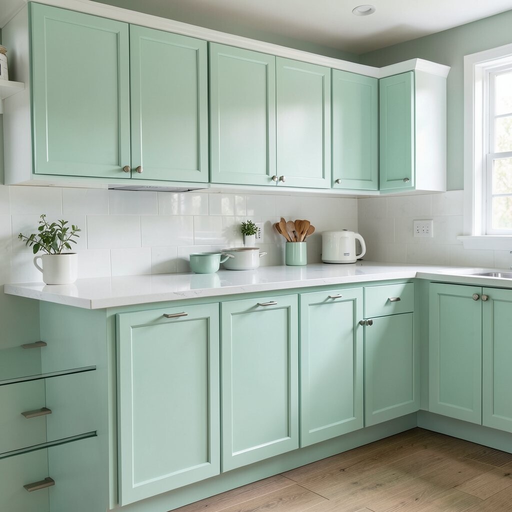
Mint green gives a light, refreshing look that feels like a breath of fresh air. The trick is using a mint shade that’s not too neon so it stays modern and soothing.
This idea stands out because crisp white trim makes the color look intentional and clean. Paint window trim, door frames, or baseboards in bright white to sharpen the whole room. Use painter’s tape carefully, then check edges after each coat to prevent paint bleed.
For cost considerations, focus mint paint on one wall or a narrow accent panel. If you have a small can of paint already, consider mint as your “easy win” because the color changes can be dramatic. Pair the mint with natural textures like wicker, linen, and light wood to keep the kitchen feeling airy.
12. Warm Cream With Texture for a Designer Look

Warm cream paint can make your kitchen feel cozy, especially when the lighting is a bit harsh. Add a little texture—like a subtle stipple or smooth finish with careful roller technique—to keep it from looking flat.
This approach is unique because texture adds visual depth without needing fancy decor. A lightly textured wall can also hide minor dings and unevenness. To make it practical, choose a roller technique that fits the surface, and avoid heavy texture if you plan to wipe walls often.
Personalize by painting the area behind open shelves in cream and leaving other walls a simpler neutral. That small contrast can make your shelf styling look curated. For under $25, paint a partial wall or just the back wall to avoid buying extra cans.
When you’re ready to clean, use gentle soap and avoid abrasive scrubbers so the texture stays crisp.
13. Modern Olive Green for an Earthy Accent
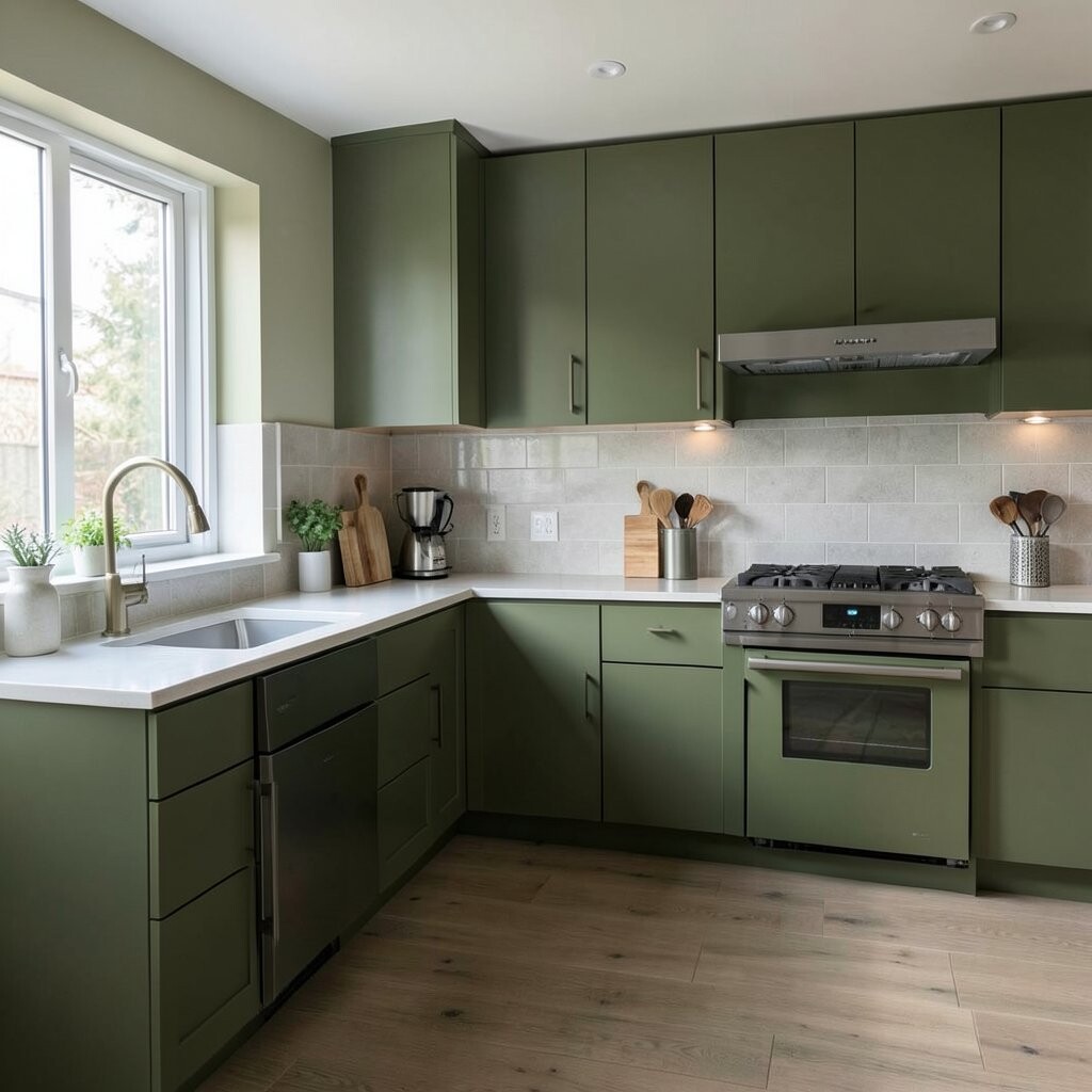
Olive green brings an earthy, modern mood that feels grounded and stylish. It works especially well when paired with warm woods and black or brass fixtures.
This paint choice is unique because it sits between green and neutral, making it easier to style. It can also look great against subway tile or stone-look countertops. To get the best result, test the olive shade in daylight and in the evening so you can see how it behaves under your kitchen lights.
Practical tips help you stay within budget: choose one accent wall, then focus on clean edges and even coats. A good brush for corners and a reliable roller for flats will reduce rework. Personalize with simple styling, like woven baskets, olive-oil themed decor, or a plant that echoes the green tone.
14. Monochrome Blue With Matching Accessories

Going monochrome means using different shades of the same color family, like light blue walls with darker blue accents. It looks modern because everything feels connected rather than random.
This idea is unique because the paint color becomes a backdrop for your accessories. Add coordinating items like matching canisters, a blue rug runner, or dish towels in a slightly different blue. Keep practical expectations in mind: paint a single wall or a small section behind your seating to manage cost.
For cost considerations, use your budget on one quality coat system and don’t rush drying time. If your wall has stains, prime first so your blue stays true. Personalize further by adding a darker frame around a chalkboard or magnetic panel in the kitchen for a functional, modern look.