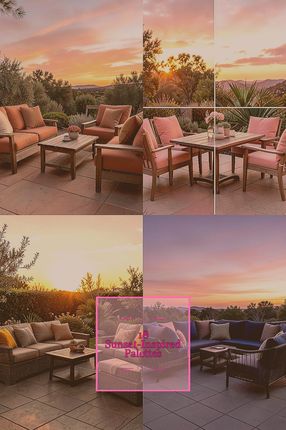
Sunsets have a secret power: they make even simple outdoor spaces feel special. With the right colors, your patio can glow in the evening and look great all day.
-
1. Terracotta Ember + Creamy Sand

Terracotta Ember + Creamy Sand Picture terracotta planters warmed by sunlight, with creamy sand tones floating around them. This combo feels cozy without looking heavy.
Use terracotta pillows or outdoor rugs as your “ember” anchor, then soften everything with cream cushions and light curtains. It helps hide outdoor dust and makes furniture look cleaner. Choose warm white string lights so the colors stay inviting after dark.
2. Coral Reef Pink + Soft Peach Mist

Coral Reef Pink + Soft Peach Mist Think coral reefs under golden light, with peachy haze drifting over everything. The mood is playful, bright, and still relaxed.
Pair coral accents—like throw blankets or a bench cushion—with peach-toned lanterns or outdoor ceramics. This palette can make a small patio feel bigger because the colors reflect light. Add a tiny sprinkle of greenery, such as lime leaves or potted herbs, to keep the look fresh.
For personalization, mix matte fabrics with a few shiny accents, like a glazed pot or a small metal tray. Start budget-friendly by swapping only textiles first, then add bigger pieces later. Right now, many outdoor styles lean “sun-kissed” and casual, so this palette fits today’s relaxed vibe.
3. Golden Saffron + Deep Chocolate Bronze

Golden Saffron + Deep Chocolate Bronze Imagine saffron streetlights fading into a deep chocolate evening. It feels upscale and grounding at the same time.
Use golden cushions or a saffron-toned umbrella to catch attention, then balance it with chocolate brown chairs or a bronze lantern. This gives contrast, which helps your patio look styled even when it’s simple. If you love a calmer look, keep patterned items minimal and let the warm colors do the work.
A fun tip: add one “metal moment,” such as a bronze side table or a candle holder. That tiny detail makes the sunset theme feel intentional. Cost-wise, you can often find affordable golden outdoor throw pillows and then splurge on one statement piece like a rug.
Personalize by choosing shades based on your home’s exterior paint. If your house is warm-toned, go slightly richer; if it’s cooler, choose a lighter saffron so everything still feels harmonious.
4. Sunset Navy + Blush Dusk

Sunset Navy + Blush Dusk Picture a sky where navy clouds frame soft blush light. This palette looks dramatic, but it stays wearable outdoors.
Pair deep navy cushions with blush planters, or use a navy outdoor rug with blush lanterns. The benefit is that navy hides fading and dirt better than many light colors, which helps your patio look neat longer. Add white accents—like teak, light stone, or pale candles—to keep the blush from feeling too sweet.
5. Ember Orange + Olive Leaf Green

Ember Orange + Olive Leaf Green Ember orange pops like firelight, while olive green brings calm and nature. Together they feel bold, healthy, and full of life.
Start with olive as the base through potted plants, outdoor mats, or cushions that lean green. Then add ember orange through pillows, a table runner, or a bold outdoor chair fabric. This pairing is great for patios because it makes plants look even more vibrant.
Tip: choose olive tones that aren’t too gray so they stay warm. If you want to keep costs lower, use inexpensive orange accessories like planters or napkins instead of replacing furniture. This style also matches current trends toward “nature meets sunset,” especially for modern farmhouse and boho outdoor looks.
-
6. Apricot Glow + Charcoal Smoke

Apricot Glow + Charcoal Smoke Apricot glow is like warm fruit at dusk, and charcoal smoke adds a sleek edge. This palette is perfect if you want sunset energy without bright chaos.
Use apricot curtains or a small outdoor rug, then ground the space with charcoal seating or metal accents. Charcoal can make furniture look clean and stylish, even in high-traffic areas. Add a few soft beige or cream candles so the apricot stays glowing instead of turning orange.
7. Magenta Sunset + Soft Tan

Magenta Sunset + Soft Tan Magenta sunset tones bring a fun burst, like a vivid sky right before the stars show up. Soft tan keeps everything balanced and friendly.
Try magenta in a single area first, like the cushions on two chairs or a patterned outdoor umbrella. Then repeat tan through the rest of the patio using woven baskets, light wood tables, or neutral planters. This keeps your space from feeling too loud.
Personalization idea: mix two magenta shades—one deeper and one lighter—so the patio looks layered, not flat. For budget thinking, buy one “magenta touchpoint” at a time and let it guide the rest of your choices. A trend you’ll see right now is mixing one bold color with calm neutrals, which makes this palette feel modern.
-
8. Sea Glass Turquoise + Coral Sunset

Sea Glass Turquoise + Coral Sunset Sea glass turquoise feels cool and breezy, while coral sunset adds warmth and joy. Together they look like coastal air with a fiery finish.
Put turquoise into larger items such as outdoor cushions, a pool-style mat, or even a statement planter. Add coral through smaller pieces like side table decor or decorative throws. The benefit is that turquoise makes the patio feel light, and coral keeps it feeling energetic.
Tip: add white shells, ceramic accents, or pale rope textures to connect the palette. It’s also smart to choose fade-resistant fabrics because bright turquoise can shift quickly in strong sun. If you want a cost-friendly plan, start with planters and textiles since they’re easier to replace than big furniture.
Personalize by matching your coral to the undertone of your turquoise. If your turquoise is more green, choose coral that leans pink; if it’s more blue, choose coral that leans orange.
-
9. Lavender Dusk + Warm Cream

Lavender Dusk + Warm Cream Lavender dusk feels like evening air, and warm cream gives it a gentle cushion. This palette is calm, romantic, and surprisingly cheerful.
Use lavender in throws, outdoor pillows, or a soft-toned rug, then anchor with warm cream furniture covers or table linens. This combination also helps your patio feel cozy during cool evenings. Add subtle gold or brass candle holders if you want the sunset glow to feel fancy.
10. Sunset Teal + Terracotta Tiles

Sunset Teal + Terracotta Tiles Sunset teal is deep and moody, and terracotta tiles look like warm, sun-baked earth. This mix brings a Mediterranean feel with strong visual character.
If you already have terracotta tile or stone, use teal textiles so the colors echo your floor. If not, you can use terracotta-patterned rugs or even tile-effect outdoor trays. The benefit is that the palette ties everything together and makes your patio look designed, not random.
Tip: choose teal that isn’t too bright so it stays elegant and doesn’t fight the orange warmth. Cost considerations: rugs and planters are a smart place to spend money because you can swap them as trends change. Right now, there’s a lot of love for Mediterranean-inspired outdoor spaces, and this palette fits right in.
-
11. Sunlit Yellow + Espresso Leather

Sunlit Yellow + Espresso Leather Sunlit yellow looks like late-afternoon sunshine, and espresso leather adds smooth depth. This palette feels welcoming and a bit dramatic.
Use sunlit yellow in a bold way, like a parasol, outdoor cushion group, or a patterned rug. Balance it with espresso brown in seating, storage benches, or leather-like cushions. The contrast helps your patio look crisp and gives the space a “day-to-night” vibe.
Personalize by choosing the yellow tone that matches your style: go butter-soft for a gentle look or go mustard for a richer feel. If you’re watching your budget, choose washable cushion covers and swap them seasonally. Current trend-wise, people love “warm modern” outdoor spaces, and this combo reads warm and styled.
12. Red Sunset Brick + Soft Linen

Red Sunset Brick + Soft Linen Red sunset brick feels like a warm wall at golden hour, and soft linen keeps it airy. It’s cozy, practical, and easy to live with.
Put brick red into durable materials like outdoor chair cushions, a sturdy rug, or a storage box. Then lighten the mood with linen-like tablecloths, light wooden accents, or cream planters. The benefit is that linen tones make the red feel less intense while still looking rich.
Tip: add natural textures, like woven baskets or rattan lanterns, so everything feels layered. Consider cost: brick-red fabrics can hide stains and fading better than very pale colors, which can save money in the long run. For personalization, mix in one subtle pattern, like small stripes, to stop the look from feeling flat.
-
13. Peach Sunset + Sage Green Calm

Peach Sunset + Sage Green Calm Peach sunset brings friendly warmth, and sage green adds quiet balance. This palette feels fresh and comforting, like a garden you can relax in.
Use peach in pillows, outdoor dinnerware, or a small accent rug, then repeat sage in plant pots or outdoor curtains. Sage is a great choice because it pairs with so many plant greens, making the garden look intentional. It also feels soft against wood and stone.
Tip: match your peach to the warmth of your sage, so they don’t fight. If you want lower cost, start with table styling—placemats and napkins are quick wins. This palette also fits a current trend toward “soft earth tones,” which many homeowners love for calm outdoor living.
Personalize by adding one deeper accent color, such as terracotta or caramel, to make the peach stand out even more.
-
14. Sunset Rosewood + Oat Beige

Sunset Rosewood + Oat Beige Rosewood tones feel like warm wood at dusk, and oat beige keeps the whole space soft and grounded. This palette looks elegant without needing fancy decor.
Choose rosewood in thicker textures like outdoor cushions, a teak-toned bench, or a decorative screen. Then use oat beige in throws, seat covers, and light-colored lanterns. This helps the rosewood feel rich instead of dark.
15. Sky Amber + Eucalyptus Mint

Sky Amber + Eucalyptus Mint Sky amber glows like honeyed light, and eucalyptus mint brings a cool, clean feel. Together they create a refreshing sunset vibe.
Use amber as the highlight through a rug pattern, a set of matching cushions, or warm-toned ceramic planters. Add eucalyptus mint through plants, woven accessories, or small decorative items. The benefit is that mint gives your patio an airy feel while amber brings comfort.
Tip: mix mint with natural wood so it doesn’t look too “painted.” Cost considerations: eucalyptus tones are easiest to add through fabric and decor, which can be cheaper than replacing furniture. Personalize by choosing a single plant variety that matches the mint vibe, like herbs, to create a living color link.
-
16. Rust Sunset + Creamy Whitewashed
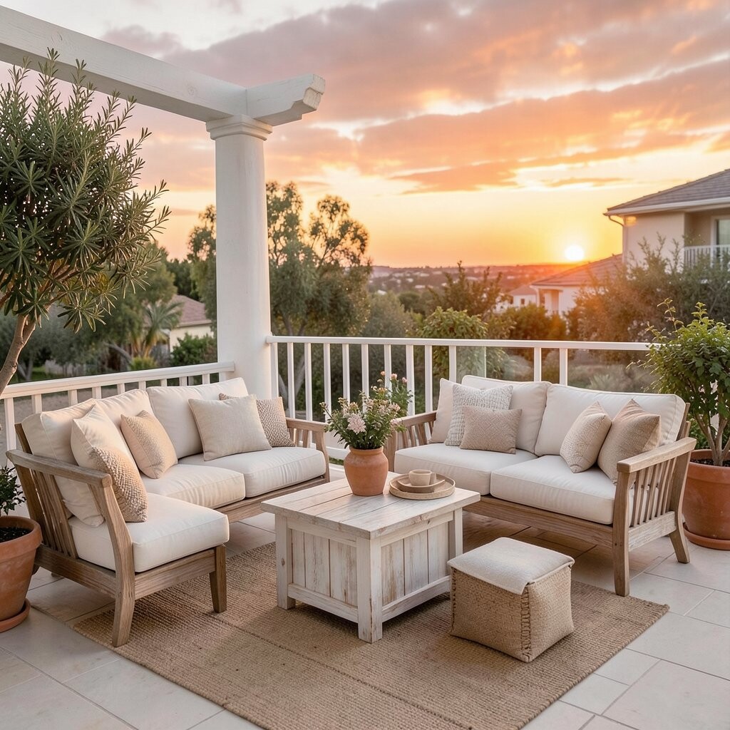
Rust Sunset + Creamy Whitewashed Rust sunset tones feel like sun-warmed metal, and creamy whitewashed colors make everything airy. This combination gives a rustic-chic look that works year after year.
Apply rust with outdoor pillows, a patterned table runner, or metal lanterns, then balance with creamy whitewashed pieces. Whitewashed wood, light stone, and pale wicker are great partners. The benefit is that the palette looks intentional even when your decor is minimal.
Tip: if you have a neutral patio already, use rust accents only—one rug or one cushion set can do a lot. For budget, thrift store finds like old planters can be refreshed with outdoor-safe paint. Current trend-wise, vintage-inspired outdoor styling is popular, and rust tones are perfect for that look.
-
17. Plum Dusk + Warm Sandstone

Plum Dusk + Warm Sandstone Plum dusk looks deep and dreamy, and warm sandstone feels calm and inviting. This palette is great for patios that need a little mystery.
Use plum in decorative elements like outdoor curtains, a bold umbrella, or cushion covers with rich color. Then ground everything with sandstone in chairs, side tables, or textured rugs. The benefit is strong depth: plum reads lush, while sandstone keeps it from feeling too dark.
Tip: add small brass or copper details to connect the evening mood. Cost considerations: umbrellas and shade can be pricier, so start with smaller items like pillows and table decor. Personalize by keeping patterns subtle; a solid plum works beautifully with woven textures.
This palette also looks stunning for night setups because plum deepens under evening lights and makes candles glow.
-
18. Peach Apron + Navy Night Sky

Peach Apron + Navy Night Sky Peach apron tones feel soft and friendly, and navy night sky brings a bold evening contrast. This pairing is sweet, modern, and easy to style.
Use navy for bigger items like outdoor furniture cushions or a rug, then add peach through throw pillows, planters, and table styling. The benefit is that navy makes the patio look clean, and peach adds warmth right where you want it. Keep a few white accents nearby for a crisp, airy finish.