
These bold patterned tiles can turn a plain wall into a true cafe moment. Pair them the right way and your space will feel stylish without feeling fussy.
1. Graphic Black-and-White Checker Hits

A crisp checkerboard pattern instantly reads as energetic. It also makes small areas feel more structured and lively. Keep the grout clean and consistent to maintain that sharp, modern look, and consider using it around a service counter or entryway where people naturally look.
Choose square tiles that match your cafe vibe, from bold 4-inch to classic larger grids. Light-reflecting finishes can make the pattern look extra crisp under warm lights. If you want personalization, swap to a slightly off-white or add a thin color grout for a subtle signature twist.
2. Mediterranean Arches With Warm Speckles

Arches and speckles bring a sunlit, Mediterranean mood to your cafe. They feel welcoming and add visual movement without needing extra decor. Look for tiles with varied specks so fingerprints and everyday spills feel less noticeable.
Because this style has lots of texture, it hides wear better than flat, high-gloss designs. Use it on a feature wall behind menus or near the coffee bar for a cozy focal point. For a practical upgrade, seal the surface if the tiles are porous, especially in wet splash zones.
When planning cost, compare ceramic and porcelain options, since porcelain often offers better durability and water resistance. Try a limited palette that includes terracotta, cream, and muted greens so it harmonizes with wood counters. You can personalize with a border strip tile in a slightly darker shade that frames the pattern like a storefront window.
3. Color-Block Zigzags That Feel Retro
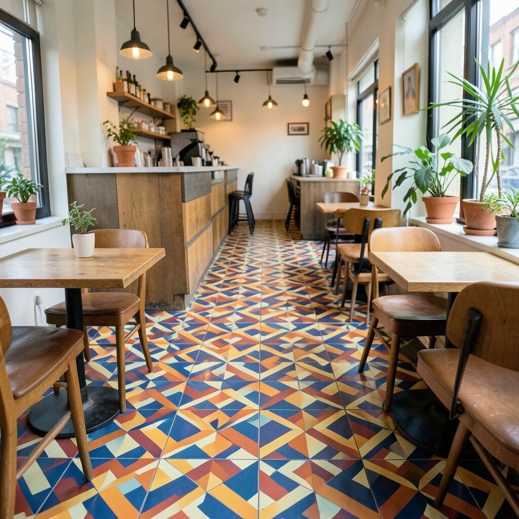
Zigzag tiles add a playful energy that can make a cafe feel instantly memorable. The repeating angles create a sense of rhythm that suits latte art and fast coffee service. Pick two or three colors max so the space stays cohesive and easy on the eyes.
This design works especially well on floors where your footsteps create a subtle “walkable pattern.” It can also work as a backsplash band that ties together shelves and lighting. Consider mixing matte and slightly glossy tiles so the zigzags catch light but don’t glare.
If you want the look to feel trendy instead of costume-like, place the strongest colors in a controlled area. Use neutrals around it—like light wall paint and simple barstools—to let the tiles lead the design. For personalization, rotate the pattern so it aligns with door openings or counter edges for a custom “designed” feel.
Cost varies by tile complexity, since custom color blends often price higher. To keep your budget steady, look for a standard set that includes corner pieces and trim. Installing professionally can save time, especially because zigzags require careful alignment.
4. Geometric Hexagons In Earthy Neutrals

Hexagon tiles add a modern honeycomb look that feels both bold and calm. The earthy tones make them easy to pair with espresso brown, oak wood, and linen fabrics. If your cafe has lots of natural light, the hex pattern can look especially warm and inviting.
This style also helps zones feel intentional, like separating ordering from seating. Use darker grout to emphasize the shape and keep the pattern crisp. For a practical tip, confirm slip resistance if you’re using them on the floor, since texture can affect traction.
5. Blue Floral Moroccan Mash-Up

Moroccan-inspired floral motifs in deep blue can make a cafe feel like a charming getaway. The curving shapes bring softness, while the pattern layout keeps it visually bold. Choose tiles with a balanced number of light and dark areas so the design doesn’t overwhelm your lighting.
This look shines on a statement wall behind the counter, where customers often wait and look around. It pairs nicely with brass fixtures and dark wood shelves for a polished finish. If you want easy upkeep, consider glazed tiles that wipe clean quickly after busy service.
Budget-wise, patterned Moroccan sets can be pricier, especially when they include many variations. You can save money by using the pattern only in a defined area, like a vertical stripe or a half-wall height band. For personalization, add a single accent tile type at the center of a panel to create a focal “signature” moment.
6. Speckled Terrazzo-Like Mix For Instant Depth

Terrazzo-inspired tiles with speckles add depth without the chaos of too many shapes. They feel trendy, modern, and surprisingly versatile in a cafe setting. This style also hides everyday scuffs better than uniform solid tiles.
The speckled look works well on floors, walls, and even small steps leading to seating areas. It pairs beautifully with plants because the natural tones feel grounded. For practical results, choose a tile with consistent thickness and use a grout shade close to the dominant speck color.
In terms of cost, you may find terrazzo looks at different price levels depending on whether the specks are printed or truly embedded. Printed options can still look great, but embedded materials often handle wear longer. Personalize by selecting speck colors that mirror your coffee roast display—think warm browns, soft creams, and charcoal accents.
7. Oversized Botanical Leaves In Monochrome

Large botanical leaf tiles make a dramatic statement without needing bright colors. The monochrome approach keeps the look sleek and cafe-appropriate, even when the pattern is bold. Place them where customers can see them up close, like along a hallway leading to seating.
Leaf tiles bring a fresh feel and can soften the vibe of metal lighting and hard surfaces. They also help your space look designed even with minimal furniture. A practical tip is to keep the rest of the decor simple, so the leaves don’t compete with art prints.
If you’re worried about cost, buy one or two accent panels instead of tiling an entire wall. Look for tiles with repeat patterns that are easy to match so installation doesn’t become a puzzle. For personalization, mix in a few blank or smaller-pattern tiles to create a custom layout that feels intentional.
8. Retro Sunburst Radiating From One Wall
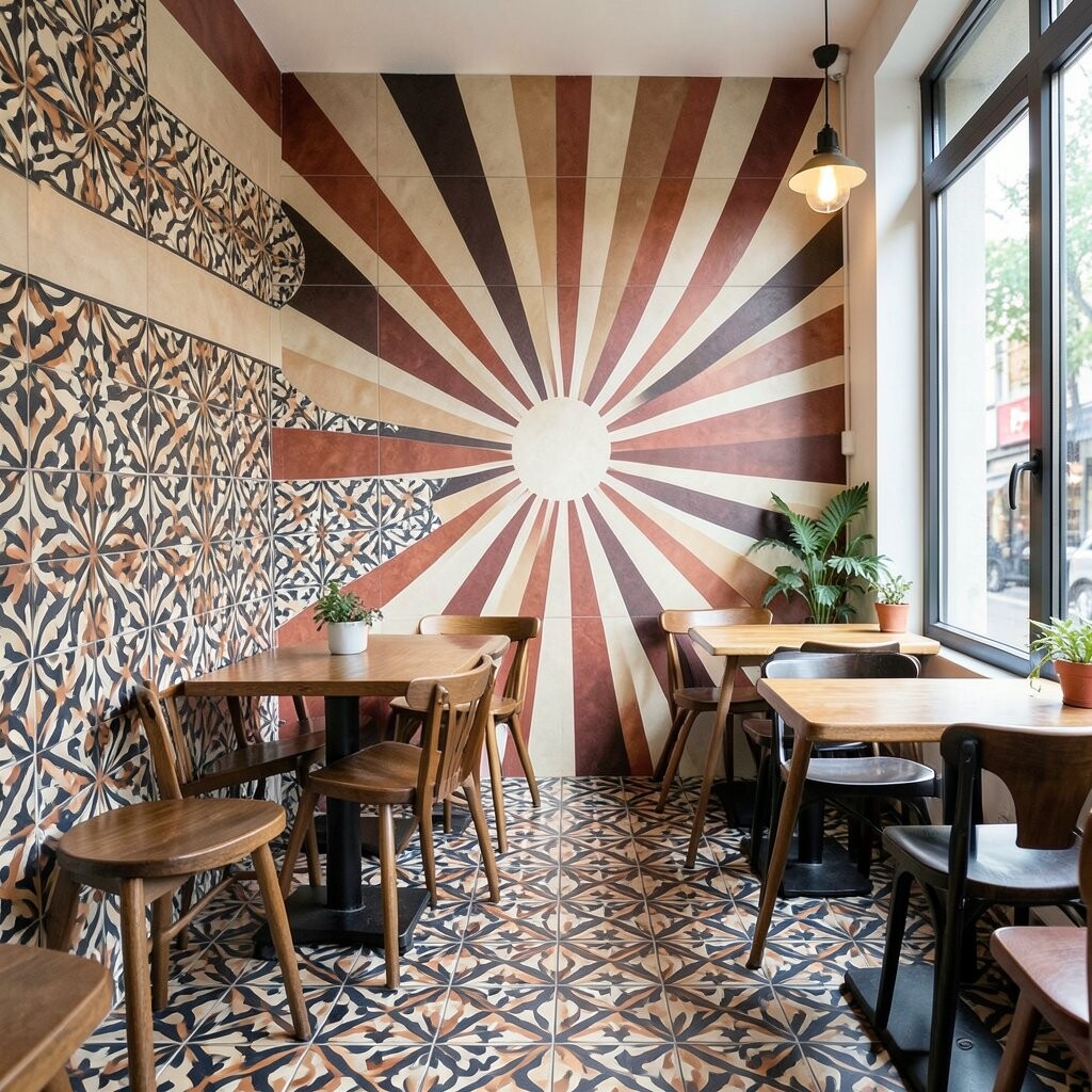
Sunburst tiles bring instant “wow” because they radiate outward like a piece of wall art. They’re perfect for cafes that want a lively personality and a strong photo spot. If you’re using them behind a menu board or ordering station, the burst naturally draws attention.
This pattern is unique because it’s not just decorative; it creates a visual direction for the room. A practical approach is to center the design at eye level and keep surrounding walls neutral. Choose grout that matches one of the mid-tones so the rays read smoothly.
For cost considerations, sunburst designs may be sold as panels or limited sets, which helps control price. Make sure you measure the wall carefully and plan for trim pieces, since edges matter a lot with radiating designs. To personalize, rotate the burst slightly so it aligns with a window frame or light fixture.
If you want a calmer vibe, use a smaller burst scale or mix in plain tiles around it. That way you still get the energy, but the room stays balanced. Always check tile finish and cleaning instructions, especially near food service areas.
9. Vertical Stripe Tiles With Bold Accent Bands
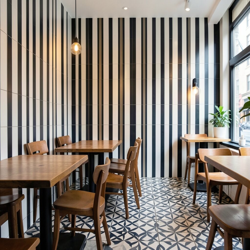
Vertical stripes can make a cafe feel taller, brighter, and more organized. Pairing stripes with bold accent bands gives you a structured, modern look. This is a great choice if you want patterns without a busy background everywhere.
Use stripes on a partial wall to frame the coffee menu or highlight a drink cooler. The straight lines work well with shelving, since the geometry can visually align with rails and brackets. For practical tips, ensure straight installation by using a laser level or high-quality spacers.
The uniqueness comes from how you control emphasis, letting one band become the “hero.” Consider a slightly darker grout to sharpen the stripe edges. If you want to personalize, choose an accent band that matches your cafe logo color, even if you keep the rest neutral.
Cost tends to be manageable because strip tiles are often sold in consistent lengths. Check whether you can buy matching corner trims to reduce cutting and labor. This style also adapts well if you plan to change decor later.
10. Antique-Look Medallions With Aged Gold Highlights
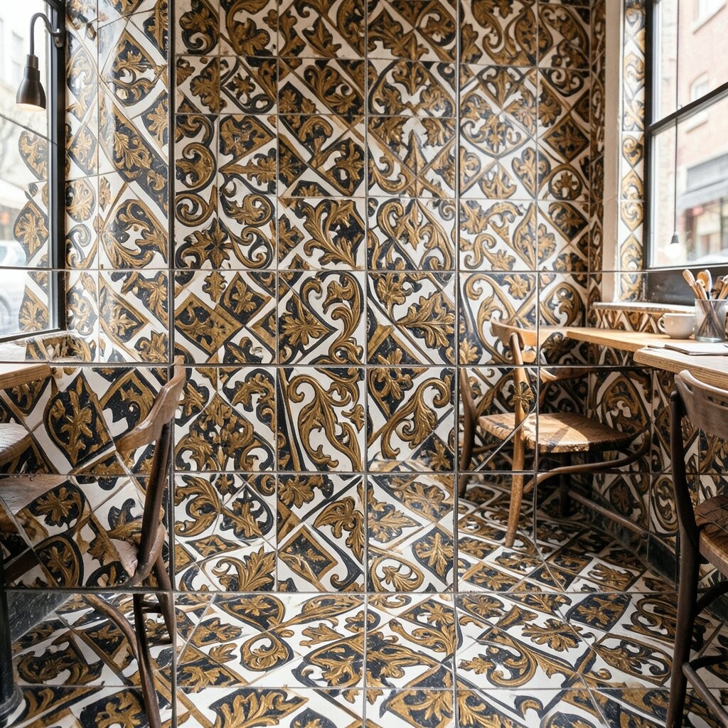
Medallion tiles can turn a corner of your cafe into a vintage gallery moment. When they include aged gold highlights, they feel warm and slightly glamorous. This design is ideal for entry alcoves, bar backs, or a seating nook where guests linger.
Benefits include strong visual storytelling, since medallions create a clear focal point. Keep the surrounding tiles plain so the medallion reads as a centerpiece rather than a background blur. A practical tip is to use sealed grout if the cafe sees heavy daily traffic.
On cost, medallions often come in smaller quantities, which can be cheaper than full patterned coverage. You can place one medallion panel and flank it with solid tiles to stretch your budget. Personalization is easy here: choose a medallion style that matches your brand mood, from art deco to classic ornate.
11. Tropical Waves In Teal And Coral

Tropical wave tiles feel fresh and fun, especially in teal and coral tones. The curves create a gentle sense of motion, like ocean ripples behind your menu. This style can brighten up darker cafes and make daylight spots look more vibrant.
For practical use, consider installing them on a backsplash or around a wall-mounted menu so they stay protected from direct water exposure. Pair the colors with simple off-white walls and natural wood to keep the vibe cohesive. If you want the pattern to last, choose glazed tiles that resist stains from coffee and syrup.
Cost can vary depending on whether the waves are a repeat printed pattern or a more complex mosaic. A helpful strategy is to use waves as an accent band instead of tiling every surface. Personalize by matching coral to a cushion or signage color so the room feels like one plan.
12. Black Ink Doodles On Light Clay
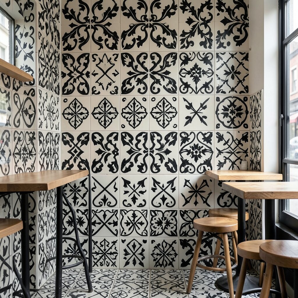
Doodle-style tiles add a casual, artistic vibe that feels like a sketchbook wall. They look bold without demanding a color palette overhaul. Choose light clay backgrounds so the cafe stays airy and the tiles don’t feel heavy.
This design is unique because it reads as playful texture rather than strict geometry. It works well in a cafe that already has character through art, plants, or vintage seating. For upkeep, glazed doodle tiles are easiest to wipe after busy days.
If you’re planning a budget-friendly upgrade, use doodle tiles as a narrow strip behind the counter. That gives you impact while keeping the rest of the walls simple. Personalize by selecting doodle themes that match your brand—coffee beans, stars, or simple lines that echo your logo style.
13. Classic Herringbone With A Patterned Twist

Herringbone tiles are timeless, but adding a patterned twist makes them feel trendy again. Whether you use a subtle color variation or a patterned glaze, the layout stays elegant. This look works in both modern and warm, cozy cafes because it feels structured and stylish.
The benefit is that herringbone naturally guides the eye and adds depth, especially when paired with matte finishes. Install it on the floor or create a strong feature on a lower wall section. For practical tips, plan your starting point carefully so the lines line up neatly near doorways.
Cost considerations depend on tile size and thickness, and some premium herringbone tiles are priced higher. Still, you can reduce expense by focusing on a smaller area like the service corridor. Personalize with a slightly darker grout that makes the pattern pop, even under busy lighting.
To stay on trend, pair the herringbone with minimal hardware and clean lines so the tile remains the star. This combination can make your cafe feel designed, not decorated.
14. Moroccan Zellige Patchwork In Jewel Tones
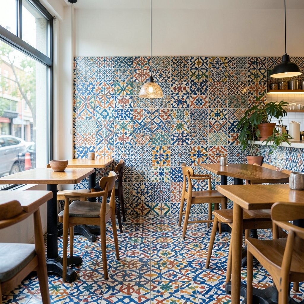
Zellige-style patchwork feels artisanal and rich, with jewel tones that look stunning in warm lighting. It brings a handcrafted mood that customers often remember. Choose a palette like emerald, deep blue, and amber so the colors feel intentional rather than random.
One key benefit is that the irregularities hide minor imperfections and everyday wear. That makes patchwork tiles a practical choice for high-traffic cafes. For installation, expect some variation in piece size and schedule extra time for layout planning.
On cost, patchwork can be a bigger investment, but you can use it on a feature area to control spending. Personalize by repeating one main color across the space, then adding small accents for balance. Pair with simple, warm neutrals so the jewel tones feel bold but not overwhelming.
15. Minimal Squares With One Loud Color Accent
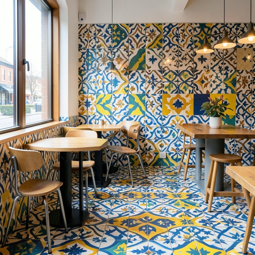
Minimal square tiles keep your cafe looking clean, and one loud color accent makes the design feel modern. This approach is bold because it focuses the energy into a small, confident area. It’s also great if you want a pattern that won’t tire your eyes after months of use.
Use solid squares on most surfaces and reserve the accent color for a stripe, corner, or small checker-like panel. This makes your layout more flexible if you change menu boards or seating later. For practical tips, use a durable tile with a stain-resistant finish, since cafes see spills daily.
Cost is often reasonable because plain tiles are usually less expensive than fully patterned sets. You can personalize by choosing an accent color that matches your branding, seasonal drink names, or even the roast you highlight each month. This style also photographs well because it creates clear, simple lines.
16. Kaleidoscope Tiles With Soft Pastels

Kaleidoscope tiles bring a fun burst of shapes, even when you keep the colors soft. Pastels can feel airy and playful, which is perfect for cafes aiming for a friendly, light-filled look. The many facets also make surfaces interesting from different angles.
This design is unique because it gives a “moving” effect as people walk by and light shifts. To keep it from becoming visually loud, choose pastel tiles with a limited number of base colors. A practical tip is to use simpler wall art and avoid competing patterns nearby.
Cost can be higher because kaleidoscope designs often involve multiple tile types or intricate matching. If budget is a concern, try placing the kaleidoscope pattern in a vertical feature panel instead of tiling an entire floor. Personalize by selecting pastel tones that echo your seating cushions or seasonal decor.
17. Bold Patterned Floor Tiles In A Gallery-Like Layout

A gallery-like layout of bold patterned floor tiles turns walking paths into part of the experience. It can guide guests from the entrance to the ordering area like a curated exhibit. This style works best when you use strong patterns but keep the layout organized.
Benefits include a dramatic first impression without needing more furniture or decor. For practical tips, plan your tile grid carefully and use matching trims so edges look finished. Consider slip-resistant flooring if the pattern tiles have smooth finishes.
Cost considerations depend on how many patterned tiles you include, but a mixed layout can help you stay within budget. Personalize by selecting one pattern theme—like geometrics or florals—and repeating it in small clusters to unify the look. This method also gives you flexibility to swap out a small section later if you redecorate.
To keep the space trendy, pair the bold floor with simple counters and warm lighting. That balance makes your cafe feel high-end while staying comfortable and inviting.
18. Graphic Black-and-White Checker Hits

A crisp checkerboard pattern instantly reads as energetic. It also makes small areas feel more structured and lively. Keep the grout clean and consistent to maintain that sharp, modern look, and consider using it around a service counter or entryway where people naturally look.
Choose square tiles that match your cafe vibe, from bold 4-inch to classic larger grids. Light-reflecting finishes can make the pattern look extra crisp under warm lights. If you want personalization, swap to a slightly off-white or add a thin color grout for a subtle signature twist.
19. Mediterranean Arches With Warm Speckles

Arches and speckles bring a sunlit, Mediterranean mood to your cafe. They feel welcoming and add visual movement without needing extra decor. Look for tiles with varied specks so fingerprints and everyday spills feel less noticeable.
Because this style has lots of texture, it hides wear better than flat, high-gloss designs. Use it on a feature wall behind menus or near the coffee bar for a cozy focal point. For a practical upgrade, seal the surface if the tiles are porous, especially in wet splash zones.
When planning cost, compare ceramic and porcelain options, since porcelain often offers better durability and water resistance. Try a limited palette that includes terracotta, cream, and muted greens so it harmonizes with wood counters. You can personalize with a border strip tile in a slightly darker shade that frames the pattern like a storefront window.
20. Oversized Botanical Leaves In Monochrome
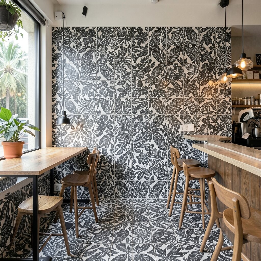
Large botanical leaf tiles make a dramatic statement without needing bright colors. The monochrome approach keeps the look sleek and cafe-appropriate, even when the pattern is bold. Place them where customers can see them up close, like along a hallway leading to seating.
Leaf tiles bring a fresh feel and can soften the vibe of metal lighting and hard surfaces. They also help your space look designed even with minimal furniture. A practical tip is to keep the rest of the decor simple, so the leaves don’t compete with art prints.
If you’re worried about cost, buy one or two accent panels instead of tiling an entire wall. Look for tiles with repeat patterns that are easy to match so installation doesn’t become a puzzle. For personalization, mix in a few blank or smaller-pattern tiles to create a custom layout that feels intentional.
Pick a tile finish that matches your lighting, since reflective surfaces can emphasize smudges. Matte surfaces often feel calmer and hide minor dust between cleanings.
21. Vertical Stripe Tiles With Bold Accent Bands
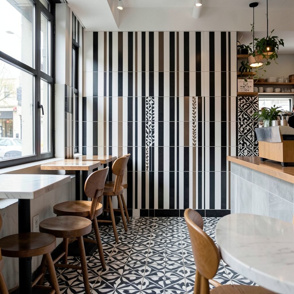
Vertical stripes can make a cafe feel taller, brighter, and more organized. Pairing stripes with bold accent bands gives you a structured, modern look. This is a great choice if you want patterns without a busy background everywhere.
Use stripes on a partial wall to frame the coffee menu or highlight a drink cooler. The straight lines work well with shelving, since the geometry can visually align with rails and brackets. For practical tips, ensure straight installation by using a laser level or high-quality spacers.
22. Antique-Look Medallions With Aged Gold Highlights
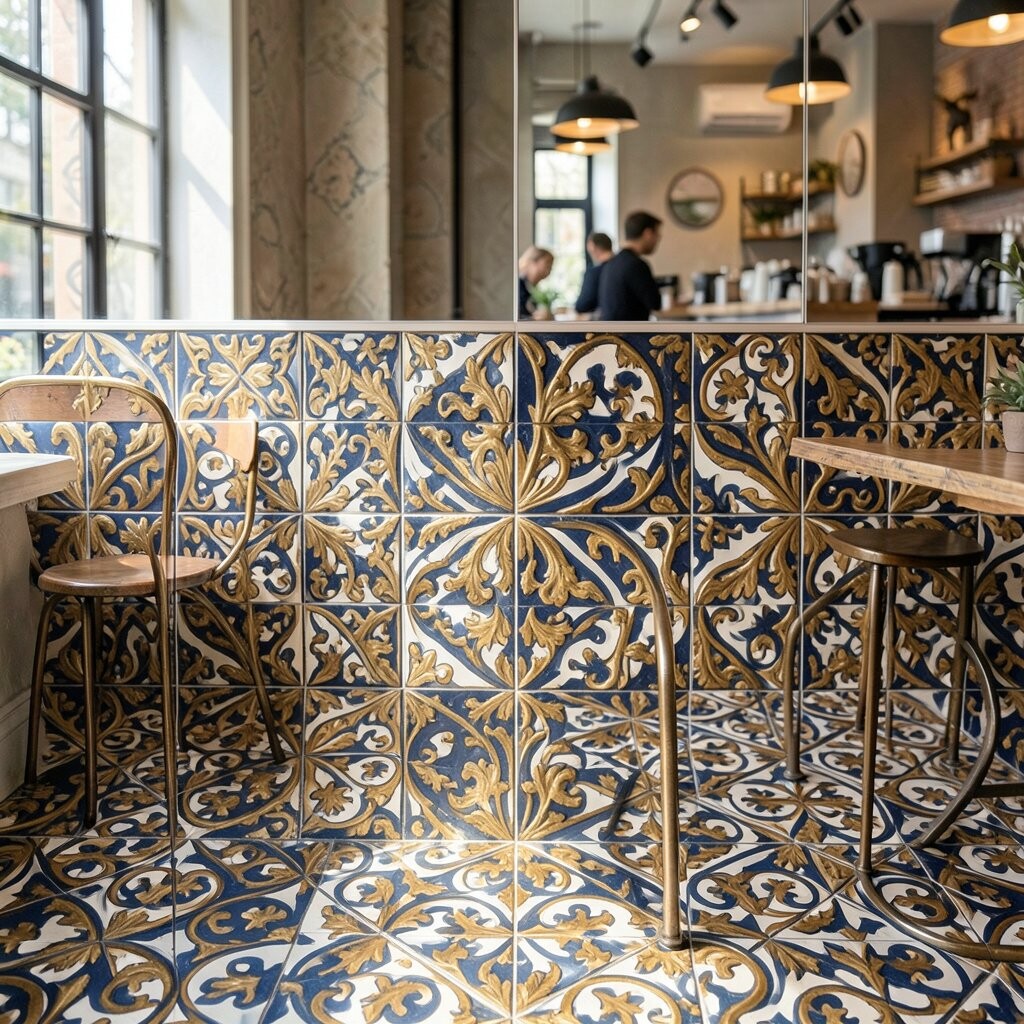
Medallion tiles can turn a corner of your cafe into a vintage gallery moment. When they include aged gold highlights, they feel warm and slightly glamorous. This design is ideal for entry alcoves, bar backs, or a seating nook where guests linger.
Benefits include strong visual storytelling, since medallions create a clear focal point. Keep the surrounding tiles plain so the medallion reads as a centerpiece rather than a background blur. A practical tip is to use sealed grout if the cafe sees heavy daily traffic.
On cost, medallions often come in smaller quantities, which can be cheaper than full patterned coverage. You can place one medallion panel and flank it with solid tiles to stretch your budget. Personalization is easy here: choose a medallion style that matches your cafe mood, from art deco to classic ornate.