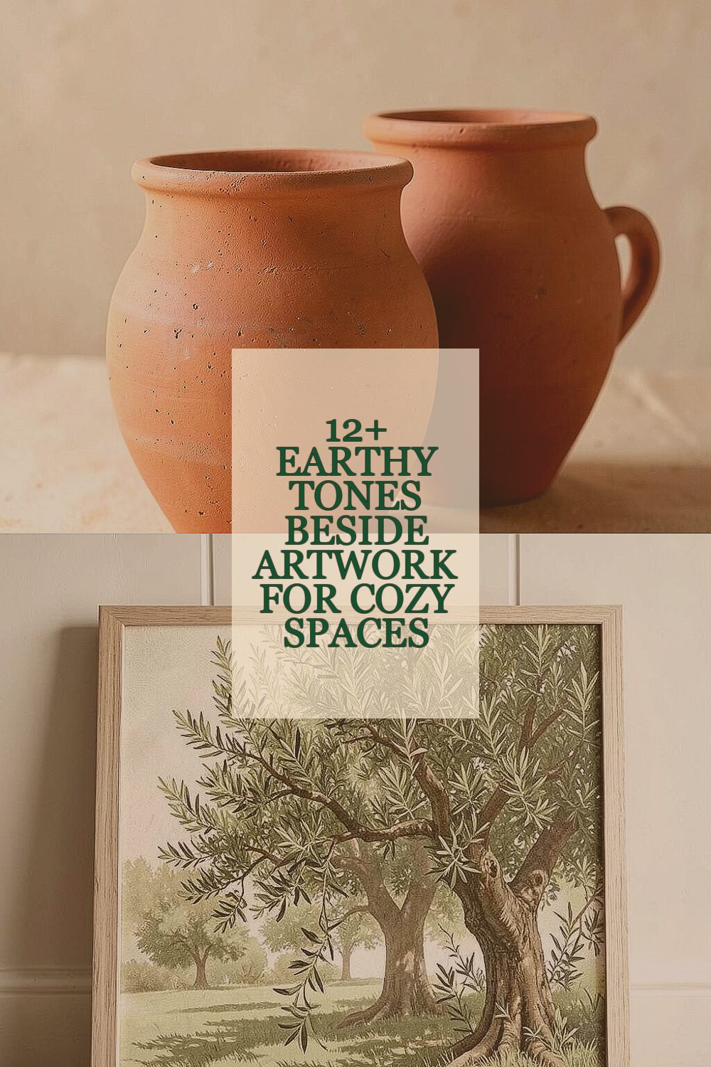
Warm colors can make your walls feel like home. The right earthy tone beside artwork can turn everyday corners into calm, cozy retreats.
1. Clay Terracotta

Clay terracotta feels like sun-baked pottery and soft earth at once. It warms up a room without shouting, especially near botanical or ceramic-themed art.
Pair it with artwork that has rust, creams, or muted greens so everything looks like it belongs together. This tone helps create a welcoming “gather here” mood in living rooms and entryways. For practical setup, test the paint on a poster board and hold it next to your favorite piece for a full day of lighting changes.
2. Olive Grove Green

Olive grove green brings quiet depth and a natural balance to wall art. It works beautifully with framed landscapes, nature photography, and traditional prints.
This color is unique because it avoids the sharpness of bright green while still adding character. It can also make metal frames look richer and wood frames feel more grounded. Try a soft matte finish to reduce glare when you have overhead lighting.
If you want to stay flexible, use it on only one wall or as a trim color around a gallery wall. In terms of cost, paint is usually the most budget-friendly option, while removable wallpaper panels can be a mid-range alternative. A trendy move is mixing olive with warm neutrals like oat, sand, and light camel so the whole display feels layered rather than matchy.
3. Warm Sand Beige

Warm sand beige gives artwork a gentle stage instead of a competing background. It makes cozy spaces feel open and calm, even when you have several frames.
This tone is special because it blends well with almost any palette, from dark wood to soft linen. Beige also helps the colors in artwork look more “true,” which is great when your art has fine details. For tips, choose a beige with a slight yellow or tan undertone so it stays warm and inviting.
If you’re personalizing, match it with textured accessories like woven baskets or thick-knit throws for a cozy rhythm. Budget-wise, sanding, priming, and repainting can be a reasonable weekend project if the wall is already smooth. A current trend is using sand beige with minimal, oversized frames so the art becomes the hero and the wall becomes a quiet breath of color.
When hanging art, keep frames slightly spaced for an airy look, or group them closer for a snug, gallery vibe.
4. Burnished Umber Brown
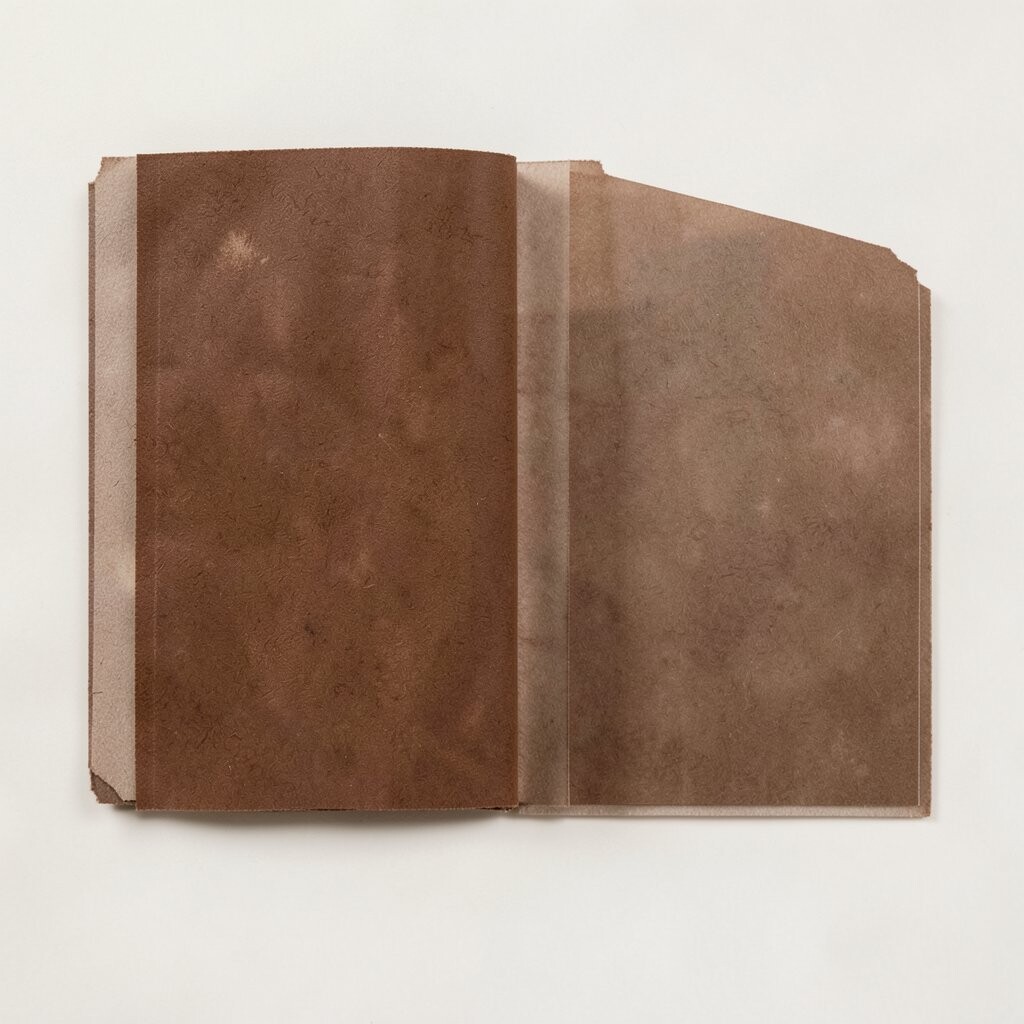
Burnished umber brown feels like leather, wood grain, and a crackling fireplace mood. It’s perfect beside portraits, vintage maps, or abstract pieces with earthy shading.
Its uniqueness comes from how it deepens colors without turning everything gray. Use it to anchor a gallery wall so the artwork feels weighty and intentional. If you worry it’s too dark, try a deep espresso base with a warm undertone rather than a cool brown.
5. Soft Mushroom Taupe

Soft mushroom taupe is a cozy middle ground between beige and greige. It gives your artwork a calm, balanced frame without feeling plain.
This tone stands out because it pairs easily with both warm and cool colors, so your collection can grow over time. It also looks great with metals like brushed brass or antique gold, making even small prints feel elevated. Keep the lighting in mind; taupe can shift a little from creamy to more gray depending on the bulb temperature.
For practical personalization, layer taupe with fabrics that have subtle patterns, like oatmeal stripes or woven textures. In cost terms, taupe is typically similar to other paint shades, though custom mixing can add a little depending on where you buy. A modern trend is using taupe as a backdrop for art with bold linework, since the muted wall makes the lines feel crisp and intentional.
6. Dusty Terracotta Rose

Dusty terracotta rose adds a gentle blush that still feels earthy. It’s a fantastic choice beside botanical prints, soft portraits, and art with peachy highlights.
This color is unique because it softens the room like a warm sweater while still keeping the grounded vibe of clay. It also plays nicely with white mats and creamy frames, which helps artwork look polished. Try it in a half-wall, accent wall, or behind a statement piece to control the intensity.
If you want practical tips, test two shades close together, because rose undertones can change noticeably with sunlight. A budget-friendly path is painting only the area behind the artwork and leaving the rest neutral. The current trend is pairing muted blush-earth tones with natural textures like rattan, linen, and cork for a soothing, lived-in look.
For personalization, bring in a small color echo from your art—like repeating a peachy hue in a pillow or ceramic vase.
7. Sage Whisper Gray
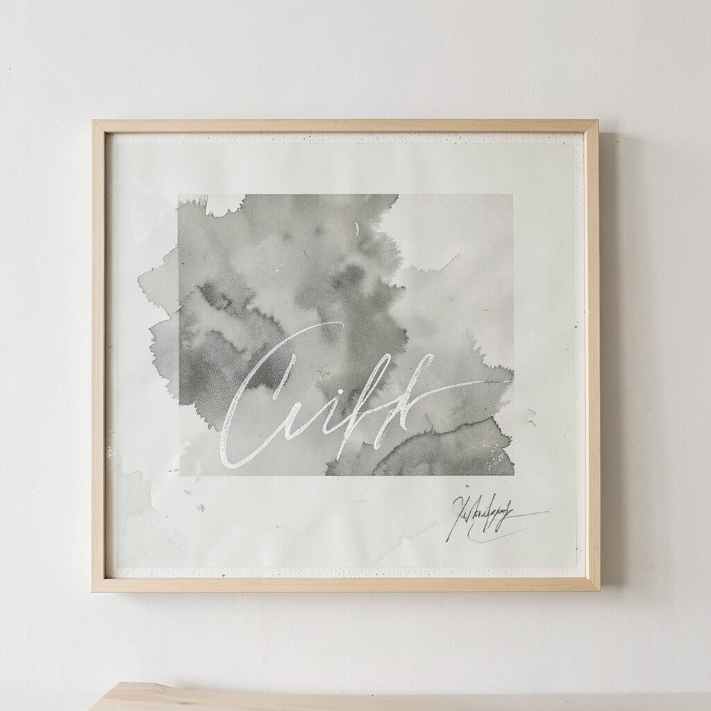
Sage whisper gray sounds delicate, but it brings real steadiness to a room. It’s ideal beside calm landscapes, abstract art with green-gray wash, or minimalist prints.
This tone is unique because it blends botanical softness with a gentle neutral base. It helps your walls feel airy while still connecting to nature themes. To make it work, choose art with at least one color that touches the sage range, such as moss, soft leaf green, or dusty gray-green.
For tips, use a semi-matte finish so small lighting reflections don’t steal attention from the artwork. Cost considerations are similar to standard paint, and if you use peel-and-stick wallpaper, you can swap patterns without a full repaint. A trend you may notice is “quiet color,” where sage-gray walls pair with light oak furniture and simple black frames for a modern cozy feel.
8. Mossy Cedar Green
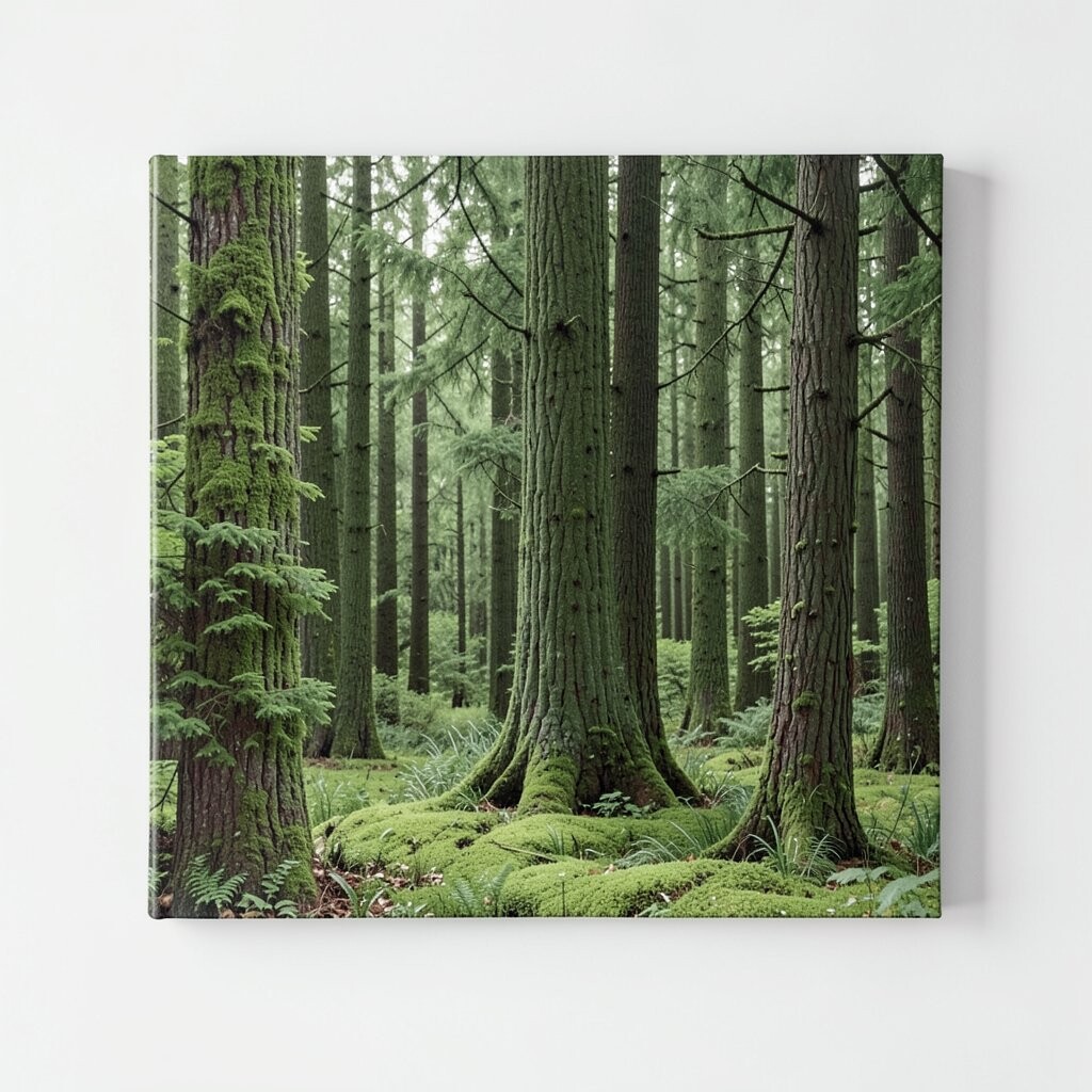
Mossy cedar green gives your space a forest edge that feels cozy, not dark. It’s great next to woodsy art, wildlife photography, and prints with layered greens and browns.
This tone stands out because it has a slightly richer, more textured feel than typical sage, so artwork looks more vibrant beside it. If you want practical guidance, pick a green that leans toward brown if your art includes warm wood tones. It can also help camouflage minor wall imperfections since the color is forgiving.
9. Chalk White Linen

Chalk white linen is soft, warm, and slightly off-white like fabric straight from a fresh wash. It makes artwork feel crisp while keeping the room relaxed.
This tone is unique because it avoids the glare of bright white, so your art looks comfortable to look at for hours. It’s especially good for colorful pieces, because the wall doesn’t steal attention. For practical tips, choose a wall paint labeled as warm white or ivory linen and check it under your real lighting.
To personalize, add depth with small shadows using slightly recessed frames or gallery lighting. Budget-wise, white tones can be easy to maintain because small scuffs blend in better than bold colors. A current trend is using chalky whites with natural stone textures, like faux marble coasters or travertine-inspired decor, to keep everything feeling calm and cozy.
If your artwork is very dark, this tone helps create a halo effect that makes the colors pop.
10. Sienna Dusty Orange

Sienna dusty orange brings a gentle spice that feels like warm light on a wall. It pairs well with abstract art, pottery photography, and prints that have gold or burnt tones.
This tone is unique because it sits between red and tan, so it adds warmth without overpowering your furniture. For benefits, it can make a room feel more energetic while still staying grounded. If you’re unsure, start with a smaller accent area or use it behind a single large artwork.
Practically, use it with neutral trim and simple frame styles so the color stays the focus. Cost is usually straightforward if you paint, and less permanent options like removable murals can keep your budget safe. A modern look pairs dusty orange with deep green accents, which creates a balanced earthy contrast that feels both cozy and styled.
11. Deep Field Blue-Gray

Deep field blue-gray feels like stormy sky over a quiet landscape. It adds mood and calm, especially beside abstract pieces with muted blues or black-and-cream photography.
This tone is unique because it’s earthy while still being cool, which can make warm art colors look even richer. It also pairs well with dark wood frames and matte black hardware for a grounded, modern vibe. For practical tips, choose a finish that reduces shine, since glossy paint can make the art look washed out under direct light.
12. Lichen Cool Green
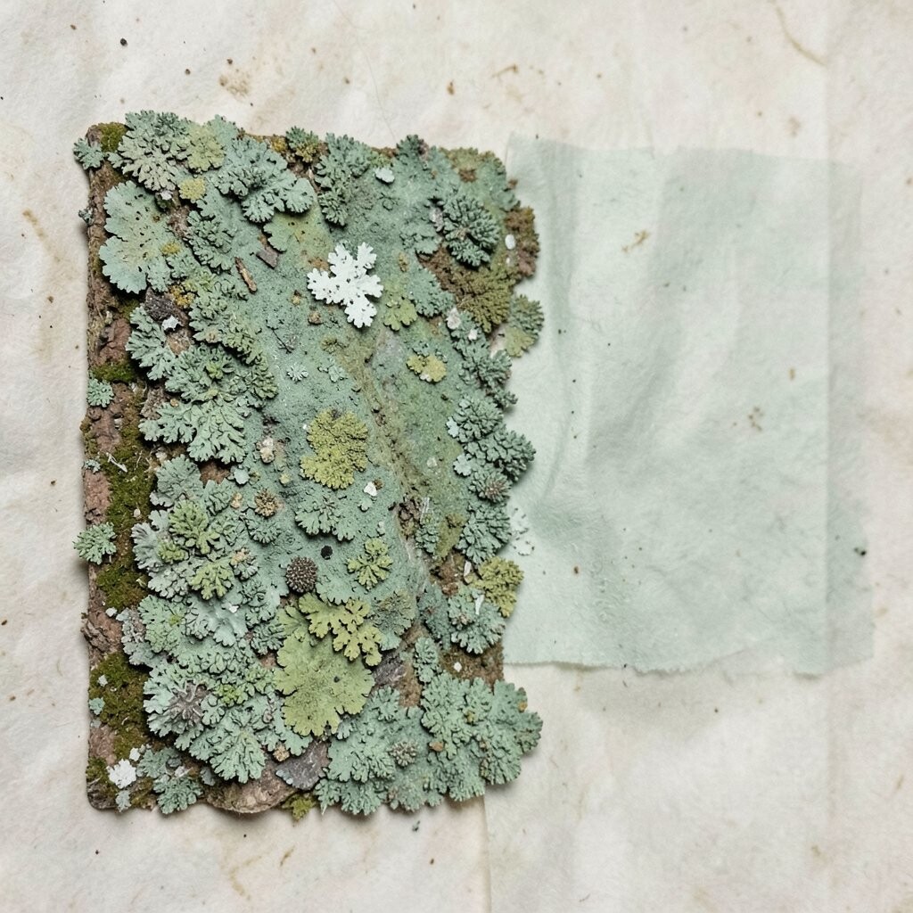
Lichen cool green is a muted, slightly grayish green that feels fresh but not loud. It’s a wonderful neighbor for artwork featuring leaves, herbs, or soft nature gradients.
This color stands out because it gives the room a soft “breathing space” feeling while keeping your palette earthy. It can also make skin tones in portraits look warm and natural when your art has subtle green undertones. If you want personalization, pair it with creamy frames and linen curtains so the overall look stays calm and cozy.
From a cost perspective, choosing this shade is similar to other mid-range paint colors, but it may require mixing for the exact lichen tone. For current trends, look for coordinated “nature duo” palettes, where lichen greens sit beside oat beige or warm taupe for a layered, organic look. Use a small swatch near the artwork and watch how it changes throughout the day to ensure it supports your art rather than fights it.
13. Copper Patina Accent
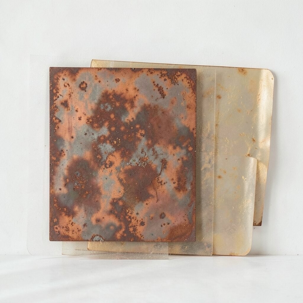
Copper patina is less about flat paint and more about richness and glow. When used as an accent tone near artwork, it can add warmth and a hint of vintage charm.
This option is unique because it plays beautifully with metal details in frames, lamps, and sculpture-like decor. It can also make neutral artworks feel special, since the warm metallic undertone adds depth. For practical tips, use copper in small areas like a narrow strip, a frame wall section, or a textured paint effect, rather than covering every surface at once.
Cost considerations vary widely: true metal finishes can be pricier, while faux patina paint or copper-toned peel-and-stick options can be more budget-friendly. A trend you’ll see is mixing earthy tones with subtle metallic warmth, which keeps cozy spaces feeling lively rather than flat. To personalize, repeat copper in at least one other element near your art, like a candle holder or a small vase, so the whole scene feels intentionally styled.