Small details can make a kitchen feel custom. Tiled overhangs add charm, protection, and style in one move.
1. Classic Subway Tile Splash Edge

Subway tile along the counter edge looks crisp and timeless. The grout lines create a clean rhythm that makes even simple cabinets feel finished.
This idea helps protect the wall area from splashes and daily mess. Pick a slightly glossy tile so light bounces and the overhang feels brighter. Keep grout sealed to reduce staining and make cleanup easier.
2. Bold Color Block Overhang
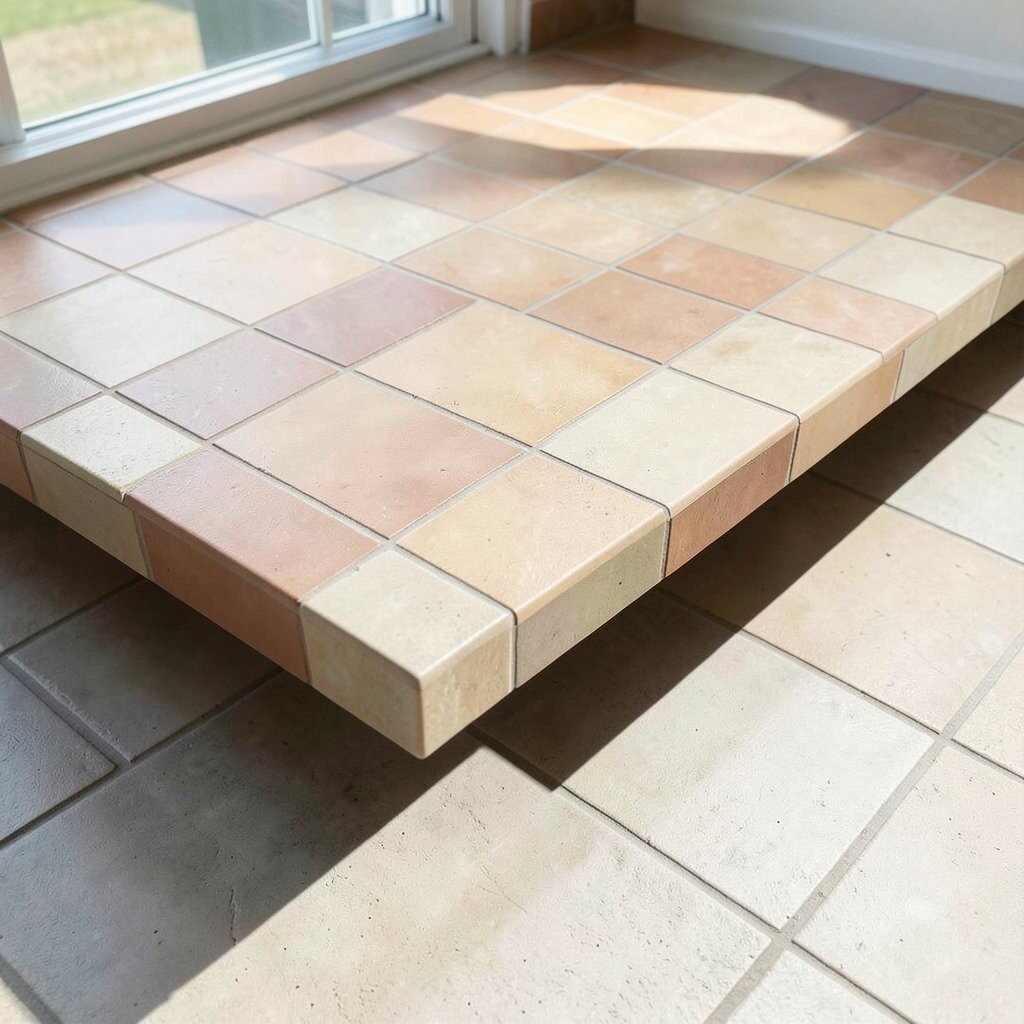
Choose two or three bold tile colors and set them in a clean stripe. A color block overhang makes the kitchen feel lively without changing your whole layout.
It also creates a visual “frame” for the counter, which can make your space look taller. Use painter’s tape to mark straight lines before you spread thinset. Consider sealing the entire surface and selecting easy-to-clean grout shades that won’t show minor splatters.
If you like to update your style, swap only the overhang tile in the future. Budget-wise, standard ceramic or porcelain in solid colors is usually more affordable than premium stone. Current trend lines are leaning toward saturated accent tones paired with calm cabinetry.
3. Moroccan Patterned Tile Fringe
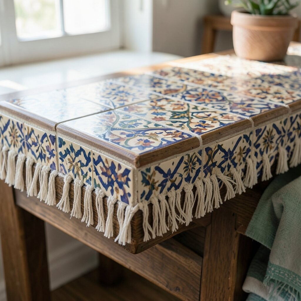
Turn the overhang into a small decorative “fringe” with Moroccan-style geometric tiles. The mix of shapes adds movement, even when the rest of the kitchen is simple.
This style can hide minor variations in lighting and make the backsplash area feel like an art piece. Use a tile layout template so the pattern repeats neatly across the counter run. If your kitchen has warm wood tones, look for tiles with honey, terracotta, or deep navy colors.
For practicality, pick porcelain tiles since they handle moisture and cleaning well. A medium-dark grout can cut down on frequent scrubbing. Plan a slightly larger budget if you want handmade-look tiles, because specialty patterns may cost more.
You can personalize it further by choosing one pattern color that matches your cabinet hardware. Many kitchens now pair this look with simple shaker fronts and a matte black faucet for a strong contrast.
4. Monochrome Marble-Look Edge Tiles
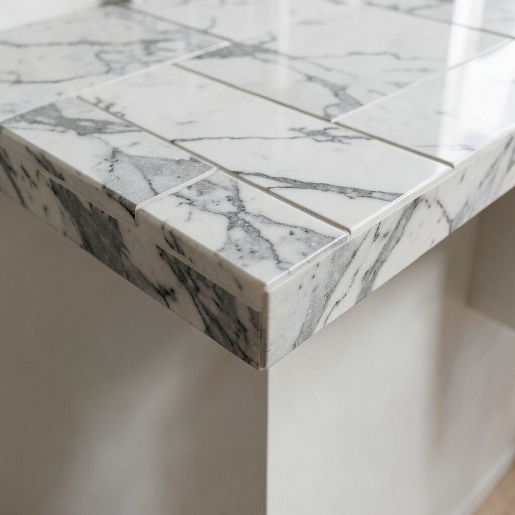
Marble-look tiles on the overhang give that high-end spa feeling. The veining adds texture while still keeping the look modern and calm.
This option helps your counter area feel cohesive with stone counters and backsplashes. Choose a tile with consistent veining direction so the edge looks intentional. For cost control, you can often get a similar look from porcelain that mimics marble at a lower price.
5. Slim Herringbone Overhang for Texture
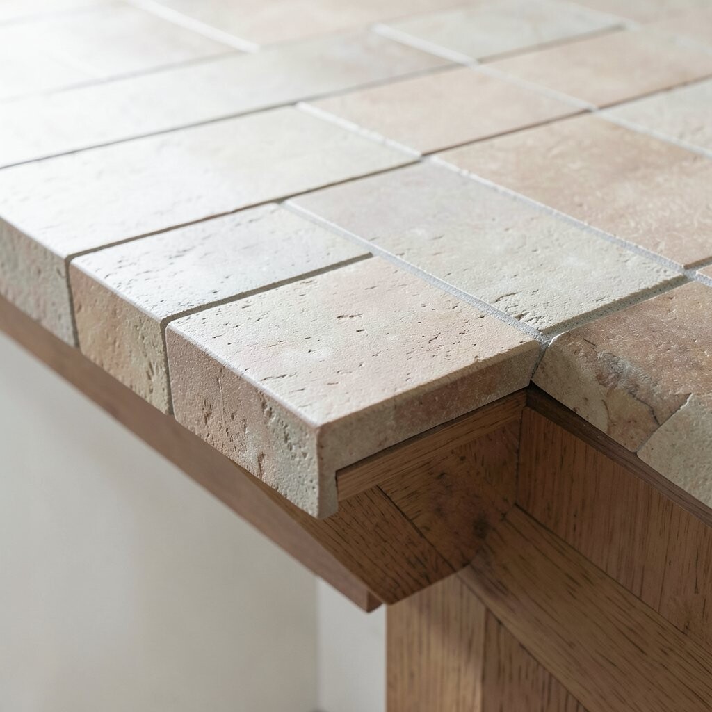
Use narrow herringbone tiles along the counter edge to add a subtle texture. The angled lines bring a gentle sparkle when light hits the surface.
Texture can also make the overhang feel more “custom” without using large patterns. Install on a flat, level substrate and check spacing often to keep the lines crisp. Choose a grout color that matches the tile body so the pattern stays the star.
Porcelain herringbone is a practical choice for daily kitchen splashes and wiping. If you’re watching costs, buy extra tile because cutting around corners can take more material than expected. This look is trending because it blends modern style with classic craftsmanship.
6. Narrow Mosaic Band with Solid Center Tile

A mosaic band on the overhang can look like a jewelry detail for your kitchen. Keep the main backsplash plain and let the edge tile do the talking.
This setup works well because it adds visual interest without overwhelming the whole wall. Choose a mosaic made for countertops or splash zones so it bonds securely. Use consistent spacing and a flat-mount mesh backing to avoid lumpy sections.
7. Arched Corner Overhang Accent Tiles
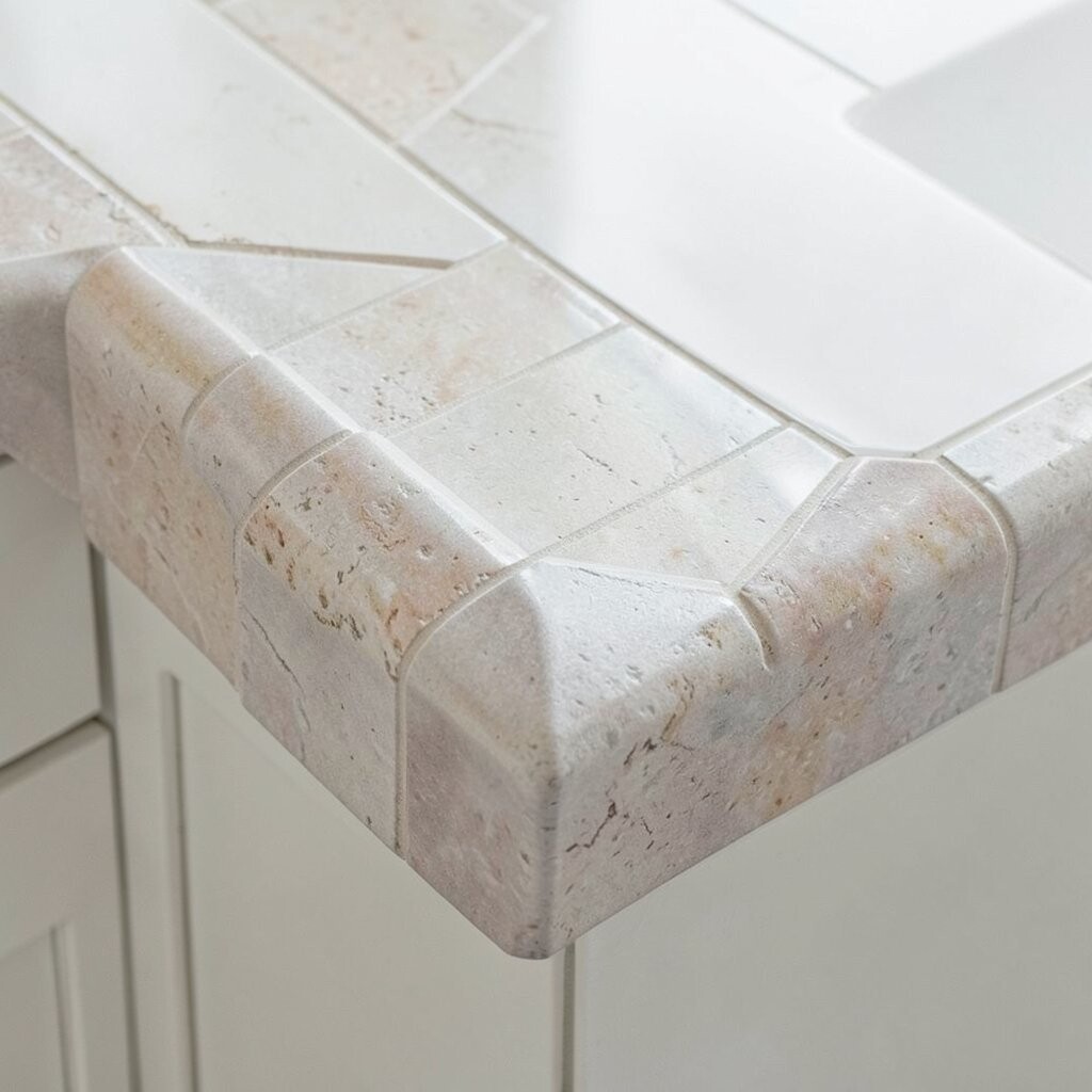
Shape the overhang with arched corner tiles to soften hard lines in your kitchen. Rounded corners can make a small room feel more welcoming.
It adds a unique focal point where people naturally look when they walk in. Use corner tiles that match your design height so the overhang edge stays even. If you’re comfortable with simple cuts, you can also add a small half-arch at transitions.
Cost can stay reasonable if you limit the special tiles to just the corner areas. For trend alignment, rounded forms pair beautifully with warm neutrals and curved cabinet pulls. Sealing and grout maintenance still matter, so plan to re-seal when recommended by the product label.
8. Hand-Painted Look Tiles in Soft Pastels
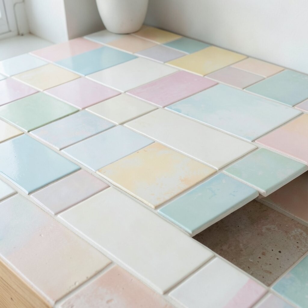
Hand-painted style tiles create a gentle, artistic overhang that feels personal. Pastels like sage, blush, or soft blue can make the kitchen feel airy.
This idea benefits homeowners who love color but prefer a lighter mood. Use tiles with a clear glaze so they resist stains and are easy to wipe down. To keep the kitchen balanced, choose simple cabinet colors and let the overhang be the accent.
Expect some variation in painted tiles, so buy a bit extra to maintain continuity. Budget can be higher depending on the brand and how “handmade” the tiles are marketed. A current trend is mixing these tiles with warm lighting and natural wood textures.
Personalize it by matching one pastel tone to a throw rug or dish set you already love.
9. Dark Slate-Style Tiles with Light Grout

Dark slate-style tiles look bold and grounding right under the counter line. When paired with a light grout, the contrast makes the pattern pop.
This combination hides everyday mess better than bright grout on light tiles. Use a grout that’s designed for high-moisture kitchen areas and seal it after curing. If you have lighter cabinets, this edge detail creates a dramatic focal point without changing your storage layout.
For personalization, keep your grout color consistent with your countertop undertones. Porcelain slate-look tiles are often more affordable than real slate. This look is popular because it gives a modern farmhouse feel with a sleek, updated twist.
10. Vertical Stop-and-Go Chevron Drop

Create a chevron drop that runs slightly downward from the counter edge. It breaks the flat line and gives your kitchen a playful sense of motion.
The benefit is that you get visual drama while the overall area stays manageable. Start with straight reference lines so the zigzag stays aligned from left to right. Use a level and spacers to keep the height consistent along the entire run.
Cost considerations are usually medium since you’re using pattern tiles only where the drop appears. Choose smaller formats if your countertop overhang changes direction around outlets. This style is trending in kitchens that want a “statement” detail without heavy renovation.
11. Thin Blue Lattice Tile Edge

A thin lattice pattern in blue can look both modern and cozy. The small grid lines feel delicate, especially against neutral cabinets.
It helps your overhang look designed rather than accidental. Pick porcelain tiles with a smooth finish so wiping is easy and grout doesn’t collect grime. If you want the lattice to stand out, use a bright blue tone and pair it with a soft gray grout.
12. Textured Terracotta Look for Warmth

Terracotta-look tiles give your overhang a warm, earthy personality. The surface texture makes light feel richer and more inviting.
This is a great option if your kitchen uses warm wood, brass, or cream-colored surfaces. Choose tiles that are rated for moisture and sealing, since terracotta-style looks can be more porous than glossy tiles. Seal both the tile and grout if the manufacturer recommends it for that finish.
For practical care, wipe spills quickly and avoid abrasive scrubbers. Cost can be moderate because many terracotta-look tiles are mass-produced in durable porcelain. The trend right now is leaning toward warm, grounded colors instead of only cool grays.
Personalize by matching the grout tone to your cabinet base for a smoother “blend,” or choose a contrasting color for a stronger border.
13. Oversized Rectangular Tiles with Micro Grout
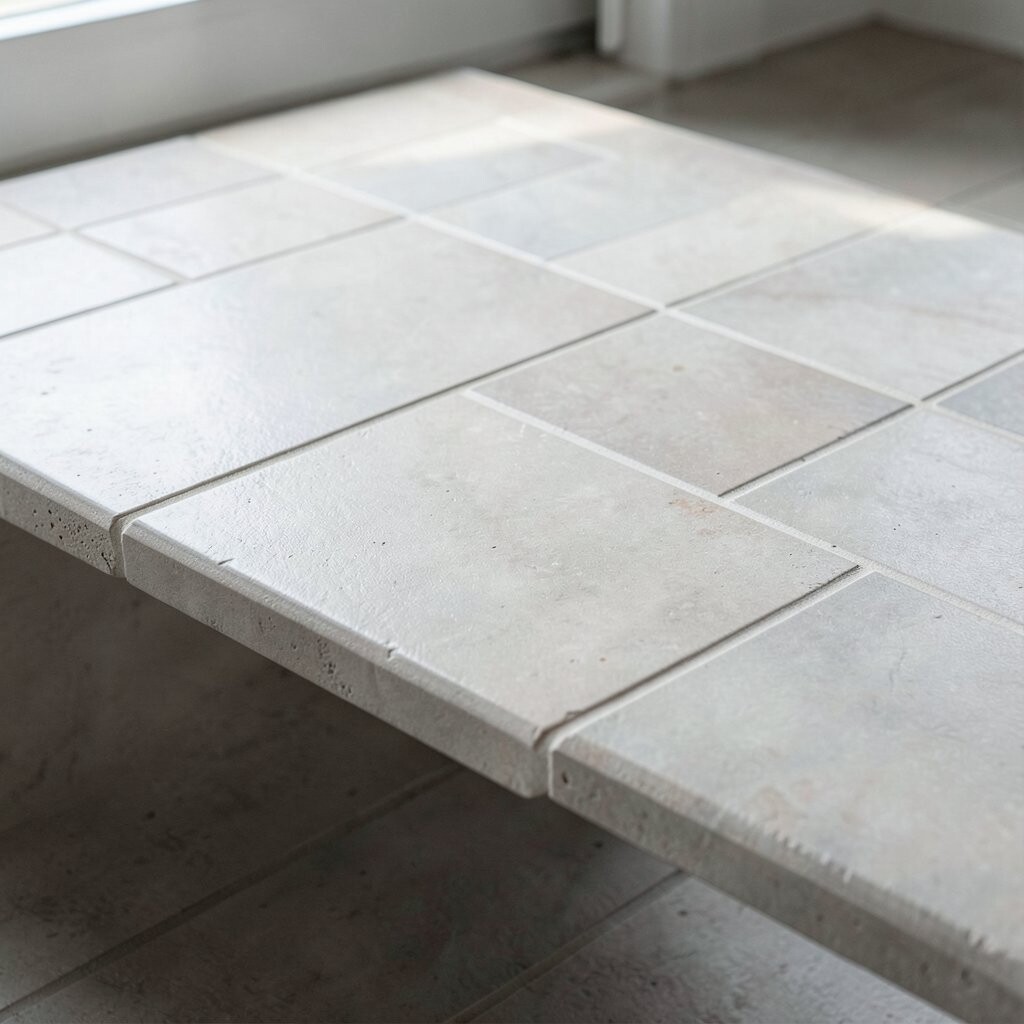
Large rectangular tiles create a clean, architectural edge under the counter. When you keep grout lines tight, the overhang looks almost seamless.
This approach benefits small kitchens because it reduces visual busyness. Use spacers sized for your desired grout gap and plan for extra time leveling the wall. Large tiles can be cost-effective per square foot, but they may require careful cutting around outlets.
To stay practical, choose a tile with a slip-resistant finish if the overhang gets splashed often. Pair the look with matte cabinets and simple hardware for a modern feel. This style fits current trends that favor calm surfaces and straight lines.
14. Metallic Champagne Tile Trim
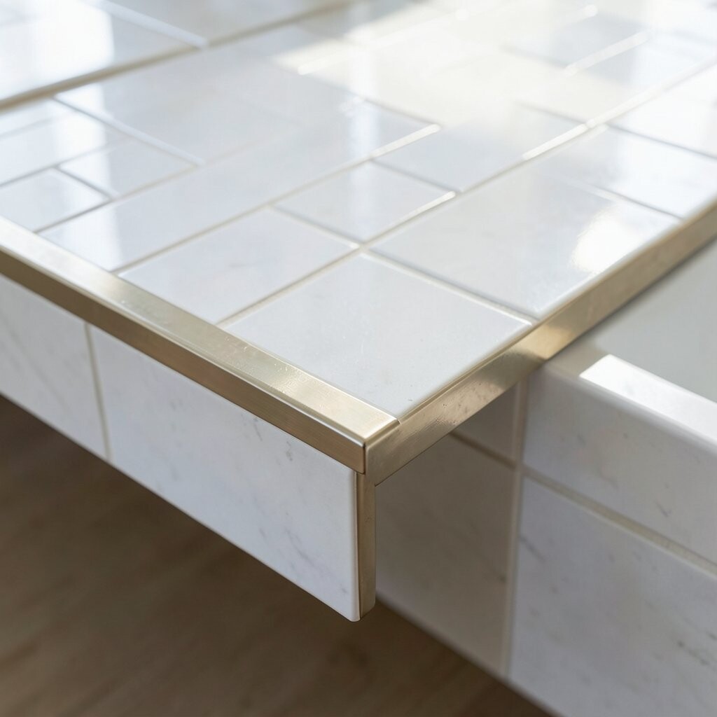
Metallic champagne tiles add a soft glow right at eye level. Even a small overhang can reflect light like jewelry.
The benefit is that metallic accents can make the kitchen feel brighter without adding more fixtures. Pick a tile that’s meant for backsplashes so the finish stays durable. Keep grout color neutral so it doesn’t fight with the shine.
15. Classic Penny Tile Edge with Grout Contrast
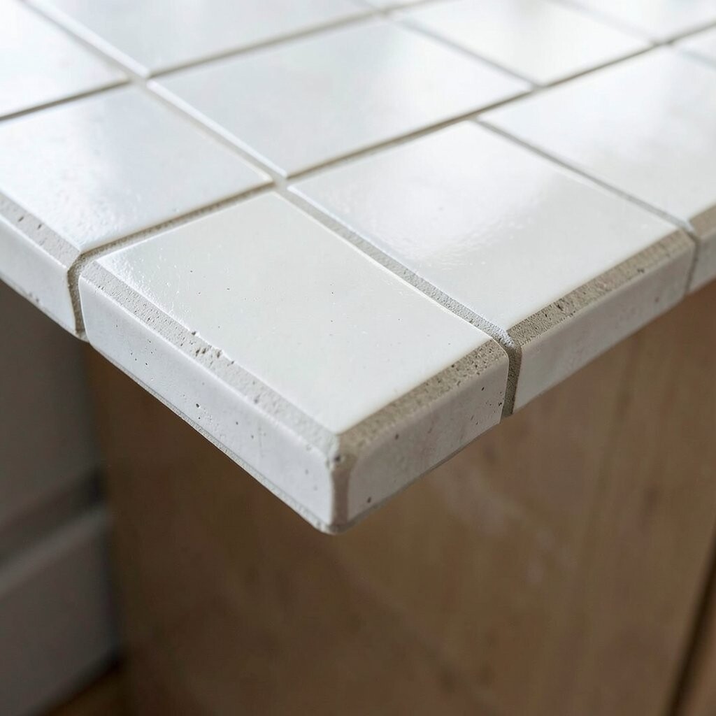
Penny tile along the counter edge gives a playful, vintage nod. The rounded shapes create tiny shadows that make the overhang feel dimensional.
This texture can help hide small specks and everyday wear. However, penny tile does mean more grout lines, so sealing matters a lot. Choose a grout shade that complements your cabinetry, and plan a simple routine for wiping before buildup happens.
For personalization, pick colors like warm white and tan for a coastal look, or black and gray for a bold modern contrast. Cost can vary because penny tile projects can require more material and labor for installation. This look stays popular because it feels classic while still being fun.
16. Candy-Stripe Counter Edge in Pastel Bands
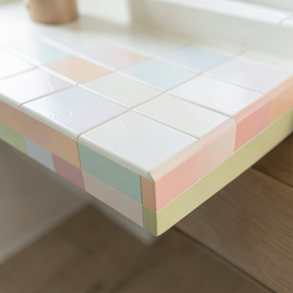
Run pastel bands like a candy stripe along the counter overhang. This creates an upbeat vibe that feels cheerful and fresh.
The unique part is how the stripes guide your eyes along the counter line. Keep the bands thin for a neat, tailored look rather than a heavy border. Use consistent spacing and check your alignment against cabinet doors before the first tile sets.
For practical tips, seal grout well and wipe splashes quickly. Budget considerations depend on tile size and whether you’re using multiple colors, but you can keep costs down by choosing a durable standard tile body. This style fits current trends that embrace subtle retro touches.
Personalize by choosing pastel shades that echo your wall paint or nearby décor textiles.
17. Black-and-White Checker Edge for Contrast

A black-and-white checker edge is bold, graphic, and instantly recognizable. It turns a simple overhang into a statement design.
This idea helps kitchens with neutral cabinets look sharper and more styled. Use consistent tile sizes and plan your layout so the pattern doesn’t look chopped near corners. Consider using a stain-resistant grout and sealing it after cure since contrast grout can show discoloration.
18. Scalloped Tile Undershelf Style

Scalloped tiles create an undershelf vibe along the counter edge. The curves soften the kitchen and add a gentle, playful look.
This design feels unique because the shape looks almost like a decorative wave. Choose a glazed tile so cleaning is straightforward after cooking splashes. Install carefully so the scallops stay aligned across the run and around corners.
Cost can be medium because scalloped tiles may be more specialized than basic rectangles. You can lower expenses by using the scalloped tile only on the main visible run and using a simpler tile on less noticeable sections. The trend toward organic shapes makes this a great match for modern kitchens that still want warmth.
19. Subway Tile with a Mitered Side Accent

Use subway tile for the overhang, but add a mitered side accent at transitions. This gives a crisp, tailored look where the counter meets side walls.
The benefit is cleaner lines at the edges, which can make the whole project look professionally finished. Measure carefully and dry-fit tiles to confirm how cuts will land near corners. If you want a unique twist, use a different finish for the side accent, like satin versus glossy.
Cost considerations are usually friendly because subway tile is widely available. Keep grout color close to the tile body for a seamless look, or go contrasting for a stronger “pattern” statement. This style remains popular because it balances classic and refined.
20. Limewash Look Ceramic for Soft Character
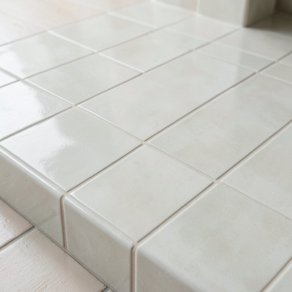
Limewash look tiles add a soft, mottled finish that feels full of character. The overhang looks like it has depth, even when the design is simple.
This option is great if you love the look of aged plaster but want an easier-to-clean surface. Choose glazed tiles so the mottled effect doesn’t trap mess in tiny pores. Use a light grout to keep the kitchen bright and reduce the harshness that some dark grouts create.
Budget-wise, limewash look tiles can range widely, so set a target price and compare sizes and coverage. The current trend favors textured neutrals, and this style fits right in with airy, modern kitchens. Personalize it by pairing the overhang with warm pendant lighting and natural stone or wood countertops.
21. Custom Color-Matched Border to Cabinet Trim

Match your overhang tile to a color from your cabinet trim or hardware. This makes the kitchen feel coordinated and designer-like.
The unique benefit is that the overhang doesn’t compete with the rest of the room; it connects everything visually. Bring a cabinet sample to the tile shop or check manufacturer color matches online if available. For practical tips, choose a tile that resists staining and pick grout that complements both the tile and your nearby wall paint.
Cost depends on your tile choice, but color-matched projects can be budget-friendly when you use standard sizes. This approach also stays timeless, since it ties to your cabinetry rather than a temporary trend. Personalize by using a slightly different shade for grout to create a subtle line that highlights the border.