
Hand-painted textured walls can make a room feel lived-in from the first step. The best part is you can shape the look to match your taste and daily life.
1. Plaster Cloud Swirls in Soft Neutral Tones
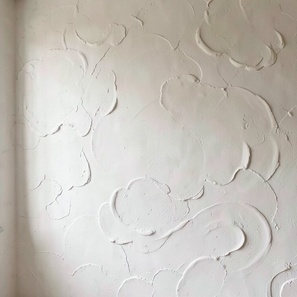
Picture walls that look like gentle waves of plaster settling in slow motion. The surface catches light in a calm, velvety way.
This design often uses off-whites, warm grays, and beige-browns so the swirls feel cozy rather than dramatic. Texture adds depth without needing heavy colors, which is great for small spaces or rooms with lots of furniture. For personalization, vary the swirl thickness near corners to frame the room.
2. Rag-Roll Earthy Texture with Clay and Sand Shades

Think of a sun-baked courtyard wall, but indoors. The rag-rolling texture creates tiny valleys that make light look softer and warmer.
Earth tones like terracotta, muted ochre, and sand can balance modern pieces and also pair well with rustic wood. One unique benefit is how forgiving it is—small bumps and natural-looking shadows hide minor imperfections on the wall. To keep it consistent, use the same pressure and direction for each pass, and plan your pattern so seams fall behind furniture.
If you want a personalized touch, mix a slightly darker “base” strip behind a doorway or headboard so the room feels anchored. For cost, rag-rolling can be mid-range since it needs specialty tools and multiple coats, but it often uses common paint products. A current trend is pairing earthy texture with matte finishes and natural textiles like linen, jute, and leather.
3. Faux Limestone Bands with Subtle Brush Marbling

Imagine limestone veining wrapped around your walls like elegant stone bands. The design looks sophisticated while still feeling handmade.
With faux limestone bands, you build a base layer, then add banded color shifts using sponges and soft brushwork. Texture makes the marbling look more realistic, especially near windows where daylight creates natural gradients. This is a strong choice for entryways, dining rooms, and any space that needs a “wow” without bright color.
To make it unique, choose a band height that matches your decor scale, such as slightly taller bands for high ceilings. Keep a reference photo of real stone and limit your palette to three related tones for a cleaner look. For practical tips, mask with painter’s tape and remove it while the paint is slightly tacky so edges stay crisp.
Cost-wise, expect slightly higher supplies because you may need glazing mediums and multiple colorants. A current trend is warm stone tones paired with modern black hardware, which helps the texture look intentional. If you’re renting, use a removable wallpaper panel for a single statement wall instead of coating the whole room.
4. Coastal Salt-Paint Textures with Brushed Foam Highlights
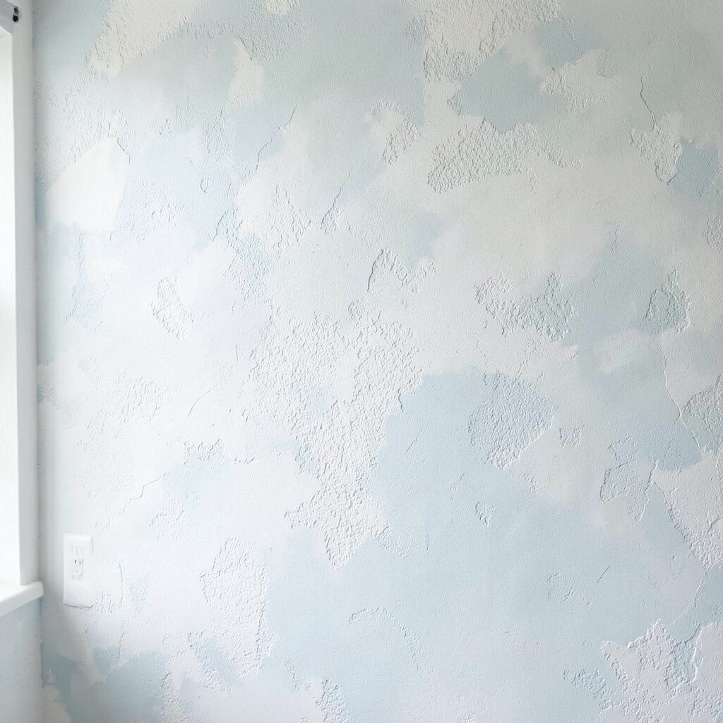
Coastal salt-paint textures bring a breezy, light-catching feel to your home. The surface can resemble foam, with raised marks that look playful yet tidy.
Typically, you apply a base wash and then dab or brush over it with lighter shades so the highlights appear like sea spray. This design benefits calming color psychology and works well in bathrooms, kitchens, and bedrooms. For personalization, add slightly bolder foam patches around a mirror or artwork so the wall feels like it’s framing a scene.
5. Geode-Inspired Texture with Layered Color Veins

Geode walls feel like a hidden gem turned into a backdrop. You can create crystal-like depth using raised texture and layered paint colors.
The look often combines muted base tones with brighter accents in purples, teals, or soft golds. Texture is the key, because it turns flat paint into “light” that seems to sit inside the wall. To make it truly yours, place the main “crystal” area off-center, then fade the veins outward like a natural stone pattern.
Practical tips include using a stencil for large shapes while freehanding the smaller cracks so it stays organic. For cost considerations, geode designs may run higher due to specialty metallics and more prep time, but you can keep it budget-friendly by focusing on one accent wall. A current trend is mixing warm neutrals with one jewel tone for a modern, not-too-busy effect.
6. Vertical Linen Texture with Modern “Height” Illusions
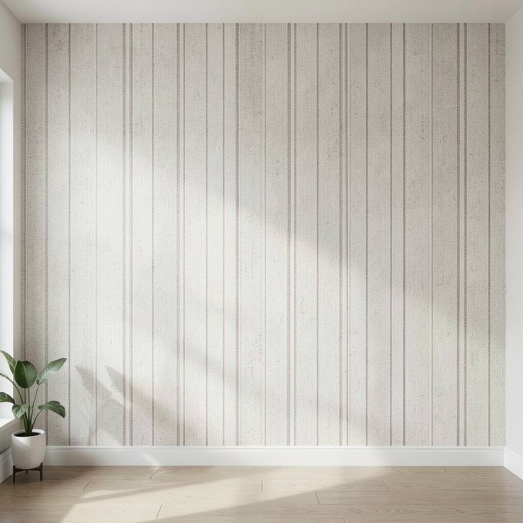
Vertical linen textures give walls an airy, tailored feel. The raised strokes subtly pull the eye upward, which helps rooms feel taller.
This style is made with fabric-like rolling, combing, or thin coat strokes that mimic woven strands. The benefits include a soft, warm look that hides subtle flaws and reduces glare compared to shiny paint. For practical personalization, match the direction of the strokes to the most visible lines in your space, like window frames or built-in shelving.
If you want a stronger effect, use two close shades—one slightly lighter for the “threads” and one deeper for the valleys. It’s also a good idea to test swatches on scrap drywall or a hidden corner first. Cost usually stays moderate because you can often achieve the look with standard wall texture additives and a few tools.
7. Hand-Brushed Scales for a Warm, Artistic Statement Wall

Scale patterns add personality without needing loud colors. When they’re painted by hand, each “scale” looks like it has its own story.
This design usually uses overlapping shapes, formed with a stencil or a freehand guide, then finished with texture so the edges cast tiny shadows. The biggest benefit is movement—your wall changes slightly as you walk past, especially with warm lighting. For personalization, vary the scale size near a focal point like a fireplace or bed headboard.
To keep it practical, plan a simple palette first and stick to it, such as warm cream plus a bronze-brown. If you’re concerned about time, start with a smaller area like behind a console table, then expand later. Current trends favor painterly textures and earthy palettes, which makes scale designs feel modern rather than themed.
8. Ombre Texture Fade with Soft Raised Edges

An ombre fade can look elegant and calm when paired with texture. The raised edges make the color shift feel three-dimensional.
Start with a darker base at the bottom and blend lighter tones as you move upward, then add a gentle texturing layer on top for depth. This design benefits open, airy rooms because the gradient visually expands space. For a unique twist, blend colors that match your flooring or textiles so everything connects.
Practical tips: use blending tools consistently, work in sections, and keep a wet-edge so the transition stays smooth. You can also add slightly darker “micro flecks” near the brightest area for a subtle sparkle effect. Cost considerations are usually reasonable because most of the price is in time and paint amounts rather than expensive specialty materials.
A trend right now is pairing ombre walls with warm minimal decor, like light wood and brushed metal, so the texture stays the star. If you want a safer option for renters, consider using a peel-and-stick textured mural panel for the fade portion only.
9. Sgraffito-Inspired Tool Marks with Color Washes
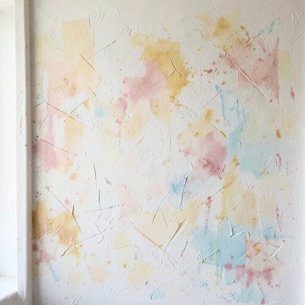
Sgraffito-inspired walls feel handcrafted and full of character. The technique uses layers and tool marks to create a scratch-and-reveal effect.
This design often begins with a base coat, then a contrasting layer, and finally controlled scraping or carving to show the earlier color. The benefit is strong visual texture that can make even simple rooms look custom. For personalization ideas, carve gentle lines that match your style—wave lines for coastal homes, geometric scratches for modern spaces, or organic swirls for softer interiors.
Practical tips include practicing on a scrap board first so you learn how deep the marks should go. Keep a consistent hand speed, and plan where your “highlight” areas will appear so they line up with your lighting. Cost-wise, it can be mid to higher depending on whether you buy texture additives, tools, and extra test materials.
A current trend is pairing sgraffito-like texture with neutral furniture and bold single-color art, letting the wall do the talking. If you want less mess, use fewer layers and choose a smaller feature area like a hallway panel.
10. Moroccan Tile Texture with Raised Dot Accents
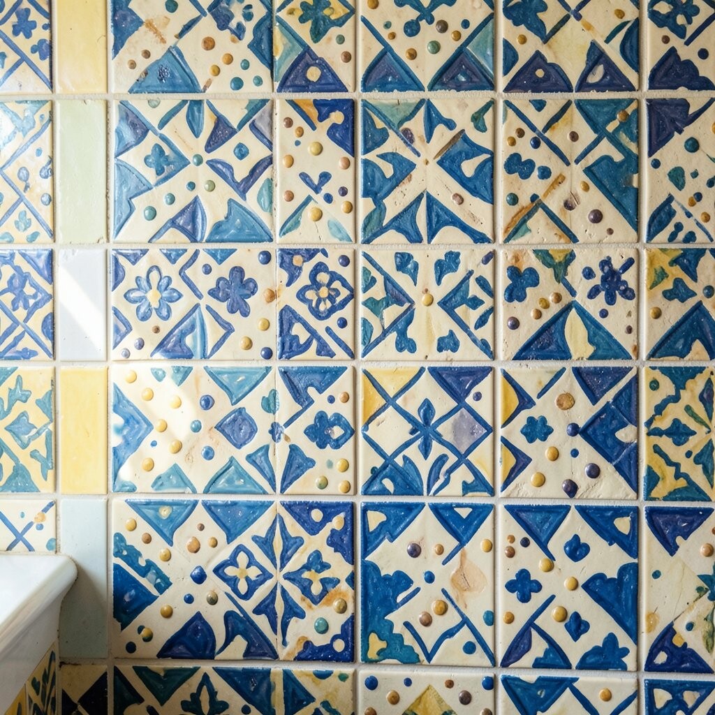
Moroccan-inspired walls can feel both glamorous and comforting. With raised dot accents, the pattern becomes tactile, not flat.
This look uses repeating shapes, often created with stencils, then finished with raised texture where dots or small ridges would appear on tile. The benefit is a rich, patterned feel that works in kitchens, powder rooms, and entryways. For personalization, pick a palette that matches your existing tiles—such as warm ivory plus deep teal or terracotta with caramel.
To make the pattern look intentional, keep the grout-style lines consistent in width and spacing. Use light raking light from a lamp while painting to see whether the relief reads correctly. Cost considerations depend on how far you go: a full room uses more stencil time, while a half-wall or niche can look just as impressive.
11. Botanical Leaf Relief with Painted Veins

Botanical leaf relief brings a calm, fresh vibe without needing greenery everywhere. You get the look of nature, but with a tailored interior finish.
Typically, this design uses a textured medium to form leaves, then paint layers to highlight veins and edges. The benefit is softness—leaf shapes feel gentle even when the room has sharp modern furniture. For personalization, choose leaf styles that match your mood, like olive branches for Mediterranean homes or broad tropical leaves for a bold but warm look.
Practical tips include using a stencil or template for the leaf outline, then adding hand-painted vein lines for realism. Keep the highlight color slightly lighter than your base so the raised veins catch light. In terms of cost, botanical relief can be higher due to time, but you can reduce expense by covering only one wall or a narrow vertical band.
A current trend is combining nature-inspired texture with muted greens and creamy neutrals for a soothing, not-overstimulating palette. If you’re worried about maintenance, choose paints that are wipeable, especially in kitchens or kids’ rooms.
12. Art Deco Steps with Metallic Edge Texture

Art Deco steps add drama in a way that still feels elegant. When you add metallic edges, the pattern looks like it’s glowing.
This design uses geometric lines that echo the stepped motifs of classic Deco style. The benefits include crisp visual structure and texture that frames architectural features like archways and door trims. For personalization, match the metallic tone to your fixtures—brass for warm gold hardware, champagne for silver, or bronze for darker accents.
Practical tips: plan symmetry carefully and use painter’s tape for straight lines, then hand-paint the metallic edges for a softer finish. Cost considerations can be moderate to high because metallic paints and clear sealers may be needed. A current trend is using Deco textures with neutral walls and small metallic highlights so the look stays refined.
13. Night Sky Speckle Texture with Deep Blue Wash

A night sky wall feels magical and relaxing, especially in bedrooms. The speckled texture adds dimension like distant stars.
This style is usually built with a deep blue or charcoal wash, then layered speckling in lighter tones and tiny spark highlights. Texture is what makes it feel immersive instead of merely painted, because the dots can be raised or blended with a slightly rough finish. For personalization, add one “constellation” shape near the bed so it becomes meaningful and not random.
Practical suggestions include protecting nearby furniture with drop cloths and testing your speckle size on scrap first. Use a smaller brush or toothbrush method for tight dot patterns, and vary dot brightness so it feels natural. Cost is usually reasonable since it relies on paint and tools, but it can take time, which is where the labor cost often comes from.
A current trend pairs starry textures with warm lighting, like amber bedside lamps, to create a cozy contrast. If you want less intensity, choose a smoky gray palette and fewer dots for a subtle sky effect.
14. Warm Brick-Shadow Texture Without Real Brick
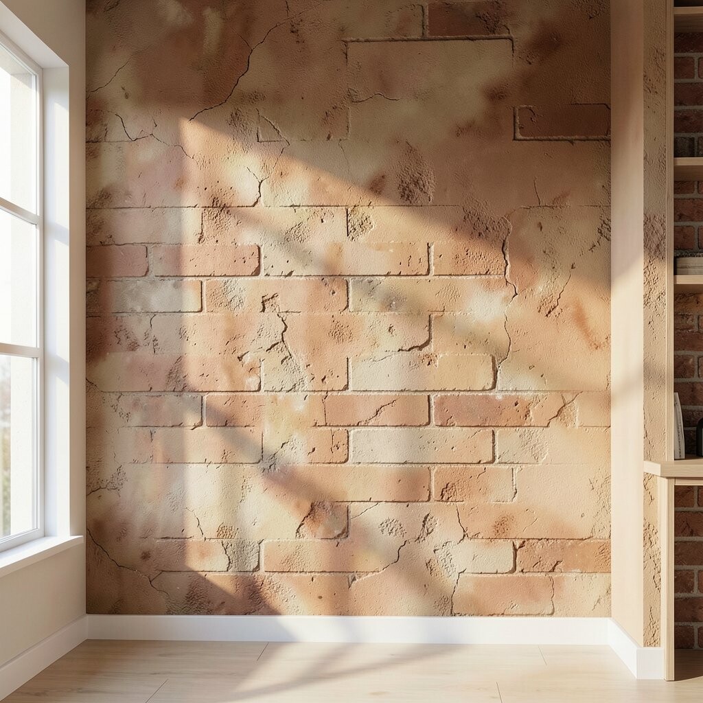
Brick-shadow texture gives you the look of brick while staying softer and smoother. It’s like having the vibe of a loft, tailored to your interior comfort.
This design often uses scoring tools or textured rollers to suggest mortar lines and brick edges, then adds a gentle wash to soften the contrast. The benefits include adding pattern and depth without the weight and complexity of real brick. For personalization, choose whether the “bricks” feel rustic and uneven or neat and modern based on the room’s style.
Practical tips: use consistent spacing for mortar lines, and keep the brick colors within one temperature family so it doesn’t look patchy. If you’re painting over new drywall, use a primer so the texture medium bonds properly. Cost considerations are typically moderate since you’re creating the look with paint and texture additives rather than materials and construction.
15. Color-Blocked Texture Panels with Hand-Textured Borders
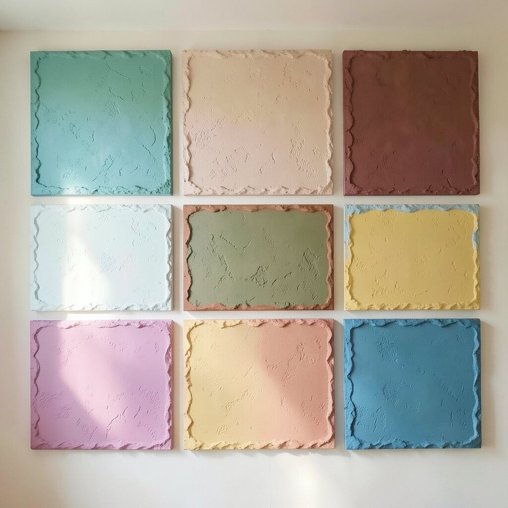
Color-blocked walls can look playful when the blocks have real texture. Raised borders make the panels feel like art, not just paint stripes.
This design uses separate color fields, then adds textured edges with sponging or combing so the lines cast a subtle shadow. The benefit is flexibility—you can match each panel to your decor colors, like tying one block to a rug or sofa accent. For personalization, use one panel as a backdrop for art, a reading nook, or a built-in shelf so the wall supports your everyday routines.
Practical suggestions include using tape for straight block lines, but relying on hand finishing along the edges so it still feels handmade. For cost, you may need more paint and primer due to multiple colors, yet it can still stay reasonable if you keep the number of blocks limited. A current trend is mixing one bold textured block with calm surrounding neutrals so the look stays modern and balanced.
16. Terrazzo-Look Texture with Hand-Set Speckles
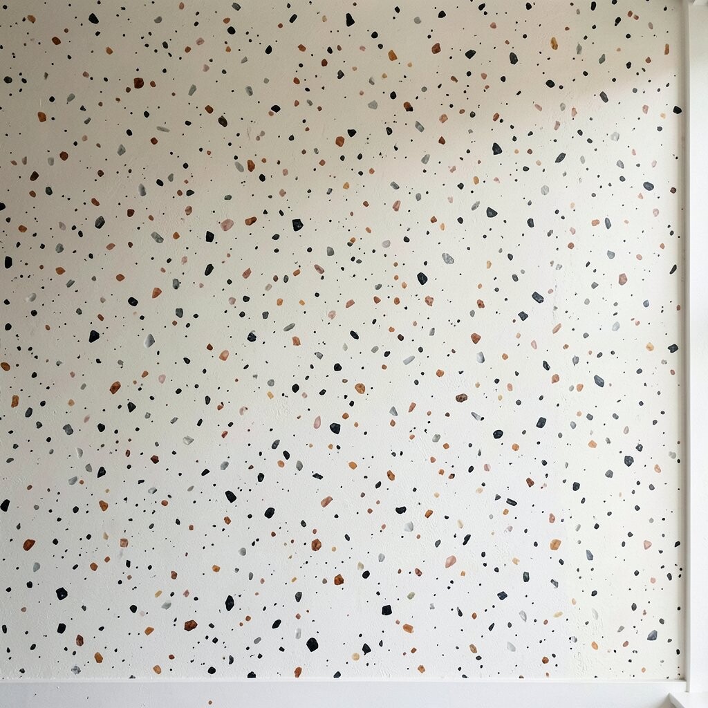
Terrazzo-look walls feel energetic and friendly, like a room with personality. The speckles create tiny moments of interest all day long.
This design uses a base color plus mixed speckling, often with several tones to mimic stone fragments. Texture benefits include hiding small surface imperfections and adding visual depth without heavy patterns. For personalization ideas, choose speckle colors that reflect your favorite items—like the tones in your throw pillows or artwork.
Practical tips: create a test board to dial in speckle size and density, then adjust using different brush techniques. If you want a cleaner, more tailored look, keep the speckle palette to three or four colors and avoid too much contrast. Cost considerations are usually manageable, but specialty pigments or faux stone additives can raise the price depending on what you choose.
A current trend is using terrazzo texture in bathrooms and hallways with matte finishes, because the speckles show light beautifully without glare. If you prefer a calmer version, go for smaller speckles and a monochrome or near-monochrome palette.