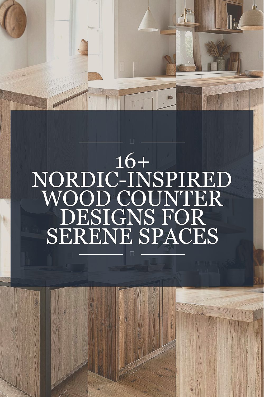
Nordic counters feel calm on sight and practical in daily life. The right wood choice can make your space look warmer without getting busy.
1. Light Oak Slab With Subtle Varied Grain

A light oak slab top instantly brightens a room. Its gentle, natural grain keeps the look grounded and peaceful.
Choose a matte oil finish so the surface feels warm, not shiny. This style hides small scratches better than high-gloss coatings. For a unique touch, keep the slab thickness bold and pair it with simple, light-colored cabinets. If you want it to last, use felt pads for decor and wipe spills quickly to protect the finish.
2. Whitewashed Pine Counter With Soft Edge Bevel

Whitewashed pine brings an airy, Scandinavian feel to everyday meals. The lighter tone makes smaller kitchens feel more open.
Ask for a smooth, lightly rounded bevel along the front edge to catch light without looking sharp. Pine is a softer wood, so it can dent, but that character fits Nordic styling. To reduce worry, seal it with a hard-wearing, water-resistant topcoat.
For personalization, add a contrasting backsplash in pale stone or ceramic. If your household is active, consider thicker wear layers or choose a similar look using a harder wood veneer. Budget-wise, pine often costs less than premium oak, but upkeep may be slightly more frequent.
3. Walnut Floating Counter With Narrow Freestanding Return

Walnut adds instant depth while still feeling cozy and modern. A floating look makes the room feel lighter and more design-forward.
Keep the counter depth moderate and add a narrow return at the ends for a crisp Nordic geometry. Walnut’s warm brown works beautifully with light cabinetry and brushed metal hardware. The unique benefit here is how the clean underside shadow line visually “lifts” the counter.
For practical tips, ensure the support structure is rigid so there’s no bounce when you lean or chop. Finish with a satin, durable clear coat to reduce daily scuffing. Pair it with a simple faucet and a few minimal open shelves to keep the mood serene.
If you’re planning a renovation, ask your fabricator about edge profiles that match your countertop thickness. Higher-end walnut costs more, but the rich color can reduce the need for extra decorative finishes.
4. Ash Counter With Charcoal-Tinted Front Rail

Ash wood keeps the Scandinavian look bright and flexible. Adding a charcoal-tinted front rail gives the design a calm, modern contrast.
This approach gives you the best of both worlds: warm grain on top and a darker grounding line below. For uniqueness, have the rail routed as a slim channel rather than a flat strip. Maintenance is easier because dark areas show fewer light marks. To keep the overall feel Nordic, match the charcoal with your hardware or window frames.
5. Reclaimed Teak-Look Wood With Clean, Minimal Lines

Even if you can’t source real teak, a teak-look finish can feel rich and beachy in a Nordic way. Reclaimed-style boards bring history without adding clutter.
Go for long plank panels laid in a simple, straight orientation to avoid a busy pattern. This makes the texture the star rather than the layout. A lightly weathered top with a sealed protective layer helps it handle daily use. To personalize, pair the reclaimed look with a creamy countertop apron or a pale stone sink surround.
Cost depends on whether you choose true reclaimed slabs or engineered panels with a similar aesthetic. If you’re budget-conscious, engineered wood with a quality veneer can deliver the vibe while staying stable across seasons. Always ask about thickness and the care instructions so the finish stays consistent for years.
6. Birch Laminate Counter With Hand-Rubbed Oil Finish Effect

Birch has a bright, tidy grain that instantly reads “Nordic.” It’s a great option when you want a serene kitchen that still feels modern.
Instead of a heavy stain, choose a clear or very light oil tone so the wood grain looks fresh and natural. Birch counters work especially well with light cabinetry and pale stone floors. The unique feel comes from the subtle warmth that shows through without overpowering other colors.
For practical tips, pick a high-pressure laminate or engineered wood system designed for countertop wear. Then use a professional finish that mimics hand-rubbed oil so it looks inviting while staying practical. Keep cutting boards on top and use gentle cleaners to preserve the sheen.
If you like variety, ask for slightly different plank widths across the surface to create slow, quiet visual movement. This can look intentional when the rest of the room stays simple. Birch-style finishes can be more budget-friendly than premium hardwoods.
7. Narrow-Board Scandinavian Counter With Vertical Grip-Friendly Texture

Using narrower boards creates a rhythmic pattern that still feels calm. It’s a subtle way to add design interest without using bold colors.
Keep the boards aligned with tight seams and finish the edges smoothly for a clean Nordic feel. If you want a unique touch, add a micro-textured top treatment that improves grip and reduces slip when cooking. That makes daily tasks feel safer and more comfortable.
For personalization, match the board rhythm to your backsplash slats or cabinet panel lines. Consider a warm, neutral stain and a satin protective coat so fingerprints don’t become an eyesore. This is also a smart option for families because the visual pattern can hide small wear marks.
8. Maple Counter With Soft-Frosted Clear Coat

Maple counters look crisp and gentle, almost like warm daylight. A lightly frosted clear coat adds a smooth, hazy glow instead of shine.
This finish helps reduce glare during cooking and makes the counter feel “quiet” visually. Maple’s pale color pairs beautifully with Nordic neutrals like linen, chalky whites, and light gray. For uniqueness, consider a barely-there edge chamfer that softens the outline.
If you want longevity, choose a clear coat rated for heat and household cleaners. Practical tip: keep hot pans on trivets to prevent finish stress, even with protective coatings. For cost considerations, maple is often mid-range and can provide a premium look without the premium price tag.
To personalize, add a thin groove line near the back edge, echoing the clean lines found in many Scandinavian furniture pieces. When you maintain the finish with the recommended cleaner, it stays serene instead of sticky or patchy.
9. Curved Front Wood Counter With Relaxed Radius

A gently curved front makes the counter feel more welcoming and less boxy. It’s a small design shift that can make a space feel instantly calmer.
Ask for a soft radius along the front edge so hands naturally rest without catching on sharp corners. This is especially helpful around breakfast bars or small spaces where people bump elbows. The unique benefit is comfort—your kitchen feels friendly rather than strict.
Choose a wood species like oak or ash to keep the grain visible and bright. Pair the curved wood with simple, flat cabinet doors for a consistent Scandinavian look. Maintenance is straightforward: wipe spills, use mild soap, and avoid abrasive scrubbers.
Budget-wise, curved edges can cost more due to fabrication time. If you want to control cost, start with a modest curve rather than a dramatic wave profile. For personalization, match the curve to your stools or dining table legs for a cohesive feel.
10. Smoky Walnut With Built-In Waterfall Corner

Smoky walnut gives a moody, elegant warmth that still feels Nordic. A waterfall corner extends the wood down the side for a clean, gallery-like finish.
When done right, the corner becomes a natural focal point without needing extra decor. The unique aspect is how the continuous grain visually “frames” the room. For practical tips, make sure the wood is properly sealed at edges, since water and steam tend to collect around corners.
Personalization idea: keep the rest of the kitchen bright and calm so the dark counter feels grounded rather than heavy. Consider pairing it with matte black or brushed stainless fixtures. Cost considerations vary, but walnut plus waterfall fabrication typically sits in the higher range.
11. Light Spruce Counter With Hidden Channel for Utilities

Spruce-inspired wood tones feel airy and fresh, like pale pine in a bright room. A clever design detail can make it even more functional.
Include a narrow hidden channel along the back edge for small utilities, like charging cords or a tucked utensil organizer. This keeps surfaces clear, which is a key Nordic habit. The unique benefit is fewer clutter moments during busy mornings.
To make it practical, ensure the channel is sealed and easy to wipe so crumbs and moisture don’t collect. Use a durable topcoat that resists staining from coffee and oils. For personalization, align the channel with a matching groove in the backsplash or cabinet trim.
12. Stained Ash in Taupe-Gray With Crisp Horizontal Joinery

Staining ash in a taupe-gray tone creates a calm “stormy” mood that still reads warm. The soft gray works nicely with white walls and natural stone.
Focus on crisp horizontal joinery so the design feels structured and tidy. This keeps the wood from looking rustic or accidental. Unique benefit: the neutral stain makes it easier to match your color palette without adding extra accessories.
For practical tips, use a durable matte finish to prevent visible fingerprints. Keep a consistent cleaning routine using pH-neutral cleaner to protect the stain depth. Cost is generally similar to many engineered and mid-grade hardwood options, depending on whether you choose solid wood or a veneer.
To personalize, echo taupe-gray in textiles like chair cushions or a rug, so everything feels intentional and serene.
13. Minimalist Oak Counter With Edge Detail Like Nordic Joinery

This design keeps everything simple while still feeling handcrafted. Oak’s warm grain plus a clean edge profile creates a quiet, timeless look.
Ask your fabricator for an edge detail inspired by joinery, like a gentle shadow gap or refined notch. That subtle detail makes the counter look designed rather than generic. The unique benefit is how it adds depth without adding clutter.
For practical tips, choose a finish that balances warmth and durability, such as a satin oil with a protective top layer. Always use a cutting board; even strong oak will show knife marks over time. Personalization is easy—match the counter edge detail to your cabinet hardware for a consistent theme.
14. Two-Tone Counter With Light Top and Dark Under-Shelf Panel

A two-tone counter can feel playful while staying very Nordic. A light wood top paired with a dark under-shelf panel grounds the look.
Keep the transition line sharp and intentional so it looks architectural, not accidental. The unique benefit is visual organization: it makes the counter area feel structured. If your kitchen includes open shelving, use the same dark tone on the shelf slats for harmony.
Practical tips include sealing both tones carefully, since different finishes can age differently. Ask for a finish schedule that ensures consistent sheen across surfaces. Cost considerations depend on how complex the under panel is, but you can limit cost by using a simple framed design.
15. Weathered Sanded Wood Counter With Brass Minimal Accents

A lightly weathered, sanded wood top looks relaxed but still refined. Add minimal brass accents for a Nordic-calm style with a touch of glow.
Choose a finish that preserves the wood texture while sealing it against spills. Brass accents can appear on the faucet, handles, or a slim trim strip near the edge. The unique effect is a gentle warmth that feels welcoming rather than flashy.
For practical tips, keep brass clean with a gentle polish so it doesn’t dull or streak. Use placemats during parties and avoid soaking the surface with water, especially around seams. This design can cost more if weathering and distressing are done by hand, but it’s often worth it for the character.
16. Striped Nordic Veneer Counter With Balanced Symmetry

A striped veneer counter brings a modern Nordic vibe through controlled patterning. When the stripes are balanced, the look stays serene instead of loud.
To get the calm effect, choose symmetrical plank alignment and a light-to-medium wood palette. The unique benefit is stability: veneer systems can resist warping better than some solid wood options. This can be helpful if your home has big seasonal temperature swings.
Practical tips: pick a countertop system with strong edge sealing so moisture can’t creep into layers. Keep your cleaner consistent and avoid harsh chemicals that can dull veneer finishes. For personalization, match the stripe direction to the room’s main lines, like cabinet doors or flooring planks.
Cost considerations vary, but veneer often offers a high-end visual for a more manageable price compared to thick slabs.
17. Solid Nordic Birch With Handmade Groove Countertop Apron

Solid birch with a handmade groove apron feels crafted and quietly special. The light tone keeps everything airy and clean.
Build the apron with a shallow groove pattern that catches shadow, giving the counter subtle texture even when it’s empty. This is a unique way to add design interest without changing the wood color. For practical tips, seal the grooves thoroughly so crumbs and water won’t settle into tiny lines.
Personalization ideas include matching the groove spacing to the cabinet panel frames or adding a simple border where the counter meets the backsplash. Cost-wise, solid wood and detailed apron work can raise the budget, but birch’s bright look can reduce the need for other finishes. If you want to save money, consider a veneer top with a solid wood apron for a similar visual payoff.
To keep the surface serene long-term, re-oil only when recommended by your finish system and use coasters for drinks. Small habits keep the wood looking fresh instead of dull.