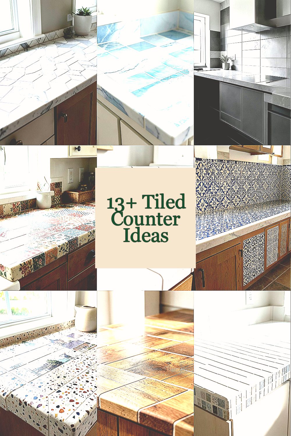
A tiled counter can change the whole mood of a space fast. With the right layout, it feels custom without the stress.
1. Herringbone Hero with Small-Format Tile

Pick a tight herringbone layout using small tiles for a lively, never-boring surface. The pattern adds movement, even when the color stays calm.
Choose tiles around 1 to 2 inches so the lines stay crisp. Use a warm neutral grout if you want a soft, cozy look, or a matching grout if you want it to feel seamless. For practical care, seal the grout lines if your tile is porous, and wipe spills quickly to prevent staining.
2. Coastal Waves with Light Blues and White Grout
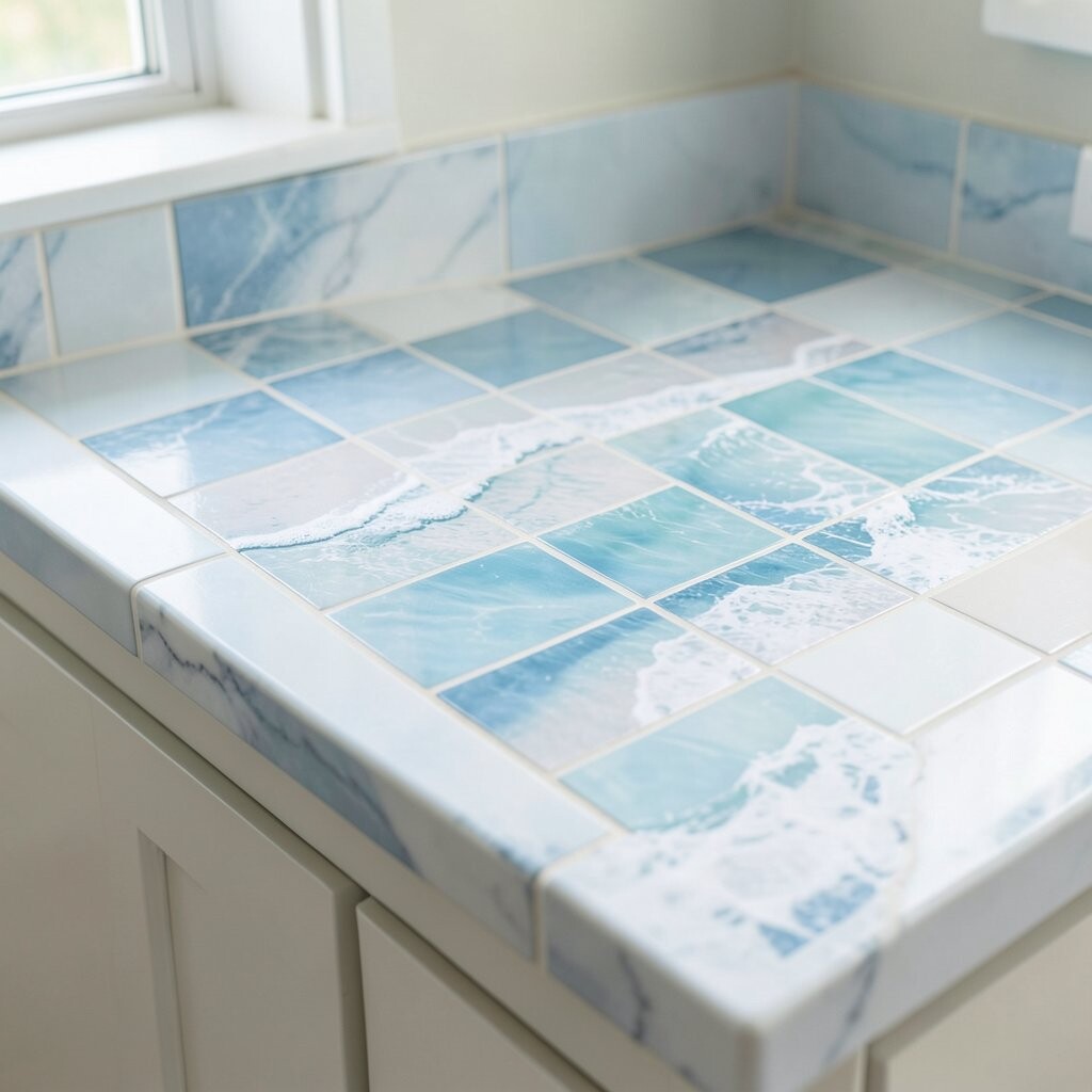
Create a counter that looks like gentle ocean ripples by mixing curved accents with flat fields. Light blues can make a kitchen feel brighter without heavy color blocks.
Use a mostly white or pale base tile, then add wave-shaped mosaics at the backsplash edge or along the front lip. Keep grout bright for contrast, but know that grout needs regular cleaning to stay fresh. A simple trend to match is “coastal clean,” which often pairs with matte fixtures and simple hardware.
Budget-wise, you can keep costs down by using accent waves only in a narrow strip. If you want personalization, select grout color that matches a countertop material elsewhere, like a quartz island or a painted cabinet hue.
3. Modern Monochrome with Oversized Rectangles

Go sleek by using large rectangular tiles in shades of gray, charcoal, or crisp white. Fewer grout lines make the counter feel modern and easy to maintain.
Try a staggered “brick” or straight grid for a clean look that still has rhythm. Use a grout that is close in color to the tile for a smooth visual flow. If you’re aiming for current styles, this look fits well with minimalist kitchens that use matte black faucets and simple cabinet fronts.
For personalization, add a thin metallic-look trim tile at the perimeter. Cost can vary, but oversized tiles often reduce installation time, which can help with labor prices.
4. Vintage Patchwork with Color-Limited Variety
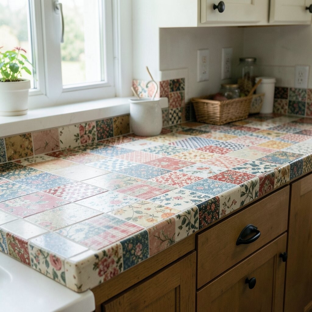
Use a patchwork style that mixes several small tile prints, but keep the palette limited. When the colors share a theme, it looks curated instead of chaotic.
Pick two or three complementary colors and repeat them across the counter so the design feels intentional. Consider using vintage-inspired ceramic tiles with a slightly glossy finish for that nostalgic charm. To keep maintenance reasonable, seal if needed and plan on gentle cleaning rather than harsh scrubbing that can dull older finishes.
5. Subway Tile Classic with a Twist: Gloss + Accent Line
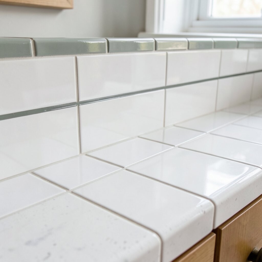
Subway tile has timeless appeal, and gloss can make it feel fresh and bright. A straight layout with a small accent line gives you a “designed” look without complicated patterns.
Use classic white subway tiles for the main field, then add a narrow stripe of a different color along the edge. A popular twist right now is using a muted accent like sage, terracotta, or deep navy. Keep grout color light for visual clarity and a crisp finish.
For practical tips, choose a grout type that resists stains and consider sealing for extra protection. If you want to personalize, match the accent line to your cabinet pulls or a nearby rug color so it all feels connected.
6. Moroccan-Inspired Geometric Panels
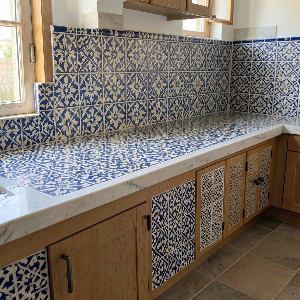
Bring in a bold, artistic vibe with geometric tile panels that feel like small mosaics. The repeating shapes can make a plain counter area look like a focal point.
Design it by framing the counter front or adding a central panel, then surround it with simpler solid tiles. Keep the rest of the kitchen neutral so the pattern stays the star. This style is great for hiding minor imperfections because the geometry naturally draws the eye.
7. Travel-Themed Terrazzo Look with Speckled Tiles

Terrazzo-style tiles bring speckled character and a modern, playful feel. They also hide everyday messes better than solid colors.
Look for tiles with a mix of small flecks in colors that match your cabinets or flooring. A practical advantage is that you can often get a “stone-like” effect without dealing with heavy natural stone. When installed with grout that blends into the specks, the surface can feel seamless.
For cost considerations, check whether the tiles come in larger sheets or mosaics, since sheet mosaics can be quicker to install. Personalize by picking fleck colors that echo natural wood tones, brass accents, or even your backsplash palette.
8. Warm Wood-Tone Tiles That Mimic Planks

Create cozy warmth using tiles that imitate wood planks. The counter will look inviting while still being more water-resistant than real wood.
Choose a tile pattern that runs horizontally across the counter face to emphasize width. Use a light grout to keep the planks feeling open and airy. If you love current design trends, wood-tone tile pairs nicely with matte hardware and soft beige walls.
To personalize, vary the plank colors subtly by selecting tiles from the same line but different batches, if the manufacturer allows it. Budget-wise, wood-look tiles can range widely, so compare the tile’s thickness and finish because those impact durability and slip resistance.
For practical care, use a pH-neutral cleaner so the finish stays smooth. Wipe up acidic spills like lemon juice quickly, since grout can darken if it repeatedly absorbs stains.
9. Minimalist Grid with Micro-Mosaic Border

Keep the main field simple with a clean grid, then add a micro-mosaic border for a refined detail. This gives you a “quiet luxury” effect without needing a complicated layout.
Use large tiles or medium rectangles for the body, then cap the edge with tiny tesserae in a coordinating color. A small border can be easier to personalize because you can swap just the accent strip. This style also works well in small kitchens since it doesn’t overwhelm the room.
10. Bold Color Blocking with Two-Tone Panels

Try a two-tone counter face where one side block pops and the other side stays calm. Color blocking can make the whole space feel more intentional and lively.
Map out a clear dividing line, like a horizontal band at countertop height or a vertical panel near a corner. Choose grout that matches the lighter tile to prevent the lines from looking too busy. For suggestions, use colors that appear in your kitchen already, such as navy accents, warm mustard tones, or deep green.
Cost is often manageable because this design uses fewer unique tiles than full patterns. Personalize by changing which cabinet color the “pop” matches, so the counter feels connected instead of random.
11. Hand-Painted Look with Subtle Brushstroke Tiles
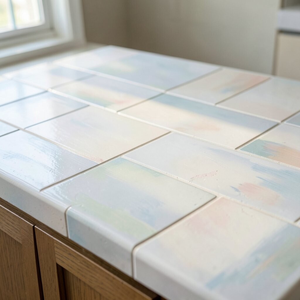
Add character with tiles that resemble hand-painted ceramics. The brushstroke effect makes the surface look like it has depth, even from a distance.
Keep the pattern subtle by spreading the painted tiles across the counter face rather than using them all at once. Choose a base color that blends with your backsplash so the counter feels cohesive. This style is unique because it reads as art, not just decoration, while still staying practical for daily use.
For practical tips, select tiles meant for walls but confirm they are rated for countertop or heavy-use applications if you’re installing on a surface where heat and impact matter. Consider sealing depending on the tile’s finish and your grout choice. If you want to personalize further, pick one shade from the “paint” and echo it in accessories like a utensil crock or a dish towel.
12. Classic Basketweave for Texture Without Loud Color
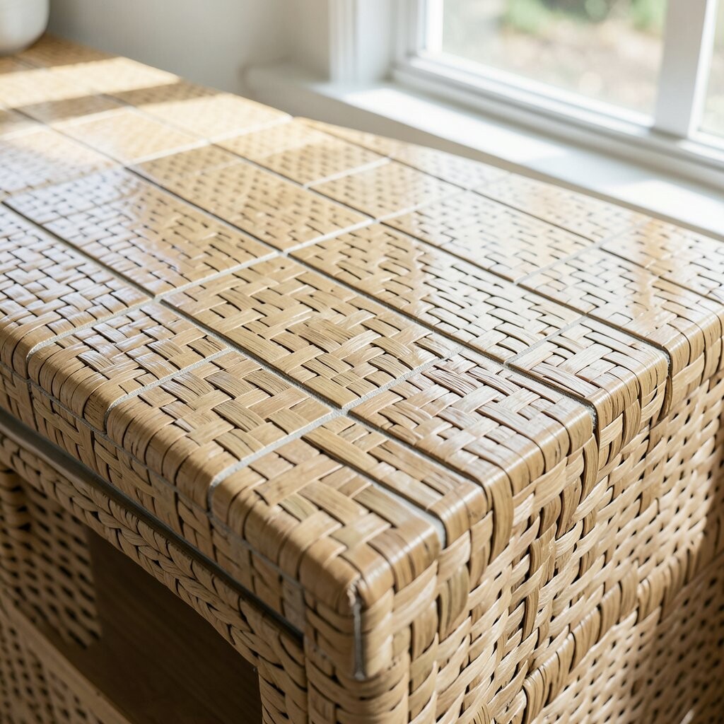
Basketweave tile brings texture and interest without demanding bold colors. It’s a smart choice if you want something tactile that still feels timeless.
Use earthy tones like cream, taupe, or muted gray to keep the look calm. Pair it with a slightly darker grout for definition, or choose matching grout for a smoother appearance. A practical advantage is that texture can hide tiny scuffs, but remember that textured tiles may require a bit more careful cleaning.
13. Sleek Stone-Look Marble Style with Vein Running Direction
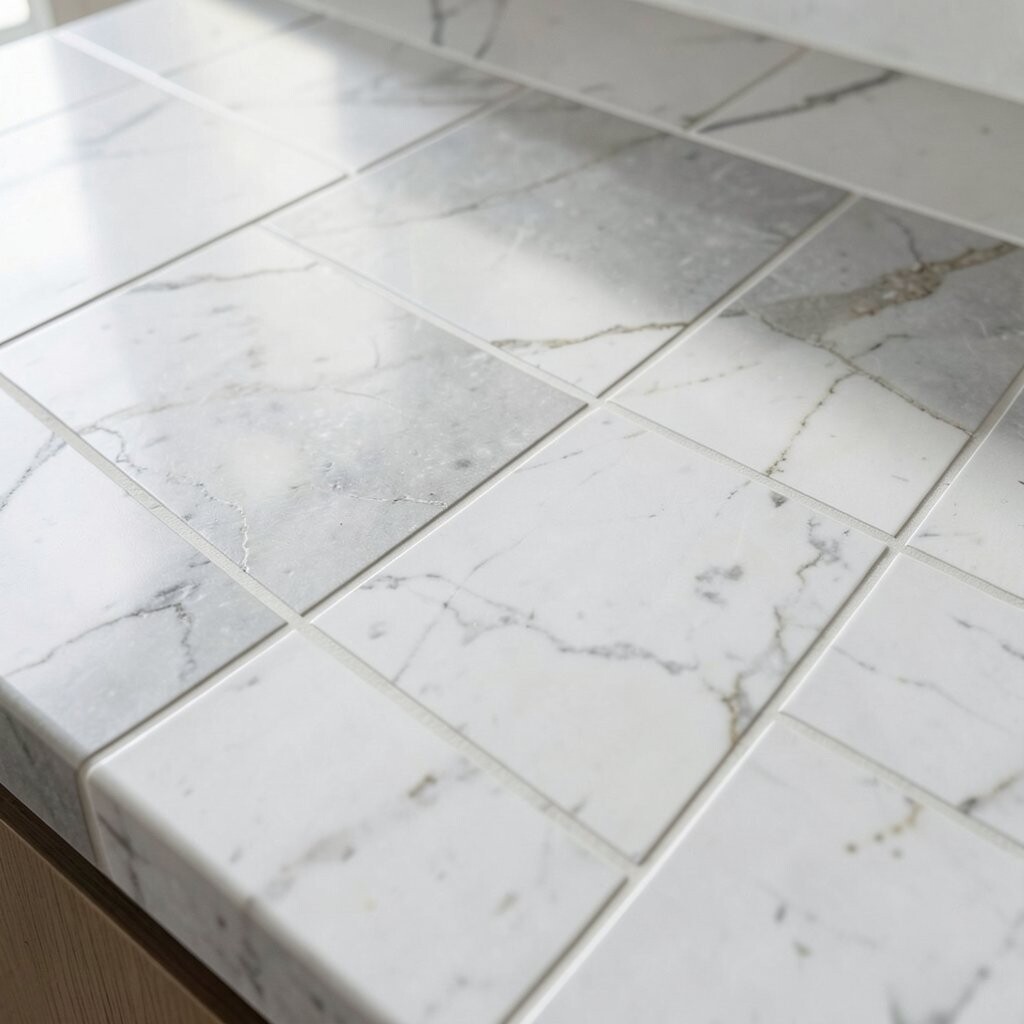
For a high-end feel, pick marble-look tiles and pay attention to the direction of the veining. When you line it up, the counter looks more premium and less “patterned.”
Plan a layout where the most dramatic vein lines meet in a pleasing way at corners or edges. Use grout that’s light and consistent so it doesn’t overpower the veining. This is a current trend because many people want the look of stone while keeping installation simpler and cost more predictable.
Cost considerations depend on tile quality and whether you get porcelain versus ceramic. Personalize by choosing a warm white marble look for softer rooms or a cooler white/gray option for crisp modern spaces.
For practical tips, use coasters and cut boards to protect the surface from scratches, even if it’s porcelain. Wipe up grease quickly since some stone-look finishes can show buildup over time.
14. Reflective Metallic Accent Tiles for a Light-Catching Edge
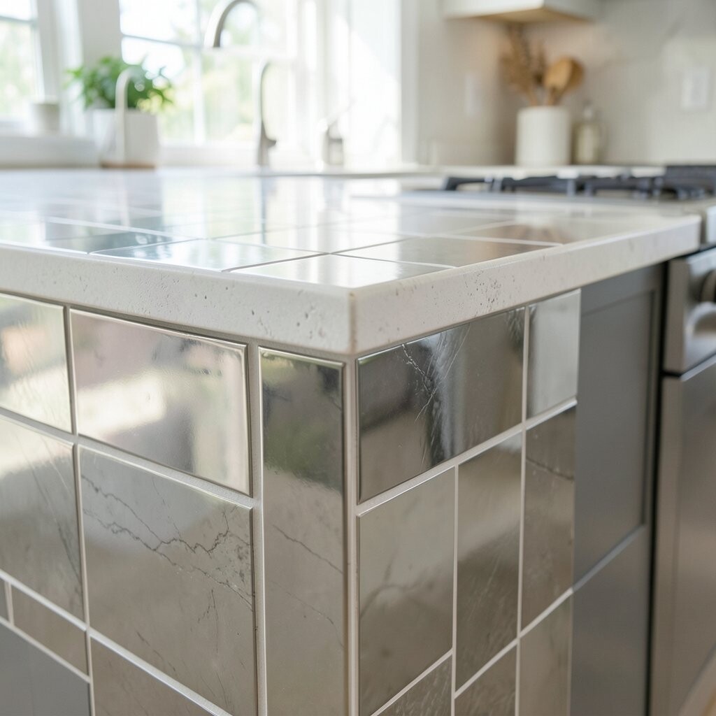
Add sparkle with metallic accent tiles placed along the counter edge or around a sink. The shimmer catches light and makes the whole kitchen feel brighter.
Choose a metallic finish that matches your hardware, like brushed brass, polished chrome, or a soft copper tone. Keep the main field simple—solid white or neutral stone-look—so the metallic detail stays elegant. For personalization, you can vary the accent placement by adding a small section near a coffee station or along the backsplash transition.
Cost can be higher for metallic tiles, so consider using them only in a narrow strip. For practical care, clean with a gentle non-abrasive product to avoid dulling the finish over time.
1. Herringbone Hero with Small-Format Tile

Pick a tight herringbone layout using small tiles for a lively, never-boring surface. The pattern adds movement, even when the color stays calm.
Choose tiles around 1 to 2 inches so the lines stay crisp. Use a warm neutral grout if you want a soft, cozy look, or a matching grout if you want it to feel seamless. For practical care, seal the grout lines if your tile is porous, and wipe spills quickly to prevent staining.
2. Coastal Waves with Light Blues and White Grout
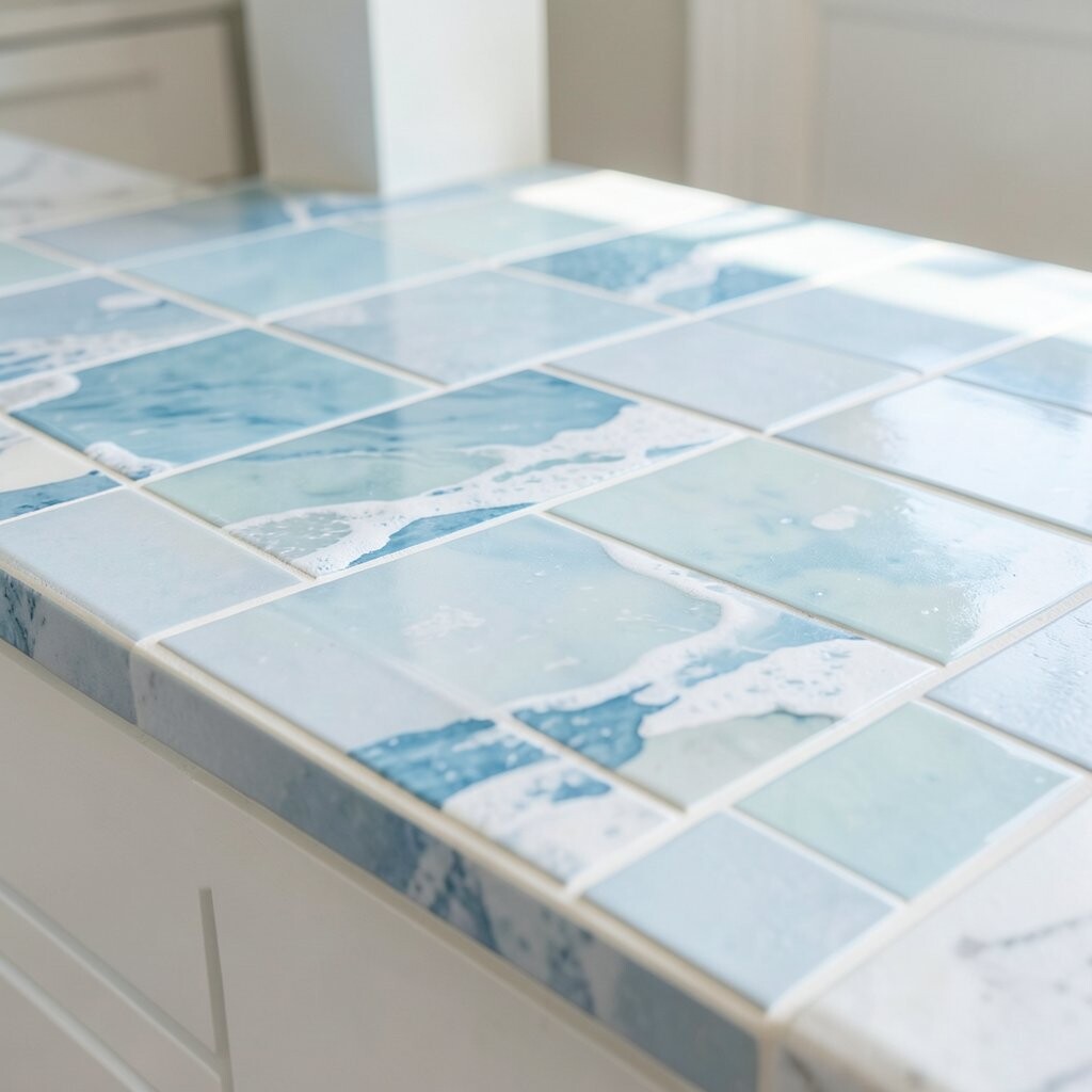
Create a counter that looks like gentle ocean ripples by mixing curved accents with flat fields. Light blues can make a kitchen feel brighter without heavy color blocks.
Use a mostly white or pale base tile, then add wave-shaped mosaics at the backsplash edge or along the front lip. Keep grout bright for contrast, but know that grout needs regular cleaning to stay fresh. A simple trend to match is “coastal clean,” which often pairs with matte fixtures and simple hardware.
Budget-wise, you can keep costs down by using accent waves only in a narrow strip. If you want personalization, select grout color that matches a countertop material elsewhere, like a quartz island or a painted cabinet hue.
3. Modern Monochrome with Oversized Rectangles
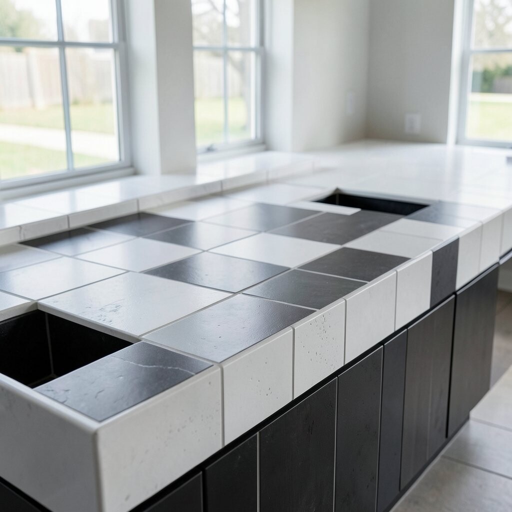
Go sleek by using large rectangular tiles in shades of gray, charcoal, or crisp white. Fewer grout lines make the counter feel modern and easy to maintain.
Try a staggered “brick” or straight grid for a clean look that still has rhythm. Use a grout that is close in color to the tile for a smooth visual flow. If you’re aiming for current styles, this look fits well with minimalist kitchens that use matte black faucets and simple cabinet fronts.
For personalization, add a thin metallic-look trim tile at the perimeter. Cost can vary, but oversized tiles often reduce installation time, which can help with labor prices.
4. Vintage Patchwork with Color-Limited Variety

Use a patchwork style that mixes several small tile prints, but keep the palette limited. When the colors share a theme, it looks curated instead of chaotic.
Pick two or three complementary colors and repeat them across the counter so the design feels intentional. Consider using vintage-inspired ceramic tiles with a slightly glossy finish for that nostalgic charm. To keep maintenance reasonable, seal if needed and plan on gentle cleaning rather than harsh scrubbing that can dull older finishes.
5. Subway Tile Classic with a Twist: Gloss + Accent Line

Subway tile has timeless appeal, and gloss can make it feel fresh and bright. A straight layout with a small accent line gives you a “designed” look without complicated patterns.
Use classic white subway tiles for the main field, then add a narrow stripe of a different color along the edge. A popular twist right now is using a muted accent like sage, terracotta, or deep navy. Keep grout color light for visual clarity and a crisp finish.
For practical tips, choose a grout type that resists stains and consider sealing for extra protection. If you want to personalize, match the accent line to your cabinet pulls or a nearby rug color so it all feels connected.