
A seasonal home can feel brand new with the right colors. These surprising pairings bring cozy style without needing a full makeover.
1. Sage-Gray With Burnt Sienna Accents

Sage-gray makes your space calm like fresh air on a breezy day. Burnt sienna adds warmth that feels like sunlit terracotta.
Use it in spring and early fall for a balanced look that never feels too bright. Try a sage sofa throw or slipcover, then add burnt sienna pillows and a small ceramic vase. To keep it cohesive, repeat the sienna in one lamp shade or one framed print so it feels intentional, not random.
2. Deep Teal, White Peach, And Ink-Black
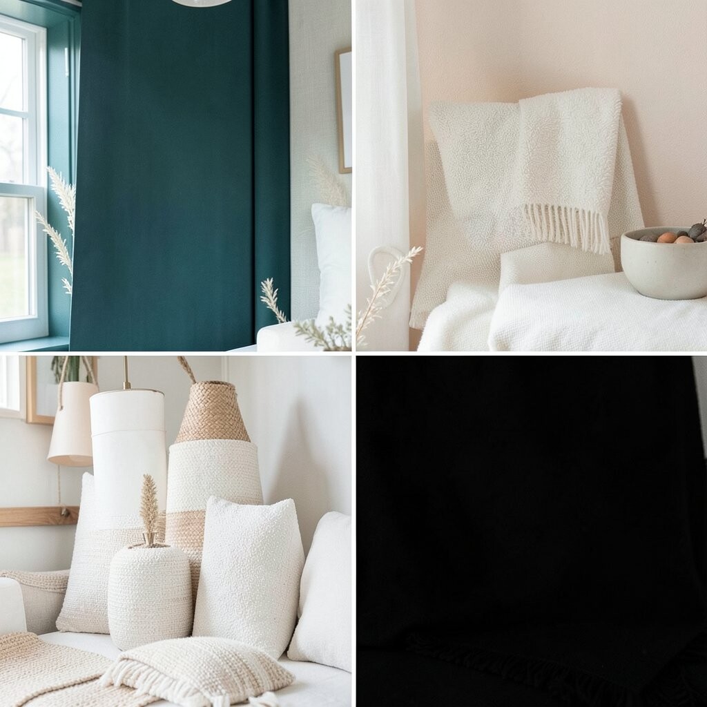
Deep teal feels rich and dramatic, even when the room is bright. White peach softens the mood so the palette stays welcoming.
Ink-black ties everything together and makes the teal look even more vivid. For practical style, choose a teal rug or curtains, then layer peach wall art and a few black picture frames. This combo is unique because it mixes cool, warm, and high-contrast tones without looking harsh.
If you’re watching costs, start with paint samples and one statement cushion cover. Current trend energy favors “bold base color + gentle accent,” and teal is trending in both modern and coastal homes.
3. Cornflower Blue, Soft Butter, And Mushroom Taupe
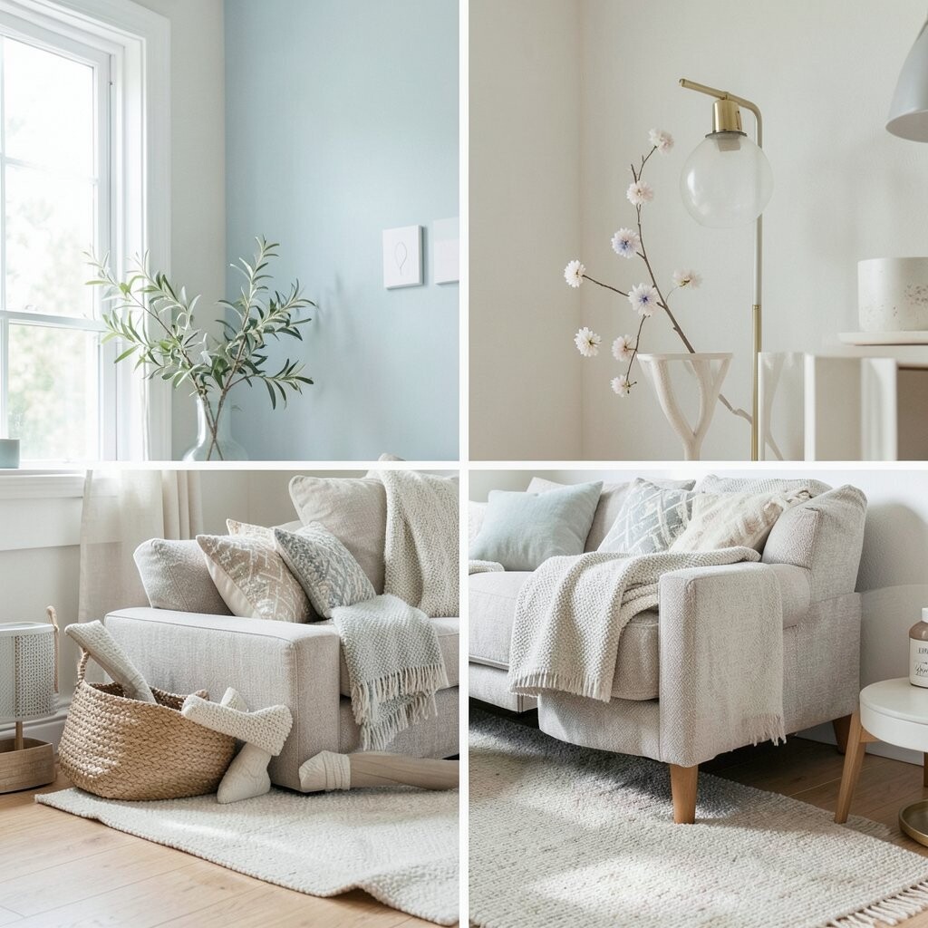
Cornflower blue brings a cheerful pop that still feels grown-up. Soft butter adds a sunny glow that looks great in daylight.
Mushroom taupe grounds the palette so it doesn’t tip into cartoon brightness. Choose a butter-colored knit throw and pair it with cornflower blue curtains, then finish with taupe baskets for storage. This palette feels like a spring picnic, but it works nicely all year.
For personalization, match the blue to your favorite denim shade and keep the taupe neutral in texture, like linen or boucle. Budget-wise, you can get a big change from a single curtain panel plus new throw pillows. A fun trend to follow is “pastels with earthy neutrals,” which keeps seasonal decor from looking temporary.
When you swap seasons, change only the accessories: use more blue in spring and add more taupe in fall.
4. Olive Green, Creamy Beige, And Rusty Pink
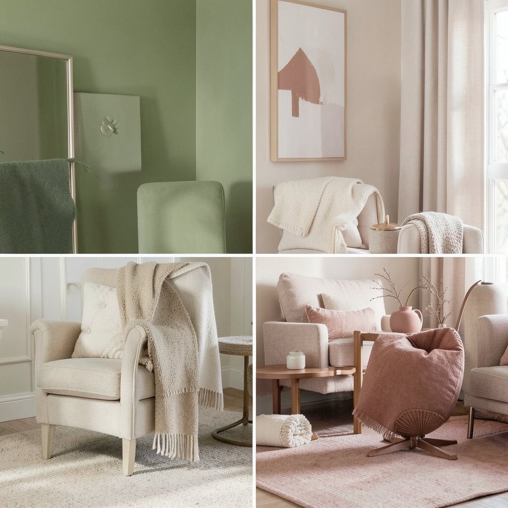
Olive green gives a natural, earthy vibe that feels timeless. Creamy beige keeps the room light and makes olive feel fresh.
Rusty pink adds a surprising romantic touch, like dried rose petals in a vase. Try olive accents in a wreath or curtains, then add beige bedding and small dusty-pink ceramics. Keep the pink muted, because a bright hot pink would fight the earthy greens.
5. Charcoal, Icy Lavender, And Warm Sand
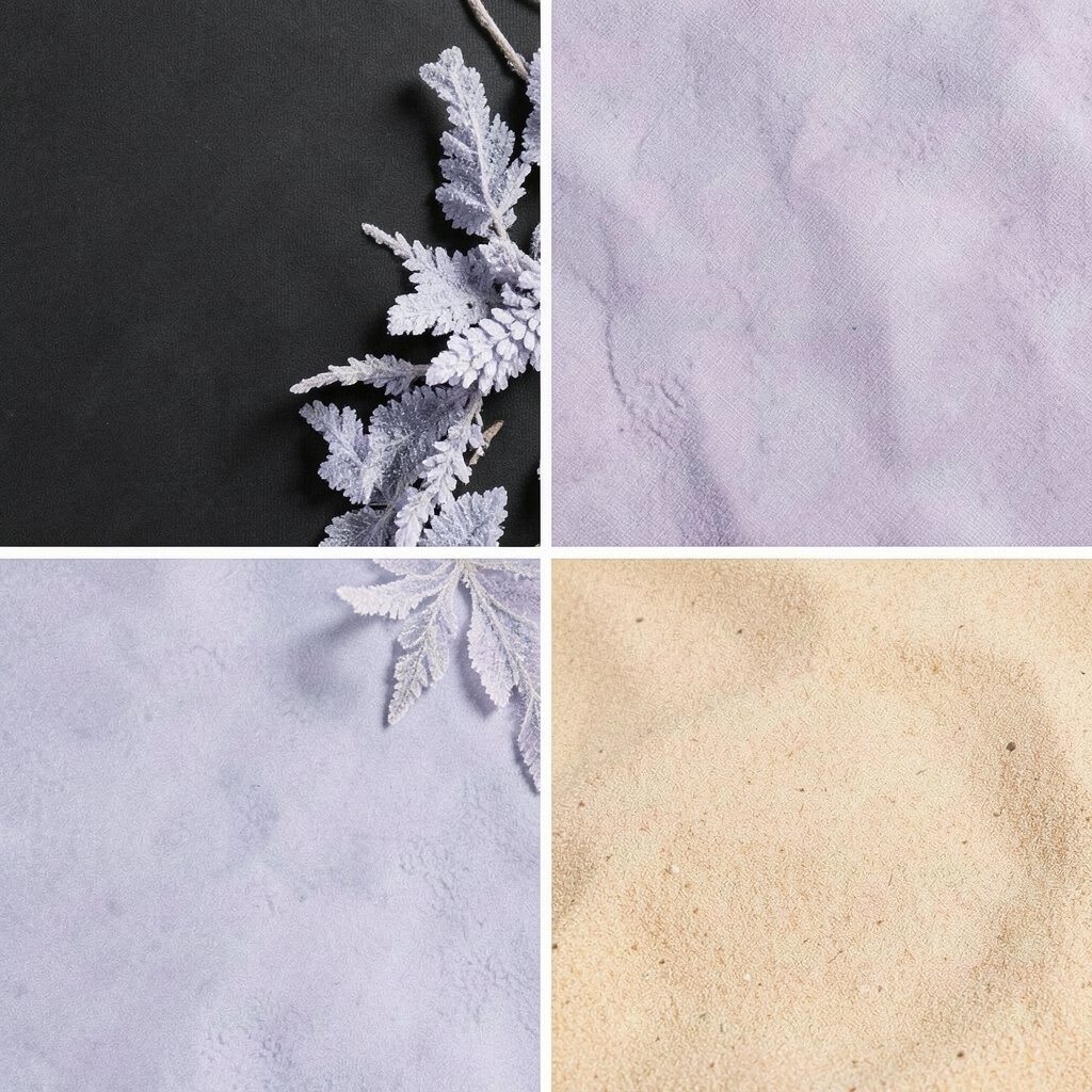
Charcoal brings a sleek, modern mood that works in any season. Icy lavender adds a gentle, airy color that feels like cool morning light.
Warm sand makes it cozy and prevents the palette from looking cold. For practical tips, paint one accent wall charcoal, then layer lavender curtains or bedding. Add sand-toned wood, like a console or side table, so textures do the heavy lifting.
This combination is unique because it balances a dark anchor with a delicate hue and a natural warmth. If you want to save money, swap textiles first: start with one bedding set and one area rug. Seasonal trend-wise, soft lavender tones are back, especially when paired with deep grays.
6. Blush Mauve, Evergreen, And Toasted Oat
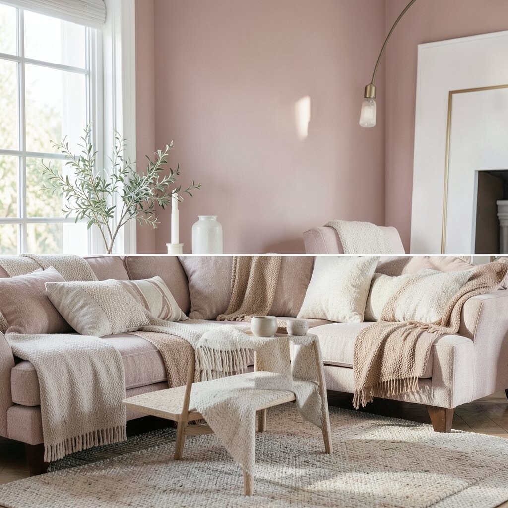
Blush mauve feels elegant and calm, like a gentle sunset. Evergreen adds that winter-ready depth without going full traditional.
Toasted oat warms the palette so everything stays soft and inviting. For a practical approach, use evergreen in pillows or a small accent chair, then bring in mauve through wall art and rugs. Add oat-colored throws for a cozy layer that works during chilly months.
Personalize it by choosing a mauve that matches your existing artwork—opt for “dusty” mauve rather than bright pink. Cost considerations are friendly here because you can get a full look by updating only bedding and one decorative blanket. The current trend is “soft color blocking,” and this palette delivers it in a gentle way.
7. Bright Coral, Seafoam Green, And Crisp White
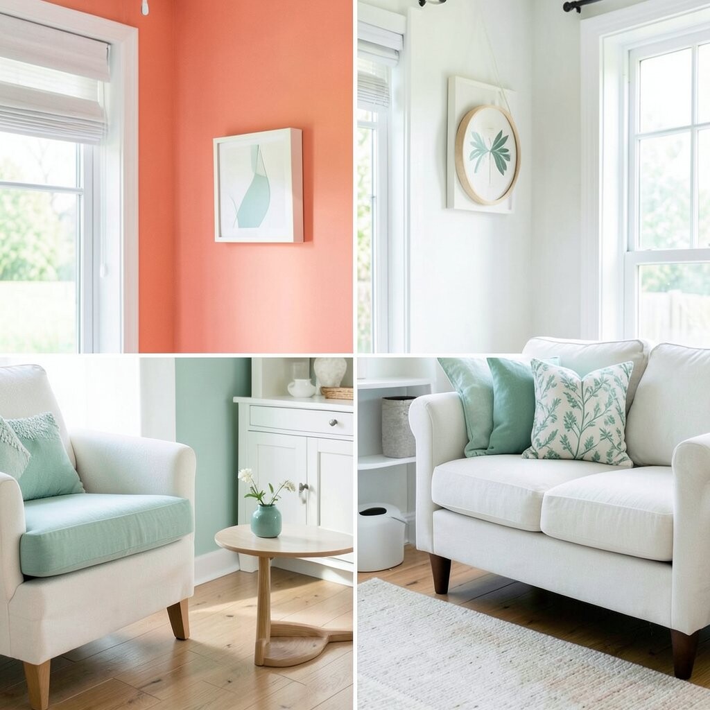
Bright coral energizes a room and instantly signals summer. Seafoam green feels light and fresh, like ocean mist.
Crisp white makes the colors pop while keeping the style clean. Use coral on a single statement piece like a sofa throw, then add seafoam through smaller accents like planters or a runner. White should show up in larger areas, like walls, trim, or linen curtains.
This palette is unique because it’s playful without feeling childish when you keep the white airy. If you’re budget-conscious, buy one coral pillow set and one seafoam ceramic cluster. Seasonal trend notes: coastal color schemes are popular, but many people keep them too traditional—this adds coral for a fresher twist.
8. Burgundy, Cream, And Antique Gold
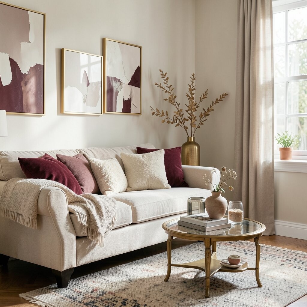
Burgundy feels rich and cozy, perfect for autumn evenings. Cream keeps the room bright and prevents the palette from feeling heavy.
Antique gold adds a soft glow that looks elegant in candlelight. Try burgundy in a table runner or curtains, then pair with cream bedding and gold-framed photos. This palette is unique because it mixes deep winter warmth with gentle vintage shine.
For personalization, choose gold accents with a matte or aged finish instead of shiny modern chrome. If cost is a concern, add gold through inexpensive items like picture frames, candle holders, and mirror accents. The trend is still leaning toward “warm metals,” especially aged gold and brushed bronze.
Swap the vibe by reducing burgundy for spring and keeping the cream and gold for a lighter seasonal feel.
9. Marigold, Slate Blue, And Off-White Linen
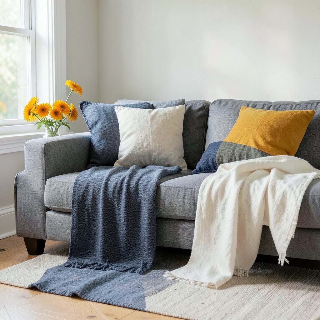
Marigold brings bold cheer and makes your home feel welcoming. Slate blue adds a grounded, slightly moody contrast.
Off-white linen softens the look and gives the palette a natural, breathable feel. To use it practically, start with marigold in accent pillows or a small rug, then add slate-blue curtains or a wall gallery. Keep the main larger surfaces off-white so the colors stay balanced.
This palette is unique because it pairs warm “sun” color with cool “sky” color, plus a soft fabric neutral. A budget-friendly way to try it is through seasonal table decor and removable art prints. Current trends favor warm yellows, but they’re often paired with grays and blues—slate blue is a stylish, modern choice.
When you personalize, match the marigold to your dining room theme so it feels like part of your everyday style.
10. Navy, Buttercream, And Forest Fleck
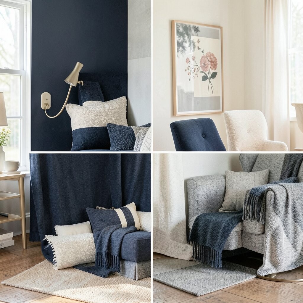
Navy is classic, but it can feel stuffy if you use only dark tones. Buttercream makes it feel friendlier and more seasonal.
Forest fleck adds that unexpected pop, like tiny leaves scattered across a window ledge. Choose navy as the base in bedding or a rug, then use buttercream on lampshades or curtains. Add forest fleck via small prints, textured ceramic pieces, or a patterned throw.
This palette is unique because the “fleck” color appears in small doses rather than taking over the room. If you want to stay within budget, focus on one patterned item and let the rest be simple solids. Trend-wise, people are moving toward deep colors with creamy, vintage-feeling neutrals.
11. Lilac Mist, Charcoal Dots, And Warm Wood
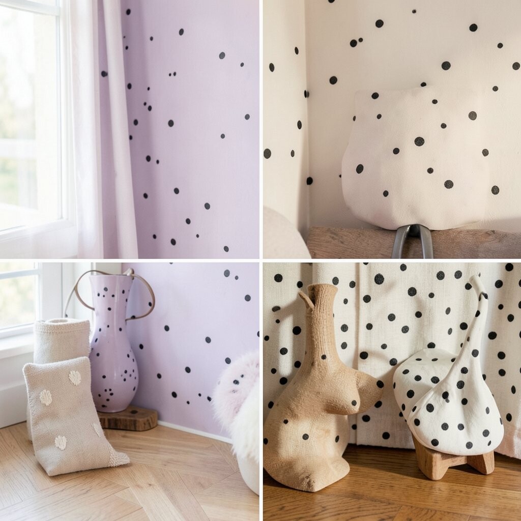
Lilac mist feels dreamy and light, ideal for spring or early summer. Charcoal dots add a playful, graphic edge.
Warm wood makes everything feel grounded and cozy. Use lilac in curtains or a bedding set, and keep the charcoal in items like a patterned pillow or a framed print. Add warm wood through shelving, a coffee table, or even picture frames.
This palette is unique because it treats a color like a background mood while using dots for structure. To personalize, pick a lilac that leans grayish if you want a calm look and more pink if you want a softer, romantic feel. For cost considerations, textiles are usually the cheapest way to test the palette before painting walls.
12. Terracotta, Cool Gray, And Celery Green
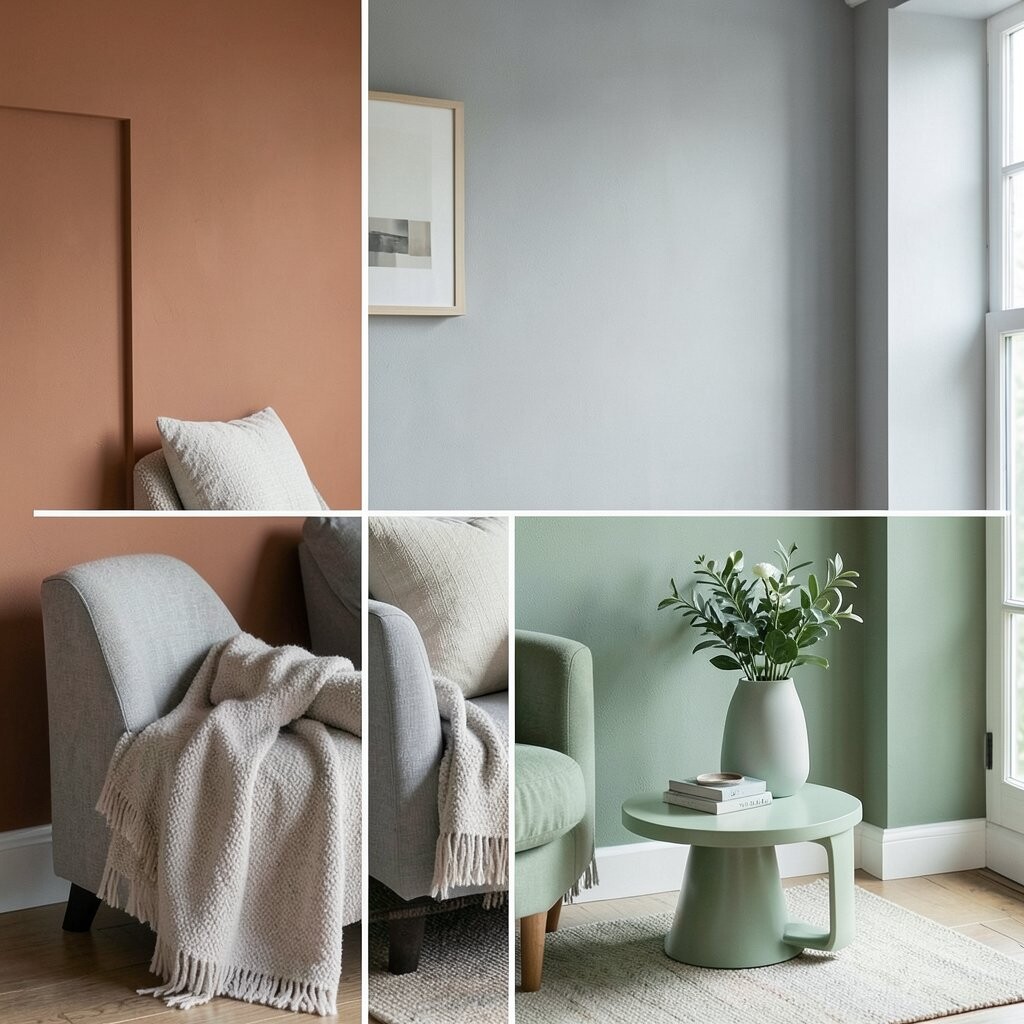
Terracotta feels like home, with a cozy earthy glow. Cool gray adds a modern calm that keeps the look from turning too rustic.
Celery green brings a fresh, unexpected “garden” note. Try terracotta in wall art or a clay-colored vase, then add cool gray through furniture upholstery or a rug base. Use celery green in small accents like a plant pot, candle label, or ceramic tray.
This palette is unique because it blends warm earth with a crisp, fresh green twist. If you’re planning a seasonal swap, keep the gray steady and rotate terracotta for fall and celery for spring. The trend right now is warm earth tones with a bright, punchy accent rather than a full set of matching neutrals.
Personalization tip: choose greens with yellow undertones for a more lively, bright seasonal feel.
13. Soft Black, Mint Leaf, And Pale Coral
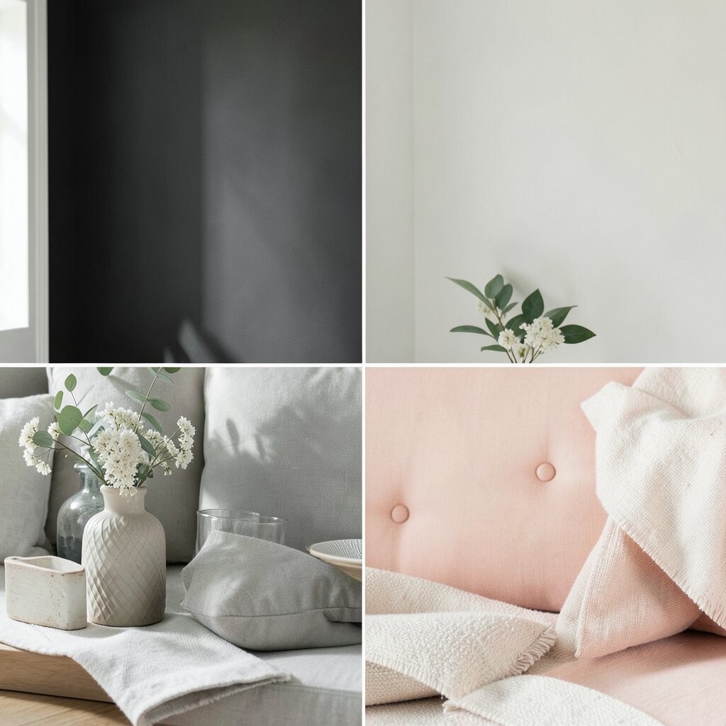
Soft black creates a stylish base that hides everyday mess well. Mint leaf adds a light, refreshing contrast that feels seasonal.
Pale coral brings gentle warmth so the palette stays cheerful. Use soft black in frames, lamps, or a media console, and add mint through bedding or curtains. Add pale coral in small decorative pieces like throw pillows or a centerpiece.
This palette is unique because mint and coral usually compete, but here pale coral keeps everything balanced. For practical tips, keep patterns minimal and let color do the work with clean lines. Budget-wise, updating throw pillows and a couple of accessories can change the entire mood quickly.
To personalize, use the mint color in your kitchen too, like a mat or canister, for a cohesive home vibe.
14. Powder Blue, Oatmeal, And Brick Red

Powder blue feels calm and airy, like a clear sky. Oatmeal adds a cozy neutral that looks great with natural light.
Brick red is the surprise accent that makes the palette feel warm and lively. Use powder blue on larger items like curtains or bedding, then layer oatmeal in rugs and throws. Add brick red through ceramics, a lamp base, or a small art print.
15. Olive Charcoal, Cream, And Tangerine

Olive charcoal is moody and sophisticated, like deep forest shadows. Cream softens the contrast and keeps the space bright and welcoming.
Tangerine adds a playful seasonal punch without going full orange. For practical use, paint cabinets or a built-in shelf with olive charcoal, then use cream textiles for balance. Add tangerine in small decor items like a bowl, seasonal sign, or accent pillows.
This palette is unique because it’s both grounded and exciting at the same time. Cost considerations are manageable since you can use peel-and-stick wallpaper or removable decor to test tangerine. Current trends lean toward “earthy darks with citrus pops,” and this pairing fits that style perfectly.
16. Sea Glass Teal, Light Gray, And Lemon Thread

Sea glass teal looks soothing and fresh, especially in bathrooms and entryways. Light gray keeps the tone airy and modern.
Lemon thread adds a small bright note like sunlight catching glass. To make it practical, use teal for towels, a shower curtain, or a rug, then add light gray in walls or larger furniture. Sprinkle lemon accents in small items like soap dispensers, trays, or chair cushions.
This palette is unique because lemon is used sparingly, so it feels like a highlight instead of a theme. For personalization, match the lemon shade to your favorite mug or artwork tones. If you want to keep costs down, focus on bathroom and tabletop accessories where changes are affordable.
Seasonal tip: in colder months, swap lemon items for buttery gold to keep the warmth.
17. Chocolate Brown, Sky Tan, And Sage Shadow
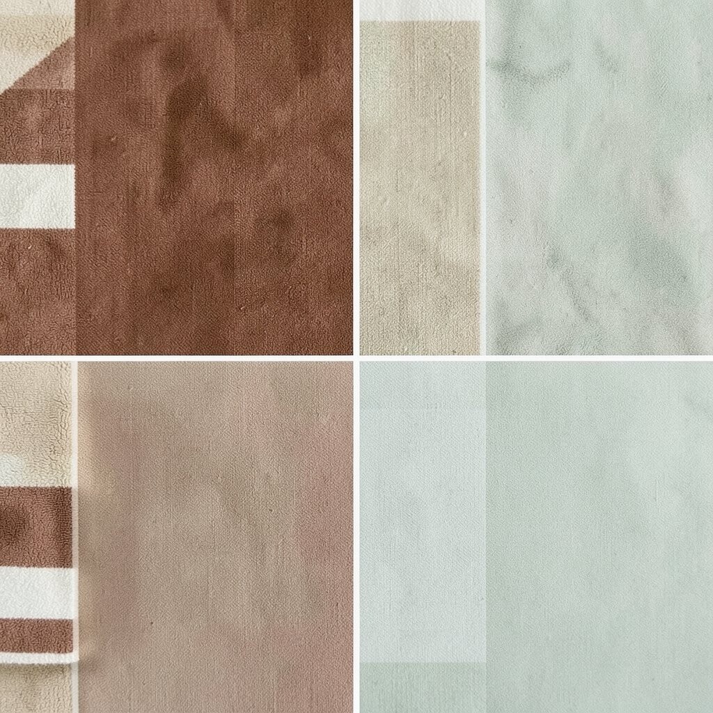
Chocolate brown brings comfort and a grounded, cozy feel. Sky tan adds a lighter tone so the room stays open.
Sage shadow gives a muted green accent that feels natural and calm. Use chocolate in wood furniture, leather items, or a rug, then balance it with sky tan walls or linens. Add sage shadow via plants, patterned curtains, or small throw pillows.
This palette is unique because it pairs deep browns with soft, slightly cool tan and a muted green. A practical tip is to use texture heavily, like knit throws and woven baskets, so colors blend naturally. Budget-wise, you can update decor with affordable woven items and change a lamp shade for quick impact.
18. Cranberry, Pale Mint, And Warm White

Cranberry gives a festive vibe that still feels stylish, not overly holiday. Pale mint makes it feel fresh and modern for transitional seasons.
Warm white prevents the palette from looking too stark and makes everything feel inviting. Choose cranberry in seasonal pillows or a table runner, then add pale mint through a wall color or smaller decor. Use warm white as your base on walls, ceilings, and large fabrics for a smooth look.
19. Charcoal Blue, Buttermilk, And Wildflower Violet
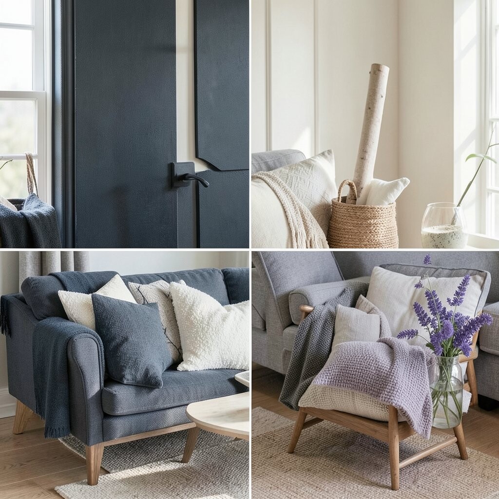
Charcoal blue feels calm but not boring, like the evening sky. Buttermilk adds a buttery softness that makes the room feel cozy.
Wildflower violet is the standout accent that adds personality and charm. For practical tips, paint a feature wall charcoal blue or use it in a rug, then bring in buttermilk through curtains and bedding. Add violet through art prints, vases, or a single patterned cushion.
This palette is unique because violet is bolder than lavender but still softened by the buttermilk. If you’re cost-conscious, use removable wall decals or swap framed prints rather than repainting. Trend-wise, saturated jewel-adjacent colors like violet are popular, especially when balanced with creamy neutrals.
20. Sandstone, Cool Navy, And Dusty Sky

Sandstone tones feel warm and grounded, like natural stone near the shore. Cool navy adds structure and a crisp contrast.
Dusty sky brings a gentle blue-gray that looks soft with both neutrals. Use sandstone as your base through paint or large textiles, then add navy in curtains, throw blankets, or metal decor. Bring in dusty sky through rugs, bedding details, or patterned accents that blend both blue and beige.
This palette is unique because it feels like a calm seaside story told with muted colors. Budget considerations are easy since you can keep big furniture neutral and update textiles seasonally. Personalization can be done by repeating navy in more than one spot, like a frame and a lamp to make it feel designed.
21. Raspberry Blush, Stone Gray, And Brass Sun
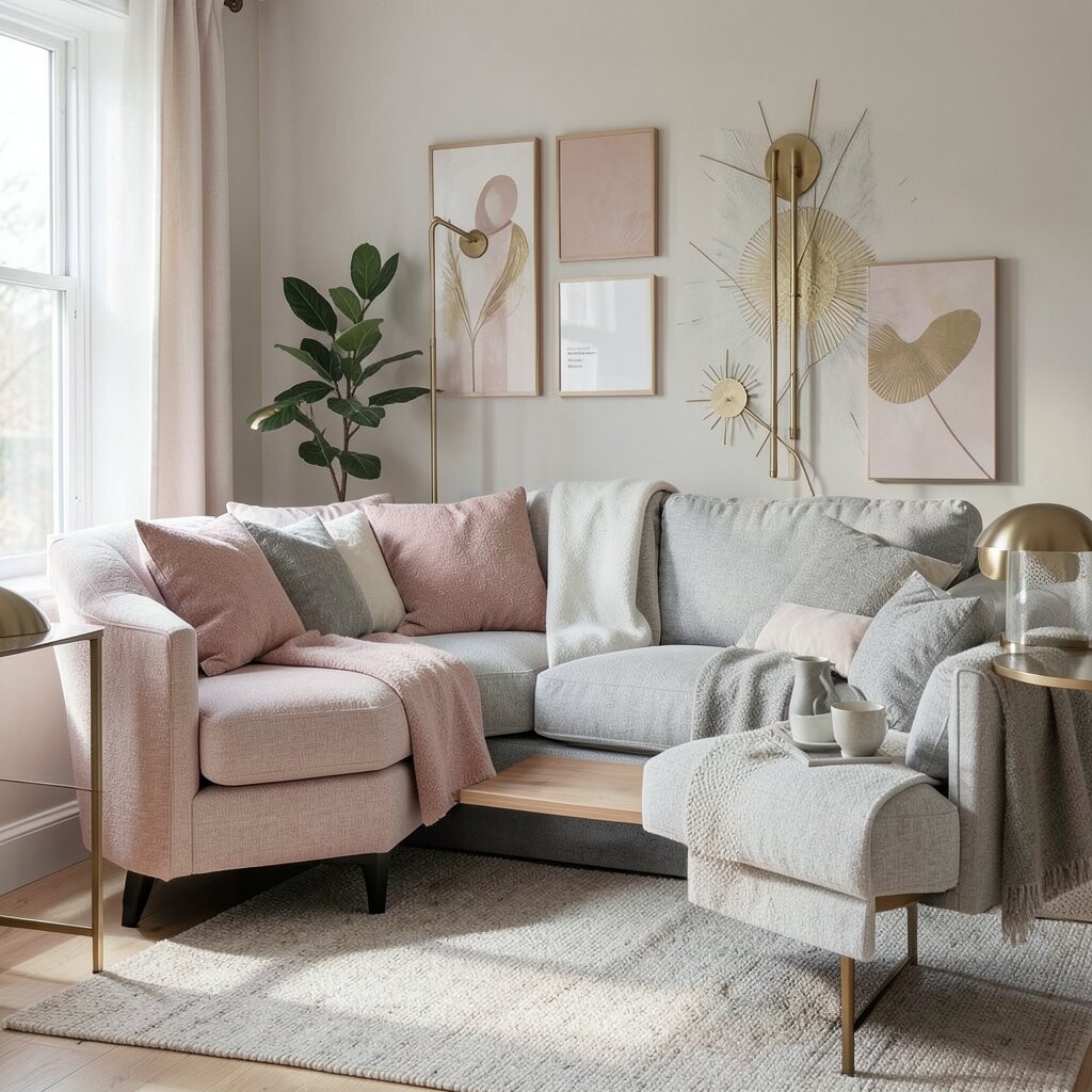
Raspberry blush brings a playful, sweet energy that feels perfect for spring decor. Stone gray keeps it modern and helps the color look refined.
Brass sun adds a warm shine that makes the room feel bright. Try raspberry in a throw pillow set or a wreath ribbon, then balance with stone gray on the walls or a large blanket. Add brass through candle holders, mirror frames, or small decorative hardware.
This palette is unique because it blends a fruit-forward blush with cool gray and warm metal highlights. Cost considerations: you can often get brass sun with budget-friendly items like trays and picture frames. The trend right now is using blush tones with metallics for a soft, festive look that isn’t too loud.
When personalizing, pick a raspberry shade that matches the warmth of your wood floors for a seamless feel.
22. Midnight Plum, Creamy Khaki, And Moss Olive

Midnight plum feels dramatic and cozy, perfect for evenings and colder months. Creamy khaki keeps it comfortable and stops the deep color from feeling dark.
Moss olive adds a natural accent that makes the palette feel earthy and alive. Use midnight plum in blankets, curtains, or a statement chair, then add creamy khaki through bedding and rugs. Finish with moss olive via plant leaves, textured baskets, or small ceramic pieces.
This palette is unique because it creates a “night garden” mood with rich purple and living green. For practical tips, choose fabrics with texture, like velvet or chunky knit, so the colors look rich without needing a lot of items. Budget-wise, start with one statement fabric and add olive accents through inexpensive decor, then build from there.