
Bright outdoor corners have a magic way of making everyday life feel like a holiday. Color can turn your yard into a comfy story you get to live inside.
-
1. Saffron Sunshine Marigold
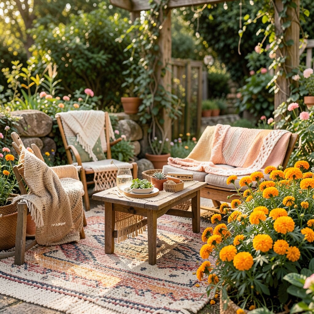
Saffron Sunshine Marigold Marigold yellow looks like warm tea in a cup, glowing even when the sky is gray. It pairs beautifully with woven textures, like rattan and natural jute, so everything feels lived-in and cheerful.
Use it on outdoor cushions, a small rug, or planters to bring instant energy to a seating zone. This hue helps lift moods and makes spaces feel more open, especially on covered patios.
Try layering marigold with deep green plants and white ceramic pieces for a calm, boho balance. If you want an easier budget win, start with removable items like pillow covers and outdoor trays.
-
2. Terracotta Clay Tiles and Pots
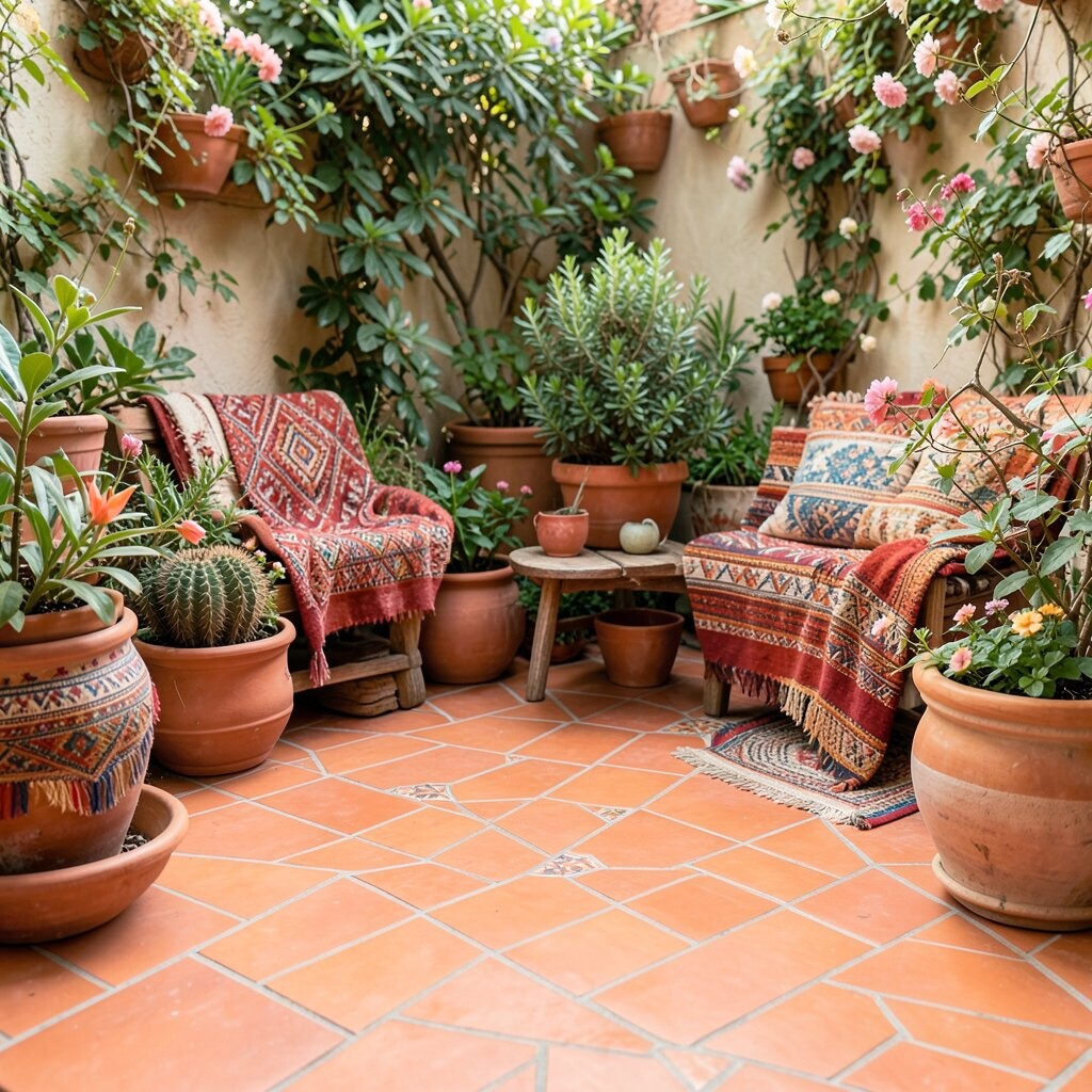
Terracotta Clay Tiles and Pots Terracotta looks earthy and honest, like sun-baked clay warmed by afternoon light. You’ll notice how it softens hard surfaces and makes wooden furniture feel cozier.
It’s also a great benefit-color for outdoor dining areas because it looks friendly next to food and glassware. A few clay pots can create a “designed” feel without covering the whole yard.
Match terracotta with teal accents, then add a light blanket in cream or sand. For trends, many boho outdoor looks now blend warm clay tones with hand-painted patterns, like dipped planters or small mosaic coasters.
-
3. Deep Ocean Teal for Calm Evenings
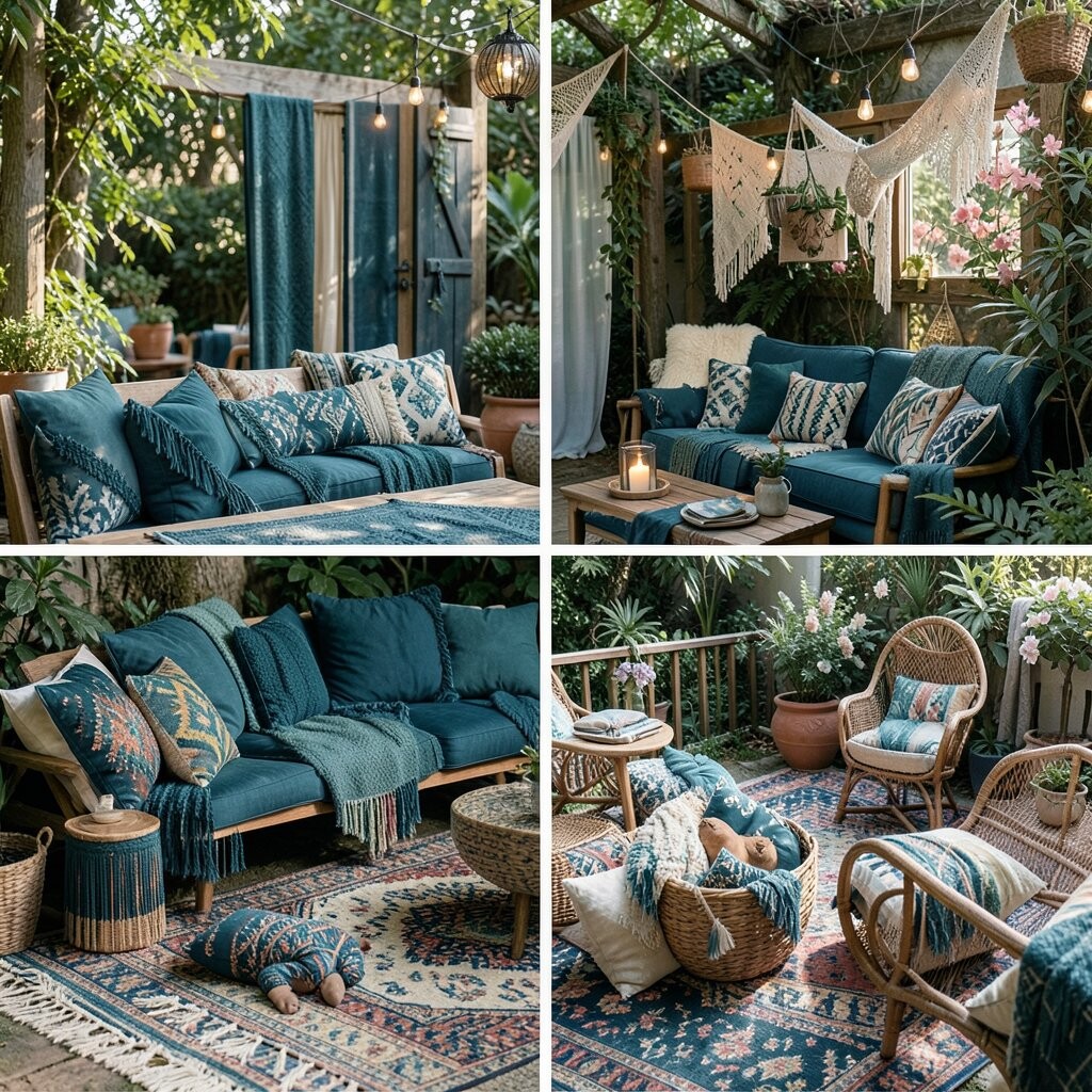
Deep Ocean Teal for Calm Evenings Teal brings the mood of a shaded lagoon to your patio. It looks rich against black metal, driftwood, and leafy greens.
Try a teal outdoor throw, a hanging lantern, or even a painted side table. The benefit is simple: teal can make evenings feel cooler and more relaxed, which is perfect for slow dinners and chats.
To keep it bohemian, mix teal with patterns like ikat, stripes, or small floral prints. If you’re cost-conscious, use fabric paint on plain cushions or thrift a teal frame and add a new liner.
Personalize it by matching teal with your favorite plant colors, like silver sage or dark purple basil.
-
4. Magenta Pop in Small Doses
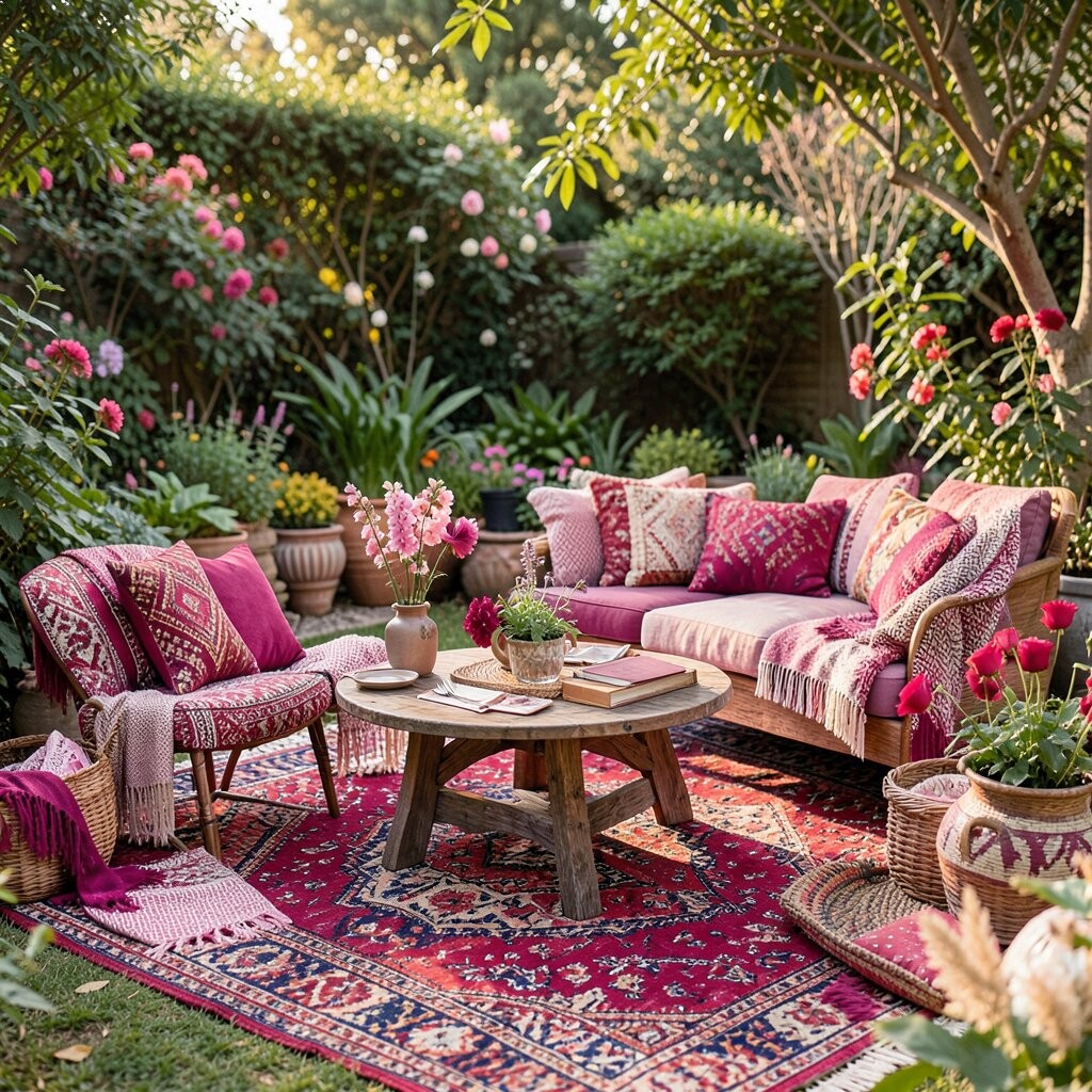
Magenta Pop in Small Doses Magenta adds a playful punch that feels like music in color form. It makes neutral furniture look more exciting without needing a full remodel.
Use magenta in a single focal spot, like a hammock strap, lantern shade, or a set of mismatched candles. This helps you control the vibe while still enjoying a bold look.
-
5. Emerald Green That Feels Like a Forest
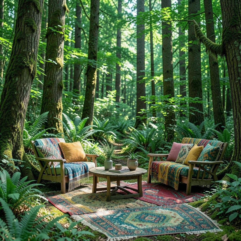
Emerald Green That Feels Like a Forest Emerald green is bold, but it still feels natural because it reminds you of mossy paths. When it shows up in textiles, it can make outdoor seating feel like a cozy nook.
Choose emerald for a larger piece, like a cushion set, a outdoor curtain panel, or a patterned rug. The benefit is that green tones help your space feel refreshing, and plants usually look even brighter nearby.
For uniqueness, mix emerald with warm browns and small touches of gold, like a candle holder or star-shaped decor. If you want a budget approach, swap one item at a time and use color-matched fabric clips for quick updates.
-
6. Dusty Rose for Soft Romantic Comfort
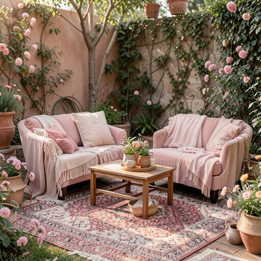
Dusty Rose for Soft Romantic Comfort Dusty rose is gentle and dreamy, like the color of a rose petal after sunset. It gives boho spaces a sweet, cozy feeling without looking too loud.
Pair dusty rose with cream, beige, and light wood tones for an easy, breezy setup. This color benefit is calm energy, making your yard feel peaceful for reading or family time.
Personalize with a mix of textures: macramé wall hangings, knotted poufs, and linen napkins. You can also spot a current trend—layering soft pinks with warm neutrals and natural greenery.
-
7. Sunlit Corn Yellow on Garden Corners
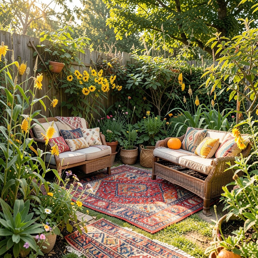
Sunlit Corn Yellow on Garden Corners Corn yellow feels bright and friendly, like late-morning sunshine. It works especially well on entry steps, side tables, or areas where people naturally pause.
Use corn yellow on small decor, like painted plant stands, wind chimes, or a low bench cushion. The benefit is quick visibility, so your space looks welcoming even from the sidewalk.
To keep it bohemian, add natural fibers around it, such as woven placemats and a fringe throw. If you’re watching costs, paint thrifted wood items and seal them for outdoor use.
Make it personal by choosing a shade that matches your flowers, like yellow marigolds or golden zinnias.
-
8. Indigo Blue for Artistic Depth

Indigo Blue for Artistic Depth Indigo blue feels deep and artistic, like denim, ink, and faraway skies. It creates an instant “gallery” vibe when used with patterned textiles.
Try indigo on a bold rug, a blue-and-white outdoor tablecloth, or hanging fabric panels. This shade brings depth, which can make small patios feel larger and more interesting.
-
9. Cinnamon Brown for Warm Grounding

Cinnamon Brown for Warm Grounding Cinnamon brown is a grounding color that makes your outdoor layout feel steady. It looks great with rattan, wicker, and natural wood because it belongs in the same warm family.
Use it as your base tone through planters, outdoor mats, or furniture finishes. The benefit is that brown helps other vibrant hues pop, so your teal or magenta looks even more vivid.
For uniqueness, add woven baskets in different browns and heights. For cost considerations, consider shopping for natural fiber pieces that can be found in many price ranges and then adding thrifted color accents.
-
10. Golden Brass Shine for Boho Glam
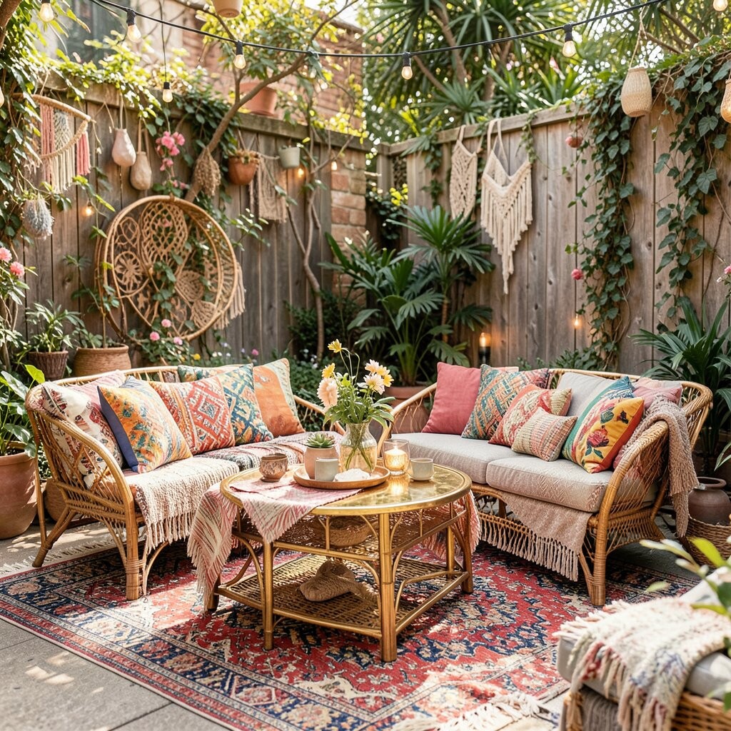
Golden Brass Shine for Boho Glam Golden brass tones look like late-day light catching on metal. Even simple details like hooks, tray handles, or lantern frames can look fancy in a boho way.
Pair brass with jewel-toned cushions and rich greens for a lively contrast. This benefit is glow: your outdoor space feels brighter and more special when light hits shiny accents.
Current trend-wise, many outdoor setups now mix boho craft elements with light glam, like brass planters and warm amber lighting. To personalize, keep brass accents to one theme, like “brass only” for small decor so the look stays tidy.
-
11. Lavender Calm for a Dreamy Corner
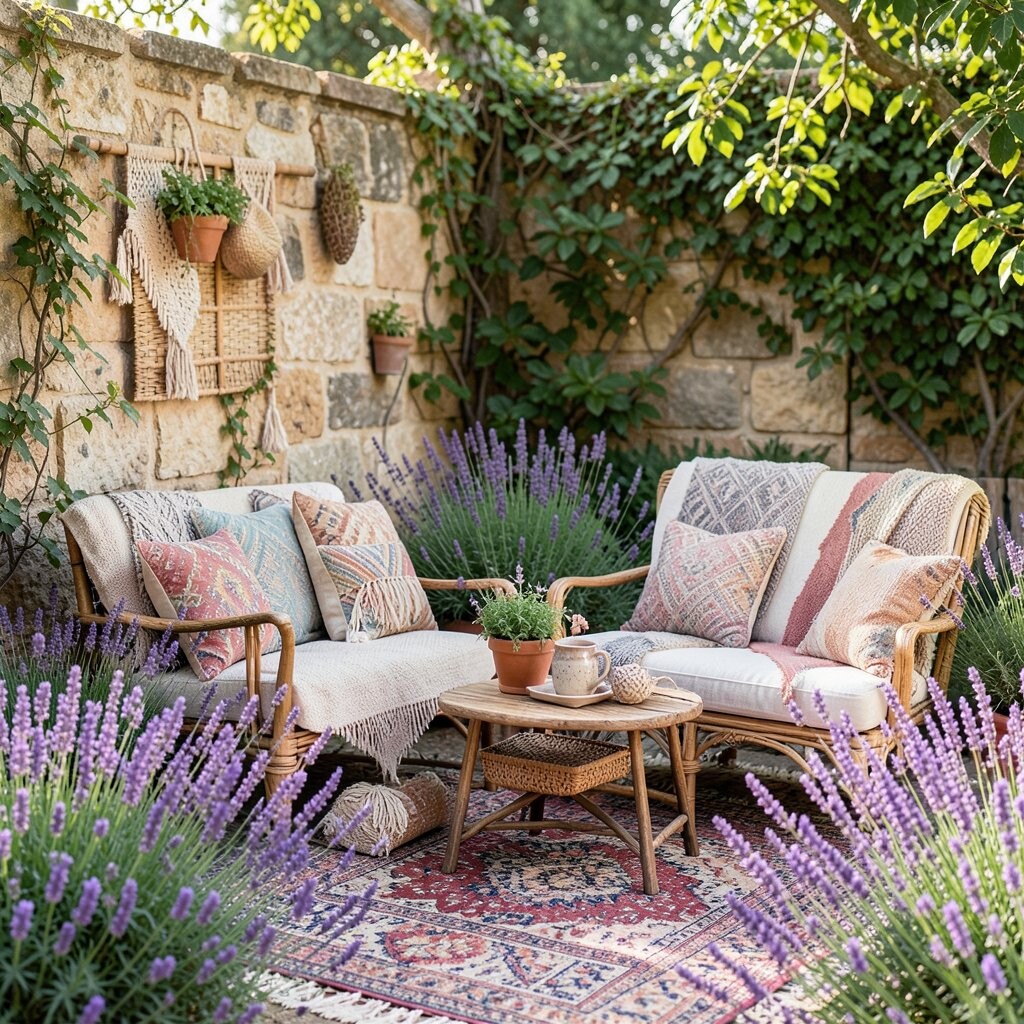
Lavender Calm for a Dreamy Corner Lavender feels airy, like a soft breeze you can see. It makes garden seating feel gentle, especially when paired with light walls or pale wood.
Try lavender in cushions, outdoor rugs, or a sheer curtain near a pergola. The benefit is a soothing mood, which is great for morning coffee or slow evenings.
For uniqueness, combine lavender with sage green and warm beige, then add a few patterned pillows in small lavender motifs. If you want to keep costs low, use spray fabric dye on plain outdoor cushions that are made to handle weather.
Make it personal by choosing lavender that matches your flower garden, like lilac blooms or purple petunias.
-
12. Cherry Red for Bold Energy
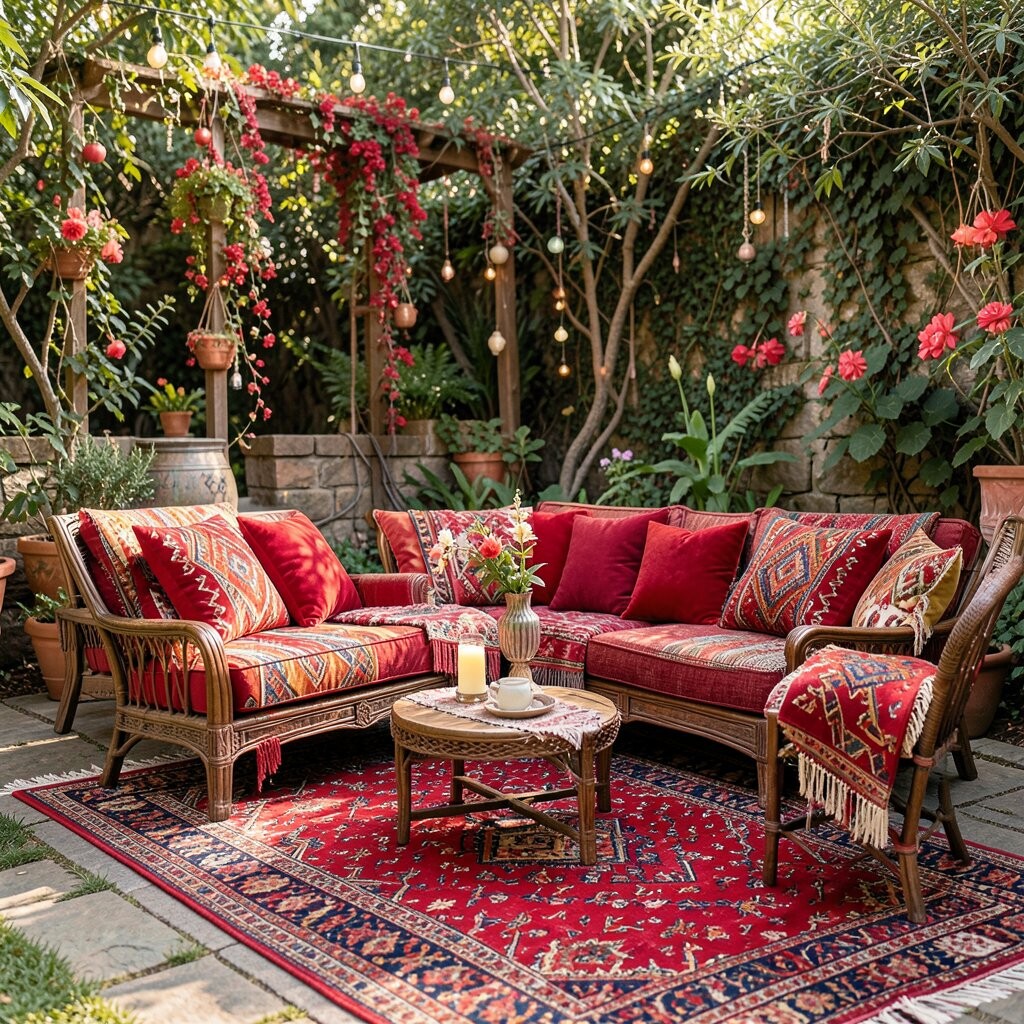
Cherry Red for Bold Energy Cherry red is dramatic and full of confidence, like a painted door on a sunny street. When used in boho outdoor spaces, it can turn a simple chair into a statement.
Use cherry red carefully: pick one feature such as a chair, a side table, or a cluster of outdoor cushions. This benefits your space by adding excitement while keeping the rest of the palette steady.
-
13. Emerald and Gold Mustard Mix for Vintage Vibes
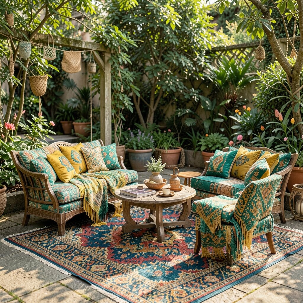
Emerald and Gold Mustard Mix for Vintage Vibes This color combo feels like a vintage market stall under warm lights. Mustard yellow brings cheer, while emerald green keeps it grounded and rich.
Try mustard and emerald in a patterned throw or a rug with mixed tones. The benefit is versatility—these hues work well together and also make plants look vibrant.
For uniqueness, add vintage-inspired details like distressed wood planters and small brass candle holders. Cost-wise, search for secondhand textiles or grab a bold runner rug that does most of the styling work.
-
14. Charcoal and Smoke Grey for Modern Boho Balance
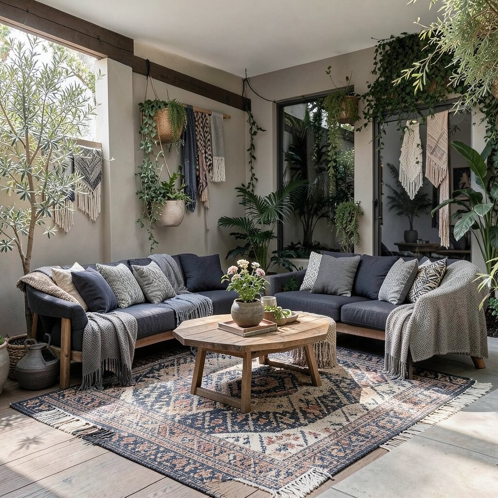
Charcoal and Smoke Grey for Modern Boho Balance Charcoal grey can make bohemian spaces feel more polished. It’s like the “pause button” that lets bright colors breathe without taking over.
Use grey in outdoor cushions, a protective cover, or a rug with subtle pattern. The benefit is that it hides dirt and wear, which is especially helpful if you live where it rains or storms come through.
Personalize with bright accents on top, like turquoise lanterns or orange throw pillows. Current trend notes: many outdoor design looks now blend moody greys with handwoven textures and colorful art pieces for a balanced style.
-
15. Tangerine for Playful Patio Pops
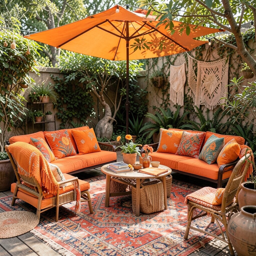
Tangerine for Playful Patio Pops Tangerine looks like fresh fruit and warm afternoons. It adds instant fun to any outdoor gathering spot.
Use tangerine on small, movable pieces like seat cushions, outdoor lanterns, or a table runner. This benefits your space by making it feel energetic while still letting you swap items when seasons change.
To keep it boho, combine tangerine with cream, natural fiber browns, and leafy greens. For cost considerations, look for fade-friendly fabrics and focus on pieces that you can cover or store during harsh weather.
Personalize by matching tangerine with your outdoor art, like colorful pottery or handmade wall hangings.
-
16. Royal Purple for Regal Nights
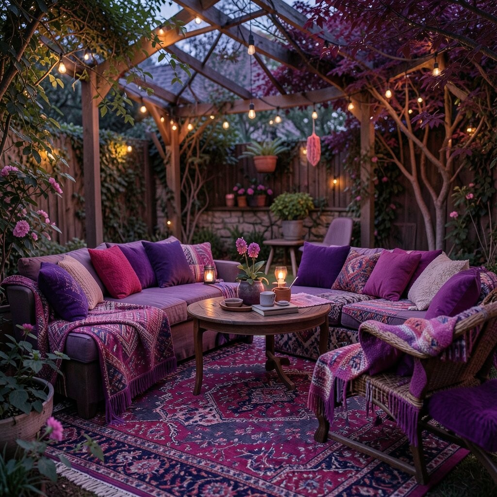
Royal Purple for Regal Nights Royal purple feels bold and theatrical, like evening velvet. It can create a dramatic mood for night-time dinners and candlelight chats.
Use royal purple in a statement item, like a patterned rug, a fringe curtain, or a set of mismatched cushions. The benefit is impact: purple makes your outdoor space feel special, even with simple decor.
-
17. Coral Orange That Feels Like Sunset

Coral Orange That Feels Like Sunset Coral orange is warm and friendly, like the sky right before it turns dark. It works well with boho styles because it sits between bright and soft.
Add coral orange through planters, outdoor tableware, or a cozy throw blanket. The benefit is that coral creates a welcoming glow, and it looks lovely against green leaves and blue ceramics.
For uniqueness, mix coral with turquoise and light sand tones for a beach-meets-boho vibe. If you’re budgeting, choose a coral outdoor rug or one big textile piece, since one anchor item can carry the whole look.
-
18. White and Natural Linen for Airy Texture
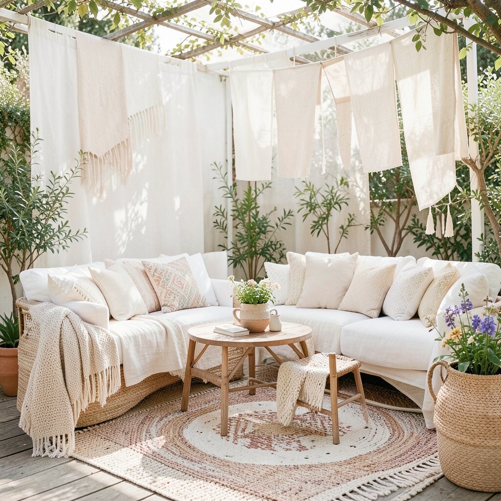
White and Natural Linen for Airy Texture White and natural linen might not sound “vibrant,” but they make every bright hue feel richer. They also give your outdoor space breathing room, like clean pages in a colorful notebook.
Use white linen in table settings, airy curtains, or layered throws. The benefit is lightness: your patio looks fresher and less crowded, even when you have many colors.
Personalize by adding subtle embroidery, macramé knots, or fringe edges in colors you love. For cost considerations, linen-look outdoor fabrics can give the vibe for less money, and they often mix well with both modern and vintage boho styles.
-
19. Peacock Teal, Green, and Blue for Maximal Magic

Peacock Teal, Green, and Blue for Maximal Magic Peacock-inspired teal, green, and blue create a bold, dramatic feel like feathers in motion. It’s perfect for a true bohemian look where patterns and color live happily together.
Bring this hue in through a peacock-patterned outdoor pillow set, a bold runner rug, or a gallery wall of colorful planters. The benefit is that it turns your space into a “wow” moment, and it gives you a fun color story to repeat across decor.
To keep it from feeling too busy, anchor the look with neutral baskets, natural wood, and a few solid-color textiles. If you want the trend feel, add one statement piece with mixed jewel tones, plus warm lighting like amber string lights for extra magic at night.
Personalize by choosing a peacock palette that matches your favorite leaf colors, then repeat one shade in at least three spots so it feels intentional.