Picture mint-green walls that look soft and airy, like fresh air on a sunny day. The color pairs beautifully with warm white trim and light wood furniture.
Mint can make small rooms feel bigger and calmer. It is a current favorite because pastel tones look modern, not heavy. Try painting only the main wall first if you want a gentle start.
If you have light curtains, mint will make them look even brighter. For personalization, add a gallery of simple line drawings in black, gray, and a tiny pop of coral. Keep an eye on cost by choosing matte paint and borrowing tools like rollers if you can.
2) Bold Terracotta for a Cozy, Earthy Hug
) Bold Terracotta for a Cozy, Earthy Hug
Imagine terracotta walls that look like warm clay, with hints of orange and brown. Under daylight, they glow; at night, they feel snug and inviting.
This trend is loved for its warmth and easy styling. Terracotta also hides scuffs better than very light colors, which is great for busy homes. To keep it from feeling too intense, use it on a feature wall or pair it with cream or sandy tones.
Want it to feel unique? Add a subtle texture with a decorative roller, like a light stucco look. Match accessories with brass, terracotta planters, and natural baskets. Budget-wise, you may spend more on primer if your walls need extra prep, but the payoff looks rich.
3) Sapphire Accent Panels With Fluted Texture
) Sapphire Accent Panels With Fluted Texture
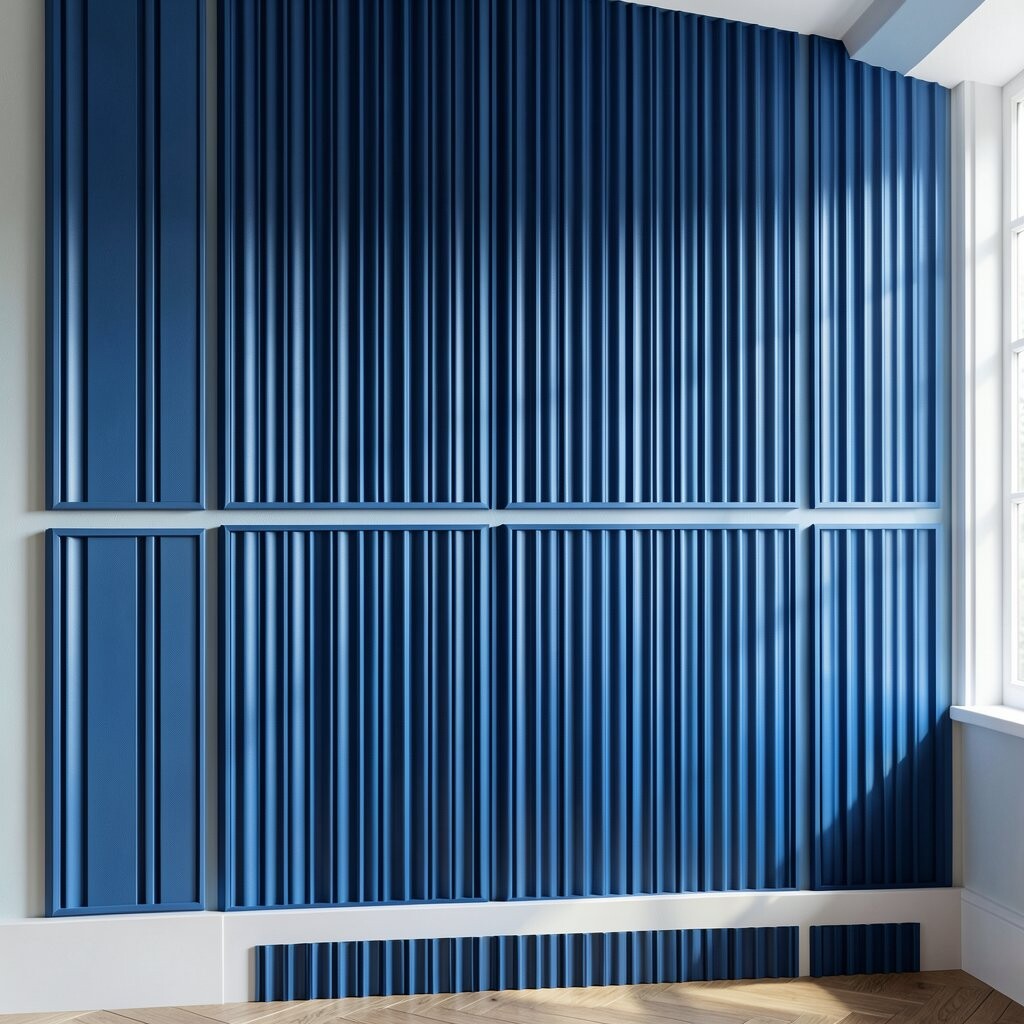
Sapphire-blue panels can feel like velvet, especially when the wall has a little texture. Think vertical fluted lines that catch light and create depth.
Blue is trending again in a big way, and this style makes it feel special. You can use paint plus simple wall paneling strips to get the look. The benefit is that it adds interest without covering the whole room in heavy color.
For personalization, choose a slightly different blue tone for the panels and keep the rest neutral. Add a round mirror or a slim console table to bounce the color around. Consider cost by using peel-and-stick or pre-primed strips if you want an easier installation.
If you rent, removable panels are a smart way to keep things flexible. Finish with painter’s tape edges for clean lines. Then style with light-colored art so the blue stays the star.
4) Sunburst Yellow Behind a Shelf
) Sunburst Yellow Behind a Shelf
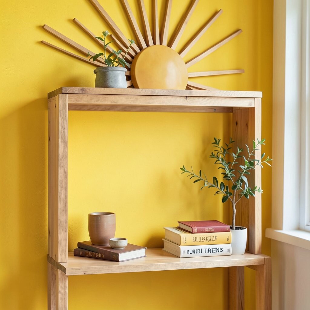
Think of a bright yellow back panel that looks like sunshine, especially behind open shelving. It instantly makes books, dishes, and baskets pop.
Yellow walls are a classic mood booster, and the current twist is using them as a backdrop. This helps you brighten your space without painting every wall. Tip: test a swatch at different times of day because yellow can look different in morning versus evening light.
To personalize, add a small accent color in the shelf decor, like navy or teal. A simple pattern, such as chevron shelf styling, can look playful. Cost is usually manageable since it is a smaller area, and you can often finish the job in one weekend.
5) Deep Emerald Green With Brass Details
) Deep Emerald Green With Brass Details
Picture emerald green walls that feel luxurious, like a jewel box. When paired with brass light fixtures, the whole room looks more polished.
Green is having a moment because it feels calm, natural, and stylish. It is also great for creating a focus area, like a dining nook or reading corner. Keep the benefit strong by using matte paint to reduce glare and keep the color looking rich.
For personalization, add a few framed mirrors with thin brass frames. Choose wood tones like walnut or oak so the green feels balanced. Budget-wise, a small room can be more expensive to repaint if you need many coats, so plan for extra time and primer.
6) Color-Blocked Corners for Instant Personality
) Color-Blocked Corners for Instant Personality
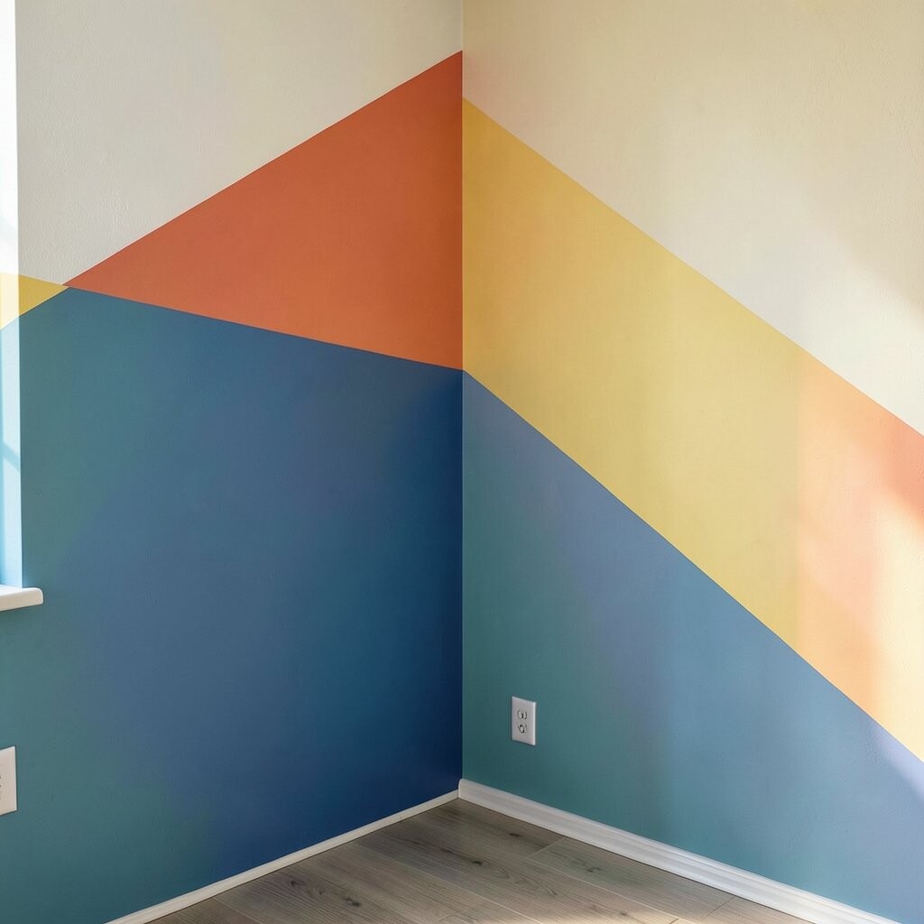
Try painting just the corners in a lively color, like coral or cobalt, while keeping the main walls a soft base. The room looks designed, even when you keep the rest simple.
This approach is unique because it creates “movement” without overwhelming the space. Color-blocking is trending because it feels modern and artistic. For tips, use painter’s tape carefully and keep the lines straight, even if the colors are bold.
You can personalize with tiny repeating shapes, like little half-circles on a single corner. Choose a base wall color that matches your furniture, and let the corners be the fun surprise. Cost considerations are friendly here because you are using less paint and covering less surface area.
If you want a softer look, use sponge blending at the tape edge so the colors fade slightly. That trick keeps things playful and less harsh.
7) Ombre Walls That Fade Like a Sunset
) Ombre Walls That Fade Like a Sunset
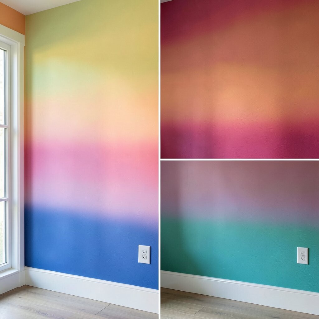
Imagine your wall fading from warm peach at the top into a gentle cream below. The effect looks like a sunset drifting indoors.
Ombre is still popular because it feels dreamy and relaxing. It benefits your space by adding color without making everything loud. To do it, blend in sections and use a dry brush technique so the transition stays smooth.
Personalize by choosing your own “time of day” palette: sunrise pink, afternoon coral, or evening plum. Add neutral furniture and one patterned throw to complete the look. Budget-wise, ombre can be a little more work, but paint costs are similar to any multi-coat project.
8) Wallpaper Accents With Bold Botanical Prints
) Wallpaper Accents With Bold Botanical Prints
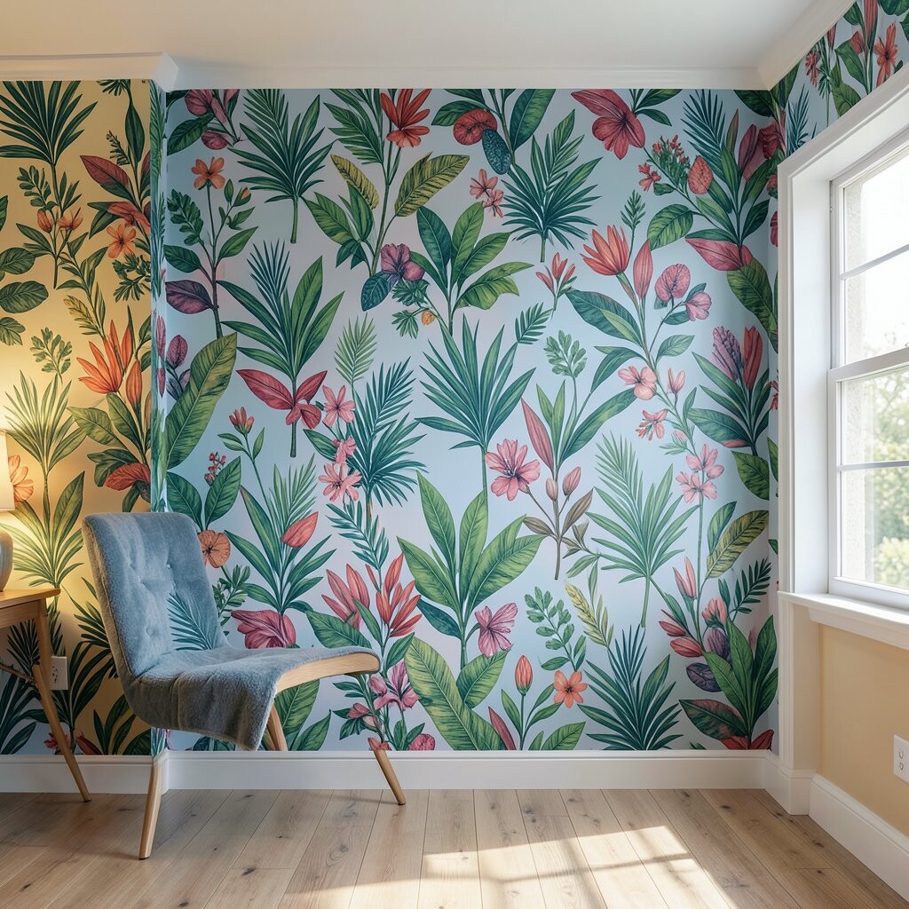
Picture a wall covered in lush botanical leaves that feel bold, fresh, and slightly dramatic. The greenery can look like it is growing right into your room.
Botanical prints are a big trend because they bring nature vibes without needing real plants everywhere. Wallpaper accents can be easier than full painting, especially if you pick an easy-to-match pattern. Tip: choose a wall that gets good light so the print shows off its detail.
Personalization is simple: pick a print style that matches your personality, like tropical, classic garden, or modern line art. Pair it with solid curtains and simple decor so the leaves stay clear. Cost depends on the brand, but accents are often more budget-friendly than covering an entire room.
9) Checkerboard in Fresh Colors for a Playful Kick
) Checkerboard in Fresh Colors for a Playful Kick
Think about a checkerboard wall that uses bright but friendly colors, like aqua and buttery yellow. Up close, it looks crisp; from far away, it feels fun and energetic.
This idea is unique because it turns a wall into art. It benefits your space by adding rhythm, and the grid makes styling easier since patterns repeat. For tips, measure carefully and use a level so each tile line stays straight.
Want personalization? Swap classic black-and-white for colors that match your sofa or rug. For cost, you can do a smaller panel behind a desk rather than covering an entire room. Use painter’s tape and test a small section first to confirm your color choices.
Seal the surface if needed, especially in high-traffic areas. Then hang art that follows one color from the checkerboard so everything feels linked.
10) Color-Blocked Bookshelf Backing With Hidden Depth
) Color-Blocked Bookshelf Backing With Hidden Depth
Imagine your bookshelf back panel painted in a bold color while the shelves stay neutral. Every book looks brighter because the background is vivid and clean.
This trend works well because you get a colorful “frame” for your things. It benefits your space by reducing visual clutter in a fun way. Tip: choose one main color and one supporting tone, so the result feels intentional.
Personalize by matching the back color to an accent in your rug, bedding, or pillows. Consider painting the back panel only, not the shelves, to keep costs lower. You can also use removable wallpaper panels if you love changing style over time.
11) Lemony Accent Strip for a Clean, Modern Look
) Lemony Accent Strip for a Clean, Modern Look
Picture a narrow strip of lemon yellow running along the wall, like a bright highlight. It feels modern, neat, and surprising.
An accent strip is trending because it adds color without making the room feel smaller. The benefit is control: you can go bold in a small area and keep the rest calm. Try placing the strip where eyes naturally land, near chair rails or above a baseboard.
For personalization, add a matching detail in the room, like a framed print or a throw pillow in the same lemon shade. Cost considerations are great here since you need less paint and fewer supplies. Use painter’s tape for sharp edges, and consider a semi-gloss finish for easy wipe-down.
If your wall has flaws, a strip can hide imperfections by pulling attention up. Keep the strip width consistent for a crisp, designer vibe.
12) Moody Plum With Soft Lighting for Cozy Nights
) Moody Plum With Soft Lighting for Cozy Nights
Imagine rich plum walls that look elegant and a little mysterious. With warm lamps, the space feels like a calm lounge.
This color trend brings depth and makes art look more dramatic. The benefit is a “cocoon” feeling, which many people love in bedrooms and reading spaces. Tip: pair plum with warm neutrals like cream, taupe, or soft gray to avoid a cold look.
Personalization ideas include adding gold or copper frames and choosing bedding with subtle texture, like velvet or boucle. Cost can be managed by painting only the main wall or doing two-tone sections. If you use dark paint, plan on extra coats for full coverage, especially on lighter walls.
13) Chalkboard Wall in Fun Colors for Everyday Creativity
) Chalkboard Wall in Fun Colors for Everyday Creativity
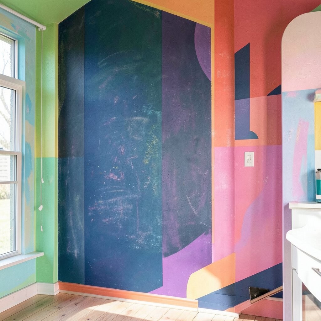
Picture a chalkboard wall that lets you write menus, reminders, or doodles in bright chalk. It looks artsy and turns daily life into something colorful.
Chalkboard surfaces are unique because they are both decoration and function. The benefit is that you can personalize constantly without repainting. Choose a chalkboard paint in green or dark slate, then add colored chalk markers for extra pop.
For tips, use painter’s tape to create a clean rectangle and seal the edges properly. Keep a small chalk tray on a nearby shelf so it feels convenient. Cost considerations are usually moderate, and you can keep the board small if you want to control budget.
To make it feel modern, mix handwriting with simple icons like stars and check marks. This helps your wall stay neat instead of messy.
14) Retro Pink Panels With a Modern Base
) Retro Pink Panels With a Modern Base
Think of retro-inspired pink wall panels that feel playful but not childish. The room looks charming when you keep the rest in clean, modern neutral tones.
This trend is popping because it blends nostalgia with fresh design. The benefit is that pink can feel welcoming, especially in spaces where you want warmth. Tip: use a muted blush or dusty rose so it stays classy.
Personalize with geometric art or a patterned rug that repeats one of the pink shades. If you want a cheaper path, paint panel lines with a slightly darker pink instead of building real paneling. Budget-wise, you can start with one wall and add more panels later if you love it.
15) Terrific Teal With Whitewashed Wood Accents
) Terrific Teal With Whitewashed Wood Accents
Imagine teal walls paired with light wood that looks airy and bright. The combination feels beachy, fresh, and full of energy.
Teal is trending as a “happy middle” between blue calm and green freshness. The benefit is that it works in many styles, from modern to cottage. For tips, use crisp white trim so teal stays vivid and clean.
Personalize by adding woven textures, like rattan baskets, and art with ocean-inspired shapes. Cost considerations are manageable because teal can be done on one wall, then repeated in small decor items. If you are painting, remember to prime if your wall is uneven or has stains.
In rooms with less natural light, choose a slightly brighter teal to keep things open. Then finish with warm bulbs for a flattering glow.
16) Colorful Top Trim for a “Crown” Effect
) Colorful Top Trim for a “Crown” Effect
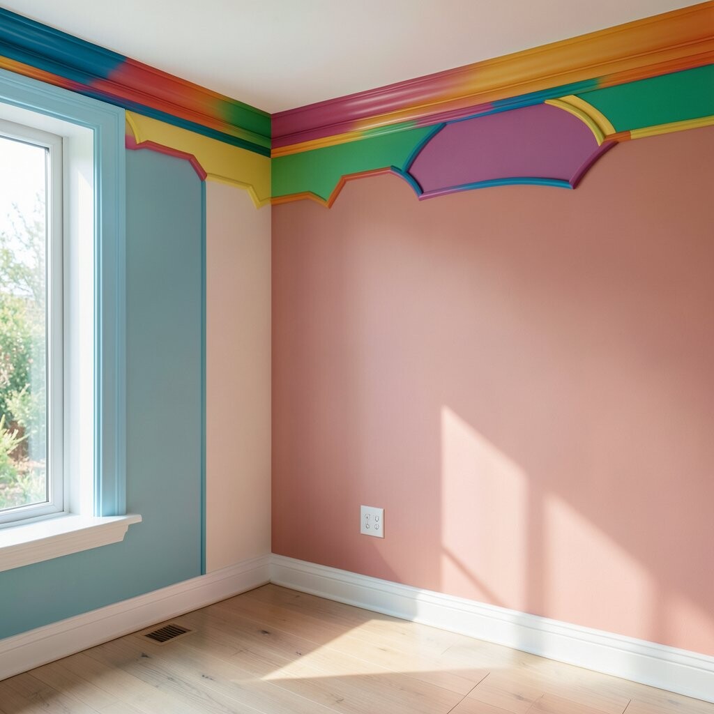
Picture a wall painted in a soft neutral, while the top border glows in a vivid color. It looks like your room is wearing a crown.
This idea is unique because it frames your walls without blocking sight lines. The benefit is that rooms feel taller and more polished. Tip: decide if you want a subtle band or a wider stripe, then keep the color consistent across the room.
Personalize by matching the top trim to your favorite metal, like gold or black hardware. Consider adding a matching accent on a picture frame edge or lamp base. Cost is usually low because you paint less area, and tape makes clean lines easier.
17) Dramatic Red Statement Wall With Neutral Everything Else
) Dramatic Red Statement Wall With Neutral Everything Else
Imagine a red statement wall that looks bold, warm, and full of confidence. With neutral furniture, the red becomes a striking focal point.
Red is trending in design because it adds energy and personality fast. The benefit is motivation: it can make a room feel like it has momentum. Tip: choose a red tone that matches your space, like brick red for warmth or true red for high contrast.
For personalization, add artwork with cream mats and simple frames so the red stays clean. Use soft lighting and avoid too many competing patterns. Cost considerations include planning for primer and possibly two or three coats for strong coverage, especially over pale walls.
If you worry about commitment, paint a removable mural panel first and see how you feel after a week. That way, the color stays exciting, not stressful.
18) Soft Gray With a Bright Color Wash Over Art Niches
) Soft Gray With a Bright Color Wash Over Art Niches
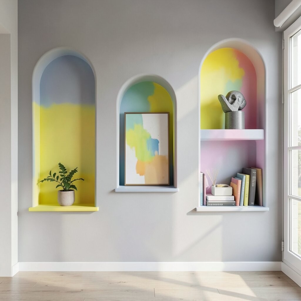
Picture gray walls that look modern and calm, with bright “wash” color inside small niches or alcoves. The pops of color feel like little surprises around the room.
This is a smart trend because it keeps the main background easy while still adding fun. The benefit is balance: calm walls reduce stress, and bright spots guide your eyes. Tip: use a slightly translucent technique so the gray shows through and keeps the look soft.
Personalize by picking niche colors that match your art themes, like lavender for calm pieces or aqua for playful prints. Cost considerations are lower because the colored area is small. If you want a flexible approach, you can use decorative panels or removable vinyl in each niche.
19) Sunset Gradient Murals for a Big Wow
) Sunset Gradient Murals for a Big Wow
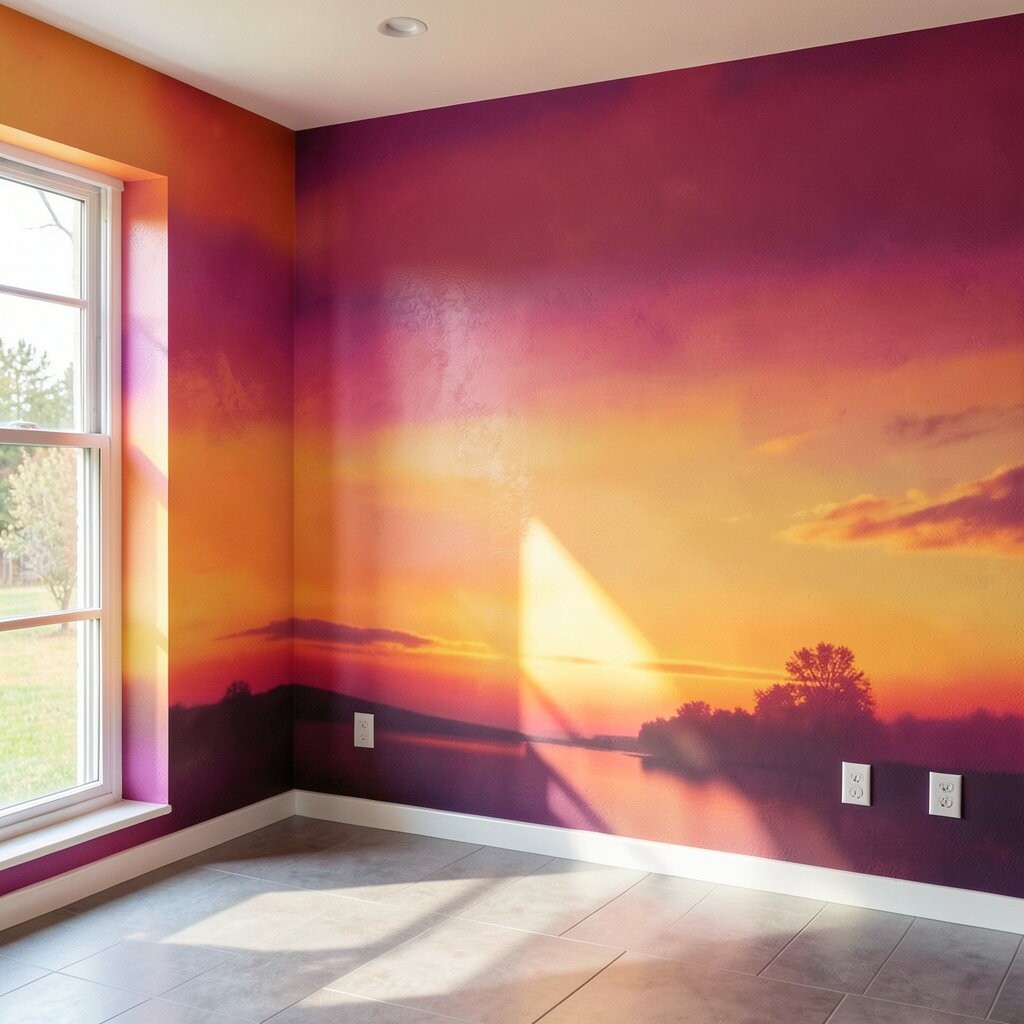
Imagine a whole wall painted like a sunset, with pinks, oranges, and soft purples blending across the space. The mural feels like you can step into an evening sky.
Murals are unique because they turn a wall into a story. The benefit is instant wow-factor, especially in living rooms, entryways, or creative studios. For tips, sketch your shapes lightly first, then blend the colors in smooth layers for a natural look.
Personalization ideas are endless: add silhouettes like palm trees, mountains, or a simple sun circle. Budget considerations can be friendly if you keep the mural to a single wall and use painter-friendly tools. If you are not painting professionally, start with a simpler gradient and add small details later.
20) Bold Geometric Lines With Matte Paint
) Bold Geometric Lines With Matte Paint
Picture crisp geometric lines forming triangles, zigzags, or angled frames across a wall. The result looks graphic and modern, like a bold poster you can live in.
This idea feels irresistible because it turns a plain wall into a design feature. The benefit is that geometry can hide small wall flaws and guide the eye around the room. Tip: use tape for clean edges, and choose a matte finish to keep colors looking smooth and trendy.
Personalize by selecting shapes that match your style, like fun zigzags for a playroom or neat blocks for a home office. Cost considerations are usually manageable because you can do it in two or three colors and focus on one wall. If you want extra safety for renters, use removable paint guides or temporary wallpaper for the first try.