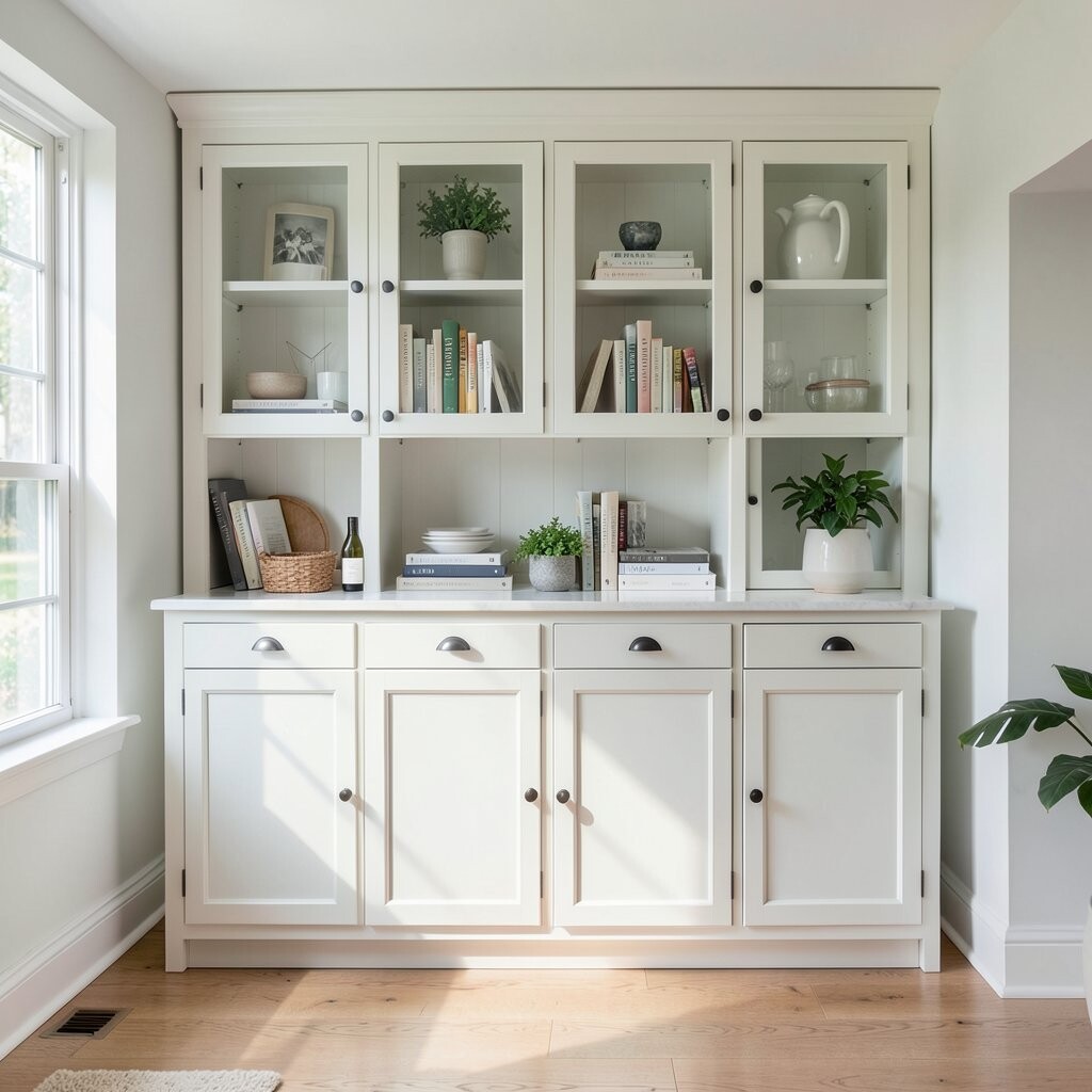
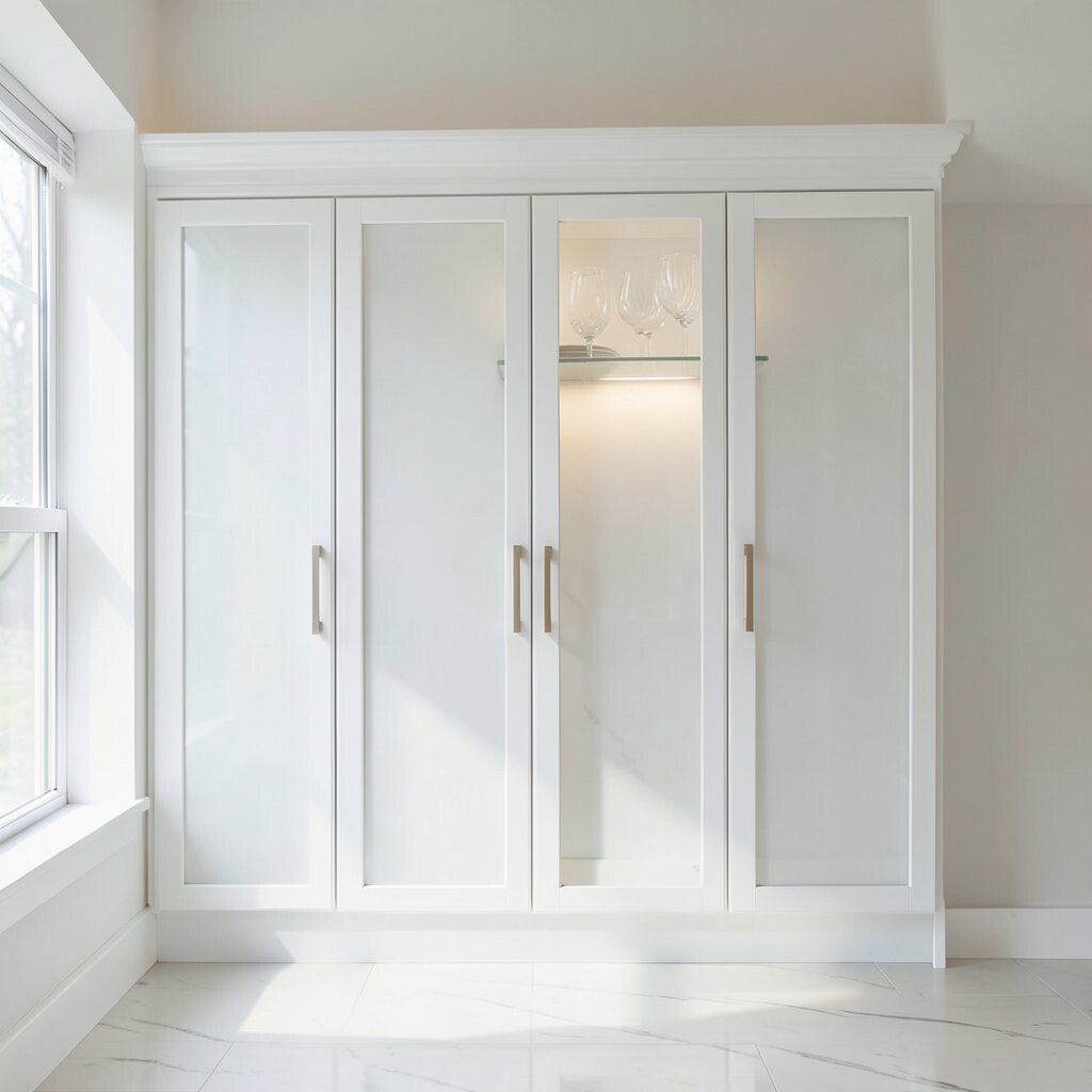
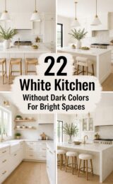
Soft white cabinets look like light is trapped inside the wood. You’ll notice the finish glows in morning sun and stays cozy at night.
A big benefit is how forgiving soft white is with wall colors and floors. It also helps hide small scratches compared to very glossy finishes.
Try choosing a “warm” soft white if your lighting feels yellow, and choose a “cool” one if your space feels too gray.
For personalization, match your cabinet hardware to a similar undertone, like brushed nickel with cool whites or oil-rubbed bronze with warm whites.
For cost, soft white often stays in the safe middle range because it’s a classic option with many paint and stain choices. If you’re renovating on a budget, repainting doors and drawers is usually cheaper than replacing cabinets.
A current trend is “layered neutrals,” where cabinets are soft white while the walls use a gentle creamy tone. Use a sample board and view it at different times of day before you commit.
2. Warm Gray That Makes Rooms Feel Bigger
Warm Gray That Makes Rooms Feel Bigger
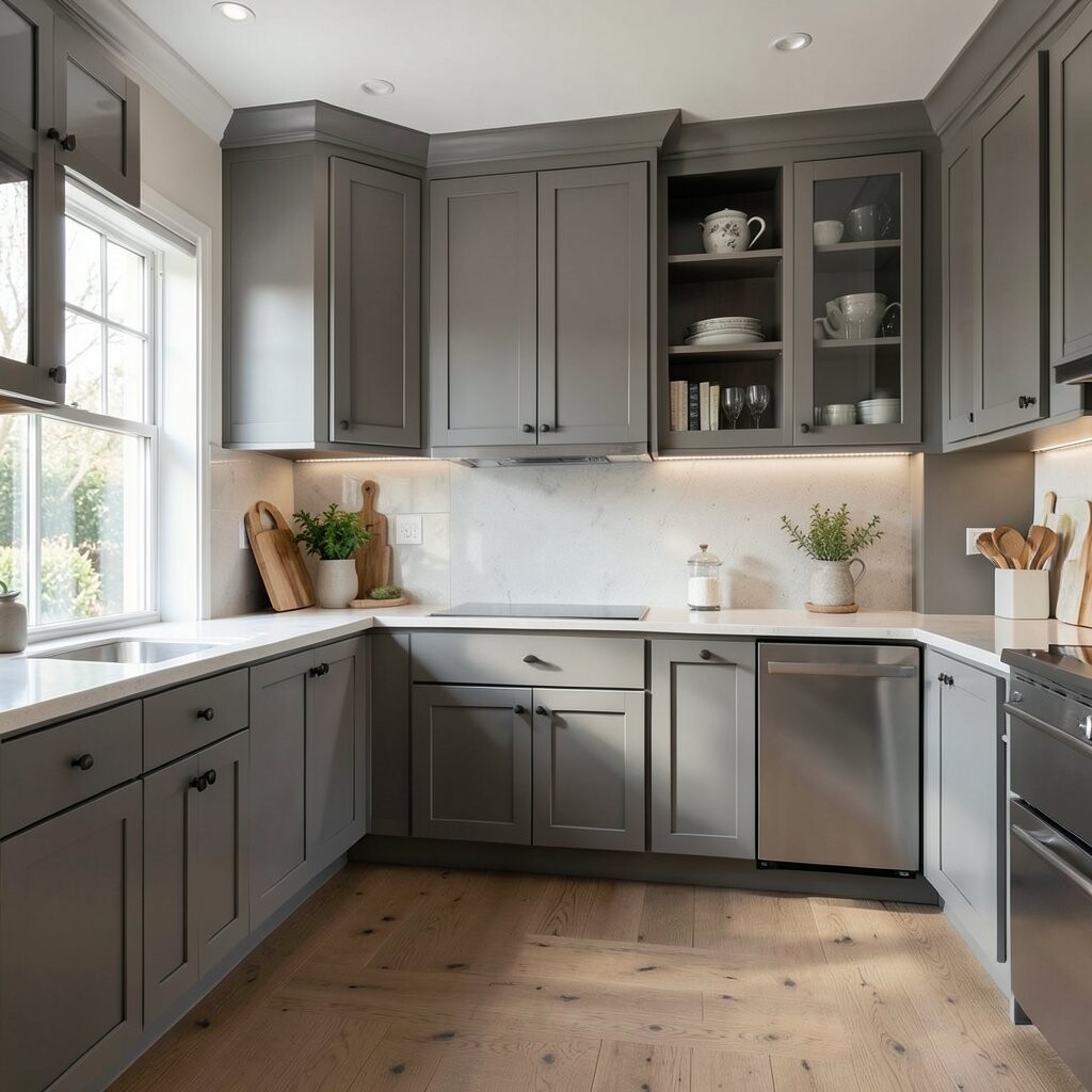
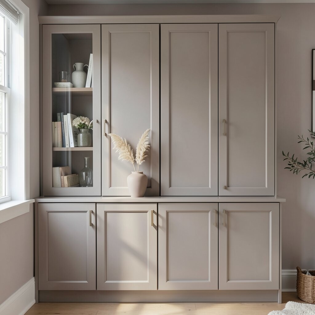
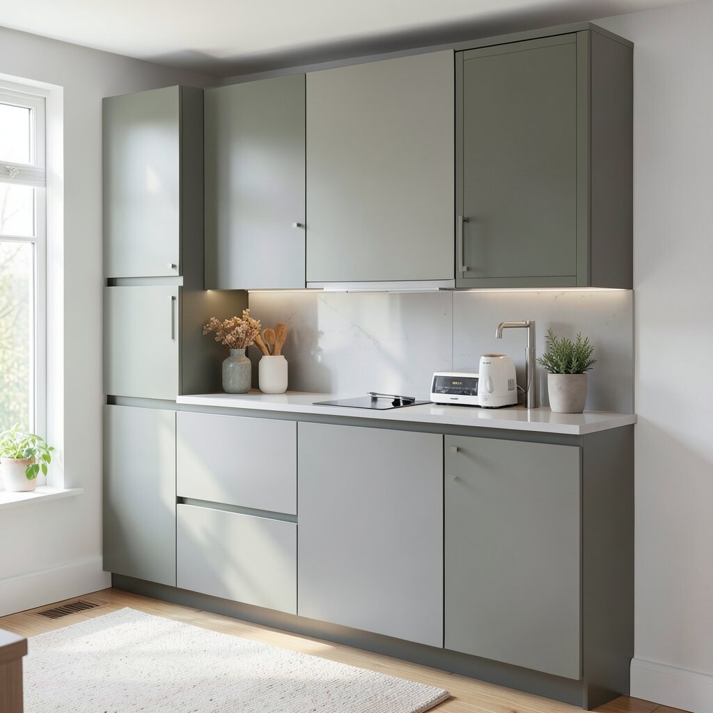
Warm gray cabinets can look both modern and calm. They often remind people of smooth stone with a cozy hug.
This color is great for brightening because it reflects light without feeling plain. It also pairs well with wood tones, which keeps your kitchen or bath from looking too chilly.
Pick a warm gray with a touch of beige so it stays inviting. For tips, test two shades: one slightly lighter and one slightly deeper, then compare them on a cabinet door in your own lighting.
Personalize it by adding lighter countertops or a backsplash with subtle movement, like marbled veining.
Cost can be managed by repainting frames first and leaving some doors for later if you want a staged upgrade. You can also update the look with new pulls instead of changing everything at once.
A trend right now is mixing warm gray cabinets with warm metal accents and matte finishes. Choose satin or matte paint so the color feels soft, not shiny.
If you have dark floors, warm gray can help balance the contrast and keep the room from feeling heavy.
3. Crisp White With a Hint of Color in the Undertone
Crisp White With a Hint of Color in the Undertone
Some “white” cabinets are actually tinted with tiny amounts of color. That hidden undertone is what makes the whole room look brighter.
For example, a white with a faint blush feel can look fresh and friendly. It can also make your dining area feel cheerful even when the sun goes down.
To get the best results, check the paint name and look for “undertone” notes like warm, neutral, or cool.
Personalize by matching the undertone to your backsplash, tiles, or the tone of your light bulbs.
This idea can be unique because it avoids the “flat” look of pure white. If you like bright spaces but want something that doesn’t feel sterile, undertone-tinted white is a smart path.
Cost is usually similar to other repaint options, but the real variable is prep time. If your cabinets are already painted, sanding and priming well can save money later by preventing peeling.
A current style is pairing crisp white cabinets with colorful accessories like canisters and art. Keep the cabinetry calm and let the rest of the room do the talking.
4. Chalky Blue for Cabinets That Feel Like Fresh Air
Chalky Blue for Cabinets That Feel Like Fresh Air
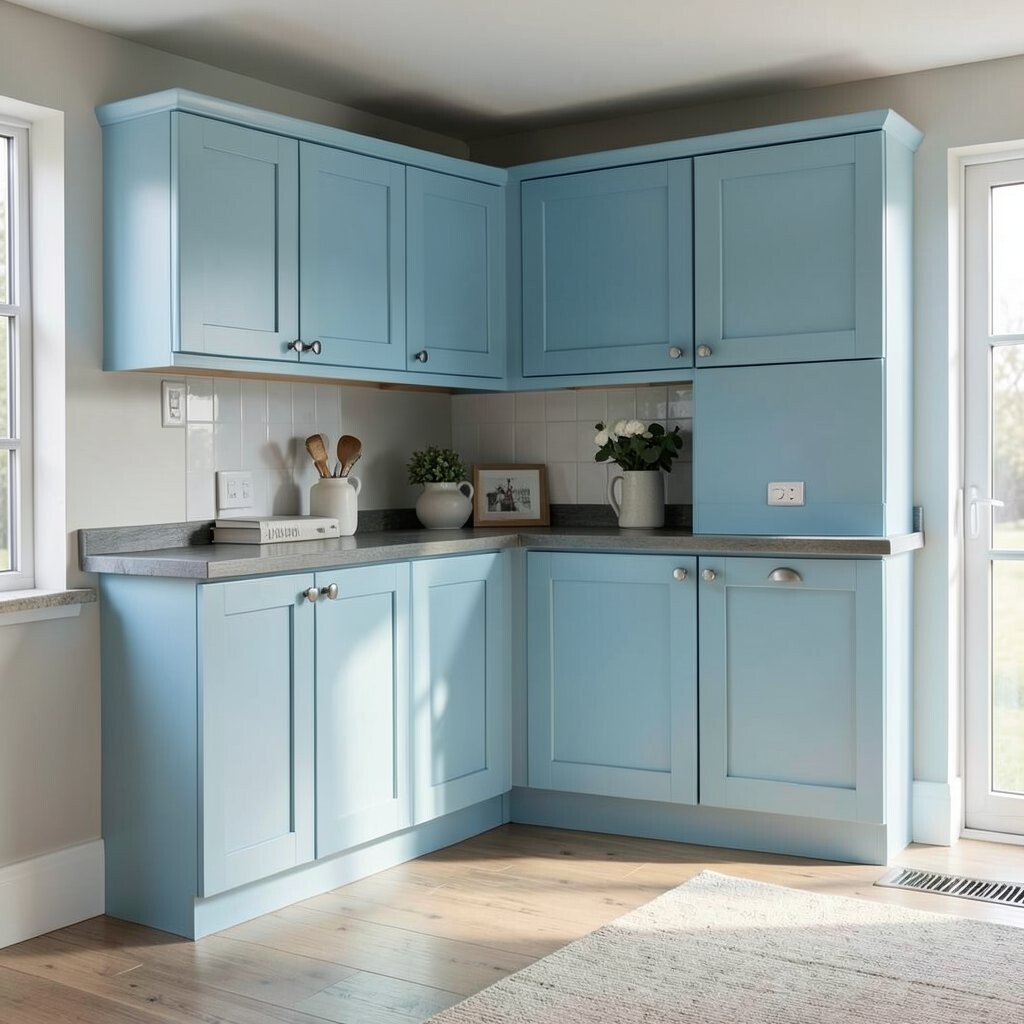
Chalky blue cabinets can look like sky light, even on cloudy days. When the finish is slightly matte, the color looks gentle and lived-in.
You get a bright look without the harshness of bright neon shades.
The benefit is that blue brings a relaxing mood, which can make your kitchen feel calmer. It also gives you a strong visual identity that still feels soft.
Try a chalky or powder blue that’s slightly dusty, not bright royal.
For personalization, pair it with white countertops and warm wood stools to keep the space balanced.
If your walls are already cool, this shade can help bring harmony and a fresh feeling.
Cost can shift depending on whether you spray or roll the paint. Matte finishes also hide minor surface bumps, which can reduce the time you spend sanding.
A trend is “color breaks,” where you use blue on lower cabinets and keep upper cabinets light for contrast. This is a brightening trick that draws the eye upward.
5. Mint Green That Makes Morning Routines More Fun
Mint Green That Makes Morning Routines More Fun
Mint green cabinets can make a room feel playful and clean. Picture a light garden breeze, but indoors.
This shade works especially well in kitchens that get morning sun.
One big benefit is how it softens hard edges in the space. It also makes whites in your countertops and backsplash look extra crisp.
Use a mint that leans slightly toward gray if you want a more grown-up feel.
For personalization, add greenery through decor, like a vase of eucalyptus or small herbs on the counter.
If you want extra brightness, choose light-reflecting finishes like satin rather than ultra-flat. It helps the color shimmer gently while still looking smooth.
Cost considerations: mint paint can require better primer coverage if your cabinets are dark. Budget for primer and plan for two to three paint coats.
A current trend is mixing mint with off-white walls and warm brass hardware. That combo feels modern but not too serious.
6. Buttery Yellow That Feels Sunlit, Not Garish
Buttery Yellow That Feels Sunlit, Not Garish
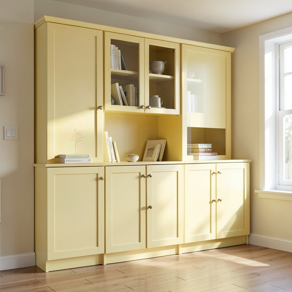
Buttery yellow cabinets can bring real warmth to a room. They look like sunlight captured in a soft, buttery tone.
The benefit is a cheerful effect that helps the whole space feel more active. Even when you’re not changing your furniture, the yellow makes it feel refreshed.
Choose a “butter” or “cream-yellow” shade instead of bright yellow so it stays friendly.
Personalize it with light gray counters or white quartz to keep the color from feeling heavy.
For tips, consider using yellow on island cabinets or select sections first. That way you can test how bold it feels without painting everything at once.
Cost can be lower if you only repaint some cabinet parts, like the island drawers and doors.
A trend is pairing warm yellow with matte black hardware for a clean contrast. You can also use textured knobs to add a small style moment.
If your kitchen feels dim, buttery yellow can add instant lift and make the area feel more open.
7. Rose-Taupe Neutrals That Add Soft Color Without Full Commitment
Rose-Taupe Neutrals That Add Soft Color Without Full Commitment
Rose-taupe cabinets look like muted blush mixed with warm sand. They brighten a space while still reading as a neutral.
This is a unique idea if you love color but want it to feel subtle. It also helps cover up small imperfections, especially with a slightly textured matte finish.
Try a rose-taupe with a warm base if your home has warm wood floors.
For personalization, match it with warm whites, like creamy wall paint and off-white trim.
Benefits include a calm, cozy feel that still feels fresh. It works well in bathrooms too, where soft tones can make morning routines feel smoother.
Cost considerations are similar to other repaint shades, but careful prep matters. If your cabinets have glossy surfaces, sanding and priming well will help the new color stick.
A trend is using “dusty color neutrals” throughout the home. This cabinet shade can connect with pillows, rugs, or artwork so everything feels coordinated.
8. Two-Tone Cabinets for Bright Contrast
Two-Tone Cabinets for Bright Contrast
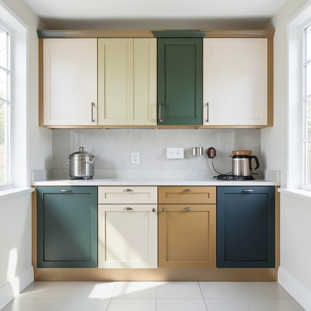
Two-tone cabinets can make a room feel instantly brighter. Imagine one set in a light color and another set in a slightly deeper shade.
The benefit is that your eye gets layers, which makes the space feel designed. You also gain flexibility: light upper cabinets can keep things airy while deeper lower cabinets add grounding.
Try light cabinets on top and a soft charcoal, warm gray, or muted green on the bottom.
For personalization, pick a color that shows up in your backsplash or flooring so the whole look feels intentional.
Cost can be higher if you plan a full repaint for many doors. You can lower cost by keeping your current cabinet layout and changing only colors, not hardware or boxes.
A current trend is “same-family contrast,” where both colors share undertones. That makes the result look smooth instead of jarring.
9. Forest Green That Feels Bold and Bright at the Same Time
Forest Green That Feels Bold and Bright at the Same Time
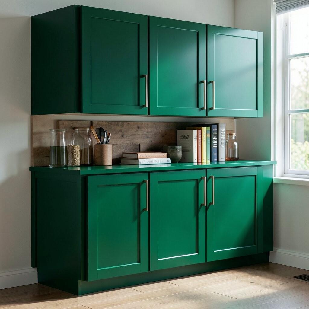
Forest green cabinets can sound scary, but they can actually brighten a home. The key is choosing a green that’s rich and clear, not muddy.
In good lighting, green brings depth without shrinking the room.
The benefit is uniqueness: you’ll have a look that feels special and not like every other kitchen. It also pairs well with brass accents and light countertops.
For tips, balance dark cabinets with very light walls and a bright backsplash. Add warm lighting, like bulbs that make skin tones look natural.
Personalize it by choosing hardware finishes that match your faucets, like brushed brass or warm bronze.
If you want a softer start, try green on the island or lower cabinets only.
Cost considerations: darker colors sometimes need more paint coats for even coverage. Plan time for proper drying between coats to avoid patchy areas.
A trend right now is pairing deep green with light wood shelves. Open shelving makes the space feel airy and gives your dishware a place to shine.
10. Light Wood Stains That Look Like Warm Sun
Light Wood Stains That Look Like Warm Sun
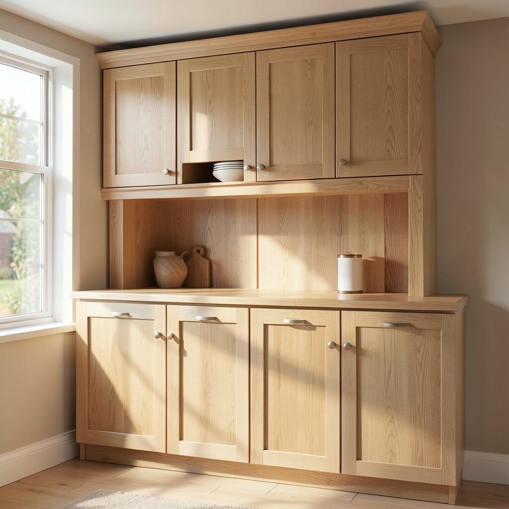
Light wood-stained cabinets can brighten your home without adding paint. The grain still shows, and that texture makes spaces feel alive.
Picture honeyed boards in a sunny room.
A major benefit is warmth that still feels clean. Stains also tend to look great with natural decor, like linen curtains and woven baskets.
Tips: choose a stain that’s lighter than you think and test on a hidden door. Sunlight can darken wood over time, so planning ahead helps.
Personalize by keeping the stain consistent while changing hardware styles, like switching from traditional knobs to modern bar pulls.
If you want brightness, keep your clear coat sheen moderate so the wood doesn’t look overly glossy.
Cost considerations: staining can sometimes be similar to painting, but it depends on prep and whether you’re stripping old finishes. If your current surface is already smooth, you may save time.
A current trend is “wood-forward kitchens,” where the cabinetry feels warm and natural while walls stay light. This combo can make your home feel friendly and bright.
11. Soft Sand Beige for a Clean, Calm Brightness
Soft Sand Beige for a Clean, Calm Brightness
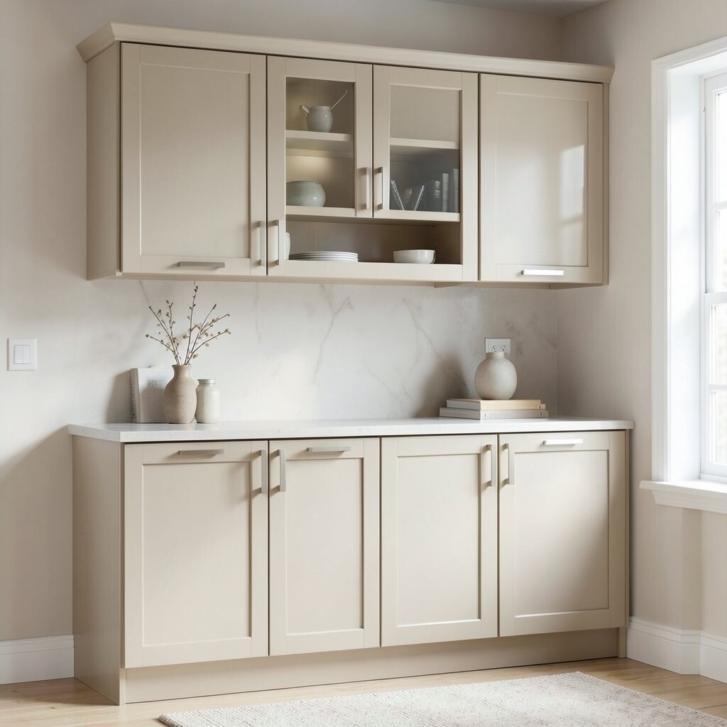
Soft sand beige cabinets give a light, steady glow. They can feel like the color of sun-warmed sand.
This neutral works beautifully because it doesn’t fight with your decor. It also makes most backsplash colors look more balanced and bright.
For tips, choose a beige that isn’t too gray if you want a warmer glow. If your home is already warm, a beige with a slightly cooler undertone can keep things steady.
Personalize it with white or cream walls and choose hardware that adds contrast, like matte black or brushed nickel.
Benefits include a timeless look that won’t feel outdated quickly. Beige also hides everyday marks better than some high-contrast colors.
Cost considerations: beige tones are common, so you can often find affordable paint options with great coverage. Still, primer and careful sanding matter for a smooth finish.
A trend is pairing sand beige cabinets with creamy stone countertops and simple, clean-lined faucets. The result feels bright and uncluttered.
12. Matte Black Accents for High-Impact Brightness
Matte Black Accents for High-Impact Brightness
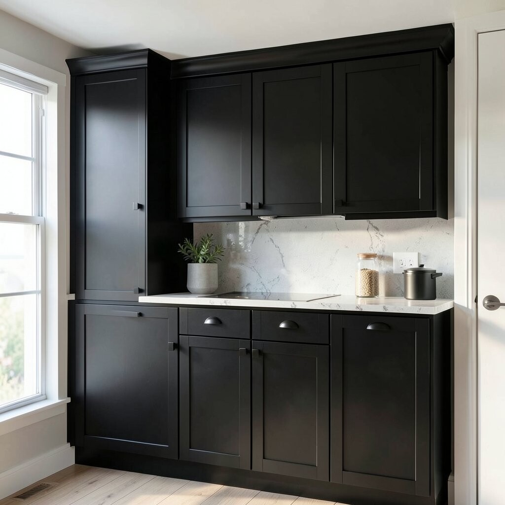
Matte black cabinets can brighten your home in a surprising way. When used as accents, black adds clear focus and helps the light bounce from other surfaces.
Think of it like using a dark frame around a bright picture.
The benefit is drama with control, especially if you keep most cabinetry light. You can also use black for lower cabinets while leaving uppers in white or cream.
Personalize it with a soft-touch finish so it doesn’t look harsh.
Add warm metals like brass on lighting fixtures to keep the vibe inviting.
For tips, avoid making every cabinet black at once if your space is small. Instead, choose a section: an island, a single wall run, or a few drawer fronts.
Cost considerations: painting black can be tricky because it shows unevenness if prep is rushed. Budget extra time for leveling the surface and using quality paint.
A trend is “statement drawer fronts,” where drawers are black and cabinet boxes are light. It keeps the room bright while adding that bold design punch.
13. Light Lavender Cabinets for a Dreamy, Bright Mood
Light Lavender Cabinets for a Dreamy, Bright Mood
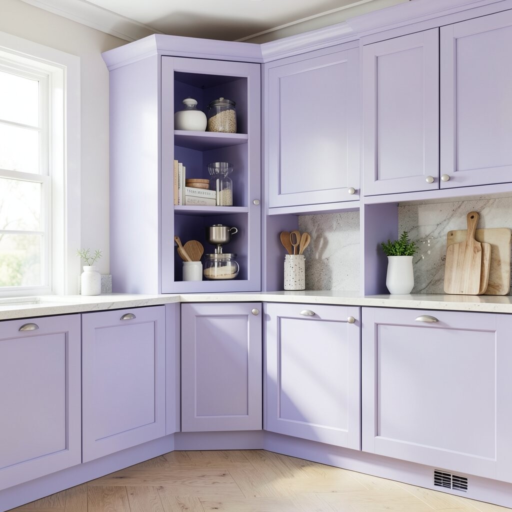
Light lavender cabinets feel like soft morning color. They look airy, especially when the finish is smooth and lightly reflective.
The benefit is an uplifting mood that feels gentle rather than loud. Lavender can also make white tiles look brighter and cleaner.
For tips, choose a lavender that leans more toward white than purple. That keeps the color from overpowering the room.
Personalize by adding simple patterned textiles, like a subtle stripe or small floral, so the cabinet color feels connected to your style.
Consider pairing lavender with warm gray or creamy walls to avoid a too-cool look.
Cost considerations: colored paint can require more coats if your current cabinets are dark. Plan for extra paint and primer so the final shade looks even.
A current trend is using “unexpected pastels” in kitchens and laundry rooms. Lavender works great in those spaces because it makes them feel less utilitarian.
14. Brightening With Light Hardware and Clear Finishes
Brightening With Light Hardware and Clear Finishes
Sometimes the cabinet color is only half the story. The right hardware and finish can make the same shade look brighter.
Light-colored metals can pull more light into your room.
The benefit is that you get a high-impact change without repainting everything. Switching from dark hardware to brushed nickel, polished chrome, or light brass can lift the whole look.
Tips: choose a metal tone that matches your faucet and lighting fixtures. For personalization, pick knobs or pulls with shape you love, like rounded edges for softness or bar pulls for clean lines.
If your cabinets are glossy, consider a satin or matte topcoat next time you repaint, because glare can hide color nuance.
Cost considerations are usually lower because hardware upgrades are often quicker than cabinet paint. You can also mix finishes carefully, like using one metal in a visible spot and another in hidden areas.
A trend right now is “soft shine,” where hardware isn’t mirror-bright, but still reflects light. This balances brightness with a relaxed feel.
15. Pick the Right Finish: Matte, Satin, or Gloss for Bright Feel
Pick the Right Finish: Matte, Satin, or Gloss for Bright Feel
Cabinet finish changes how color behaves under light. Matte can feel calm and smooth, while satin can feel slightly more lively.
Gloss can look bright too, but it may show fingerprints and small surface bumps. The best finish depends on your household habits and how your room is lit.
For tips, consider matte in busy family spaces if you want less visible smudging.
Choose satin if you want light to bounce around and highlight cabinet color in a gentle way.
Personalize the look by pairing finish choices with color choices. For instance, soft white with satin feels airy, while forest green with matte feels bold and rich.
If you want a bright look without glare, keep gloss low and use good lighting above and near the cabinetry.
Cost considerations: finish upgrades can sometimes be added to your paint job, but they may require different products and extra drying time. Ask about coverage and dry time so you don’t run into streaking.
A current trend is “velvet matte,” where cabinetry looks smooth and modern without shine. That finish is especially popular in spaces meant for calm, like kitchens that double as living areas.
When you pick the finish, test a small section first so you can see how it reflects your real bulbs and daylight.