Dark colors don’t have to feel heavy or gloomy. With the right mix of light, texture, and styling, they can make a room feel cozy and bright at the same time.
Think of these shades as mood-setting partners for your brighter moments. You’ll find ideas that fit small budgets, big renovations, and everything in between.
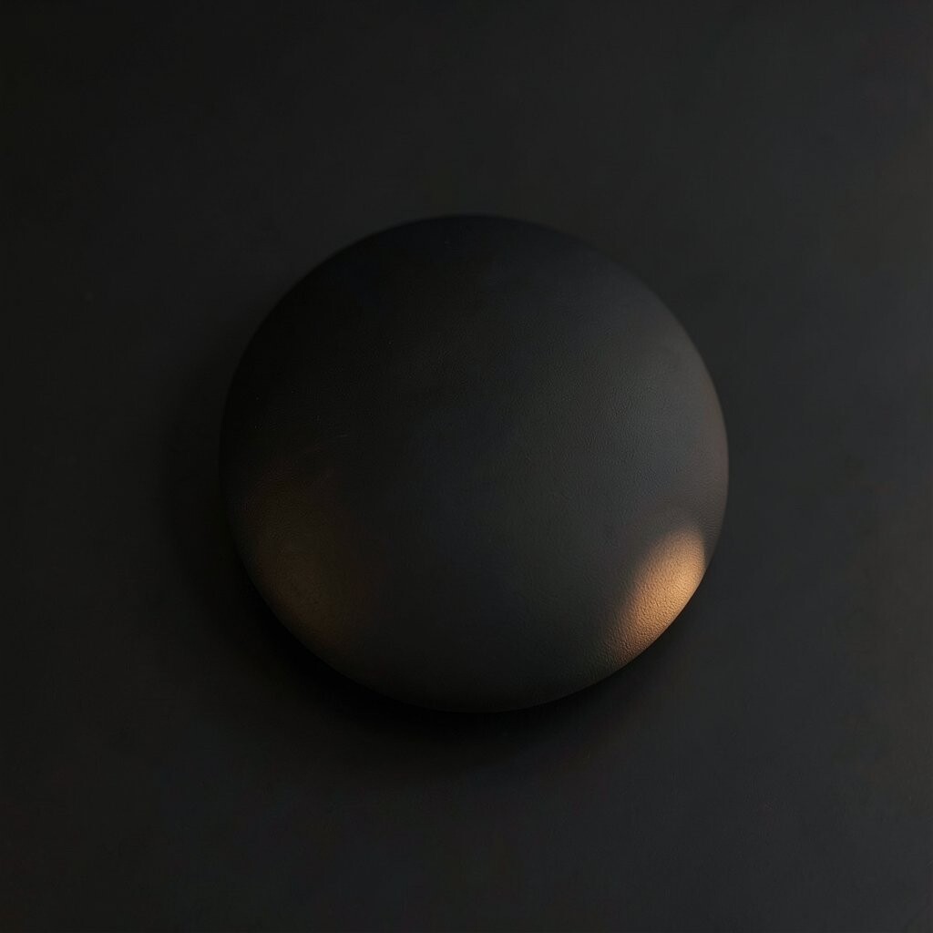
Charcoal gray looks like a smooth stone with a soft, smoky glow. It sets a calm base and makes bright accents pop.
To brighten with charcoal, paint walls a light sheen and add warm white trim. Use matte charcoal on cabinets and keep the floor or rug lighter so the room stays airy.
Try pairing charcoal with brass, creamy whites, and soft amber lighting. This color is unique because it feels modern but still welcoming. If you want a cheaper option, use charcoal in removable pieces like throw pillows, a curtain panel, or a frame set.
2. Deep Navy
Deep Navy
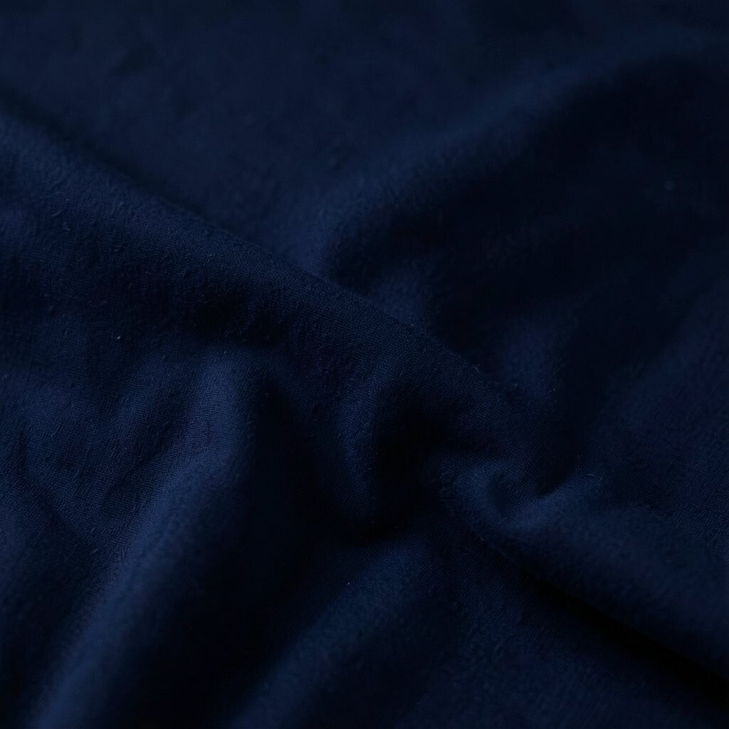
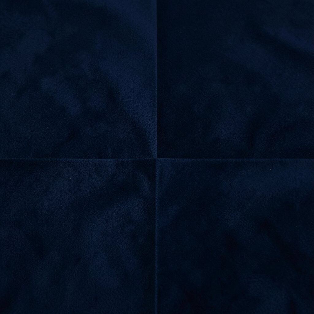
Deep navy feels like twilight, rich and steady. When you add light wood and warm lamps, it looks bright instead of dark.
Put navy on an accent wall or on lower cabinets, then balance it with crisp white ceilings and pale curtains. Choose satin or eggshell finishes to help reflect light gently.
For a personal touch, match navy with star-like patterns in pillows or artwork. A trendy move is “navy + natural textures,” like jute rugs, rattan trays, and linen cushions. Budget tip: try navy peel-and-stick wallpaper on one section behind a desk or reading chair.
3. Espresso Brown
Espresso Brown
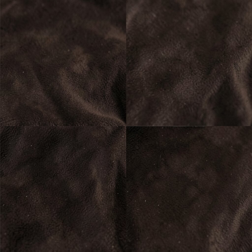
Espresso brown looks glossy and warm, like strong coffee in the morning. It can make a room feel grounded and stylish.
Use espresso on furniture legs, a feature panel, or a statement chair. Add lighter walls and add bright, indirect lighting so it doesn’t feel heavy.
This color is unique because it works with almost any highlight shade: butter yellow, soft pink, or cool gray. If you want to keep costs down, swap out cabinet hardware in espresso-toned metal and add a few new cushion covers.
For personalization, style espresso with natural wood, textured knit throws, and art with airy whites. Try one “brightness anchor,” like a pale lamp shade, to lift the whole look.
4. Blackened Teal
Blackened Teal
Blackened teal is moody like storm clouds, but it still glows with blue-green life. It feels bold, yet it can brighten a room when paired with the right tones.
Paint just one wall or use it on a backsplash area, then include creamy whites, light oak, and shiny accents. Place a floor lamp near that wall so the color gets a friendly highlight.
This shade is unique because it gives you color depth without looking flat. A modern trend is pairing teal with warm metallics like gold or champagne. For budget control, use blackened teal through paintable accessories: a picture rail, a small bookcase, or a closet door.
Personalize it by choosing fabrics with tiny shimmer threads or subtle patterns. That little sparkle helps the room feel brighter from morning to night.
5. Burgundy Wine
Burgundy Wine
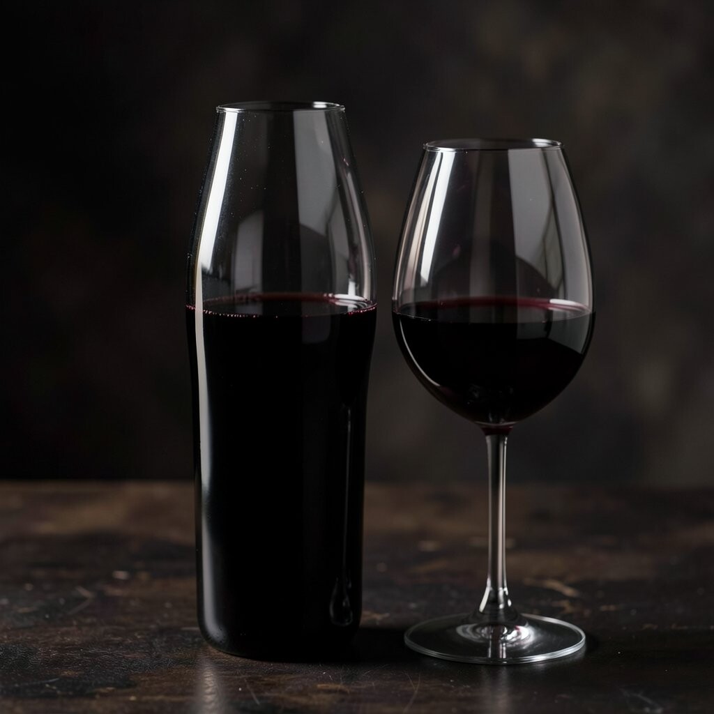
Burgundy wine feels rich and cozy, like velvet curtains on a chilly evening. It becomes bright when you use it in smart, smaller doses.
Style burgundy with warm white walls, tan leather, and light-colored rugs. Add a mirror near the color so it bounces light around the room.
A uniqueness trick: mix burgundy with muted rose, caramel, and antique gold. It’s a fun, creative look that still feels elegant. If you’re working with a tight budget, try burgundy throw blankets, art prints, and a single statement lamp to get the mood without big costs.
6. Smoky Sage Black
Smoky Sage Black
Smoky sage black looks like dark green shaded with gray, like an old forest at dusk. It brings calm energy and depth without stealing the light.
Use it in a kitchen island, a bathroom vanity, or on cabinet doors. Keep the rest of the room light, and add bright bulbs with warm tones for a soft glow.
This color feels unique because it’s dark, but not harsh. Pair it with soft cream, natural linen, and pale stone for a fresh finish. To personalize, add plants with glossy leaves, because their shine makes the room feel more alive.
Budget idea: use smoky sage black in peel-and-stick panels, a small accent shelf, or a set of labeled jars and canisters.
7. Matte Black with Warm Undertones
Matte Black with Warm Undertones
Matte black with warm undertones looks smooth and calm, not shiny or sharp. It can frame light so your space looks brighter and more organized.
Choose matte black for hardware, a fireplace surround, or a slim wall trim line. Then add plenty of warm white lighting so the black feels like a soft backdrop.
This shade is unique because it reads elegant and steady instead of overpowering. Pair it with textured surfaces like boucle, woven baskets, and light stone countertops. For current trends, many people are using black as a “line and layer” color, not the whole room.
8. Dark Sand Dune
Dark Sand Dune
Dark sand dune is a shadowy beige-brown that feels natural and grounded. It gives warmth while staying neutral enough to brighten everything else.
Paint it on lower walls, use it on accent panels, or style it in upholstery. Add crisp whites, light tan woods, and sheer curtains so sunlight still moves freely.
The uniqueness here is that it’s both dark and friendly, like a sunbaked wall at night. It works well with modern minimal decor and also with cozy, layered styles. Budget-friendly tip: try dark sand dune through rugs, curtains, or a big area art piece instead of full-wall paint.
Personalize it by choosing natural patterns like stripes or subtle geometric prints. Those designs keep the look bright and lively.
9. Deep Plum
Deep Plum
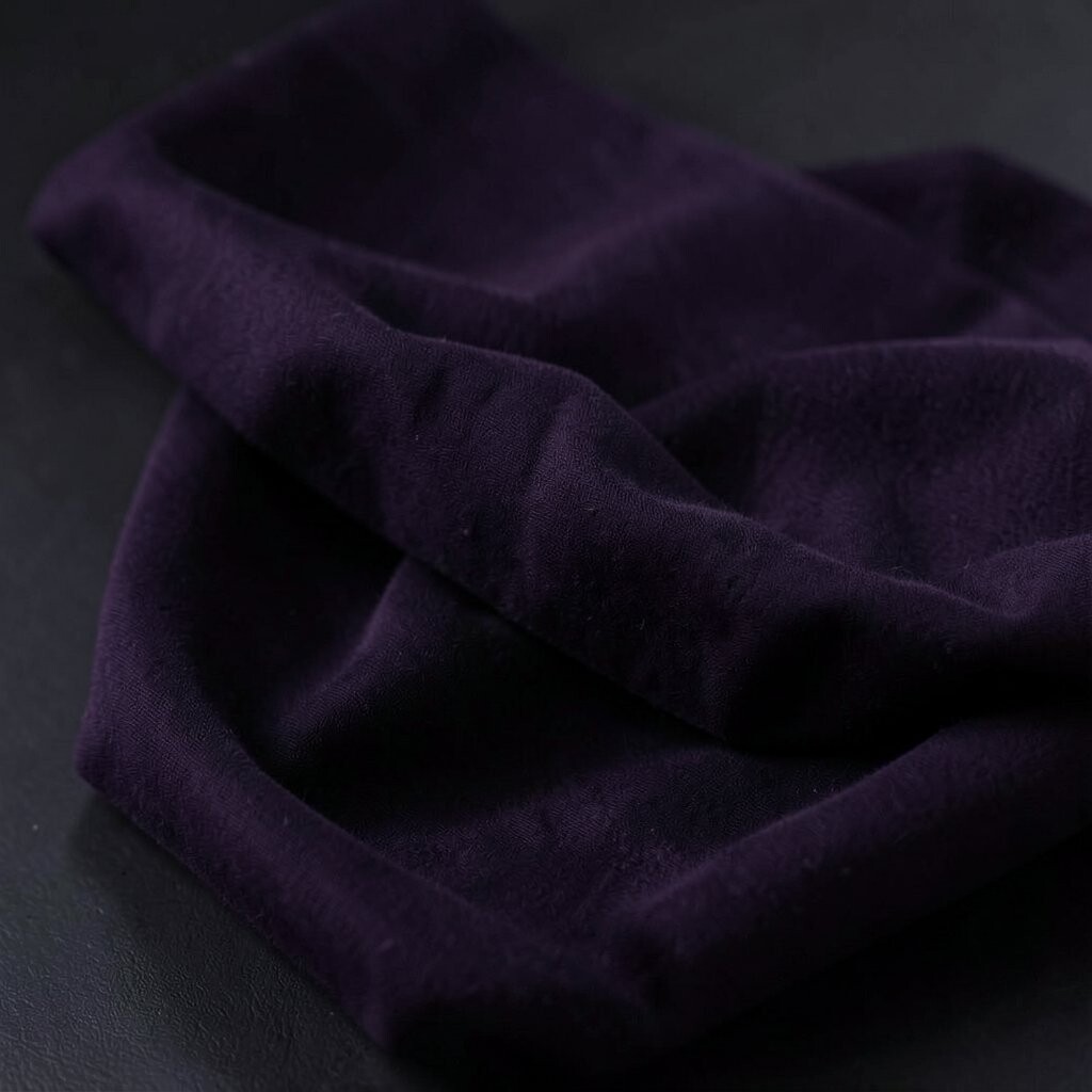
Deep plum looks like ripe fruit and dark ink mixed together. It can feel luxurious while still making a room feel colorful and fresh.
Use plum as an accent on a chair, curtains, or a gallery wall. Pair it with soft white, light gray, or pale lilac for a bright contrast.
This color is unique because it adds color depth without going toward too much red. Trendy pairing right now is deep plum with brass and creamy neutrals. For a cost-smart approach, pick one plum feature and keep other items neutral, like bedding and floor coverings.
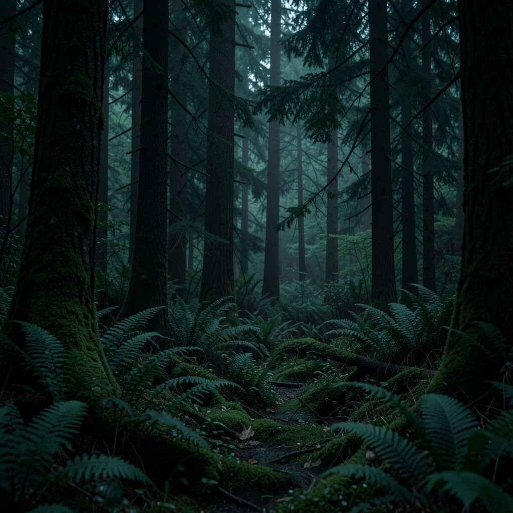
10. Night Forest Green
Night Forest Green
Night forest green feels dramatic like pine shadows under moonlight. It can still brighten your space when you pair it with glowing lights and light floors.
Try forest green on cabinets or a built-in shelf, and keep the wall color in a warm off-white. Add reflective finishes like glass vases or polished metal to bounce light.
Its uniqueness comes from how it mixes nature vibes with a polished, modern mood. Personalize with wood grain textures and botanical wall art. If you want budget control, add forest green through throw pillows, a rug runner, or a small wall stencil.
Current trend: nature-inspired colors with biophilic decor, like plants and natural fibers, placed against dark backdrops.
11. Charcoal Blue-Gray
Charcoal Blue-Gray
Charcoal blue-gray sits between gray and blue, making it feel calm and a little futuristic. It’s a great dark base color that can make highlights look brighter.
Choose it for a media wall, desk backdrop, or large cushions. Keep the ceiling and trim light, and use bulbs with a warm white glow.
This shade is unique because it flatters both cool and warm decor. Pair it with white cabinetry, pale oak, and muted blue accessories for an easy, layered look. Budget tip: use removable paint swatches as a guide, then commit to one area, like a chair back or a closet interior.
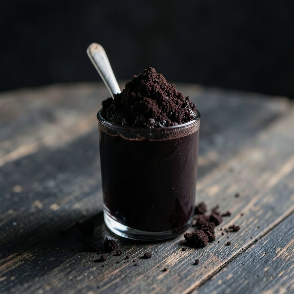
12. Dark Chocolate Haze
Dark Chocolate Haze
Dark chocolate haze feels soft like cocoa powder, not flat like plain brown. It brings comfort and can make warm lighting look even better.
Use it in a living room with tan or cream walls and a light rug. Add layered lighting, such as a table lamp and a wall sconce, to keep shadows from pooling.
This color is unique because it hides dirt better than lighter browns while still looking cozy. Personalize by matching it with caramel, light teal, or warm white patterns in your textiles. For cost considerations, try chocolate on accent walls or stair rails before doing a full room.
If you rent, use washable paint pens or peel-and-stick decals on shelves and picture frames.
13. Obsidian Gray-Black
Obsidian Gray-Black
Obsidian gray-black looks sleek and dramatic, like a polished stone. It makes bright decor look crisp and helps your room feel styled.
Place it where light naturally travels, like behind a sofa or under a window. Use light curtains and add a mirror so the dark surface turns into a reflection tool.
Its uniqueness comes from that near-black depth that still shows subtle gray undertones. Pair it with white, chrome, and pale marble for a modern look. Budget idea: keep the room neutral and add obsidian through a rug, an oversized frame, or a statement light fixture.
14. Deep Rust with Burnt Orange Energy
Deep Rust with Burnt Orange Energy
Deep rust feels like warm clay and evening sunsets. It can brighten your space because warm colors make light feel warmer and more welcoming.
Try rust on a textured wall, a terracotta-style tile accent, or a statement chair. Balance it with cream walls, natural wood, and off-white textiles so it doesn’t overpower.
This color is unique because it gives a cozy glow even in rooms with fewer windows. Personalize with golden lighting, woven baskets, and patterned cushions in soft neutrals. For cost considerations, choose one rust element first, like a lamp base or a curtain panel, then expand slowly if you love it.
15. Dark Gray-Blue in Denim Mood
Dark Gray-Blue in Denim Mood
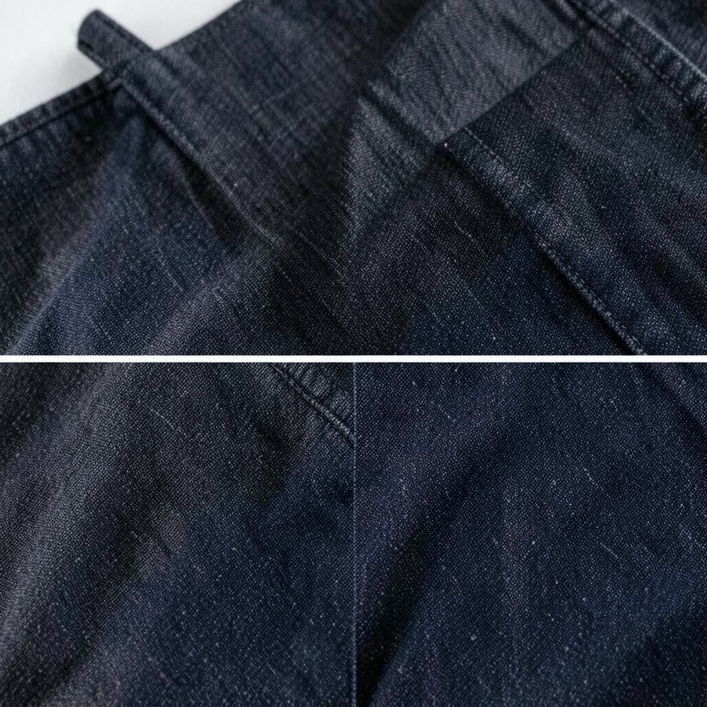
Dark gray-blue in a denim mood feels casual and cool. It adds a “soft strength” background that makes brighter colors look fresh.
Use it on a feature wall, a cabinet color, or layered curtains. Pair it with white, pale gray, and bright pops like coral or butter yellow accents.
This shade is unique because it feels wearable and comfortable, like your favorite jacket. Trend-wise, denim-toned interiors pair well with relaxed decor and textured throws. Budget tip: go for denim-inspired bedding and a couple of wall prints before painting.
Personalize by matching the color with metal finishes like brushed nickel or matte steel for a clean modern edge.
16. Plum-Black for a Gallery Wall
Plum-Black for a Gallery Wall
Plum-black looks like dark grapes with a hint of shine. It’s perfect for creating a gallery wall that feels rich but not heavy.
Paint a small area behind frames, or use plum-black as the background for shelves. Choose bright artwork matting in off-white to pull light forward.
This color is unique because it makes art look more vivid. Personalize with family photos, nature prints, and one larger statement piece in a lighter frame. For cost considerations, one wall section and a few frames can give a big impact without a full remodel.
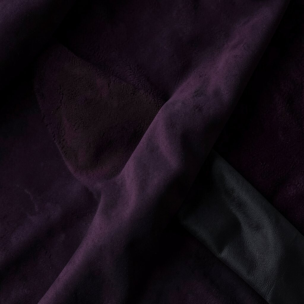
17. Midnight Purple
Midnight Purple
Midnight purple feels mysterious, like ink slowly fading into starlight. It can brighten your space when you let it sit with warm whites and shiny reflections.
Use it on a reading nook wall, a headboard backdrop, or cabinet interiors. Add a warm lamp and use light bedding so the purple reads elegant, not dark and closed.
Its uniqueness comes from that deep violet tone that turns the room into a mood. Trendy tip: combine midnight purple with light wood and soft gold accents for a dreamy, modern look. Budget idea: try a midnight purple removable wallpaper strip behind a bed or desk.
18. Dark Sea Blue
Dark Sea Blue
Dark sea blue feels oceanic, like deep water with gentle highlights. It can make walls feel like they have depth, which often makes rooms feel more open.
Pair it with light floors, white trim, and airy linen curtains. Add a clear glass vase or glossy decor to catch daylight and spread it.
This color is unique because it balances cool calm with a subtle brightness when the light hits. Personalize with ocean-inspired art, but keep the colors in your frames light. For cost considerations, start with one room corner: paint the inside of a bookshelf or add sea blue through an accent rug.
19. Ink Black with Soft Contrast
Ink Black with Soft Contrast
Ink black is crisp, bold, and clean, like writing on fresh paper. It can brighten your space by making lighter colors look more vivid and organized.
Use ink black for trim, shelves, or a sleek media console. Keep large surfaces light, and choose warm lighting so black doesn’t look cold.
This shade is unique because it works like a frame around your everyday items. Try pairing ink black with creamy whites, oatmeal textures, and clear acrylic accessories. Budget tip: swap out a dull mirror frame for an ink black one, or repaint just the TV stand area.
Personalize by arranging books by color in bright spines, then let the ink black background make them stand out.
20. Black Walnut Tone
Black Walnut Tone
Black walnut tone looks like dark wood with warm brown richness. It brings a natural elegance that feels brighter than plain black because of its warmth.
Choose it for cabinets, a coffee table, or picture frames. Add light walls and soft textiles so the dark wood feels like it belongs in a bright space.
This color is unique because it adds warmth without needing bright paint. Personalize with grain-focused decor, like wooden bowls, woven wall hangings, and textured lampshades. For cost considerations, stain or re-finish one piece instead of replacing everything.
21. Dark Charcoal Green-Gray
Dark Charcoal Green-Gray
Dark charcoal green-gray feels balanced, like weathered stone with a hint of plant life. It’s a modern, calming color that can hold bright accessories beautifully.
Use it on a feature wall, in a dining room chair color, or on the back of open shelving. Combine it with creamy neutrals, pale gold, and bright natural materials like rattan.
Its uniqueness comes from being “in between” tones, which helps it work with many styles. For trends, people are leaning into moody neutrals paired with lots of texture, like chunky knits and woven baskets. Budget tip: start with a few key items, such as a dark throw blanket and matching wall art, and only paint after you love the pairing.
Personalize by choosing artwork that includes one bright highlight color, like warm yellow or sea glass blue. That small pop keeps everything feeling bright.
Finally, keep lighting layered: one overhead source, plus lamps at different heights. When light spreads evenly, even a dark color reads as friendly.