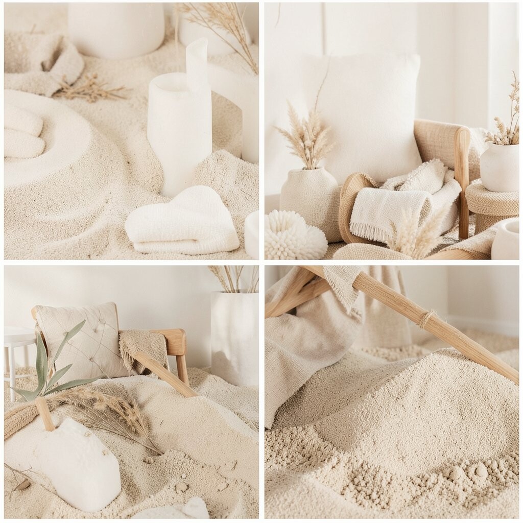
Picture a room that feels like morning sun on a quiet beach. Sand beige walls paired with warm white trim make everything feel light and safe.
Dried sage accents—like throw pillows or a small plant shelf—bring gentle calm without looking plain. This palette is great for relaxation because it avoids harsh contrast. Try using matte finishes for paint and fabrics to keep the space soft to the eye. If you want a personal touch, add a woven basket in tan and a ceramic vase in off-white.
2. Charcoal, Cream, and Whisper-Green
Charcoal, Cream, and Whisper-Green
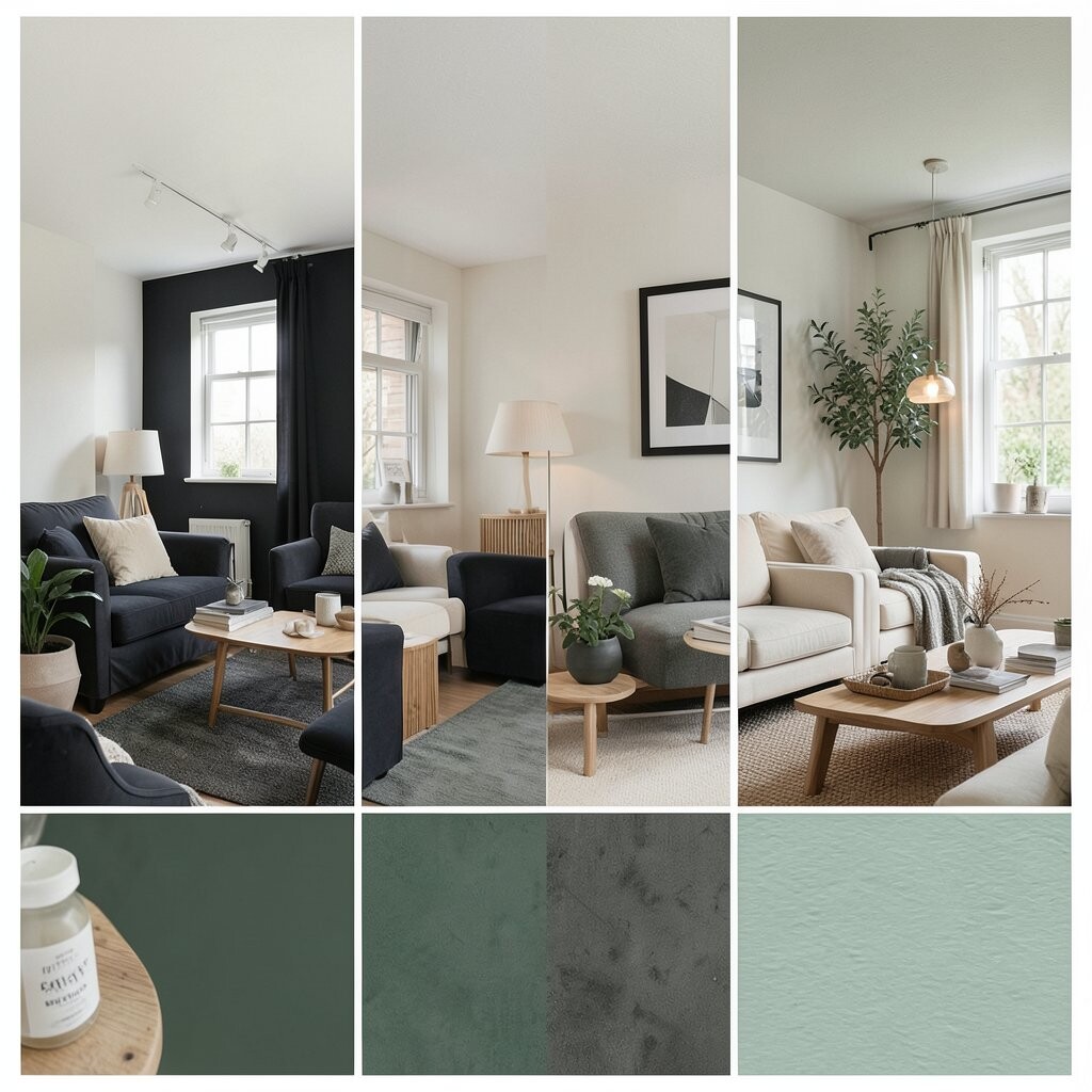
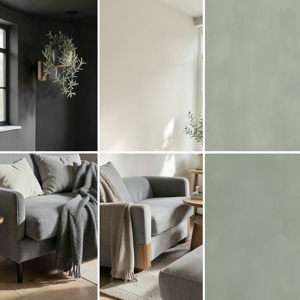
Imagine a cozy lounge where dark lines frame bright calm. Charcoal accents on a feature wall or media console add a calm “grounding” effect.
Cream acts like a quiet backdrop for your everyday life. Whisper-green in small pieces—like curtains, art, or a lamp shade—keeps the room fresh and less heavy. For practical tips, balance the dark with lots of soft textures such as boucle throws and linen cushions. If you’re watching costs, start with a few high-impact items first, like curtains and rug, then layer in smaller decor.
This combo is a modern trend right now because it feels stylish but still soothing. Personalize it with a mix of natural wood and smooth stone colors for a spa-like look. If you love plants, choose darker green leaves to echo the palette.
3. Pearl Gray, Mist Blue, and Pale Oak
Pearl Gray, Mist Blue, and Pale Oak
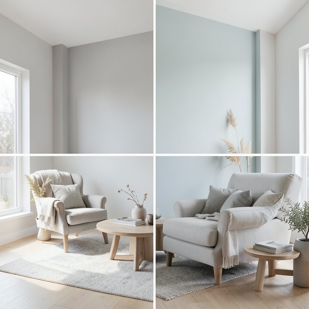
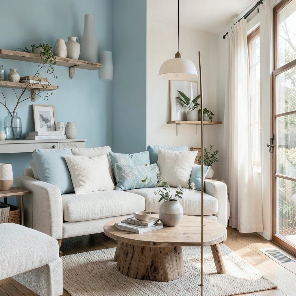
Think of a cloudy day that still feels peaceful and clean. Pearl gray walls and mist blue accents create a soft “cool air” vibe.
Pale oak furniture adds a gentle warmth so the room never feels icy. This palette helps your brain slow down because it looks organized and quiet. Keep your decor simple: pick one soothing art print and repeat the blue in a few places.
For personalization, add a low wooden tray with candles and a bowl of smooth stones. If you want to save money, paint is usually cheaper than replacing furniture. A rug in pale gray or off-white can also bring everything together quickly.
4. Blush Rose, Warm Taupe, and Soft Walnut
Blush Rose, Warm Taupe, and Soft Walnut
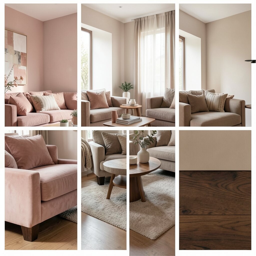
Picture a lounge that feels like a gentle hug. Blush rose on pillows, wall art, or a single accent wall makes the mood welcoming.
Warm taupe balances the blush so it stays relaxing, not too sweet. Soft walnut—like in a coffee table or shelving—adds depth and comfort.
5. Deep Teal, Soft Linen, and Stone White
Deep Teal, Soft Linen, and Stone White
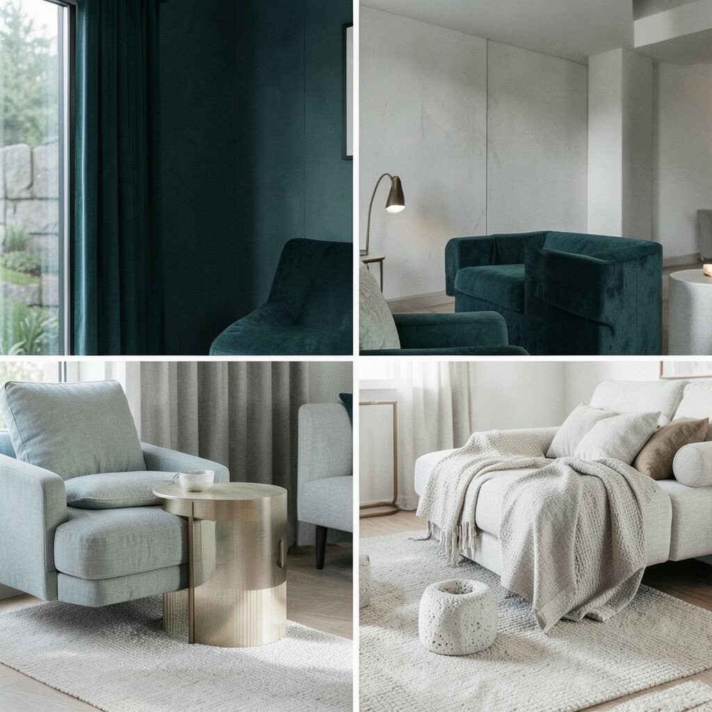
Imagine evening light reflecting off a calm lake. Deep teal looks rich, and when paired with soft linen it feels calm instead of dramatic.
Stone white brightens the room and helps the teal feel classy. This palette is perfect for people who want a spa feel with a bit of personality. Add a subtle pattern in your textiles, like a simple woven texture, to keep it interesting.
To personalize, choose teal shades that match your style: a darker teal for mood, or a lighter one for airiness. For cost thoughts, start with teal curtains or a throw blanket before buying bigger items. Current trends lean toward jewel-tones used in calm ways, like teal paired with neutral whites.
6. Lemon Cream, Oat Milk, and Charcoal Ink
Lemon Cream, Oat Milk, and Charcoal Ink
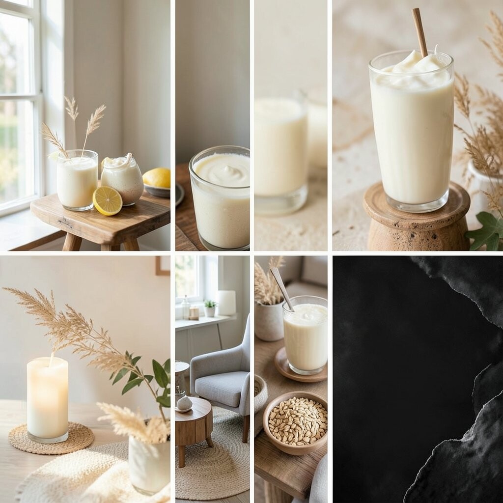
Think of a bright morning where everything feels clean and cozy. Lemon cream works like a gentle glow, especially in smaller accents.
Oat milk neutrals keep the space soft and friendly, so the yellow never feels too loud. Charcoal ink details, like picture frames or a slim lamp base, add balance and help the palette look intentional.
For tips, use lemon in small areas first, such as a rug pattern, a lamp shade, or a few decorative pieces. This helps you control the mood without spending too much. Personalize by mixing in a warm wood shelf and a few light-textured plants.
7. Forest Green, Sandstone, and Burnished Brass
Forest Green, Sandstone, and Burnished Brass
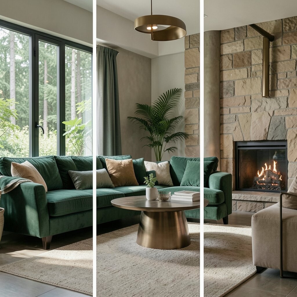
Visualize a quiet garden corner inside your home. Forest green walls or large curtains create a deep calming backdrop.
Sandstone-colored furniture keeps the room grounded and warm. Burnished brass details—like a small tray or picture light—add a gentle shine that feels calming rather than flashy.
This palette supports relaxation because nature colors often feel familiar to our eyes. Tip: choose one “hero” element in green, then let the rest stay neutral so the space doesn’t get heavy. For personalization, use leaf-themed art or a simple botanical print with lots of white space.
Cost-wise, brass accents can be affordable when used in small pieces. If you’re on a budget, try faux brass finishes for frames and trays. Right now, earthy greens plus warm metals are a popular look in modern Zen-style rooms.
8. Cool White, Soft Sage, and Light Graystone
Cool White, Soft Sage, and Light Graystone
Imagine fresh linens and quiet air. Cool white makes your lounge feel open, while soft sage adds a mild, calming tint.
Light graystone in your rug or textured wall panels brings a natural feel. This combo helps the room feel tidy, which can make it easier to unwind after a busy day. Personalize by adding a few matching containers in sage tone for your remotes, tea, or books.
9. Cacao Brown, Cream, and Caramel Highlights
Cacao Brown, Cream, and Caramel Highlights
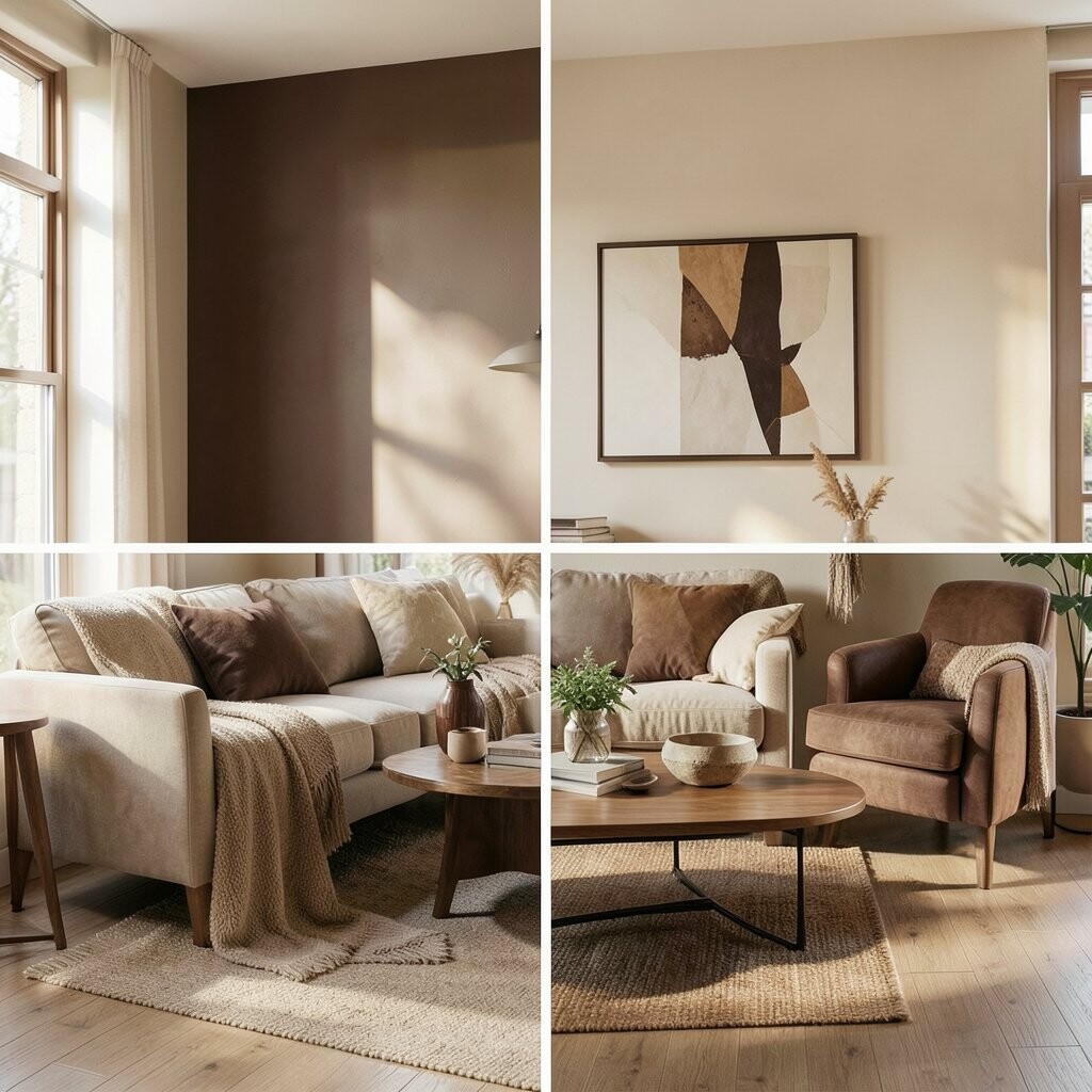
Picture warm cocoa and soft candlelight in the evening. Cacao brown looks cozy and grounding, especially in a lounge where you want comfort.
Cream keeps the palette airy and prevents the room from feeling too dark. Caramel highlights—like in pillows or a lamp—add a gentle glow that makes relaxation feel natural.
Try using cacao in larger surfaces like upholstery or curtains, then keep cream on walls and bigger surfaces. For personalization, add a soft throw with subtle stripes in caramel and cream. Cost considerations: if you can’t replace big furniture, add caramel through paintable accessories, like a small cabinet or picture frames.
10. Sky Blue, Off-White, and Driftwood
Sky Blue, Off-White, and Driftwood
Think of a clear sky and a calm shoreline. Sky blue accents can make your lounge feel airy without needing a full remodel.
Off-white walls and driftwood tones in furniture bring a relaxed, beachy Zen vibe. This palette benefits sleep and stress relief because it looks light and not overwhelming. Add driftwood textures by using woven baskets, wood trays, or a jute rug.
Personalize with wall art showing simple waves or minimalist landscapes. If you want to keep costs down, choose a sky-blue pillow set and one sky-toned piece of art first. This style fits current trends that mix coastal calm with modern, simple shapes.
11. Charcoal Sand, Ecru, and Sage Mist
Charcoal Sand, Ecru, and Sage Mist
Visualize a stone walkway warmed by sun, then cooled by evening. Charcoal sand feels earthy and calm, while ecru adds soft brightness.
Sage mist accents bring a gentle, plant-like energy. This palette is great for Zen relaxation because it blends neutral grounding with soothing green. Tip: keep your patterns subtle and use texture, not loud colors, to make the room feel rich.
For personalization, mix in a small hanging macramé or a simple ceramic incense holder. Cost considerations: repainting walls to ecru is often more budget-friendly than buying new furniture. Keep one “signature” piece, like a unique lamp, and let everything else support it.
It’s also on trend because people are moving toward natural, toned-down palettes rather than bold, high-contrast looks.
12. Terracotta Clay, Creamy Linen, and Olive Ink
Terracotta Clay, Creamy Linen, and Olive Ink
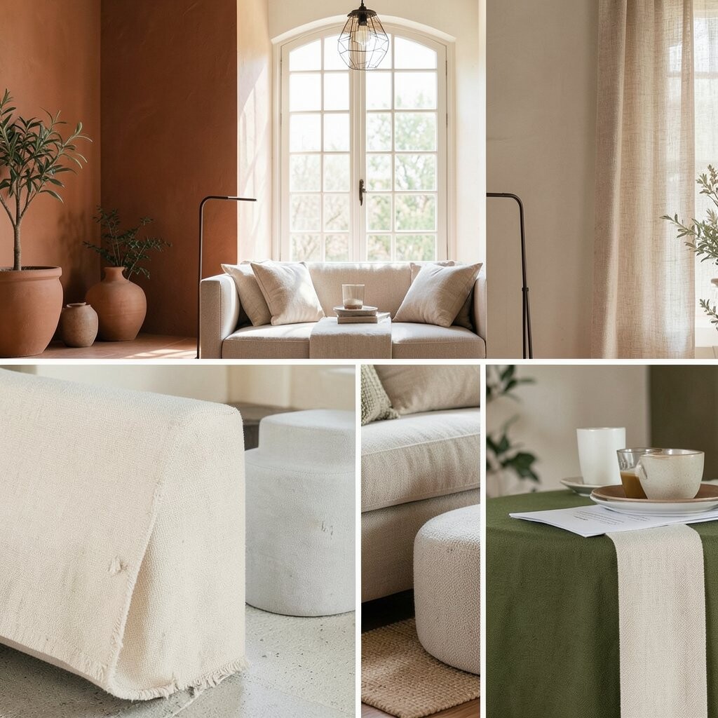
Imagine warm clay after rain, with soft light over everything. Terracotta clay brings a cozy earth feeling that invites you to slow down.
Creamy linen makes the warmth feel gentle instead of heavy. Olive ink details—like in cushions or a bookshelf—add depth and a nature calm that feels grounded.
For tips, use terracotta in mid-size pieces first, such as a rug, a chair, or a wall panel. Personalize with handmade-looking decor like woven coasters or a ceramic planter. Cost-wise, terracotta accents can be budget-friendly because you can find many affordable pillow and pottery options.
13. Soft Black, Warm White, and Dusty Green
Soft Black, Warm White, and Dusty Green
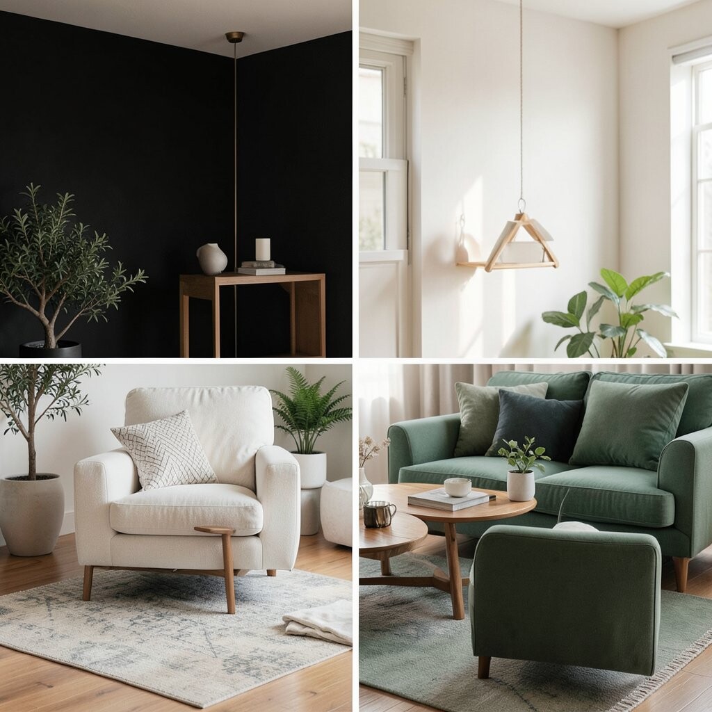
Picture a sleek lounge that still feels relaxing. Soft black works best when used as trim, frames, and small furniture details.
Warm white walls and upholstery create a calm base that keeps the room from feeling too intense. Dusty green adds a gentle nature touch that makes the contrast feel balanced.
Benefits include a clean look that supports focus and calm. Tip: keep green in textiles and artwork, not everywhere, so it stays soothing. For personalization, add one textured element like a felt or wool cushion cover.
If you’re cost-conscious, swap only the lamp shades and add a green throw. Current trends often pair deep near-black tones with muted greens for a modern, restful vibe.
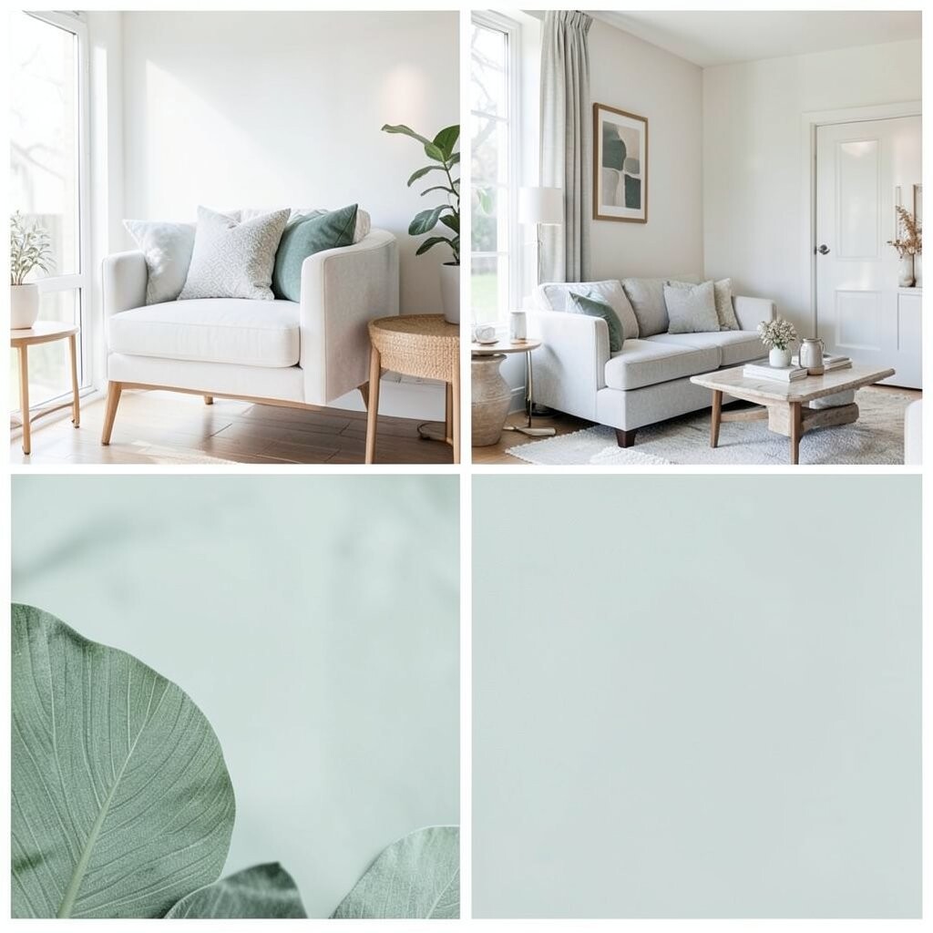
14. Pale Mint, Cloud White, and Light Walnut
Pale Mint, Cloud White, and Light Walnut
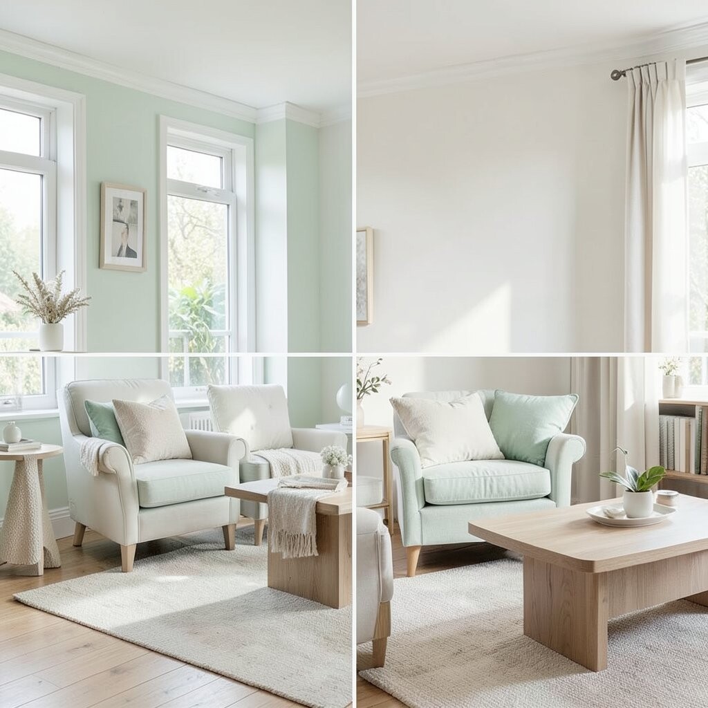
Imagine fresh air, cool plants, and clean shelves. Pale mint feels light and calming, especially with cloud white.
Light walnut furniture adds cozy warmth so the mint stays balanced. This palette helps your space feel rejuvenating and soft, which is perfect for a reading nook or meditation corner. Tip: match your mint shade across small items like a vase, a cushion cover, or a corner shelf.
For personalization, add a simple zen stone bowl or a minimal candle stand. Cost considerations: mint paint can be affordable, but if you’d rather not repaint, mint can show up in peel-and-stick wall decals or new pillow covers. This look also fits current trends that like “fresh pastels” for calming rooms.
15. Olive Sand, Creamy Ivory, and Moss Thread
Olive Sand, Creamy Ivory, and Moss Thread
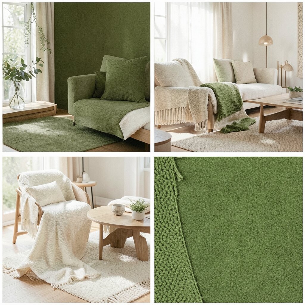
Think of sunlit trees and quiet shade. Olive sand is a mellow neutral that still feels alive.
Creamy ivory brightens the room and helps you feel rested. Moss thread accents—like subtle green stitching on cushions or a textured throw—add a cozy, natural touch.
This palette benefits relaxation because it looks natural and not flashy. Tip: choose fabrics with texture, such as knit blankets or woven rugs, so your eyes can rest. Personalize by adding a small fabric wall hanging in moss tones for a soft focal point.
16. Soft Lavender, Warm Gray, and Ivory Linen
Soft Lavender, Warm Gray, and Ivory Linen
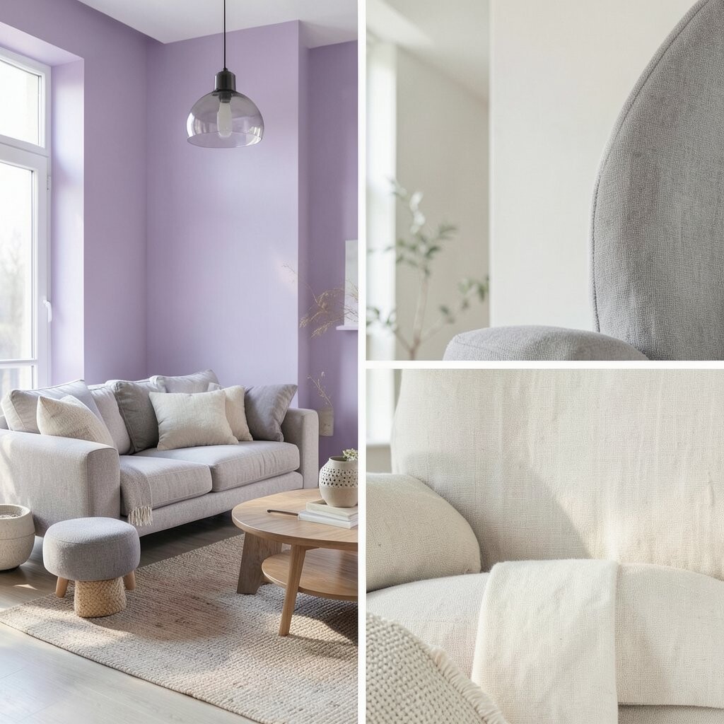
Picture a gentle evening color that helps you unwind. Soft lavender can feel calming when it’s muted and paired with warm gray.
Ivory linen keeps the room bright and cozy, so lavender doesn’t feel too dreamy or too bold. This combination supports relaxation by bringing a quiet, soothing atmosphere without needing dark colors.
For tips, use lavender mainly in textiles and art, like curtains, pillow covers, or a simple painting. Personalize with a scented candle or subtle floral note through decor, not strong perfume. Cost considerations: swapping pillow sets and adding a rug is usually cheaper than changing major furniture.
17. Terrarium Green, Neutral Sand, and Soft Gold Calm
Terrarium Green, Neutral Sand, and Soft Gold Calm
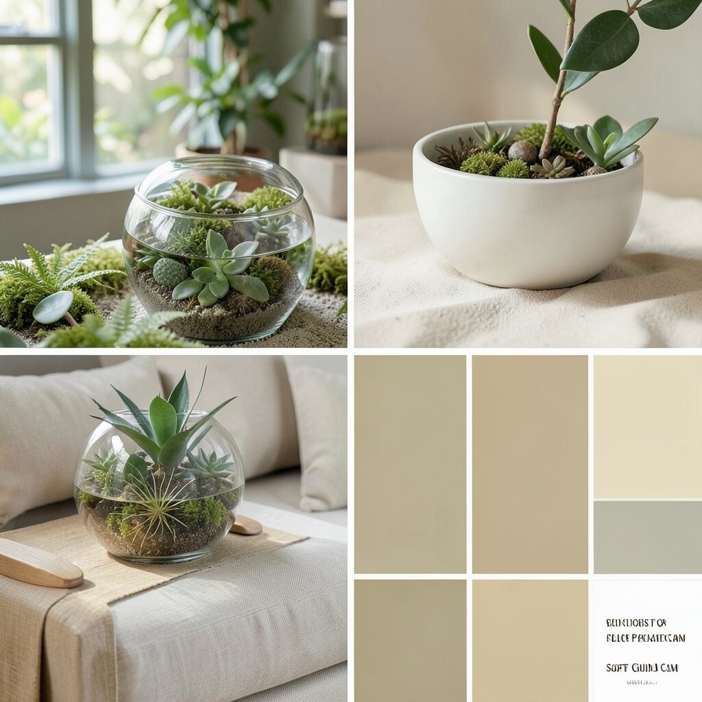
Imagine a terrarium world where everything feels contained and peaceful. Terrarium green looks lively, but it becomes relaxing when paired with neutral sand.
Soft gold calm in small touches—like a mirror frame or a candle holder—adds warmth and a gentle glow. This palette is unique because it mixes “living plant energy” with neutral space.
Tips: keep the base colors light so the green feels balanced. Personalize by arranging a group of plants in matching pots that echo your green tone. For cost thoughts, try thrifted frames painted soft gold, then style them with simple art to keep spending under control. This look also matches current trends that favor biophilic design, where nature colors and textures help create calm.
If your lounge gets a lot of sun, choose slightly muted greens to avoid glare. Finish the look with a cozy neutral rug so the room feels ready for slow mornings and quiet evenings.