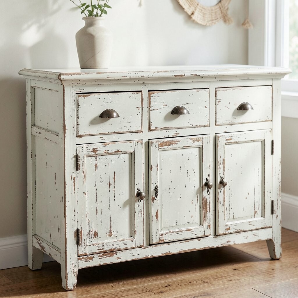
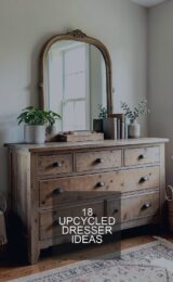
Picture a painted dresser with soft edges and tiny worn spots on the corners. A chalky finish makes the whole piece feel airy and cozy.
This look is loved for its gentle vibe and forgiving application. Use a matte chalk paint or chalk-style latex for that powdery texture. To keep it from scuffing too fast, seal with a wax or a clear topcoat meant for furniture.
2. Dry-Brush Distressing for Walls
Dry-Brush Distressing for Walls
Imagine a wall where one color whispers through another in light, painterly strokes. Dry-brushing feels like sun-faded fabric for your room.
It helps hide small imperfections and adds texture without heavy sanding. Start with a base coat you love, let it cure, then lightly brush a lighter or darker glaze over raised areas.
For personalization, match the “peek-through” shade to your trim or rug tones. Costs stay low because you can use small amounts of paint and a cheap brush. In many homes, this method is trending because it looks effortless and modern while still warm.
3. Crackle Glaze Over Two-Tone Paint
Crackle Glaze Over Two-Tone Paint
Think of porcelain with fine cracks, but scaled up for your cabinet doors. Crackle glaze creates a dramatic, vintage pattern that catches light beautifully.
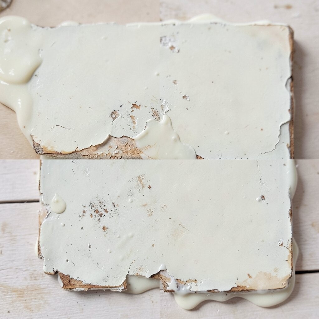
Because crackle shows up differently each time, it feels unique even on matching pieces. Paint a solid base, then add a crackle medium in the right thickness. Once it dries, the top coat shrinks slightly and forms the web-like lines.
To keep the cracks from looking messy, practice on a scrap board first. Seal afterward for easier cleaning. A clear top coat can also deepen the color, which makes the finish look richer.
Plan for a little extra time because drying steps matter. This option can cost more than simple distressing, but it often looks like custom artisan work. It’s perfect when you want “wow” texture without complex carpentry.
4. Sanded-Edge Distress on Farmhouse Tables
Sanded-Edge Distress on Farmhouse Tables
Picture table edges that look smooth with age, like hands have rubbed them for years. Sanded-edge distress gives a classic farmhouse feel while staying neat and controlled.
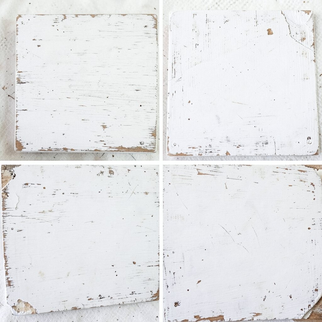
This method is great for high-use furniture because you can target wear spots where they naturally happen. Use a sanding block on corners and edges after the paint cures, then protect with a durable topcoat.
5. Rub-and-Wipe Patina Distress
Rub-and-Wipe Patina Distress
Imagine a soft, smoky patina where color fades in gentle waves. Rub-and-wipe distress looks calm and artistic, like aged plaster.
Start with a neutral base, then apply a second tint glaze and wipe it back. The wiping motion creates natural gradients and keeps the finish from looking too “perfect.”
For personalization, choose warm undertones like clay, sage, or sand. Costs are usually budget-friendly because you can stretch glaze with simple mixing. This style is popular right now because it looks natural and pairs well with modern decor.
6. Sponging for Soft, Random Wear
Sponging for Soft, Random Wear
Visualize small bursts of worn color that feel organic and playful. Sponging brings a lively “layered history” to dressers and doors.
It’s a smart technique when you want distressing that doesn’t look staged. Dab a second paint color over the base using a sea sponge, then lightly sand high points for extra realism. Seal when you’re happy with the balance of light and shadow.
7. Foil-Feeling Metal-Look Distress
Foil-Feeling Metal-Look Distress
Think of a painted surface with little flashes of metal at the edges. This finish feels bold, like a thrifted find brought back to life.
Use metallic wax or a metallic glaze on the spots you want to look “worn through.” It gives contrast and makes your piece stand out in photos, which is a fun perk when you’re styling your home.
To keep it from turning too shiny, buff lightly and seal properly. Consider cost: metallic waxes cost a bit more, but the amount you use is small. Right now, metal-accent distress is trending because it balances rustic charm with a sleek, current feel.
8. Layered Color Blocking With Targeted Wear
Layered Color Blocking With Targeted Wear
Picture a cabinet where color layers peek out like old paint under new paint. The look is graphic, yet still weathered.
Layering gives you control and helps the distress feel intentional. Paint your first color, then tape off blocks and add a second color on top. After drying, sand only the edges and corners to reveal the hidden layers beneath.
This is a great way to personalize with bold choices without committing to a full bold color story. Costs stay reasonable because you can use small sample pots for the top layers. If you like trends, this method matches the current love for color contrast and clean lines.
For best results, remove tape at the right time so edges stay crisp. Then add distress where you want “real life” to show. You’ll end up with a finish that feels custom to your home.
9. Board-and-Batten Inspired Plank Distress
Board-and-Batten Inspired Plank Distress
Imagine painted wood planks with worn spots that track along the grain. Board-and-batten inspired distress adds depth and makes wall features feel architectural.
You can do this on a single accent wall or on a DIY panel section. Use sandpaper on the raised edges, then spot-tint with a glaze to soften the contrast. Choose a topcoat that resists scuffs if the wall is in a busy area.
10. Crackle Paint With Built-In Texture
Crackle Paint With Built-In Texture
Some paints already include a crackle effect, which can save time and simplify the process. When it dries, the surface breaks into charming lines that look naturally old.
This option is unique because the texture pattern can feel different across panels. Shake well, apply in an even layer, and avoid overworking the paint with repeated strokes. Follow the product directions for dry time, since crackle paints need the right schedule.
Personalize by using two complementary shades, such as cream over charcoal. Cost can vary, but you may buy fewer separate products. This finish looks especially nice on statement pieces like headboards, shelves, or framed wall art.
11. Vine Brush Marks for Natural Aging
Vine Brush Marks for Natural Aging
Picture a surface brushed with soft streaks that resemble old wood patterns. Vine brush marks add movement and make distress look grown-up and organic.
Use a directional brush technique over your base, then sand lightly where the brush raised texture is strongest. This helps create realistic wear without random-looking spots. It’s also great for hiding tiny brush imperfections.
12. Rust-Colored Wash Over Blue or Gray
Rust-Colored Wash Over Blue or Gray
Imagine a cool blue cabinet with warm rust hints seeping into the edges. A rust-colored wash looks like time has colored the paint.
It works well because warm tones create visual depth and make distressed areas pop. Mix a thin wash, apply with a small brush, and wipe back to control intensity.
For personalization, keep it subtle for a calm coastal vibe, or go stronger for an industrial feel. Costs are usually low since a wash is mostly paint and water or glaze. Industrial distress is popular now, especially in entryways and kitchens.
13. Antiqued Edges Using Candle Wax
Antiqued Edges Using Candle Wax
Picture corners that show a soft, worn path like paint rubbed off over time. Candle wax resist is a classic trick for charming, believable distress.
Rub candle wax into areas where hands would touch, like drawer fronts and rail edges. Paint over it, let it dry, then sand or buff the waxed spots to reveal the layer underneath. The result looks naturally irregular, which is the whole magic.
To personalize, focus wax on your “touch points” and relax everywhere else. This method can be budget-friendly because wax is cheap and you use small amounts. It’s also trending because it uses simple materials but still looks high-end.
Don’t skip sealing, especially for kitchen or bathroom items. Test a small area first so you can learn how much wax resistance you like. You’ll get a finish that feels custom without expensive specialty products.
14. Damp Sponge Aging for Paper-Like Texture
Damp Sponge Aging for Paper-Like Texture
Imagine a painted drawer front with a papery, softly aged surface. Damp sponge aging adds a delicate texture that looks refined, not rough.
Lightly sponge a slightly darker glaze and blur it outward, then wipe off extra for control. This method works well on cabinets and shelves where you want subtle character. Expect low costs because sponges are inexpensive and glaze can stretch far.
15. Two-Step Whitewash With Weathered Depth
Two-Step Whitewash With Weathered Depth
Picture wood or painted panels with layered whitewash that looks sun-faded. This finish feels light, airy, and full of depth.
Apply a thin whitewash over a base color, let it dry, then add a second pass where you want more wear. For distress, sand edges and use a damp rag to soften some areas so the finish feels lived in. It’s especially pretty on farmhouse doors and open shelving.
Cost is usually manageable because whitewash mixes with regular paint. For personalization, choose a warm base like oatmeal or a cooler base like greige. This style fits current trends because it looks bright but not sterile.
16. Ink-Tint Distress for Darker Shadows
Ink-Tint Distress for Darker Shadows
Imagine distressed paint that has tiny shadow pockets in the grooves. Ink-tint adds depth, making the finish look more realistic and layered.
Use a very small amount of tinted glaze or diluted paint, then wipe into corners and seams. It makes the worn areas feel deeper without needing heavy sanding. Seal afterward so the tint stays put and cleans well.
17. Edge-Rub Distress on Picture Frames
Edge-Rub Distress on Picture Frames
Think of a frame with gently rubbed edges that catch the light. This type of distress is perfect for small projects that still make a big style statement.
Paint the frame, let it cure, and rub edges with sanding pads or fine steel wool. Then wipe clean so you don’t leave dust. Add a glaze if you want the edges to look slightly darker and more aged.
For personalization, match the frame distress to your wall paint or to the colors in your artwork. Costs are low because frames are small and supplies are simple. This finish is popular for gallery walls because it looks curated and warm.
18. Limewash-Style Distress for Soft Walls
Limewash-Style Distress for Soft Walls
Imagine walls that look like airy plaster after a long weekend in the sun. Limewash-style distress is all about soft variation and a natural, breathable look.
Instead of sharp sanding marks, you get gentle mottling that feels subtle and organic. Apply limewash paint or limewash-style coatings in thin layers, then dab to create natural patches. You can distress lightly by sanding only the most raised areas.
Personalize by picking a muted tone that matches your room lighting. Costs can be moderate depending on the product, but the visual impact often feels worth it. This finish is trending because people love the “real” look it gives to modern spaces.
To keep it lasting, use a finish that suits the room’s traffic level. Bathrooms need more durable options, while bedrooms can handle softer textures. Always test in a corner before committing to the full wall.
19. Metallic Leaf Veining With Distressed Paint
Metallic Leaf Veining With Distressed Paint
Picture a cabinet panel where subtle metallic leaf peeks out like delicate veins. When paired with distressing, it looks fancy and old-world without being too flashy.
Apply metallic accents in thin areas, then distress around them so the highlights look earned. Use a controlled topcoat so the leaf stays protected. This can cost more because metallic materials add up, but it’s a showstopper for focal furniture.
20. Weathered Board Finish for Cabinet Interiors
Weathered Board Finish for Cabinet Interiors
Imagine the inside of cabinets looking styled too, with distressed paint that feels quietly rugged. A weathered board finish adds personality where most people forget to decorate.
You can paint interior panels with a base coat, then add distress by sanding edges and wiping a glaze into seams. If you plan to store dishes, choose a strong seal so cleaning stays easy. For personalization, keep the “wear” on the back panels where it’s hidden but still beautiful.
Costs are usually reasonable because interior projects use less paint and smaller surfaces. This trend is growing because people want every detail to match the mood of the room. With the right topcoat, you get durability plus a charming, collected look.