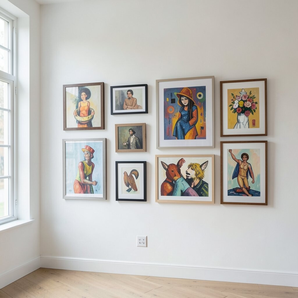
Picture a neat grid of frames that still feels warm, not stiff. Use mismatched frame colors, but keep the artwork sizes mostly similar so it stays tidy.
Start with a bold anchor piece, like a large black-and-white photo or a colorful print, then build around it. This layout helps your brain feel calm because it creates structure while your art keeps things interesting. To make it truly yours, add one small surprise frame with a totally different vibe, like a tiny painting or a ticket-style print.
You’ll benefit from an easy decision-making path: choose a grid size, pick a few frame finishes, and repeat. For cost, focus on thrift-store frames and swap the art later when you find something that makes you grin. A current trend is mixing clean spacing with one “oddball” piece, so your wall looks curated, not chaotic.
2. Frame-Farm Collage on a Single Vertical Line
Frame-Farm Collage on a Single Vertical Line
Imagine a tall line of frames that climb like plants on a trellis. Keep the spacing small, and let different sizes overlap the way a collage does.
This idea feels playful right away, and it turns blank wall space into a statement. A vertical cluster is also great for narrow hallways because it doesn’t widen the room visually.
To personalize it, pick a color family and then break it with one frame that’s a bright “wild card,” like teal or sunny yellow. For budget, use inexpensive prints and upgrade frames only for the top third where people look first. People are leaning into more organic layouts lately, and this one gives that look without needing perfect alignment.
3. Gallery Wall with Shadow-Box Textures
Gallery Wall with Shadow-Box Textures
Picture a wall that holds more than photos, like a mini display case. Add shadow-box frames that show fabric swatches, pressed leaves, or small objects with meaning.
When you include texture, your wall feels richer and more “real,” like you can almost touch it. It’s also a smart way to protect delicate items while still showing them off.
Try grouping items by theme, such as nature, travel, or family memories. You can even label one box with a short date or a tiny handwritten note, which makes it feel personal. For cost, shadow boxes can be pricey, so start with just a few and mix them with regular frames.
A current trend is mixing flat art with objects, because it adds depth and catches light at different angles. Keep the backing colors simple so the textures stand out, not fight for attention.
4. Monochrome Moments with One Pop Color
Monochrome Moments with One Pop Color
Think of a wall mostly in black, white, and gray, like a calm photo in a magazine. Then add one bright piece—maybe a red illustration or a blue abstract print—to make the whole wall wake up.
This style helps your eye rest while still feeling excited, and it’s great if you like order but not boredom. Choose prints with similar tones, so the colors blend even if the frames are different.
For personalization, pick a pop color that matches something in your room, like a throw pillow or a lamp shade. Budget-friendly tip: print your own monochrome art from free sources or create simple shapes with your own photos. This “mostly one palette” look is popular right now, because it feels modern while still letting you be creative.
Hang your pop color piece at eye level or slightly higher, so it becomes the first thing people notice.
5. Vintage Maps Mixed with Modern Prints
Vintage Maps Mixed with Modern Prints
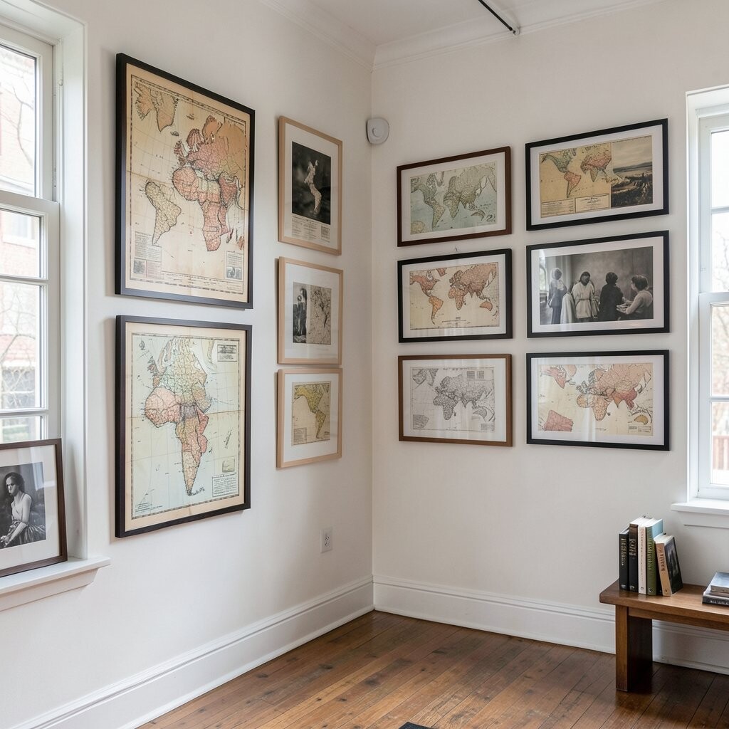
Imagine old map pages next to clean modern artwork, like two time periods high-fiving on the wall. The mix feels smart and stylish, especially if you like stories and places.
This combination gives your home a layered personality. The vintage paper adds warmth, while modern prints add clarity and a fresh look.
To personalize, choose maps from places you love—where you lived, traveled, or dreamed about. Pair each map with a modern piece that shares a color, like muted green, warm tan, or deep navy.
For cost, thrift store maps and scan them for printing if you want cleaner edges. If you can’t find maps, use vintage-style printables in similar sizes and frame them the same way for a cohesive feel. A current trend is “heritage + modern,” which turns your wall into a conversation starter every day.
6. The “Odd Collection” Wall with Curated Chaos
The “Odd Collection” Wall with Curated Chaos
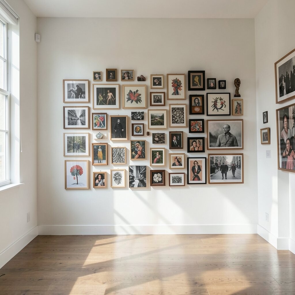
Picture a wall where different styles bump into each other in the best way. You’ll see bold art, calm photos, and a few playful posters that look like they belong to different worlds.
This approach is unique because it celebrates your real taste, not a single theme. It also works well for people who keep collecting things they love and want them shown nicely.
Start by choosing one boundary rule, like keeping all frames at the same height or using only two frame colors. Then break the rule with one piece, like a mirror or a clock, so it feels intentional. For personalization, add small quotes, art from friends, or even a drawing you made as a kid.
Cost-wise, you can control spending by buying affordable prints and saving your best budget for the two most important pieces. This style fits current trends because people love walls that feel collected over time, not perfectly purchased.
7. Color-Block Gallery with Overlapping Matting
Color-Block Gallery with Overlapping Matting
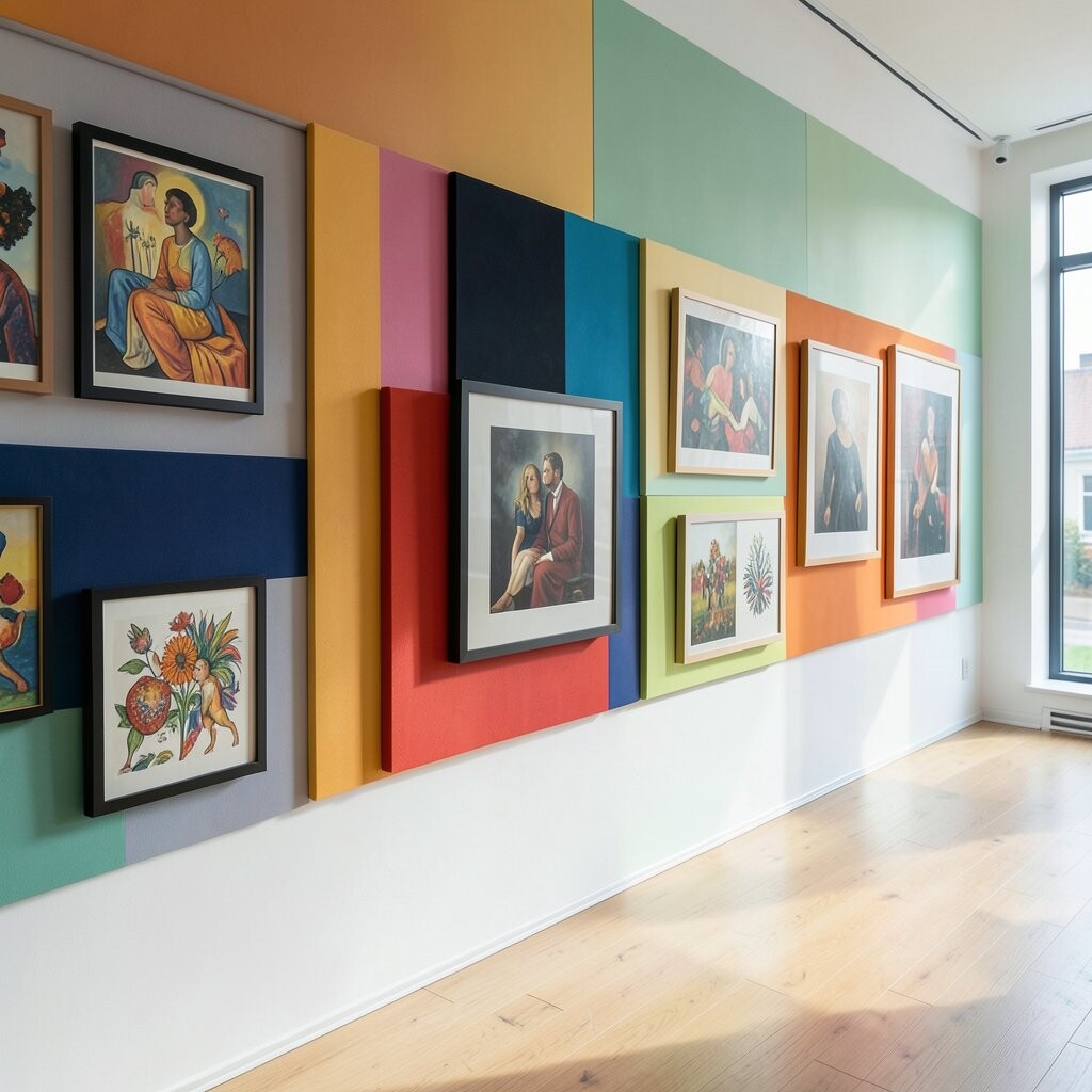
Imagine your wall dressed in color blocks where frames overlap like friendly neighbors. Use mats in different shades, but keep the cut and thickness similar for a clean look.
This gives a bold, graphic vibe, and it helps the wall feel designed even if the art is mixed. It also makes it easier to mix sizes because the colored mats act like a “bridge” between pieces.
To personalize, pick a color direction that matches your room, like warm earth tones for a cozy space or cool blues for a calm one. Try pairing abstract art with simple illustrations so the wall doesn’t feel too busy.
For cost, look for ready-made frame kits and swap the mats yourself. A recent trend is using layered mats and big negative space, because it makes the whole wall look high-end without spending designer money.
8. Black Frames with White Backing for a Crisp Look
Black Frames with White Backing for a Crisp Look
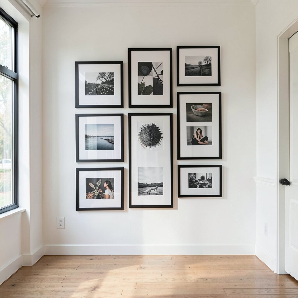
Picture a gallery wall with slim black frames and bright white paper behind everything. The result feels crisp, like your photos just got a fresh haircut.
This setup keeps eclectic art from getting messy. You still get variety in subject matter, but the shared frame style gives your wall a clear “team uniform.”
To personalize, mix photo prints, small typography, and one large art print that stands out. Place a few pieces slightly higher than eye level so your wall feels lifted and airy.
For budget, buy black frames at sale prices and print your own art or use inexpensive downloads. This look is popular because it reads modern, and it pairs beautifully with many home styles.
9. Shapely Frames: Circles, Squares, and Arches Together
Shapely Frames: Circles, Squares, and Arches Together
Imagine a wall where frames come in different shapes, like a set of decorative cookies. Some are circles, some are rounded rectangles, and some are classic squares.
This is an instant way to make an eclectic gallery feel playful and creative. The variety also adds visual rhythm, so your eye keeps moving instead of getting stuck.
To personalize, choose one theme like “bottles and flowers” or “city scenes” and match each shape to a sub-theme. You can also repeat one frame shape a few times, which helps tie the whole wall together.
Cost tip: circular frames can be pricey, so start with standard frames and add a couple of special shapes later. A current trend is using “architectural” frame variety, especially around entryways and stair landings, because it makes those spaces feel welcoming.
10. Family Photo Stories with Handwritten Captions
Family Photo Stories with Handwritten Captions
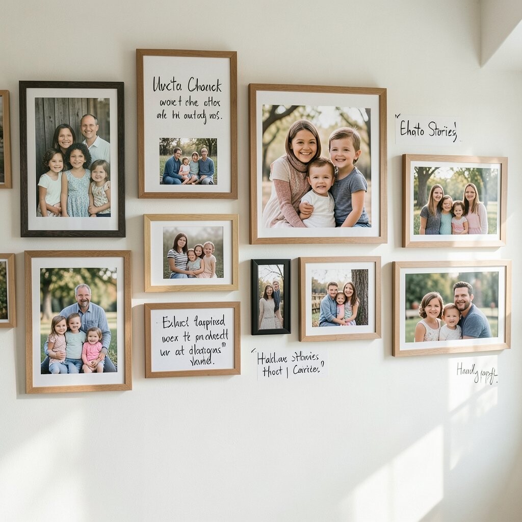
Picture a wall of family photos where each one has a tiny story attached. The captions can be written on small cards or placed under glass in frame mats.
This makes your gallery wall more than decoration. People connect with it because it holds meaning, and it brings warmth to everyday moments.
To personalize, write short phrases instead of long paragraphs, like “First day of school,” “Best trip ever,” or “Tiny victory.” Add one frame that’s more artsy—like a painted portrait photo—so the wall still feels creative, not only sentimental.
For cost, print photos from your phone and use affordable frames. If you want the captions to look neat, use a small label maker or simple handwriting in a consistent style. A growing trend is mixing personal storytelling with modern frames, because it feels human and inviting.
Consider hanging your first photo slightly above eye level, so visitors notice the story right away.
11. Mirror + Art Mix for a Brighter Room
Mirror + Art Mix for a Brighter Room
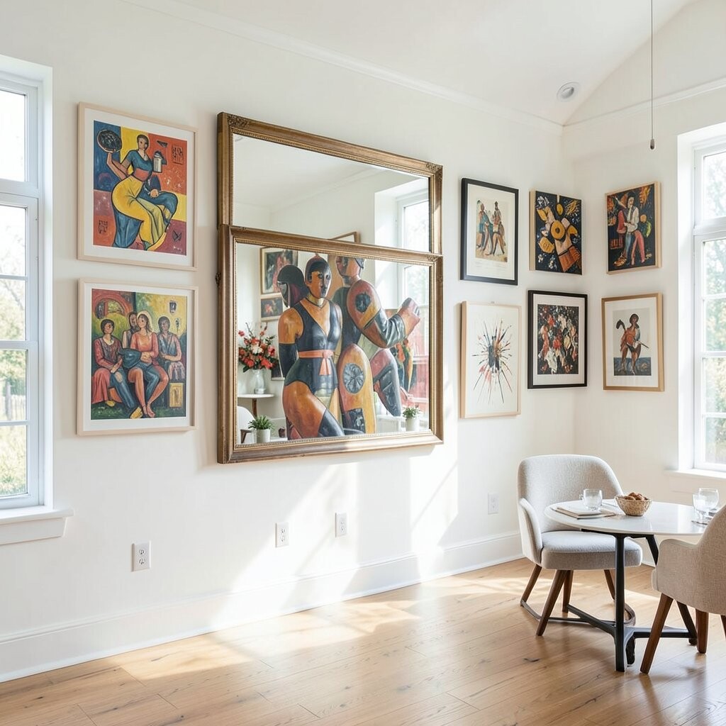
Imagine a gallery wall where a mirror sits among artworks like a shining friend. The mirror bounces light around and makes your room feel bigger without extra furniture.
This idea is unique because it mixes “gallery” and “function.” You get visual interest from art, plus the practical benefit of checking your look on the way out the door.
To personalize, choose a mirror shape that fits your vibe—round for softness, rectangular for clean lines. Pair it with framed photos or prints that share similar colors, so the mirror doesn’t feel random.
Cost considerations: mirrors can cost more than prints, so hunt for deals at thrift stores or use a budget-friendly frame mirror. Current trends show more mixed walls using reflective pieces, because they add drama and brighten darker corners.
12. Travel Postcards and Ticket Stubs in a Display Strip
Travel Postcards and Ticket Stubs in a Display Strip
Picture a long strip of small frames that look like a scrapbook turned into art. You’ll see postcards, ticket stubs, and short notes that feel like a journey frozen in time.
This is a fun way to show memories without needing a huge collage. It also helps you organize keepsakes so they look intentional, not cluttered.
To personalize, sort your cards by mood—coastal, mountain, city lights—or by year. Use a consistent background color behind small items so the whole wall stays neat.
For budget, use smaller frames and print your own postcard-style designs if you’re missing items. A current trend is “micro-collections,” which means tiny meaningful pieces grouped tightly to make a big emotional impact.
Keep the strip at eye level in a hallway or near a desk, so it’s easy to enjoy every day.
13. Patterned Background Papers Behind the Frames
Patterned Background Papers Behind the Frames
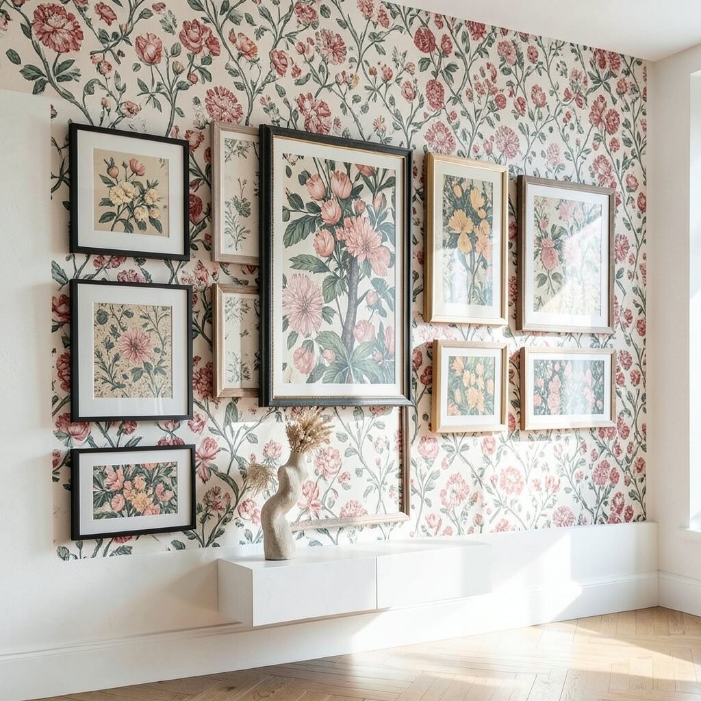
Imagine your gallery wall with wallpaper-like energy behind the frames. The art stays in frames, but the background pattern makes everything feel richer and more layered.
This gives your wall a designer feel because the pattern adds depth even when your art collection changes. It also helps unify different styles, since the background acts like a common thread.
To personalize, choose a pattern that matches your room’s personality—soft florals for cozy spaces, bold geometric for modern rooms. Make sure the pattern colors don’t clash with your art; pick two main tones and build around them.
Cost tip: wallpaper can be affordable when you use it strategically on one section. You can also use peel-and-stick options and remove it later if you want a new look. This idea aligns with current trends where people use “contrast backing” to make prints pop.
14. Minimal Frames, Maximum Artwork Styles
Minimal Frames, Maximum Artwork Styles
Picture many simple frames all the same style, like thin wood or matte metal. Then inside each one, the art can be wildly different—sketches, photos, quotes, and paintings.
This is a smart way to go eclectic without making the wall look messy. The consistent frames act like a calm border, so the variety inside feels exciting instead of confusing.
To personalize, choose a “story lane” for the wall, like art that shows your hobbies: cooking, music, nature, and art. Put your most meaningful piece in the center or near the top, so the arrangement has a clear leader.
For cost, buy uniform frames during sales and focus your budget on the artwork. A current trend is clean frame sets with mixed media inside, because it looks intentional and modern while still playful.
15. The Shelf-Side Gallery with Leaning Art
The Shelf-Side Gallery with Leaning Art
Imagine a gallery wall that includes a small shelf, with art leaning slightly like it’s been casually placed. A few frames can be angled, and some can sit flat, creating a relaxed feel.
This approach is unique because it feels more like a lived-in studio than a formal display. It also makes it easier to swap art seasonally since you can change pieces quickly.
To personalize, mix in small objects on the shelf, like ceramics, books, and one plant. Choose frames that match each other in color or finish, so the leaning pieces look artful rather than accidental.
Cost considerations: you can reduce spending by using art prints you already own and frames you can find cheaply. Current trends love “gallery-as-style,” where the wall and the shelf look like one design moment, not separate projects.
16. Color Wheel Collage for a Big Personality Wall
Color Wheel Collage for a Big Personality Wall
Picture a wall arranged like a color wheel, with reds flowing into oranges, then yellows, greens, blues, and purples. The frames may differ, but the color flow keeps it smooth.
This idea is bold and fun, and it instantly makes a room feel cheerful. It also helps you choose art more easily because each piece has a “color home.”
To personalize, pick your favorite colors and include different textures in those tones—paintings, photos, fabric art, and prints. Add one neutral frame, like off-white or black, to give your eyes a break.
For cost, print art in different colors from your own photos or use poster prints you can afford. A current trend is using color gradients in interiors, because it feels modern and energetic while still looking organized.
Start by mapping your colors on the floor, then place frames until the gradient feels right.
17. Wraparound Corner Gallery for “Secret Room” Energy
Wraparound Corner Gallery for “Secret Room” Energy
Imagine art that bends around a corner so it feels like your home has hidden depth. Frames wrap from one wall to the next, creating a cozy “secret spot” vibe.
This is unique because most gallery walls are flat on one wall, so a corner instantly feels special. You also get the benefit of making a corner look purposeful instead of awkward.
To personalize, choose a theme that works from both angles, like botanical prints, abstract shapes, or travel photos with similar colors. Keep a few larger pieces on the main wall and smaller ones around the corner so the arrangement feels balanced.
Cost considerations: corners can work with thrift frames and print art because you’re creating a stylish effect through placement. This is trending because people want design moments that feel like “rooms within rooms,” even in small spaces.
When hanging, use painter’s tape to mark your layout first, so you can adjust the wraparound path without stress.