1. Soft Sage + Warm Wood for an Easy, Everyday Calm
Soft Sage + Warm Wood for an Easy, Everyday Calm
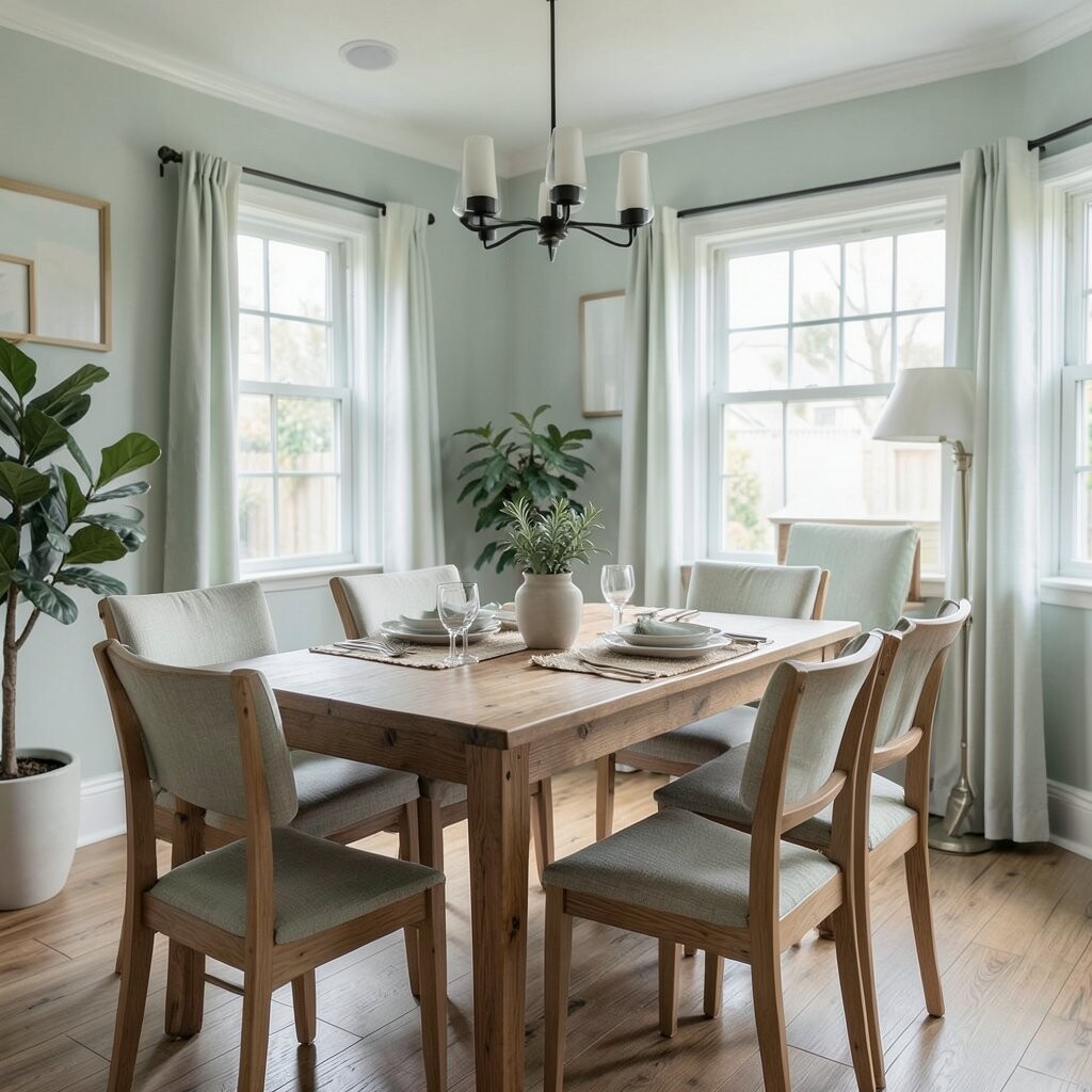
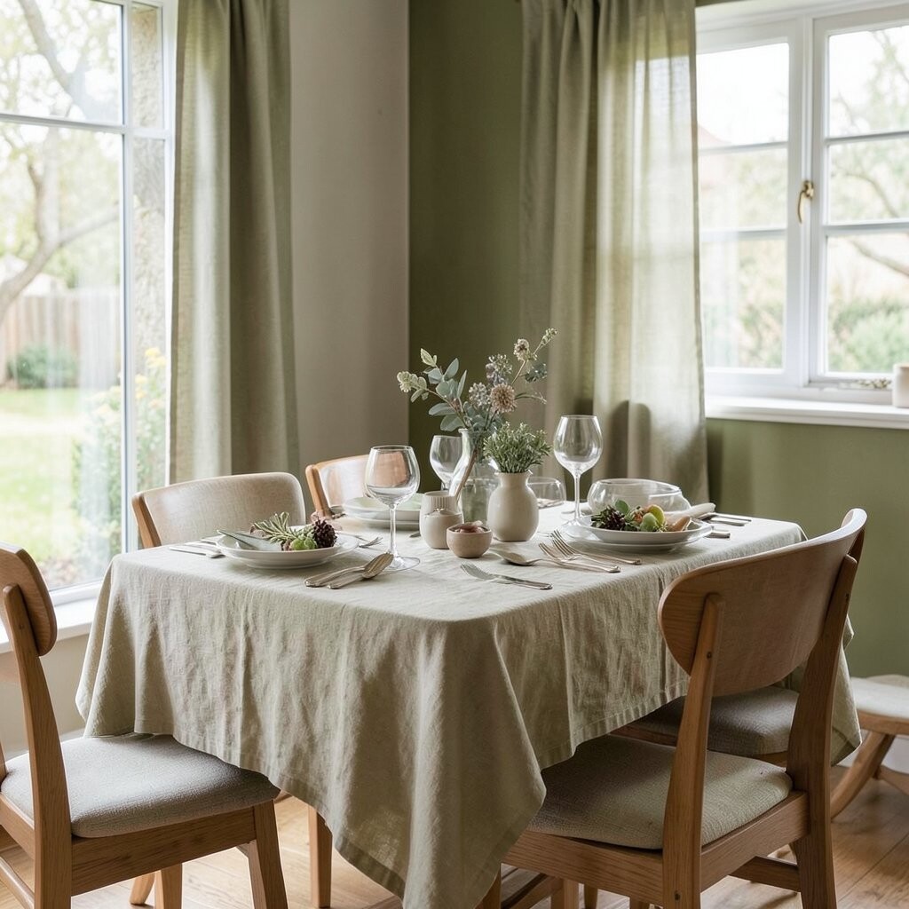
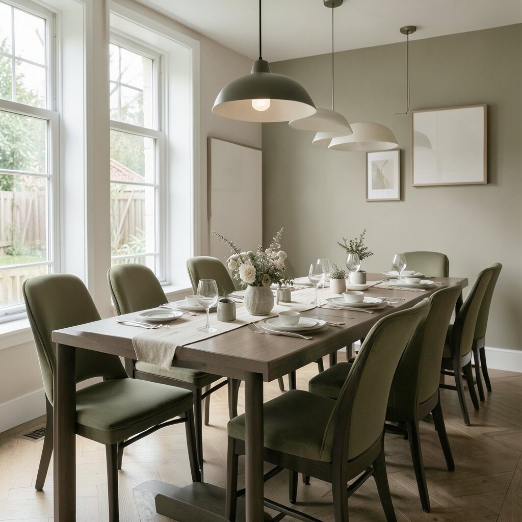
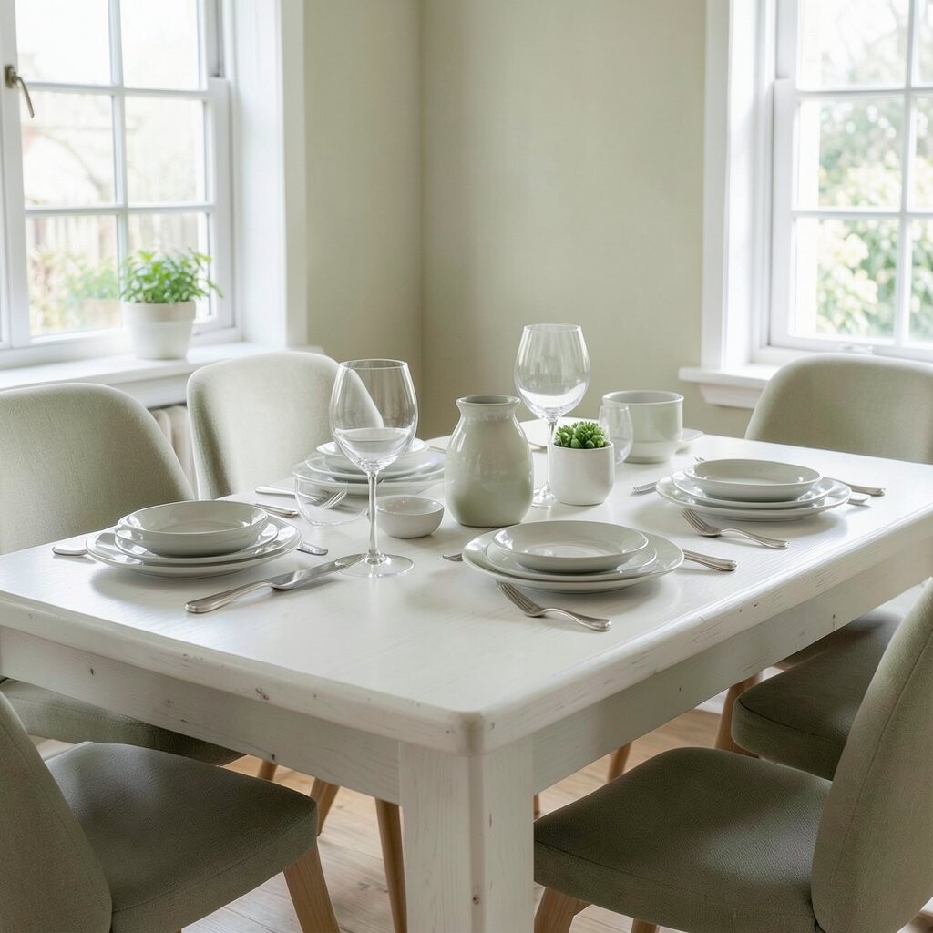
Picture dining chairs in a light sage green while the table stays warm and natural. The room feels fresh, like morning air resting on a porch.
This palette helps people slow down and talk more, because the colors never feel harsh.
To keep it from looking too “painted,” match sage accents with wood grain that’s visible and not overly glossy.
Add warm cream curtains and a light linen table runner for a gentle balance.
If you want a quick upgrade, swap just the seat cushions or dining chair covers first.
2. Dusty Blue Walls with Cloud-White Details
Dusty Blue Walls with Cloud-White Details
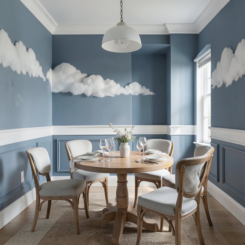
Imagine a dining nook wrapped in dusty blue, with bright white trim that looks like soft clouds.
Your eyes rest on the cool tone, and the whole space feels tidy and calm.
Cool colors can make a room feel more spacious, which is great for apartments and smaller dining areas.
Pair the blue with simple lighting so it glows at night.
For personalization, choose a deeper blue on just one wall and keep the rest cloud-white.
Use a round mirror to bounce light and make the palette feel airy.
Budget-wise, consider painting one wall first or using peel-and-stick wallpaper panels if you want an easier change.
3. Sand Beige + Light Gray for a Relaxed Neutral Haven
Sand Beige + Light Gray for a Relaxed Neutral Haven
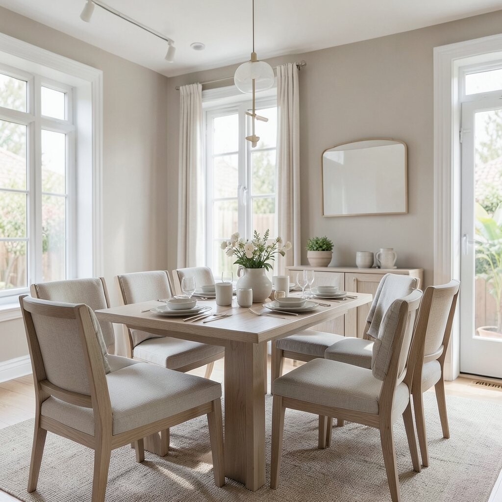
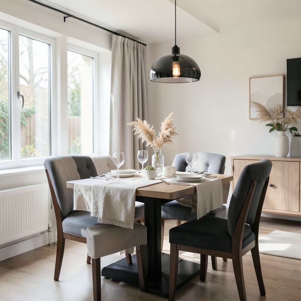
Think of sand beige on the walls, light gray on textiles, and a table surface that shows natural texture.
The room looks calm and “put together” without feeling formal.
Neutral tones help everything else stand out, like a vase of herbs or a bowl of citrus.
This kind of palette is also easy to update over time because you can swap decor without repainting.
If you like change, neutrals are friendly to your future ideas.
Try adding a touch of warm white ceramics and a woven placemat for a cozy look.
Keep patterns gentle, like thin stripes or small dots, so the space stays peaceful.
4. Soft Blush Pink with Antique Gold Accents
Soft Blush Pink with Antique Gold Accents
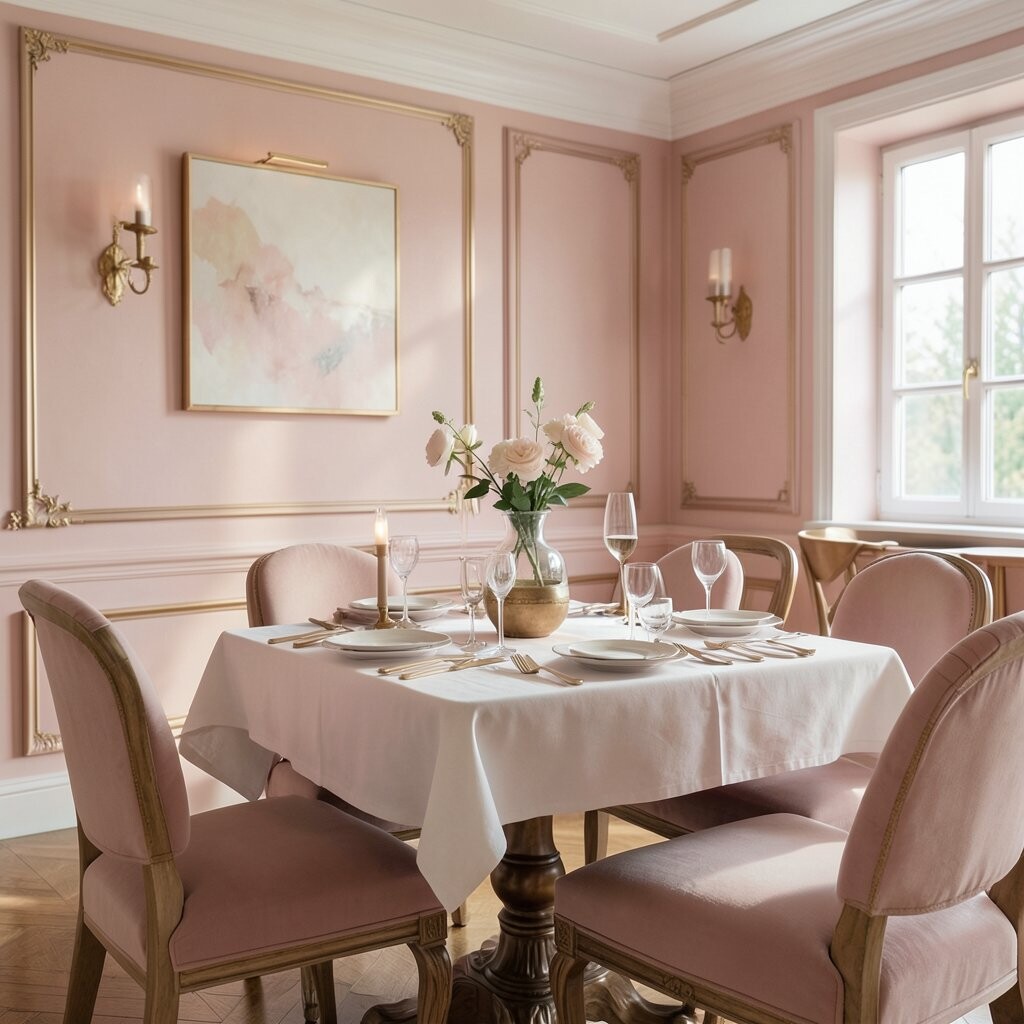
Picture blush pink chairs or wall panels with antique gold light fixtures.
The mix feels gentle, romantic, and surprisingly calm when the pink is not too bright.
You get a warm glow that makes dinner feel special.
Blush tones can lift the mood without turning the room into a loud party spot.
For a balanced look, use gold in small places like a pendant, mirror frame, or picture frames.
5. Olive Green + Natural Linen for Earthy Serenity
Olive Green + Natural Linen for Earthy Serenity
Visualize an olive-colored wall or sideboard, paired with light linen napkins and textured placemats.
The room feels grounded, like being surrounded by plants even when you’re indoors.
This palette is great for people who love nature vibes.
Olive and linen together can make the dining area feel cozy in every season.
The muted green also hides small marks, which is handy if you host often.
To personalize, add a few earthy colors like clay terracotta or muted ochre in small decor items.
If you’re working with a tight budget, switch table textiles and add a green centerpiece instead of repainting.
6. Crisp White + Pale Teal for a Fresh, Clean Feel
Crisp White + Pale Teal for a Fresh, Clean Feel
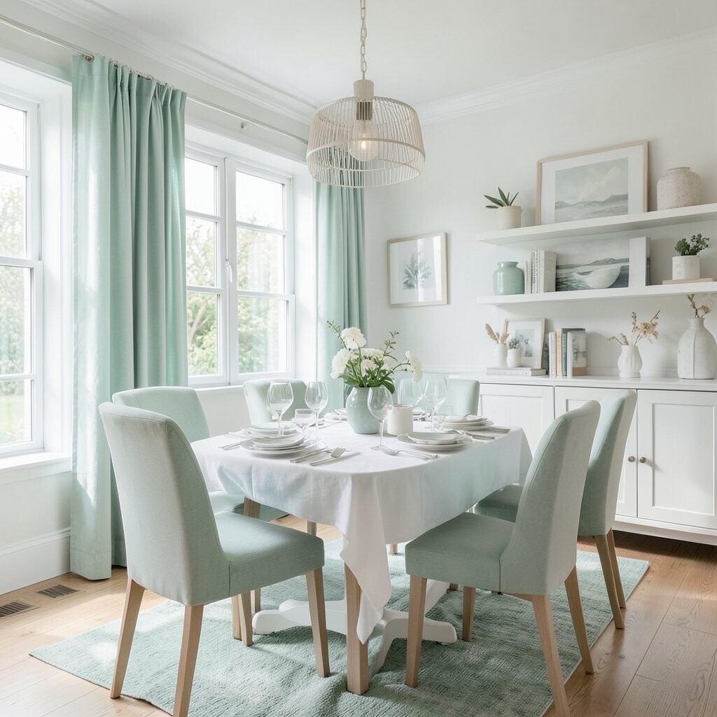
Imagine crisp white walls with pale teal accents in a runner, art, or light curtains.
The palette feels clean, bright, and softly refreshing.
Light teal can bring a calm “water” feeling, which many people find relaxing during meals.
Use textured materials like cotton, jute, or matte ceramics so it doesn’t look too sterile.
This combo works well for modern and coastal styles.
7. Charcoal Mist + Warm Off-White for Quiet Drama
Charcoal Mist + Warm Off-White for Quiet Drama
Picture charcoal mist on the lower walls or a buffet, with warm off-white above.
It creates a calm kind of contrast, like evening shadows that still feel inviting.
Darker neutrals can help dining lighting look richer and more flattering.
Just keep the room balanced with light fabrics and bright tableware.
Personalize with soft patterns like subtle checks, or add a muted stone vase for depth.
For cost, try painting only the buffet or adding a dark peel-and-stick panel to one section.
Pair with warm bulbs for extra coziness.
8. Soft Lavender + Warm Cream for a Dreamy Table Mood
Soft Lavender + Warm Cream for a Dreamy Table Mood
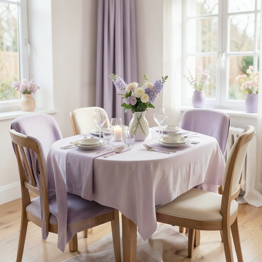
Think of lavender chair backs and creamy table linens coming together like a gentle hug.
The room feels soothing and a little dreamy, especially with warm lighting.
Purple family colors can feel calming when they’re muted, not loud.
This palette is perfect if you enjoy a cozy, spa-like vibe.
It also makes flowers look vivid without needing extra color.
Personalize by using lavender in a few spots: curtains, a table runner, or a patterned placemat.
If you want a budget-friendly start, swap napkins and add a light purple candle holder.
9. Pale Peach + Natural Rattan for Gentle Warmth
Pale Peach + Natural Rattan for Gentle Warmth
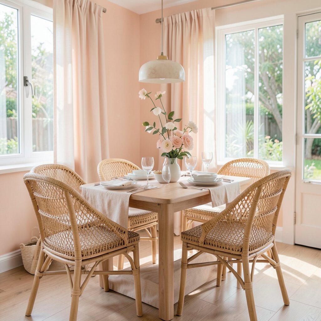
Imagine a pale peach wall color with rattan chairs and a few woven lampshades.
The palette feels warm and friendly without being too energetic.
It’s like sunshine that stays mellow.
Peach tones can encourage conversation because they feel welcoming and easy.
Combine with off-white and honey-colored wood to keep everything soft.
10. Monochrome Olive + Cream for a Clean, Calm Look
Monochrome Olive + Cream for a Clean, Calm Look
Visualize an olive dining scheme where the shades vary from sage to deeper green, all paired with cream.
The room looks layered, not flat, and it feels calm because the colors belong to the same family.
This is a great choice when you like variety but hate chaos.
Monochrome color families often feel more peaceful because they don’t compete.
You can keep the look stylish by mixing materials like matte paint, woven textures, and smooth ceramics.
For personalization, add one “special” accent like a small dark plant pot or a single patterned cushion.
Cost-wise, you can do this with textile swaps, paint touch-ups, and a couple of budget-friendly decor pieces.
11. Powder Gray + Silver Blue for a Cozy, Modern Edge
Powder Gray + Silver Blue for a Cozy, Modern Edge
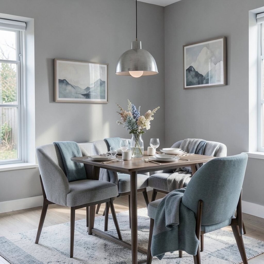
Imagine powder gray walls with a silver-blue runner and subtle cool-toned decor.
The dining area feels modern, soft, and calm like a winter sky.
This palette works especially well with sleek furniture and simple table settings.
Add warm lighting and cream-colored dishes so the room stays inviting.
You’ll notice guests relax faster because the colors feel controlled and gentle.
12. Light Terracotta + Soft White for Comforting Heat
Light Terracotta + Soft White for Comforting Heat
Picture soft terracotta on the walls or on a statement artwork, paired with soft white table linens.
The room feels cozy like a warm meal at home, even on quiet days.
Warm earthy colors can make dining areas feel welcoming and calm at the same time.
Keep the terracotta muted so it doesn’t overpower the space.
Personalize by adding small touches of clay and straw, like woven chargers or handmade ceramic bowls.
For cost, try painting a single accent wall or using color on a buffet instead of covering everything.
Trend-wise, earthy warm tones are staying popular because they feel natural and lived-in.
13. Sea Glass Green + White for an Airy, Restful Room
Sea Glass Green + White for an Airy, Restful Room
Imagine sea glass green chairs, with a white table and bright sheer curtains.
The color looks calm and watery, like something you’d find near the shore.
This palette helps rooms feel lighter, which is great when you want a peaceful dining corner.
Pair it with natural stone details or matte white fixtures for a clean look.
The benefit is that your space feels cheerful but never loud.
For personalization, add glass candle holders or a simple tray with shells and green plants.
Budget ideas: start with chair seat covers or small decor instead of full furniture replacement.
14. Soft Charcoal + Ecru Linen for a Quiet, Luxurious Feel
Soft Charcoal + Ecru Linen for a Quiet, Luxurious Feel
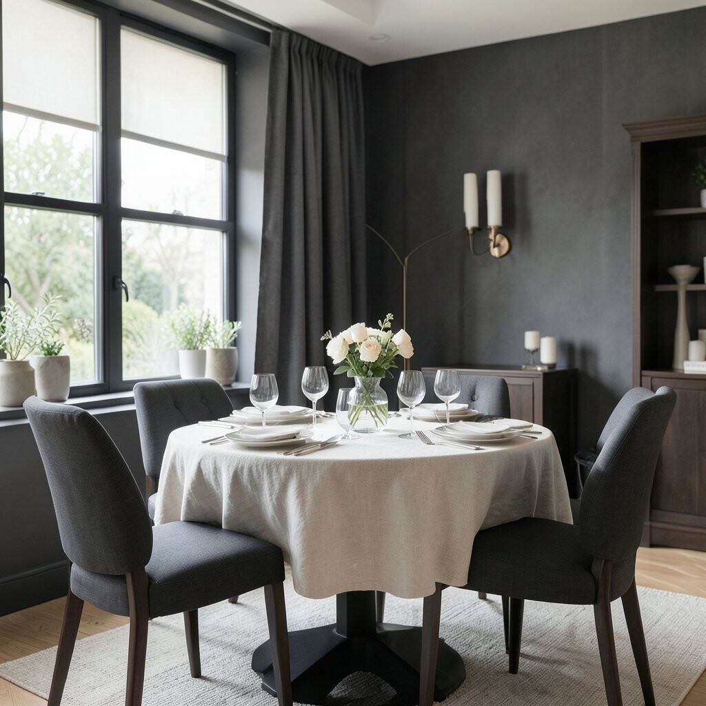
Picture a soft charcoal dining chair with ecru linen curtains and placemats.
It feels rich and calm, like a cozy hotel restaurant that never rushes you.
The contrast is subtle but it looks expensive.
Charcoal can hide stains better than light colors, which is helpful for everyday meals.
Keep the table bright with creamy dishes and warm wood accents.
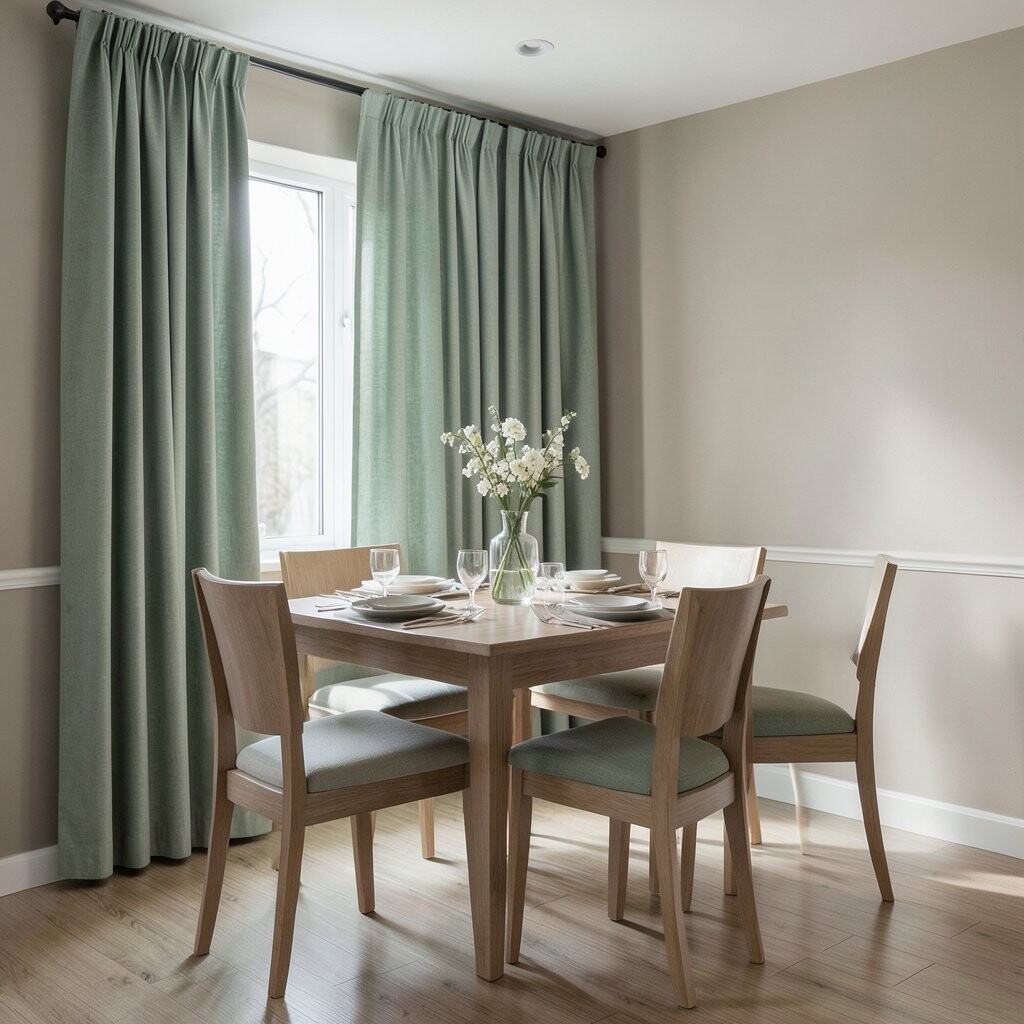
15. Sage Green Curtains + Neutral Walls for an Easy Balance
Sage Green Curtains + Neutral Walls for an Easy Balance
Visualize neutral walls paired with sage green curtains that sway gently when air moves.
The palette feels calm and layered without needing big changes.
It’s a great option for renters too.
Curtains can quickly change the “mood” of a room because they add color and softness.
Sage also works well with wood floors and warm lighting.
Personalize by choosing a curtain fabric with a slight texture, like linen blend, for a more calming look.
Cost considerations: curtains are often more affordable than repainting, and you can reuse them later in other rooms.
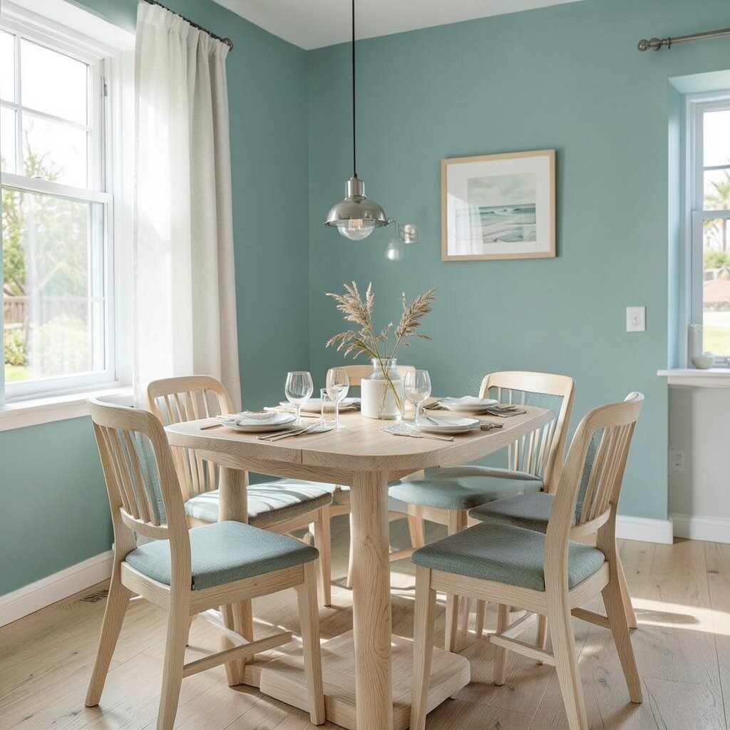
16. Milky Teal + Light Oak for a Relaxed Coastal Twist
Milky Teal + Light Oak for a Relaxed Coastal Twist
Imagine milky teal paint on a wall, with light oak furniture and cream textiles.
The room feels like the ocean nearby, even if you live far from the coast.
Teal with a milky softness is soothing because it’s not too bright or too dark.
Add a textured rug to make the dining area feel grounded and comfortable.
Guests often find it easier to linger when the room feels calm.
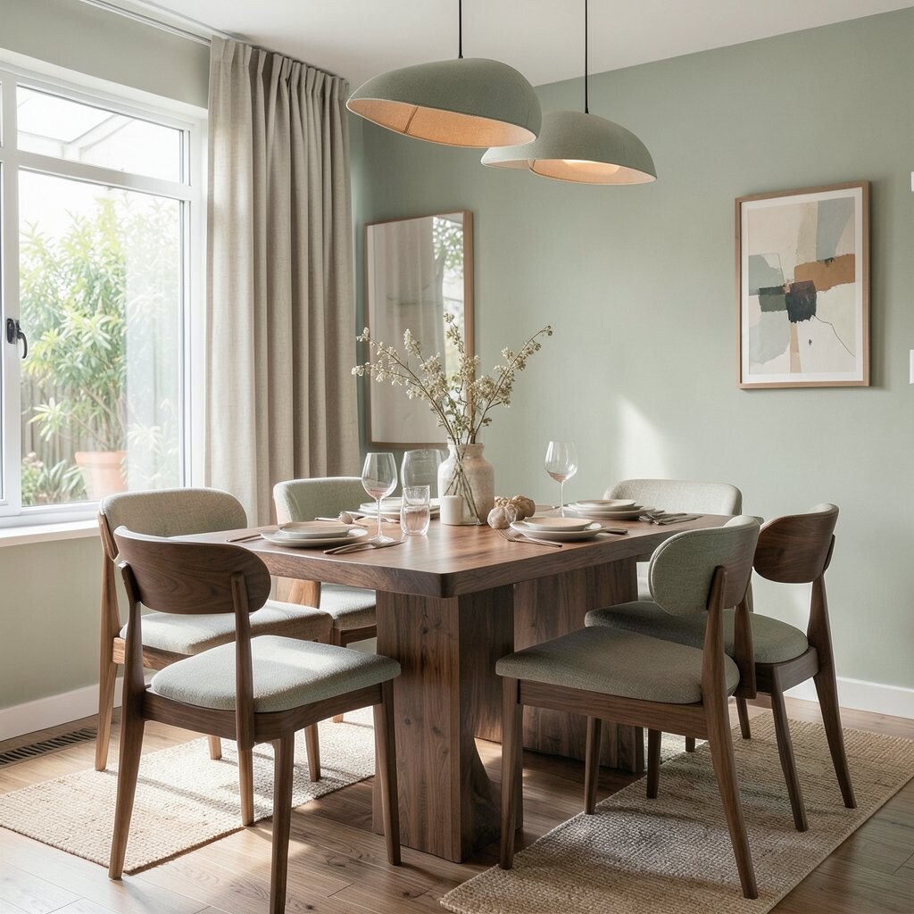
17. Warm Walnut + Soft Sage for Modern Cozy
Warm Walnut + Soft Sage for Modern Cozy
Picture walnut-toned wood and soft sage accents working together like a perfect team.
The dining space feels modern, calm, and deeply welcoming.
Walnut adds warmth, while sage keeps the vibe fresh and restful.
This combo looks great with matte finishes and natural fiber decor.
Personalize with a centerpiece that matches the palette, like sage leaves in a simple vase plus a few pale flowers.
For budget, you can swap chair pads, add placemats, and use peel-and-stick wall decals instead of big remodels.
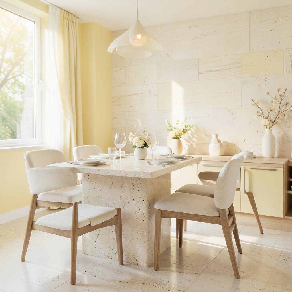
18. Soft Yellow-White + Natural Stone for Bright, Gentle Energy
Soft Yellow-White + Natural Stone for Bright, Gentle Energy
Think of soft yellow-white on the walls and natural stone textures on a side table or tabletop.
The room feels warm, but the colors stay gentle and not too intense.
Light yellow tones can make dining areas feel cheerful, which helps people feel relaxed and happy.
Stone textures add calm grounding, so the space doesn’t feel too light.
This pairing is perfect for breakfast-style dinners and family meals.
Personalize with neutral artwork and simple candle holders in warm white.
Cost considerations: if paint is too much, use a yellow-white runner and a few matching ceramics to get the effect first.
19. Powder Blue + Off-White Woven Textures for a Light Touch
Powder Blue + Off-White Woven Textures for a Light Touch
Imagine powder blue on an accent wall, balanced by off-white woven chairs and textured placemats.
The dining room feels gentle, airy, and easy to live in.
It’s a sweet palette that works for everyday use.
Woven textures make colors feel softer because the fibers scatter light in a calm way.
Keep patterns simple, like subtle stripes or small dots.
20. Pale Olive + White Stoneware for a Calm Table Setting
Pale Olive + White Stoneware for a Calm Table Setting
Picture pale olive walls and white stoneware plates that look handmade.
The dining table feels clean and serene, like a peaceful reset.
This palette makes food look fresh and bright.
Pale olive keeps things grounded without feeling heavy.
White stoneware helps the room feel airy, especially when you add warm lighting.
For personalization, mix in one darker olive element like a napkin ring or a small tray.
Budget tips: focus on tableware and linens first, since dishes and textiles are easier to change than paint.
21. Warm White + Soft Gray + Black Accents for Calm Balance
Warm White + Soft Gray + Black Accents for Calm Balance
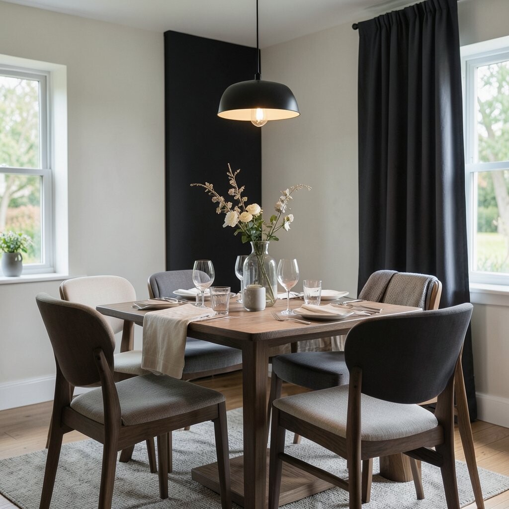
Imagine warm white walls with soft gray upholstery and a few calm black accents.
The room feels balanced and modern, yet still relaxing for long dinners.
This palette is great if you like clean lines but still want comfort.
Add black in small ways like chair legs, a slim frame, or a pendant light.
The benefit is that the room looks stylish without feeling busy.
22. Muted Charcoal Green + Cream for a Cozy, Grown-Up Calm
Muted Charcoal Green + Cream for a Cozy, Grown-Up Calm
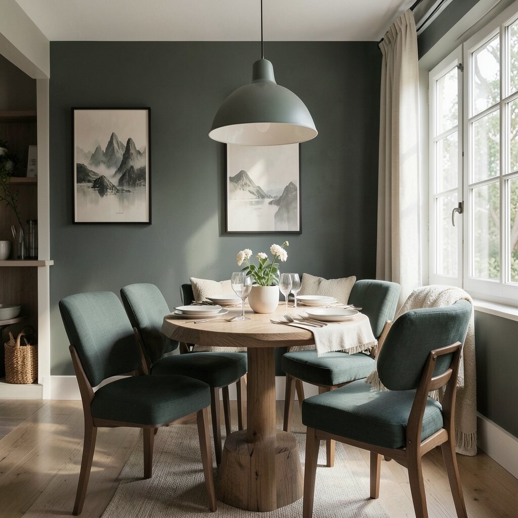
Picture muted charcoal green on a wall, paired with cream curtains and creamy table linens.
The dining area feels cozy and grown-up, like a calm evening even when the day was busy.
This darker green family is a popular trend because it feels natural, modern, and comforting.
To keep it bright, add reflective touches like a mirror or polished metal light fixture.
Personalize with natural decor like wooden trays, ceramic bowls, and soft greenery.
Cost considerations: try painting the smallest wall section first, or use removable wallpaper in a test area before committing.