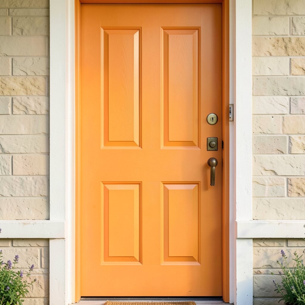
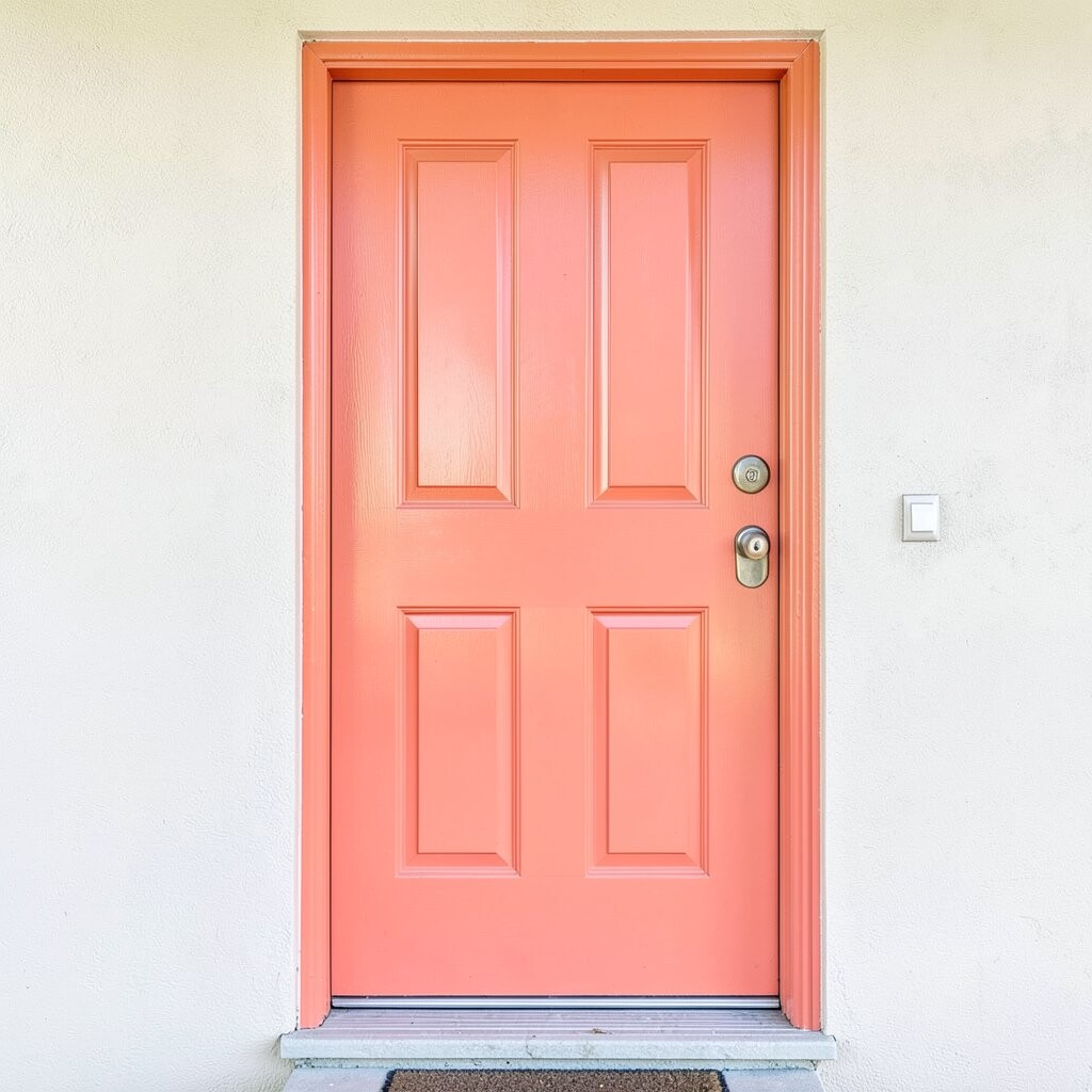
Tangerine door paint looks like warm sunshine waiting at the curb. It gives a cheerful first impression and makes the entrance feel more welcoming.
For a fun look, pair it with clean white trim and brushed nickel hardware. You will love how the color hides scuffs better than very pale shades. If your home has beige or light brick, tangerine can add instant energy without feeling harsh.
To keep the finish smooth, sand lightly and wipe away dust before painting. Choose a semi-gloss exterior paint for easy cleaning after rain and pollen. Consider adding a simple potted plant in green tones to balance the bright orange vibe.
2. Berry-Wine Plum
Berry-Wine Plum
Plum paint on a door feels rich and classy, like velvet curtains. It looks great in photos and makes your porch look more styled.
This color also adds depth to cool-toned homes and can make dark accents stand out. If you want uniqueness, plum is bold but still elegant.
Try pairing a plum door with brass or gold numbers for a warm glow. Use a primer if your old door is stained or glossy, since it helps the new color stick. For cost, plan for two coats, especially if the old paint is very different from plum.
3. Ocean-Teal Lagoon
Ocean-Teal Lagoon
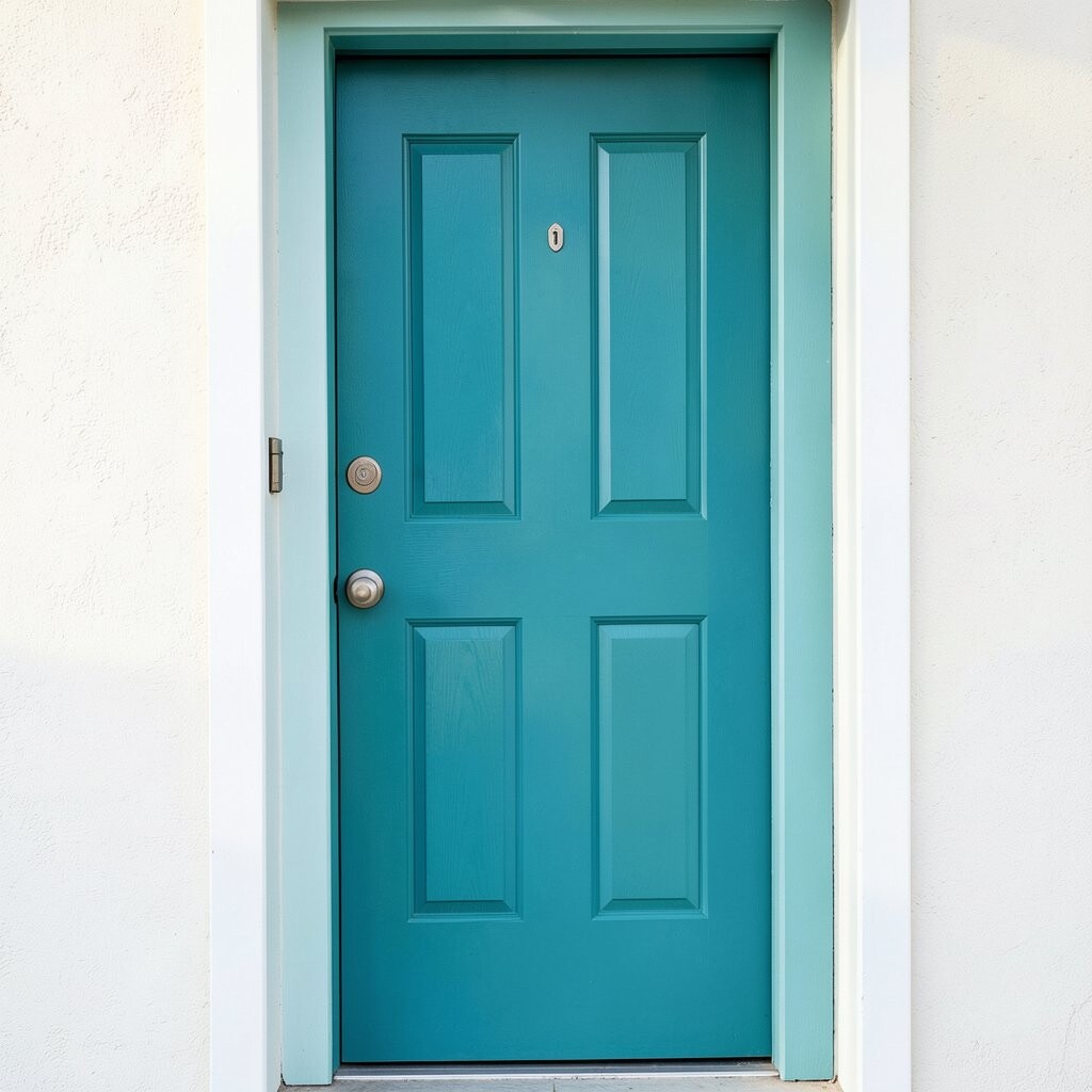
Ocean-teal is one of those colors that feels fresh and calm at the same time. You get a beachy pop without turning your home into a theme park.
Teal works especially well with light gray siding and natural wood elements. It also makes houseplants look extra healthy and bright.
To personalize, add a wreath in coastal colors like sea glass green or off-white. Keep the trim crisp with white or soft cream so the teal stays the star. If you live in sunny areas, choose UV-resistant exterior paint to help the color last longer.
For a budget-friendly approach, repaint the door only and keep the rest neutral. That single upgrade can feel like a full makeover.
4. Bold Emerald Green
Bold Emerald Green
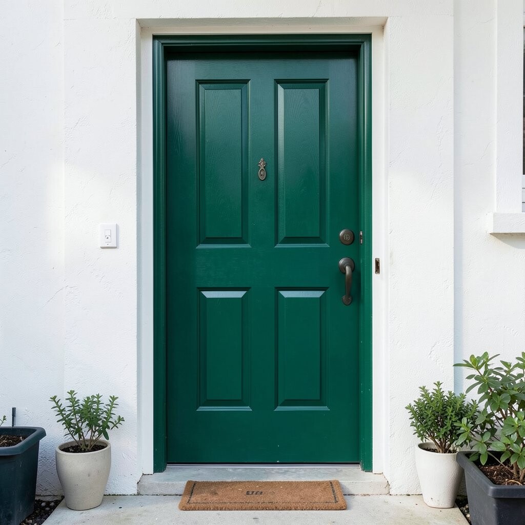
Emerald green creates a dramatic, modern look and feels surprisingly cozy. When the light hits it, the doorway looks layered and expensive.
It is a great match for black shutters, warm wood, and stone steps. If you worry about it being too much, use emerald on only the door while keeping the surrounding trim simple.
5. Electric Royal Blue
Electric Royal Blue
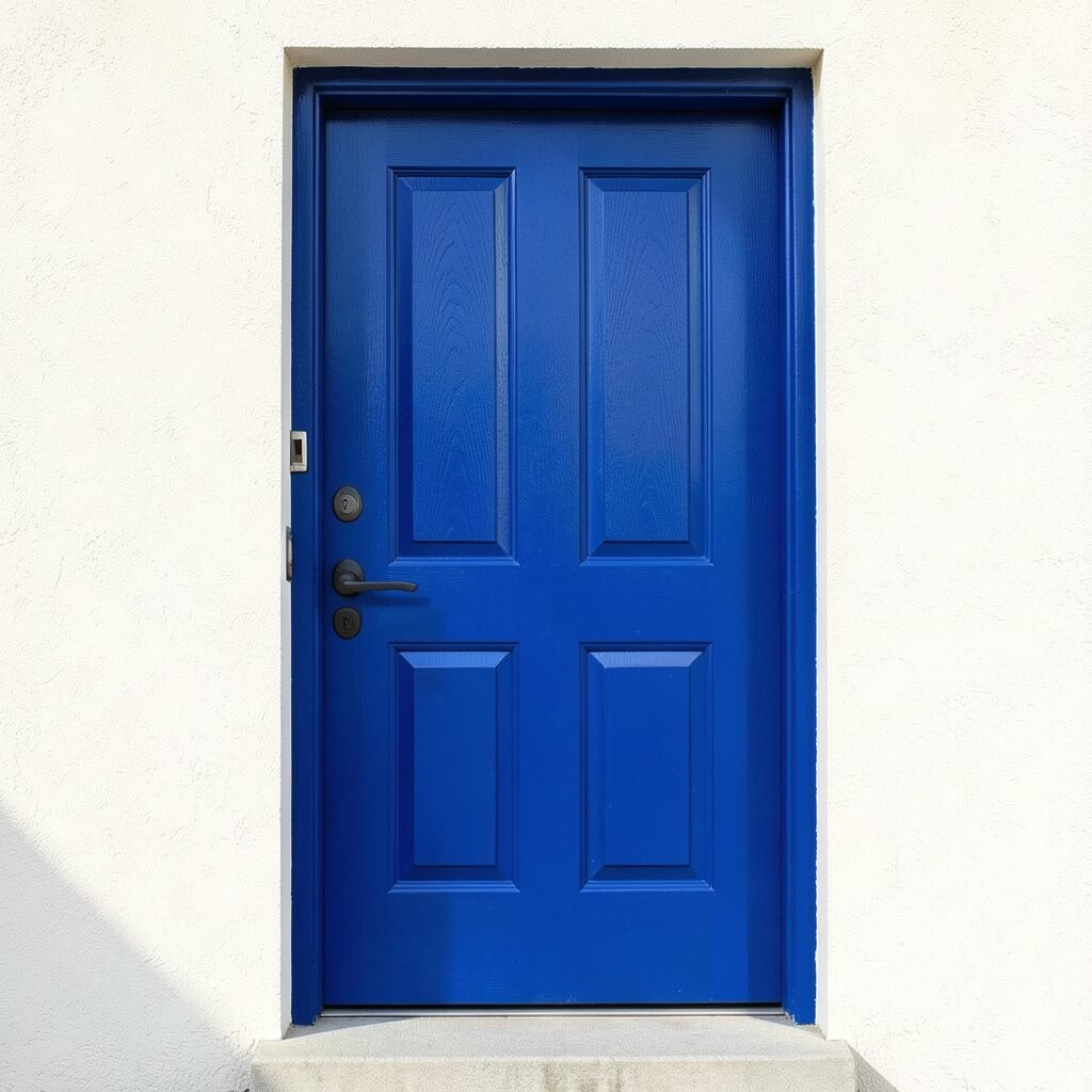
Royal blue is fearless and fun, and it instantly boosts curb appeal. It also pairs nicely with many roof colors and can brighten up a shaded entry.
This hue can make your front porch feel like a cheerful spotlight. It also hides everyday marks better than ultra-light colors.
When painting, use painter’s tape for clean edges around the panels. Consider swapping a simple welcome mat for one in white or navy to tie the look together. For durability, look for exterior paint with good fade resistance, since blue can face sun damage.
6. Hot Coral With Warm Undertones
Hot Coral With Warm Undertones
Hot coral brings a lively splash of color that feels friendly and upbeat. It makes your entry look more energetic and slightly playful.
Coral is also very forgiving against brick and warm siding colors. If you like bold choices but want them to feel softer than red, coral is a great middle path.
Personalize with porch details like terra-cotta pots or patterned cushions in cream and coral. For a cost check, think about repainting the door and updating the hardware for a two-step refresh. New hinges and a fresh doorknob can make the paint look even more “finished.”
7. Fiery Red With a Classic Feel
Fiery Red With a Classic Feel
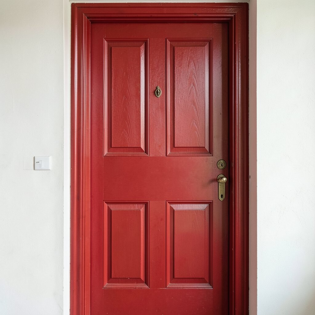
A red door signals confidence and makes visitors feel instantly invited. It is bold, but it also feels timeless and familiar.
Choose a red that matches your home’s style—deep and wine-like for traditional looks, or bright and crisp for modern homes. Red also looks stunning with black railings and white trim.
For tips, apply a thick, even coat and let it dry fully between layers. If your door has window panes, tape carefully so the edges stay sharp. Budget wise, glossy exterior finishes may cost a little more, but they often clean easier year-round.
8. Golden Mustard Sunshine
Golden Mustard Sunshine
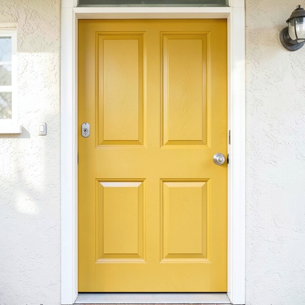
Mustard yellow is a bold hue that feels like late-afternoon light. It brings warmth to front steps and makes a neutral home look happier.
This color stands out against gray, cream, and brick tones. If you want a unique twist, mustard can look amazing with vintage-style lighting and black house numbers.
9. Charcoal-Pepper Smoke Gray
Charcoal-Pepper Smoke Gray
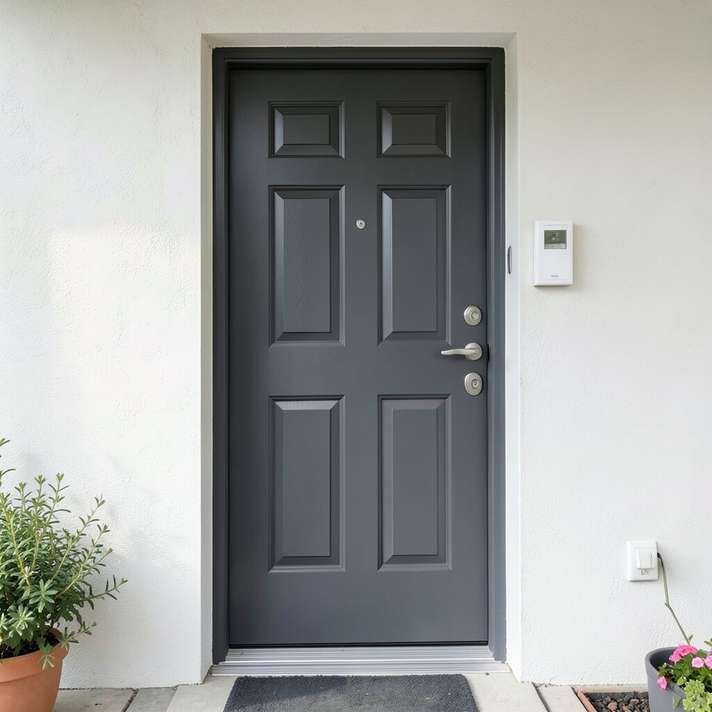
Smoke gray might not sound “bold,” but it can feel bold when it is deep and rich. It adds drama without being loud, and it makes the whole entrance look polished.
This color is great if you want something modern and a little mysterious. It also hides chips and scuffs well, which is a practical bonus.
To personalize, add a bright wreath or colorful seasonal flowers to keep the look cheerful. Pair smoke gray with matte black hardware for a sleek, current style. If you are counting costs, consider using a single satin coat on a well-prepped surface to reduce extra work.
10. Lime Punch Neon-Ready Green
Lime Punch Neon-Ready Green
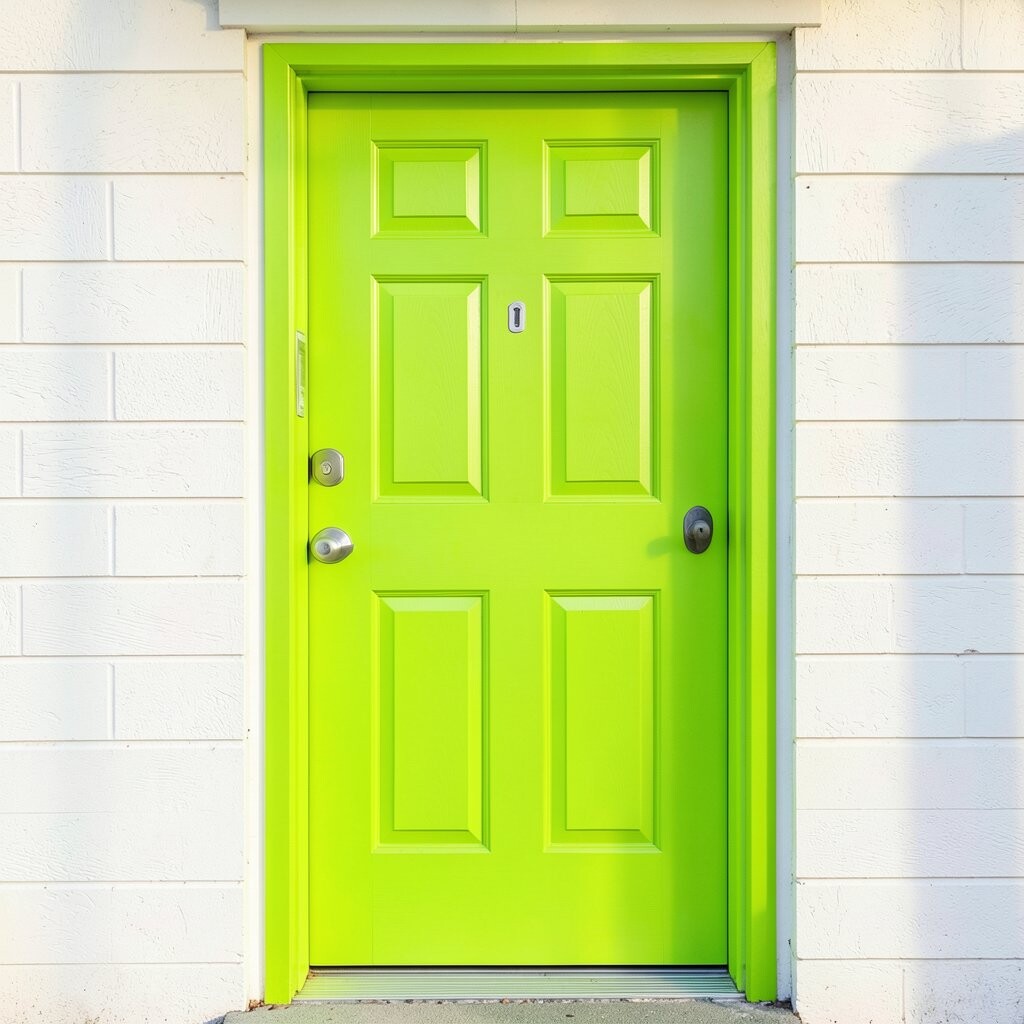
Lime green feels playful and bold like a bright sports drink label. It can make a plain porch feel like it is full of life.
This color is perfect when you want people to notice your home right away. It also works well with white trim and light-colored brick or siding.
For tips, use a primer and choose a high-quality paint, since bright greens can show uneven coverage. If neon feels too wild for everyday, pick a lime shade that leans toward chartreuse instead of ultra-bright. Add simple decor like a matching mailbox or colorful doormat to tie the fun together.
11. Soft Plum-Red Rose Tones
Soft Plum-Red Rose Tones
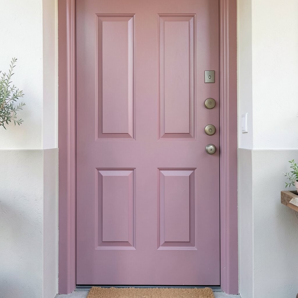
Rose-plum paint sits between pink and berry and looks truly special. It feels romantic but still bold enough to stand out from the crowd.
This color can brighten up a front entry that feels too neutral. It also creates a nice contrast with light stone, cream siding, or warm wooden details.
To personalize, choose hardware in polished brass or antique gold for a vintage vibe. Use a wreath in eucalyptus green and blush accents to keep it balanced. On the cost side, plan to budget for proper prep, because rose tones often show flaws more easily than dark colors.
12. Tangerine Burnt Orange With Depth
Tangerine Burnt Orange With Depth
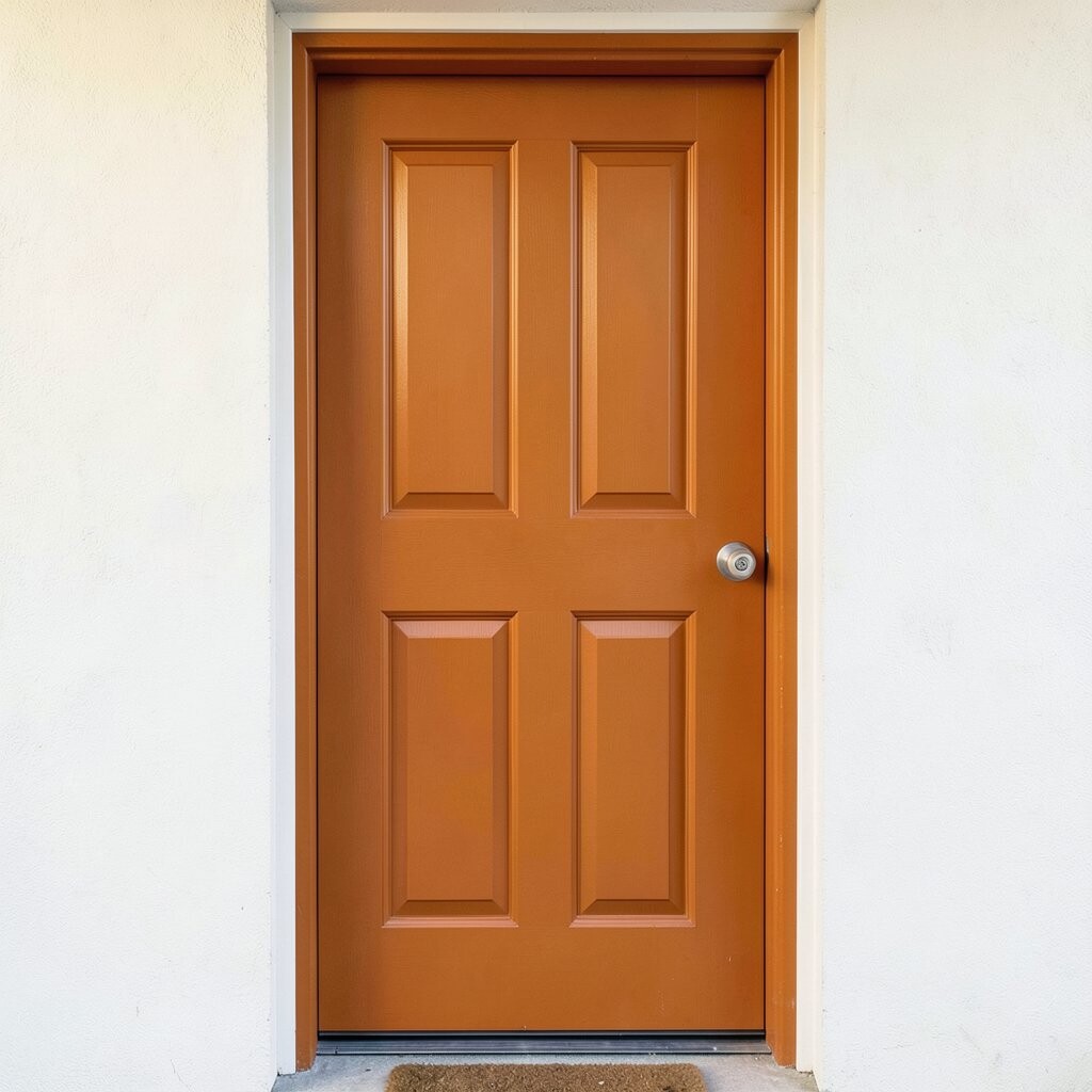
Burnt orange feels richer than typical orange, like spices in the sunlight. It brings warmth to your entrance and looks especially good on doors with classic panel shapes.
This hue can make your front steps feel cozy even on gray days. It also pairs beautifully with black numbers, dark doormats, and natural stone.
Try adding a small accent light or spotlight so the color glows at night. For personalization, repaint the door knocker or handle area in a coordinating tone, or keep the hardware in matte black. Budget wise, burnt orange may need two solid coats, but the final look is worth it.
For best results, stir your paint well and keep a wet edge while rolling and brushing to avoid streaks.
13. Deep Teal With Glossy Shine
Deep Teal With Glossy Shine
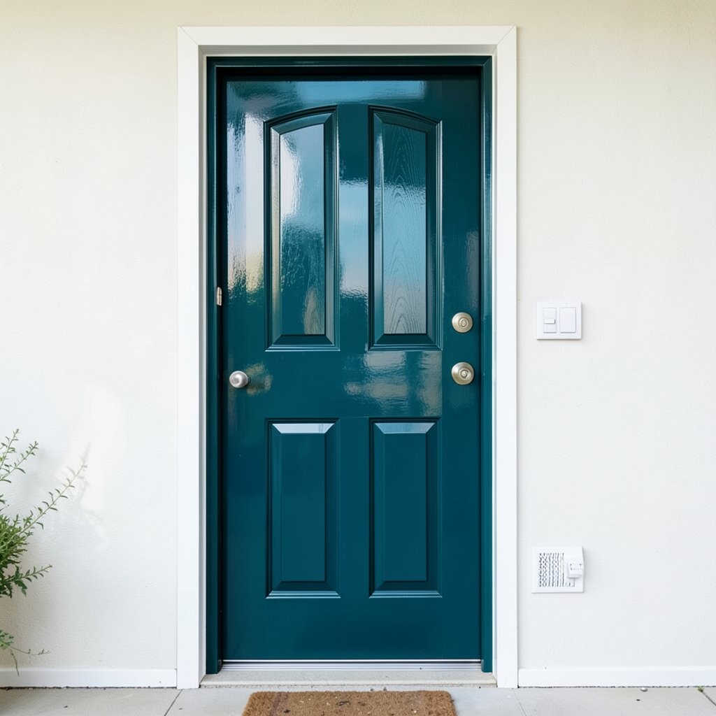
Deep teal adds a bold, ocean-like feel that looks calm and strong. When you use a glossy finish, the doorway reflects light and looks freshly painted longer.
It also works as a great “statement color” for modern homes, especially when the rest of the exterior stays simple. You will notice how it makes the trim look cleaner by contrast.
To make it feel personal, choose an outdoor mat in white with a teal pattern or a solid color in navy. Match your planter colors to the teal by using blue-green leaves, not just bright flowers. If you are working with limited time, a semi-gloss or gloss exterior paint can help hide minor imperfections while still looking sharp.
Keep costs under control by covering nearby surfaces well and using quality tape to prevent paint bleed. That small step saves time on touch-ups later.