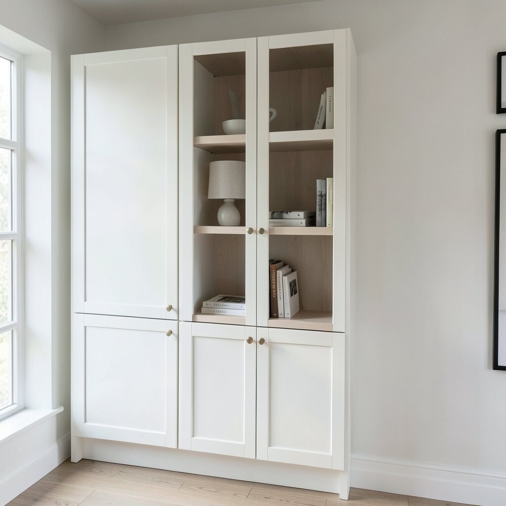
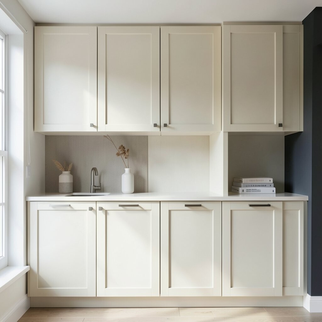
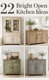
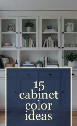
Imagine cabinets that look like warm milk in morning light. They sit gently over dark walls, so the space feels calm instead of heavy.
Warm white helps bright colors pop, especially brass faucets and colorful dishware. It also makes small kitchens feel bigger because the eye keeps moving across the smooth light tone. Choose a finish that is not too shiny for a cozy look.
For personalization, add a darker glaze only in the corners to keep the details visible. Pair with light wood shelves or a beige backsplash for extra softness. Budget-wise, cabinet paint is often cheaper than full replacement, and it gives you a big visual change fast.
2. Greige Cabinets That Balance Gray and Beige
Greige Cabinets That Balance Gray and Beige
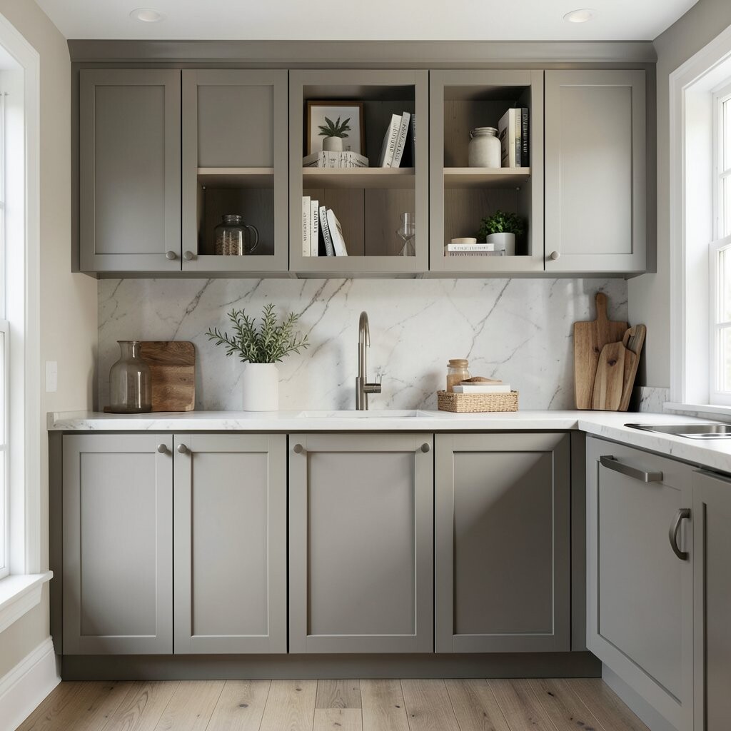
Greige cabinets look like a foggy sunrise—somewhere between gray and tan. Against dark floors or charcoal walls, they feel balanced and grown-up.
This color works well because it holds its own without fighting the dark tones. It also pairs smoothly with black hardware, matte stone counters, and natural wood accents. If you want a “not too trendy” option that still feels current, greige is a strong pick.
Try a semi-matte finish so fingerprints don’t stand out as much. Add a warm under-cabinet light to make the color look richer in the evening. You can usually update hardware and paint together for a cost-friendly refresh.
3. Light Oak Cabinets for a Golden Contrast
Light Oak Cabinets for a Golden Contrast
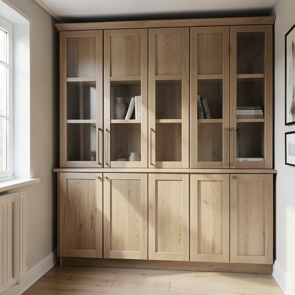
Light oak cabinets bring golden warmth to a darker room. The grain looks inviting, like sunshine on wood.
When you place light oak over dark tones, you get a clear contrast that still feels natural. It softens the look of black counters and makes stainless steel feel less cold. This combo is popular because it feels modern but still cozy.
Pick a stain that stays on the lighter side, so the cabinet color reads as bright. Add a simple bar pull in brushed brass for a classy touch. If you’re working with a tight budget, you can refinish doors or use veneer overlays.
For extra personalization, match oak to a wood-toned coffee station or open shelving. Use warm white lighting to highlight the grain at night. Keep the backsplash simple so the wood stays the star.
4. Deep Soft Taupe for an Elegant, Grounded Look
Deep Soft Taupe for an Elegant, Grounded Look
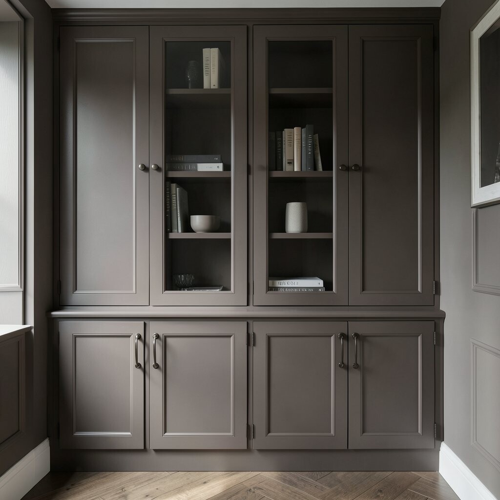
Taupe cabinets give a “tailored” feel, like a well-made jacket. They look rich over dark tones without turning the room into a cave.
This shade gives you depth, but it still reflects enough light to stay friendly. Pair it with stone countertops that have warm veining to keep the mood inviting. You’ll also get a timeless style that doesn’t rely on super bright colors.
If your walls are very dark, keep the taupe on the lighter end of the range. Use matte black hardware for a crisp outline, or choose bronze for a softer vibe. Consider a painted cabinet system if you want the color without the cost of new custom wood.
5. Chalky Off-White With Texture-Like Character
Chalky Off-White With Texture-Like Character
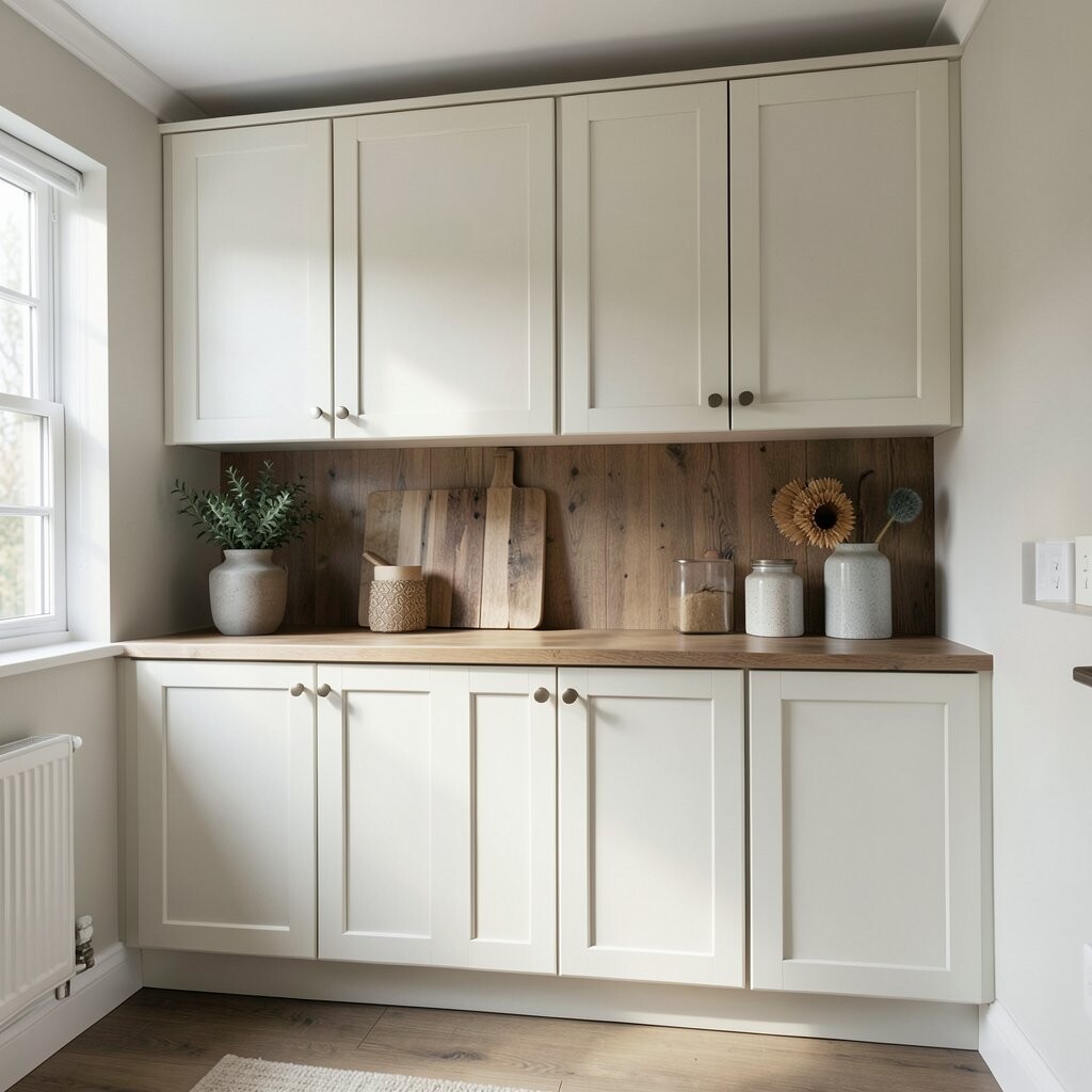
Chalky off-white cabinets look lightly aged, even when they’re brand new. They add charm over dark floors and dark backsplashes.
The slightly dusty look helps hide small imperfections and makes cabinets feel cozy. You also get a casual feel that pairs nicely with woven baskets and simple open shelving. It’s a great choice if you love farmhouse touches but want it to feel fresh.
To personalize, add beadboard panels on select doors for gentle detail. Use a soft gray or warm beige backsplash so the color doesn’t clash. Cost can stay manageable because repainting is often cheaper than major remodeling.
6. Pale Sage Cabinets for a Calm, Fresh Pop
Pale Sage Cabinets for a Calm, Fresh Pop
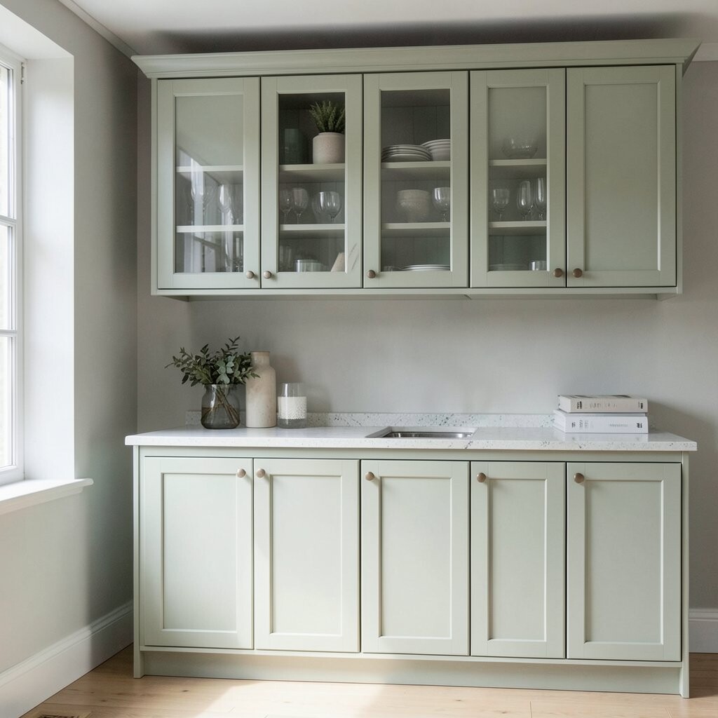
Sage cabinets add a quiet splash of color, like plants near a window. Over dark tones, they look refreshing and not too loud.
Sage is a trend that keeps showing up because it feels natural and soothing. It also pairs well with white marble, light stone, and warm brass hardware. You’ll get a “new air” feeling in the kitchen without changing everything else.
Try a semi-matte paint so the cabinets look smooth but not glossy. Add a pale cream backsplash or light-colored tile to keep the look airy. Budget-wise, repainting or refacing can usually fit more plans than full cabinet replacement.
Personalize by choosing cabinet lighting that looks warm, around the color of candlelight. If you love color, keep the rest simple so sage stays balanced. Add a few sage-toned accessories like towels or ceramic canisters.
For a modern twist, choose sleek flat-panel doors instead of ornate molding. That keeps the sage fresh and current.
7. Soft Powder Blue for a Surprising Friendly Contrast
Soft Powder Blue for a Surprising Friendly Contrast
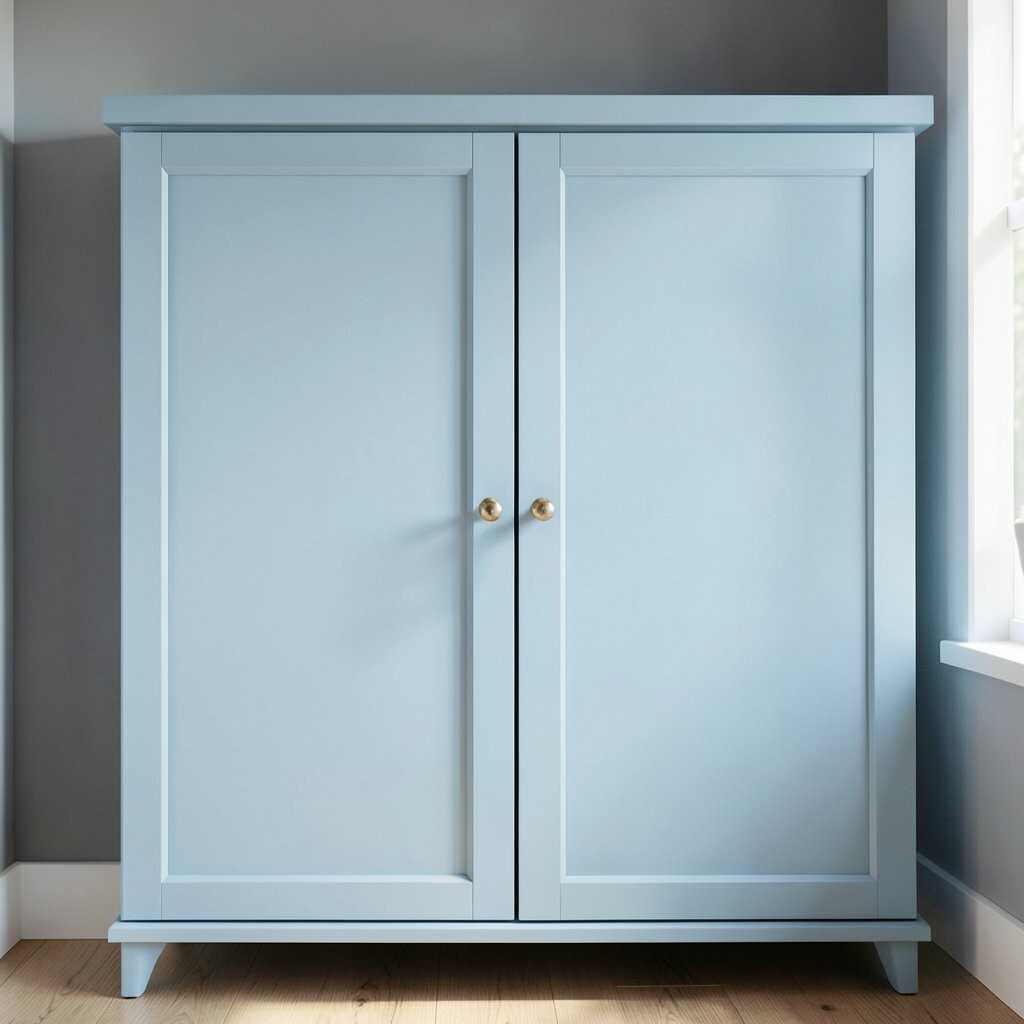
Powder blue cabinets look playful, like a sky tone in a darker room. The contrast is bright, yet it still feels gentle.
This color makes dark backgrounds feel less heavy. It also draws attention to your layout, especially if you have a kitchen island. Powder blue is unique because it’s colorful but not neon.
Choose matte or eggshell paint so the blue stays calm and velvety. Pair with brass, warm white walls, and light countertops. If you want a budget win, paint only the cabinet boxes and keep hardware updates for extra impact.
8. Warm Sand Beige Cabinets for a Cozy Neutral
Warm Sand Beige Cabinets for a Cozy Neutral
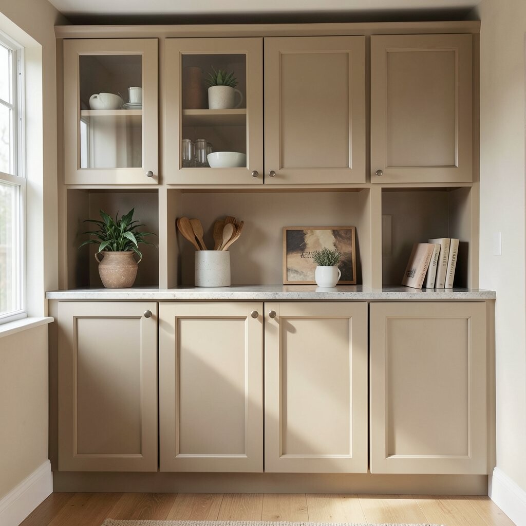
Sand beige cabinets look like sunlit sand after a warm day. Over dark walls, they create a cozy layer that feels welcoming.
This neutral is great for families because it doesn’t show dirt as easily as very light colors. It also blends with almost any metal finish and many countertop colors. If you want warmth without the risk of strong color, beige is a smart middle path.
Personalize with decorative pulls that match your style—bronze for classic or matte black for modern. Add a cream backsplash tile with subtle texture to make the beige look richer. Cost stays reasonable if you repaint and refinish doors rather than replacing everything.
For a current look, keep the cabinet lines clean and add a slightly thicker countertop edge. That small detail makes the whole room feel more custom.
9. Light Gray Cabinets That Look Fresh, Not Cold
Light Gray Cabinets That Look Fresh, Not Cold
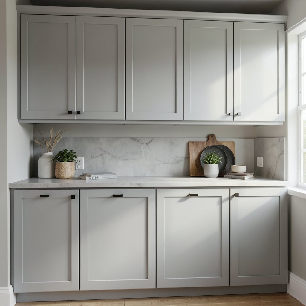
Light gray cabinets can make a dark room feel neat and organized. The key is picking one with warmth, so it doesn’t feel icy.
These cabinets help dark tones feel intentional instead of gloomy. They also work well with white walls, dark hardware, and patterned rugs in the open areas. Light gray is a popular choice because it fits both modern and traditional homes.
Try pairing with a warm backsplash like off-white or beige stone. Keep lighting soft, not overly cool, to prevent the gray from feeling dull. For cost, paint is a great option and can often cover wear and stains.
10. Bright White Cabinets for Crisp High-Contrast Style
Bright White Cabinets for Crisp High-Contrast Style
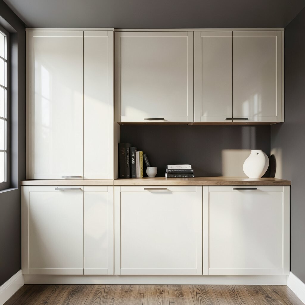
Bright white cabinets create a bold contrast against dark walls or floors. They instantly make the room feel cleaner and more open.
This is a strong choice if you want a fresh, sharp look and you like clean lines. White also makes everyday items stand out, which can feel satisfying. For trends, people love high-contrast kitchens because they look edited and modern.
Personalize with a mix of hardware finishes, like black pulls with brass knobs. Choose a durable paint that can handle daily cooking life. For cost, you may spend less on cabinets if you keep your layout and only update the finish.
11. Warm White Cabinets With Subtle Greige Undertones
Warm White Cabinets With Subtle Greige Undertones
Some “warm white” paints still have a hidden greige twist. That little undertone helps cabinets blend smoothly into dark spaces.
This choice gives you the brightness you want without looking flat. It also plays nicely with dark hardware, textured tiles, and neutral countertops. You’ll feel the benefit when the room looks good in both daytime and night lighting.
Test a sample in your room because undertones can change with light. Add a matte topcoat for a soft feel and easy cleaning. If you’re planning a budget-friendly update, painting doors and adding new hardware can be a big win.
To personalize, add glass-front cabinets and fill them with matching jars. Keep the jars simple so the look feels neat and not crowded. The warm undertone makes glass look more flattering.
12. Natural Linen White for a Soft, Modern Calm
Natural Linen White for a Soft, Modern Calm
Linen white cabinets feel airy, like fabric that catches light. Over dark tones, they bring softness without going too bright.
This color helps your kitchen feel “edited,” especially with minimalist cabinet doors. It also pairs beautifully with natural stone, soft gray accents, and warm metallics. The benefit is a gentle look that still feels stylish.
For personalization, use textured backsplash tile that echoes the linen tone. Choose warm LED lights underneath to make the sheen look inviting. Cost can be managed by focusing on the highest-visibility surfaces, like upper cabinets and the island.
If you have kids or pets, pick a paint made for cabinets so it holds up to scuffs. That keeps your look fresh longer and saves repainting later.
13. Light Buttery Yellow for a Happy, Sunlit Feel
Light Buttery Yellow for a Happy, Sunlit Feel
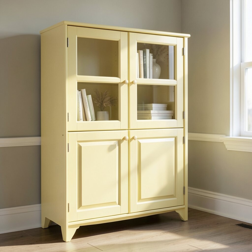
Buttery yellow cabinets can feel like warm sunlight in the middle of the day. They work surprisingly well over dark tones because they add energy.
The benefit is a cheerful kitchen that still feels balanced, especially if your walls are deep gray or charcoal. Yellow also pairs nicely with white countertops and natural wood. It’s unique because it brings personality without needing bold patterns.
To keep it from getting too bright, choose a soft yellow with a creamy base. Add black hardware for a modern edge, or bronze for a softer classic mood. For cost, painting is usually much less expensive than replacing cabinets.
14. Pale Cream Cabinets With a Traditional Warmth
Pale Cream Cabinets With a Traditional Warmth
Pale cream cabinets look timeless, like a classic bakery kitchen. Against dark tones, they bring comfort and familiarity.
This color helps the room feel inviting and less stark. It also makes it easier to decorate because you can use nearly any accent color. If you love traditional styling, cream cabinets support that look well.
Personalize by adding raised panel doors and classic knobs. Pair with a dark bronze faucet or polished nickel depending on your style. When planning cost, consider repainting plus a hardware swap first—often that’s enough to feel brand new.
For a current touch, mix cream cabinets with a darker countertop that has warm undertones. It keeps the kitchen modern while staying cozy.
15. Soft Black-Blue for a Dreamy Moody Twist
Soft Black-Blue for a Dreamy Moody Twist
If you’re already living with dark tones, try a soft black-blue for depth. It looks like ink that caught the light from a window.
Blue undertones can make dark cabinetry feel less flat and more dimensional. The benefit is that your kitchen still feels moody, but it also feels refined. This is a unique option for people who don’t want to lighten everything.
To personalize, choose hardware in brushed brass or antique bronze to match the undertone. Add warm white or creamy grout on the backsplash to avoid turning it too dark. Cost is a consideration here too—painting can create the effect without buying new custom cabinetry.
For best results, test samples in different lighting hours. Some black-blues look deep and elegant in daylight but brighter at night.
16. Light Walnut Cabinets for Rich Warmth Without Weight
Light Walnut Cabinets for Rich Warmth Without Weight
Light walnut cabinets give a warm, woodsy look that feels inviting. Over dark tones, they add richness while avoiding heavy darkness.
The advantage is that walnut brings texture you can’t get from plain paint. It also hides everyday wear better than very pale colors. This style is popular because it blends modern lines with nature-inspired warmth.
Personalize with a matte black or bronze pull to frame the wood grain. Pair with a white or beige backsplash so the walnut stands out. If budget matters, refinishing existing cabinets can be far cheaper than new wood.
Add open shelving in matching walnut tones for a layered look. That makes your kitchen feel collected, not just installed.
17. Muted Pink-White Cabinets for a Gentle Modern Pop
Muted Pink-White Cabinets for a Gentle Modern Pop
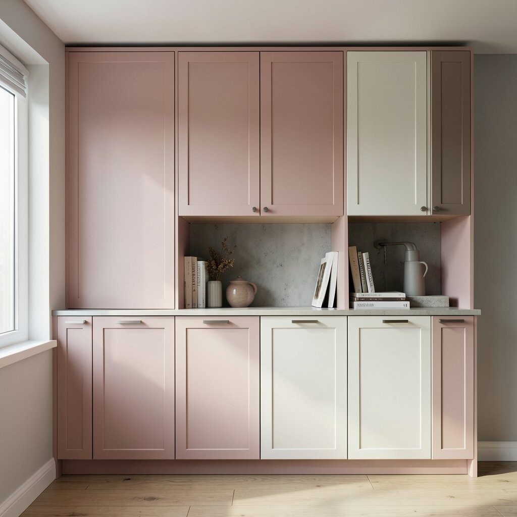
Muted pink-white cabinets bring a soft romance to your kitchen. They look delicate, but they still hold up over dark tones.
This color is unique because it feels airy while staying warm. It can make dark walls feel friendly, especially if you have lighter countertops. Pink undertones also look great with brushed brass and creamy tiles.
To keep the look cohesive, choose a backsplash with warm neutrals or tiny specks. Add simple cabinet lighting so the pink reads as soft, not dusty. For cost, you can achieve a similar effect with cabinet paint and updated hardware.
18. Creamy White Cabinets With Modern Flat Panels
Creamy White Cabinets With Modern Flat Panels
Pair creamy white cabinets with flat-panel doors for a clean modern style. Over dark tones, the simple shapes make the space feel crisp and organized.
This gives you a current look without needing dramatic color swings. The benefit is that flat panels highlight your countertop and backsplash, which often already carry the charm. Add one bold element, like a dark faucet or unique pendant lights, to keep it interesting.
For personalization, use long bar pulls for a sleek feel. If you love a little drama, consider two-tone styling by painting only the island cabinets a slightly different cream. Cost can stay controlled since changing hardware and finish can be cheaper than structural changes.
Choose a cabinet paint designed for high-traffic areas so it resists chips and scuffs. That helps the “new” look last longer.
19. Powdery Warm Gray Cabinets for a Soft-Luxe Feel
Powdery Warm Gray Cabinets for a Soft-Luxe Feel
Powdery warm gray cabinets look like smooth stone with a gentle touch. Over dark floors, they create a luxe feeling without going too bright.
This shade helps the room feel calm and high-end. It also works well with countertops that have gray, white, or warm beige veining. If you want modern style that still feels cozy, this is a strong option.
Personalize with gentle texture in the backsplash, like small tiles or a subtle pattern. Add gold or brass accents for warmth that matches the gray undertone. Cost-wise, paint plus a good sealant can be one of the most affordable upgrades.
20. Light Peach Cabinets for a Cozy, Sunlit Vibe
Light Peach Cabinets for a Cozy, Sunlit Vibe
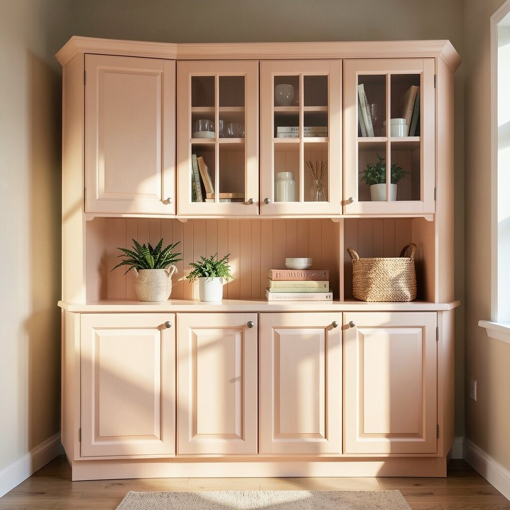
Light peach cabinets can make a dark kitchen feel warm and welcoming. They add color the way a soft throw blanket adds comfort to a room.
The benefit is that peach tones look flattering with many materials, including wood, marble, and warm metals. They also help create a “lived-in” vibe that still feels tidy. This is a great choice for people who want uniqueness without going bold.
To personalize, combine peach cabinets with white countertops and a backsplash that includes soft cream. Choose hardware in matte black for crisp contrast, or brushed bronze for a warm classic touch. For cost, repainting is usually easier than replacing cabinets, especially if your layout is already working.
If you have dark open shelving or a dark pantry wall, peach cabinets will balance it beautifully. Keep your accessories in neutral colors to keep everything feeling calm.
21. Crisp Linen White With a Dark Trim Accent
Crisp Linen White With a Dark Trim Accent
Try linen white cabinets and add a dark trim accent for a designer look. The contrast feels built-in, like custom cabinetry from a showroom.
This approach is unique because it gives you interest without using a whole new cabinet color. You can frame panels, add trim around doors, or style the island differently for a stronger focal point. The benefit is that the room looks more layered and intentional.
Personalize by choosing the trim color based on your existing dark tones. If your room already has black, match the trim with black hardware and light fixtures. Cost considerations are important too—trim and paint can be more affordable than new cabinets, and you can do it room by room.
22. Glossy Off-White Cabinets for Bright Shine Over Dark Tones
Glossy Off-White Cabinets for Bright Shine Over Dark Tones
Glossy off-white cabinets create a shiny, clean look even in a darker space. Light bounces off the finish, so your kitchen feels more lively.
The benefit is clear: you get brightness and a polished look that feels modern. This style is trending in some homes because it pairs well with dark countertops and dramatic lighting. Just remember that glossy finishes may show fingerprints, so plan on quick wipe-downs.
For personalization, use glass inserts or open shelves with a glossy edge to keep the look interesting. Pair with matte stone or textured backsplash so the shine doesn’t feel too slippery. Cost-wise, cabinet refinishing or painting can help you reach that glossy look without full replacement.
If you want a balanced approach, use satin or semi-gloss only on select areas like the island. That way you get shine where you want it most.