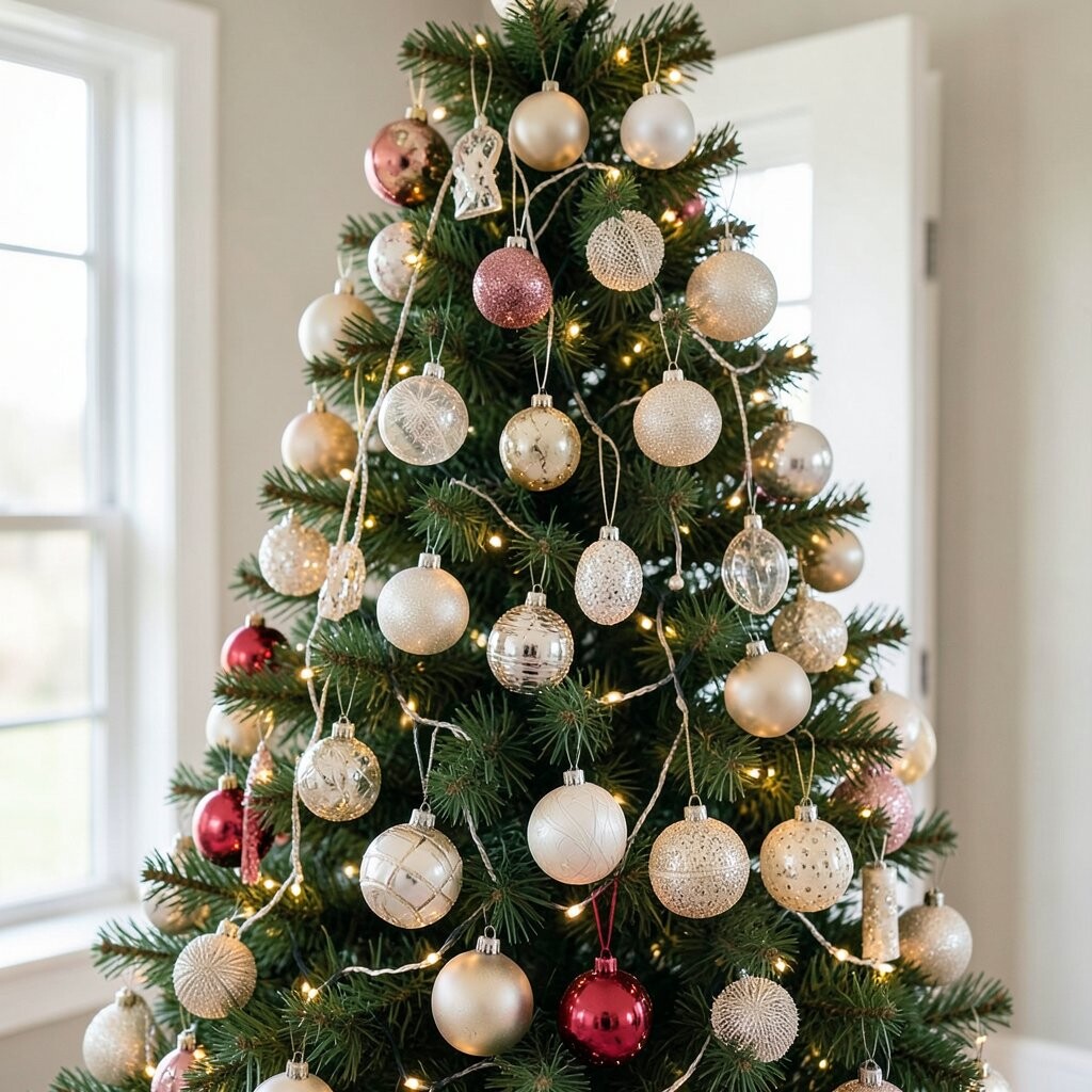
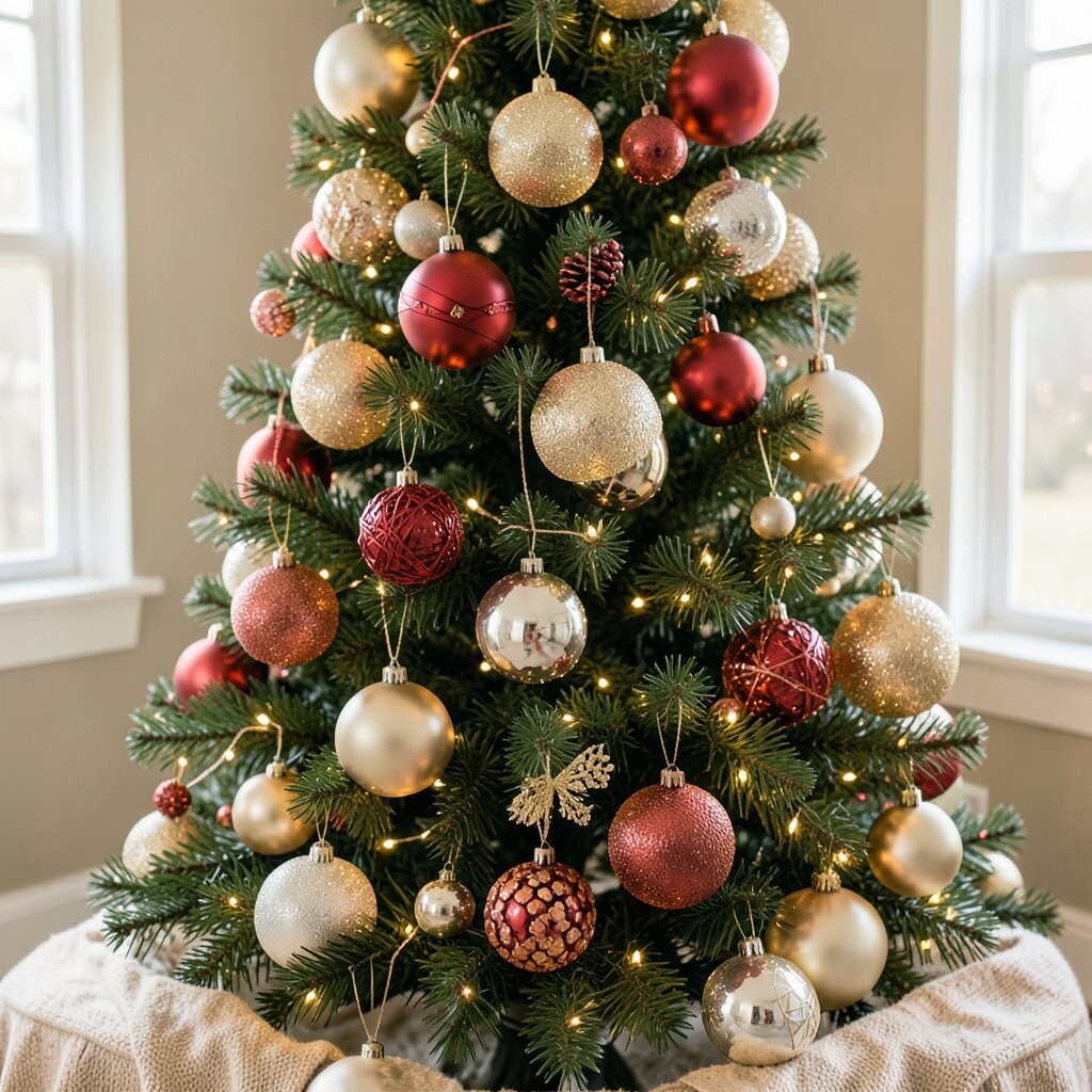
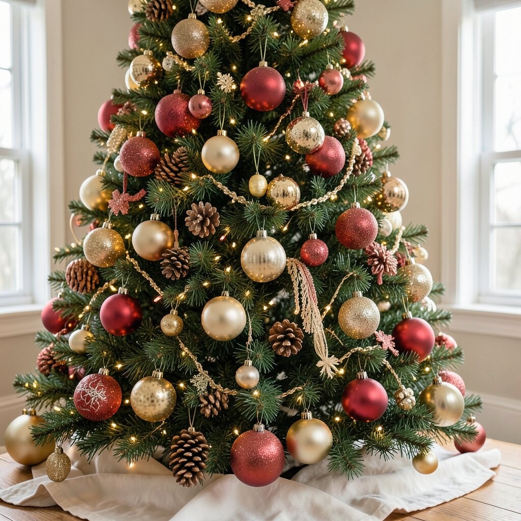
Many people dump every ornament they own into one area. The result looks busy, not beautiful, and your space may feel crowded instead of calm. When you step back, the colors can fight each other like they are all trying to be the hero.
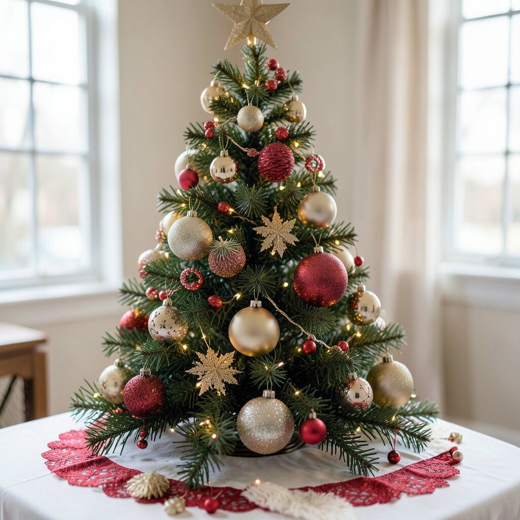
Pick a simple theme first, like classic red and gold, snowy silver, or a soft mixed neutral set. Then choose a few ball shapes and finishes to repeat, like matte, glossy, or glittery. This makes your display look intentional, which is one of the biggest benefits of planning.
For a unique twist, use one “signature” accent, such as deep emerald or warm caramel, and repeat it across the balls. Personalize it by matching the theme to your holiday pajamas, your wrapping paper, or even your kitchen wall color. If you want a cost-friendly approach, shop your own storage and only fill gaps with a small pack of coordinating balls.
2. Choosing the wrong sizes for your space
Choosing the wrong sizes for your space
Using only tiny balls can make a display look like scattered confetti. Using only huge balls can overwhelm a doorway or table. Either way, the balance feels off and your eye has no place to rest.
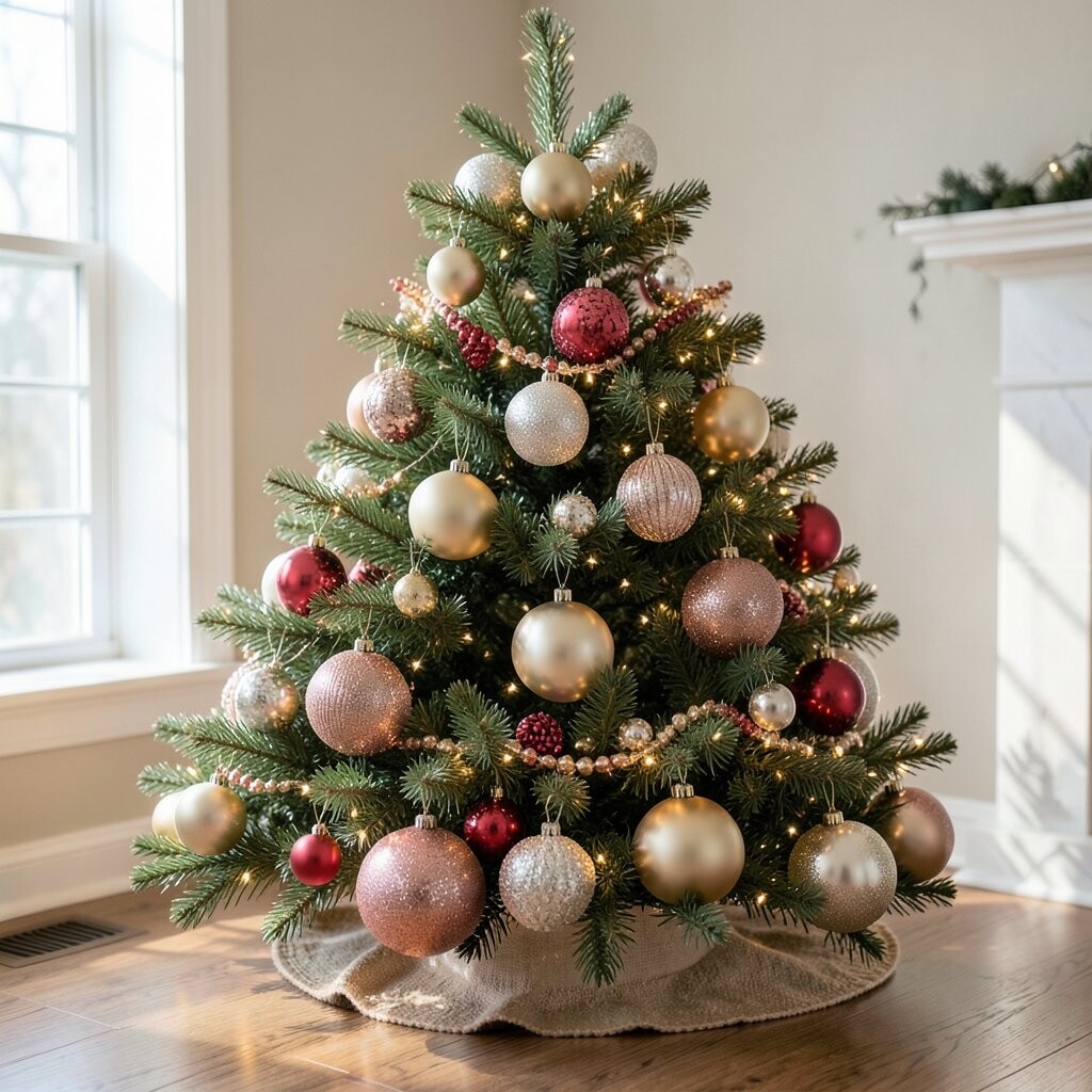
Plan for size variety so your display has layers. Try placing larger balls near the bottom or in the center, and smaller ones around the edges. This creates a natural focal point and helps the whole arrangement read clearly.
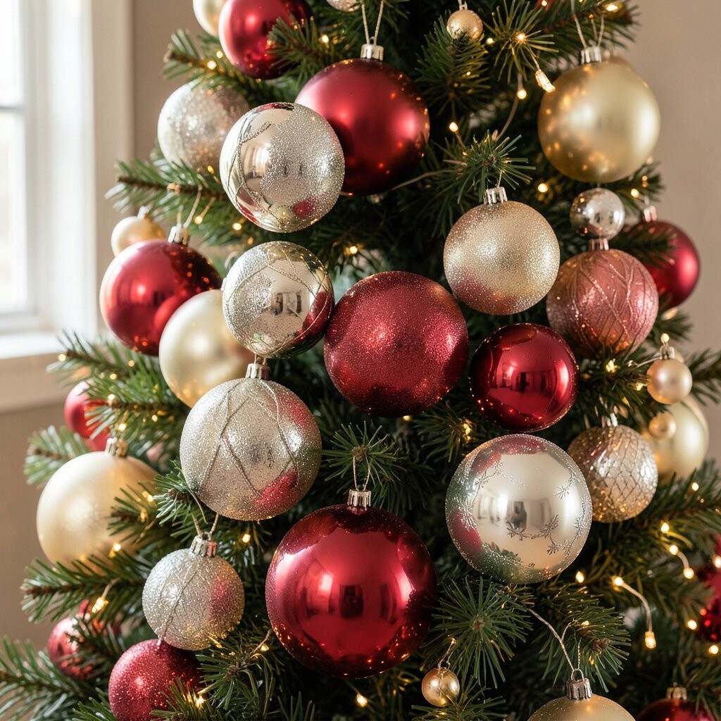
For visual appeal, mix a few “hero” balls that are slightly bigger and add filler balls in-between. You can also vary the spacing, like grouping some balls tightly and leaving a little breathing room nearby. This gives a polished look without needing expensive extras.
If you like current trends, you may notice “layered clusters” showing up in home decor posts. These clusters often use mixed sizes and different textures, like smooth glass next to frosted or ribbed balls. Personalize them with your favorite colors, and remember that you can create the same trend vibe with affordable plastic or fabric balls.
When budgeting, measure the area before buying. Then buy only what fills the space well, instead of overloading your cart. The benefit is clear: fewer items, better balance, and less clutter to adjust later.
3. Ignoring color balance and contrast
Ignoring color balance and contrast
It’s easy to pick colors you love and forget how they work together in real life. Some palettes look flat when they lack contrast, and others look chaotic when every color is equally loud. When you view the display from the doorway, the colors should feel like a team, not a crowd.
Choose a main color, a secondary color, and a supporting neutral. Then add one accent that pops, like a metallic champagne or a berry red. This helps your eye glide across the balls instead of getting stuck on random shades.
A great visual trick is to pair glossy balls with matte ones. Glossy reflects light, and matte softens the look, which makes your display feel rich. You can even add a light dusting of faux snow for contrast if your balls are mostly shiny.
Personalize by pulling colors from things you already own, like ribbon, stockings, or a holiday table runner. If you want cost consideration, use a small set of “anchor” colors and repeat them in different finishes. That way, you get a full look without buying a new color for every single ball.
Want a unique, modern vibe? Try a “cool neutral” mix with silver, white, and pale blue, then add a tiny streak of deep navy. It looks stylish, and it still feels warm when you add soft lights.
Keep contrast in mind when picking light bulbs too. Warm white lights make reds and gold look cozy, while cool lights can sharpen silvers and icy blues.
When planning color, step back often and take a photo. Photos help you spot color imbalance faster than your eyes can. Adjusting earlier saves time and keeps you from buying more than you need.
4. Overloading every surface
Overloading every surface
One of the most common mistakes is filling every corner with balls until nothing shows. Your display can start to look like a storage bin instead of a decorated moment. Even pretty ornaments need space to shine, so they can be seen and felt as part of the room.
Leave empty space on purpose. Use clusters on shelves, a few lines along a garland, or a tidy grouping on a tray. This makes the design look calmer and more “styled,” which is a big benefit.
For personalization, think about your home’s rhythm. If you have a busy living room with many patterns, keep the ball display simpler. If your room is calm and neutral, you can add a bolder set of balls and still keep it tidy.
Cost-wise, empty space saves money because you need fewer balls. It also saves work, because you won’t spend extra time hiding gaps and adjusting tiny pieces. Current trends often show “intentional spacing,” so this mistake fix matches what many designers do.
5. Skipping secure mounting and relying on hope
Skipping secure mounting and relying on hope
Sometimes balls look fine until the first bump, fan, or curious pet. Then one drops, cracks, or rolls away, and the display loses its magic. A fragile setup can turn a fun decorating day into stressful cleanup.
Use proper hooks, sturdy wire, or designed ornament clips. For indoor trees and garlands, check that your hangers won’t slide. This keeps your display safe and helps it last through the whole holiday season.
For a unique look, try suspended clusters with clear fishing line. They give a floating effect and still feel neat, especially with balanced weights. Personalize it by matching the line length to your ceiling height so the balls land exactly where you want them.
When budgeting, don’t spend money twice by using cheap mounting that fails. A small kit of strong hooks or clips is often less expensive than replacing cracked ornaments. Also, test your setup by gently tugging after you hang everything.
If kids or pets are around, use shatter-resistant balls for the lower areas. That simple choice keeps peace at home and protects your decor.
Look for current trend comfort too: many people now choose safer displays like covered trays, secured wreath backs, and wall-mounted tiers. The benefit is a cleaner look with less worry.
Remember, a perfect display isn’t just pretty; it should also stay perfect.
6. Using lights without a plan
Using lights without a plan
Lights can make balls glow, but they can also turn your display into an uneven mess. One side might look bright while another side looks dark. If the cords show too much, your eyes will notice that instead of the beauty.
Plan where lights go before you attach them. Wrap lightly around a garland or frame, then place balls so they catch the glow. This gives the benefit of even illumination and a more magical look.
For a unique idea, mix light colors in a controlled way, like warm white plus a small burst of soft gold. Keep the color limited so it doesn’t feel like a party in every direction. Personalize by using the light style that matches your home vibe, from classic steady glow to gentle twinkle.
If you want to stay on budget, consider battery-powered lights for indoor displays. They avoid outlet cords and can be cheaper than running new wiring. Just check how long the batteries last, and plan ahead for the holidays.
Current trends often favor “warm, cozy lighting” over harsh blue tones. Warm light makes skin tones and natural woods look better too, so it’s a win in every room.
7. Forgetting texture and finish variety
Forgetting texture and finish variety
If every ball looks the same, the display can feel flat. Glossy balls reflect light the same way, and matte balls can look similar when there’s no variety. Your arrangement may look pretty up close but not as exciting from farther away.
Add texture on purpose by mixing finishes like smooth, glitter, velvet-matte, or ribbed glass-style. Toss in a few faux berries, pinecones, or ribbon knots to break up the round shapes. This gives your eye more to enjoy and makes the display feel more “alive.”
A uniqueness booster is to include one unusual element, like a smoky gray ball paired with snow-white fluffy picks. It looks modern and still works with classic decor. Personalize by adding a favorite holiday color you already love, like teal or burgundy.
When thinking cost, don’t feel like you need fancy textures for every item. You can buy a small set of high-impact textured balls and surround them with simpler ones. The benefit is a full look with smart spending.
Try placing textures at different heights too. Put glitter near eye level, matte on the outer edges, and softer fluffy pieces in the middle. That way, the display feels layered without being messy.
When you do this, the balls look like they belong together instead of being randomly stacked.
8. Putting balls too close to heat or sunlight
Putting balls too close to heat or sunlight
Some setups place ornaments near radiators, fireplaces, or bright windows. Over time, colors can fade, and some finishes can warp. Even if it looks fine on day one, the display can lose its charm.
Choose a spot with gentle, stable light. Keep balls away from direct heat sources, and avoid placing delicate glass near warm airflow. This protects your investment and keeps your look fresh longer.
If you love window displays, use a UV-resistant approach by keeping the balls shaded behind sheer curtains. You can also add thicker frames or decorative backing to block direct sun. That adds safety and makes the display look intentional.
Personalize by matching your display location to your daily routine. If you pass by the area often, put it where you’ll enjoy it. If you rarely visit, use durable materials like shatter-resistant or fabric balls that can handle bumps.
Cost consideration matters here too: replacing faded decor is expensive. Simple placement choices help you avoid that problem.
9. Overlooking backdrop and surface styling
Overlooking backdrop and surface styling
Balls look best when they sit against something that supports them. A bare shelf can make the display feel like it’s missing the “rest of the story.” A plain table without a tray or liner can make the balls slide visually.
Add a backdrop like a wooden board, a fabric runner, or a piece of textured paper. You can also use a tray with raised edges so the balls stay neatly contained. This gives the benefit of structure, and your display will look finished.
For a unique look, try a layered base: first a neutral cloth, then a small scatter of greenery, and then your ball clusters. The contrast makes the balls pop without adding extra clutter.
Personalize the background with items that match your home. If you love farmhouse style, use burlap or natural linen. If you like modern decor, try black, white, or metallic trays for a cleaner vibe.
Budget tip: use wrapping paper, craft foam, or leftover fabric as a liner. It’s a smart way to add style without buying a new expensive base.
Current trends often show “intentional base styling,” meaning the bottom matters as much as the ornaments. When you style the backdrop, your balls look like part of a designed scene.
Also, remember to check how the display looks from different angles. A backdrop helps it look good from the front and the sides.
10. Ignoring the weight of the display
Ignoring the weight of the display
When you stack lots of balls in one spot, the weight can become a hidden problem. Shelves can bow, hooks can bend, and some stands can tip. You might not notice until the display shifts and your careful arrangement changes.
Use sturdy bases, and spread weight across multiple supports. For hanging setups, confirm the hook can handle the total load. This keeps the display safe and reduces the risk of broken ornaments.
For uniqueness, create multiple smaller displays instead of one giant heavy cluster. That also improves visual flow and gives the room more “points of interest.” Personalize it by placing one cluster near the entry, another on a console table, and a small one on the mantel.
Cost-wise, smaller setups can reduce the number of balls you need. You still get the festive feeling, but with less strain on furniture and fewer items purchased.
If you want trend-friendly decor, look for “gallery-style clusters” and “vignette moments.” Those often use smaller pieces in different spots, which naturally helps with weight distribution.
Finally, test stability after decorating. A gentle shake should not move the stand. Doing this now prevents a “oops” later.
It’s one of the easiest ways to keep your display looking perfect all season.
11. Overusing one theme without variety
Overusing one theme without variety
Sometimes people commit to a theme and never switch it up. For example, every ball might be the exact same size, color, and finish. That can look like a single-note playlist, even if the theme is still cute.
Keep your theme, but vary details. Mix ball colors, try two to three finishes, and add small decor accents like ribbon, sprigs, or miniature picks. The benefit is a display that feels richer and more interesting without losing unity.
For personalization, add one item that means something to your family, like an ornament from a special trip or a handmade ball. Those moments make the display uniquely yours. They also create great conversation points for guests.
Cost considerations are simple: if you can’t buy more balls, buy fewer accents and reuse what you have. A single handmade or sentimental piece can do a lot for the look.
Current trends often reward “layered storytelling,” where a display includes shapes beyond balls. You can keep it subtle by using just a few small touches, like pinecone picks or a tiny bow. This helps the scene feel complete.
When you add variety, your eye has places to rest, and the whole area looks more styled.
12. Forgetting spacing inside wreaths and garlands
Forgetting spacing inside wreaths and garlands
When balls are placed too tightly together, they can look like one big blob. When they’re spaced too far apart, you might see bare gaps everywhere. Either mistake makes the display feel unfinished.
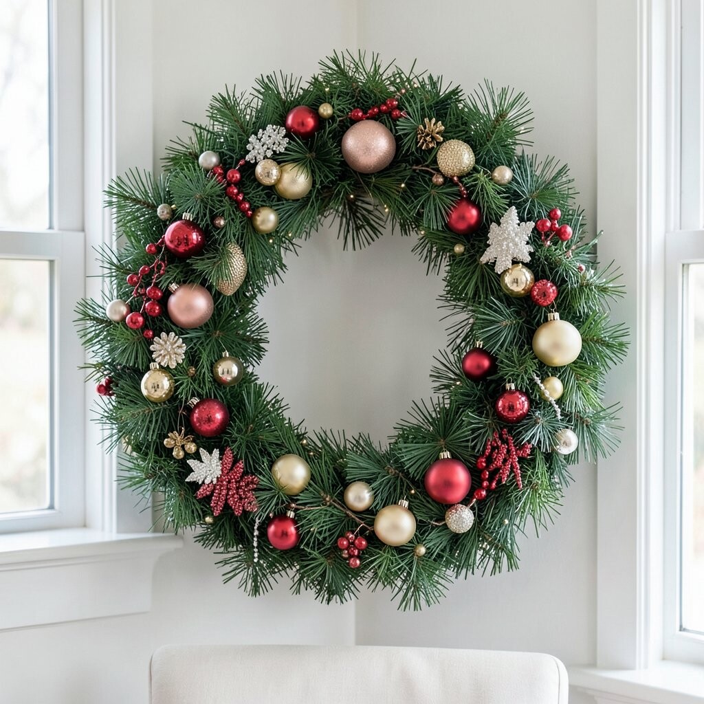
Work in sections and aim for a repeating rhythm. Place a ball, then leave a small gap, then place another ball, and so on. This creates a pattern that looks neat and deliberate.
For visual descriptions, picture a garland where light reflections move across the balls in a smooth line. That happens when your spacing helps the light travel evenly. It’s a small change that makes your display feel “designer.”
Personalize by adjusting the rhythm for your style. If you love a soft cottage look, use slightly wider gaps with fluffy greenery. If you prefer a bold modern look, use a tighter pattern and fewer distractions.
Budget tip: you don’t always need more balls to fix spacing. You can reuse ribbon ties, greenery, and filler picks to help shape the gaps. It makes the display look fuller without buying extra ornaments.
13. Choosing fragile ornaments for high-traffic areas
Choosing fragile ornaments for high-traffic areas
Breakable glass balls look stunning, but they can be risky near doors, stairs, or kids’ play zones. Accidents happen, and one drop can crack an ornament you waited to hang. That can ruin your vibe and waste your money.
Use safer materials where accidents are more likely. Shatter-resistant plastic, soft fabric balls, or foam-backed ornaments work great. This protects your display and keeps your holiday stress low.
For uniqueness, mix materials on purpose. Pair a few true glass-style glitter balls at eye level with durable balls lower down. Guests will see the sparkle, and you’ll keep the setup safe.
Personalize by matching durability to your real life. If you have pets that jump, choose lightweight decor and secure mounting. If your home is quieter, you can use more delicate pieces in stable spots.
Cost considerations matter too: durable balls can be reused for years, and you won’t have to replace broken ones. Over time, that saves money and frustration.
Current trends also highlight “practical beauty,” meaning decor that looks great and works with family life. That trend is perfect for homes with kids and pets.
So you don’t have to choose between safe and pretty.
14. Forgetting to mix in your personal story
Forgetting to mix in your personal story
A display can be perfectly arranged and still feel like it came from a catalog. When everything looks brand new and identical, it can miss the cozy magic of home. Guests may admire it, but it might not feel memorable.
Add personal story pieces to make it yours. Include a few ornaments with names, dates, or memories. You can also add a small handmade element like a ribbon bow you made or a family photo ornament.
For a unique look, create a “memory lane” section where the balls represent milestones. Put a cluster of silver balls for a wedding year theme, or red and green for a family tradition. Keep it subtle so the display still looks neat.
Personalization also includes your scent and lighting. Add a small pine-scented candle nearby, or tuck a cinnamon-scented sachet into a basket. This creates a full experience, not just a visual one.
Budget tip: you don’t need new decor to add story. Reuse old ornaments and give them a spotlight position. That makes them feel special again.
Current trends show more “authentic homes,” where decor looks lived-in and meaningful. When you add story pieces, your display feels trendy without trying too hard.
And that’s the best kind of uniqueness: the kind that can’t be copied.
15. Waiting until the last minute to adjust
Waiting until the last minute to adjust
Finishing fast can cause small problems that look big later. Balls may sit crooked, lights may be uneven, or spacing may look different in the evening. If you don’t tweak it, the display can feel “almost perfect” instead of perfect.
Build in time for quiet adjustments after the first setup. Turn on lights, step back, and check how everything looks from common viewing spots. Then fix what feels off, even if it’s just a few ornaments.
For personalization, try a quick photo check in daylight and at night. The colors can change under warm bulbs, and you might notice gaps you missed earlier. This helps you get that rich holiday glow you wanted.
Cost considerations are real here too: if you rush, you might buy extra items you didn’t need. Slow down just enough to confirm what’s missing or what’s already working.
Current trends favor “fine-tuned vignettes,” where small corrections create a clean, finished scene. That means your last-hour adjustments matter as much as the first placement.
Make it a mini ritual: adjust, breathe, and enjoy. Your display will look better, and you’ll feel proud of the effort.