Imagine your door glowing like morning light, with a happy yellow panel that pops right off the wall. Add a thin cream border so the edges look neat and custom.
This style instantly makes entryways feel friendly and clean. It also hides small scuffs better than very dark colors. For best results, use painter’s tape for the border and keep a steady hand by leaning your elbow on a table.
If you want it more “designer,” pick a warm yellow that matches your porch rail or trim. Consider a satin finish, since it wipes clean and still looks bright. Costs are usually moderate because yellow paint often goes far, but you may need two coats for smooth coverage.
2. Coastal Blue With White Speckled Detailing
Coastal Blue With White Speckled Detailing
Picture a calm ocean-blue door that makes the entry feel like a beach day. Top it off with subtle speckles in white, like tiny waves catching the sun.
Blue is a go-to trend because it feels cool and modern, yet still cozy. It can also pair nicely with many home colors, from sandy beige to crisp gray. Use a small foam brush or a toothbrush-style dab method for the speckles, and test it on cardboard first.
Personalize it by adding one stripe across the top panel in a lighter shade of blue. For budget planning, you can buy a base blue and create the speckles using leftover craft paint mixed into a matching off-white. Seal everything with an exterior clear coat so the speckles stay sharp in the weather.
3. Bold Coral With a Matching Planter Color
Bold Coral With a Matching Planter Color
Think of coral as a confident, playful color that looks amazing at the curb. Your door can be painted coral, while your porch planters echo the same tone for a pulled-together look.
This combo brings energy without looking messy. Coral can brighten dull days and makes simple landscaping look more “styled.” Choose a paint labeled for exterior doors and use a primer if your old color is dark.
To personalize, add a thin teal stripe near the knob area for a fun “pop.” If you have a wreath, a coral background makes greenery look richer. Cost-wise, coral pigments can be pricier sometimes, so grab enough paint in one batch to avoid slight shade differences.
For durability, consider semi-gloss so fingerprints wipe away easily, especially if the door gets lots of hand traffic.
4. Deep Forest Green With Brass-Ready Contrast
Deep Forest Green With Brass-Ready Contrast
Visualize a rich forest green door that looks elegant and grounded. Pair it with brass accents so the hardware feels like part of the color story.
This color choice is popular right now because it feels nature-inspired and timeless. Green also balances warm woods and works well with stone or brick siding. Use a primer made for slick surfaces if your door previously had a shiny finish.
5. Soft Blush Pink for a Gentle, Modern Feel
Soft Blush Pink for a Gentle, Modern Feel
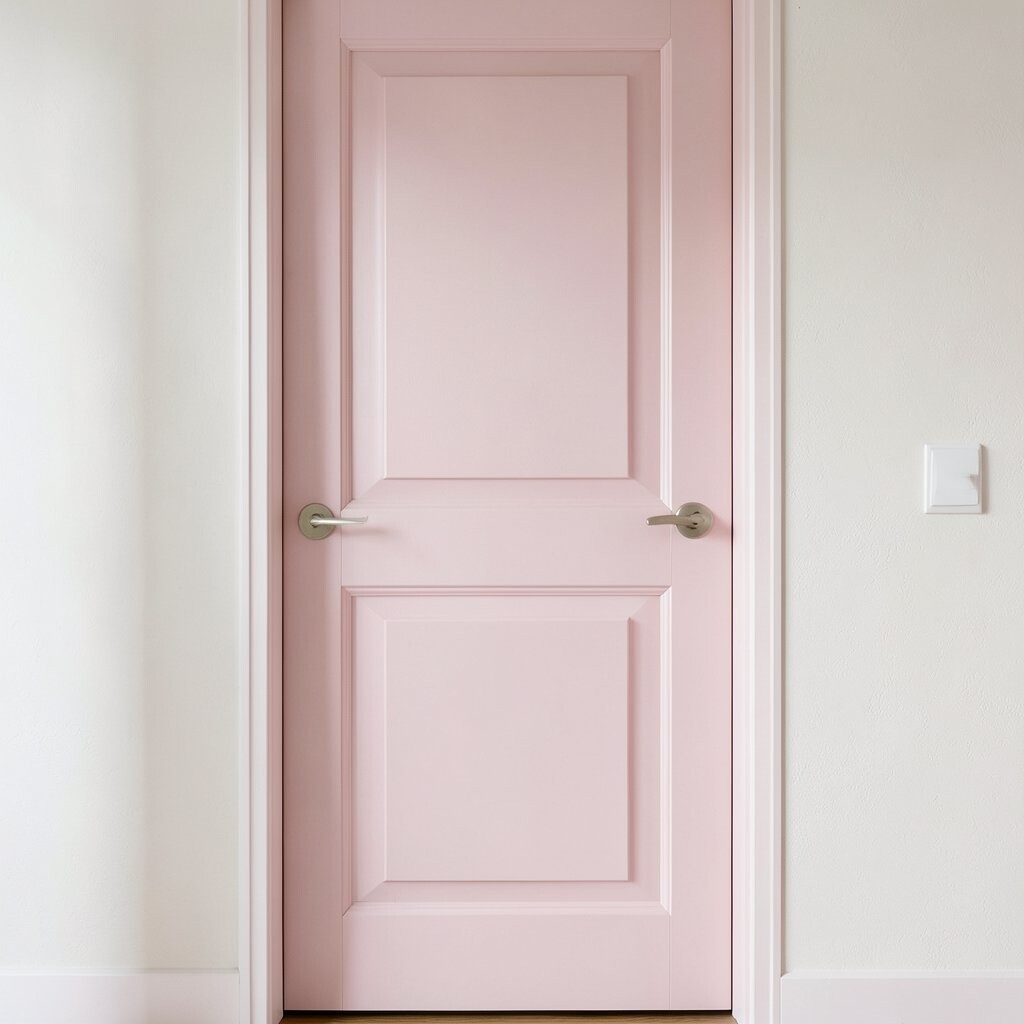
Picture a blush pink door that feels sweet but not too childish. It looks especially lovely when your trim is white or light gray.
Pink can make your home feel welcoming, and it stands out in a polite way. It also photographs beautifully for holiday cards. For tips, choose a rose-toned blush that leans slightly warm so it doesn’t look washed out.
Personalize by adding a simple panel design: paint the inset panels blush and keep the raised parts in a slightly lighter tint. If you want lower costs, you can do it with one blush base and only small amounts of accent paint. Seal the door with an exterior topcoat to keep the color from fading.
6. Terracotta Orange With Hand-Painted Lines
Terracotta Orange With Hand-Painted Lines
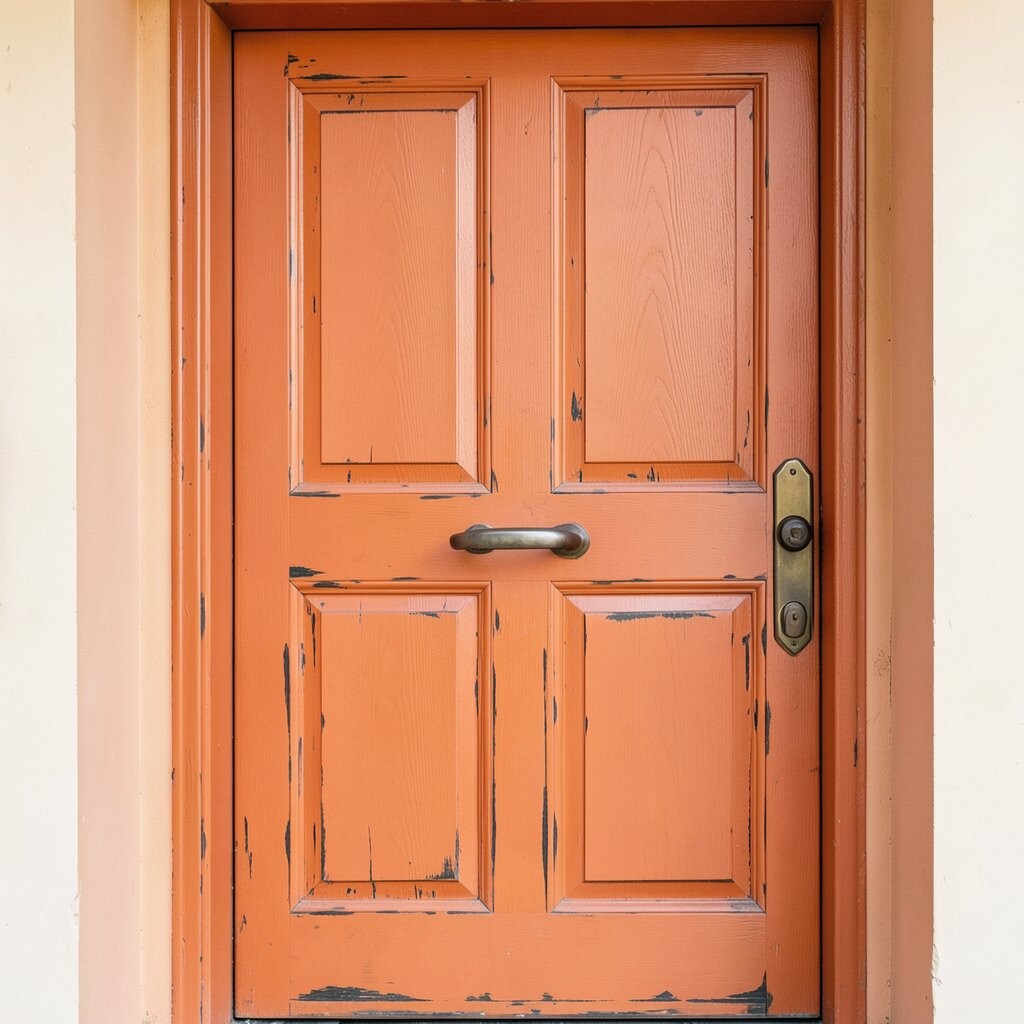
Terracotta looks warm and artsy, like sun-baked clay. Imagine orange-brown panels with slim hand-painted lines that follow the door’s shape.
This idea is unique because it turns a plain door into a mini mural. It also makes your porch look cozy, especially with outdoor rugs and wood planters. Use a fine brush and a steady guide, like placing a ruler just where your line should go.
For personalization, decide on a line pattern: thin diagonal stripes, a small arch near the top, or tiny dots around the knob. Budget-wise, terracotta can be affordable, but careful line work means you may need extra time more than extra materials. Trends are leaning into warm earthy colors, and this fits right in.
7. Jet Black With a Glossy Highlight Stripe
Jet Black With a Glossy Highlight Stripe
A jet black door looks bold, sleek, and high-end. Add one glossy highlight stripe—maybe in bright white or even a metallic silver—to catch the light.
Dark colors are great when you want your entry to feel dramatic. They also hide dirt better than light paint, which helps if your area is dusty. To avoid chipping, prep well: clean the door, sand lightly, and prime before painting.
Personalize the stripe by placing it vertically down the center for a tall look. If you like a little luxury, try a thin metallic line that matches your house number plaque. Cost considerations are simple here: black paint often needs only two coats, and a tiny amount of accent paint goes a long way.
8. Sky Teal With a Sunburst Sun Yellow Top
Sky Teal With a Sunburst Sun Yellow Top
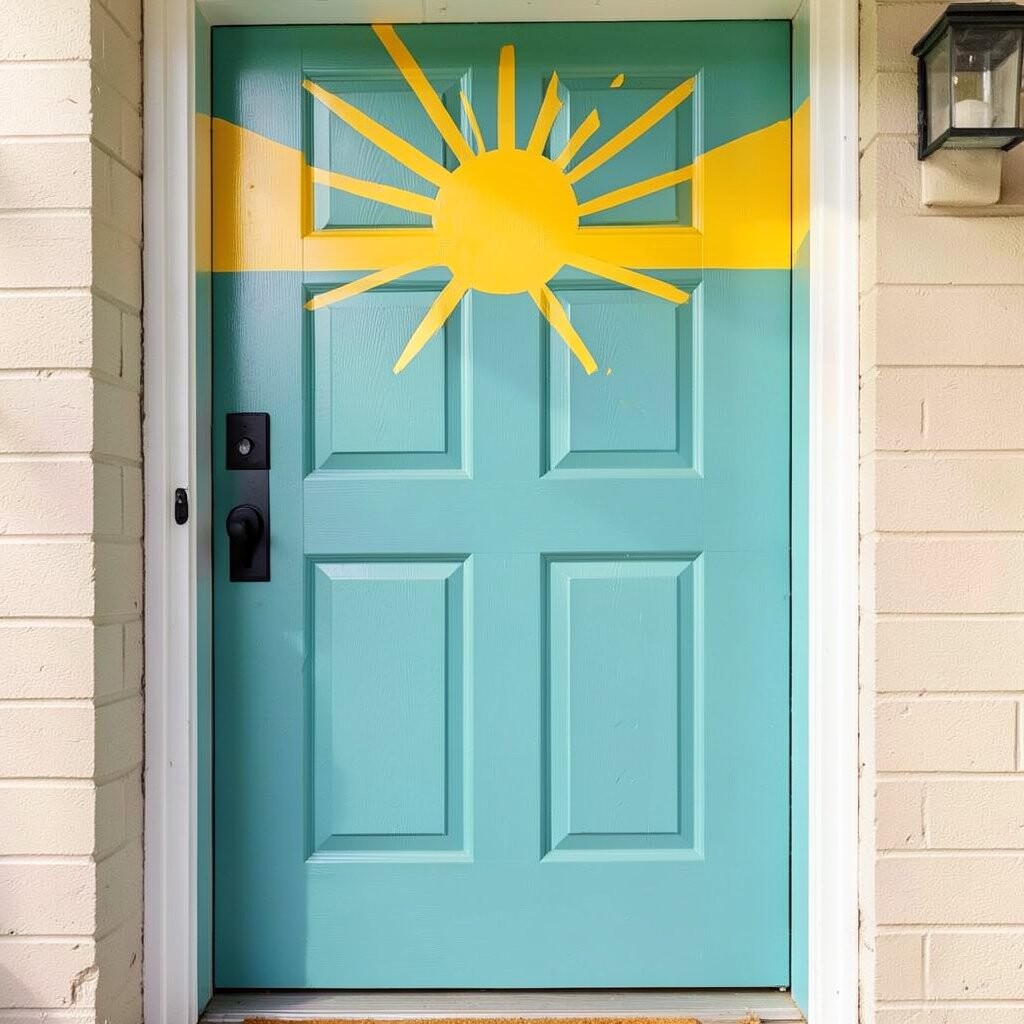
Picture sky teal as the base color, then a sunburst painted across the top half of the door. The design looks like a greeting from the sun every time you come home.
This is a fun way to add art without doing a complicated mural. Teal feels current and blends well with modern trim. Use painter’s tape to map the sunburst points so your lines stay even and crisp.
For personalization, choose a sun yellow that’s slightly buttery so it doesn’t look too neon. If you’re worried about effort, keep the sunburst small and let the teal do most of the work. When planning cost, know that the extra steps use more time, while paint costs stay similar to any two-coat job.
9. Berry Red With a Simple White Frame
Berry Red With a Simple White Frame
A berry red door can make your home look lively and classic at the same time. Add a white “frame” around the panels to sharpen the design.
This style has a long history because it looks good with many exterior materials. It also helps your door look tidy even if the porch gets busy with coats and bags. For tips, pick a red that leans toward berry instead of pure fire-engine red for a smoother, more modern look.
10. Lavender Purple With Soft Gray Speckles
Lavender Purple With Soft Gray Speckles
Imagine a lavender door that feels calm and dreamy, like a garden at dusk. Now picture tiny gray speckles sprinkled across the lower half like gentle clouds.
Lavender is a creative choice that feels fresh and different from typical browns and grays. It can also make white trim look brighter and cleaner. Try using a stencil or a craft dab technique, and always test your speckle pattern on scrap first.
Personalize by adding a matching wreath ribbon in gray or purple. If you want a budget-friendly twist, buy one lavender color and mix a small batch of lighter gray for speckles. Trends show more homeowners using playful pastel-like tones, and lavender fits that vibe.
11. Royal Blue With a Chalky Matte Finish
Royal Blue With a Chalky Matte Finish
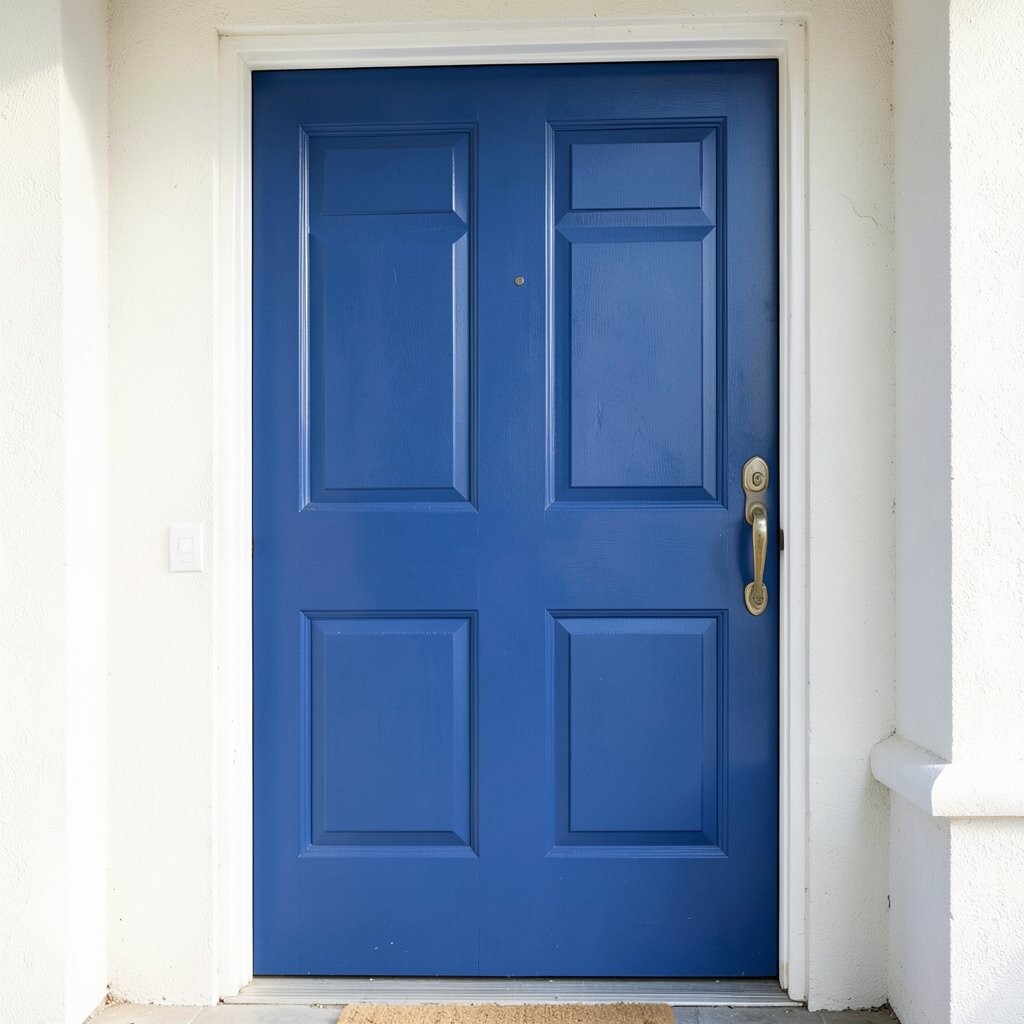
Royal blue feels powerful, like a confident handshake. Use a chalky matte finish for a velvety look that still feels modern.
This idea is unique because matte paint can hide minor imperfections and make colors look deep. It also looks great on doors with classic panel designs. Keep it practical by sealing the matte paint with an exterior-friendly topcoat, since doors need protection from weather.
Personalize it with small corner accents in light blue or silver near the top edges. Cost-wise, matte paints can be a bit pricier, but you may love how much character they add with fewer layers. If your door gets lots of direct sun, choose a formula meant for fade resistance.
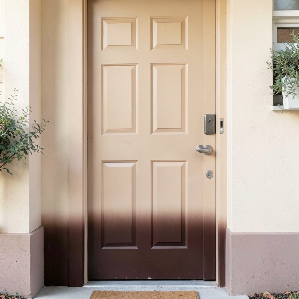
12. Warm Beige With a Chocolate Brown Ombre Bottom
Warm Beige With a Chocolate Brown Ombre Bottom
Picture a warm beige door where the bottom slowly fades into rich chocolate brown. The ombre effect creates a smooth, stylish gradient without needing heavy patterns.
Ombre looks modern and artistic, and it can soften the look of busy exterior textures. It’s also great for personalization because you can control how dramatic the fade is. For tips, use a sponge and blend in gentle passes, then stop and reassess often so it doesn’t get muddy.
Consider pairing the beige with a matching entry rug color and matching the brown accents to your porch rail. If you’re cost-conscious, this is a smart choice because beige and brown are common shades that often come in affordable paint lines. Just be sure to plan the blending so you don’t need to redo the whole door.
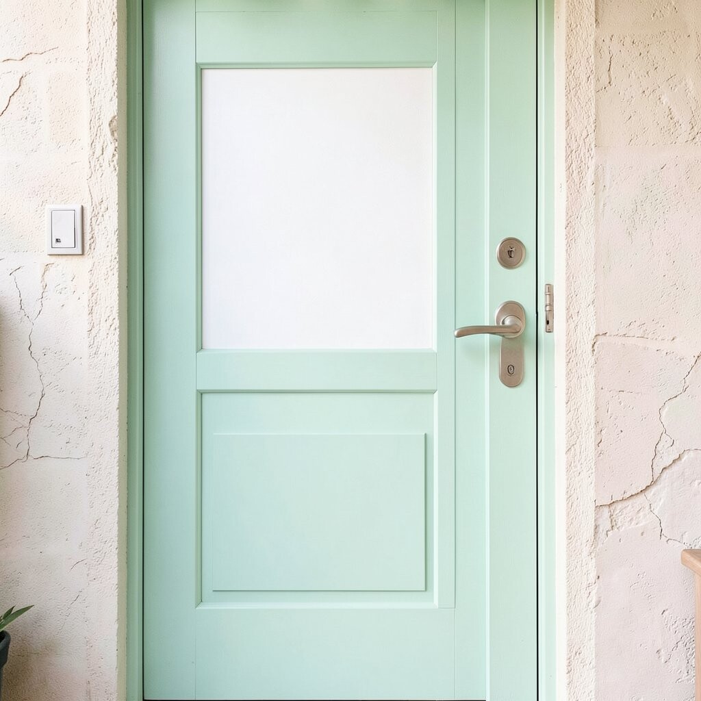
13. Mint Green With a White “Pop” Panel
Mint Green With a White “Pop” Panel
Mint green is light, fresh, and easy on the eyes. Imagine it covering most of the door, while one panel area stays crisp white for a bold contrast.
This creates a clean look that still feels fun. Mint also goes great with white trim, light stone, and even some natural brick tones. To personalize, pick which panel becomes the white pop—top, center, or around the knob—for a slightly different vibe.
For a smooth result, use painter’s tape and press the edges down firmly. Budget-wise, mint colors can require two coats for full coverage, but they are often reasonably priced. Sealing matters here too, especially if your door gets a lot of rain.
Current trends lean toward airy pastels, and mint green fits that demand while keeping things practical.
14. Sunflower Yellow With Dark Brown Center Circle
Sunflower Yellow With Dark Brown Center Circle
Imagine a sunflower look: bright yellow door with a dark brown circle near the center. It feels cheerful every single time you pull into the driveway.
This idea is unique because it turns a front door into a friendly “welcome sign.” Sunflower colors can also make your entry look brighter, even on cloudy days. Use a round stencil for the circle so it stays perfectly shaped.
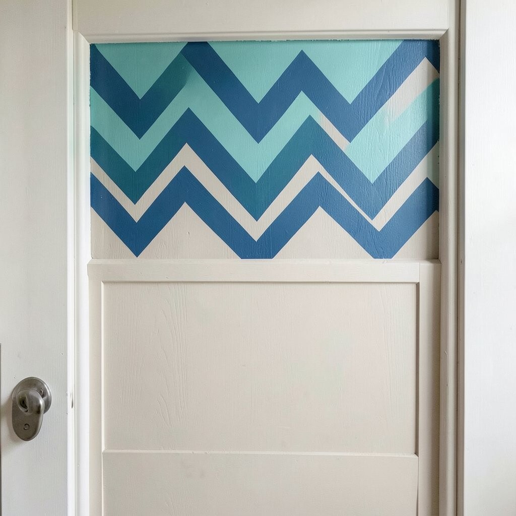
15. Teal-Blue Chevron Top With a Neutral Base
Teal-Blue Chevron Top With a Neutral Base
Start with a neutral base color like warm white or light gray. Then add teal-blue chevrons near the top so the door has movement without overwhelming the whole design.
Crisp chevrons feel trendy and modern, and they’re great for people who like pattern but not loud color everywhere. This approach also helps with personalization since you can pick the width and number of chevron lines. Use a level and tape for straight edges, and consider painting the neutral base first so the pattern looks centered.
Cost-wise, you’ll mainly buy one base color plus a small amount of teal. That can be cheaper than using multiple bright shades. For protection, keep a good exterior topcoat on hand so the teal stays sharp and doesn’t fade.
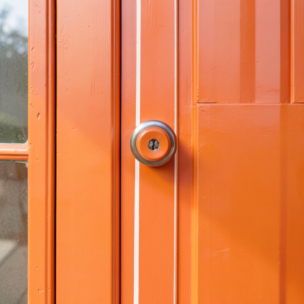
16. Tangerine Orange With a Vertical Stripe Around the Knob
Tangerine Orange With a Vertical Stripe Around the Knob
Tangerine orange is bold, playful, and full of “good mood” energy. Paint the whole door tangerine, then frame the knob area with a vertical stripe in a slightly lighter shade.
This is a quick way to add uniqueness without complex art. It draws attention to the handle and can make your entry feel more intentional. For tips, use a thin brush to define the stripe, and keep the edges clean by wiping off extra paint on the brush.
If you want personalization, match the lighter stripe to your front light color or door mat accents. Budget consideration: orange shades sometimes need extra coverage, so plan for two to three coats depending on your old door color. Trends favor bright citrus tones, and tangerine fits right in.
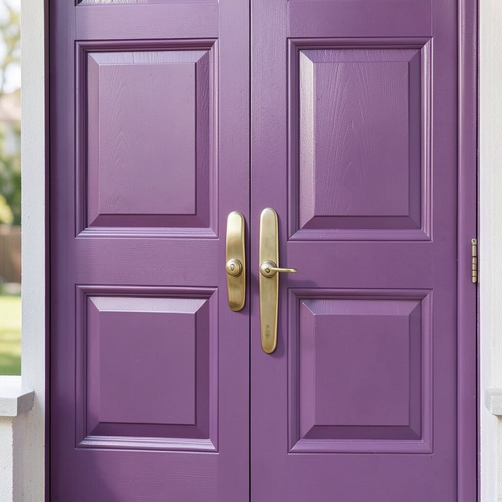
17. Plum Purple With Metallic Gold Hardware Accent
Plum Purple With Metallic Gold Hardware Accent
Plum purple feels rich and dramatic, like a velvet curtain. Pair it with metallic gold hardware accents so the whole entry looks coordinated and classy.
This idea is unique because it mixes a deep color with warm metal tones. Purple is also a conversation-starter color that still looks sophisticated when done right. Use primer to ensure the purple sits evenly, especially if the door was previously painted a light shade.
Personalize by adding a thin gold line along the panel edges, or painting a tiny gold dot near the top corner. Cost considerations are manageable: you can keep gold accents minimal and still get a high-impact look. For current trends, jewel tones like plum are especially popular right now for front-door updates.
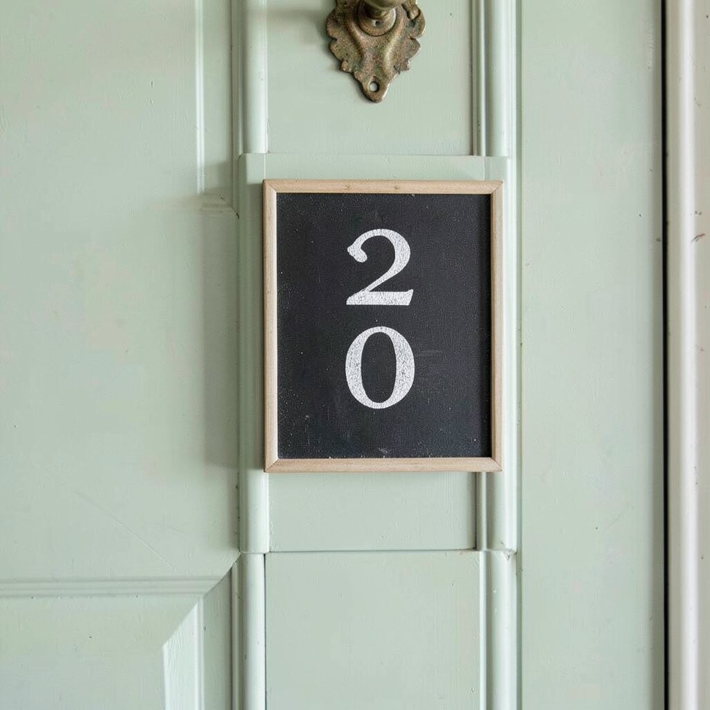
18. Soft Sage Green With a Chalkboard-Style Number Plaque
Soft Sage Green With a Chalkboard-Style Number Plaque
Sage green makes your door feel calm and balanced. Add a chalkboard-style plaque near the front with painted-on numbers for a smart, artsy touch.
This combination is both stylish and practical because it makes your home number easy to read. It also gives your door a creative “label” without needing extra signs. For tips, paint the plaque area first, then seal it so it can handle weather.
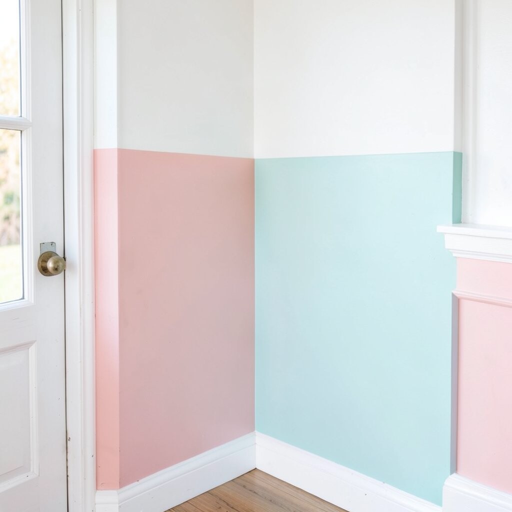
19. Bright White With a Pastel Color Block Corner
Bright White With a Pastel Color Block Corner
Go mostly bright white for that clean, modern look. Then add one pastel color block in a corner—think light blue, blush, or mint—to bring the doorway to life.
This idea is unique because it keeps things simple while still adding a playful twist. It’s perfect if you want color but don’t want to commit to painting the whole door a vivid shade. Personalize by choosing the color block corner based on where your outdoor light hits, so it looks extra lively.
Cost considerations are friendly here, since bright white is common and you use only a small amount of pastel accent paint. Trends show people favoring “small statement” design moments, and a corner block is an easy way to do that. For best results, use painter’s tape carefully and fill in the color block in smooth, even strokes.
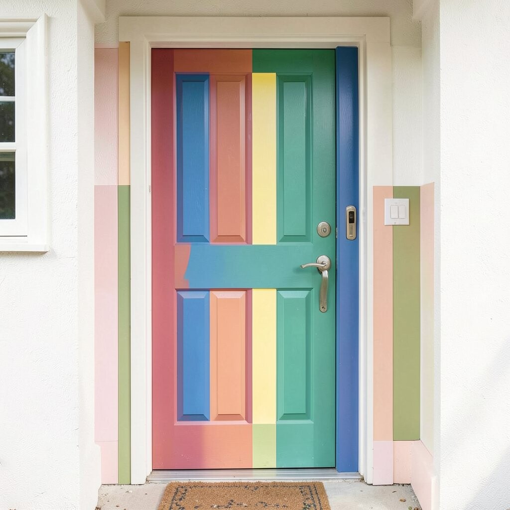
20. Multi-Color Panel Swap With a Consistent Theme
Multi-Color Panel Swap With a Consistent Theme
Want maximum curb appeal? Keep the door’s style, but paint each panel in a different color that follows one theme, like warm tones or ocean tones.
This approach is all about personalization, because you can build a palette that matches your landscaping and siding. It’s also unique because it turns a simple entry into a mini art gallery. Choose colors that belong together, such as coral, peach, and terracotta for a warm theme, or teal, aqua, and navy for a cool theme.
For tips, label your panels before you paint, so the order stays clear. Use a consistent finish across colors to keep the door looking smooth and professional. Cost-wise, you’ll buy more paint colors, but you can reduce spending by picking small sample cans for the accents and using a main color for the largest panels.